Taking Your Talent to the Web: A Guide for the Transitioning Designer- P13 doc
Bạn đang xem bản rút gọn của tài liệu. Xem và tải ngay bản đầy đủ của tài liệu tại đây (509.42 KB, 20 trang )
But keyboard shortcuts aside, Photoshop has advanced tremendously in its
handling of type and now offers essentially the same typographic func-
tionality that Illustrator does. As a result, many designers use Photoshop
for everything.
Photoshop 5.5 and higher also allows you to select an anti-aliasing option
for type, apply simulated styles to type, and turn off fractional character
widths to improve the appearance of small, bitmapped type displayed at
low resolution.
Anti-Aliasing
As all designers know, anti-aliasing enables you create the appearance of
smooth-edged type by partially filling in the edge pixels with intermediary
colors. For those who don’t know, we provide the following handy exercise.
Exercise 4: The Great Intermediary
Launch Photoshop and create a new blank document with a white back-
ground. Work at 72ppi. (We always work at 72ppi on the Web.)
Select the type tool. Click in the image to set an insertion point.
Enter some text in the Type Tool dialog box (Photoshop 5.5) or directly on the
image (Photoshop 6). Format the text however you like. For the sake of argu-
ment, we’ll type our names in black, 24pt. Helvetica. “Crisp” anti-aliasing is
chosen by default. (If it is not, choose it now.)
Close the Type dialog.
Go to Photoshop’s Navigator menu and blow up the image by 400%. Look at
the edges of any letter. Those soft gray pixels are anti-aliasing. Now you know.
The purpose of anti-aliasing is to fool the eye into seeing type as smoothly
rounded in spite of the low resolution of computer monitors.
Anti-aliasing is also used for images unless you’re deliberately going for a
bitmapped, pixellated look. And you’re usually not. Whether for type or
images, it can cause problems when working with GIF transparency.
241
Taking Your Talent to the Web
13 0732 CH09 4/24/01 11:22 AM Page 241
Exercise 5: Match 'Em Up
Open Photoshop and create a new blank document with a white background.
Choose any two web-safe colors from the Photoshop Color Picker or the Vis-
iBone web palette. For the sake of argument, we’ll choose a dark purple and
a light green.
Select a circular area and fill it with the foreground color (dark purple).
Save the image as circle.psd.
Hide the Background layer so that it becomes transparent.
Save for Web.
Choose GIF (choosy mothers choose GIF) and click the Transparency checkbox.
Select the background (light green) color as your transparency color.
Optimize at 16 colors with dithering on and the web-safe slider dragged to
about 40% web-safe.
Save the image as circle.gif.
Open BBEdit or your HTML editor of choice.
Create a new basic HTML document with a background color to match the
light green (transparent) background of your GIF image.
Save the file as circle.html.
Open it in any web browser.
The circle should look good and should have a soft edge thanks to anti-
aliasing.
Return to the HTML document and change the <BODY> background color to
a new, contrasting color. Say, black (#000000).
Save the file and reopen it in the web browser.
The circle should be surrounded by an ugly light green halo.
That is improper anti-aliasing. What have we learned? Always anti-alias
against the color you expect to use in the finished web page.
How do you anti-alias a transparent type (or image) GIF when the site uses
a gradient background image or a random texture?
You can’t. So avoid using those types of backgrounds unless you never need
to set transparent GIFs in the foreground.
242
HOW: Visual Tools: The ABCs of Web Type
13 0732 CH09 4/24/01 11:22 AM Page 242
You should avoid gradient background images anyway because they will
dither horribly on 256-color monitors, don’t render properly in the GIF for-
mat, and if exported as JPEGs cannot be web-safe.
And you should avoid busy random textured backgrounds as well because
they are generally hideous, and they make text harder to read. Even beau-
tiful pages developed with subtle background tiles are not much use if no
one can read the text they contain.
The PNG format mentioned earlier offers real transparency, which means a
PNG image could be used against any type of web background without ill
effect. But the trouble with PNG is…well, we’ve covered that to death
already.
Specifying Anti-Aliasing for Type
Anti-aliasing options in Photoshop and ImageReady allow you to choose
from three levels of anti-aliasing to modify the appearance of type online.
You can choose to make type appear crisper, smoother, or heavier.
Exercise 6: Shape Up—Sizes and Faces
Create a new type layer by typing in a new, blank Photoshop document.
In the Type Tool dialog box, select an anti-aliasing option from the pop-up
menu. Choose:
■ None to apply no anti-aliasing. Useful for bitmapped fonts such as Joe
Gillespie’s Mini 7 (www.wpdfd.com/mini7.htm), Jason Kottke’s Silkscreen
(www.kottke.org/plus/type/silkscreen/), or the Fountain Type Foundry’s
Sevenet (www.fountain.nu).
■ Crisp to make type appear sharp. This is the default setting. It renders
well and uses less bandwidth than Strong or Smooth.
■ Strong to make type appear heavier. This is an impressive setting, but
because it requires additional anti-aliasing to create its effect, it fights
the LZW compression algorithm and results in larger file sizes. We are
talking about very small differences here, but these differences do
add up.
■ Smooth to make type appear, well, smoother.
243
Taking Your Talent to the Web
13 0732 CH09 4/24/01 11:22 AM Page 243
Experiment with different sizes and faces to get a feeling for which type of
anti-aliasing is appropriate for each face, size, and weight. This also varies
depending on the background being used, the visual interaction of other ele-
ments on the page, and so on. Most web designers choose Crisp most of the
time.
General Tips
As just mentioned, the smoother or heavier the anti-aliasing, the greater
the number of edge pixels in various shades, and the more bytes the result-
ing GIF image will require. When bandwidth is at a premium—and it is
always at a premium—err in the direction of Crisp.
Not all type needs to be anti-aliased. Smaller type might be easier to read
with no anti-aliasing at all. For instance, 10px Helvetica will be easier to
read (and will use up less bandwidth) if you choose “None” in the Anti-
Aliasing dialog box. But rather than create GIF type of that nature, a more
responsible course would be to use HTML and CSS to create small bits of
web type because such text may be easily copied, pasted, and indexed by
search engines—whereas type GIFs are simply images.
GENERAL HINTS ON TYPE
Pardon the pun. (Get it? Type? Hints? Never mind.) Every aspect of web
design involves trade-offs and potential problems for some web users.
When setting typography for the Web, here are some points to keep in
mind.
The Sans of Time
Let’s just get it over with: Sans serif fonts are far easier to read onscreen
than serif fonts. This is the exact opposite of what is true for books. But
printing is high-resolution; the computer screen is low-resolution. There
are simply not enough pixels to correctly render the tiny details required
by serif typefaces. This is especially true with smaller type, such as body
text and subheads. (It is also true for CSS text.)
244
HOW: Visual Tools: General Hints on Type
13 0732 CH09 4/24/01 11:22 AM Page 244
It helps to think of your type GIFs as icons, which must be rendered pixel
by pixel in a 72ppi environment—because that is essentially what they are.
Anti-aliased fringe colors must use up an entire pixel (there are no half-
pixels). Now add subtle ascenders and descenders to this mix, attempt to
wedge such nuances into discreet pixels, and you can see why serifs work
poorly onscreen.
You also can see why typographic colors should be web-safe. Add dither-
ing to the unholy mix of anti-aliasing and serifs, and you have an illegible
mess.
This inherent preference for sans serifs on the Web might be behind the
present resurgence in Helvetica. We could be talking through our hats, but
we haven’t heard a better theory, and as we’ve shown earlier, web styles
have been entering mainstream media as fast as designers could rip each
other off.
From this discussion, it might seem that the Web is no place for fine typog-
raphy. But that is not the case. Juxt Interactive is one agency that creates
superb type treatments online, and their work repays careful study
(www.juxtinteractive.com).
Space Patrol
In most cases, web type is more readable when it is widely spaced because
such spacing makes allowances for the imprecise spreading of unruly edge
pixels. So when setting type, try loosening your tracking in the Type dialog
box. If you’ve done any TV design, it’s pretty much the same thing. If you
haven’t, just trust us.
Lest We Fail to Repeat Ourselves
Always start with web-safe colors for your type and your background to
avoid ugly dithering in low-end monitors.
245
Taking Your Talent to the Web
13 0732 CH09 4/24/01 11:22 AM Page 245
Accessibility, Thy Name Is Text
The more text you create graphically, the less a search engine will under-
stand about your client’s web page and the more problems you create for
readers with disabilities or those using alternative web browsers.
As mentioned elsewhere in this book, use <ALT> and <TITLE> attributes in
your HTML <IMG> tags to explain what the search engine and the disabled
visitor cannot see. If HTML and a text GIF look equally good, choose HTML
because it increases the accessibility and usability of your page, makes it
easier for search engines to locate the relevant information, and almost
invariably uses less bandwidth than graphics.
In most cases, HTML text can be resized by the user. Type GIFs cannot. Keep
in mind that small type that looks great to you might be difficult or impos-
sible for folks with impaired vision to read.
If you were wondering why you see so much large bold sans serif typogra-
phy on the web, now you know. It’s not that web designers are copycats.
Well, we are, but it’s not just that. It’s that we’ve learned by experience that
small fonts, sans serif fonts, and tightly kerned text can all be problematic
for the people who use our sites.
As support for CSS improves, it becomes a little easier to sell clients on
CSS-style text instead of type GIFs. But resistance to this notion is wide-
spread because clients seek branding, and designers like creating it. And,
most of the time, type GIFs just work better for that purpose, regardless of
their accessibility issues.
NAVIGATION: CHARTING THE VISITOR’S
COURSE
We covered the guiding principles of navigation in Chapter 3, “Where Am
I? Navigation & Interface.” And in Chapter 7, “Riding the Project Life Cycle,”
we learned that developing a branded, intuitive navigational menu—or a
series of hierarchical navigation menus—is only the beginning and that
most web firms perform interface testing, asking volunteers to work with
the developing site. And as problems are identified, the designer is asked
to rethink and redesign.
246
HOW: Visual Tools: Navigation
13 0732 CH09 4/24/01 11:22 AM Page 246
Focus group testing in advertising often results in mediocre campaigns, but
focus group testing of a web interface can result in a better site—if those
who run the tests know what they are doing.
What this means in the context of Photoshop is that you will be creating
a lot of comps until you truly crack the interface problem, and then you
will be refining your comps based on feedback from user tests.
When the perfect interface has been designed in Photoshop, there is still
more to do. Often, the design team will implement a menu bar that changes
state via JavaScript as the visitor navigates the site. On the simplest level,
changing state means that the menu bar subtly indicates where the user
is within the site structure. For instance, when the visitor reaches the About
section of PlanetRX ( />the About portion of the menu bar is highlighted to remind the visitor “you
are here.” Refer back to Chapter 3’s Figures 3.2 and 3.3 to see how this “you
are here” state change is handled on the Gap site.
Changing state to reinforce the visitor’s position within the site can be
accomplished by simple HTML, via JavaScript, or with the help of publish-
ing systems that swap visual elements on-the-fly. The choice of imple-
mentation varies by the scope of the site and the size of the budget. On a
small site, the menu bar can be changed via HTML or JavaScript. On a very
large site that is constantly updated, a publishing system will probably be
used.
No matter how the technique is implemented, it is up to the designer to
create the alternate state graphics on separate layers in the Photoshop
document. (These will come in handy later in the process when the work is
sliced and produced in ImageReady.)
Typical navigation menus also “light up” or otherwise change state when
the user drags the mouse cursor over a given menu item selection. Again,
this is accomplished via JavaScript, and again, though there is no substi-
tute for home-cooked code (or working with good developers), ImageReady
can help out, as we are about to see.
247
Taking Your Talent to the Web
13 0732 CH09 4/24/01 11:22 AM Page 247
SLICING AND DICING
Photoshop is the primary tool used to design navigational menus and their
associated text (unless these menus are created in CSS, per the preceding
discussion). Photoshop and Illustrator are also used to create assorted nav-
igational elements such as arrows and buttons. The larger and more com-
mercial the site, the greater the pressure to create uniquely branded
elements.
These elements can be created in separate image documents. For instance,
you might create hundreds of arrows in Illustrator before choosing one for
your design. Similarly, you might (and probably will) go through several
rounds of logo development.
But after they are created and chosen, all of these elements are generally
layered into a single Photoshop comp, which is used to sell the work to the
client (see Figure 9.13). Of course, as we’ve just said (and as Chapter 7
explained), this “selling” is a multistage process, with continual refinement
occurring based on research, user testing, and the client’s strange whims.
248
HOW: Visual Tools: Slicing and Dicing
Figure 9.13
Here is a Photoshop web
layout that combines
photography, logos, and
interface elements. We
used this layout to sell
a final web design to
JazzRadio.Net
(www.jazzradio.net).
13 0732 CH09 4/24/01 11:22 AM Page 248
After it’s sold, production begins, and at this point Photoshop’s ImageReady
module comes into its own. Knives were made to slice cake, and
ImageReady was made to slice web comps. The process begins by dragging
Photoshop guidelines across any area that will have to be sliced—for
instance, dragging guidelines to separate one menu bar item from the next
(see Figure 9.14).
249
Taking Your Talent to the Web
Figure 9.14
The next phase is dragg-
ing Photoshop’s guides
to mark areas to be con-
verted to slices in the
ImageReady module.
(Photoshop 6 can create
the slices itself.) Though
slicing such comps is the
normal next step, for this
project we opened a text
editor and re-created the
layout in HTML and CSS to
minimize bandwidth and
enable the layout to
squash or stretch in true
“liquid” fashion.
With Photoshop 6, you can create and name slices right in the Photoshop
program itself. With Photoshop 5.5, having dragged guides, you “Jump to
ImageReady” via the File menu and automatically convert your guides to
slices at the touch of a button. ImageReady generates the relevant HTML,
animations (if any), and JavaScript rollover functions (if any). We don’t
mean to imply that this happens instantly, of course. There is a great deal
of typing, dragging, and layer selection involved.
Rollovers are created by selecting new layers for each rollover state and
typing the relevant URL and text (if any) in the Slices dialog box. Now you
can see why rollover states are visually designed during the comping phase.
Not only does this satisfy the client, it also enables you to focus on pro-
duction tasks without worrying about previously unconsidered design
issues.
13 0732 CH09 4/24/01 11:22 AM Page 249
Performing all these production tasks is a fairly straightforward process,
and the Photoshop manual spells it out so completely that we won’t bother
doing so here. One thing Photoshop’s manual does not emphasize (but we
will) is that you can often replace selected slices with bandwidth-friendly
HTML and CSS equivalents. For example, instead of generating a large
brown GIF image, you can generate an empty table cell filled with the
appropriate background color, merely by choosing No Image from the Type
drop-down menu.
This by no means converts a browser-centric, brand-heavy site into a light,
accessible one. It does, however, help reduce overall file size, and it does
make life a bit easier for those using nontraditional browsers, given that
this will be one less pointless image to trouble them with its incompre-
hensibility.
After the process is completed, sophisticated web designers take the HTML
and JavaScript generated by ImageReady, open it in an HTML text editor
such as BBEdit, PageSpinner, or HomeSite, and edit as needed. For exam-
ple, you might substitute a simpler JavaScript function for one generated
by ImageReady.
ImageReady’s JavaScript is verily a two-edged sword. Novices and experi-
enced web designers in a hurry can rightly consider ImageReady’s auto-
mated scripting a godsend. But it is equally easy to generate massively
confusing or even completely dysfunctional scripts until you familiarize
yourself with the process. The first time we used ImageReady to automat-
ically generate image rollovers, we ended up with a folder full of bizarrely
named duplicate slices and a script that changed every image on the page
at the slightest movement of the mouse.
Then we read the manual.
Most professionals will use ImageReady to generate slices and raw HTML,
then tighten up its markup for better standards compliance and lower
bandwidth, and replace its often complex scripts with simpler ones. In large
web agencies, web technicians will perform these tasks.
250
HOW: Visual Tools: Slicing and Dicing
13 0732 CH09 4/24/01 11:22 AM Page 250
THINKING SEMANTICALLY
Photoshop and ImageReady perform vital tasks splendidly, but what they
cannot do is generate semantic websites predicated on the separation of
style from content. Being visual tools, they necessarily create visual sites—
and of course this is what most clients want and what most designers are
comfortable with. But this is not the only way and not necessarily the best
way to create websites.
Visual sites are a comforting link to the past, to our history of print and
package design—of concrete objects made beautiful and intelligible
through precise design. Semantic sites are something else again.
Because they are rooted in images, and images are necessarily of fixed and
specific sizes, Photoshop and ImageReady generate image-laden sites laid
out in HTML tables with specific heights and widths. They do not generate
the Liquid Design we discussed in Chapter 2 because it is not in the nature
of a pixel-based program to develop abstractions of form. And certainly
they cannot separate style from content because style is their content.
So separating style from content becomes your job, if you choose to accept
it. As an interim step, what we’ve done in our shop over the past two years
is confine ImageReady’s slicing skills to key elements that must be precisely
sized—for instance, to branded navigational menu bars. But whenever pos-
sible, instead of slicing entire comps to create precise graphic web layouts,
we use our comps as guidelines to create HTML (or, even better) CSS equiv-
alents that are loose, flexible, and fairly minimalist.
This process enables us to create templates that function as “content con-
tainers.” Such sites are still branded and still function as all sites function,
but they are less tied down by fixed elements than traditional sites. This
makes them easier to revise and update (just change a style sheet) and
harder for clients to screw up when they take over the maintenance chores.
It also makes them easier for nontraditional browsers to process and posi-
tions them for the next phase of web development.
251
Taking Your Talent to the Web
13 0732 CH09 4/24/01 11:22 AM Page 251
We have now broached the vital next step in the web’s history: the sepa-
ration of style from content. Meanwhile, in our discussion of web typogra-
phy, we have so far avoided the specifics of coping with actual web texts
as opposed to decorative elements. So maybe it’s time to look at a tech-
nology that handles both the separation of style from content and the need
for precise typographic control of web text.
The people of earth call it CSS, and the next chapter will explain how it
works—and what to do when it stops working.
252
HOW: Visual Tools: Thinking Semantically
13 0732 CH09 4/24/01 11:22 AM Page 252
chapter 10
Style Sheets for
Designers
IN THE BEGINNING WAS THE WORD: without style and unadorned on a plain gray
background.
The scientists who envisioned the Web saw it as a place for reasoned dis-
course conducted through documents whose structure was as logical as
the arguments they propounded. HTML would present content and struc-
ture, and the browser (or User Agent) would interpret it visually, according
to its own built-in rules of display. <h1>Headlines</h1> would look like
whatever the browser decided they should look like (typically, 24pt. Times).
<p>Paragraphs</p> would look like whatever the browser decided they
should look like (typically, 12pt. Times).
In early browsers such as Mosaic and Netscape 1.0, web page backgrounds
were generally gray. Why did browser developers choose this dingy color?
The answers are lost in the mists of time. In other words, we have no idea.
But we do have a theory. Namely, images seemed to want to appear against
a black background for maximum contrast and impact. Text, of course,
wanted to appear on white. We’re guessing that the makers of the first
browsers compromised by giving us a washed-out gray that would provide
rudimentary contrast for either type of foreground element. Regardless of
their reasons, the resulting web pages were not much to look at.
14 0732 CH10 4/24/01 1:04 PM Page 253
TAG SOUP AND CRACKERS
Designers and their clients, however, were not about to sit still for such lim-
ited presentational capabilities, so browser companies (mainly Netscape at
first) began “extending” HTML willy-nilly to offer web designers more con-
trol over the visual appearance of their sites. Netscape extended the
<BODY> tag, allowing us to choose background colors as well as text and
link colors. Microsoft gave us proprietary <BODY> tag extensions that
allowed us to create margins of a limited sort.
Netscape gave us the <FONT> tag. We could control the size of our text,
regardless of its structural context. (We could, for instance, make para-
graphs really big <FONT SIZE=”7”> and headlines really small <FONT
SIZE=”1”> even if such approaches contradicted the underlying document
structure.) Microsoft gave us the <FACE> attribute for the <FONT> tag. We
could control typography in a limited, Flintstonian fashion. <FONT
FACE=”ARIAL, HELVETICA”> would make text on the page appear in Arial
if the visitor’s operating system offered that font. If not, the text would
appear as Helvetica. If neither font were available, visitors would see their
default typeface (probably Times).
While browser companies corrupted HTML in a well-meaning but wrong-
headed effort to serve designers and their clients, designers began setting
their text in Photoshop and saving the images in web-friendly GIF format.
14pt. Meta or Futura, with precise kerning and leading, looked a lot better
than <FONT FACE=”ARIAL, HELVETICA”>. Instead of using HTML to present
text, designers used it to embed visual representations of text.
What we gained in presentational spiffiness, we lost in usability. GIF images
of text could not be searched, indexed, copied, or pasted. They could not
even be seen by some people or in some browsers.
At the same time, designers began using HTML tables to control their lay-
outs, a practice most of us still follow, though it runs counter to the struc-
tural nature of HTML. The practice has another downside as well: It yokes
our presentation to our content, making it harder or even impossible for
those with disabilities or those using nontraditional browsers to access the
information on our sites.
254
HOW: Style Sheets for Designers: Tag Soup and Crackers
14 0732 CH10 4/24/01 1:04 PM Page 254
Many of us went beyond using tables and text images. We harnessed invis-
ible powers to our task. As you know, in Photoshop any layer may be fully
or partially transparent. Images in the GIF format are limited to 256 (or
fewer) colors, any one of which may be designated as transparent. Using
Photoshop, web designers created small (1 pixel by 1 pixel) GIFs filled with
a single, transparent color. We then used these transparent GIF images to
control the positioning of elements on the page, as if we were designing
for a fixed medium like print.
We used these transparent GIF images again to simulate leading, inserting
“spacer GIFs” between lines of HTML text.
<IMG WIDTH=”100” HEIGHT=”100” ALT=” “ SRC=”transparent.gif”>
Notice the height and width. Netscape’s browser likes it when you indicate
the size of images used. This helps the browser leave space for the images,
even before they have finished downloading. A tangential aspect of the
whole affair is that browsers will display your images at any size you tell
them to. Thus a 1 pixel by 1 pixel transparent.gif could be 100 pixels wide
by 100 pixels tall if you marked it up that way in your HTML. These crude
feats provided rudimentary layout control, while HTML itself did not.
That was the key. HTML, practically the only tool at our disposal, provided
no typographic or layout control. So most of us deliberately deformed the
simple markup language in hopes of forcing it do our bidding. We made a
“tag soup” of the Web, using <TT> (“typewriter text”) to force the browser
to display a monospaced font (usually Courier). To create vertical space, we
deployed transparent GIFS or typed structurally meaningless carriage
returns such as:
<br><br><br>
or went so far as to create “invisible headlines” which were never intended
to be read. To create invisible headlines we used the nonstandard <FONT
COLOR> attribute to set a headline to the same color as the web page’s
background. For example, on a page whose background color was white,
we might use the following:
<H1><FONT COLOR=”#FFFFFF”>Don’t read this headline</FONT></H1>
255
Taking Your Talent to the Web
14 0732 CH10 4/24/01 1:04 PM Page 255
By means of these stunts, the Web began to look better on the surface, but
the markup that was supposed to hold it together was becoming less and
less meaningful, more and more fragmented. Documents made less and less
structural sense and were more and more tied to the quirks of specific
browsers. “Use Netscape so you can see this page!” we screamed at our
viewers in the mid-1990s.
CSS TO THE RESCUE…SORT OF
In 1996, Microsoft, Netscape, and other members of the World Wide Web
Consortium (W3C) came up with a brilliant new standard technology—one
intended to give designers far more power over the display of web pages,
without further corrupting the structural meaning of their HTML docu-
ments. The name of that technology was Cascading Style Sheets (CSS).
CSS is the best friend a visually oriented web designer ever had, but sup-
port for this crucial standard has been a long time coming. In the follow-
ing section, we’ll gently introduce you to CSS, showing how and why it
works. Afterward, we’ll talk about what can go wrong with CSS and pres-
ent a detailed No Fault CSS Plan that enables you to harness the power of
style sheets without running afoul of buggy browsers. The good news about
all of this is that most current web browsers now offer good-to-excellent
CSS support. The bad news is that older, inferior browsers are still in use,
though they are fading away over time (see the section, “The 18-Month
Pregnancy” in Chapter 2, “Designing for the Medium,” for comments on this
topic).
As a last prefatory note, you might find yourself working at a large web
agency—one where web designers spend most of their time in Photoshop
and Illustrator, while HTML production chores are handled by a separate
group of professionals. Even at job like that, you will still need to know CSS.
Why? It’s because even when HTML chores are assigned to web technicians,
it is almost always the web designer’s job to create the style sheet.
256
HOW: Style Sheets for Designers: CSS to the Rescue…Sort of
14 0732 CH10 4/24/01 1:04 PM Page 256
That may seem puzzling. If web technicians and developers handle all other
markup and coding, why wouldn’t those professionals also be called upon
to write the site’s style sheet? The answer is simple—style sheets control
typography and layout, and that makes them the designer’s responsibility.
(You don’t really want a programmer deciding how your web typography
should look, do you?)
DESIGNING WITH STYLE: CASCADING STYLE
SHEETS (CSS)
CSS is a developing web standard whose purpose is to control the display
of web pages. Cascading Style Sheets Level 1, the initial version of CSS rec-
ommended by the W3C in 1996, is well (or fairly well) supported in current
browsers including Opera 5 or higher, Internet Explorer 5 or higher, and
Netscape 6 or higher. CSS empowers web designers to control such ele-
ments as:
■ Font families, font sizes, and leading (“line-height” in CSS-speak)
■ Margins and page divisions
■ Colors, backgrounds, whether or not backgrounds tile, whether or
not they scroll, and so on
■ Positioning of elements in relation to each other, and to the edges of
the browser window
■ Borders, HTML elements (such as <FORM> elements), and more
As this list suggests, CSS is a very powerful standard that can replace the
use of HTML tables to control layout; end the use of <FONT> tags to con-
trol web typography; and do much more than tables and <FONT> tags ever
could (see Figure 10.1).
257
Taking Your Talent to the Web
14 0732 CH10 4/24/01 1:04 PM Page 257
Separation of Style from Content
Beyond providing designers with a powerful tool set, CSS serves an addi-
tional purpose—that of formally separating a website’s style (or design ele-
ments) from its content (otherwise known as writing and such).
Disadvantages of Traditional Web Design
Methods
The way web designers have historically designed pages, style and content
are hopelessly intermingled. Text appears inside table cells. <FONT> tags
are wrapped around every paragraph.
258
HOW: Style Sheets for Designers: Designing with Style
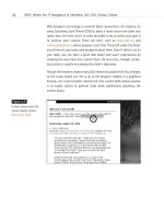
Figure 10.1
The New Year’s 2001
Greeting at zeldman.com.
The background image,
text, and “core” button are
exactly positioned via CSS,
which also creates the
black outline and back-
ground colors. Notice that
the image hugs the upper
left corner of the browser
window, a feat that is
easily achieved by using
CSS to set margins and
padding at “0.” JavaScript
was used to route
Netscape 6 users, IE5
users, and Opera 5 users
to subtly different pages
(www.zeldman.com/
2001.html).
14 0732 CH10 4/24/01 1:04 PM Page 258
While this old system works, and while it is used in literally millions of sites,
it has two powerful disadvantages:
1. Problems in the present: wasted bandwidth and HTML abuse.
HTML tables were never intended to be used as design tools; when
used for that purpose, they slow the rendering of web pages in the
browser and can cause problems for users of text-based browsers—
such as people with disabilities. While they do work in most
browsers, these tags and tricks slow down web pages and contribute
to bandwidth problems by forcing the user to download unnecessary
text (namely, the tags themselves). They also clutter the markup.
2. Problems for the future: retarding progress. By mingling content
with style, the present system makes it much more difficult for web
designers and programmers to create sites that can be used by non-
graphical browsers and devices, such as web phones, Personal Digi-
tal Assistants (PDAs), and audio browsers for the blind. Such devices
represent a growing and vital market. On the other hand, if content
and style are formally separated, then nongraphical browsers can
simply display text and links, while computer users with graphical
browsers still enjoy a rich visual experience created by web design-
ers. In addition to the harmful effects on web-enabled devices, the
mingling of content and style also makes it more difficult to design
and build robust interactive sites, including the e-commerce sites
you will inevitably find yourself designing.
CSS Advantages: Short Term
Under the present system, designers who wish to control the appearance
of text on the Web must type <FONT> tags for every paragraph of client
content. This adds up to hundreds of kilobytes of wasted bandwidth on
every site and hundreds of hours of tedious labor for the web designer
and/or the HTML technician.
259
Taking Your Talent to the Web
14 0732 CH10 4/24/01 1:04 PM Page 259
After all those hours of labor, if the client requests a design change, many
more hours of labor must be put in, as the designer or web technician man-
ually searches for and replaces all those annoying <FONT> tags.
It’s a dumb way to work. With style sheets, the web designer can change
just one document—a global style sheet—and the layout and typography of
the entire site will be instantly changed. Hundreds of hours of the dullest
sort of labor can be saved in this way. If style sheets are used to control
layout as well as typography, the savings in labor (and client costs) can be
even more profound.
What can you do with the client dollars saved? You can spend them on
design, programming, writing, photography, illustration, research, testing,
marketing, and maintenance. With less of it wasted on monkey work, the
same budget now enables you to create a richer, more powerful site.
Another bonus is that after putting every ounce of our experience and tal-
ent into the design of web pages, we typically turn the sites over to our
clients, who then update the sites as needed. Websites are not carved in
stone; a site that’s not minty-fresh is a dead site. How many clients have
a background in design and extensive knowledge of web technology?
We’ve been lucky enough to find precisely one such client in nearly six
years of doing this work.
As explained in Chapter 7, “Riding the Project Life Cycle,” often during the
hand-off and maintenance phase, a junior or mid-level person with no
design experience and little web knowledge is made responsible for the
site’s maintenance and updating. Frequently, “refreshing the site” is merely
one of that employee’s daily duties. The more our pages are filled with
<FONT> tags, complex tables and framesets, the sooner that overworked
web coordinator can turn the site into an eyesore as well as a usability
nightmare. By separating design elements from content, we make it much
harder for our clients to destroy the sites we’ve worked so hard to create
for them. CSS is our friend.
260
HOW: Style Sheets for Designers: Designing with Style
14 0732 CH10 4/24/01 1:04 PM Page 260


