Taking Your Talent to the Web: A Guide for the Transitioning Designer- P14 potx
Bạn đang xem bản rút gọn của tài liệu. Xem và tải ngay bản đầy đủ của tài liệu tại đây (361.57 KB, 20 trang )
CSS Advantages: Long Term
As indicated, CSS provides a way for web designers to create richly visual-
ized, robustly interactive sites that also might function well outside the
traditional web browser environment. As more and more people begin to
interact with the Web through new, nontraditional Internet devices—and
as more and more powerful web standards are brought to fruition in the
browser as well as at the W3C bargaining table—the need to separate con-
tent from style becomes even more important. So it’s pretty darned crucial
that web designers come to grips with this concept of style/content sepa-
ration and learn to use style sheets effectively in designing for the Web.
COMPATIBILITY PROBLEMS: AN OVERVIEW
The CSS-1 standard was created in 1996 but was not completely supported
by any web browser before the year 2000. As of this book’s publication, it
is still imperfectly supported by browsers most often used to access the
Web. This has slowed the adoption of CSS in the field given that no client
wishes to pay for a site that might not work correctly for many users.
Poor, partial, or incompatible CSS implementations in browsers also have
persuaded most web designers who do use style sheets to employ them
only in very limited ways. For example, many designers now use CSS to con-
trol the fonts on a site. But these same designers continue to use HTML
tables to control the layout of text and graphical elements on each page
(see Figure 10.2) because poor or incompatible CSS implementations in the
browser might otherwise render their layouts illegible. They can even cause
one browser to crash (more on that shortly).
261
Taking Your Talent to the Web
14 0732 CH10 4/24/01 1:04 PM Page 261
We refer to this two-pronged, “safe” approach as No-Fault CSS, a tech-
nique we began recommending in1998 in the A List Apart “Fear of Style
Sheets” series:
■ www.alistapart.com/stories/fear/
■ www.alistapart.com/stories/fear2/
■ www.alistapart.com/stories/fear3/
■ www.alistapart.com/stories/fear4/
The series was designed to evangelize CSS use in spite of browser compli-
ance problems by showing which CSS techniques to avoid and which could
be safely used.
Browser companies such as Netscape and Microsoft have sometimes been
slow to realize that what is good for designers and web users is also good
for browser makers themselves because fewer problems mean fewer com-
plaints and better word of mouth. Nevertheless, by fits and starts, the
262
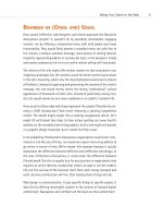
HOW: Style Sheets for Designers: Compatibility Problems
Figure 10.2
The Daily Report at
zeldman.com uses CSS
to control typography but
traditional HTML tables to
lay out the page. CSS-
capable browsers are on
the market, but so are
Netscape 4 and IE3—two
old browsers whose sup-
port for CSS is problem-
atic. Because Netscape 4
users can crash from CSS
layouts and IE3 users can
barely see them, an
interim approach was
taken. When these old
browsers have faded into
disuse, the same page will
be designed entirely in
CSS (www.zeldman.com/
coming.html).
14 0732 CH10 4/24/01 1:04 PM Page 262
browser companies have increasingly supported CSS in earnest. Eventually,
web designers will be able to dispense with HTML tables and other forms
of HTML abuse altogether and use CSS to design robust sites that conserve
bandwidth while offering true separation of style from content.
In turn, this separation of style from content will enable designers, pro-
grammers, and web technicians to more capably use additional web stan-
dards, such as JavaScript and the Document Object Model (DOM), to build
truly dynamic, interactive sites.
WORKING WITH STYLE SHEETS
Style sheets are composed of “rules.” Rules have two parts: a selector that
is followed by a declaration. Consider the style sheet below:
BODY {background: white; font-family: helvetica, arial, sans-serif;}
H1 {font-weight: bold; font-size: 24px; }
P, LI {font-size: 12px; line-height: 150%;}
BODY is the first selector, while the text within brackets is the declaration.
Each declaration consists of one or more properties, followed by its asso-
ciated values. For example, in the first line, background is a property, and
white is declared as its value. font-family is a property, and the fonts listed
are possible values for that property. This terminology is confusing at first,
but working with style sheets is actually very easy. Let’s look more closely
at the following example:
BODY {margin-top: 0; background: white; font-family: helvetica, arial, sans-serif;}
H1 {font-weight: bold; font-size: 24px; }
P, LI {font-size: 12px; line-height: 150%;}
The first line indicates that the BODY of the HTML document will use a
white background and that typography throughout the entire page (unless
otherwise noted via an additional selector) will be in the Helvetica family.
If the user does not have Helvetica on his or her system, the type will be
displayed in Arial. If Arial is not available, a generic sans serif will be used.
Finally, margin-top: 0 tells the browser to start the web page at the top of
the browser window, rather than “helpfully” offsetting it with an unpre-
dictable or inconsistent vertical margin.
263
Taking Your Talent to the Web
14 0732 CH10 4/24/01 1:04 PM Page 263
Font families are displayed in the order with which they are written. If the
user has both Arial and Helvetica on her system, Helvetica will be displayed
because it is listed first. In this way it is possible for designers to specify
“best-case” scenarios while providing backup options. Remember: The first
font listed will be displayed if it is available. The old <FONT> tag worked
the same way.
It is crucial to provide typographic alternatives to compensate for cross-
platform differences and to end every font declaration with a generic alter-
native, such as “serif” or “sans serif.” Additional generic alternatives
include “monospace” for monospaced fonts such as Courier and “fantasy”
for ugly and cancerous fonts such as Microsoft Comic Sans.
Recognize the awesome power of style sheets. In a single line, the typeface
has been provided for an entire site. Imagine typing all those <FONT
FACE=”HELVETICA, ARIAL, SANS-SERIF”> tags instead. Yuck.
BODY {margin-top: 0; background: white; font-family: helvetica, arial, sans-serif;}
Note also that the background color has been written out as “white.” Any
color may be used, though as has been discussed before, it is always best
to use web-safe colors.
Colors need not and usually should not be specified by name because
names do not necessarily trigger web-safe colors. Instead of white, the
designer could have specified the hexadecimal code for that color: #ffffff.
It is even possible to use “shorthand” and specify only the first letter of each
hexadecimal pair (#fff). This will be clearer with a color such as #ff9900,
which can be written as #f90 in the style sheet, saving the designer three
strokes of the keyboard and saving the user an infinitesimal amount of
bandwidth.
Note that the H1 (headline), P (paragraph), and LI (list item) have had their
sizes specified in pixels:
H1 {font-weight: bold; font-size: 24px; }
P, LI {font-size: 12px; line-height: 150%;}
264
HOW: Style Sheets for Designers: Working with Style Sheets
14 0732 CH10 4/24/01 1:04 PM Page 264
It is possible (though not always useful) to specify a size of 1px or 200px
(or even larger type). Besides pixels, style sheets can use points, inches,
centimeters, .ems, percentages (“font-size: 75%;”) and even absolute font
size keywords. We will discuss the advantages and disadvantages of each
further on in the chapter. Oh, brother, will we discuss them.
Note also that it is possible to specify bold (or light, or italic, or italic bold)
and that for the first time in web design history, it is also possible to cre-
ate Quark-like leading in HTML text. Okay, you’re new to web design, so
you’re not impressed. We’ve had leading in desktop publishing tools since
Nixon wore short pants—but not on the Web, sister. On the Web, this is
some cool new stuff.
line-height: 150%
This declaration means that the text will have leading of 150%. Any num-
ber may be chosen. Line-height can be 110%, 200%, or 75% (for special
effects involving overlapping text). Assume 100% as a default, which need
not be written. (Actually, the built-in leading seems to be closer to 110%,
but again, unless you are specifying leading for a reason, leave it out to
avoid creating problems.)
Line-height, like font-size, can be specified in points, pixels, .ems, percent-
ages, centimeters, or inches.
line-height: 18px;
Because 150% of 12px equals 18px (12 + 6 = 18), a line-height of 18px
would look exactly the same as a line-height of 150% on 12px type. If the
font-size were 24px, then 150% would yield a line-height of (24 + 12) 36
pixels.
It is also possible and often desirable to indicate font-size and line-height
in the same declaration, using CSS shorthand:
P, LI {font: 12px/18px;}
The first number (12px) is the font-size; the second (18px) is the line-
height. All CSS-capable browsers understand this shorthand.
265
Taking Your Talent to the Web
14 0732 CH10 4/24/01 1:04 PM Page 265
Leading on the Web serves exactly the same purpose as leading in print: it
adds air to the “page” and enhances readability. On the screen-based Web,
with its low typographic resolution, anything we can do to encourage read-
ability is all right by us. By contrast, reading may be discouraged when we
fail to apply leading and other CSS niceties to our text (see Figure 10.3).
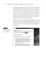
266
HOW: Style Sheets for Designers: Working with Style Sheets
Figure 10.3
The Adobe web column,
written by your humble
author, but laid out by
Adobe’s online design
team. CSS is used to
control typography, but
the small text is tough on
the eyes. CSS leading and
a larger font-size would
make the reading experi-
ence more pleasurable.
This typographic approach
works well for image
captions, a staple of the
Adobe site, but it is less
well-suited to longish
articles (www.adobe.com).
Now that we’ve taken a brief look at the rudiments of CSS, let’s see how
web designers can make this work on a site.
Types of Style Sheets
There are three main ways to use style sheets on a website:
1. By linking to an external style sheet from the HTML document
2. By embedding a style sheet within each HTML document
3. By adding styles inline in an HTML document
14 0732 CH10 4/24/01 1:04 PM Page 266
Additionally, it is possible to import one style sheet into another. Unfortu-
nately, this technique is not supported by Netscape Navigator 4, so we will
confine our discussion to the first three items. If Netscape 4 has gone to
its reward by the time you buy this book, you can read up on “CSS import”
at www.w3.org/Style/CSS/.
External style sheets
Linking to an external style sheet enables you control multiple web pages
(or even an entire site) using a single CSS document. The more pages con-
trolled by the same CSS document, the easier it becomes to make design
changes to that site. It is literally possible to change the appearance of a
5,000-page website in under a minute, simply by editing one external Style
sheet. Trust us, this is one maintenance chore you will genuinely enjoy.
Five steps to paradise: creating an external style sheet
1. Essentially, in BBEdit, PageSpinner, HomeSite, or any other HTML
editor, the designer creates a style sheet. For simplicity’s sake, here
is a basic one:
BODY {background: white; font-family: helvetica, arial, sans-serif;}
H1 {font-weight: bold; font-size: 24px; }
P, LI {font-size: 12px; line-height: 150%;}
2. The designer saves this document with a filename ending in .css. For
instance, the name could be style.css, or clientname.css.
3. This CSS file is then uploaded to the server via FTP, just like an HTML
file.
4. Next, in the website’s HTML files, the designer inserts one additional
line of code within the <HEAD> tag:
<html>
<head>
<title>Welcome to Widgets.com</title>
<link rel=”stylesheet” HREF=”style.css” TYPE=”text/css”>
</head>
<body>
…and so on.
267
Taking Your Talent to the Web
14 0732 CH10 4/24/01 1:04 PM Page 267
5. The <link> tag calls up the separate syle sheet file (style.css) and uses
its contents as instructions for displaying the page.
Note that it is possible to link to a CSS file using a relative path (“ /styles/
style.css”), a rooted URL (“/path/from/server/root/style.css”), or a full URL
( This style sheet will now control
any web page that links to it via the additional line of code within the
<HEAD> tag. An entire site can be controlled in this way.
Embedding a style sheet
Web designers who wish to affect only one page may do so by embedding
a style sheet within the <HEAD> tag of that web page.
<html>
<head>
<title>Style Sheets Rule!</title>
<style type=”text/css”>
<!
BODY {background: #ffc; font-family: palatino, georgia, times new roman, serif;}
P {font-size: small; line-height: 125%;}
.sub {font: large bold arial, helvetica, sans-serif; margin-top: .25in;}
>
</head>
Note the use of commenting to prevent older, non-CSS-capable browsers
from being confused by the code and to prevent search engines from point-
lessly indexing your style sheet:
<!
(Anything within comments will be ignored by browsers that do not under-
stand the code, and ignored as well by search engines. Have a nice day.)
>
What else is new in this example? The CSS is preceded by a tag that tells
the browser how to interpret it:
<style type=”text/css”>
A more complete heading tells the browser not only that what follows is
an embedded CSS, but also tells what type of media the CSS is intended to
support:
<link REL=”StyleSheet” HREF=”style.css” TYPE=”text/css” MEDIA=”screen”>
268
HOW: Style Sheets for Designers: Working with Style Sheets
14 0732 CH10 4/24/01 1:04 PM Page 268
The idea is that a document can link to several style sheets. For instance,
one controls screen presentation (MEDIA=”screen”), another printing, and
a third audio browsers. Not all browsers support this as of now, though it’s
a good idea to begin fully spec’ing your CSS anyway.
In a Class by Itself
All of the preceding is straightforward, but what does .sub mean in this line?
.sub {font: large bold arial, helvetica, sans-serif; margin-top: .25in;}
The selector labeled .sub is a unique class, created by the web designer for
his or her own particular design needs on this page.
That’s correct. CSS not only gives web designers the power to style traditional
HTML markup, it also enables them to create and style unique items to suit
their needs.
For instance, here, the web designer wished to create a special subhead class
with a quarter-inch margin at the top. She decided to call it sub because the
name was easy to remember and indicated the purpose (subhead) for which
the class was created. The designer could have called this class unclecharlie
if she wished.
To make use of this special class, the web designer will refer to it in the HTML
document in this way:
<div class=”sub”>Here is my subhead, with a quarter-inch margin at the top.</div>
In the web page, the line, Here is my subhead, with a quarter-inch margin at
the top would be large, bold, Arial or Helvetica (or generic sans serif) with
(surprise!) a quarter-inch margin at the top.
Style sheets rock.
Adding styles inline
The inline method is used when the web designer wishes to change the
appearance of a single tag or group of tags on one page, and not for chang-
ing the entire page or site. Adding styles inline does not offer web design-
ers the true power of CSS because it forces them to restyle text one item
at a time. Still, it can be very useful at times.
269
Taking Your Talent to the Web
14 0732 CH10 4/24/01 1:04 PM Page 269
For instance, an entire page or site may be set in medium-size Verdana
(Helvetica, Arial, sans serif). But one line of text needs to stand out from
the rest. Perhaps this line of text represents a letter from a customer—or a
message from the U.S. Internal Revenue Service. The web designer decides
that this particular line of text should be set in 12px Monaco.
She could create an entire class just for that line of text and include that
class in the site’s global style sheet, but why create an entire class for one
line of text on a single web page? Inline styling does the job better:
<p style=”font: 12px monaco, monospace;”>
Greetings from the I.R.S.</p>
Inline styling seems like an oddity, but it is actually a wonderful supple-
mental tool—much like a tube of touch-up paint that is used to correct a
small detail.
Inline styling is also quite effective for improving the appearance of
<FORM> elements:
<div align=”center”>
<form>
<input
type=”button” style=”font-size: 12px; font-family: geneva, arial; background-color:
#ff6600; color: #ffffff;”
value=”Previous Reports”
onClick=”window.location=’com0400d.html’;”
onMouseOver=”window.status=’More of same.’; return true;”
onMouseOut=”window.status=’’;return true;”>
</form>
</div>
Form elements also may be styled via DIV classes in a global style sheet. If
every <FORM> button on your site is supposed to be orange (#ff6600) and
use 12px Geneva or Arial type, by all means create an orangebutton
class for the site, declare it on the global style sheet, and then refer to it in
individual HTML pages, like so:
<div align=”center”>
<form>
<input
type=”button”
class=”orangebutton”
270
HOW: Style Sheets for Designers: Working with Style Sheets
14 0732 CH10 4/24/01 1:04 PM Page 270
value=”Previous Reports”
onClick=”window.location=’com0400d.html’;”
onMouseOver=”window.status=’More of same.’; return true;”
onMouseOut=”window.status=’’;return true;”>
</form>
</div>
TROUBLE IN PARADISE: CSS COMPATIBILITY
ISSUES
The first web browser to attempt to support CSS was Microsoft Internet
Explorer 3.0 (1997). It supported about 30% of the standard. A year later,
Netscape 4 came out with support that was marginally better than that of
IE3. During three years of hell, while Netscape sought to rebuild its browser
from the ground up, Navigator 4 sat rotting on the market—its once-proud
CSS support looking more and more shoddy. IE4 got more of it right and
was soon replaced by IE5, which got still more of it right. No browser got
it absolutely right, and baffled web users were often reluctant to upgrade
to incremental (4.52 anybody?) versions of these browsers.
Thus support for CSS lagged, and problems abounded. In 1998, The Web
Standards Project (www.webstandards.org) was formed to advocate and
shore up support for CSS and other web standards, and A List Apart
(www.alistapart.com) began running the “Fear of Style Sheets” series.
Fear of Style Sheets: CSS and Layout
One of the great strengths of CSS is its ability to position elements on a
web page. Elements may be positioned by exact pixel coordinates (400 pix-
els from the top, 32 pixels from the left, for example). They may be posi-
tioned relative to each other. They may be positioned via percentages,
permitting web designers to easily set up liquid layouts, as previously
discussed.
Unfortunately, CSS positioning is not supported in IE3 and is poorly
supported in Netscape Navigator 4. In fact, it can cause the browser to
crash, as detailed in A List Apart’s article, “The Day The Browser Died”
(www.alistapart.com/stories/died/).
271
Taking Your Talent to the Web
14 0732 CH10 4/24/01 1:04 PM Page 271
So until IE3 and Netscape 4 leave the market, many of us will probably keep
using HTML tables to create our web layouts. Web pages laid out with
HTML tables will work in Netscape 1, 2, 3, 4, and 6; in IE 2, 3, 4, 5 and
beyond; and in all other graphical browsers, including Opera and iCab.
If you’ve been following along, you’ll realize this means that web design-
ers still cannot safely separate style from content on commercial projects
and will continue to face difficulties in creating sites that work well out-
side the traditional desktop computer-based browser. But in the trenches,
where work gets done, it also means that we can create sites that work for
our clients and our clients’ audiences.
By late 2001 or soon after, we should be free to truly harness the power of
CSS. Meanwhile, on personal, noncommercial projects, we can explore the
full potential of CSS and other web standards without fear of hurting our
clients’ customers (see Figure 10.4). It is hoped that these noncommercial
usages of CSS and other web standards help widen interest in emerging
technologies and encourage quicker adoption of newer, more standards-
compliant browsers.
272
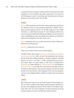
HOW: Style Sheets for Designers: Trouble in Paradise
Figure 10.4
Web Trumps, a card game
featuring well-known web
personalities, uses CSS to
control the positioning
and layering of every
image on the page and
JavaScript to reveal new
layers during game play.
Web Trumps is a mini-
masterpiece of graphic
design and web program-
ming—but one requiring
the use of a modern
browser. Experiments like
this help hasten the day
web designers can apply
the same level of sophisti-
cation to commercial
designs without worrying
about browser incompati-
bilities (http://
pixelflo.com/008/).
14 0732 CH10 4/24/01 1:04 PM Page 272
Fear of Style Sheets: Leading and Image
Overlap
As mentioned earlier in this chapter, CSS leading provides a standard
means of improving the legibility and aesthetics of textual presentations
on the Web—something every site designer should care about. And it does
this while avoiding all the problems associated with transparent GIF hacks
and other nonstandard visual workarounds.
The CSS line-height property solves all the old problems, but it can lead to
new ones, particularly in older browsers whose support for CSS is largely
theoretical. For instance, in the following example, if CSS line-height is
specified for the <p> tag, the image will float on top of the text in both
IE3 and early versions of Navigator 4:
<p><img src=”dog.gif” width=”100” height=”100” alt=”My dog, Pookie.” title=”Pookie is a
friendly mutt.” align=”left”>My dog Pookie liked this text so much, he decided to sit on it
in IE3 and Navigator 4.</p>
This problem is more prevalent in Mac OS than in Windows, largely because
big browser companies spend more time and resources developing
browsers for Windows than for other operating systems. (All the more
miraculous then, that in the year 2000 the best browser on the market was
IE5/Mac. Arguably it is still the best.) The solution to image overlap is to
keep images outside of paragraphs and <div> tags. Unfortunately, doing so
brings up yet another problem in Netscape Navigator 4:
<img src=”dog.gif” width=”100” height=”100” alt=”My dog, Pookie.” Title=”Pookie is a
friendly mutt.” align=”left”>
<p>My dog Pookie liked this text so much, he decided to shove it to the right in its own
little column in Navigator 4.</p>
With a left-aligned image placed outside the <p></p>, some versions of
Netscape Navigator 4 will stick all the paragraph text in an imaginary col-
umn to the right of the image, as if the web designer had desired to cre-
ate such a column. New paragraphs, in turn, will appear also in that
unwanted column. Many a simple layout has been ruined in this way.
There is no solution to this problem. No matter which approach is used,
some Netscape 4 users are going to get an ugly layout. Because an
unwanted and mindlessly stupid column is preferable to text that is hid-
273
Taking Your Talent to the Web
14 0732 CH10 4/24/01 1:04 PM Page 273
den behind an image, it is best to hope and pray that most Netscape 4.x
users are equipped with a more recent version of the browser. Alternately,
the designer can create pages that use no images whatsoever—scarcely an
attractive option. Finally, the designer can wrap images inside table cells,
given that doing so seems to solve most of these problems—at the terrible
cost of adding needless, bandwidth-wasting and time-consuming code to
every single web page.
The good news of course is that Netscape 6 avoids all these problems, and
Netscape 4, like other old browsers, will gradually wither away. The bad
news is it hasn’t withered away yet. So proceed with caution.
Fear of Style Sheets: CSS and Typography
Guerrilla warfare pays little heed to niceties and neither can designers in
the trenches. Too much of CSS still does not work in millions of web users’
browsers. To prepare you for battle, we will now pay little heed to the way
things should work. Instead, we will show you what does work in any CSS-
capable browser, no matter how old, inadequate, or semi-standards-
compatible it is. In other words, the following is an interim strategy for use
until nearly all web users are packing a CSS-compliant browser. If you wish
to control your web typography with CSS (and why wouldn’t you wish to
do that?), there are only two things that always work:
1. Use pixels (not points, not .ems, not percentages, not keywords) to
specify your font sizes.
2. Or use nothing. Do not specify font sizes at all, and let the browser’s
stylistic defaults and the visitor’s preferences take care of the rela-
tive size relationships. This approach is detailed in the “Dao of Web
Design” article at A List Apart (www.alistapart.com/stories/dao/)
Promise and performance
By now you understand that CSS is an important standard. It allows web
designers to specify the font family, size, margins, and leading of type on
the web; permits web designers to create advanced web layouts without
abusing HTML; and enables web designers, web practitioners, and pro-
grammers to separate design elements (presentation) from content.
274
HOW: Style Sheets for Designers: Trouble in Paradise
14 0732 CH10 4/24/01 1:04 PM Page 274
This ability to separate presentation from content theoretically empowers
us to create attractive sites without excluding visitors who cannot use
graphical browsers—a highly desirable goal. It also paves the way for the
expansion of the Web beyond the desktop computer and onto a variety of
hand-held and other Internet-enabled devices.
Yet many times our best CSS efforts fail in one browser or another.
Even though the CSS Level 1 standard was finalized in 1996, the first
browser to meaningfully support it did not appear until the year 2000
(Internet Explorer 5, Macintosh Edition). Fortunately, Netscape 6 (multiple
platforms), Opera 5 (multiple platforms), and Konqueror (Linux/UNIX) soon
followed, with commendable CSS support of their own. But each of these
fine browsers enjoys only a relatively small market share as of this writing.
At present, the market is dominated by IE for Windows—a browser that
comes teasingly close but misses the mark in a few critical areas. The Win-
dows version of Microsoft’s browser did not fully support CSS-1 before the
release of IE6—if then. And Netscape Navigator 4, still used by tens of mil-
lions, does such a poor job of handling style sheets that it has been known
to crash upon encountering them, as detailed in A List Apart’s “The Day the
Browser Died.”
Faced with these inconsistencies, many web designers have avoided using
CSS altogether. A few brave souls have leaped ahead to fully exploit the
power of CSS in spite of the dangers posed to old browsers. Other web
designers and developers have followed the “No-Fault CSS” plan outlined
in A List Apart’s “Fear of Style Sheets” series, whether they picked it up at
ALA or figured it out on their own.
Still others—tricky devils—have created platform and browser detection
scripts to serve a variety of “appropriate” style sheets to specific user
agents—for instance, serving one style sheet to an IE4/Mac user and
another to a Navigator 4 user on Windows NT. This approach was always
unpleasantly complicated, but at least it used to work. As we’ll show you
in a moment, it no longer works.
What works? Pixels or no sizing at all works. How can we make this auda-
cious claim? We’ll let an expert make it for us. Take a sad look at Web
Review’s Master List and see the inconsistencies for yourself:
275
Taking Your Talent to the Web
14 0732 CH10 4/24/01 1:04 PM Page 275
The Master List
www.webreview.com/style/css1/charts/mastergrid.shtml
“The mother of all CSS (Cascading Style Sheet) charts,” which lists every
aspect of the CSS spec and identifies how well it is supported by various Mac
and Windows web browsers.
If the Master List did not convince you (or if you could not quite grasp its
meaning), we’ll look at the alternatives one by one:
Font Size Challenges
Among many other capabilities, CSS allows web designers to specify the
size of typography on web pages. As shown below, font sizes can be indi-
cated using any of the following: points, pixels, absolute keywords, relative
keywords, length units, and percentage units.
H1 {font-size: 14pt}
H1 {font-size: 14px}
H1 {font-size: x-large}
H1 {font-size: larger}
H1 {font-size: 1.5 em}
H1 {font-size: 125%}
Too bad most of the stuff doesn’t work everywhere…yet.
Points of contention
Points are the units of measure with which designers are most familiar—
from their years of creating print layouts in Quark XPress or similar pro-
grams. Unfortunately, points are meaningless on the Web. Points function
as units of print, not as units of screen space. (Pixels are the only mean-
ingful unit of screen space.) Due to platform and resolution differences,
14pt. can mean many things. What it does not mean is a specific unit of
screen size.
Points are included in the CSS spec so that designers can set up a second
style sheet for printouts, as mentioned earlier in this chapter—one CSS doc-
ument to control the way the display looks on the screen and a second for
printing.
276
HOW: Style Sheets for Designers: Trouble in Paradise
14 0732 CH10 4/24/01 1:04 PM Page 276
In your print-oriented style sheet (if the browser supports this), it makes
perfect sense to use points because printers understand points and can be
thrown for a loop by pixels. In some older browsers, 12px type gets printed
as 12 pixels, and those pixels are computed against the printer’s resolution.
Got a 1200ppi printer? Your 12px type could be .01 inches tall. To avoid
that kind of lunacy, points should be used in style sheets devoted to the
printer—and nowhere else. (Better browsers recalculate style sheets
according to the needs of the printer, but your visitors may not be using
these browsers.)
In the world of print, there are approximately 72 points per inch. To match
this, Mac OS offers a default resolution of 72 pixels per inch, mapping pix-
els to points (give or take a fraction). Of course, as soon as the Mac user
changes her screen resolution, all bets are off. In Windows and other PC
operating systems, there are 96 pixels per inch—until the PC user changes
her screen resolution, and then all bets are off.
What this means is that point sizes are incompatible between Mac OS and
Windows right from the get-go. For instance, when a Windows client sends
a Microsoft Word document to a Mac-based graphic designer, the type is
often too small for the designer to read. The same problem traditionally
plagued web pages.
Leaving aside the fact that most users change their screen resolution (and
therefore all bets are off), savvy developers have used JavaScript to serve
appropriate point-size-based style sheets to Mac users versus PC users. It’s
more complicated than using pixels, but at least it used to work.
Point of no return: browsers of the year 2000
In IE5/Mac and Netscape 6, this has changed. (See ALA’s “Why IE5/Mac
Matters” for a complete discussion of this issue.)
IE5/Mac sets as its default typographic preference 16px type at 96ppi. In
other words, it brings the default Windows typographic resolution to the
desktop of Mac users. Netscape 6 does exactly the same thing.
277
Taking Your Talent to the Web
14 0732 CH10 4/24/01 1:04 PM Page 277
This is not evil hegemony; it is simply common sense in that the more
closely browsers adhere to commonalities, the less likely web users are to
get hurt. Windows’ default resolution is no better or worse than Mac res-
olution. But it is the most commonly used resolution, so more sites are
designed to accommodate it. Treating it as a de facto “standard” prevents
Mac users from being hurt by the poor authoring practices of some web
developers.
“Aha!” cries the Scripting Brigade. “So all we have to do is add a few more
lines of code to our browser detection scripts, and we can serve Windows-
size type to Mac users if they are surfing with IE5 or Netscape 6 and Mac-
size type if they are using older browsers?”
Not so fast, buckos. IE5/Mac starts at this default resolution but enables
users to change it. They can change it back to standard Mac resolution (and
how will you know if they’ve done that?). Adept users can change it to a
size based specifically on their screen resolution, and Netscape 6 users can
change their font size to any arbitrary value that strikes their fancy. You
have no way of knowing if they’ve done this or not. Therefore, using
JavaScript to detect the user’s browser and platform tells you exactly noth-
ing about their default font size and its relationship to standard point sizes.
There is only one thing of which we can be certain: If you use points to
control sizes, you are kidding yourself.
What works? Pixels.
Pixels for fun and profit
Though screen resolutions vary, a pixel is always equal to a pixel. Pixels are
the only reliable means of sizing typography if the web designer absolutely
must control the size of type on the web page. Unfortunately, this practice
might cause problems for some readers. For instance, if the designer has
specified 10-pixel type:
1. The visually impaired might have difficulty reading the type. This is
not a problem in IE5/Mac, which allows users to resize type at their
discretion by using the included “text zoom” function. Netscape 6
offers similar functionality, and Opera 5 zooms the entire page at the
touch of a button. So in those browsers, you can use pixels without
causing accessibility problems for anyone. (But these, as we’ve
already explained, are not the most popular browsers.)
278
HOW: Style Sheets for Designers: Trouble in Paradise
14 0732 CH10 4/24/01 1:04 PM Page 278
2. Older browsers do not allow visitors to resize most CSS type—
particularly type set in pixels, and IE5.5/Windows still does not offer
text zooming at all. Thus, there will always be a potential accessibil-
ity hazard involved when you specify text in pixels—at least until IE
for Windows offers text zooming or an equivalent solution. As
explained in Chapter 2, we might have to wait 18 months or more
for Netscape users to upgrade to the 6.0 browser and for Microsoft
to implement text zoom in its Explorer browser for Windows.
3. If your style sheet calls up a scalable True Type font and if the user’s
operating system includes that font (and supports True Type), your
pixel-based style sheet will work just fine. But if the user’s system
does not include a scalable version of that font or a suitable substi-
tute or does not natively include True Type fonts (Linux for example),
type set in pixels can display jaggedly and may be illegible.
Accessibility problems are deadly serious. This is not idle, theoretical
chitchat. When people can’t read (or even access) your site, it hurts them,
it hurts you, and it hurts your clients.
Accessibility problems aside, some designers quibble that pixels are bad
because they vary according to screen resolution. A 400 x 400 pixel square
fills most of the screen at 640 x 480, and very little of it at 1600 x 1200.
To which we reply, so what? A 100 pixel–tall CSS headline will be the same
height as a 100 pixel–tall GIF image. A 200 pixel–wide CSS div will be
equivalent to a 200 pixel–wide JPEG image.
If you intend to create print-like layouts on the web—or even liquid layouts
that depend on the relative sizing of elements—you have exactly one
choice: pixels. If you can get away with a looser type of design (as you can,
for instance, in a personal diary or an academic paper), so much the bet-
ter. Most of us have to size the elements in our layouts, and most of us
designers like it that way.
Besides, our other options simply do not work. For instance:
279
Taking Your Talent to the Web
14 0732 CH10 4/24/01 1:04 PM Page 279
Absolute size keywords
There are seven absolute size keywords in CSS Level 1:
xx-small medium large
x-small x-large
small xx-large
If implemented correctly and uniformly, these seven keywords would allow
designers to specify approximate sizes without running into the accessi-
bility problems associated with pixels. For that reason, the W3C recom-
mends their use. The W3C is wise, and the recommendation is
sound—except that it fails in too many browsers.
One size fits nobody
Unfortunately, absolute size keywords are unusable in many browsers.
Netscape 4 largely ignores them. Netscape 4.5 and higher and IE3 render
them at illegible sizes. (For instance, Netscape 4.5 and IE3 render xx-small
at 6 pixels, which is 3 pixels below the threshold of legibility.) In Netscape’s
case, the engineers were following an early recommendation of the W3C,
which was that each size should be 1.5 times larger than the size below it.
If small was 10 pixels, medium (one size larger) would be 15 pixels.
The W3C later changed its recommendation, but not before Netscape had
followed it. We can’t fault Netscape for trying to support standards that
changed, but we can point out the absurdity of using absolute size key-
words if even one of your visitors is using Netscape 4 or IE3. And millions
of folks use those browsers.
Small means medium, war means peace
Does IE5.x/Windows get it right? Not in our estimation. In IE5.x/Windows,
there is a logical disconnection between the keyword and the way it is ren-
dered. “Small” is displayed as medium; “medium” is larger than normal; and
so on. (IE/Windows gets keywords right.)
The engineers who developed IE for Windows are not hacks and are not evil.
They were trying to do the right thing. Remember the seven <FONT SIZE>
settings supported by Netscape? Sure you do—<FONT SIZE=1>, <FONT
SIZE=4>, and so on. Rather deftly and cleverly, the IE developers mapped
280
HOW: Style Sheets for Designers: Trouble in Paradise
14 0732 CH10 4/24/01 1:04 PM Page 280


