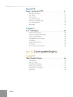
Learning Web Design Third Edition- P23 ppsx
Bạn đang xem bản rút gọn của tài liệu. Xem và tải ngay bản đầy đủ của tài liệu tại đây (454.87 KB, 10 trang )
Part III: CSS for Presentation
206
The Font Properties
Serif
Decorative
serif stroke
Straight
strokes
Sans-serif
Times Georgia
Times New Roman Lucida (Mac)
Veranda Trebuchet MS
Arial Arial Black
Courier
Courier New Andale Mono
Comic Sans Snell
Stencil Mojo
Apple Chancery
Imapct
Monospace
Cursive
Fantasy
Monospace font
(equal widths)
Proportional font
(different widths)
Figure 12-2. Examples of the five generic font families.
Font specifying strategies
The best practice for specifying fonts for web pages is to start with your first
choice, provide some similar alternatives, then end with a generic font family
that at least gets users in the right stylistic ballpark. Here’s another example
of this strategy in action. With this style rule, I specify that I’d prefer that users
see all the text in Verdana, but I’d settle for Arial, or Helvetica, or, if all else
fails, I’ll let the browser choose an available sans-serif font for me.
body { font-family: Verdana, Arial, Helvetica, sans-serif; }
Because a font will only show up if it’s on a user’s hard drive, it makes sense
to specify fonts that are the most commonly available. Although there are
countless fonts out there, the fact is that because licensed copies of fonts cost
big bucks, most users stick with the fonts that are installed by their operating
You’ll find that the majority of
professional web sites use Verdana
because it was specially designed to
be legible at small sizes on computer
monitors. This is a common value
line-up for
font-family
:
Verdana, Arial, sans-serif
D e S I G n t I P
You’ll find that the majority of
professional web sites use Verdana
because it was specially designed to
be legible at small sizes on computer
monitors. This is a common value
line-up for
font-family
:
Verdana, Arial, sans-serif
D e S I G n t I P
The Font Properties
Chapter 12, Formatting Text
207
system or other applications. Font copyright also prevents designers from just
making cool fonts available for download.
For these reasons, web designers tend to specify fonts from the Microsoft
Core Web Fonts collection. These come installed with Windows, Internet
Explorer, and Microsoft Office, so it is likely that they will find their way onto
all Windows and even most Apple and Linux computers. Not only are they
widely available, they were designed to be legible on low-resolution computer
screens. Table 12-1 lists the fonts in the collection.
Table 12-1. Core Web Fonts from Microsoft
Serif
Georgia, Times New Roman
Sans Serif
Arial, Arial Black, Trebuchet MS, Verdana
Monospace
Courier New, Andale Mono
Miscellaneous
Comic Sans, Impact, Webdings
So, as you see, specifying fonts for the Web is more like merely suggesting
them. You don’t have absolute control over which font your users will see. It’s
one of those web design quirks you learn to live with.
Now seems like a good time to get started formatting the Black Goose
Bistro menu. We’ll add new style rules one at a time as we learn each new
property.
N o t e
There are techniques for using graphics
and even small Flash movies for head-
lines in order to achieve more stylized
typography than can be handled with
CSS alone. These image replacement
techniques are not appropriate for large
amounts of text, however. Read more
about image replacement in Chapter 17,
CSS Techniques.
exercise 12-1
|
Formatting a menu
In this exercise, we’ll add font properties to the Black Goose Bistro menu document,
menu-summer.html, that you marked up back in Chapter 5. A fresh and validated
copy, complete with DOCTYPE declaration, is available at www.learningwebdesign.
com/materials. Open the document in a text editor. You can also open it in a browser
to see its “before” state. It should look similar to the page shown in Figure 12-1. Hang
onto this document, because this exercise will continue as we pick up additional font
properties.
We’re going to use an embedded style sheet for this exercise. Start by adding
a
style
element with its required
type
attribute to the
head
of the document
(remember, the only place a
style
element can go is in the
head
), like this:
<head>
<title>Black Goose Bistro</title>
<style type="text/css">
</style>
</head>
1.
N o t e
If your browser is configured to use
Verdana or a sans-serif font as its default
font, you won’t see much of a change
after adding this rule. Hang in there,
more changes are to come.
N o t e
If your browser is configured to use
Verdana or a sans-serif font as its default
font, you won’t see much of a change
after adding this rule. Hang in there,
more changes are to come.
Part III: CSS for Presentation
208
The Font Properties
Specifying font size
Use the aptly-named font-size property to specify the size of the text.
font-size
Values:
length unit, percentage,
xx-small
|
x-small
|
small
|
medium
|
large
|
x-large
|
xx-large
|
smaller
|
larger
|
inherit
Default:
medium
Applies to:
all elements
Inherits:
yes
You can specify text in a several ways:
At a specific size using one of the CSS length units (see the sidebar, CSS
Units of Measurement, for a complete list), as shown here:
h1 { font-size: 1.5em; }
When specifying a number of units, be sure the unit abbreviation imme-
diately follows the number, with no extra character space in between:
INCORRECT h1 { font-size: 1.5 em; } /*space before the em*/
•
CSS Units of
Measurement
CSS2 provides a variety of units of
measurement. They fall into two
broad categories: absolute and
relative.
Absolute units
Absolute units have predefined
meanings or real-world equivalents.
pt
points (1/72 inch in CSS2.1)
pc
picas (1 pica = 12 points)
mm
millimeters
cm
centimeters
in
inches
Absolute units should be avoided
for web page style sheets because
they are not relevant on computer
screens. However, if you are creating
a style sheet to be used when the
document is printed, they may be
just the ticket.
Relative units
Relative units are based on the
size of something else, such as the
default text size, or the size of the
parent element.
em
a unit of measurement equal to
the current font size.
ex
approximately the height of a
lowercase “x” in the font.
px
pixel, considered relative
because it varies with display
resolution, particularly between
low resolution screens and high
resolution print output.
%
percentage values, although
not a unit of measurement, are
another way to specify relative size.
It is recommended that you stick
with ems, percentage values, or
a combination of the two when
specifying text size.
I would like all the text on the page to appear in Verdana or some other sans-serif
font. Instead of writing a rule for every element in the document, we will write
one rule for the
body
element that will be inherited by all the elements it contains.
Add this rule to the embedded style sheet.
<style type="text/css">
body {font-family: Verdana, sans-serif;}
</style>
Save the document and reload the page in the browser. It should look like Figure 12-
3. We’ll work on the font size in the next installment.
2.
Figure 12-3. The menu in the Verdana or sans-serif font.Figure 12-3. The menu in the Verdana or sans-serif font.
The Font Properties
Chapter 12, Formatting Text
209
As a percentage value, sized up or down from the element’s default or
inherited font size:
h1 { font-size: 150%; }
Using one of the absolute keywords (xx-small, x-small, small, medium,
large, x-large, xx-large). On most current browsers, medium corresponds
to the default font size:
h1 { font-size: x-large; }
Using a relative keyword (larger or smaller) to nudge the text larger or
smaller than the surrounding text:
strong { font-size: larger; }
I’m going to cut to the chase and tell you that, despite all these options, the
only acceptable values for font-size in contemporary web design are em
measurements, percentage values, and keywords. These are preferred because
they allow users to resize text using the text-zoom feature on their browser.
This means you can size the text as you prefer it (generally smaller than the
most common default 16 pixel text), but still rest assured that users can make
it larger if they have special needs or preferences.
While it may be tempting to specify text in actual pixel measurements, Internet
Explorer (all versions) does not allow text-zoom on type sized in pixels. That
means users are stuck with your 10 or 11 pixel type, even if they are unable to
read it. That’s a big no-no in terms of accessibility. In addition, all of the abso-
lute units such as pt, pc, in, mm, and cm are out because they are irrelevant on
computer monitors (although they may be useful for print style sheets).
Working with keywords
Many web designers like to specify type size using one of the predefined
absolute keywords: xx-small, x-small, small, medium, large, x-large, xx-
large. The keywords do not correspond to particular measurements, but
rather are scaled consistently in relation to one another. The default size
is medium in current browsers. Figure 12-4 shows how each of the absolute
keywords renders in a browser when the default text is set at 16 pixels. I’ve
included samples in Verdana and Times to show that, even with the same
base size, there is a big difference in legibility at sizes small and below.
Figure 12-4. Text sized with absolute keywords.
•
•
•
Part III: CSS for Presentation
210
The Font Properties
The benefit of keywords is that current browsers in Standards Mode will never
let text sized in keywords render smaller than 9 pixels, so they protect against
illegible type (although I would still opt for Verdana for better readability).
On the downside, the size keywords are imprecise and unpredictable. For
example, while most browsers scale each level up by 120%, some browsers use
a scaling factor of 150%. Another notable problem is that Internet Explorer 5
and 5.5 for Windows use small as the default (not medium), meaning your text
will display a lot smaller for users with those browsers. Fortunately, with the
introduction of IE 7, these old versions are slowly going away.
The relative keywords, larger and smaller, are used to shift the size of text
relative to the size of the parent element text. The exact amount of the size
change is determined by each browser, and is out of your control. Despite that
limitation, it is an easy way to nudge type a bit larger or smaller if the exact
proportions are not critical.
Figure 12-5 shows the result of this simple bit of markup (note that the inline
styles were used just to keep the example compact).
<p>There are two relative keywords:
<span style="font-size: larger">larger</span> and
<span style="font-size: smaller">smaller</span>. They are used to
shift the size of text relative to the parent element.</p>
Figure 12-5. Relative size keywords make text slightly larger or smaller than the surrounding text.
Working with percentages and ems
By far the most popular way to specify font sizes for the Web is using em
measurements or percentage values, or a combination of the two. Both ems
and percentages are relative measurements, which means they are based on
another font size, namely, the font-size of the parent element.
In this example, the font-size of the h1’s parent element (body) is 16 pixels, so
the resulting size of the h1 would be 150% of that, or 24 pixels.
body { font-size: 16px; }
h1 { font-size: 150%; } /* 150% of 16 = 24 */
If no font-size properties have been specified, relative measurements are
based on the browser’s base font size, which is 16 pixels in most browsers. Of
course, users can resize their base font as small or as large as they like, so there
is no guaranteed starting size, only a reasonable guess.
An em is a relative unit of measurement that, in traditional typography, is
based on the width of the capital letter M (thus, the name “em”). In the CSS
specification, an em is calculated as the distance between baselines when the
N o t e
Don’t confuse the em unit of measure-
ment with the em (X)HTML element used
to indicate emphasized text. They are
totally different things.
N o t e
Don’t confuse the em unit of measure-
ment with the em (X)HTML element used
to indicate emphasized text. They are
totally different things.
The Font Properties
Chapter 12, Formatting Text
211
font is set without any extra space between the lines (also known as leading).
For text with a font size of 16 pixels, an em measures 16 pixels; for 12 pixel
text, an em equals 12 pixels, and so on, as shown in Figure 12-6.
em box
24px type
1em=24px
12px type
1em=12px
16px type
1em=16px
Figure 12-6. An em is based on the size of the text.
Once the dimensions of an em for a text element is calculated by the browser,
it can be used for all sorts of measurements, such as indents, margins, the
width of the element on the page, and so on.
For text sizing, an em value works like a scaling factor, similar to a percent-
age. As in the previous example, if the base font size is 16 pixels, giving h1
elements a font-size of 1.5 ems makes them 24 pixels high.
body { font-size: 16px; }
h1 { font-size: 1.5em; } /* 1.5 x 16 = 24 */
For the most part, ems and percentages can be used interchangeably when
specifying type size. It’s mostly a matter of preference.
There are a few snags to working with ems. One is that due to rounding
errors, there is a lot of inconsistency among browsers and platforms when
text size is set in fractions of an em. There are also documented problems in
Internet Explorer when font-size is specified at sizes smaller than 1em. It is
safest to use ems to scale text larger.
For both ems and percentages, there is the lingering issue of not knowing the
base font size. We are left with best guesses, and the assumption that users
probably have their default font size set to a size that is comfortable to read,
and we probably shouldn’t muck around with it too much. There is much
more to the font size story. The Font Sizing Techniques sidebar lists some
good resources for further research.
N o t e
Although I’ve set the size of the body text in pixels in the previous two examples for
explanation purposes, you wouldn’t want to do that in the real world because the text
could not be zoomed in Internet Explorer.
In the meantime, we can add some font-size properties to the sample menu
in the continuation of Exercise 12-1.
Font Sizing
Techniques
Sizing type for web pages is
problematic and the subject of
much debate even among seasoned
web designers.
One popular method for sizing text
is to make the text slightly smaller
globally (using the
body
element)
with a percentage value, then size
all the elements
up
as appropriate
using em measurements. The
following articles provide slightly
different takes on that method.
How to Size Text Using
Ems
, by Richard Rutter (www.
clagnut.com/blog/348) is a
detailed how-to that makes
em increments easy to use. The
comments to this blog entry are
also informative and give good
insight into the varying opinions
on how web text should be sized.
Owen Briggs’ article on
Text
Sizing
is the result of exhaustive
cross-browser testing. Hundreds
of screenshots are available if
you want the proof. This article is
a little dated, but still brings up
relevant issues. Read it at www.
thenoodleincident.com/tutorials/
box_lesson/font/index.html.
If keywords are vexing you, read
Todd Fahrner’s classic article,
CSS
Design: Size Matters
on
A List
Apart
(www.alistapart.com/articles/
sizematters/). It is a little dated (for
example, support in Netscape 4
figures prominently), but it provides
some useful background information
and workarounds.
Part III: CSS for Presentation
212
The Font Properties
exercise 12-1
|
Formatting a menu
(continued)
Let’s refine the size of some of the text elements to give the online menu a more
sophisticated appearance. Open menu_summer.html in a text editor and follow the
steps below. You can save the document at any point and take a peek in the browser
to see the results of your work. You should also feel free to try out other size values
along the way.
I would prefer that the body text for the document appear smaller than the
common 16 pixel default. I am going to set the size of the
body
to
small
, which
renders at approximately 12 pixels on most current browsers. If it ends up too
small for some users, they can always zoom the text up, since it was specified
with a keyword.
body { font-size: small; }
Now let’s get that giant
h1
under control. I’m going to make it one and a half
times larger than the
body
text size with an em measurement. I could also use
font-size: 150% to accomplish the same thing.
h1 { font-size: 1.5em; }
Figure 12-7 shows the result of our font sizing efforts.
smaller h1
Before
After (the font-size is set to small)
Figure 12-7. The online menu after a few minor font-size changes.
I want to point out that at this point, I don’t really know exactly how many pixels tall
the
h1
s will be for every user. They’re likely to be 18 pixels, but they may be smaller or
much larger. The important part is that I’ve set my desired proportion of
h1
elements
to the surrounding text. If the user resizes or zooms the text, that proportion stays
the same.
1.
2.
The Font Properties
Chapter 12, Formatting Text
213
Font weight (boldness)
After font families and size, the remaining font properties are straightfor-
ward. For example, if you want a text element to appear in bold, use the
font-weight property to adjust the boldness of type.
font-weight
Values:
normal
|
bold
|
bolder
|
lighter
|
100
|
200
|
300
|
400
|
500
|
600
|
700
|
800
|
900
|
inherit
Default:
normal
Applies to:
all elements
Inherits:
yes
As you can see, the font-weight property has many predefined values, includ-
ing descriptive terms (normal, bold, bolder, and lighter) and nine numeric
values (100 to 900) for targeting various weights of a font if they are available.
Because most fonts common on the Web have only two weights, normal (or
roman) and bold, the only font weight value you will use in most cases is
bold. You may also use normal to make text that would otherwise appear in
bold (such as strong text or headlines) appear at a normal weight.
The numeric chart is an interesting idea, but because there aren’t many fonts
with that range of weights and because browser support is spotty, they are not
often used. In general, numeric settings of 600 and higher result in bold text,
although even that can vary by browser, as shown in Figure 12-8.
Rendered on Safari Rendered on Firefox (Mac)
Figure 12-8. The effect of font-weight values.
About inherit
You will see that CSS properties
include
inherit
in their list of
keyword values. The
inherit
value
allows you to explicitly force an
element to inherit a style property
value from its parent. This may come
in handy to override other styles
applied to that element and to
guarantee that the element always
matches its parent.
exercise 12-1
|
Formatting a menu
(continued)
Back to the menu. I’ve decided that I’d like all of the menu item names to be in
bold text. What I’m
not
going to do is wrap each one in
<b>
tags that would be so
1996! I’m also not going mark them up as
strong
elements that is not semantically
accurate. Instead, the right thing to do is simply apply a style to the semantically
correct
dt
(definition term) elements to make them all bold at once. Add this rule to
your style sheet, save the file, and try it out in the browser (Figure 12-9).
dt { font-weight: bold; }
Part III: CSS for Presentation
214
The Font Properties
Figure 12-9. Using the font-weight property to dt elements in the menu.
Font style (italics)
The font-style property affects the posture of the text, that is, whether the
letter shapes are vertical (normal) or slanted (italic and oblique).
font-style
Values:
normal
|
italic
|
oblique
|
inherit
Default:
normal
Applies to:
all elements
Inherits:
yes
Italic and oblique are both slanted versions of the font. The difference is
that the italic version is usually a separate typeface design with curved letter
forms, while oblique text takes the normal font design and just slants it. The
truth is that in most browsers, they may look exactly the same (see Figure
12-10). You’ll probably only use the font-style property to make text italic
or to make text that is italicized by default (such as emphasized text) display
as normal.
Figure 12-10. Italic and oblique text.
The Font Properties
Chapter 12, Formatting Text
215
Figure 12-11. Applying the font-style property to the strong elements.
Font Variant (Small Caps)
Some typefaces come in a “small caps” variant. This is a separate font design
that uses small uppercase-style letters in place of lowercase letter designs.
The one-trick-pony font-variant property is intended to allow designers to
specify such a small-caps font for text elements.
font-variant
Values:
normal
|
small-caps
|
inherit
Default:
normal
Applies to:
all elements
Inherits:
yes
In most cases, a true small caps font is not available, so browsers simulate
small caps by scaling down uppercase letters in the current font, as you’ll see
when we add some small caps text to the menu next. To typography sticklers,
this is less than ideal and results in inconsistent stroke weights, but you may
find it an acceptable option for adding variety to small amounts of text.
h1 in small caps
Figure 12-12. Using font-variant for small caps.
exercise 12-1
|
Formatting a menu
(continued)
Now that all the menu item names
are bold, some of the text I’ve
marked as
strong
isn’t standing out
very well, so I think I’ll make them
italic for further emphasis. To do
this, simply apply the
font-style
property to the
strong
element.
strong { font-style: italic;
}
Once again, save and reload. It
should look like the detail shown in
Figure 12-11.
exercise 12-1
|
Formatting a menu
(continued)
Just for kicks, let’s set the first level
heading (
h1
) in small caps so we can
try out this
font-variant
property.
Remember that you can add this
property to the existing
h1
rule. The
result is shown in Figure 12-12. If you
find it kind of clunky, don’t worry,
we’ll be undoing it later.
h1 {
font-size: 1.5em;
font-variant: small-caps;
}


