Learning Web Design Third Edition- P30 pdf
Bạn đang xem bản rút gọn của tài liệu. Xem và tải ngay bản đầy đủ của tài liệu tại đây (438.59 KB, 10 trang )
Part III: CSS for Presentation
276
Margins
margin
Values:
length measurement | percentage |
auto
|
inherit
Default:
auto
Applies to:
all elements
Inherits:
no
The margin properties are very straightforward to use. You can specify an
amount of margin to appear on each side of the element, or use the margin
property to specify all sides at once.
The shorthand margin property works the same as the padding shorthand.
When you supply four values, they are applied in clockwise order (top, right,
bottom, left) to the sides of the element. If you supply three values, the middle
value applies to both the left and right sides. When two values are provided,
the first is used for the top and bottom, and the second applies to the left and
right edges. Finally, one value will be applied to all four sides of the element.
As for most web measurements, em units are your best bet for providing mar-
gin amounts that scale along with the text. Pixel values are commonly used
as well. You can also provide a percentage value, but it should be noted that,
as for padding, the percentage value is calculated based on the width of the
parent element. If the parent’s width changes, so will the margins on all four
sides of the child element. The auto keyword allows the browser to fill in the
amount of margin necessary to fit or fill the available space.
Figure 14-14 shows the results of the following margin examples. Note that
I’ve added a light dotted rule to indicate the outside edge of the margin for
clarity purposes only, but they would not appear on a real web page.
A
p#A {
margin: 4em;
border: 1px solid red;
background: #FCF2BE;
}
B
p#B {
margin-top: 2em;
margin-right: 250px;
margin-bottom: 1em;
margin-left: 4em;
border: 1px solid red;
background: #FCF2BE;
}
C
body {
margin: 0 10%;
border: 1px solid red;
background-color: #BBE09F;
}
Browser Default
Margins
You may have noticed that space
is added automatically around
headings, paragraphs, and other
block elements. That’s the browser’s
default style sheet at work, applying
margin amounts above and below
those elements.
It is good to keep in mind that the
browser is applying its own values
for margins and padding behind the
scenes. These values will be used
unless you specifically override them
with your own style rules.
If you are working on a design and
coming across mysterious amounts
of space that you didn’t add, the
browser’s default styles may be the
culprit.
c S S t I P
Adding a margin to the
body element adds space
between the page content
and the edges of the
browser window.
Adding a margin to the
body element adds space
between the page content
and the edges of the
browser window.
Margins
Chapter 14, Thinking Inside the Box (Padding, Borders, and Margins)
277
body: 0 10%;
Adding margins to the body puts space between the
element and the edges of the viewing area of the browser
window. The red border shows the boundary of the
body element (there is no padding applied).
margin: 4em;
margin-top: 2em;
margin-right: 250px;
margin-bottom: 1em;
margin-left: 4em;
A
B
C
Figure 14-14. Applying margins to the body and to individual elements.
Margin behavior
While it is easy to write rules that apply margin amounts around (X)HTML
elements, it is important to be familiar with margin behavior.
Collapsing margins
The most significant margin behavior to be aware of is that the top and bottom
margins of neighboring elements collapse. This means that instead of accumu-
lating, adjacent margins overlap, and only the largest value will be used.
Using the two paragraphs from the previous figure as an example, if the top
element has a bottom margin of 4 ems, and the following element has a top
margin of 2 ems, the resulting margin space between elements does not add
up to 6 ems. Rather, the margins collapse and the resulting margin between
the paragraphs will be 4 ems, the largest specified value. This is demonstrated
in Figure 14-15.
Part III: CSS for Presentation
278
Margins
Adjacent vertical
margins collapse
4em
Figure 14-15. Vertical margins of neighboring elements collapse so that only the larger
value is used.
The only time top and bottom margins don’t collapse is for floated or abso-
lutely positioned elements (we’ll get to floating and positioning in Chapter
15). Margins on the left and right sides never collapse, so they’re nice and
predictable.
Margins on inline elements
You can apply top and bottom margins to inline text elements (or “non-
replaced inline elements”, to use the proper CSS terminology), but it won’t add
vertical space above and below the element, and the height of the line will
not change. However, when you apply left and right margins to inline text
elements, margin space will be held clear before and after the text in the flow
of the element, even if that element breaks over several lines.
Just to keep things interesting, margins on replaced elements, such as images,
do render on all sides, and therefore do affect the height of the line. See Figure
14-16 for examples of each.
img { margin: 2em;}
Margins are rendered on all sides of replaced elements, such as images.
em { margin: 2em;}
Only horizontal margins are rendered on non-replaced (text) elements.
Figure 14-16. Margins applied to inline text and image elements.
Collapsing Margins
When spacing between and around
elements behave unpredictably,
collapsing margins are often to
blame. Here are a few articles that
dig deep into collapsing margin
behavior. They may help you
understand what is happening
behind the scenes in your layouts.
“No Margin for Error” by Andy
Budd (www.andybudd.com/
archives/2003/11/no_margin_
for_error/)
“Uncollapsing Margins” by Eric
Meyer (www.complexspiral.
com/publications/uncollapsing-
margins/)
“CSS: Auto-height and Margin-
collapsing,” by Minz Meyer
(www.researchkitchen.de/blog/
archives/css-autoheight-and-
margincollapsing.php)
F U R t H e R R e A D I n G
Margins
Chapter 14, Thinking Inside the Box (Padding, Borders, and Margins)
279
Negative margins
It is worth noting that it is possible to specify negative values for margins.
When you apply a negative margin, the content, padding, and border are
moved in the opposite direction that would have resulted from a positive
margin value.
This will be more clear with an example. Figure 14-17 shows two neighboring
paragraphs with different colored borders applied to show their boundaries.
In the top view, I’ve added a 4-em bottom margin to the top paragraph and
it has the effect of pushing the following paragraph down by that amount.
If I specify a negative value (-4em), the following element moves up by that
amount, and overlaps the element with the negative margin.
p.top { margin-bottom: -4em;}
The following element moves back by 4 ems.
p.top { margin-bottom: 4em;}
Pushes the following paragraph element away by 4 ems.
Figure 14-17. Using negative margins.
This may seem like a strange thing to do, and in fact, you probably wouldn’t
make blocks of text overlap as shown. The point here is that you can use
margins with both positive and negative values to move elements around on
the page. This is the basis of many CSS layout techniques.
Now let’s use margins to add some space between parts of the JenWARE
home page in Exercise 14-3. You’ll also see how margins are used to properly
center an element in the width of the browser window.
Part III: CSS for Presentation
280
Margins
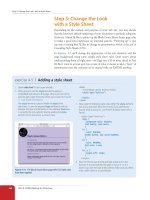
exercise 14-3
|
Adding margin space around
elements
Open jenware.html in your text editor if it isn’t open already, and we’ll get some
margins in there. We’ll be using a variety of properties and values along the way. Feel
free to save the page and look at it in the browser after each step.
First, we’ll add some space between the browser window and the sides of the
content. Making the margins 12% of the browser window should give it plenty of
space, and it will scale proportionally for different browser widths. To add space
around the whole page, you use the
body
element, of course.
body {
margin-left: 12%;
margin-right: 12%;
font: 76% Verdana, sans-serif;
background: #FCF191 url(images/top-background.gif) repeat-x;
}
Now let’s add some space above and below the “intro” section of the page. This
time, we’ll use the shorthand
margin
property to add 3-em margins to the top
and bottom edges only.
#intro {
margin: 3em 0;
text-align: center;
}
So far, we’ve been using measurement values exclusively for the
margin
property.
Another option is to use the
auto
keyword and let the browser apply as much
margin as is necessary to fill the available space. If you set the margin to
auto
on
the left and right sides of an element, it has the effect of keeping the element
centered in the width of the browser window or other containing element. In
fact, that is the proper method for centering elements horizontally.
We’ll use this technique to center the testimonials box on the page. First, set
the
width
of the element to 500 pixels. Then, apply a 2-em margin to the top
and bottom, and
auto
margin left and right. You can use the
margin
property as
shown here. Note that you have to declare a width so the browser knows how to
calculate the
auto
distances.
#testimonials {
width: 500px;
margin: 2em auto;
border: 1px dashed #F26521;
padding: 1em;
padding-left: 60px;
background: #FFBC53 url(images/ex-circle-corner.gif) no-repeat left
top;
line-height: 1.2em;
}
This isn’t the most beautiful design, but it’s only temporary. In the next chapter, we’ll
be putting this testimonials box into its own column in a two-column layout.
Finally, I’d like 3 ems of space above the product category
h2
elements
(particularly since there may be more in the future). By this point, I bet you could
write this one without my help, but for thoroughness’ sake, here is the new
declaration added to
h2
s in the “products” section.
1.
2.
3.
4.
N o t e
When the value is 0, you don’t need to
provide a specific unit.
N o t e
When the value is 0, you don’t need to
provide a specific unit.
To center an element in
the browser window, apply
a width to the element
and set its left and right
margins to auto.
To center an element in
the browser window, apply
a width to the element
and set its left and right
margins to auto.
Assigning Display Roles
Chapter 14, Thinking Inside the Box (Padding, Borders, and Margins)
281
A good understanding of padding, borders, and margins is the first step to
mastering CSS layouts. In the next chapter, we’ll learn about the proper-
ties used to float and position elements on the page. We’ll even turn the
JenWARE page into a two-column layout. But before we move on, there is
one more property to get out of the way.
Assigning Display Roles
As long as we’re talking about boxes and the CSS layout model, this is a good
time to introduce the display property. You should already be familiar with
the display behavior of block and inline elements in (X)HTML. However, not
all XML languages assign default display behaviors (or display roles, to use
the proper term from the CSS specification) to the elements they contain. For
this reason, the display property was created to allow authors to specify how
elements should behave in layouts.
display
Values:
inline
|
block
|
list-item
|
run-in
|
inline-block
|
table
|
inline-table
|
table-row-group
|
table-header-group
|
table-footer-group
|
table-row
|
table-column-group
|
table-column
|
table-cell
|
table-caption
|
none
|
inherit
Default:
disc
Applies to:
ul
,
ol
, and
li
(or elements whose display value is list-item)
Inherits:
yes
#products h2 {
margin-top: 3em;
border-left: 3px solid;
border-top: 1px solid;
padding-left: 1em;
font-size: 1.2em;
color: #921A66;
}
Save and look at it in the browser. There’s more space above
the product category headings now, but I don’t like all that
extra space above the first one. Fortunately, that heading has
been marked up as belonging to the class “first”, so we can
write another rule that applies zero margin above just that
heading.
This somewhat complicated selector targets
h2
elements
with the class “first” but only when they appear in the
div
with the
id
“products”.
#products h2.first {
margin-top: 0;
}
Save the document again and it should look something like the
one in Figure 14-18 (the width of your page may be different
depending on your browser and monitor size). The final style
sheet for this page is available in Appendix A.
5.
Figure 14-18. The JenWARE home page after adding padding,
borders, and margins.
Part III: CSS for Presentation
282
The Box Model in Review
The display property defines the type of element box an element generates
in the layout. In addition to the familiar inline and block display roles, you
can also make elements display as list items or the various parts of a table
(list and table display roles are addressed in Chapter 17, CSS Techniques).
In general, the W3C discourages the random reassigning of display roles for
(X)HTML elements. However, in certain scenarios, it is benign and has even
become commonplace. For example, it is common practice to make li ele-
ments (which usually display as block elements) display as inline elements to
turn a list into a horizontal navigation bar. You may also make an otherwise
inline a (anchor) element display as a block in order to give it a specific width
and height. These techniques are demonstrated in Chapter 17.
WA R N I N G
Bear in mind that changing the presentation of an (X)HTML element with the CSS
display property does not change the definition of that element as block-level or inline
in (X)HTML. Putting a block-level element within an inline element will always be
invalid (X)HTML, regardless of its display role.
Another useful value for the display property is none, which removes the
content from the normal flow entirely. Unlike visibility: hidden, which
just makes the element invisible, but holds the space it would have occupied
blank, display: none removes the content, and the space it would have occu-
pied is closed up.
One popular use of display: none is to prevent certain content from appear-
ing when the source document is displayed in specific media. For example,
you could have a paragraph that appears when the document is printed, but
is not part of the page when it is displayed on a computer screen.
The Box Model in Review
At this point you should have a good feel for element boxes and how to
manipulate the space within and around them. These are the raw tools you’ll
need to do real CSS-based layouts. In the next chapter, we’ll start moving the
boxes around on the page, but first, why not get some practice at writing
rules for padding, borders, and margins in the following test.
Test Yourself
In this test, your task is to write the declarations that create the effects shown
in each example. All the paragraphs shown here share a rule that sets the
dimensions and the background color for each paragraph. You need only to
provide the box-related property declarations. Answers, as always, appear in
Appendix A.
Test Yourself
Chapter 14, Thinking Inside the Box (Padding, Borders, and Margins)
283
p { background-color: #C2F670;
width: 200px;
height: 200px;}
All of the samples in
this exercise start out
styled as shown here
and share the
properties listed
below.
2 em
2 em
2 em
2 em
2 em
2 em
2 em
2 em
4 pixels 4 pixels
2 em
2 em
2 em
2 em
1 em
1 em
1 em
1 em
6 em 6 em
1 em
6 em
4 pixels
1 em
1 em
50 pixels
50 pixels
2 pixels
Some useful hints: outer margin edges are indicated by dotted blue lines. All
necessary measurements are provided in dark red. Borders use one of the 17
standard color names.
Part III: CSS for Presentation
284
Review: Basic Box Properties
Review: Basic Box Properties
The following is a summary of the properties covered in this chapter related
to the basic box model.
Property Description
border
A shorthand property that combines border properties
border-top,
border-right,
border-bottom,
border-left
Combine border properties for each side of the element
border-color
Shorthand property for specifying the color of borders
border-top-color,
border-right-color,
border-bottom-color,
border-left-color
Specify the color for each side of the element
border-style
Shorthand property for specifying the style of borders
border-top-style,
border-right-style,
border-bottom-style,
border-left-style
Specify the style for each side of the element
border-width
Shorthand property for specifying the width of borders
border-top-width,
border-right-width,
border-bottom-width,
border-left-width
Specify the width for each side of the element
display
Defines the type of element box an element generates
height
Specifies the height of the element’s content area
margin
Shorthand property for specifying margin space around an
element
margin-top,
margin-right,
margin-bottom,
margin-left
Specify the margin amount for each side of the element
max-height
Specifies the maximum height of an element
max-width
Specifies the maximum width of an element
min-height
Specifies the minimum height of an element
min-width
Specifies the minimum width of an element
overflow
How to handle content that doesn’t fit in the content area
padding
Shorthand property for specifying space between the con-
tent area and the border
padding-top,
padding-right,
padding-bottom,
padding-left
Specify the padding amount for each side of the element
width
Specifies the width of an element’s content area
285
IN THIS CHAPTER
Floating elements to the
left and right
Clearing floated elements
Relative positioning
Absolute positioning and
containing blocks
Fixed positioning
At this point, you’ve learned dozens of CSS properties that allow you to
change the appearance of text elements and the boxes they generate. But so
far, we’ve merely been decorating elements as they appear in the flow of the
document.
In this chapter, we’ll look at floating and positioning, the CSS methods for
breaking out of the flow and arranging elements on the page. Floating an
element moves it to the left or right, and allows the following text to wrap
around it. Positioning is a way to specify the location of an element anywhere
on the page with pixel precision.
We’ll start by examining the properties responsible for floating and position-
ing, so you’ll get a good feel for how the CSS layout tools work. In Chapter 16,
Page Layout with CSS, we’ll broaden the scope and see how these properties
are used to create common multicolumn page layouts.
Before we start moving elements around, let’s be sure we are well acquainted
with how they behave in the normal flow.
Normal Flow
We’ve covered the normal flow in previous chapters, but it’s worth a refresher.
In the CSS layout model, text elements are laid out from top to bottom in
the order in which they appear in the source, and from left to right (in left-
to-right reading languages*). Block elements stack up on top of one another
and fill the available width of the browser window or other containing ele-
ment. Inline elements and text characters line up next to one another to fill
the block elements.
When the window or containing element is resized, the block elements
expand or contract to the new width, and the inline content reflows to fit
(Figure 15-1).
For right-to-left reading languages such as Arabic and Hebrew, the normal flow is top to bottom
and right to left.
FLOATING AND
POSITIONING
CHAPTER
15


