The Adobe Photoshop CS5 Book for Digital Photographers part 20 pot
Bạn đang xem bản rút gọn của tài liệu. Xem và tải ngay bản đầy đủ của tài liệu tại đây (1.57 MB, 10 trang )
ptg
171Chapter 6Color Correction Secrets
The Adobe Photoshop CS5 Book for Digital Photographers
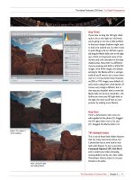
Step One:
To convert this photo to the proper
color space for emailing or posting to the
Web, go under the Edit menu and choose
Convert to Profile. This brings up the
Convert to Profile dialog (shown here).
The Source Space at the top shows you
the current color space your photo is in
(if you’re working in Adobe RGB [1998],
like in this example, that’s what you’ll
see here). For your Destination Space
(what you’re converting to), choose
sRGB IEC61966-2.1 from the Profile pop-
up menu (as shown here) and click OK.
That’s it—it’s ready to go.
Step Two:
One quick way to ensure that your
photo has been converted to sRGB
is to look at the window’s title bar. If
you’ve got Photoshop’s color space set
to Adobe RGB (1998), which is pretty
typical for photographers, and you
just converted this photo to a different
color space (sRGB), then you have a
“profile mismatch.” So, you should see
an asterisk right after (RGB/8) in the
title bar (as shown circled here in red),
which is Photoshop’s way of letting you
know that your photo is one space, and
Photoshop is in another. In this case,
that’s a good thing.
Keeping Great Color
When Emailing or
Posting Photos
to the Web
Email applications (and nearly all Web browsers) don’t support color management.
So, if you’re working in Adobe RGB (1998) or ProPhoto RGB as your Photoshop
color space, when you email your photos or post them on the Web, they probably
look like %$*# (with the colors all desaturated and flat-looking). Ah, if only there
was a trick that would let anyone you email (or anybody who sees your photos
on the Web) see your photos pretty much the same way you do in Photoshop
(of course, there is—I just wish I knew it. Kidding!) Here ya go:
SCOTT KELBY
Download from www.wowebook.com
ptg
Dragging Multiple
Images from Mini Bridge
If you have more than one image in Mini
Bridge you want to place into an open
document, just select them all first, then
drag-and-drop them as a group into the
open document, and they’ll come in all
on their own separate layers (this is really
handy if you’re putting together a col-
lage). However, there’s something you’ll
need to know: Once you drag them, the
first selected image appears in your open
document as a Smart Object—ready for
you to resize (if you want)—but the next
image won’t appear until you first press
Return (PC: Enter) to lock in the size
for your placed Smart Object. For RAW
images, the first selected image will open
in Camera Raw first, and then when you
click OK, it’ll appear as a Smart Object, as
well. So basically, it’s: (1) drag-and-drop,
(2) Click OK in Camera Raw if it’s a RAW
image, and then (3) press Return (PC:
Enter) for the next photo to appear.
Dragging Images
from Your Desktop
In CS5, you don’t actually have to have
an image visible in Mini Bridge to get it
into an open document in Photoshop.
You can literally drag-and-drop an image
on your desktop directly into an open
Photoshop document. These appear
with a “resize border” around them, but
they’re not Smart Objects. Just choose
your size, then press Return (PC:
Enter) to lock in your size. From then
on, it’s just like any other regular layer.
Resize Image During
Place Preferences
By default, when you drag-and-drop
an image into an open document in
Photoshop CS5, it assumes you want to
resize it to fit entirely within that docu-
ment, but if you’d rather not have this
option turned on, press Command-K
(PC: Ctrl-K) to bring up Photoshop’s
Preferences, click on General on the
left, then in the Options section, turn off
the Resize Image During Place checkbox.
Shortcut for Highlighting the First
Field in Adjustment Layers
Adobe added a nice feature that’s
handy when you’re working with
adjustment layers: when you’re in the
Adjustments panel, you can automati-
cally highlight the first adjustment field
by pressing Shift-Return (PC: Shift-
Enter) on your keyboard. Then you
can jump from field to field using the
Tab key. When you’re done in the
fields, just press Return (PC: Enter).
TAT Always On in the
Adjustments Panel
The Hue/Saturation, Curves, and
Black & White Adjustment layers
all give you the option of using the
Targeted Adjustment Tool (or TAT,
for short), and now in CS5, you can
have the TAT active automatically
each time you choose one of those
adjustments. The next time you have
one of those adjustments open in the
Adjustments panel, from the panel’s
flyout menu, choose Auto-Select
Targeted Adjustment Tool. Now, the
TAT will always be active when you
choose a Hue/Saturation, Curves, or
Black & White adjustment layer.
172
Chapter 6 Color Correction Secrets
The Adobe Photoshop CS5 Book for Digital Photographers
Photoshop Killer Tips
Download from www.wowebook.com
ptg
The 32-Bit Mode Lighting Effects
If you’re running Photoshop in 64-bit
mode, you’ve probably noticed that the
Lighting Effects filter doesn’t work or
even appear in the Filter menu (under
Render). If you need to use it, you’ll
have to quit Photoshop, and re-launch
it in 32-bit mode, and then it will be
available. On a Mac, once you’ve quit
Photoshop, go to your Applications
folder, click on the Adobe Photoshop
CS5 icon, and press Command-I to
bring up the Get Info window. Turn
on the Open in 32-bit Mode checkbox,
re-launch Photoshop, and you’ll find
Lighting Effects under the Filter menu.
This is currently unavailable on a PC.
Change the Opacity
of Multiple Layers
This is one we’ve all wanted for a while:
the ability to change the opacity of mul-
tiple layers at the same time. All you do
is select the layers you want to affect,
then lower the Opacity at the top of the
Layers panel, and the opacity for all the
selected layers is lowered to the same
amount, as well. Ahhhhhh, it’s the little
things, isn’t it?
Jump to Any Layer
You don’t have to keep the Layers panel
open to change layers—it’s faster to
just press-and-hold the Command (PC:
Ctrl) key and then click right within
the image itself with the Move tool (V),
and it makes that area of your image’s
layer active. If you fall in love with this
way of selecting layers, you can have
it on all the time (no having to hold
the Command key) by first getting the
Move tool, then up in the Options Bar,
turning on the Auto-Select checkbox.
One thing to keep in mind: if the opac-
ity of a particular layer gets really low
(like 20%), you won’t be able to select it
using Auto-Select (hey, I thought you’d
want to know).
Make Your Own Custom Panels
Adobe has a separate utility called the
“Configurator,” which lets you create
your own custom panels by dragging-
and-dropping (for example, you could
create a Retouching panel, with just
the tools and menu items, plus any
scripts or actions you use when you’re
doing retouching). You download the
Configurator directly from Adobe’s
website at
technologies/configurator/ (it’s free).
Change Thumbnail Sizes
If you want to see larger-sized thumb-
nails in your Layers panel, just Right-
click in an open space beneath the
layer stack (click in that gray area
right below the Background layer),
and from the pop-up menu that
appears, choose Large Thumbnails.
Now, you get nice big thumbnails.
173Chapter 6Color Correction Secrets
The Adobe Photoshop CS5 Book for Digital Photographers
Photoshop Killer Tips
Download from www.wowebook.com
ptg
Photo by Scott Kelby Exposure: 1/1600 sec | Focal Length: 24mm | Aperture Value: ƒ/8
Download from www.wowebook.com
ptg
Chapter 7 How to Create Stunning B&W Images
175
Black & White
how to create stunning b&w images
I know what you’re thinking, “He’s given up on the whole
movie name/song title/TV show thing,” but actually the
“Black & White” you see above is from the song by the
1970s hit machine Three Dog Night. (Remember the song:
“The ink is black. The page is white. Together we learn to
read and write”? I can’t believe with captivating lyrics like
that, these guys aren’t still crankin’ out the hits.) Anyway,
back in the CS4 intro for this chapter, I wrote that I had
toyed with the idea of using the song “Black Widow” by
Mötley Crüe, but I chose not to for a very legitimate (yet,
secret until now) reason: I couldn’t figure out how to add
those two little dots above the letter “u” in Crüe, so I went
with Elvis Costello’s “Black and White World” instead (it
was an easy choice, as it contains no crazy dots above
any letters). I have to admit, I am a bit embarrassed that
I didn’t know what those little dots are called, so I did a
Google search for this phrase: “two little dots above the
letter U.” It returned six search results, including a
Face book group called (and I’m not making this up):
“It is a crime to write über without the Umlaut.” At that
moment I realized two things: (1) it’s called an umlaut,
and (2) people get totally psychotic about things like
a missing umlaut. This is probably why, in the printed
version of my CS4 book, not only did my editor Kim add
the umlaut above the “u” for me, but she also added an
umlaut over the “o” in Mötley. You’re thinking, “Wow, she’s
good!” and she totally is, but I know her dirty little secret.
She only knew there was a problem there to fix because
she’s a huge “big hair bands from the ’80s” fan. If, instead,
she had been a fan of Sheena Easton or Garth Brooks back
then, you know and I know she would have changed it
to read “Motley Crew,” just like she referred to the song
“Walk This Way” as being performed by Arrow Smith.
(Kidding, Kim. Just a joke. Really!)
Download from www.wowebook.com
ptg
176
Chapter 7 How to Create Stunning B&W Images
The Adobe Photoshop CS5 Book for Digital Photographers
Step One:
We’ll start by opening a color image in
Camera Raw (as seen here). Converting
from color to black and white is simple—
just click on the HSL/Grayscale icon (it’s
the fourth icon from the left) and then
turn on the Convert to Grayscale check-
box at the top of the panel (as seen here).
That’s all you want to do here (trust me).
Step Two:
Once you click on that Convert to Gray-
scale checkbox, it gives you an incredibly
flat conversion (like the one you see here),
and you might be tempted to drag those
color sliders around, until you realize
that since the photo is already converted
to black and white, you’re kind of just
dragging around in the dark. So, the best
advice I can give you is to get out of
this panel just as fast as you can. It’s the
only hope for making this flat-looking
grayscale image blossom into a beautiful
butterfly of a B&W image (come on,
I at least get five points for the butterfly
metaphor thingy).
Although Photoshop has its own Black & White conversion adjustment layer,
I never, ever use it, but that’s only because it totally stinks (I don’t know any pros
who use it). I think you can create a much better black-and-white conversion using
Camera Raw, and it’s much faster and looks infinitely better. Well, that is as long as
you don’t get suckered into using the HSL/Grayscale panel in Camera Raw, which
is nothing more than the Black & White adjustment layer hiding in Camera Raw,
trying to sucker in some poor unsuspecting soul.
Converting to
Black and White
Using Camera Raw
SCOTT KELBY
Download from www.wowebook.com
ptg
177Chapter 7How to Create Stunning B&W Images
Continued
The Adobe Photoshop CS5 Book for Digital Photographers
Step Three:
When you talk to photographers about
great B&Ws, you’ll always hear them
talk about high-contrast B&Ws, so you
already know what you need to do—
you need to create a high-contrast B&W.
That basically means making the whites
whiter and the blacks blacker. Start by
going to the Basic panel and dragging
the Exposure slider as far over to the
right as you can without clipping the
highlights (I dragged to +2.35 here; see
page 32 for more on clipping high-
lights). If you clip them just a little, drag
the Recovery slider over until the white
clipping triangle (up in the histogram)
turns black again. If you have to drag it
pretty far, you’re better off just lowering
the Exposure amount instead, or your
conversion may look a little flat in
the highlights.
Step Four:
Now, drag the Blacks slider to the right
until it really starts to look contrasty (as
shown here, where I dragged to 6). If
part of it gets too dark, drag the Fill
Light slider a little to the right to open
up those areas. So far, I’ve increased the
Exposure and the Blacks.
Download from www.wowebook.com
ptg
178
Chapter 7 How to Create Stunning B&W Images
The Adobe Photoshop CS5 Book for Digital Photographers
Step Five:
The last two things I do are to increase
the contrast (you can go to the Tone
Curve panel and choose Strong Contrast
from the pop-up menu at the top of
the Point tab, or in this one instance,
it’s okay to just drag the Contrast slider
to the right until the image looks real
contrasty). Then, I increase the Clarity
amount (which adds midtone contrast),
and I usually push this one to around 75
for black-and-white images (unless it’s a
portrait, then I’ll usually set it to around
25, unless it’s a baby, then I leave it set
at 0). A before/after of the conversion is
shown below (the Auto conversion from
the HSL/Grayscale panel is shown at left,
with the simple Camera Raw tweaks
you just learned at right). Pretty striking
difference, eh?
After (tweakin’ it a bit)Before (the Auto grayscale conversion)
Download from www.wowebook.com
ptg
179Chapter 7
The Adobe Photoshop CS5 Book for Digital Photographers
Continued
How to Create Stunning B&W Images
Step One:
Open the color photo you want to
convert into a high-contrast B&W
image. You start by pressing the letter D
to set your Foreground color to black,
and then in the Adjustments panel,
click on the Gradient Map icon (it
looks like a horizontal gradient—
it’s shown circled in red here).
Step Two:
Once you click that button, you’re done!
The Gradient Map options appear, but
you don’t have to do anything. Not a
bad B&W conversion, eh? Believe it or
not, just the simple act of applying this
black-to-white gradient map will almost
always give you a much better conver-
sion than choosing Grayscale from the
Image menu’s Mode submenu, and I
feel it’s generally even better than both the
default and Auto settings in the Black
& White adjustment layer. Now, if I was
going to nitpick this conversion, I’d like to
see the edges a little darker. Easy enough.
Some of the best techniques unfold when you least expect it, and this
technique is a perfect example. I was working on a completely different
technique when I stumbled upon this and I fell in love. It’s about the easiest,
fastest, most predictable way to create stunning high-contrast B&W images.
Plus, at the end I show you how you can get two different variations to
choose from with just a few clicks each. Not bad, eh matey?
Scott’s Favorite
High-Contrast B&W
Technique
SCOTT KELBY
Download from www.wowebook.com
ptg
180
Chapter 7 How to Create Stunning B&W Images
The Adobe Photoshop CS5 Book for Digital Photographers
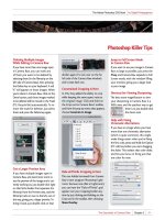
Step Three:
If you find a photo (like this one) where
you want to tweak the conversion a
little (like darkening the edges), then
go to the Adjustments panel, and click
directly on the gradient to bring up the
Gradient Editor dialog. Once it appears,
click once directly below the center of
the gradient to add a color stop to your
gradient (as shown here). The stop
appears in the color black, so it’s going
to greatly darken your photo, but you’ll
fix that in the next step.
Step Four:
Double-click on that color stop you creat-
ed and Photoshop’s Color Picker appears
(seen here). All you have to do is click-
and-drag your cursor all the way over to
the left side of the Color Picker, right up
against the edge (as shown here), and pick
a gray color. As you slide up and down
that left side, let go of the mouse button
and look at your photo, and you’ll see
the midtones changing as you drag. Once
you find a spot that looks good (in our
case, one where the center looks lighter),
click OK to close the Color Picker (don’t
close the Gradient Editor, though—just
the Color Picker at this point—because
there’s another tweak you can do. Of
course, what we’ve done so far is prob-
ably all you’ll have to do, but since there
is something else you can do, I at least
want to show you, but know that this
next step usually isn’t necessary).
Download from www.wowebook.com