The Adobe Photoshop CS5 Book for Digital Photographers part 21 doc
Bạn đang xem bản rút gọn của tài liệu. Xem và tải ngay bản đầy đủ của tài liệu tại đây (1.34 MB, 10 trang )
ptg
181Chapter 7How to Create Stunning B&W Images
Continued
The Adobe Photoshop CS5 Book for Digital Photographers
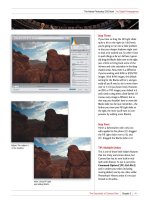
Step Five:
Once you’re back at the Gradient Editor,
and your color stop is now gray, you can
drag that middle gray stop around to
adjust the tone of your image (as shown
here). What’s weird is you drag the
opposite way that the gradient shows.
For example, to darken the photo, you
drag to the right, toward the white end
of the gradient, and to lighten the
photo, you drag left toward the dark
end. Freaky, I know. One other thing:
unlike almost every other slider in all
of Photoshop, as you drag that color
stop, you do not get a live preview of
what’s happening—you have to release
the mouse button and then it shows
you the results of your dragging. Click
OK, and you’re done.
Step Six:
Here’s one of the two variations I talked
about in the introduction for this tech-
nique: just go to the Layers panel and
lower the Opacity of your Gradient Map
adjustment layer to 70% (as shown here).
This bleeds back in a little of the color,
and gives a really nice subtle “wash”
effect (compare this slightly-colored
photo with the full-color photo in Step
One, and you’ll see what I mean. It’s
kinda nice, isn’t it?). Okay, now raise it
back up to 100% for the second varia-
tion, which is also a second version of
your B&W conversion.
Download from www.wowebook.com
ptg
182
Chapter 7 How to Create Stunning B&W Images
The Adobe Photoshop CS5 Book for Digital Photographers
Scott’s high-contrast B&W conversionRegular grayscale conversion
Step Seven:
For this version, go to the Layers panel
and click on the Background layer, which
is still in color. If you remove the color
from that Background layer, you’d get
a somewhat different conversion, right?
Right! So, once you’ve clicked on the
Background layer, press Command-
Shift-U (PC: Ctrl-Shift-U), which is the
shortcut for the Desaturate command
(it’s found under the Image menu, under
Adjustments). This removes the color and
gives you a different look (although the
change is fairly subtle with this photo,
with some photos it’s pretty dramatic—
it just depends on the photo). But, either
way, wouldn’t you rather choose between
two B&W conversions and then pick your
favorite? If you don’t like this other look,
just press Command-Z (PC: Ctrl-Z) to
Undo it.
Download from www.wowebook.com
ptg
183Chapter 7
The Adobe Photoshop CS5 Book for Digital Photographers
Continued
How to Create Stunning B&W Images
Step One:
Start by converting your full-color image
to black and white by clicking on the HSL/
Grayscale icon (the fourth icon from the
left) at the top of the Panel area and then
just turning on the Convert to Grayscale
checkbox at the top of the panel (see page
228 for one of my favorite methods for
converting to black and white).
Step Two:
Now, click on the Split Toning icon (the
fifth icon from the left) at the top of the
Panel area (it’s circled in red here). At this
point, dragging either the Highlights or
Shadows Hue slider does absolutely noth-
ing because, by default, the Saturation
sliders are set to 0. So, do yourself a favor
and drag the Saturation sliders for both the
Highlights and Shadows to around 20 right
now, so at least you can see what you’re
doing while you’re dragging the Hue sliders.
TIP: Seeing Your Colors
To temporarily see your hues at their full
100% saturation, just press-and-hold the
Option (PC: Alt) key, then click-and-drag
a Hue slider. It helps when picking your
colors, if you don’t feel like taking my
advice and increasing the saturation (like
I mentioned at the end of Step Two).
Split toning is a traditional darkroom special effect where you apply one tint to
your photo’s highlights, and one tint to your photo’s shadow areas, and you even
can control the saturation of each tint and the balance between the two for some
interesting effects. Although split-toning effects can be applied to both color and
B&W photos, you probably see it most often applied to a B&W image, so here we’ll
start by converting the photo to black and white, then apply the split-tone effect.
Split Toning
SCOTT KELBY
Download from www.wowebook.com
ptg
184
Chapter 7 How to Create Stunning B&W Images
The Adobe Photoshop CS5 Book for Digital Photographers
Step Three:
Now, click-and-drag the Highlights Hue
slider until you find a highlight hue you
like. Once that’s in place, do the same
thing with the Shadows Hue slider. Since
you increased the Saturation amount to
20 back in Step Two, you’ll immediately
see your tint appear on your image.
In the example shown here, we have a
yellow tint in the highlights and a blue
tint in the shadows. I know what you’re
thinking, “Scott, I’m not sure I like split
toning.” I hear ya—it’s not for everybody,
and it’s definitely an acquired taste (and
I’m not quite sure I’ve acquired it yet),
but some people love ’em. There’s a
name for these people. Freaks! (Kidding.)
Step Four:
There is one more control—a Balance
slider, which lets you control whether
your split tone favors your highlight or
shadow color. Just drag left, then back
right, and you’ll instantly see what this
slider does (here, I dragged the Balance
slider over to the left and you can see
that the split tone now has more blue in
the shadow areas). If you do find a split-
toning combination you like (hey, it could
happen), I’d definitely jump to page 240 to
find out how to turn that into a one-click
preset, so you don’t have to go through
all this every time you want a quick split-
tone effect.
Download from www.wowebook.com
ptg
185Chapter 7
The Adobe Photoshop CS5 Book for Digital Photographers
How to Create Stunning B&W Images
Step One:
Start by converting your color image
to black and white by clicking on the
HSL/Grayscale icon (the fourth icon
from the left) at the top of the Panel
area and then turning on the Convert
to Grayscale checkbox at the top of
the panel (see page 231 for one of my
favorite methods for converting to
black and white).
Step Two:
Now, click on the Split Toning icon at the
top of the Panel area (it’s the fifth icon
from the left), and then, in the Shadows
section, increase the Saturation amount
to 25 as a starting point. Next, just drag
the Shadows Hue slider until you have a
nice sepia-tone hue (I generally use some-
thing around 28). If you think it’s too
intense, lower the Saturation and you’re
done. That’s right—completely ignore the
Highlights controls altogether, and you’ll
love the results you get (ignore the power-
ful pull of the Highlights sliders. I know
you feel on some level that they will make
things better, but you are already holding
the magical key to great duotones. Don’t
blow it!). That’s it—that’s the whole ball of
wax (I told you it was easy, but don’t let
that fool you. Try printing one of these and
you’ll see what I mean). Mmmm. Duotone.
Don’t let the fact that this technique fits neatly on one page make you think
it’s not a rocking technique, because this is the best and fastest duotone technique
I’ve ever used (and it’s the only one I use in my own workflow). I used to do a more
complicated version, but then my buddy Terry White showed me a technique he
learned from one of his buddies whose duotone he adored, and well…now
I’m passing it on to you. It’s very easy, but man does it work like a charm.
Duotones Made
Crazy Easy
SCOTT KELBY
Download from www.wowebook.com
ptg
186
Chapter 7 How to Create Stunning B&W Images
The Adobe Photoshop CS5 Book for Digital Photographers
Step One:
Open the photo you want to apply your
quadtoning effect to (the term quadton-
ing just means the final photo will use four
different inks mixed together to achieve
the effect. Tritones use three inks, and
do I really have to mention how many
duotones use?). Quadtoning effects seem
to look best with (but are not limited to)
two kinds of photos: (1) landscapes, and
(2) people.
Step Two:
To create a quadtone, you’ll have to
convert to Grayscale mode first, but by
now you know what a flat-looking B&W
photo that creates, so instead try this
(from a few pages ago): Press the let-
ter D to set your Foreground and Back-
ground colors to their defaults of black
and white, then click on the Gradient
Map icon in the Adjustments panel.
When the Gradient Map options appear
in the panel, you don’t need to make any
changes. Now, before you can make a
quadtone, you need to convert this image
to Grayscale mode by going under the
Image menu, under Mode, and choosing
Grayscale. It will ask you if you want to
flatten your layers, so click the Flatten
button. (It will also ask you if you want
to discard the color info. Click Discard.)
If you’ve ever wondered how the pros get those deep, rich-looking B&W photos, you
might be surprised to learn that what you were looking at weren’t just regular B&W
photos, instead they were quadtones or tritones—B&W photos made up of three or
four different grays and/or brown colors to make what appears to be a B&W photo,
but with much greater depth. For years, Photoshop had a bunch of very slick presets
buried somewhere on your computer, but luckily in CS5, they’re just one click away.
Quadtoning for
Richer B&Ws
SCOTT KELBY
Download from www.wowebook.com
ptg
187Chapter 7How to Create Stunning B&W Images
The Adobe Photoshop CS5 Book for Digital Photographers
Step Three:
Once your photo is in Grayscale mode,
the Duotone menu item (which has been
grayed out and unchoosable until now)
is now open for business (if you’re in 8-bit
mode). So, go under the Image menu,
under Mode, and choose Duotone.
When the Duotone Options dialog
appears (shown here), the default setting
is for a one-color Mono tone (a cruel joke
perpetrated by Adobe engineers), but
that’s no big deal, because we’re going to
use the built-in presets from the pop-up
menu at the top. Here, you’ll literally find
137 presets (I counted). Now, you’d think
they’d be organized by duotones first,
tritones, then quadtones, right? Nope—
that makes too much sense (in fact, I’m
not sure they’re in any order at all).
Step Four:
I thought I’d give you a few of my favorites
to get you started. One I use often is
named “Bl 541 513 5773” (the Bl stands
for black, and the three sets of numbers
are the PMS numbers of the three other
Pantone colors used to make the quad-
tone). How about a nice duotone? It
uses black and it adds a reddish brown
to the mix. It’s called “478 brown (100%)
bl 4,” and depending on the photo, it
can work really well (you’ll be surprised
at how different these same quadtones,
tritones, and duotones will look when
applied to different photos). There’s a
nice tritone that uses black and two
grays, named “Bl WmGray 7 WmGray 2.”
We’ll wrap things up with another nice
duotone—this one’s named “Warm
Gray 11 bl 2,” and gives you the duo-
tone effect shown here. Well, there you
have it—four of my favorites (and don’t
forget, when you’re done, convert back
to RGB mode for color inkjet printing).
Download from www.wowebook.com
ptg
SCOTT KELBY
188
Chapter 7 How to Create Stunning B&W Images
The Adobe Photoshop CS5 Book for Digital Photographers
Creating Your Own
One-Click Presets
Now that we created split tones and duotones, this is the perfect time to start
making your own one-click presets. That way, the next time you open a photo
that you want to have that same effect, you don’t have to go through all those
steps (converting it to black and white, tweaking it, then applying the Split Toning
settings), you can just click one button and all those settings are applied at once,
giving you an instant one-click effect anytime. Of course, these presets aren’t just
for split tones and duotones—make one anytime you want to reuse any settings.
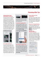
Step One:
Since we just created that duotone effect,
we’ll go ahead and use that to create a
one-click preset. Just remember—anytime
you come up with a look you like, you can
save it as a preset. To create a preset, you
click on the Presets icon (it’s the second
icon from the right at the top of the Panel
area), and then click on the New Preset
icon (shown circled here in red) to bring
up the New Preset dialog (seen here).
Now, just turn on the check boxes for the
adjustments you want copied to your
preset (as shown here), give your preset
a name, and then click the OK button.
Step Two:
Once you’ve saved the preset, it appears
in the Presets list (since there’s only two
presets here, I’m not sure it qualifies as a
list at this point, but you get the idea,
right?). To apply it is really a one-click
process—just open a different photo,
go to the Presets panel, and click on the
preset (as shown here), and all those set-
tings are applied. Keep in mind, though,
because the exposure is different for every
photo, if you save a preset where you had
to tweak the exposure a lot, that same ex-
posure will be applied anytime you apply
this preset. That’s why you might want to
save just the split-tone/duotone settings
and not all the exposure stuff, too.
Download from www.wowebook.com
ptg
SCOTT KELBYSCOTT KELBY
189Chapter 7
The Adobe Photoshop CS5 Book for Digital Photographers
How to Create Stunning B&W Images
I saved this for the last page, because I wanted to share all my favorite techniques
for doing B&W using just Photoshop’s tools, and although I still use those techniques
from time to time, it would be pretty disingenuous of me if I didn’t tell you what
I do most of the time, which is: I use Nik Software’s Silver Efex Pro black-and-white
plug-in. Almost all the pros I know use it as well, and it’s absolutely brilliant
(and super-easy to use). You can download the free 15-day trial copy
from www.niksoftware.com and see for yourself. Here’s how I use it:
Step One:
Once you install Silver Efex Pro, open the
image you want to convert from color to
B&W, then go under Photoshop’s Filter
menu, under Nik Software, and choose
Silver Efex Pro. When the window opens,
it gives you the default conversion (which
isn’t bad all by itself), and a host of
controls on the right side (but honestly,
I literally never touch those controls).
Step Two:
The magic of this plug-in is its B&W (and
duotone) presets. They’re listed along the
left side of the window, complete with a
small preview of how the effect will look,
but here’s where I always start: on their
High Structure preset. Eight times out
of 10, that’s the one I choose, because it
has it’s own high-contrast, sharpened look
that is wonderful for so many images.
However, if I’m converting a portrait, I’ll
often wind up using a different preset,
because High Structure can be too intense
when your subject is a person. So, I click
on the top preset in the list, and then click
on each preset below it until I find one
that looks good to me, then I click OK in
the bottom-right corner and I’m done.
That’s all I do. It’s fast, easy, and it looks
fantastic. That’s just what I want.
If You’re Really, Really
Serious About B&W,
Then Consider
This Instead
Download from www.wowebook.com
ptg
Why the Fill Dialog Shows Up
Sometimes, but Not Others
If you have a flattened image (so, it’s
just a Background layer), and you make
a selection and press the Delete (PC:
Backspace) key, the Fill dialog appears,
(Content-Aware is selected in the Use
pop-up menu, by default). But there are
times when hitting Delete won’t bring
up the Fill dialog. Instead, if you have a
multi-layered document, it will delete
whatever is inside the selection on your
current layer, making it transparent.
(That’s either, “Yikes!” or “Great!” de-
pending on how you look at it.) Also, if
you have only one single layer (that is not
a Background layer), you’ll again delete
anything inside your selection and make
it transparent. So, to bring up the Fill
dialog in those instances, just use Shift-
Delete (PC: Shift-Backspace) instead.
Move an Object Between
Documents and Have It Appear
in the Exact Same Place
If you have something on a layer in one
document, and you want the object to
appear in the exact same place in an-
other open document, here’s what you
do: First, press-and-hold the Command
(PC: Ctrl) key, go to the Layers panel
and click on the layer’s thumbnail to
put a selection around your object.
Then, press Command-C (PC: Ctrl-C)
to Copy that object into memory.
Switch to the other document, then
go under the Edit menu, under Paste
Special, and choose Paste in Place.
Now it will appear in the exact same
position in the other document (pro-
vided, of course, the other document
is the same size and resolution). This
also works with selected areas—not
just layers.
Removing Red Eye
If you have a photo that has someone
with the dreaded red-eye problem, it’s
a 15-second fix. Use the Zoom tool (Z)
to zoom in tight on the eye, then get
the Red Eye tool from the Toolbox (it’s
under the Spot Healing Brush, or press
Shift-J until you have it). Click it once on
the red area of the eye, and in just a sec-
ond or two, the red is gone. If your first
try doesn’t select all the red, increase the
Pupil Size up in the Options Bar. If the
retouch doesn’t look dark enough (the
pupil looks gray, rather than black), just
increase the Darken Amount up in the
Options Bar.
Dragged-and-Dropped
Images Don’t Have to
Appear as Smart Objects
You learned earlier that you can drag-
and-drop images from Mini Bridge right
into open documents (and if there isn’t
a document open, it’ll open as a new
document), but by default it always
drags in as a Smart Object. If you’d
rather it didn’t, press Command-K
(PC: Ctrl-K) to bring up Photoshop’s
Preferences, click on General on the left,
then turn off the checkbox for Place or
Drag Raster Images as Smart Objects.
190
Chapter 7 How to Create Stunning B&W Images
The Adobe Photoshop CS5 Book for Digital Photographers
Photoshop Killer Tips
Download from www.wowebook.com