Write a report describing the information in the graph belo1 pot
Bạn đang xem bản rút gọn của tài liệu. Xem và tải ngay bản đầy đủ của tài liệu tại đây (61.39 KB, 2 trang )
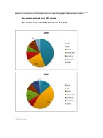
Write a report describing the information in the graph below.
You should write at least 150 words.
You should spend about 20 minutes on this task.
model answer:
The chart shows striking changes in the fertility rate of women in six Gulf countries
� Saudi Arabia, the UAE, Oman, Qatar, Kuwait and Bahrain between 1990 and
2000.
In the ten year period, there was a decline in the number of births per woman in all
countries. The biggest declines were in two countries which had low fertility rates at
the start of the decade, Bahrain and the UAE.
Fertility rates vary greatly between the six countries. Oman and Saudi Arabia had
the highest rates, with over seven births per woman in 1990. This compared with
around 4 births per woman in Bahrain and the UAE, and just 3.75 in Kuwait
By 2000, the rate had fallen below three births per woman in Kuwait, Bahrain and
the UAE, with a drop of over 25% in a decade in the UAE. However, in Saudi Arabia
and Oman, the rates fell by just 20%, from 7.0 to 5.5.
In summary, there were major decreases in birth rates in all countries, but some
countries in the region have double the fertility rate of others.