thiết kế giao diện wordpress phần 10 pdf
Bạn đang xem bản rút gọn của tài liệu. Xem và tải ngay bản đầy đủ của tài liệu tại đây (1.32 MB, 35 trang )
Chapter 8
[ 179 ]
Even if you haven't upgraded to WordPress 2.5, WordPress 2.3 makes use of AJAX
on the widgets panel, allowing you to easily drag-and-drop to add and arrange your
sidebar widgets. (For some reason, this has been redesigned in 2.5; I would have
preferred if it had stayed the same).
pageMash
In addition to nding plug-ins and widgets that enhance your theme, you should
consider looking for plug-ins that enhance your administration experience of
WordPress! For example, if your WordPress site has a lot of pages and/or you
display your page links as drop-down menus, as discussed in Chapter 7, then, Joel
Starnes pageMash plug-in is for you.
pageMash is a great little plug-in that uses the MooTools framework and Moo.
fx library. Instead of having to go into each individual page's editor view and then
use the Page Parent view to manipulate your pages around into your hierarchical
structure, this plug-in lets you reorder and assign pages as parents and sub-pages
on-the-y.
AJAX / Dynamic Content and Interactive Forms
[ 180 ]
Time For Action:
1. Download the pageMash plug-in from: />plugins/pagemash/.
2. Unzip the les and upload the pagemash directory to your /wp-content/
plugins/ directory.
3. Go to Administration | Plug-ins and Activate it. pageMash will then show
up under the Administration | Manage tag.
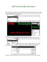
I hope you can get an idea by the following screenshot about how much easier and
quicker it is to arrange your WordPress pages with pageMash.
The AJAX Factor
Aside from the many-interface enhancing, time-saving benets of Ajax, sometimes
you do just want to 'wow' your site visitors. It's easy to give your site an 'Ajaxy' feel,
regardless of asynchronously updating it with server-side XML, just by sprucing up
your interface with some snappy JavaScripts. The easiest way to get many of these
effects is to reference a JavaScript library (sometimes called a toolkit or framework,
depending on how robust the provider feels the code is). A few of the leading
favorites in the AJAX community (in no particular order) are:
1. Script.aculo.us: ( />2. Prototype: ( />3. jQuery: ( />There's also:
4. MooTools: ( />5. Moo.fx: ( />Chapter 8
[ 181 ]
Prototype is more of a framework and Script.aculo.us is more of an add-on toolkit
or set of libraries for neat effects. In fact, Script.aculo.us references the Prototype
framework, so your best bet is probably to use Script.aculo.us, but if you do
work with it, be sure to check out Prototype's site and try to understand what that
framework does.
Moo.fx is the smallest JavaScript effects library (boasting a 3k footprint), but again, it
needs to be supported by the MooTools or Prototype frameworks.
jQuery is my personal favorite. It pretty much stands on its own without needing to
be backed up by a more robust framework (like Prototype), but you can still do some
very robust things with it, manipulating data and the DOM, plus it's packed with
neat and cute visual effects, similar to Script.aculo.us.
Using JavaScript libraries like the above, you'll be able to implement their features
and effects with simple calls into your WordPress posts and pages.
JavaScript Component Scripts
The fun doesn't stop there! What's that? You don't have time to go read up on how
to use a JavaScript library like jQuery? Never fear! There are many other JavaScript
effect components and libraries that are built using the libraries above. One of the
most popular scripts out there that makes a big hit on any website is Lightbox JS:
/>Lightbox JS is a 'simple, unobtrusive script used to overlay images on the current
page.' It's great, but it uses both the Prototype and Script.aculo.us libraries to achieve
its effects. I also found that Lightbox was limited to only displaying images and a
hair difcult to manipulate it to handle anything more than that. What if I wanted to
display XHTML text, or markup containing YouTube videos, maybe even make an
AJAX request to the server?
Enter Thickbox: />Thickbox is very similar to Lightbox JS. It uses only the jQuery library, and in
addition to handling images similar to Lightbox JS, it can also handle in-line content,
iFrame content, and AJAX content (be sure to check out the examples on the
ThickBox page!). The downside—Thickbox doesn't do that smooth animation that
Lightbox JS (version 2) does when images are different sizes. This is the trade-off
I made when I decided it was more important to be able to display more than just
images in my OpenSource Magazine theme.
AJAX / Dynamic Content and Interactive Forms
[ 182 ]
Depending on your theme's design and what type of blog or site you're creating
it for, you may opt to use Lightbox instead or something all together different! It's
your theme, don't feel limited to what I specically discuss in this book. I'll walk you
through the process of installing ThickBox, but many 'Ajaxy' scripts that use these
JavaScript libraries/frameworks are installed similarly. Just follow the instructions in
the ReadMe les and you're on your way to an enhanced theme.
Time For Action:
1. This is an extremely easy-to-implement script. After downloading it, add the
key js and CSS les to your WordPress theme's home.php and header.php
les using the bloginfo template tag to target your theme:
<script type="text/javascript" src="<?php bloginfo
('template_directory'); ?>/js/jquery.js"></script>
<script type="text/javascript" src="<?php bloginfo
('template_directory'); ?>/js/thickbox.js"></script>
2. You'll also add in a call to the ThickBox CSS le:
<style type="text/css" media="all">@import "<?php bloginfo
('template_directory'); ?>/thickbox.css";</style>
3. Don't forget to upload the loadingAnimation.gif and macFFBgHack.png
images to your theme directory and update the thickbox.js and thickbox.
css les as per the ReadMe le instructions.
4. Then, you can create a post (or page) in your Administration Panel and using
the Code View add in basic href links around your image tags, like so:
<a href='/wp-content/uploads/2008/04/inkscape2.jpg'
class="thickbox" rel="inkscape"><img src="/wp-content/
uploads/2008/04/inkscape2-150x150.jpg" alt="" title="inkscape2"
width="150" height="150" class="alignnone size-thumbnail
wp-image-15" /></a>
<a href='/wp-content/uploads/2008/04/inkscape1.jpg'
class="thickbox" rel="inkscape"><img src="/wp-content/
uploads/2008/04/inkscape1-150x150.jpg" alt="" title="inkscape1"
width="150" height="150" class="alignnone size-thumbnail
wp-image-14" /></a>
I uploaded the images via WordPress's built-in up-loader and let WordPress create
the thumbnails; I just added the captions to the title attribute, the rel attribute and
the thickbox class by hand.
That's it!
Chapter 8
[ 183 ]
Summary
In this chapter, we reviewed a few ways to take advantage of AJAX on your
WordPress site. We 'Wigitized' our theme and downloaded and installed a couple
of useful plug-ins, and looked at using jQuery and ThickBox to enhance post and
page content. Up next—let's take a look at some nal design tips to working
with WordPress.
WordPress
Alright, for this last chapter, let's sum things up by giving you a few nal design tips,
tricks, and troubleshooting ideas to take with you into your future WordPress theme
designs. As we've gone through this book there are quite a few tips that have been
given to you along the way. Here are the top four to remember:
1. Create and keep lists: Check lists, color lists, font lists, image treatment lists.
Keep all of these handy from your initial design phase. You'll nd them to be
useful and excellent inspiration for your designs to come.
2. Design for FireFox rst, then, x for IE: Firefox is more than a browser
preference; it's a true web designer and developer's tool.
3. Validate your XHTML and CSS often: The more stable your markup and
CSS, the less hacks and xes you'll need to make.
4. Consider usability issues when implementing site enhancements: Steve
Krug is a cool guy. Moreover, good usability naturally lends itself to
great design.
With that said, let's just go over a few last design techniques that any good designer
wants in their arsenal these days.
The Cool Factor
Next, I'll go through what I feel are the most popular tricks used in website design
today. After that, we'll take a look at some interesting samples of unique design
ideas and how theme authors approached achieving them. Most techniques are
easily incorporated into WordPress as they're handled one hundred percent via CSS.
A few items will require you to think and plan ahead, as you'll need to make sure
the WordPress theme code accommodates the effect. The best thing is, if you can
implement these techniques into a WordPress theme, you can implement them into
any website.
Design Tips for Working with WordPress
[ 186 ]
First off, we've already looked at several 'cool factor' techniques that are very
popular in web design today. Among these techniques are using oats to create a
three column layout complete with header and footer, along with a two column
internal page layout. We've looked at styling lists with CSS (essential, as WordPress
outputs a lot of lists). And we've also covered using the CSS hover property for our
drop-down menus, which could be applied to text or used with images for a rollover
effect without the use of (or with minimal use of) JavaScript.
Get good with backgrounds! If you haven't already realized this by now,
about ninety eight percent of the CSS that will make your WordPress
theme look great is dependent on how creative you get with images and
the background properties of your XHTML objects, classes, and id rules.
From page header backgrounds to data table spruce ups, rounded corners
and fancy text (as you'll nd out about in a minute), knowing how to
really control and manipulate background colors and images via CSS is
key. Check out
to learn the ins and outs of this CSS property.
Rounded Corners
Rounded corners have been pretty popular the past few years, to the point that many
sites have been accused of incorporating them just beacuase they seemed 'Web 2.0-
ish‘. Fads aside, rounded corners are occasionally just at going to work well with a
design (they're great for implying happy-friendly-ish tones and/or retro styles), so
you might as well know how to incorporate them into your WordPress theme.
The Classic – All Four Corners
Ideally, you'll wrap your WordPress template tag in enough div tags to be able
to create a round cornered object that is exible enough to scale horizontally and
vertically. You can also use heading tags or probably any other XHTML tag that
occurs in the element.
Chapter 9
[ 187 ]
Really understanding rounded corners in a table-less design: If you
haven't noticed by now, I'm a fan of aListApart.com, so I'll leave it to
these trusted experts to give you the complete low-down on the details
outs of making rounded corner boxes with pure CSS:
/>Also, there are many rounded corner generator sites out there which
will do a lot of the work for you. If you're getting comfortable with CSS
and XHTML markup, you'll be able to take the generated code from one
of these sites and 'massage' the CSS into your WordPress style.css.
Roundedcornr.com is my favorite:
/>To start, just make four rounded corner images named left-bot.gif, right-
bot.gif, left-top.gif, and right-top.gif respectively (or generate them at
roundedcornr.com). And using a class name called .sidebarItem (you can name
this class whatever you'd like), reference the images via background parameters in
your CSS like so:
.sidebarItem {
background: #cccccc;
background: url( /images/left-top.gif) no-repeat top left;
/*be sure to set your
preferred font requirements*/
}
.sidebarItem div {
background: url( /images/right-top.gif) no-repeat top right;
}
.sidebarItem div div {
background: url( /images/left-bot.gif) no-repeat bottom left;
}
.sidebarItem div div div {
background: url(roundedcornr_170953_br.png) no-repeat bottom
right;
}
.sidebarItem div div div, .sidebarItem div div, .sidebarItem div,
.module{
width: 100%;
height: 30px;
font-size: 1px;
}
.sidebarItem {
margin: 0 30px;
}
Design Tips for Working with WordPress
[ 188 ]
The following is an example of the markup you should wrap your template tag(s) in:
<div class="sidebarItem"> <! //left-top.gif >f
<div> <! //right-top.gif >
<div> <! //left-bot.gif >
<div> <! //right-bot.gif >
<h3>Header</h3>
Content the Template Tag outputs goes in here
</div>
</div>
</div>
</div>
Your end result should be something that looks like the following:
The Two Image Cheat
I'll be honest; I'm on the cheater's band wagon when it comes to rounded corners.
I often create locked-width designs so I always know exactly how much room my
columns can take up, and they only need to be able to expand vertically.
Chapter 9
[ 189 ]
More aListApart: Again aListApart.com comes in with a great take on
this two image process, along with some great tips for creating the corners
in your favorite graphic program:
/>This rounded corner x only works for a set width with a variable height. That means,
how wide you make your graphic, is as wide as your outer div should be. So, if you
know the width of your columns and just need the height to expand, you can do this
two image cheat by only making a top image and an extended bottom image like so:
Test this technique! In the previous graphic, I mention to make sure this
height is a bit longer than what you think the div may need to expand
to. Once you have it implemented, try it out in different browsers and
set your browser's default type to different sizes. If someone has their
browser set to very large type, this effect can be easily broken!
Next reference the images in your CSS (note how much simpler the CSS becomes):
.sidebarItem {
margin:0 0 10px 0;
padding:0 0 10px 0;
width: 150px;
background:url( /images/bot-side.gif) bottom left no-repeat;
/*be sure to set your
Design Tips for Working with WordPress
[ 190 ]
preferred font requirements*/
}
.sidebarItem h3 {
padding:8px 10px 6px 15px;
margin-bottom:8px;
/*be sure to set your
preferred font requirements*/
background:url( /images/top-side.gif) top left no-repeat;
}
You'll see the XHTML markup is now greatly simplied because I take advantage of
my header tag as well:
<div class="sidebarItem"> <! //bot-side.gif >
<h3>Header</h3><! //top-side.gif >
Content the Template Tag outputs goes in here
</div>
Great for block quotes! I also use this technique to handle custom block
quotes that get used inside static pages and posts (a great way to spice up
pages so that they look 'magazine-ish'). Again, the block quotes must be a
set width, but I then only need to make sure I place in my <blockquote>
and <h3> tags to have an effective style with minimal (and semantic)
markup. Just replace the .sidebarItem{ from the preceding
code with blockquote{ (or make a special class to assign to your
<blockquote> tag).
Chapter 9
[ 191 ]
Creative Posting
In these next few sections, we're going to focus more on ideas than specic
techniques. The good news is, because you're using the Firefox browser with the
Web Developer Toolbar, you'll be able to easily 'deconstruct' many of these site
samples using the CSS | View Style Information and CSS | View CSS tools and
think of ways to creatively use them in your own themes.
How Toons ( is a great kid's site that
teaches them interesting things in math, art, history, and science using fun comic
illustrations. The site's blog features a great use of the Comic Sans font (we discussed
in Chapter 2 how it's hard to make that font work well; here it's perfect), and the site's
author has created a very unique post template.
If you explore this site with your Web Developer Toolbar, you'll see the author
creates these posts using actual image tags inside the .blogpost class. It works, and
it allows the author to easily randomly assign bottom speech-bubble images with
different cartoon scenes.
Design Tips for Working with WordPress
[ 192 ]
I'd like to point out that while the author's technique works very well, using a
variation of the 'two image cheat' listed previously could achieve the same effect.
This would work best if you didn't want to have randomly different post bottoms
on each post. The point is, as you surf the web, you'll nd there are many ways to
achieve the same effect. You'll need to decide which solutions work best for you and
your theme.
Breaking Boundaries
The HowToons.com site does something more than just make their posts creative;
the speech-bubble bottoms of each post and the nice big background image that is
positioned with no-repeat and fixed in the bottomright, achieve what I refer to
as 'boundary breaking‘.
Whether we realise it or not, we tend to create theme designs and page templates
that adhere to a 'grid' of some sort. This is not a bad thing. It makes for good design,
easier use of the interface, and most importantly, easier content reading.
However, I tend to nd we can become 'desensitised' to many site's designs, and
thus, it's interesting when a site's design displays clever ways of breaking out of the
layout's grid.
Whenever I see boundary breaking done on other sites, I nd it catches my eye and
awakens it to really move around and take in the other details of the site's design
that I might have otherwise ignored. As a result, I look for interesting ways to do this
subtly within my own designs.
Chapter 9
[ 193 ]
Within this book's case study, the OpenSource Magazine theme, I achieved this in the
main and internal headers by extending it out past the container2 div. The graphic
seems to swoop back to line up with the container2 div's boundary for easy content
reading, but the header extends past it, engaging the reader in a little design detail:
Kaushal Sheth has created a WordPress theme based on his favorite book, The
Hobbit ( />released/). His use of Bilbo's sword in the upper-left corner adds a nice layered
dimension to the theme and interests your eye in moving around taking in all the
other very nice details that Kashual took the time to put into it—the detailed paisley
corners, the 'elvish' writing separating the posts, and so on.
Kaushal achieved this effect by splitting the sword and title graphic into two parts,
then using an absolute positioned div to lay the handle of the sword up against the
part of the image contained inside the header div.
Design Tips for Working with WordPress
[ 194 ]
The left side of the image is opaque, so he had to pay very special attention, making
sure the absolute positioning of the div not only aligned it with the rest of the header
image but also overlaid the repeating background image perfectly.
A minor drawback to the Hobbit theme is that on some browsers, while the handle
of the sword is always aligned perfectly with the header h1 background image,
the delicate paisley background doesn't always overlay perfectly with the site's
repeating background, and as a result, you're made aware of the images edges
against the background.
Rhodia Drive ( uses a similar technique to Kaushal's
by using an absolute positioned div to hold a CSS background image of an orange
Rhodia notebook, which breaks the boundaries on the left side. Because the site's
main background uses a subtle repeat-x gradient that has been set to fixed, the
image uses a transparent PNG. This way, as you scroll the blog up, the background
of the notebook reveals the site's true background gradient.
Chapter 9
[ 195 ]
Using transparent PNGs: The great news is IE7, and all newer browsers,
natively support transparent PNGs. For the fewer out there still clinging
to IE6, there's a good IE6 x which helps that browser display transparent
PNGs properly using a Microsoft lter that can be accessed via image tags
and stylesheets.
The Rhodia Drive site makes use of alternate stylesheets using the <!
[if IE6]> solution discussed in Chapter 4, and an IE6 transparent PNG
x, which you can nd out more about at: tocreate.
co.uk/alpha.html.
Design Tips for Working with WordPress
[ 196 ]
Want to really break the boundaries? Molly E. Holzschlag has an in-
depth article that goes way beyond the occasional 'overstepped line‘. With
pure CSS, anything is possible and it's a great thought-provoking read.
/>Keep Tabs on Current Design Trends
In addition to rounded corners there are some fairly common graphic interface
techniques that seem to dene those trendy '2.0' sites. These include things like
the following:
Gradients and glows: But remember, it's all about being subtle!
Reections: Again, just be subtle!Again, just be subtle!
Vector images and creative drop-shadows: Give your page a feeling
of space.'
Thin, diagonally stripped background: Could be for just header delineation,
not necessarily the whole site's background!
Glass or 'jelly' buttons and star-burst 'stickers'.
Grunge-organic: Emerged in its hey-day of print design in the early 90s, but
it's quickly becoming the new 'shiney, clean, and bright' of Web 2.0 sites:
paper-looking photos, X-File-ish folder/messy desk layouts, decaying/
misprinted fonts, natural edges, and liberal (but again, subtle) doses of
various spills, drips-and-drops that we usually encounter in creative life.
•
•
•
•
•
•
Chapter 9
[ 197 ]
Design trends come and go; while the above are popular today, they'll become 'old
hat' soon enough. Take note of bookmark leading sites and blogs of designers, web
programmers, and key contributors to the web eld. Visit these sites often (the good
ones update their interface at least once a year; most are constantly tweaking their
interface adding new things little-by-little). By keeping your nger on the 'pulse,'
you'll be able to recognize new trends as they start emerging. Think about how you
can creatively leverage them into your own theme designs. You'll probably nd
yourself inventing your own unique interface looks that other people start adopting.
Learn the ins and outs of how to use your image editing software. Right now, a
large part of these design trends are graphics loaded in via CSS. To get those great
trendy images into your theme, you'll need to understand CSS, and as I've already
mentioned, you'll need to know how to effectively (and sometimes creatively) use
the background property in your CSS rules.
PSDTuts is a a great site for picking up a little quick 'how to' knowledge
for current design techniques. The whole site is denitely worth a look
through, but they have a special section for interfaces that covers how to
create many design trends and visual effects using Adobe Photoshop:
/>Stylegala and SmashingMagazine are other good sources of keeping
up on web design trends. Stylegala also has a great, clear, concise CSS
reference chart that I've found very useful from time to time:
/>
Graphic Text
Now here's something that's a total pain all web designers have had to deal with.
As we discussed in detail in Chapter 2, there's really only three, maybe ve, truly
safe fonts for the web—fonts that you can be fairly sure that every PC and Mac (and
maybe Linux) computer has natively installed. All other fonts tend to be off limits for
web design. This is a shame, as typography is a huge element of great design. None-
the-less, if you want these fonts, you have to create them as graphics and include the
images into your layout.
Design Tips for Working with WordPress
[ 198 ]
The problem with using graphics instead of text is that it really messes with your
site's semantics. Usually, it's the section headers that you want in the pretty font.
However, if you use in-line image tags, your semantic markup gets thrown off and
your SEO will fall because search engine bots really like to nd those h1, h2, and h3
header tags to help them assess the real keywords in your page. Plus, if your style
aesthetic changes, you have to not only change the theme but then update individual
posts and pages with new images from within WordPress's Administration Panel.
The solution is to use text in your header tags, yet display unique fonts as images, by
setting up custom classes in your stylesheet that will 'move' the text out of the way
and insert your graphic font as a background image.
Again, as we mentioned in Chapter 4: search engine bots generally view your pages
as though the stylesheet has been turned off, therefore the search engine bot and
people using screen readers will keep owing smoothly over pure text, while the rest
of us get to see your sweet design and nice font selection. The bonus: when the site
design changes, all your images are handled via the CSS sheet, so you won't have to
touch individual post and static pages.
My WordPress theme makes use of Futura in the header. I'd love to use it for my
section headers, the problem is, a lot of people don't have Futura on their computer.
Even if my user has Futura on his machine, I think the font looks best when it's anti-
aliased. While Mac users with Futura would then see it OK, PC users won't. I've
created graphics of my headers using Futura, and will set up my header tags with
classes to move the XHTML text out of the way and use my new background images.
The drawback: Try to keep track of the bandwidth your site needs to
load. The more images and the bigger they are, of course the longer it will
take to load. By switching my headers from XHTML text with a small,
thin repeating background, to a full non-repeating image, I went from a
1k graphic to a 10k graphic. On the whole, especially in this day and age
of broadband, it's no big deal, but still something to keep in mind as you
try to assess what elements of your design will use pure XHTML and CSS
and what will be images.
As an example, in your CSS page, set up the following class rules:
.textMove{ /*this is your standard for each header*/
height: 23px;
margin-top:10px;
width: 145px;
text-indent: -2000px;/*This pushes your text back so it's invisible*/
Chapter 9
[ 199 ]
}
.specificText{ /*specific header-text image*/
background: url(" /images/specificText.jpg") no-repeat left top;
}
Now, either in your theme's template pages or in posts and pages you've added via
the Administration Panel, apply the appropriate classes to the text headers that you
would like replaced with graphics (again, if you're in the Administration Panel, use
the Code view).
<h2 class="textMove specificText">Section Header</h2>
Assign more than one class rule to an XHTML markup object? As you
can see by our sample above, you can assign more than one class rule
to a markup object. Simply separate each class rule with a space (not a
comma), e.g., class="rule1 rule2". This comes in handy when you
need to customize many elements, yet don't want to repeatedly copy
similar properties across all of them (plus, you can easily change the main
properties in just one spot instead of having to x them all). In the case
of graphic text headers, I like to make one rule that handles pushing the
text out of the way and sets the height and margins for my header images,
then, all my other class rules just handle the background image name,
e.g., class="textMove graphicText". This trick only works with
CSS class rules, not id rules.
Design Tips for Working with WordPress
[ 200 ]
Extra Credit – Use PHP to make Graphic
Headers Easy
I like to simplify this process by using a simple PHP script with a local TTF font
(True-Type Font) to help me quickly generate my header graphics. I can then just
include them into my CSS sheet, dynamically setting up the text that the header
needs to say.
This technique is very useful if your site is going to be mainly controlled by a client.
As they'll probably have to let you know every time they make a new header that
needs to be a graphic loaded in via CSS. You'll be able to accommodate them on-the-
y (or even better, teach them how to do it), as opposed to having them wait for you
to generate the graphic with PhotoShop or Gimp, and then implement the CSS.
Heads up: This PHP code requires the standard ImageGD library to be
installed with your PHP conguration. This library has been on most
shared/virtual hosting companies I've used, but to be safe, contact your
website host administrator to ensure the ImageGD library is installed.
You can place this script's le anywhere you'd like. I usually place it in my theme's
image directory—imgtxt.php—as I will be referencing it as an image.
<?PHP
/*Basic JPG creator by Tessa Blakeley Silver
Free to use and change. No warranty.
Author assumes no liability, use at own risk.*/
header("Content-type: image/jpeg");
$xspan = $_REQUEST['xspan'];//if you want to adjust the width
$wrd = $_REQUEST['wrd'];//what the text is
if (!$xspan){//set a default width
$xspan = 145;
}
$height = 20;//set a default height
$image = imagecreate($xspan, $height);
//Set your background color.
//set to what ever rgb color you want
if(!$bckCol){
$bckCol = imagecolorallocate($image, 255, 255, 255);
}
//make text color, again set to what ever rgb color you want
if (!$txtCol){
$txtCol = imagecolorallocate($image, 20, 50, 150);
Chapter 9
[ 201 ]
}
//fill background
imagefilledrectangle($image, 0, 0, $xspan, $height, $bckCol);
//set the font size on the 2nd parameter in
//set the server path (not the url path!) to the font location at the
7th parameter in:
imagettftext($image, 15, 0, 0, 16, $txtCol, "home/user/sitename/fonts/
PLANE___.TTF", "$wrd");//add text
imagejpeg($image,'',80);//the last number sets the jpg compression
//free up the memory allocated for the image.
imagedestroy($image);
?>
This script only works with True-Type fonts. Upload the True-Type
font and directory location you referenced in the script to the matching
location on the server. Also, my script is very basic, no drop-shadows or
reections. It only creates a JPG with a solid background color, True-Type
font, font-size, and solid font color. If you're comfortable with PHP, you
can Google/search the web for PHP image scripts that allow you to do
more with your text-image, that is, add gradient backgrounds or generate
transparent PNGs, or overlay other images on top of or behind your text.
From here on out, you'll only need to reference this PHP script in your CSS, passing
your text to it via a query string instead of the images you were generating:
.specificText {
background: url(" /images/imgtxt.php?xspan=300&wrd=
This Is My New Text") no-repeat left top;
}
The xspan variable is optional; if you don't include it, the default in the script is set
to 145 pixels wide. If your custom text will be longer than 145 pixels, you can set it
to the pixel width you desire. (In the previous example, I have it set to 300. Be sure
your width doesn't conict with your div widths!)
The wrd variable is where you'll set your custom text. (Be aware that some characters
may not come over as the string will be url encoded.)
Design Tips for Working with WordPress
[ 202 ]
Each time you have a new graphic to generate, you can do it entirely via the theme's
stylesheet. The following is a screenshot from my professional site, which uses the
PHP script in the previous example to generate header fonts.
Good Design isn't Always
Visual – Looking at SEO
At this point you've gone through the trouble to create a semantic, user-friendly, and
accessible XHTML theme, and one of the benets of that structure is that it helps
with SEO (Search Engine Optimization, if you haven't guessed by now). You might
as well go all out and take time to set up a few more optimizations.
Search Engine Friendly URLs
WordPress URLs by default are dynamic. That means they are a query string of the
index.php page, e.g, />Chapter 9
[ 203 ]
In the past, dynamic URLs had been known to break search engine bots who either
didn't know what to do when they hit a question mark or ampersand and/or started
indexing entire sites as 'duplicate content', because everything looked like it was
coming from the same page (usually the index.php page).
Generally, this is no longer the case, at least not with the 'big boy' search engines like
Google, but you never know who is searching for you using what service.
Also, by changing the dynamic string URL to a more SEF (Search Engine Friendly)
URL, it's a little harder for people to directly manipulate your URLs because they can't
clearly see what variable they're changing once it's in a search engine friendly URL.
WordPress has this SEF URL feature built-in, but only if you're running PHP on Apache.
Go to Adiministration | Settings | Permalinks (Administration | Options |
Permalinks in version 2.3.x) and simply switch the Default selection to either Day
and Name based, Numeric, or Custom.
I like to select Custom and tell my structure to be /%category%/%postname%/.That
way, my URLs will reect the category they are posted to and then the permalink
title which is your post's title with (-) dashes put in for spaces. If your blog is going
to be more date-based, then one of the presets might be a better option for you.