Professional DotNetNuke ASP.NET Portals wrox phần 3 docx
Bạn đang xem bản rút gọn của tài liệu. Xem và tải ngay bản đầy đủ của tài liệu tại đây (1.57 MB, 45 trang )
Figure 3-5
You can see by this example that the use of containers offers you a lot of flexibility with controlling the
display of content to your users. Normally you will want your containers to match the colors and design
of your site, and most skins provide these complements as part of the package. Many commercial and
free versions of skins are available for DotNetNuke that you can download or purchase. Refer to the
DotNetNuke web site for links to a wide variety of skins and containers. Creating skins and containers
is covered extensively in Chapter 13.
Modules
Modules are the meat and potatoes of the DotNetNuke application. Modules are the components that
allow DotNetNuke to finally serve its intended purpose of displaying relative, easy-to-update content to
your visitors. The applications for these modules and how to use them to add your content is covered in
Chapter 6. Hundreds of free and commercial modules are available that you can obtain to extend the
functionality offered by the application. Just perform a web search for “DotNetNuke Modules” with
your favorite search engine and you will be able to find a module to meet almost any need you may
have for managing content. This section of the chapter provides an overview of each module and pre-
pares you for the detailed information in Chapter 6, which shows you how easy it is to use the modules
to present content to your users. With version 3 of DotNetNuke, all the content modules have been
divided into separate projects, which allows you to pick and choose the modules you need for your
installation. So, if your specific business requirement does not need an RSS module, you can remove it
from your installation without any adverse effects or any modifications of the core code. This is an
important enhancement from a business perspective because it allows you to easily modify the applica-
tion to accommodate your unique business rules and needs.
60
Chapter 3
07_595636 ch03.qxd 5/10/05 10:05 PM Page 60
Account Login
The Account Login module provides the login interface as a module. In can be useful in two scenarios:
❑ The first scenario is when you would like the login dialog to appear on the home page (without
the user clicking the login link).
❑ The second scenario is to be used on a login page, which could contain additional modules. You
can specify any page within your portal as the login page via the administration screens located
at Admin ➪ Site Settings ➪ Advanced Setting ➪ Page Management.
Announcements
As its name suggests, the Announcements module is used to present a list of announcements. Each
announcement includes a title, text, and a “read more” link. Optionally, the announcement can be set
to expire after a specified date.
Banners
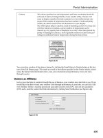
DotNetNuke provides a rich set of vendor management tools. One of the tools provided is the Banners
module. This module is used to display the advertising banners of vendors created within the portal.
Management of these vendors and creation of banners is performed in the administration area located at
Admin ➪ Vendors. The module itself provides facilities to select the number of banners to display and
the banner type.
Contacts
The Contacts module renders contact information for a group of people; some example groups are a pro-
ject team, a sporting team, or personnel within your department. The module provides an edit page,
which allows authorized users to edit and add contacts.
Discussions
The Discussions module is a threaded discussion board; it provides groups of messages threaded on a
single topic. Each message includes a Read/Reply Message page, which allows authorized users to reply
to existing messages or add a new message thread. Although this is not a full-fledged forum module, it
offers some functionality that you can use to enable light forum activities on your site.
Documents
The Documents module renders a list of documents, including links to browse or download the docu-
ment. The module includes an edit page, which allows authorized users to edit or add the information
about a document (for example, a friendly title).
61
Portal Overview
07_595636 ch03.qxd 5/10/05 10:05 PM Page 61
Events
The Events module renders a list of upcoming events, including time and location. Individual events can
be set to automatically expire from the list after a particular date. The module includes an edit page,
which allows authorized users to edit or add an event.
FAQ
The FAQ module allows an authorized user to manage a list of Frequently Asked Questions and their
corresponding answers. This is a great module for reducing support calls to your customer service cen-
ter because you can compile a list of the questions you receive about your business or services and pre-
sent this data to your users.
Feedback
The Feedback module allows visitors to send messages to the administrator of the portal. With version 3
of the portal software you have the ability to customize this module to send e-mails to various individu-
als within your organization depending on the message content. This was not available in previous ver-
sions because all e-mails sent from the module were sent to the portal administrator. This is just one
more example of how DotNetNuke allows you to assign different tasks to the correct individuals in your
organization.
IFrame
The IFrame module is an Internet Explorer browser feature that allows you to display content from
another web site within a frame on your site.
Image
The Image module renders an image using an HTML IMG tag. This module includes an edit page that
allows an authorized user to specify the location of the image that can reside internal or external to the
portal. The authorized user can also specify height and width attributes, which permits you to scale
the image.
Links
The Links module renders a list of hyperlinks. This module includes an edit page, which allows autho-
rized users to edit and add new links. Each link can be customized to launch new windows or capture
information such as how many times that link has been clicked.
News Feeds (RSS)
The News Feed module allows you to consume syndicated news feeds in Rich Site Summary (RSS) for-
mat. This module includes an edit page that allows you to specify the location of the news feed and the
style sheet (XSL) used to transform the news feed.
62
Chapter 3
07_595636 ch03.qxd 5/10/05 10:05 PM Page 62
Search Input
The Search Input module provides the ability to submit a search to a given search results module.
Search Results
The Search Results module provides the ability to display search results.
Text/HTML
The Text/HTML module renders a snippet of HTML or text. This module includes an edit page, which
allows authorized users to edit the HTML or text snippets directly (using the configured rich text editor).
User Accounts
The User Accounts module allows users to register and manage their account.
User Defined Table
The User Defined Table module allows you to create a custom data table for managing tabular
information.
XML/XSL
The XML/XSL module renders the result of an XML/XSL transform. This module includes an edit page,
which allows authorized users to specify a location for the XML document and the XSL style sheet used
for transformation.
Remember, this is not a definitive list of the modules available within DotNetNuke; you have the option
of installing modules provided by third parties, or to even author your own module. For complete
instructions on how to use each of these modules, refer to Chapter 6, which covers the administration of
the DotNetNuke base modules. Chapters 9 through 12 cover the aspects associated with authoring your
own modules to solve a unique business need for your organization.
Additional Modules
DotNetNuke also provides some additional modules that are available in the download but not installed
by default in the application:
❑ User’s Online: This module allows you to display information about the current number of visi-
tors accessing your portal at any given time.
❑ Survey: This module allows you to conduct online surveys with your portal.
63
Portal Overview
07_595636 ch03.qxd 5/10/05 10:05 PM Page 63
At the time of this writing, several other modules are under development that will enhance the usability
of the application even further. Several members of the DotNetNuke Core Team are developing a full-
fledged forum module and a photo gallery module, which will be included in later releases of the
application.
User Roles
DotNetNuke offers a fairly robust method for dealing with the permissions and controlling the tasks a
particular user is allow to perform. It does this with a roles-based security module, where every page
and module in the application is assigned roles that determine what the user is allowed to do within the
context of the application. As you saw earlier in the chapter, you have the option of setting permissions
at several levels within the portal. A user may be allowed access to edit certain modules, or be given
access to edit the entire page as you deem necessary. These functions also apply to actual viewing of a
module’s content or a specific page. Basically, all you need to do is create the necessary security roles
and assign the permissions you want that role to perform to the module or page. Once you have the
roles and permissions defined you can then place your users in the appropriate role, which will allow or
restrict their access based on those permissions. This allows very granular control over the actions of
users in your portal.
Summary
This chapter introduced the concepts of DotNetNuke terms and basic application functionality. The
chapters that follow dive deeper into these items and introduce the details on how each DotNetNuke
function can be implemented in your unique installation. As you can see from this chapter, the applica-
tion offers a lot of functionality from a base installation and will allow you to quickly move your web
site from conception to production. The next chapter looks at the host functions required to set up the
application to host your various child and parent portals.
64
Chapter 3
07_595636 ch03.qxd 5/10/05 10:05 PM Page 64
Portal Administration
Chapter 3 introduced basic concepts that define a portal in DotNetNuke. This chapter details the
rich features and functions available to customize the look, feel, and function of your DotNetNuke
portal and maintain it throughout its life.
To make this information more practical, examples in this chapter illustrate a real-world
scenario of building a site for a pee-wee soccer team called The Gators. Where applicable, you’ll
not only learn how to do things, but also when and why to do them. As the administrator of a
DotNetNuke portal, you now hold the keys to a powerful resource and you’ll want to know how
to manage it well.
In Chapter 3 you learned about the concept of hosting multiple portals on a single installation of
DotNetNuke. This chapter assumes no knowledge of any portal in the installation other than the
one you are currently administering. As far as the Portal Administrator is concerned, their portal
exists alone in its own corner of cyberspace separate from any other.
Who Is the Portal Administrator?
When the Host creates your portal, a new user is created as well (see Chapter 5). This user is auto-
matically associated with the portal in the Administrator security role and so becomes the default
Portal Administrator. The features discussed in this chapter are available to users who belong to
the Administrator security role (and SuperUsers such as the Host).
There is only one Portal Administrator — you! However, you have the authority to delegate
privilege to other users to perform administrative tasks. Later in this chapter you’ll learn how to
give Administrator access to another user. But regardless of how many users have administrative
08_595636 ch04.qxd 5/10/05 9:59 PM Page 65
privilege, it is the user information of the one Portal Administrator that is used by DotNetNuke. For
example, it is the Portal Administrator’s e-mail address that will appear as the “from” address for all
e-mail sent by the portal and as the default to address for the Feedback module.
Ideally, a Host will not associate the Portal Administrator user with an individual, but rather with an
account. In this way, the user information can be maintained separately and changed for the specific
purpose of managing the portal (like specifying an appropriate e-mail address). The Portal
Administrator account can be used to create additional users with administrative privileges that are
associated with real people.
Where Do I Begin?
Begin at the beginning and go on until you come to the end; then stop. This little piece of advice is as
wise today as it was when the King of Hearts delivered it to the White Rabbit. So we’ll take a cue from
Lewis Carroll and start at the beginning — logging in. Follow these steps:
1. Navigate to your web site. Our example is located at ,
although your location will vary.
2. Click the Login link in the upper right-hand corner of the page.
3. Log in to your portal using the Portal Administrator User Name and Password assigned by
your Host. Enter your User Name and Password and click Login (see Figure 4-1).
Figure 4-1
If you’ve entered your User Name and Password correctly, the first thing you will notice upon logging
in is that the screen looks a little bit different than it did before (see Figure 4-2).
Three main differences are immediately visible. The first is the addition of the Control Panel, which
spans the top of the browser window. The second is the layout of the skin panes, and the third is the
addition of the Admin menu. You’ll learn more about panes and skinning in Chapter 13. For now we’ll
focus on the Control Panel.
66
Chapter 4
08_595636 ch04.qxd 5/10/05 9:59 PM Page 66
Figure 4-2
The Control Panel
The Control Panel is primarily a palette of shortcuts to frequently used tasks, most of which are accessi-
ble from elsewhere on the Admin menu. In DotNetNuke version 3.0 it is divided into three main sections
for Page Functions, Adding Modules to the current page, and Common Tasks (see Figure 4-3).
Figure 4-3
In DotNetNuke version 2.1, the Control Panel had far fewer functions and a much thinner profile (see
Figure 4-4). That version of the Control Panel is still an option in version 3.0 at the discretion of the Host.
We’ll discuss it briefly before covering the enhanced version in more detail.
Figure 4-4
67
Portal Administration
08_595636 ch04.qxd 5/10/05 9:59 PM Page 67
You’ll note that the main differences between the Classic (version 2.1) and ICONBAR (version 3.0)
Control Panels are the addition of extra Page Functions, extra Module Options, and Common Tasks.
These differences are pretty straightforward and will become more obvious as you move along. The
remaining difference is the deprecation of the Content check box.
In version 2.1, ill behavior of a poorly written module could result in a rather nasty error message
that would keep a module from being displayed. In this case, it was virtually impossible for a Portal
Administrator to remove the offending module. The Content check box provided a way to instruct
modules not to display their content, which preempted the nasty error message and gave the Portal
Administrator access to the modules settings where it could be deleted from the page. This condition no
longer exists under version 3.0 and so the Content check box does not appear on the ICONBAR version
of the Control Panel. It is no longer necessary.
The only functions on the Control Panel that can’t be accessed through other navigation are the Site
Wizard, Help, and Preview.
The Site Wizard
A slick addition to version 3.0, the Site Wizard is the quickest way to make the most common customiza-
tions for someone new to managing their own web site. It takes you through a short conversational pro-
cess, step by step, with extensive help and the ability to cancel at any time without saving changes.
Standard navigational controls appear on each page of the wizard for Back, Next, Finish, Cancel (with-
out saving changes), and Help.
Clicking the Wizard button in the Control Panel brings you to Step 1 (see Figure 4-5).
Step 1: Choose a Template for Your Site
This optional step gives you the choice of applying a template to your portal. The purpose of a template
is to add predefined functionality and content (pages, modules, and so on) to your site. For example, a
Host might provide a variety of commonly used templates to jumpstart your club web site, family web
site, small business web site, and so on.
Clicking the check box for Build your site from a template (below) enables the list of available templates
just below it (see Figure 4-6). You select a template from the list by clicking on it. If you do not want to
apply a template to your site, simply leave the check box empty.
For advanced users and developers, templates provide a very powerful mechanism
for sharing predefined portal functionality. Templates can carry rich information
including portal settings, security roles, pages, modules, permissions, and so on.
Template creation is a function available to Host Administrators (see Chapter 5).
68
Chapter 4
08_595636 ch04.qxd 5/10/05 9:59 PM Page 68
Figure 4-5
A group of radio buttons at the bottom of the page tell the wizard how to handle any conflicts that might
be encountered during application of a template. A conflict is encountered when an existing component
in your site matches a component that is also specified in the template (for example, when a module’s
title matches that of a module specified in the template). Table 4-1 summarizes the effects of each choice.
Site templates are additive. This means that when you apply a template, it will incorporate those ele-
ments specified in the template into your existing web site. A template will not remove existing pages,
modules, or content except as part of resolving a conflict.
Table 4-1: How to Deal with Duplicate Modules
Ignore If a module of the same name and type as the one in the template already
exists, the template definition is ignored.
Replace If a module of the same name and type as the one in the template already
exists, it is replaced by the definition in the template.
Merge If a module of the same name and type as the one in the template already
exists, the content is appended to the existing module content.
Select the option that best suits your needs. If you are beginning with a new (or empty) portal, the
Replace option would be most appropriate. Remember that you can click the Help button at any time
for assistance.
69
Portal Administration
08_595636 ch04.qxd 5/10/05 9:59 PM Page 69
Figure 4-6
Step 2: Select a Skin for Your Site
This step is where the fun begins! DotNetNuke has powerful skinning capabilities that enable adminis-
trators to choose how their site should look. You can scroll though a list of the skins that are available
and select the look you want applied to your site. If the author of the skin has provided an image for
preview, it will be displayed in a thumbnail format (see Figure 4-7). You can click the thumbnail to view
a larger image.
The skin you select will be applied by default to any page that you add to your site. You’ll be able to
override that choice if you want and we’ll explore that capability a bit later in this chapter. For now just
know that you’ll be able to customize the look of other pages if you want to, even though you have cho-
sen a default for all new pages here.
DotNetNuke comes preinstalled with several variations on its default skin (new for version 3.0). You
can choose a version with vertical or horizontal menus, which display in fixed width or variable
(browser) width and in any of five available colors (Blue, Gray, Green, Red, or Yellow). If your Host has
enabled the option for your portal, you can upload additional skins that you can obtain from a variety of
sources or that you can create yourself.
When you have selected the default skin for your site, click Next.
If you are an advanced user or developer, you can find detailed information on how to create and pack-
age your own skins in Chapter 13.
70
Chapter 4
08_595636 ch04.qxd 5/10/05 9:59 PM Page 70
Figure 4-7
Step 3: Choose a Default Container for Your Site
In this step, you are asked to choose a default container (see Figure 4-8). The default container is auto-
matically applied to every new module that you add to your pages. Just like with your default skin,
you’ll be able to override that choice if you want.
Figure 4-8
71
Portal Administration
08_595636 ch04.qxd 5/10/05 9:59 PM Page 71
The container choices displayed in the wizard represent those that have been specifically packaged for
the skin you chose in the previous step. Because we chose a DNN - Blue skin for our example, the con-
tainer choices are DNN - Blue also. However, clicking the check box for Show All Containers displays all
available containers for every skin that is available to you, so if you want to apply a yellow container as
the default with the blue skin, you are free to do so.
DotNetNuke comes preinstalled with several variations on its default containers for each skin
(new for version 3.0). You can choose a version with complementary background shading or white shad-
ing for the content area and image or text headers. Image headers provide a gradient fill image as the
background for the module title, whereas text headers leave the background alone, matching the content
area shading.
When you have selected the default container for your site, click Next. At this point the wizard has
enough information to display your site if you want to stop, so you could also click Finish.
If you are an advanced user or developer, you can find detailed information on how to create and package
your own containers in Chapter 13.
Step 4: Add Site Details
Table 4-2 lists each field and describes how its value affects your portal.
Table 4-2: Site Wizard, Site Details
Name/Title Name/Title is used in a number of places in the operation of your portal.
Most notably it is displayed in the title bar of the user’s browser window.
It is also used to refer to your portal in outgoing mail for user registration,
password reminders, and so on.
Description Description is used as a default value to populate the
HTML META tag for
DESCRIPTION in each page of your site. This tag is important because it
provides search engines (such as Google, Yahoo, and MSN) with an infor-
mative description of your site (or page). The value can be set for each page
individually; however, if it is omitted this default description will be used.
KeyWords Keywords are also used as a default value to populate the
HTML META
tag for KEYWORDS in each page of your site. This tag can be useful to help
improve search engine placement. Key words and or phrases should be
separated by a comma. The value can be set for each page individually;
however, if it is omitted these default keywords will be used.
72
Chapter 4
08_595636 ch04.qxd 5/10/05 10:00 PM Page 72
73
Portal Administration
When you have finished adding details for your site, click Next or Finish (See Figure 4-9).
Figure 4-9
Step 5: Choose a Logo
In this optional step you are invited to select or upload an image for your logo (see Figure 4-10). For the
default skins provided with DotNetNuke, the logo will appear in the upper left-hand corner of the
browser window. For this example, leave the logo as unspecified.
Custom skins may place your logo in another location or ignore it altogether (that’s a skin designer’s
choice). You’ll want to make sure your logo looks good on any new skin that you choose.
The File Location and File Name drop-downs provide a simple way to locate the available files in your
portal’s root directory. Changing File Location changes the list of files available (note that only web-
friendly image files will be listed). If your logo file is on your local computer and not your site, you can
choose to upload it by clicking the Upload New File button. The page will refresh to reveal a standard
upload control (see Figure 4-11). Note that you’ll still specify the File Location so the control will know
in which subdirectory to store the image file. Click Save Uploaded File to get the file from your local
computer to your portal, or click Select An Existing File to return to the previous selector.
08_595636 ch04.qxd 5/10/05 10:00 PM Page 73
Figure 4-10
Figure 4-11
When you have finished choosing the logo for your site, click Finish or Cancel.
Having completed the Site Wizard you can now take a look at your newly configured web site by
navigating to any page (try clicking the Home menu item). Because you applied the Club or
Organization Site template in Step 1, the site will now have some additional pages and example content
instead of the empty web site that you began with. You can see the sample Gallery page in preview
mode in Figure 4-12.
74
Chapter 4
08_595636 ch04.qxd 5/10/05 10:00 PM Page 74
Figure 4-12
The Help Button
The Help button is a link that is configured by your Host (see Chapter 5). In the default installation this
link is configured to open the default help page at dotnetnuke.com. Your Host may opt to direct this link
to another site that contains help that is more personalized or relevant to your specific hosting plan.
DotNetNuke has plenty of built-in help for its administrative functions. But the Help button gives
Hosts some ability to create help completely customized for their (and your) purposes and put it right at
your fingertips. For example, a Host-provided help site might have specific information related to their
customized templates available through the Site Wizard.
The Preview Button
The Administrator’s view of the site differs from a regular user’s view because of the need to see skin
panes, edit icons, module actions, and so on. But sometimes you just need to know how things are going
to look to a non-administrative user; this is what the Preview button on the Control Panel is for.
When you click the Preview button, you will notice two things. First, your view of the portal (below the
Control Panel) changes; the pane definitions and the edit options all vanish. Second, the Preview button
icon changes (a plus becomes visible under the magnifying glass) to indicate that you are in Preview mode.
75
Portal Administration
08_595636 ch04.qxd 5/10/05 10:00 PM Page 75
It can be easy to forget that you are in Preview mode, so don’t forget to toggle this setting back off when
you no longer need it.
Configuring Your Portal
Now that your site has basic navigation, sample content, and a chosen look, you’ll want to begin config-
uring other features to make your site special. The Portal Administrator has access to a wealth of config-
uration options for customization of the look, content, and behavior of the site. This section discusses
many of the set-it-and-forget-it types of configuration options. These are things that, for the most part,
you’ll want to include in your initial planning, set, and then leave alone until your next improvement
project. This section also exposes you to a few tools that serve a purpose in both configuration and main-
tenance of your site (which will be covered later in this chapter).
Site Settings
You can reach your site settings in one of two ways, either by clicking the Settings button in the
Common Tasks area of the toolbar or by selecting Site Settings in the Admin menu. There you will be
presented with a page that contains expandable/collapsible categories of configuration options.
There are two important text buttons at the very bottom of the Site Settings page. Because a number of con-
trols on the Site Settings page generate postbacks, you might occasionally be tempted to think that your
changes have been saved — but no changes are saved until the Update button is clicked. The Submit Site
To Google button formats and submits a request for Google to add your site to its search index.
Search engine ranking is based on a number of factors. In order to improve your site’s ranking you
should add appropriate Title, Description, and Keyword text to each page before submitting your site to
Google or any other search engine.
In working with the Site Wizard you already learned about all of the options available under Basic
Settings, Details. So we’ll skip those settings here and move on to the rest.
Basic Settings: Appearance
These settings control the configuration choices that affect the appearance of your site to visitors. Several
of these settings involve the use of a similar selector (see Figure 4-13).
Figure 4-13
This selector utilizes a radio button to specify the source for populating the associated drop-down list
box. The Host may provide skins/containers to all Portal Administrators and/or additional selections
available only to your site (see Table 4-3). If the Host has enabled the Portal Administrator to upload
skins, you’ll be able to add your own and they will be available under the Sites option.
The Preview link button provides a convenient way to see what a skin or container will look like in real
life. Clicking Preview launches another browser window, which opens to the front page of the site using
the option selected. This window should be closed when you have finished previewing.
76
Chapter 4
08_595636 ch04.qxd 5/10/05 10:00 PM Page 76
Table 4-3: Site Settings, Appearance
Logo See the previous section on the Setup Wizard.
Body Background This value is used in the
HTML body tag of every page to render a tiled
background image. If the selected skin hides background images, this set-
ting may appear to have no effect. You should leave this field clear if you
don’t intend to use a background image because it does add unnecessary
weight to the rendered page.
Portal Skin This setting specifies the skin for all non-administrator (and non-host)
pages within the site. The skin is applied to all pages in the site where
another skin has not been specifically chosen on those pages’ individual
settings. It also applies by default to all new pages.
Portal Container Similarly, this setting specifies the standard module container for all non-
administrator (and non-host) pages within the site.
The same rules of application and inheritance apply for containers as well
as skins. This choice applies to all modules in the site where another con-
tainer has not been specifically chosen on those modules’ individual set-
tings. It also applies by default to all new modules.
Admin Skin The Admin Skin is the look seen only on administrator (and host) pages
within the site. Typically your choice of Admin Skin should be lightweight to
reduce excessive image transfer and emphasize productivity over pizzazz.
There are a few pages that are owned by the portal that face the public, and
so retain the Admin Skin. These are the default Login page and the Regis-
tration/Membership Services pages. You’ll learn how you can customize
these pages later in this chapter.
Admin Container The Admin Container is the same as the Portal Container but affects only
the administrator (and host) pages.
If the Host has enabled Skin Upload Permissions for Portals, two additional text buttons will appear at
the bottom of the Basic Settings category (Upload Skin and Upload Container). These functions are cov-
ered in detail in Chapter 13.
Advanced Settings: Security Settings
Portal Registration drives fundamental behavior of your site that should be part of your initial design.
Through registration, anonymous site visitors can join (or apply to join) the Registered Users role and be
granted access to privileged content or site functionality. Because the Registered Users role requires reg-
istration and authorization (either explicit or automatic), these functions combine to provide for different
options in the registration process (see Figure 4-14).
Figure 4-14
Your choice of registration type should be based on the functional access requirements for visitors to
your site. Table 4-4 summarizes the choices and how they impact site behavior.
77
Portal Administration
08_595636 ch04.qxd 5/10/05 10:00 PM Page 77
Table 4-4: Site Settings, Security, Portal Registration Options
None Registration is not an available option to site visitors. The Login button
remains visible so that administrative access can be gained; however, the
Registration button is hidden. Often, sites that select this option will
change their skin to move the Login button to a less prominent location
than it normally appears on the default skin. This setting is appropriate for
sites that do not publish privileged content or that process registration
offline.
Private Registrants apply for privileged access to the site. Until authorization is
explicitly granted, access is limited to that of any anonymous user. This set-
ting is appropriate for sites that require approval of registration requests
(for example, a private family web site that invites friends and relatives to
apply). An e-mail is sent to the registrant advising him or her of the private
nature of the site. An additional e-mail is sent upon authorization (if and
when performed).
It is good practice to explain the process for approval of private registration
prominently on your site.
Public Registration is automatically (and immediately) authorized without valida-
tion of the e-mail address. A welcome e-mail is sent to the registrant. This
setting is appropriate for sites that want to track usage but do not require
validation of contact information.
Verified Registration generates a verification code, which is included in the wel-
come e-mail sent to the address supplied by the registrant. Authorization is
granted when the user supplies the verification code at the time of first
login. This process ensures that all registered users have supplied a valid
e-mail address.
You can customize the content of the e-mails generated through the registration process by editing the
appropriate language resources. You’ll learn explicitly how to do this later in this chapter.
Remember that site registration is only the first step available for managing access to privileged content.
Once registered, you can manage a user’s access to pages and modules at a very granular level through
the application of security roles.
Advanced Settings: Page Management
Earlier you learned that some standard pages are owned by the portal. These settings give you the abil-
ity to customize those pages and a few other aspects of your site’s general navigation (see Figure 4-15).
Figure 4-15
78
Chapter 4
08_595636 ch04.qxd 5/10/05 10:00 PM Page 78
Each of the options consists of a drop-down list box for selecting a custom page within your portal. The
None Specified selection for any of these configuration options results in default behavior. Table 4-5
explains the behavioral impact of each setting.
Table 4-5: Site Settings, Page Management
Splash Page When a visitor reaches your site via its alias (for example, http://www
.dotnetnuke.com
), the default behavior is to display the Home Page. If a
Splash Page is specified, it will be displayed to the visitor instead. This
affects only the initial landing page for site navigation or invalid links and
does not change the location of Home for other purposes.
It is left to you to determine the appropriate method and timing of redirec-
tion to the Home Page. A typical implementation would be to specify a
page that is defined as a link to a Flash introduction (which redirects when
finished).
Home Page The Home Page is the default target for site navigation (in the absence of a
Splash Page). It is also used as the destination link for the site logo as well
as any other default site behavior that results in redirection to the Home
Page. If no Home Page is specified, the first page in the navigation order
will be used.
Login Page The default Login Page is provided for your convenience, however as a
system page it lacks the capability for skinning and may not be consistent
with the look of your site (it retains the admin skin). If specified, the Login
Page will be used as the target for login requests instead of the default
page. This allows for full customization and skinning including additional
modules and page elements. But don’t forget to include the Account Login
module on the page and be sure the page and module permissions specify
visibility to Unauthenticated Users (or All Users).
If you make a mistake and find yourself unable to access your custom login
page, you can force display of the system login page. Simply add the fol-
lowing query string value to the address in your browser:
ctl=Login (for
example,
A simple example of a custom login page would be to include the Account
Login module on the Home Page, visible only to the Unauthenticated
Users role.
User Page The User Page displays a user’s registration information and preferences,
provides for password changes, and lists available membership services. It
is most readily seen by clicking the Registration button or by clicking on
your username if already logged in (see Figure 4-16).
The default User Page is provided for your convenience. As another system
page it has the same skinning limitations and customization characteristics
as the Login Page (see above).
When creating a custom User Page, be sure that the User Account module
is visible to the All Users role. It serves the dual purpose of collecting regis-
tration information for Unauthenticated Users and displaying account
information for Registered Users.
Table continued on following page
79
Portal Administration
08_595636 ch04.qxd 5/10/05 10:00 PM Page 79
Home Directory This display-only field identifies the path to the directory that holds all the
portal’s files. The directory is specified by the Host and represents a loca-
tion relative to the web site root (for example,
netnuke
.com/Portals/1
)
This is an opportune time to set defaults for what information is required for users to enter upon regis-
tration. On the User Page, internal functions require that users enter a first and last name, username,
password, and e-mail address. Other contact information fields are optional, but you can choose to
require them by clicking the check box next to the field (as seen in Figure 4-16).
Figure 4-16
Advanced Settings: Payment Settings
These payment settings have been preserved from earlier versions of DotNetNuke for legacy support
purposes. Only the PayPal(r) option is supported using the
POST method to emulate PayPal’s Buy Now
button functionality. These settings come into play when public roles are defined with fees or when
online portal signup is permitted.
Several eCommerce store and/or payment components are available for DotNetNuke through third-
party providers. These payment settings will ultimately be deprecated in a future version in favor of a
more robust eCommerce API (see Figure 4-17).
80
Chapter 4
08_595636 ch04.qxd 5/10/05 10:00 PM Page 80
Figure 4-17
Since our Gators will offer at least one premium content area for subscription, you’ll sign up for a PayPal
account and use it to process payments for these services.
Other Settings
This group of miscellaneous settings (see Figure 4-18) has significant impact on several key display char-
acteristics of your portal. Table 4-6 explains the impacts of each setting.
Figure 4-18
Table 4-6: Site Settings, Other Settings
Copyright This setting is used to populate the text of the skin object token
[COPYRIGHT]. In each of the default skins, the copyright notice appears
at the bottom of the page. If your skin does not implement the
COPYRIGHT
skin object, this setting will have no effect. For more information on skin
object tokens, see Chapter 13.
Banner Advertising This setting controls the behavior of the skin object token
[BANNER]. The
None option nullifies the token, resulting in no display of banners. The
Site and Host options select whether banners are displayed from your por-
tal’s Vendor List or from the Host’s Vendor List. The Host option provides
for leveraging a single Vendor List across all portals. If your skin does
not implement the
BANNER skin object, this setting will have no effect.
If you had applied the DotNetNuke template in the Site Wizard, you
would see a banner on the upper-right side of the default skin, which is
a default banner that appears if none exist in the Vendors List.
Administrator Recall that the Portal Administrator’s contact information is used for the
“from” address in outgoing e-mail, the default-to address in the Feedback
module, and so on. You can choose to designate another portal user (who is
also in the Administrator role) as the primary Portal Administrator.
Table continued on following page
81
Portal Administration
08_595636 ch04.qxd 5/10/05 10:00 PM Page 81
Default Language DotNetNuke supports localization of text, dates, and currency within the
portal framework. English and German languages are installed by default
but additional language packs are available. The default language is dis-
played to anonymous site visitors and Registered Users that have not
selected a default language in their own membership settings.
Portal TimeZone DotNetNuke supports localization of time zone similarly to languages. The
default time zone is used for anonymous site visitors and Registered Users
that have not selected a default time zone in their own membership set-
tings. This feature is primarily available for support of modules that may
require it. Timestamps visible in the Log or for create and update events for
individual records are based on server time, rather than localized time.
There are no features in the default installation of DotNetNuke that display
localized time.
The footer area of the default skins contains the
[COPYRIGHT] skin object token, which displays the
copyright notice specified in Other Site Settings (see Figure 4-19).
Figure 4-19
Changing the default language setting translates all static portal content (labels, admin and host menus,
date and currency formats) to the language specified. You can even customize the static labels if desired.
Contrast Figure 4-18 and Figure 4-20 to see how the choice of default language affects your portal. Note
that dynamic content (like the text of the Copyright notice) is not translated.
It is worth noting that core support for Multilanguage module content (and versioning) is on the devel-
opment roadmap for a future version of DotNetNuke.
Figure 4-20
Stylesheet Editor
DotNetNuke supports cascading style sheets so that skin and container designers, as well as module
developers, have a means to customize components they provide. The highest level style sheet is
located in the portal’s Home Directory, appropriately named
portal.css. The Stylesheet Editor gives
you a convenient way to quickly update any style supported within the DotNetNuke framework (see
Figure 4-21).
82
Chapter 4
08_595636 ch04.qxd 5/10/05 10:00 PM Page 82
Figure 4-21
If you should ever need it, there is a button to Restore Default Style Sheet, which returns the template to
its original settings. Any customizations you have made will be lost, so it’s a good idea to make a
backup copy of this file first.
Security Roles
The DotNetNuke architecture allows you to control access to your content both at the page and the mod-
ule level through the application of user roles. A role can be thought of as a group with a purpose (for
example, Newsletter Subscriber, Gallery Administrator, or Team Member). You’ll learn to apply roles
later in this chapter, but for planning purposes you should consider that roles should address two types
of purposes (that is, permissions): View and Edit.
Some very important security roles are predefined and you can define others as necessary. You are
already acquainted with (and a member of!) the Administrators role. You’ve also touched briefly on the
Registered Users role, which includes all users that have registered on your site and have been autho-
rized, whether by an Administrator, through public access, or verification at login. Figure 4-22 shows the
Security Roles page and predefined roles for a default portal.
Figure 4-22
83
Portal Administration
08_595636 ch04.qxd 5/10/05 10:00 PM Page 83
Two additional built-in roles you will find useful are the Unauthenticated Users and All Users roles. The
Unauthenticated Users role has no explicit definition because it denotes anonymous users who belong to
no real security role at all. Likewise, the All Users role includes both users who are currently logged in as
well as those who are not. You’ll see how both of these roles are used later when working with page and
module permissions.
Your portal may have additional roles based on the template you specified using the Site Wizard earlier
in this chapter.
Creating a New Role
In designing The Gators web site, it was determined that a couple of additional roles would be needed.
You’ll add an opt-out role that all new users are automatically assigned to. The preconfigured Subscribers
role is an example of this, but you’ll create your own in this exercise. You’ll also add a public role for sub-
scription to premium services.
Basic Settings
After you click Add New Role, you’ll wind up on the Edit Security Role page looking at the basic set-
tings (see Figure 4-23). Table 4-7 describes the fields in the basic settings.
Table 4-7: Add New Role, Basic Settings
Role Name and Description The Role Name and Description are visible to Administrators on
the list of Security Roles (see Figure 4-22) and also in the Member-
ship Services area of the Account Profile page if the role is defined
as Public (see Figure 4-25).
Public Role Roles that are defined as Public show up as user-selectable
options in the Membership Services area of the Account Profile
page (see Figure 4-25). This is useful to enable user selection of
optional services.
Auto Assignment If checked, the role is retroactively applied to all existing users
and is automatically assigned to all new users.
You’ll define a role that is used to determine who should receive your monthly newsletter. This role is
automatically assigned to each new user but, as a public role, can be canceled by the user at any time.
Figure 4-23 illustrates the setup of your new role.
Figure 4-23
84
Chapter 4
08_595636 ch04.qxd 5/10/05 10:00 PM Page 84


