Engineering Statistics Handbook Episode 1 Part 10 ppsx
Bạn đang xem bản rút gọn của tài liệu. Xem và tải ngay bản đầy đủ của tài liệu tại đây (133.66 KB, 19 trang )
1. Exploratory Data Analysis
1.3. EDA Techniques
1.3.3. Graphical Techniques: Alphabetic
1.3.3.31.Youden Plot
Purpose:
Interlab
Comparisons
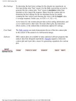
Youden plots are a graphical technique for analyzing interlab data when
each lab has made two runs on the same product or one run on two
different products.
The Youden plot is a simple but effective method for comparing both
the within-laboratory variability and the between-laboratory variability.
Sample Plot
This plot shows:
Not all labs are equivalent.1.
Lab 4 is biased low.2.
Lab 3 has within-lab variability problems.3.
Lab 5 has an outlying run.4.
1.3.3.31. Youden Plot
(1 of 2) [5/1/2006 9:57:09 AM]
Definition:
Response 1
Versus
Response 2
Coded by
Lab
Youden plots are formed by:
Vertical axis: Response variable 1 (i.e., run 1 or product 1
response value)
1.
Horizontal axis: Response variable 2 (i.e., run 2 or product 2
response value)
2.
In addition, the plot symbol is the lab id (typically an integer from 1 to k
where k is the number of labs). Sometimes a 45-degree reference line is
drawn. Ideally, a lab generating two runs of the same product should
produce reasonably similar results. Departures from this reference line
indicate inconsistency from the lab. If two different products are being
tested, then a 45-degree line may not be appropriate. However, if the
labs are consistent, the points should lie near some fitted straight line.
Questions The Youden plot can be used to answer the following questions:
Are all labs equivalent?1.
What labs have between-lab problems (reproducibility)?2.
What labs have within-lab problems (repeatability)?3.
What labs are outliers?4.
Importance In interlaboratory studies or in comparing two runs from the same lab, it
is useful to know if consistent results are generated. Youden plots
should be a routine plot for analyzing this type of data.
DEX Youden
Plot
The dex Youden plot is a specialized Youden plot used in the design of
experiments. In particular, it is useful for full and fractional designs.
Related
Techniques
Scatter Plot
Software The Youden plot is essentially a scatter plot, so it should be feasible to
write a macro for a Youden plot in any general purpose statistical
program that supports scatter plots. Dataplot supports a Youden plot.
1.3.3.31. Youden Plot
(2 of 2) [5/1/2006 9:57:09 AM]
"-1" or "+1".
In summary, the dex Youden plot is a plot of the mean of the response
variable for the high level of a factor or interaction term against the
mean of the response variable for the low level of that factor or
interaction term.
For unimportant factors and interaction terms, these mean values
should be nearly the same. For important factors and interaction terms,
these mean values should be quite different. So the interpretation of the
plot is that unimportant factors should be clustered together near the
grand mean. Points that stand apart from this cluster identify important
factors that should be included in the model.
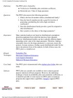
Sample DEX
Youden Plot
The following is a dex Youden plot for the data used in the Eddy
current case study. The analysis in that case study demonstrated that
X1 and X2 were the most important factors.
Interpretation
of the Sample
DEX Youden
Plot
From the above dex Youden plot, we see that factors 1 and 2 stand out
from the others. That is, the mean response values for the low and high
levels of factor 1 and factor 2 are quite different. For factor 3 and the 2
and 3-term interactions, the mean response values for the low and high
levels are similar.
We would conclude from this plot that factors 1 and 2 are important
and should be included in our final model while the remaining factors
and interactions should be omitted from the final model.
1.3.3.31.1. DEX Youden Plot
(2 of 3) [5/1/2006 9:57:10 AM]
Case Study The Eddy current case study demonstrates the use of the dex Youden
plot in the context of the analysis of a full factorial design.
Software DEX Youden plots are not typically available as built-in plots in
statistical software programs. However, it should be relatively
straightforward to write a macro to generate this plot in most general
purpose statistical software programs.
1.3.3.31.1. DEX Youden Plot
(3 of 3) [5/1/2006 9:57:10 AM]
Sample Plot:
Process Has
Fixed
Location,
Fixed
Variation,
Non-Random
(Oscillatory),
Non-Normal
U-Shaped
Distribution,
and Has 3
Outliers.
This 4-plot reveals the following:
the fixed location assumption is justified as shown by the run
sequence plot in the upper left corner.
1.
the fixed variation assumption is justified as shown by the run
sequence plot in the upper left corner.
2.
the randomness assumption is violated as shown by the
non-random (oscillatory) lag plot in the upper right corner.
3.
the assumption of a common, normal distribution is violated as
shown by the histogram in the lower left corner and the normal
probability plot in the lower right corner. The distribution is
non-normal and is a U-shaped distribution.
4.
there are several outliers apparent in the lag plot in the upper
right corner.
5.
1.3.3.32. 4-Plot
(2 of 5) [5/1/2006 9:57:10 AM]
Definition:
1. Run
Sequence
Plot;
2. Lag Plot;
3. Histogram;
4. Normal
Probability
Plot
The 4-plot consists of the following:
Run sequence plot to test fixed location and variation.
Vertically: Y
i
❍
Horizontally: i❍
1.
Lag Plot to test randomness.
Vertically: Y
i
❍
Horizontally: Y
i-1
❍
2.
Histogram to test (normal) distribution.
Vertically: Counts
❍
Horizontally: Y❍
3.
Normal probability plot to test normal distribution.
Vertically: Ordered Y
i
❍
Horizontally: Theoretical values from a normal N(0,1)
distribution for ordered Y
i
❍
4.
Questions 4-plots can provide answers to many questions:
Is the process in-control, stable, and predictable?1.
Is the process drifting with respect to location?2.
Is the process drifting with respect to variation?3.
Are the data random?4.
Is an observation related to an adjacent observation?5.
If the data are a time series, is is white noise?6.
If the data are a time series and not white noise, is it sinusoidal,
autoregressive, etc.?
7.
If the data are non-random, what is a better model?8.
Does the process follow a normal distribution?9.
If non-normal, what distribution does the process follow?10.
Is the model
valid and sufficient?
11.
If the default model is insufficient, what is a better model?12.
Is the formula
valid?13.
Is the sample mean a good estimator of the process location?14.
If not, what would be a better estimator?15.
Are there any outliers?16.
1.3.3.32. 4-Plot
(3 of 5) [5/1/2006 9:57:10 AM]
Importance:
Testing
Underlying
Assumptions
Helps Ensure
the Validity of
the Final
Scientific and
Engineering
Conclusions
There are 4 assumptions that typically underlie all measurement
processes; namely, that the data from the process at hand "behave
like":
random drawings;1.
from a fixed distribution;2.
with that distribution having a fixed location; and3.
with that distribution having fixed variation.4.
Predictability is an all-important goal in science and engineering. If
the above 4 assumptions hold, then we have achieved probabilistic
predictability the ability to make probability statements not only
about the process in the past, but also about the process in the future.
In short, such processes are said to be "statistically in control". If the 4
assumptions do not hold, then we have a process that is drifting (with
respect to location, variation, or distribution), is unpredictable, and is
out of control. A simple characterization of such processes by a
location estimate, a variation estimate, or a distribution "estimate"
inevitably leads to optimistic and grossly invalid engineering
conclusions.
Inasmuch as the validity of the final scientific and engineering
conclusions is inextricably linked to the validity of these same 4
underlying assumptions, it naturally follows that there is a real
necessity for all 4 assumptions to be routinely tested. The 4-plot (run
sequence plot, lag plot, histogram, and normal probability plot) is seen
as a simple, efficient, and powerful way of carrying out this routine
checking.
Interpretation:
Flat,
Equi-Banded,
Random,
Bell-Shaped,
and Linear
Of the 4 underlying assumptions:
If the fixed location assumption holds, then the run sequence
plot will be flat and non-drifting.
1.
If the fixed variation assumption holds, then the vertical spread
in the run sequence plot will be approximately the same over
the entire horizontal axis.
2.
If the randomness assumption holds, then the lag plot will be
structureless and random.
3.
If the fixed distribution assumption holds (in particular, if the
fixed normal distribution assumption holds), then the histogram
will be bell-shaped and the normal probability plot will be
approximatelylinear.
4.
If all 4 of the assumptions hold, then the process is "statistically in
control". In practice, many processes fall short of achieving this ideal.
1.3.3.32. 4-Plot
(4 of 5) [5/1/2006 9:57:10 AM]
Related
Techniques
Run Sequence Plot
Lag Plot
Histogram
Normal Probability Plot
Autocorrelation Plot
Spectral Plot
PPCC Plot
Case Studies The 4-plot is used in most of the case studies in this chapter:
Normal random numbers (the ideal)1.
Uniform random numbers2.
Random walk3.
Josephson junction cryothermometry4.
Beam deflections5.
Filter transmittance6.
Standard resistor7.
Heat flow meter 18.
Software It should be feasible to write a macro for the 4-plot in any general
purpose statistical software program that supports the capability for
multiple plots per page and supports the underlying plot techniques.
Dataplot supports the 4-plot.
1.3.3.32. 4-Plot
(5 of 5) [5/1/2006 9:57:10 AM]
This 6-plot, which followed a linear fit, shows that the linear model is
not adequate. It suggests that a quadratic model would be a better
model.
Definition:
6
Component
Plots
The 6-plot consists of the following:
Response and predicted values
Vertical axis: Response variable, predicted values
❍
Horizontal axis: Independent variable❍
1.
Residuals versus independent variable
Vertical axis: Residuals
❍
Horizontal axis: Independent variable❍
2.
Residuals versus predicted values
Vertical axis: Residuals
❍
Horizontal axis: Predicted values❍
3.
Lag plot of residuals
Vertical axis: RES(I)
❍
Horizontal axis: RES(I-1)❍
4.
Histogram of residuals
Vertical axis: Counts
❍
Horizontal axis: Residual values❍
5.
Normal probability plot of residuals
Vertical axis: Ordered residuals
❍
Horizontal axis: Theoretical values from a normal N(0,1)❍
6.
1.3.3.33. 6-Plot
(2 of 4) [5/1/2006 9:57:11 AM]
distribution for ordered residuals
Questions The 6-plot can be used to answer the following questions:
Are the residuals approximately normally distributed with a fixed
location and scale?
1.
Are there outliers?2.
Is the fit adequate?3.
Do the residuals suggest a better fit?4.
Importance:
Validating
Model
A model involving a response variable and a single independent variable
has the form:
where Y is the response variable, X is the independent variable, f is the
linear or non-linear fit function, and E is the random component. For a
good model, the error component should behave like:
random drawings (i.e., independent);1.
from a fixed distribution;2.
with fixed location; and3.
with fixed variation.4.
In addition, for fitting models it is usually further assumed that the fixed
distribution is normal and the fixed location is zero. For a good model
the fixed variation should be as small as possible. A necessary
component of fitting models is to verify these assumptions for the error
component and to assess whether the variation for the error component
is sufficiently small. The histogram, lag plot, and normal probability
plot are used to verify the fixed distribution, location, and variation
assumptions on the error component. The plot of the response variable
and the predicted values versus the independent variable is used to
assess whether the variation is sufficiently small. The plots of the
residuals versus the independent variable and the predicted values is
used to assess the independence assumption.
Assessing the validity and quality of the fit in terms of the above
assumptions is an absolutely vital part of the model-fitting process. No
fit should be considered complete without an adequate model validation
step.
1.3.3.33. 6-Plot
(3 of 4) [5/1/2006 9:57:11 AM]
Related
Techniques
Linear Least Squares
Non-Linear Least Squares
Scatter Plot
Run Sequence Plot
Lag Plot
Normal Probability Plot
Histogram
Case Study
The 6-plot is used in the Alaska pipeline data case study.
Software It should be feasible to write a macro for the 6-plot in any general
purpose statistical software program that supports the capability for
multiple plots per page and supports the underlying plot techniques.
Dataplot supports the 6-plot.
1.3.3.33. 6-Plot
(4 of 4) [5/1/2006 9:57:11 AM]
Box-Cox
Normality Plot:
1.3.3.6
Bootstrap Plot:
1.3.3.4
Time Series
y = f(t) + e
Run Sequence
Plot: 1.3.3.25
Spectral Plot:
1.3.3.27
Autocorrelation
Plot: 1.3.3.1
Complex
Demodulation
Amplitude Plot:
1.3.3.8
Complex
Demodulation
Phase Plot:
1.3.3.9
1 Factor
y = f(x) + e
Scatter Plot:
1.3.3.26
Box Plot: 1.3.3.7 Bihistogram:
1.3.3.2
1.3.4. Graphical Techniques: By Problem Category
(2 of 4) [5/1/2006 9:57:11 AM]
Quantile-Quantile
Plot: 1.3.3.24
Mean Plot:
1.3.3.20
Standard
Deviation Plot:
1.3.3.28
Multi-Factor/Comparative
y = f(xp, x1,x2, ,xk) + e
Block Plot:
1.3.3.3
Multi-Factor/Screening
y = f(x1,x2,x3, ,xk) + e
DEX Scatter
Plot: 1.3.3.11
DEX Mean Plot:
1.3.3.12
DEX Standard
Deviation Plot:
1.3.3.13
Contour Plot:
1.3.3.10
1.3.4. Graphical Techniques: By Problem Category
(3 of 4) [5/1/2006 9:57:11 AM]
Regression
y = f(x1,x2,x3, ,xk) + e
Scatter Plot:
1.3.3.26
6-Plot: 1.3.3.33 Linear
Correlation Plot:
1.3.3.16
Linear Intercept
Plot: 1.3.3.17
Linear Slope
Plot: 1.3.3.18
Linear Residual
Standard
Deviation
Plot:1.3.3.19
Interlab
(y1,y2) = f(x) + e
Youden Plot:
1.3.3.31
Multivariate
(y1,y2, ,yp)
Star Plot:
1.3.3.29
1.3.4. Graphical Techniques: By Problem Category
(4 of 4) [5/1/2006 9:57:11 AM]
values of an interval which will, with a given level of confidence (i.e.,
probability), contain the population parameter.
Hypothesis
Tests
Hypothesis tests also address the uncertainty of the sample estimate.
However, instead of providing an interval, a hypothesis test attempts to
refute a specific claim about a population parameter based on the
sample data. For example, the hypothesis might be one of the
following:
the population mean is equal to 10
●
the population standard deviation is equal to 5●
the means from two populations are equal●
the standard deviations from 5 populations are equal●
To reject a hypothesis is to conclude that it is false. However, to accept
a hypothesis does not mean that it is true, only that we do not have
evidence to believe otherwise. Thus hypothesis tests are usually stated
in terms of both a condition that is doubted (null hypothesis) and a
condition that is believed (alternative hypothesis).
A common format for a hypothesis test is:
H
0
: A statement of the null hypothesis, e.g., two
population means are equal.
H
a
: A statement of the alternative hypothesis, e.g., two
population means are not equal.
Test Statistic: The test statistic is based on the specific
hypothesis test.
Significance Level: The significance level,
, defines the sensitivity of
the test. A value of
= 0.05 means that we
inadvertently reject the null hypothesis 5% of the
time when it is in fact true. This is also called the
type I error. The choice of
is somewhat
arbitrary, although in practice values of 0.1, 0.05,
and 0.01 are commonly used.
The probability of rejecting the null hypothesis
when it is in fact false is called the power of the
test and is denoted by 1 -
. Its complement, the
probability of accepting the null hypothesis when
the alternative hypothesis is, in fact, true (type II
error), is called
and can only be computed for a
specific alternative hypothesis.
1.3.5. Quantitative Techniques
(2 of 4) [5/1/2006 9:57:12 AM]
Critical Region: The critical region encompasses those values of
the test statistic that lead to a rejection of the null
hypothesis. Based on the distribution of the test
statistic and the significance level, a cut-off value
for the test statistic is computed. Values either
above or below or both (depending on the
direction of the test) this cut-off define the critical
region.
Practical
Versus
Statistical
Significance
It is important to distinguish between statistical significance and
practical significance. Statistical significance simply means that we
reject the null hypothesis. The ability of the test to detect differences
that lead to rejection of the null hypothesis depends on the sample size.
For example, for a particularly large sample, the test may reject the null
hypothesis that two process means are equivalent. However, in practice
the difference between the two means may be relatively small to the
point of having no real engineering significance. Similarly, if the
sample size is small, a difference that is large in engineering terms may
not lead to rejection of the null hypothesis. The analyst should not just
blindly apply the tests, but should combine engineering judgement with
statistical analysis.
Bootstrap
Uncertainty
Estimates
In some cases, it is possible to mathematically derive appropriate
uncertainty intervals. This is particularly true for intervals based on the
assumption of a normal distribution. However, there are many cases in
which it is not possible to mathematically derive the uncertainty. In
these cases, the bootstrap provides a method for empirically
determining an appropriate interval.
Table of
Contents
Some of the more common classical quantitative techniques are listed
below. This list of quantitative techniques is by no means meant to be
exhaustive. Additional discussions of classical statistical techniques are
contained in the product comparisons chapter.
Location
Measures of Location1.
Confidence Limits for the Mean and One Sample t-Test2.
Two Sample t-Test for Equal Means3.
One Factor Analysis of Variance4.
Multi-Factor Analysis of Variance5.
●
Scale (or variability or spread)
Measures of Scale1.
Bartlett's Test2.
●
1.3.5. Quantitative Techniques
(3 of 4) [5/1/2006 9:57:12 AM]
Chi-Square Test3.
F-Test4.
Levene Test5.
Skewness and Kurtosis
Measures of Skewness and Kurtosis1.
●
Randomness
Autocorrelation1.
Runs Test2.
●
Distributional Measures
Anderson-Darling Test1.
Chi-Square Goodness-of-Fit Test2.
Kolmogorov-Smirnov Test3.
●
Outliers
Grubbs Test1.
●
2-Level Factorial Designs
Yates Analysis1.
●
1.3.5. Quantitative Techniques
(4 of 4) [5/1/2006 9:57:12 AM]
specific value may not occur more than once if the data are
continuous. What may be a more meaningful, if less exact
measure, is the midpoint of the class interval of the histogram
with the highest peak.
Why
Different
Measures
A natural question is why we have more than one measure of the typical
value. The following example helps to explain why these alternative
definitions are useful and necessary.
This plot shows histograms for 10,000 random numbers generated from
a normal, an exponential, a Cauchy, and a lognormal distribution.
Normal
Distribution
The first histogram is a sample from a normal distribution. The mean is
0.005, the median is -0.010, and the mode is -0.144 (the mode is
computed as the midpoint of the histogram interval with the highest
peak).
The normal distribution is a symmetric distribution with well-behaved
tails and a single peak at the center of the distribution. By symmetric,
we mean that the distribution can be folded about an axis so that the 2
sides coincide. That is, it behaves the same to the left and right of some
center point. For a normal distribution, the mean, median, and mode are
actually equivalent. The histogram above generates similar estimates for
the mean, median, and mode. Therefore, if a histogram or normal
probability plot indicates that your data are approximated well by a
normal distribution, then it is reasonable to use the mean as the location
estimator.
1.3.5.1. Measures of Location
(2 of 5) [5/1/2006 9:57:12 AM]
Exponential
Distribution
The second histogram is a sample from an exponential distribution. The
mean is 1.001, the median is 0.684, and the mode is 0.254 (the mode is
computed as the midpoint of the histogram interval with the highest
peak).
The exponential distribution is a skewed, i. e., not symmetric,
distribution. For skewed distributions, the mean and median are not the
same. The mean will be pulled in the direction of the skewness. That is,
if the right tail is heavier than the left tail, the mean will be greater than
the median. Likewise, if the left tail is heavier than the right tail, the
mean will be less than the median.
For skewed distributions, it is not at all obvious whether the mean, the
median, or the mode is the more meaningful measure of the typical
value. In this case, all three measures are useful.
Cauchy
Distribution
The third histogram is a sample from a Cauchy distribution. The mean is
3.70, the median is -0.016, and the mode is -0.362 (the mode is
computed as the midpoint of the histogram interval with the highest
peak).
For better visual comparison with the other data sets, we restricted the
histogram of the Cauchy distribution to values between -10 and 10. The
full Cauchy data set in fact has a minimum of approximately -29,000
and a maximum of approximately 89,000.
The Cauchy distribution is a symmetric distribution with heavy tails and
a single peak at the center of the distribution. The Cauchy distribution
has the interesting property that collecting more data does not provide a
more accurate estimate of the mean. That is, the sampling distribution of
the mean is equivalent to the sampling distribution of the original data.
This means that for the Cauchy distribution the mean is useless as a
measure of the typical value. For this histogram, the mean of 3.7 is well
above the vast majority of the data. This is caused by a few very
extreme values in the tail. However, the median does provide a useful
measure for the typical value.
Although the Cauchy distribution is an extreme case, it does illustrate
the importance of heavy tails in measuring the mean. Extreme values in
the tails distort the mean. However, these extreme values do not distort
the median since the median is based on ranks. In general, for data with
extreme values in the tails, the median provides a better estimate of
location than does the mean.
1.3.5.1. Measures of Location
(3 of 5) [5/1/2006 9:57:12 AM]