Engineering Statistics Handbook Episode 1 Part 3 pdf
Bạn đang xem bản rút gọn của tài liệu. Xem và tải ngay bản đầy đủ của tài liệu tại đây (95.7 KB, 16 trang )
1. Exploratory Data Analysis
1.3. EDA Techniques
1.3.1.Introduction
Graphical
and
Quantitative
Techniques
This section describes many techniques that are commonly used in
exploratory and classical data analysis. This list is by no means meant
to be exhaustive. Additional techniques (both graphical and
quantitative) are discussed in the other chapters. Specifically, the
product comparisons chapter has a much more detailed description of
many classical statistical techniques.
EDA emphasizes graphical techniques while classical techniques
emphasize quantitative techniques. In practice, an analyst typically
uses a mixture of graphical and quantitative techniques. In this section,
we have divided the descriptions into graphical and quantitative
techniques. This is for organizational clarity and is not meant to
discourage the use of both graphical and quantitiative techniques when
analyzing data.
Use of
Techniques
Shown in
Case Studies
This section emphasizes the techniques themselves; how the graph or
test is defined, published references, and sample output. The use of the
techniques to answer engineering questions is demonstrated in the case
studies section. The case studies do not demonstrate all of the
techniques.
Availability
in Software
The sample plots and output in this section were generated with the
Dataplot software program. Other general purpose statistical data
analysis programs can generate most of the plots, intervals, and tests
discussed here, or macros can be written to acheive the same result.
1.3.1. Introduction
[5/1/2006 9:56:27 AM]
EDA
Approach
Emphasizes
Graphics
Most of these questions can be addressed by techniques discussed in this
chapter. The process modeling and process improvement chapters also
address many of the questions above. These questions are also relevant
for the classical approach to statistics. What distinguishes the EDA
approach is an emphasis on graphical techniques to gain insight as
opposed to the classical approach of quantitative tests. Most data
analysts will use a mix of graphical and classical quantitative techniques
to address these problems.
1.3.2. Analysis Questions
(2 of 2) [5/1/2006 9:56:27 AM]
DEX Standard
Deviation Plot:
1.3.3.13
Histogram:
1.3.3.14
Lag Plot: 1.3.3.15 Linear Correlation
Plot: 1.3.3.16
Linear Intercept
Plot: 1.3.3.17
Linear Slope Plot:
1.3.3.18
Linear Residual
Standard Deviation
Plot: 1.3.3.19
Mean Plot: 1.3.3.20
Normal Probability
Plot: 1.3.3.21
Probability Plot:
1.3.3.22
Probability Plot
Correlation
Coefficient Plot:
1.3.3.23
Quantile-Quantile
Plot: 1.3.3.24
Run Sequence
Plot: 1.3.3.25
Scatter Plot:
1.3.3.26
Spectrum: 1.3.3.27 Standard Deviation
Plot: 1.3.3.28
1.3.3. Graphical Techniques: Alphabetic
(2 of 3) [5/1/2006 9:56:29 AM]
Star Plot: 1.3.3.29 Weibull Plot:
1.3.3.30
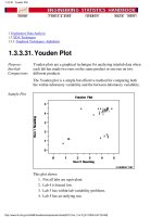
Youden Plot:
1.3.3.31
4-Plot: 1.3.3.32
6-Plot: 1.3.3.33
1.3.3. Graphical Techniques: Alphabetic
(3 of 3) [5/1/2006 9:56:29 AM]
Definition:
r(h) versus h
Autocorrelation plots are formed by
Vertical axis: Autocorrelation coefficient
where C
h
is the autocovariance function
and C
0
is the variance function
Note R
h
is between -1 and +1.
Note Some sources may use the following formula for the
autocovariance function
Although this definition has less bias, the (1/N) formulation
has some desirable statistical properties and is the form most
commonly used in the statistics literature. See pages 20 and
49-50 in Chatfield for details.
●
Horizontal axis: Time lag h (h = 1, 2, 3, )●
The above line also contains several horizontal reference
lines. The middle line is at zero. The other four lines are 95%
and 99% confidence bands. Note that there are two distinct
formulas for generating the confidence bands.
If the autocorrelation plot is being used to test for
randomness (i.e., there is no time dependence in the
data), the following formula is recommended:
where N is the sample size, z is the percent point
function of the standard normal distribution and
is
the. significance level. In this case, the confidence
bands have fixed width that depends on the sample
size. This is the formula that was used to generate the
confidence bands in the above plot.
1.
●
1.3.3.1. Autocorrelation Plot
(2 of 5) [5/1/2006 9:56:30 AM]
Autocorrelation plots are also used in the model
identification stage for fitting ARIMA models. In this
case, a moving average model is assumed for the data
and the following confidence bands should be
generated:
where k is the lag, N is the sample size, z is the percent
point function of the standard normal distribution and
is. the significance level. In this case, the confidence
bands increase as the lag increases.
2.
Questions The autocorrelation plot can provide answers to the following
questions:
Are the data random?1.
Is an observation related to an adjacent observation?2.
Is an observation related to an observation twice-removed?
(etc.)
3.
Is the observed time series white noise?4.
Is the observed time series sinusoidal?5.
Is the observed time series autoregressive?6.
What is an appropriate model for the observed time series?7.
Is the model
Y = constant + error
valid and sufficient?
8.
Is the formula
valid?9.
1.3.3.1. Autocorrelation Plot
(3 of 5) [5/1/2006 9:56:30 AM]
Importance:
Ensure validity
of engineering
conclusions
Randomness (along with fixed model, fixed variation, and fixed
distribution) is one of the four assumptions that typically underlie all
measurement processes. The randomness assumption is critically
important for the following three reasons:
Most standard statistical tests depend on randomness. The
validity of the test conclusions is directly linked to the
validity of the randomness assumption.
1.
Many commonly-used statistical formulae depend on the
randomness assumption, the most common formula being the
formula for determining the standard deviation of the sample
mean:
where is the standard deviation of the data. Although
heavily used, the results from using this formula are of no
value unless the randomness assumption holds.
2.
For univariate data, the default model is
Y = constant + error
If the data are not random, this model is incorrect and invalid,
and the estimates for the parameters (such as the constant)
become nonsensical and invalid.
3.
In short, if the analyst does not check for randomness, then the
validity of many of the statistical conclusions becomes suspect. The
autocorrelation plot is an excellent way of checking for such
randomness.
Examples Examples of the autocorrelation plot for several common situations
are given in the following pages.
Random (= White Noise)1.
Weak autocorrelation2.
Strong autocorrelation and autoregressive model3.
Sinusoidal model4.
Related
Techniques
Partial Autocorrelation Plot
Lag Plot
Spectral Plot
Seasonal Subseries Plot
Case Study
The autocorrelation plot is demonstrated in the beam deflection data
case study.
1.3.3.1. Autocorrelation Plot
(4 of 5) [5/1/2006 9:56:30 AM]
Software Autocorrelation plots are available in most general purpose
statistical software programs including Dataplot.
1.3.3.1. Autocorrelation Plot
(5 of 5) [5/1/2006 9:56:30 AM]
Discussion Note that with the exception of lag 0, which is always 1 by
definition, almost all of the autocorrelations fall within the 95%
confidence limits. In addition, there is no apparent pattern (such as
the first twenty-five being positive and the second twenty-five being
negative). This is the abscence of a pattern we expect to see if the
data are in fact random.
A few lags slightly outside the 95% and 99% confidence limits do
not neccessarily indicate non-randomness. For a 95% confidence
interval, we might expect about one out of twenty lags to be
statistically significant due to random fluctuations.
There is no associative ability to infer from a current value Y
i
as to
what the next value Y
i+1
will be. Such non-association is the essense
of randomness. In short, adjacent observations do not "co-relate", so
we call this the "no autocorrelation" case.
1.3.3.1.1. Autocorrelation Plot: Random Data
(2 of 2) [5/1/2006 9:56:30 AM]
Recommended
Next Step
The next step would be to estimate the parameters for the
autoregressive model:
Such estimation can be performed by using least squares linear
regression or by fitting a Box-Jenkins autoregressive (AR) model.
The randomness assumption for least squares fitting applies to the
residuals of the model. That is, even though the original data exhibit
randomness, the residuals after fitting Y
i
against Y
i-1
should result in
random residuals. Assessing whether or not the proposed model in
fact sufficiently removed the randomness is discussed in detail in the
Process Modeling chapter.
The residual standard deviation for this autoregressive model will be
much smaller than the residual standard deviation for the default
model
1.3.3.1.2. Autocorrelation Plot: Moderate Autocorrelation
(2 of 2) [5/1/2006 9:56:30 AM]
Discussion The plot starts with a high autocorrelation at lag 1 (only slightly less
than 1) that slowly declines. It continues decreasing until it becomes
negative and starts showing an incresing negative autocorrelation.
The decreasing autocorrelation is generally linear with little noise.
Such a pattern is the autocorrelation plot signature of "strong
autocorrelation", which in turn provides high predictability if
modeled properly.
Recommended
Next Step
The next step would be to estimate the parameters for the
autoregressive model:
Such estimation can be performed by using least squares linear
regression or by fitting a Box-Jenkins autoregressive (AR) model.
The randomness assumption for least squares fitting applies to the
residuals of the model. That is, even though the original data exhibit
randomness, the residuals after fitting Y
i
against Y
i-1
should result in
random residuals. Assessing whether or not the proposed model in
fact sufficiently removed the randomness is discussed in detail in the
Process Modeling chapter.
The residual standard deviation for this autoregressive model will be
much smaller than the residual standard deviation for the default
model
1.3.3.1.3. Autocorrelation Plot: Strong Autocorrelation and Autoregressive Model
(2 of 2) [5/1/2006 9:56:31 AM]
1.3.3.1.4. Autocorrelation Plot: Sinusoidal Model
(2 of 2) [5/1/2006 9:56:31 AM]
factor has a significant effect on the location (typical value) for strength
and hence batch is said to be "significant" or to "have an effect". We
thus see graphically and convincingly what a t-test or analysis of
variance would indicate quantitatively.
With respect to variation, note that the spread (variation) of the
above-axis batch 1 histogram does not appear to be that much different
from the below-axis batch 2 histogram. With respect to distributional
shape, note that the batch 1 histogram is skewed left while the batch 2
histogram is more symmetric with even a hint of a slight skewness to
the right.
Thus the bihistogram reveals that there is a clear difference between the
batches with respect to location and distribution, but not in regard to
variation. Comparing batch 1 and batch 2, we also note that batch 1 is
the "better batch" due to its 100-unit higher average strength (around
725).
Definition:
Two
adjoined
histograms
Bihistograms are formed by vertically juxtaposing two histograms:
Above the axis: Histogram of the response variable for condition
1
●
Below the axis: Histogram of the response variable for condition
2
●
Questions The bihistogram can provide answers to the following questions:
Is a (2-level) factor significant?1.
Does a (2-level) factor have an effect?2.
Does the location change between the 2 subgroups?3.
Does the variation change between the 2 subgroups?4.
Does the distributional shape change between subgroups?5.
Are there any outliers?6.
Importance:
Checks 3 out
of the 4
underlying
assumptions
of a
measurement
process
The bihistogram is an important EDA tool for determining if a factor
"has an effect". Since the bihistogram provides insight into the validity
of three (location, variation, and distribution) out of the four (missing
only randomness) underlying assumptions in a measurement process, it
is an especially valuable tool. Because of the dual (above/below) nature
of the plot, the bihistogram is restricted to assessing factors that have
only two levels. However, this is very common in the
before-versus-after character of many scientific and engineering
experiments.
1.3.3.2. Bihistogram
(2 of 3) [5/1/2006 9:56:31 AM]
Related
Techniques
t test (for shift in location)
F test (for shift in variation)
Kolmogorov-Smirnov test (for shift in distribution)
Quantile-quantile plot (for shift in location and distribution)
Case Study
The bihistogram is demonstrated in the ceramic strength data case
study.
Software The bihistogram is not widely available in general purpose statistical
software programs. Bihistograms can be generated using Dataplot
1.3.3.2. Bihistogram
(3 of 3) [5/1/2006 9:56:31 AM]
Definition Block Plots are formed as follows:
Vertical axis: Response variable Y
●
Horizontal axis: All combinations of all levels of all nuisance
(secondary) factors X1, X2,
●
Plot Character: Levels of the primary factor XP●
Discussion:
Primary
factor is
denoted by
plot
character:
within-bar
plot
character.
Average number of defective lead wires per hour from a study with four
factors,
weld strength (2 levels)1.
plant (2 levels)2.
speed (2 levels)3.
shift (3 levels)4.
are shown in the plot above. Weld strength is the primary factor and the
other three factors are nuisance factors. The 12 distinct positions along
the horizontal axis correspond to all possible combinations of the three
nuisance factors, i.e., 12 = 2 plants x 2 speeds x 3 shifts. These 12
conditions provide the framework for assessing whether any conclusions
about the 2 levels of the primary factor (weld method) can truly be
called "general conclusions". If we find that one weld method setting
does better (smaller average defects per hour) than the other weld
method setting for all or most of these 12 nuisance factor combinations,
then the conclusion is in fact general and robust.
Ordering
along the
horizontal
axis
In the above chart, the ordering along the horizontal axis is as follows:
The left 6 bars are from plant 1 and the right 6 bars are from plant
2.
●
The first 3 bars are from speed 1, the next 3 bars are from speed
2, the next 3 bars are from speed 1, and the last 3 bars are from
speed 2.
●
Bars 1, 4, 7, and 10 are from the first shift, bars 2, 5, 8, and 11 are
from the second shift, and bars 3, 6, 9, and 12 are from the third
shift.
●
1.3.3.3. Block Plot
(2 of 4) [5/1/2006 9:56:32 AM]
Setting 2 is
better than
setting 1 in
10 out of 12
cases
In the block plot for the first bar (plant 1, speed 1, shift 1), weld method
1 yields about 28 defects per hour while weld method 2 yields about 22
defects per hour hence the difference for this combination is about 6
defects per hour and weld method 2 is seen to be better (smaller number
of defects per hour).
Is "weld method 2 is better than weld method 1" a general conclusion?
For the second bar (plant 1, speed 1, shift 2), weld method 1 is about 37
while weld method 2 is only about 18. Thus weld method 2 is again seen
to be better than weld method 1. Similarly for bar 3 (plant 1, speed 1,
shift 3), we see weld method 2 is smaller than weld method 1. Scanning
over all of the 12 bars, we see that weld method 2 is smaller than weld
method 1 in 10 of the 12 cases, which is highly suggestive of a robust
weld method effect.
An event
with chance
probability
of only 2%
What is the chance of 10 out of 12 happening by chance? This is
probabilistically equivalent to testing whether a coin is fair by flipping it
and getting 10 heads in 12 tosses. The chance (from the binomial
distribution) of getting 10 (or more extreme: 11, 12) heads in 12 flips of
a fair coin is about 2%. Such low-probability events are usually rejected
as untenable and in practice we would conclude that there is a difference
in weld methods.
Advantage:
Graphical
and
binomial
The advantages of the block plot are as follows:
A quantitative procedure (analysis of variance) is replaced by a
graphical procedure.
●
An F-test (analysis of variance) is replaced with a binomial test,
which requires fewer assumptions.
●
Questions The block plot can provide answers to the following questions:
Is the factor of interest significant?1.
Does the factor of interest have an effect?2.
Does the location change between levels of the primary factor?3.
Has the process improved?4.
What is the best setting (= level) of the primary factor?5.
How much of an average improvement can we expect with this
best setting of the primary factor?
6.
Is there an interaction between the primary factor and one or more
nuisance factors?
7.
Does the effect of the primary factor change depending on the
setting of some nuisance factor?
8.
1.3.3.3. Block Plot
(3 of 4) [5/1/2006 9:56:32 AM]