designing for the social webj PHẦN 9 docx
Bạn đang xem bản rút gọn của tài liệu. Xem và tải ngay bản đầy đủ của tài liệu tại đây (7.73 MB, 20 trang )
ptg
148 DESIGNING FOR THE SOCIAL WEB
q
Something easily
sharable
Person reads/views
a sharable object.
w
Call to action
Person is called
to action by an
interface element
positioned
appropriately
nearby.
e
Sharing form
Person fi lls out and
sends the sharing
form.
r
Recipients
interpret shared
message
The recipient needs
to understand what
this is and who it
is from.
t
Recipients act
The recipient
decides they’re
interested in what
is being shared.
AHA! I know
just who to share
this with!
Hmm… what is
this and why
should I care?
Oh, that
sounds great, it is
interesting!
That was
interesting!
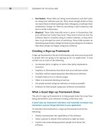
The Activity of Sharing
Sharing is a simple activity made up of several steps. For design purposes
it helps to break it down and examine each step. Here’s what a typical
sharing process looks like:
Figure 7.2 It’s easier to design for sharing when you break it down into separate steps.
In the following sections we go through each step, talking about the
design considerations that affect each one.
Sharers Discover Something Easily Sharable
The first step in the sharing process is someone discovering an item
worth sharing. Sharing works best for distinct items like movies, songs,
articles, and blog posts. These are perfect for sharing.
Here are some ways to make something easily sharable.
. Give it a permanent URL. URLs are core to the web. Give your item
a URL and then people can refer to it anywhere. And never, never
change that URL. For a rundown of the intricacies of URL creation,
read Tim Berners-Lee’s “Cool URLs don’t change.”
3
(You won’t believe
the gory technical details—or the benefits—of writing a good URL.
For example, writing better URLs will actually get you better search
result placement!)
.
Make it embeddable. In addition to giving the item a permanent
URL, make it embeddable, as long as it makes sense to do so. This
was key to the explosive growth of YouTube. Social objects are the
3 />ptg
CHAPTER 7 DESIGN FOR SHARING 149
easiest to embed, like YouTube videos, Flickr photos, and Slideshare
slideshows.
. Make it a PDF. PDFs are interesting things. They create the impres-
sion that their contents are more valuable than other formats
like HTML pages. It’s not entirely clear why, but people do love to
share them.
. Make it printer-friendly. Make your content printer-friendly so that
people can print it out and give it to others.
Sharers Heed the Call to Action
The call to action can be an interface element that signals the ability to
share an item with others. In many cases the call to action will be the
nudge that gets people to share.
Articles on the New York Times web site contain a typical set of calls to
action for sharing news articles.
Notice the designers at the Times have separated out the one-to-one
“E-Mail” option rather than including it under the list of “Share” options
(even though they are both for sharing). Most sites and apps group
these together.
YouTube is one such example. Their share feature is located directly
under each video, and combines email sharing with sharing to services
under a single “Share” link.
Figure 7.4 The sharing call to action on YouTube (youtube.com).
Of course, some people might share without using the feature you’ve
provided. That’s OK—you don’t need to force people to use your tools
(just be thankful they’re sharing in the first place). However, as in most
interaction design, prompting people helps: by providing a clear call to
action, you make it much more likely to happen, and you do remind
folks who didn’t know it was an option or don’t have an immediate
need for it.
Figure 7.3 The sharing
call to action on the
New York Times web site
(nytimes.com).
ptg
150 DESIGNING FOR THE SOCIAL WEB
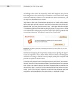
Keep the Call to Action Close
Increase the odds of sharing by placing the call to action close to the
thing being shared.
One of the more innovative ways to keep the call to action close is to do
what YouTube has done: actually replace the content with the sharing
element. When a video is done playing, the view area is replaced by
several features, including a share button. This draws extra attention
to the feature.
Figure 7.5 YouTube cleverly puts a call to action in the place where the video was playing.
Articles, unlike videos, don’t have a time dimension. So the Times places
their sharing box immediately to the right of an article, actually cutting
into the article itself. This makes it hard to miss.
ptg
CHAPTER 7 DESIGN FOR SHARING 151
Figure 7.6 The New York Times places their call to action appropriately close.
Contrast the New York Times layout with Wired magazine’s, which places
the sharing tools farther up on the right of the page. These are not
easily seen in the normal flow of reading, as they are above the hori-
zontal line created when someone starts reading the article. (I actually
looked around for a while before I found them here, as their position
in the right column separates them unexpectedly.) Unless readers are
proactively looking for them, they may not see them.
Figure 7.7 Wired’s call to action isn’t quite close enough to appear related.
ptg
152 DESIGNING FOR THE SOCIAL WEB
Another alternative to placing the toolbar to the side of the article is to
have a horizontal toolbar just below the article head. If it is distinctive
enough yet not visually heavy, readers can quickly scan over it, see
what’s there, and not be distracted. Figure 7.8 shows an example from
a site I designed called Publishing2.com.
Figure 7.8 Publishing 2.0’s call to action, in the regular fl ow of reading but distinguished
stylistically.
Time It Right
You’ll notice that the sharing call to action on the Times site is at the top
of the article, where it supports two contexts.
1. People who have just started reading
2. People who are returning to the article at some later point
This placement leaves a crucial context underserved: what about the
people who have just finished reading the article? People who have just
finished reading an article are the most likely to share, and the most
qualified, since they have just finished getting value from it. Now they
are ready for a new task. Yes, they might scroll back to the top, but
many times they won’t, and sometimes the top of the article will be on
a different page. So place the call to action at the end of the article as
well, where it is most timely. (It’s perfectly fine to have a share feature
in two places.)
Blogs tend to get this right, and offer sharing features at the end of
articles. A good example is the bottom of articles on the GigaOm blog.
Figure 7.9 For maximum effectiveness, place a call to action at the end of content.
ptg
CHAPTER 7 DESIGN FOR SHARING 153
Give Options for Sharing
While email is the primary way of sharing, people are using lots of tools
to manage their online content as well. These include bookmarking
services like Del.icio.us and Ma.gnolia, social news sites like Digg and
Newsvine, as well as social network sites like Facebook and MySpace.
For example, at Seth Godin’s blog, lots of people used the Del.icio.us link
at the bottom of each post to save his blog entries (the number of saves
is displayed). Providing support for the larger of these services makes
sense, as there’s a good chance readers will be familiar with them.
It would also make sense to support tools that you know your audience
happens to use. A good example is on an intranet: lots of intranets now
have their own bookmarking tools, so supporting “Save” features for
those makes sense.
Don’t go overboard
In the excitement of providing options for sharing, it’s tempting to offer
every option. This happened on blogs, where some designers created a
set of options for sharing that included, in some cases, dozens of applica-
tions. The result was a set of icons that simply overwhelmed.
Figure 7.10 When calls to action get out of hand.
Notice that the call to action is severely weakened with a long array of
icons. Since there are so many icons, it doesn’t make sense to include
text, which is often the most powerful call to action. Therefore, this
design leaves it up to the viewer to pick out their service by recognizing
the icon, which may be difficult.
ptg
154 DESIGNING FOR THE SOCIAL WEB
Sharers Use the Sharing Form
The sharing form is the form people must fill out in order to specify
with whom they wish to share.
Here is a typical sharing form that I designed for UIE.com.
Figure 7.11 A sharing form from UIE (User Interface Engineering).
This form contains four form elements: two input boxes, one textarea,
and the submit button. It’s a simple form, but only because we followed
the universal principle of form design:
Don’t ask for any information other than you need.
A good thing to keep in mind for any web form is to try to reduce the
number of items you request—as much as possible. The only field
absolutely required for sharing in most cases (this one included) is the
recipient’s email. With that single piece of information you can send
the sharing email. Still, I added two more fields. Why?
Well, I added “your email” for two reasons. One was familiarity. My
team wanted the share to come from a familiar address, so recipients
would be more likely to read it. Two, SPAM. We could have used the
email or something similar and forgone asking for the
sharer’s email, but with so much SPAM out there we decided that it was
good to try to identify who was sending. Many SPAM filter programs are
trained to allow email from friendly addresses.
ptg
CHAPTER 7 DESIGN FOR SHARING 155
I also added an optional “message” that people could use to write any-
thing they wanted. We found this to be tremendously useful in creating
context around the email. They could say something like “this is the
article I was talking about,” or “check out this viewpoint in regards to
our current project,” or something similar.
If there were no personal message option, the sharing wouldn’t have
been as valuable. However, I explicitly made this field optional so that
it didn’t slow down those folks who weren’t interested in it.
Note: I could have made it even more personal by asking for each person’s
name. In fact, an earlier version I designed had those fields. However,
the form seemed daunting for such a simple task, with quite a bit more
friction than the above version.
IBM, on the other hand, asks for such information.
Figure 7.12 The sharing form on IBM.com suffers several problems, one of which is that
it looks like a test.
ptg
156 DESIGNING FOR THE SOCIAL WEB
There are several problems with IBM’s sharing form:
. This looks like work. With six fields presented all in a column, this
form is daunting. The user came here wanting to simply send a web
page to someone else, and this seems like they’re taking a test.
. Too many required fields. There is only one field that is absolutely
required to send this form! However, IBM makes all six required
for submission.
. Completely unnecessary fields. Another thing, why does IBM ask
for last names here? What value is it adding? For someone sharing a
page with another, there is no reason to add a last name. You could
argue that the sender’s last name is possibly a good thing to ask, to
make certain the receiver knows exactly which Robert is sending
the email. But there is absolutely no reason to have the last name
of the recipient.
. Poor copywriting. If you do need to explain what the form is about
(and it’s questionable in this case), reinforce the value of sending the
form. The line “if you do not want to provide us with the required
information please use the back button” does the opposite. There
is no need for this explanation (obviously) and its presence raises
concerns. Imagine if all forms on the web had that text! In IBM’s
case, their best hope is that people don’t read the text! (The text at
the end of the form is better: letting people know that their email
is not being used for any other purpose is really important in this
day and age.)
Give People Something to Do After Sharing
Don’t treat sharing like it’s the last thing someone wants to do. In fact,
they might just be getting warmed up. Here is the follow-up message
for the form I designed above. It clearly communicates that the shar-
ing was successful, but also presents other options that might interest
people on the site.
Figure 7.13 A note confi rms that the sharing was successful. Follow that up with other
options people can take advantage of if they’re not done.
ptg
CHAPTER 7 DESIGN FOR SHARING 157
Remember, at this point the person is very special. They’ve just shared
your content with someone else! Give them every opportunity to par-
ticipate further.
Allow for Multiple Sharing
As we watched people share articles, we noticed that some people would
share with each of their team members, one by one, creating separate
emails for each person. This surprised us. We even had a few people
share a single article seven or eight times!
Support multiple sharing. When the sharing process is complete, show
the sharing form again near the place where you confirm success. Make it
easy to share again: pre-populate with the message they already entered,
so all the sharer has to do is change the name of the recipient.
Recipients Interpret Shared Message
How many times have you received an email from a friend or relative
only to discover that it was one of those “forward me and you’ll get
good luck” emails? While we probably like that person, we don’t appre-
ciate their readiness to share this type of email with us. This is the sad
state of sharing on the web. Even when people do share something
with us, we still have to evaluate it just as we would any other type
of information.
That’s why the email sent during sharing is so critical. It needs to
immediately signal to the receiver that it’s authentic and worthy of
their attention.
Consider the sharing email sent on MSNBC.com in figure 7.14.
Figure 7.14 An uninspired sharing email from MSNBC.com.
There are several problems with this email:
.
It looks like SPAM. This email looks like SPAM, the kiss of death. Even
though it is a completely legitimate email, it will likely be ignored.
ptg
158 DESIGNING FOR THE SOCIAL WEB
. It’s not personal. Other than the sender’s email, there is nothing
that identifies this email as being shared by two people who know
each other. Part of the problem here is that MSN did not provide
a message box in which sharers could write a personal message.
Even if they did, they would still have to do something with that
information in the email.
. It’s not authoritative. MSNBC is a reputable news organization, and
this email makes no effort to leverage that fact other than a mention
in the subject line. Referring to the organization in the body of the
email would lend more credibility to the message.
The email does do a good job of describing what the shared object is
about. But that’s all it does, and it risks being ignored.
The email I designed helped solve the above problems.
Figure 7.15 A sharing email that helps to set the right context for the recipient.
What is this?
Personal message
Description of shared item
Unique URI
Aftermatter
ptg
CHAPTER 7 DESIGN FOR SHARING 159
Once someone shares with someone else, that recipient has to recognize
and interpret the thing being shared.
The More Personal It Is, the More Powerful
If possible, use both parties’ names. This comes down to how much
you know. If the person sharing is logged in, you probably know their
name or other information already. Pre-populate the form with any
information you know, and filling out the rest of the form will seem
easier for them.
Also, it’s OK to give people a message that is pre-written, as long as
people can easily change it before it’s sent out. Surprisingly, Amazon
gets this wrong by providing a message that people cannot edit.
Figure 7.16 Amazon doesn’t let you edit the message when you send someone your
wish list.
ptg
160 DESIGNING FOR THE SOCIAL WEB
Amazon has really gotten it wrong with this email, for several reasons:
. This form literally puts words into people’s mouths, as they can’t
change the text.
.
The copywriting is painful. It creates a fake history for the person and
sounds like it was written by someone desperate to make a sale.
. It is obvious that nobody would write this to a friend. Do friends
sign their last names? No.
Amazon’s odd design choice to prevent people from personalizing the
sharing email makes the act of sharing a wish list impersonal. Any
advantage they could gain by allowing people to send it in their own
identity is lost.
Recipients Act
The last step in the activity of sharing is that the recipients do some-
thing. If the sharer sent them an article, they’ll read it. If it was a video,
they’ll watch it.
Presumably, you have already designed these objects to be easily used.
But it’s extremely important to pay attention to this act, so you can find
out if the sharing is working. If a hundred people share your stuff, and
only one is then using your application, it may mean there’s a problem in
the sharing process. Compare the sharing sends to the incoming actions.
This percentage should be high—almost everybody. If the percentage
is low, your email could be getting seen as SPAM.
Use Sharing Results to Inform What You’re Doing
The New York Times has a list of the most-shared articles. It counts the
number of times an article has been shared and ranks them over three
time frames: the last twenty-four hours, the last seven days, and the
last month.
ptg
CHAPTER 7 DESIGN FOR SHARING 161
Figure 7.17 The New York Times’ most shared screen. It’s a great way to see what
people are fi nding most valuable on the site.
This list is very valuable for the people using the site, who can use it to
find the most popular content quickly, without having to search through
each directory to find it. On a site as large as the New York Times, this
is a real time saver.
In addition, the New York Times itself can learn a lot from a list like this.
Not only do they learn what people find most valuable, but they can also
track topics over time. Do some topics get shared more or less often?
If so, the writers can use that information to plan future content around
those topics people seem to enjoy most. By watching the trends that
emerge in the sharing patterns over time, the Times can tweak its future
content strategy when necessary.
Other Ways to Share
In order to highlight the five steps of sharing, we focused on sharing
content with others. But there are other ways to enable people to help
share their enthusiasm about your service with others.
ptg
162 DESIGNING FOR THE SOCIAL WEB
. Affiliate programs. Affiliate programs let people who use your soft-
ware share it with others by offering them a way to refer people. For
example, Amazon has an affiliate program, which allows people to
embed shopping links in their web pages that send surfers directly
to Amazon’s site for purchase. This drives more traffic to Amazon,
while giving affiliates a small percentage of sales.
.
Simple Invitations. Many applications offer a simple invitation
feature. Facebook, for example, asks you to “Invite your friends.”
They allow you to import all of your addresses from web-based mail
systems such as Hotmail, Gmail, and Yahoo Mail. This makes it easy
for people to share their excitement about the service with others.
. Testimonials. As we mentioned in Chapter 4, Design for Sign-up,
testimonials are a powerful way to expose the passion of the people
who use your service. Leverage them not just for sign-up, but for
all aspects of your customer-facing activities. Include them in
emails, articles, and any other place where potential users might
be hiding.
Perhaps the best way to have people share their enthusiasm about
your application is to simply engage in dialogue with them. If they are
passionate about your service, it will show through in their comments.
Others will pick up on this and become interested as well. Passion is
hard to hide.
Conclusion
Sharing is a fundamental human activity, and digitized content makes
it easier than ever. Whether people are sharing news articles, recipes,
pictures of their kids, or funny videos, they’re helping to spread good
will about your application, product or service.
So take advantage of the sharing tendency and enable those people
who love to share. In some cases you’ll get lucky and they’ll be super
sharers. Even if they aren’t, their word is still gold, worth way more
than anything you can say.
By focusing on the separate steps of the activity of sharing, we can
design more appropriately for any given situation. By optimizing each
step of sharing, we’ll lose fewer folks along the way. Pretty soon you
might just have a sharer factory on your hands.
ptg
163
8
The Funnel Analysis
A simple analysis tool to assess
the health of your web site
It is not the strongest of the species that survives, nor the most
intelligent, but the one most responsive to change.”
— Charles Darwin
As we have noted through much of this book, there are important
benefits to talking about your site in terms of the usage lifecycle.
In this chapter, we use the lifecycle to start measuring the effective-
ness of your web site. It allows us to create a robust ecosystem for
data-driven design.
“
ptg
164 DESIGNING FOR THE SOCIAL WEB
The Funnel View
A good way to find out what’s broken in your web app is a funnel analysis.
1
A funnel analysis can show how effective your site is at moving people
along the usage lifecycle from Interested to Passionate.
So picture your site as a funnel. At the top of the funnel is everyone who
is interested in your software. At the bottom of the funnel is everyone
who is a passionate user of your software. Here’s how it might look:
Figure 8.1 A conversion funnel for the major milestones in the progression of use.
Having solid metrics for each of these steps is crucial to pinpointing problem areas in
your interface.
The way to read this funnel diagram is as follows: of those people who
get interested in your application, only some will actually use it for the
first time. Of those people who use it once, only some will continue
on and use your software regularly. Of those regulars, only some will
become passionate users. Those passionate people make up only two
percent of that original, interested group.
The key to the funnel analysis is the recognition that you will have leaks
at every level. No matter how good your design, you’ll lose people as
they progress through your application. While it is theoretically possible
to keep everyone from top to bottom, in practice you won’t. There is no
way around this: all funnels are leaky.
1 I learned the basics of this technique reading this article on funnel analysis by Mike McDerment (Mike
knows his stuff: he’s the CEO of the successful app Freshbooks):
webapps/how-to-measure-the-success-of-your-web-app
100%Interested
30%First-time use
20%Regular use
2%Passionate use
ptg
CHAPTER 8 THE FUNNEL ANALYSIS 165
Customizing the Funnel
The funnel in figure 8.1 describes a generic lifecycle of use for most
web applications. However, to do an actual funnel analysis with real
numbers you’ll want to get more fine-grained with the levels of your
particular application. Each site will have a slightly different funnel,
as each site has a slightly different purpose, a different set of screens,
and a different flow.
For example, “Passionate Use” is going to change depending on what
activities your application supports. Passionate use could apply to
someone who is a long-time paying customer or someone who creates
lots of posts on their blog. Each site will be different.
To do an actual analysis, you need to figure out which metrics are impor-
tant to you, and then construct a funnel made of those metrics.
The Analysis
For the following analysis, we’re assuming a common scenario: a web
site that allows for a trial period with upgrading to paid membership.
So let’s reformulate our funnel accordingly. We now have five levels,
particular to our scenario. In this example, “Regular Use,” becomes
“Paying Use,” which is when people sign up, and pay for the service.
100%
Site visit
70%Trial sign-up
50%Active use
35%Paying use
20%Recurring use
Figure 8.2 This is a more concrete example of a funnel. By mapping these stages onto
concrete metrics, we can get a clear idea of what’s going on with our web app.
ptg
166 DESIGNING FOR THE SOCIAL WEB
Using something measurable, preferably something whose meaning is
obvious, create a metric to represent each level in the funnel. The fol-
lowing table describes each level in the funnel diagram.
Metric What this means How to measure
Visit Visiting the site for the fi rst time Analytics program such as
Google Analytics
Trial Sign-Up Confi rming a trial registration Analytics program
Active Use Logging in a certain number of In-house analytics
times (fi ve in a month, say)
Paying Use Completing a paid transaction In-house analytics
Recurring Use Creating several paid transactions In-house analytics
Mike McDerment, the CEO of Freshbooks, describes the benefits of using
in-house analytics for the lower levels of the funnel:
We don’t use our stats to track anything but the first two steps in
our conversion funnel: visitors and trials…. I like the accuracy of
database tracking—especially when your numbers are low (i.e. you
are just getting started) and inaccuracies can really throw you off.…
Also, and I would say this is much more important, analytics do not
give you good active user counts. What does give you good active
user counts is tracking the number of times a user logs in.
2
With all this data to analyze, the question immediately arises: where
do we see this information? How do we report on it? The most common
way is to run periodic reports on your database by creating queries that
expose the information. You run a query every week and analyze the
funnel. Another alternative is to create an application dashboard that
shows these numbers in real-time. (This type of management applica-
tion is sometimes referred to as a shadow application.)
Discovering What Needs to Change
So now we have our funnel, and we’re collecting data. We know what
metrics we’re going to capture. Now what?
How do we turn this data into actual design decisions?
2 />ptg
CHAPTER 8 THE FUNNEL ANALYSIS 167
The procedure for making changes is as follows:
1. Create a baseline. In order to know what numbers you’re dealing
with you need to create a baseline. This is simply the funnel data
for the current design, before you make any changes. It’s important
to collect data for a baseline long enough so that you can tell when
your number is being affected by spikes in traffic and when it is
stable.
2. Choose a level of the funnel to improve. Do any of your baseline
numbers look out of whack? A level that is especially leaky? If
so, turn your attention there. If you don’t see any glaring holes,
then start at the top of the funnel. Changes there will have
a bigger effect on throughput than changes on lower levels.
Don’t worry if the numbers are just plain weird at first. It may take
a while to get used to your particular funnel. You might not even
know what a leaky level looks like until you’ve used the analysis
for a while.
3. Investigate level for leaks. If you are intimately familiar with your
interface, you might immediately know what to address. Some-
times you’ll look at a screen and immediately see a way to improve
it. Other times, you won’t. So find any data you can for that level:
watch people use your software, talk to your community manager,
pore over your support emails. Even the most polished software has
little holes to fill. You’ll find something to improve.
If the level in question is made up of more than one screen, and
your research into the problem isn’t providing a clear answer, then
consider doing a more fine-grained analysis. See the next section
for an example.
4. Make design changes. Make a design change to the screen or screens
on that level. Try to keep your changes relatively small, so that you
can accurately tell if they had an effect. This is similar to setting
up a scientific experiment: you only want to test a single variable
in each test. On the web, development moves so fast that changing
a single variable is often impossible. But it’s better to make more,
smaller, changes than a couple of big ones. You’ll have a better idea
of how well they worked.
5. Measure change and compare to baseline. Re-collect your funnel
data after the change is made. You’ll want to wait long enough so
that you have a decent amount of traffic after the change. This
will tell you if your design change had a positive or negative effect.