The Best-Practice Guide to xHTML and CSS phần 5 doc
Bạn đang xem bản rút gọn của tài liệu. Xem và tải ngay bản đầy đủ của tài liệu tại đây (8.94 MB, 37 trang )
110
|
chApter 5: lAyout
Fixed
Fixed boxes (position: fixed) are similar to absolutely positioned boxes, apart from
the fact that they are fixed to the viewport. Like background images set to back-
ground-attachment: fixed (see Chapter 4), fixed boxes will not scroll when the
rest of the content does. Unlike fixed backgrounds, though, fixed boxes are not sup-
ported by Internet Explorer 6 (though they are supported in IE 7).
tHe z-inDeX
Because positioned boxes are pulled out of the normal flow and can sit on top of
one another, you may want to control which of these boxes appears where in this
stacking order. Suddenly we have three dimensions to think about—we have the
x-axis that governs where something is horizontally, the y-axis where something
is vertically, and now we have the z-axis, which governs depth. The x and y axes
are controlled by
width, height, left, right, top, bottom, padding, margin,
and so on, but we don’t need anything so elaborate with the z-axis, we just need
to state the order in which things appear on top of each other.
Like Mighty Mouse,
z-index is here to save the day.
This property is used to specify where in the stacking order a positioned box
should be. The higher the number, the higher the box is in the stack.
z-index:
3 will be below z-index: 5 but above z-index: 1, for example.
Floating
Floating, using the float property, is another method that can be used to push
around boxes and manipulate how others respond to them.
A floated box will basically push the box to the far left (float: left) or right
(float: right) of its container and cause surrounding content to flow around it
rather than continue underneath it. A floated box will override any display type set-
ting and render the box as a block box.
www.htmldog.com/examples/float1.html
www.htmldog.com/examples/float2.html
FIGURE 5.16 A left-floated paragraph. See www.htmldog.com/examples/float1.html.
FIGURE 5.17 A left-floated paragraph and a right-floated paragraph. See www.htmldog.com/
examples/float2.html.
floAtIng
|
111
11
|
chApter 5: lAyout
If you want an element that follows a floating box to start underneath the floated
box, rather than flow around it, you can use the property clear.
clear: left will clear all left-floated boxes, clear: right will clear all right-floated
boxes, and clear: both will do something I’m sure you’d never expect.
www.htmldog.com/examples/float3.html
FIGURE 5.18 The fourth paragraph is set to clear: left and so starts underneath the left-
floated paragraph rather than flowing around it. See www.htmldog.com/examples/float3.html.
Essentially, clearing works by increasing the top margin of the cleared box enough
so that it will start below the floated element. Because of this, the rules of margin
collapsing should be remembered: If the cleared box has a top margin explicitly
applied, it will only work if that margin is larger than the height of the floated box.
Then the margin will apply from the position of the box before it was cleared, rather
than from the bottom of the floated box.
For a few simple techniques involving floats, take a gander at www.htmldog.com/
articles/dropcaps/ and www.htmldog.com/articles/pullquotes/, which are accompa-
nied by a few bare-bone examples.
aBsolute vs. relative values ii
In Chapter 2, “Text,” the pros and cons of using absolute units such as pixels
and relative units such as ems are looked at in relation to text. But the choice
is there for the dimensions of all boxes on a web page, and the choice between
absolute and relative values can lead to vastly different results.
There are three approaches to defining the sizes of boxes—fixed, liquid, and
elastic.
Fixed Layout
In fixed layouts, the widths of areas of the layout are explicitly specified in
lengths (rather than not specified at all or specified in percentages), which are
usually defined using pixels as units.
The advantage of fixed layouts is that the width of lines of text can be con
-
strained to keep them easy to read—the line length will remain unchanged
no matter what size the user’s window. The relationship between text area
widths and image widths can also be maintained (if you have a 500px-
wide image, for example, then a 500px-wide paragraph can be used to com
-
plement it).
The main disadvantage of fixed layouts is that they don’t take advantage of the
full area of the screen, leaving wasted space and a greater likelihood that a user
will have to scroll to reach more content.
floAtIng
|
11
11
|
chApter 5: lAyout
FIGURE 5.19 Jon Hicks’ blog (hicksdesign.co.uk/journal) utilizes a
900px fixed-width design.
FIGURE 5.20 In a wider window the content area remains the same width even if the
text-size changes.
Liquid Layout
In liquid, or fluid, layouts, the widths of some or all areas of the layout are
specified in percentages or not specified at all, so that the layout will stretch or
shrink, depending on the size of the browser window.
The advantage of liquid layouts is that they take full advantage of a user’s
computer display capabilities. Users who have large monitors can stretch their
browser windows to show more content “above the fold.” The flexible nature
means that not only do fluid layouts take advantage of larger screens, they also
have more chance of working on smaller screens, such as those on PDAs or the
latest generation of mobile phones (see Chapter 10, “Multiple Media”).
The disadvantage of a liquid layout is that longer lines, which can come about on
larger displays, can be more uncomfortable to read. From a graphic design point
of view, size-based relationships with fixed-width objects, such as images, are
also difficult.
floAtIng
|
11
11
|
chApter 5: lAyout
FIGURE 5.21 Dan Webb’s site (danwebb.net) employs
a content area that has a liquid width.
FIGURE 5.22 The content area will stretch to fill the width of the window.
Elastic Layout
Elastic layout is a cousin of fixed and liquid layouts. It involves using relative
units such as ems, rather than absolute values such as pixels, to define widths,
so that the entire layout will expand and contract depending on the text-size
preferences of the user’s browser. This approach can use elements from fixed
and fluid layouts, whereby areas can either be fixed (where all widths are defined
in ems) or fluid (where only some widths, such as those of navigation columns,
are defined in ems).
Elastic layouts can aid accessibility by increasing proportions as well as text size,
making areas of text more comfortable to read for those who are visually impaired
and need to bump up the text size. By maintaining text-size to box-dimension
ratios constant, this approach can also prevent things such as unwanted line
wrapping, due to containing boxes increasing in size with their contents.
The downside is that a fixed-elastic layout can become too wide if the text size
is increased too much. A good rule of thumb is to check that it will display on an
800px-wide screen on Internet Explorer’s “largest” text-size setting.
floAtIng
|
11
11
|
chApter 5: lAyout
FIGURE 5.23 The “Elastic Lawn” design on the CSS Zen Garden
(see csszengarden.com/?cssfile=063/063.css) at the “normal”
text-size setting.
FIGURE 5.24 When the text size is changed, the dimensions of the layout will change
as well.
You can read more about elastic layouts at www.htmldog.com/articles/elasticdesign/.
“Which layout method is better?” is one of the biggest arguments in web design.
When it comes down to it, though, there is no one correct answer. Each of these
approaches has its advantages and disadvantages and whereas one may be
more appropriate for one website, a different approach may be more appropriate
for another site.
Sample Page Layouts
Swell. Now we’ve got the theory sussed, let’s put it to practice on a grand scale:
page layouts. All it takes is a combination of manipulating the box model, position-
ing, and floating.
The thought process behind laying out a page should go a little something like this:
“Right. I’ve got this chunk of content and I want it there. So I’ll just shove that
there. And I’ve got this chunk of content and I want that over there. Cool. I’ll just
shove that there and shift it along a bit. Excellent.” CSS layout is all about grabbing
chunks of HTML and placing them wherever you want on the page.
sAmple pAge lAyouts
|
11
10
|
chApter 5: lAyout
The initial examples that we’ll go through here—creating columns, headers, and
footers—are simple bare-bones layouts used to demonstrate the techniques without
any extra bells and whistles getting in the way and confusing things. With these
basic arrangements you can flesh things out and make your pages look as appealing
as your imagination will allow.
And although these examples are used in the context of page layouts, the same
techniques can be used with any part of a page—remember, we’re just talking about
chunks here. It doesn’t matter if they’re large or small.
Creating Columns
FIGURE 5.25 A basic two-column page.
Two columns are all we need to tie down the basics of page layout. By following
these simple principles, it isn’t difficult to take the next step and move all manner
of chunks around a page.
First we need to start with a well-structured document. There is a tag specifically
designed to divide up large chunks of content—div (see Chapter 1), and this is
usually the best choice for defining important chunks. We can then latch on to their
IDs with CSS and move them about.
<div id=”navigation”>
<! stuff >
</div>
<div id=”content”>
<! stuff >
</div>
For this example, we want the navigation to be a thin column in comparison to the
main content, so we need to explicitly set the width of it. Then, to move it to the
left we need to yank it out of the flow using absolute positioning:
#navigation {
position: absolute;
left: 0;
width: 30em;
}
FIGURE 5.26 The navigation box now sits on top of the content.
www.htmldog.com/examples/pagelayout1.html
Things are starting to take form (no, honestly, they are), but at the moment the navi-
gation is sitting on top of the content, which isn’t all too helpful. So how can
we shift all of the content into view? Well, there’s a number of ways, but the most
sAmple pAge lAyouts
|
11
1
|
chApter 5: lAyout
obvious is to simply set the left margin of the content div to push the content past
the width of the navigation area:
#content {
margin-left: 30em;
}
The result? Two separate areas, just like Figure 5.25.
www.htmldog.com/examples/pagelayout2.html
A Solid Navigation Column
To visually separate the two parts of a page, you might want to specify a background
color for the navigation column, but sometimes the content area will be much longer
and the background color will of course end at the bottom of the navigation box (as
in Figure 5.25). Ideally, you would want the bottom of the navigation area to line up
with the bottom of the content area.
FIGURE 5.27 Using a colored border to shift along the content area and serve as a back-
ground for the navigation column.
margin seems like the obvious choice to shunt across the content div, as we have
used above, but you can use any part of the box model—you also have padding
and border at your disposal. By using border you can also color that area, which
will give the impression of a solid navigation bar that runs as long as the content
area does.
#navigation {
position: absolute;
left: 0;
width: 30em;
background: #ccf;
}
#content {
border-left: 30em #ccf solid;
}
www.htmldog.com/examples/pagelayout3.html
Another way to get around the short navigation bar problem is to set the background
color of the containing block (such as the page) to the color you want for the navi-
gation area (yellow, for example) and then color the rest of the boxes (such as the
header and the content) to the main color you want for the page (such as white).
You can use the same technique with background images, too.
Floating Column
Alternatively to positioning, you can also float your page chunks.
#navigation {
left: 0;
width: 30em;
}
#content {
float: right;
}
This should result in a layout that looks similar to Figure 5.25.
sAmple pAge lAyouts
|
1
1
|
chApter 5: lAyout
Three or More Columns
Creating layouts with three columns—or more, for that matter—isn’t much different
than creating two-column layouts.
FIGURE 5.28 Three columns—content flanked by two navigation bars.
So, let’s assume our HTML chunks are structured like this:
<div id=”navigation1” class=”nav”>
<! stuff >
</div>
<div id=”navigation2” class=”nav”>
<! stuff >
</div>
<div id=”content”>
<! stuff >
</div>
Taking it one step at a time, positioning the first navigation chunk is just the same
as in the two-column layout:
#navigation1 {
position: absolute;
left: 0;
width: 200px;
}
And we can do almost the same thing with the second navigation chunk:
#navigation2 {
position: absolute;
right: 0;
width: 150px;
}
Now, with the content area, all we need to do is squeeze it in on both sides, rather
than just the left:
#content {
margin: 0 150px 0 200px;
}
www.htmldog.com/examples/pagelayout4.html
If you don’t want the navigation bars to flank the content but to stand next to each
other instead, all you have to do is manipulate the various left, right, and margin
declarations, for example:
#navigation1 {
position: absolute;
left: 0;
width: 200px;
}
#navigation2 {
position: absolute;
left: 200px;
width: 150px;
}
#content {
margin-left: 350px;
}
Another approach to placing columns side by side would be to float the columns in
exactly the same way as described for two columns.
sAmple pAge lAyouts
|
1
1
|
chApter 5: lAyout
These approaches can be used for as many columns as you like, but just keep
in mind that there are still a lot of users out there whose screens are only 800
pixels wide.
Adding a Page Header
FIGURE 5.29 Popping a header on top of columns.
Adding a page header—space that might be used for branding and/or navigation—
is easy. All you need to do is make sure that any absolutely positioned boxes are
explicitly positioned below it. Continuing with the practice of separating specific
chunks of the document with divs, we can work with the following HTML:
<div id=”header”>
<! stuff >
</div>
<div id=”navigation”>
<! stuff >
</div>
<div id=”content”>
<! stuff >
</div>
In this two-column example, all that needs to be positioned is the navigation bar,
because once this is taken out of the flow the content area will automatically sit
beneath the header, so you don’t really need to do much different in the CSS
(unless you want to):
#navigation {
position: absolute;
left: 0;
top: 100px;
width: 150px;
}
#content {
margin-left: 150px;
}
www.htmldog.com/examples/pagelayout5.html
Adding a Footer
Footers are a bit trickier than headers due to the nature of absolutely positioned
boxes sitting on top of other non-positioned elements. Still, let’s see what we can do
by starting with the following HTML:
<div id=”header”>
<! stuff >
</div>
<div id=”navigation”>
<! stuff >
</div>
<div id=”content”>
<! stuff >
</div>
<div id=”footer”>
<! stuff >
</div>
If you can guarantee that the navigation area will be shorter than the content area
then you have no worries. Applying similar CSS as before, you don’t actually need to
do anything special with the footer box because it will sit directly below the content
automatically.
sAmple pAge lAyouts
|
1
1
|
chApter 5: lAyout
FIGURE 5.30 Tucking in a footer.
More often than not, though, you can’t rely on the navigation bar being shorter than
the content area. As Figure 5.31 demonstrates, using the above method of incorpo-
rating a footer, if the navigation bar is longer than the content, because it is abso-
lutely positioned it will lie on top of the static footer.
FIGURE 5.31 A static footer will fall underneath the
navigation if the navigation is too long.
If you could rely on the navigation area always being longer than the content area, then
you could absolutely position the content area instead, and leave the navigation area as
the static box that the footer can sit under, but this is rarely a practical option.
www.htmldog.com/examples/pagelayout6.html
sAmple pAge lAyouts
|
1
10
|
chApter 5: lAyout
It is because of absolutely positioned boxes being pulled out of the normal flow of
the page that it is impossible to predict where they will end (where the bottom of
the box will be)—you can’t place something on a page in relation to an absolute
box. So, if you want a footer that works, a sensible option would be to go for floating
columns and simply clear the footer of the floats:
#navigation {
width: 10em;
background: lime;
float: left;
}
#content {
margin-left: 10em;
}
#footer {
clear: both;
}
If the content is longer than the navigation, then nothing will happen—the footer
will happily just sit below it. If the navigation is longer, however, the footer will clear
the float and sit underneath that instead.
www.htmldog.com/examples/pagelayout7.html
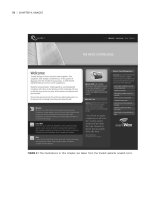
Putting It All Together
This example (shown in Figure 5.32) demonstrates most of the methods mentioned
in this chapter, incorporating different padding, border, and margin situations as
well as display types together with floated elements all inside a positioned layout.
The basic structure of the HTML looks something like this:
<div id=”container”>
<div id=”header”>
<! stuff >
</div>
<div id=”navigation”>
<! stuff >
</div>
<div id=”content”>
<! stuff >
</div>
</div>
The header has a fixed height and a background image, with the h1 element, which
is necessary for the structured document, removed from sight with the display:
none alternative.
#header {
padding: 0.5em;
background: url(images/charlesdarwin.gif);
}
FIGURE 5.32 Positioning, padding, borders, margins, and floating à go-go.
puttIng It All together
|
11
1
|
chApter 5: lAyout
The navigation area is positioned to the left, underneath the header, with padding
applied:
#navigation {
position: absolute;
top: 5em;
left: 0;
width: 7em;
w\idth: 5em;
background: #069;
color: white;
padding: 1em;
}
Note that because a width and padding are involved, the box model hack is needed
to take care of IE 5.
Inside the navigation area, the links, which sit inside unordered lists (as is appro-
priate—see Chapter 6) have their display type set to block (they are inline by
default) so that they will stretch to a uniform, “clickable” width.
There is also a “skip navigation” link (see Chapter 3) before this group of visible
links, which, like the h1 element, is removed from sight.
The content area itself provides the background color for the navigation bar with a
thick left border, and has its own contents padded.
#content {
padding: 1em;
border-left: 7em solid #069;
}
Inside the content div, images are set to float to the right, with margins to the left
and below to space them out from surrounding text. A 1px-wide border and padding
create the subtle but effective outline.
Finally, the page is made a fixed width and centered:
#container {
width: 600px;
border: solid #900;
border-width: 0 1px;
margin: auto;
}
And there you have it.
www.htmldog.com/examples/darwin.html
The techniques explained in this chapter don’t have to involve building blocks as
specific as “headers” or “navigation bars.” They can be applied to elements large
and small, one after another or one inside another. The general principles are the
same—it’s all about shifting chunks around the page.
puttIng It All together
|
1
This page intentionally left blank


