The Best-Practice Guide to xHTML and CSS phần 7 ppt
Bạn đang xem bản rút gọn của tài liệu. Xem và tải ngay bản đầy đủ của tài liệu tại đây (8.94 MB, 36 trang )
Secondly, as explained later in the “Presenting Forms” section, a standard submit
button is pretty much instantly recognized by most users and messing with that
familiarity makes the form more difficult to use.
Not only will the form be submitted when an image input element is selected, the
pixel-coordinates where the user clicked on the image will also be sent. So, two val-
ues will be sent, such as:
image1.x=498
and
image1.y=128
and if the value attribute is used, a third value will be sent:
image1=valueofattribute
So image buttons can also serve as a server-side image map, whereby those coor-
dinates can be processed and different actions can be taken depending on where
the user clicked on the image. If the image was a map of the world, for example, a
processing script could send users to a different page depending on which country
they clicked.
Sounds nifty. Once again, it’s not. Server-side image maps are rarely used, not only
because of their specific nature and the complexity of the server-side programming
required to fully exploit them, but because of their inaccessible nature: Not only do
they rely on purely visual cues (such as country boundaries on a map), but they also
rely on the user being able to click.
file
The file type allows users to select a file from their own computers, in order to
upload that file. When the form is submitted, the selected file will be sent with the
rest of the form data.
It should be remembered that when type=”file” input elements are used, an
additional enctype attribute must be added to the opening form tag with the value
“multipart/form-data”, so that when it is sent the server knows that it is getting
more than textual data. The method attribute must also be set to post.
form fIelds And buttons: Input, textAreA, And select
|
11
1
|
chApter 9: forms
<form action=”wherever.php” method=”post” enctype=”multipart/
form-data”>
<div>
<input type=”file” name=”uploadfile” id=”uploadfile” />
</div>
</form>
www.htmldog.com/examples/inputfile.html
button
button input elements do absolutely nothing. Well, when it comes directly to form
data, anyway. They are used to invoke client-side scripts (namely JavaScript—see
Chapter 7, “Scripts & Objects”) when the button is pressed. So whereas they play
no part in submitted form data, they can be used to make other things in the form
change, such as performing calculations and dynamically altering the value of a text
box, for example.
textarea
A welcome break after the mad multitude of input element options, the textarea
element is straightforward, having just one simple state. It works something like a
big text-type input element, but is used for bigger chunks of textual data, usually
with multiple lines, such as an address or a comment on a feedback form.
www.htmldog.com/examples/textarea.html
Unlike the input element, textarea has an opening and closing tag. Any text in
between the opening and closing tag makes up the initial value of the element.
<textarea name=”whatever” rows=”10” cols=”20”>Type something here
</textarea>
In the above example, the text box will appear with “Type something here” inside
the box.
Like using the value attribute in a type=”text” input element, having initial text
appear in this way can be useful in supplying extra information or instructions about
the kind of thing the user should type in the text area, and it can help with acces-
sibility (see the “Accessible Forms” section later in this chapter). The disadvantage
of doing this is that it requires more work on the users’ part—selecting the text and
deleting it before entering their own. For that reason, textarea is often used in the
following way, with no content at all:
<textarea name=”whatever” rows=”10” cols=”20”></textarea>
There is a peculiar XHTML anomaly that spoils the structure and presentation sepa-
ration party. Inside the opening textarea tag, the attributes rows and cols, which
determine the size of the text area, are not only valid but required. This will initially
alter the width and height of the text area but you shouldn’t be concerned by this
since you can easily control the width and height with CSS.
select
select form fields present the user with a list (which is usually displayed as a drop-
down menu), from which one or more options can be selected.
Key to their operation, another element is needed—the option element, which
defines each option in the list.
<select name=”book”>
<option>The Trial</option>
<option>The Outsider</option>
<option>Things Fall Apart</option>
<option>Animal Farm</option>
</select>
www.htmldog.com/examples/select1.html
In cases such as the example above, when the user submits the form data, the
value sent for the select element is the content of the selected option element (for
example, if the third option was selected above, then “Things Fall Apart” would be
sent as the value for “book”). You can supply different values for each option ele-
ment by using the value attribute inside the opening option tag. When the value
attribute is present, its value will be sent instead of the option element’s content.
form fIelds And buttons: Input, textAreA, And select
|
1
1
|
chApter 9: forms
Figure 9.5 An alternative to checkboxes or radio buttons, select
elements allow one or more selections from a list.
You can set one option element to be initially selected by using the selected attri-
bute (in the form of selected=”selected”).
In longer lists with obvious groupings, you can use optgroup elements, which sup-
ply a heading within the list (using the label attribute). Each option group can also
be styled individually, so, if you choose, you can color some groups differently, for
example.
<select name=”book”>
<optgroup label=”Camus”>
<option>The Outsider</option>
<option>The Rebel</option>
<option>The Plague</option>
</optgroup>
<optgroup label=”Orwell”>
<option>Animal Farm</option>
<option>Nineteen Eighty-Four</option>
<option>Down and Out in Paris and London</option>
</optgroup>
</select>
www.htmldog.com/examples/select2.html
By default, select elements will show one option at a time (and visually “drop
down” the list of options when the element is clicked). You can choose to show
more than one option at a time by setting the size attribute to the number of
options you want. Instead of a drop-down list, browsers will display a sized select
element as a fixed-height box containing the options, which, if all of the options do
not fit in that box, will have a scrollbar to the right.
Also by default, the user can select only one option out of a select list. You can allow
multiple selections by using the multiple attribute (in the form multiple=”multiple”).
When this is used, the user can select more than one option (usually by holding down
a key, such as Ctrl, with every selection).
<select name=”book” size=”5” multiple=”multiple”>
<! etc >
</select>
www.htmldog.com/examples/select3.html
Fieldsets
Imagine you have a long form with a multitude of form fields. Actually, it doesn’t
even need to be that long. Using fieldsets to group together common fields can help
the user straight away by splitting up the form into chunks and making it more man-
ageable. This can be done with the fieldset tag.
Fieldsets can additionally be given a caption/heading with a legend element, which
must directly follow the opening fieldset tag.
<form action=”whatever.php”>
<fieldset>
<legend>Book Details</legend>
<! lots of form fields > </fieldset>
<fieldset>
<legend>Some Other Details</legend>
<! lots of form fields > </fieldset>
</form>
fIeldsets
|
1
1
|
chApter 9: forms
By default, a browser will render a fieldset with a border around it and a legend as a
heading breaking the top border. You can choose to turn off the border (border: 0),
but you won’t have much success in styling it any other way—a legend will always
insist on sitting on top of a fieldset border.
Note that all of the bare-bone examples mentioned so far in this chapter contain
fieldsets and legends.
Accessible Forms
The first step towards accessible forms is to have a sensible design: well spaced-
out form fields with labels that are clearly associated with them are going to make
things much easier to use for anyone—and especially someone with any level of
visual impairment.
Grouping items with elements such as optgroup and fieldset will also help in split-
ting up the form and visualizing distinct areas as well as aiding assistive technology.
There are also steps that can be taken that are similar to the accessibility issues
regarding links. Using tabindex and accesskey attributes in the input, textarea,
and select tags, to aid navigation for those who do not use pointing devices such as
a mouse, will achieve the same benefits and drawbacks as discussed in Chapter 3,
“Links”.
As with any element on a page, title attributes can also be used to provide more
information, in this case possibly to explain with greater detail than a label what the
user should enter in a field.
Labels
Every form field element should be accompanied by a label element. It’s not partic-
ularly difficult; in fact, every form field should have a textual label explaining what a
form field is for anyway—the label element just formalizes the matter. A label ele-
ment links a label with a form field element, providing an explicit link between the
two rather than relying on visual proximity or adjacency within the HTML code.
The value of the for attribute associates the label with the form field whose id has
a corresponding value, such as:
<label for=”rasputin”>Rasputin:</label>
<input name=”whatever” id=”rasputin” />
No, this isn’t a particularly practical example. In most cases, you will probably find
the form field having the same values for both the name and id attributes:
<label for=”yourname”>Your name:</label>
<input name=”yourname” id=”yourname” />
<label for=”youraddress”>Your address:</label>
<textarea name=”youraddress” id=”youraddress” />
The added benefit of label elements is one of usability, particularly with check-
boxes and radio buttons. When the label is clicked, the focus will be placed on the
associated form field element. In the case of checkboxes and radio buttons, this
means that not only can you check or uncheck the element via the small area of the
element itself, you can also do so by clicking on the label, providing a much larger
(and easier) area to click.
The web pages behind the figures on this page all employ labels. Look at www
.htmldog.com/examples/inputcheckboxes.html, for example, to see them at work.
Styling Form Fields
There’s something slightly special about form fields—a browser will actually pull in a
widget that is part of the operating system to make a form field element. The impli-
cations of this are that it’s nigh on impossible to achieve a uniform style across all
browsers (and different OSs) and you are limited as to the extent to which you can
style certain aspects of these form fields.
Because form items come not only from the browser but also from the operating sys-
tem, web pages aren’t the only place that computer users come across radio buttons
and text boxes, etc. They are a familiar element of OS settings and of software pro-
grams that run on them. The borders of form fields are purposefully made to make
the element look three dimensional—text boxes, for example, appearing lowered and
buttons appearing raised, to make them “feel” more tactile—suggesting a user can
interact with them.
stylIng form fIelds
|
1
1
|
chApter 9: forms
And for a similar reason that it is a common suggestion to keep text links blue and
underlined (see Chapter 3) due to users’ familiarity with what that style signifies, it
is also a common suggestion to leave forms in their default style.
At the possible compromise of usability, many do opt to alter the style of form
fields, but there are some limitations.
One example is buttons. Browsers such as Opera and Safari have their own style of
buttons. These browsers actually go as far as ignoring any decoration, such as bor-
ders or colors, that you attempt to apply to them (whereas other browsers, such as
Internet Explorer, will give you free rein).
There are some safe changes that can be made to many form fields. You’ll probably
want control over dimensions, rather than relying on the default rendering of those ele-
ments. As with any other box, you can simply use the properties height (particularly
useful for text areas) and width. Changing dimensions is absolutely fine and pretty
much hassle-free because users are quite used to seeing form fields of various sizes.
There are a few other properties you can play with when it comes to forms. There
are no CSS properties specific to forms, but you can apply colors, padding, borders,
and margins to most form elements, just like any other visible element. As you will
see, however, it’s not all smooth sailing.
Borders
A quick, easy, and common way to radically change the appearance of form fields
such as text boxes is to take control of their borders, using the border property (see
Chapter 5, “Layout”).
input, textarea { border: 1px solid #ccc }
Some might argue that this thin border is more visually appealing, but it should be
kept in mind that this may be at the detriment of usability. A compromise might be
something like this:
input, textarea {
border: 1px solid;
border-color: #666 #ccc #ccc #666;
}
This will apply a 1-px border, overriding the thicker default border, but will keep the
three-dimensional effect users are used to, by applying different shades to the top/
left and bottom/right borders.
When it comes to select menus, you’re stuffed as far as customized borders go.
Most browsers won’t apply CSS borders to select elements at all. So if your form
includes these stubborn little blighters, you’re probably better off leaving the bor-
ders of all of the form field elements well alone, and settling for the default, for the
sake of consistency.
A similar problem arises when it comes to checkboxes and radio buttons. The gray
borders that make up the actual square or circle are also stuck in their ways and
refuse to change.
Fonts
You can specify the font details of text that will appear in text boxes and text areas
just as you can for text in other elements on the web page. The input, textarea,
and select elements will not inherit any font properties, however, and they all have
different initial properties by default—textarea has a Courier font and input has
a sans-serif font, for example. To set things such as color, font-family, and font-
size, then, you need to be explicit.
input, textarea { font: 1em arial, Helvetica, sans-serif }
Backgrounds
As with borders, it is questionable whether the backgrounds of form fields and but-
tons should be anything other than the default—white for text boxes and text areas
and gray for buttons. You do have the option of specifying either background colors
or background images for your controls, although many browsers will ignore any
background settings for checkboxes and radio buttons, leaving them white.
A clever technique that could quite possibly aid usability is to change the background
color of form fields such as text boxes and text areas when they are in focus, mak-
ing that field stand out from the others and make it clearer where the user is on the
page. This can be achieved with the dynamic pseudo-class :focus.
input:focus, textarea:focus { background: #eee }
stylIng form fIelds
|
1
10
|
chApter 9: forms
This could, of course, be used to change any property of a form field when it has
focus, such as the border.
As explained in Chapter 7, Internet Explorer 6 (and earlier) doesn’t support this, but
can this can easily be fixed with a little Suckerfish JavaScript. See the article at
www.htmldog.com/articles/suckerfish/focus or just see it in action at www.htmldog.
com/articles/suckerfish/focus/example.
chapter
Multiple Media
Conjure a n iMage in your mind of someone looking at a web page. Go
on, just do it. Humor me.
Chances are you will be thinking of someone sitting at a desk with a
desktop or laptop computer displaying the web page in all its lavish glory
on a 15- to 30-inch color screen. In all likelihood, the majority of people
looking at your web pages will be in this situation, but there will also be
those who can’t use a screen at all, an increasing number of people who
are using all sorts of mobile devices to access the web, and even just
those who simply want to print out a web page.
Web pages can be accessed and consumed in many ways.
The good news is that if you’ve been building your pages following web
standards then you’ll already be accommodating multiple media and
devices to a much greater degree than if you hadn’t. And with a few little
tricks you can further optimize for different devices.
The purpose of this chapter is to look outside the usual web surfing as
a computer-and-monitor-on-a-desk experience and explore web pages
being consumed in different ways—namely through screen-readers,
mobile devices, and, in particular, print. It is an epilogue, if you will,
demonstrating one of the great benefits of best-practice web standard
XHTML and CSS.
10
1
|
chApter 10: multIple medIA
Screen-Readers
This book has touched on the subject of accessibility a number of times, including
the accommodation of assistive devices, such as screen-readers, that web users
with physical impairments might use.
A screen-reader aids those who cannot see a monitor adequately by reading out
the content and other elements that might otherwise appear on a computer screen,
including web pages.
How do we accommodate screen-readers? Well, we should already be doing it by
using semantic HTML.
If the content in a web page is arranged in a sensible, logical order (rather than
spread all over the place in a multitude of table cells, for example), and paragraphs
are found in ps, unordered lists are found in uls, and tables really are tables, then
it’s all gravy, baby.
These pieces of software are immense, clever things that attempt to decipher the
crappiest of code. With currently supported technologies, there is nothing we can do
to directly target screen-readers, but just by coding in the clearest, proper manner,
our web pages are more likely to be understood as they are meant to be.
Mobile Devices
OK, so mobile devices do have monitors, but they’re itsy-bitsy ones, hardly worthy of
the mighty mantle of a true monitor.
I shouldn’t need to spell out the major differences in mobile screens and your
standard hulk of a desktop monitor, but I will: S.M.A.L.L. S.C.R.E.E.N. Apart from
the screen-size difference, there are also issues with fiddly input (there’s no full-on
QWERTY keyboard here), a greater potential for slower access times than with stan-
dard Internet connections, and a whole plethora of browser compatibility differences
between devices.
So we can, in theory, simply restyle our existing content so that it’s more suitable
for the mobile Web. There are two opposing camps, though, who sing and dance
about it in a faux-aggressive manner just like the gangs in Michael Jackson videos
from the 1980s. One camp, weighed down by superfluous buckles, dances for the
honor of restyled universal, multimedia content which, you know, is a lovely theory,
but the other camp, brandishing plastic knives while balancing on roller skates,
sings “You really need to re-purpose your content to better suit the medium.”
Under most circumstances (those websites with anything other than the most mini-
mal content), I think I’d side with the latter camp (although I’d object if they asked
me to wear roller skates). Although the universality side of web standards is just
peachy, reams of content that might be fine on a single standard web page usually
need to be broken down into more bite-sized chunks (or even replaced with more
concentrated content) for smaller-screen devices on which information is consumed
so differently. Having said that, most of us aren’t in the position, or even inclined,
to make the effort to produce separate mobile-friendly content. But we can at least
take the easy step of making things look a little tidier on small-screen devices.
We will look at how to do this later in the chapter, but as for what we might do,
we’re going to want to think vertically and forget about multiple columns, tone down
heavy, detailed presentational imagery. It might even be a good idea to hide nones-
sential components (such as repeated navigation).
It’s worth keeping in mind that, particularly when it comes to CSS, if you think you’ve
got problems with cross-browser compatibility between Firefox and IE, it’s a whole
new league of diversity in the mobile world, with a multitude of different devices, dif-
ferent operating systems, and different browsers. What looks like Marilyn Monroe on
one phone (with good support) might look like Marilyn Manson on another (with poor
support). So wield your power wisely—consider basic styling, or maybe even simply
relying on the browser style sheet. If your HTML is good (which, now you’re on the
final chapter, it can’t fail to be, surely), then your web pages should work better on
mobile devices than most other websites out there.
So we’ve gathered that good HTML is important for accommodating different
devices and media. That’s grand. CSS hasn’t quite had a look-in as yet, thanks to
the aural nature of screen-readers, and the compatibility issues with mobile devices.
|
1
1
|
chApter 10: multIple medIA
When it comes to printing out web pages, there are a number of style changes we
can make to increase suitability to the medium:
Font type: While sans-serif fonts such as Arial, Helvetica, or Verdana are
easier to read onscreen, serif fonts, such as Times New Roman, are easier to
read in print.
Font size: Unlike screen, print is an absolute medium, so we might as well go
with a traditionally print-related unit: points.
Useless components: The likes of navigation bars and forms—anything that
requires user interaction on a functional web page—are pretty useless when
printed out, so there’s no use printing them out at all. This is another rea-
son why “click here” and its kin are so loathsome: When such phrases are
printed out, no matter how hard you try to click, unless it’s magic paper and
you’re using Harry Potter’s mouse, very little is going to happen.
Page width: Ensuring that the content you’re printing is liquid, you can
ensure that it will make the best use of space on a page (if it was originally a
thin column on screen, for example), and also make sure it will all fit on one
page (if it was a wide column, which might be too wide for a piece of paper).
There are many arguments here about fixed versus liquid layouts—we’re all
used to standard paper sizes (which, it might be worth noting if you were
considering messing with fixed widths, are different in different countries
around the world).
Colors: Detailed and colorful as a flock of macaws though your web page
might be, be prepared to think “magpie” when it comes to print. Black
and white printers are still common (as is the choice to print in black and
white), so it wouldn’t be a good idea to rely on color. It’s worth remembering,
though, that white-on-black can also be ink-guzzling and messy.
Background images: By default, most browsers will not print out background
images (and it takes some digging to switch the option on), so, like colors,
don’t rely on them.
•
•
•
•
•
•
A Sample Print Stylesheet
To take these different approaches into account, a print-specific CSS might look
something like this:
body {
font: 12pt “Times New Roman”, Times, serif;
color: black;
background: white;
}
#navigation, form {
display: none;
}
a {
color: black;
text-decoration: none;
}
#content {
margin: 0;
width: 100%;
}
This essentially covers the list of points made previously. The body rule sets the font
to a sensible size in points, and to a serif font. The navigation area and all forms are
completely pulled out of the picture. Links are made to look like surrounding text
(because there’s nothing particularly special about them when printed out). Assuming
we were putting this on top of a fixed layout, the content area is made to fit the full
width, and the margin, which might have been used to accommodate the navigation
area (see Chapter 5, “Layout”), is zeroed.
Applying Media-Specific CSS
Does accommodating all of these media-specific styles mean we have to serve up
two versions of the same website? Not at all (although, as mentioned, we might
choose to when it comes to pages for mobile devices, for example). What we can
do is target certain styles for certain media, leaving the HTML well alone (it should
simply be, after all, meaningful content, and presentation-free).
ApplyIng medIA-specIfIc css
|
1
1
|
chApter 10: multIple medIA
“printer frienDly” alreaDy, tHanks
“Click here for a printer-friendly version” is not an uncommon phrase found on
the Web. But you don’t really want to construct two versions of every page, and
you don’t have to. Thanks to the separation of content and presentation, your
existing web pages can be printer friendly as they are.
The media Attribute
If you remember from Chapter 1, “Getting Started,” to apply CSS to our HTML we
can use either the link element:
<link rel=”stylesheet” type=”text/css” href=”core.css” />
Or we can use the style element / @import rule combo:
<style type=”text/css”>@import url(“core.css”);</style>
To cut to the chase, we can simply use the media attribute to apply a style sheet to
our HTML when it’s being read by a particular device or intended for a particular
medium. So, if we want one style sheet for the standard desktop scenario, and one
for when the web pages are printed out, we could do:
<link rel=”stylesheet” type=”text/css” media=”screen” href=”screen.
css” />
<link rel=”stylesheet” type=”text/css” media=”print” href=”print.
css” />
Or:
<style type=”text/css” media=”screen”>@import url(“screen.css”);
</style>
<style type=”text/css” media=”print”>@import url(“print.css”);
</style>
And it’s as simple as that.
Note that the values for the media attribute used here are screen and print, but
you can also use handheld (for mobile devices, although not all of them recognize
this, hence one of the compatibility problems). Other options, which aren’t widely
supported, are projection, braille, and speech.
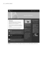
Figure 10.1 www.digital-web.com on screen…
ApplyIng medIA-specIfIc css
|
1
1
|
chApter 10: multIple medIA
Figure 10.2 …www.digital-web.com in print,
Figure 10.3 corkd.com on screen…
ApplyIng medIA-specIfIc css
|
1
00
|
chApter 10: multIple medIA
Figure 10.4a …corkd.com in print.
Figure 10.4b …corkd.com in print.
ApplyIng medIA-specIfIc css
|
01
0
|
chApter 10: multIple medIA
Figure 10.5 www.htmldog.com on screen…
Figure 10.6 …www.htmldog.com in print.
ApplyIng medIA-specIfIc css
|
0
0
|
chApter 10: multIple medIA
Separate or Cascading
There are two approaches to consider when applying multiple style sheets. You can
have an individual, stand-alone style sheet for each situation (such as one for screen
and one for print), or you can have a central, core style sheet, on top of which another
style sheet, for a certain situation (such as one for everything, and one only for print).
The former is a separated approach; the latter is a cascading approach. While the
examples above show a separated approach, a cascading approach would look some-
thing like this:
<link rel=”stylesheet” type=”text/css” href=”screen.css” />
<link rel=”stylesheet” type=”text/css” media=”print” href=”print.
css” />
Because the first link element doesn’t have a media attribute, it will apply that CSS
file to everything. When it comes to print, however, the second link element will
additionally add the print.css file.
Each approach has advantages and disadvantages. Separate may require more origi-
nal rules (such as setting colors or font sizes), whereas cascading might require more
overriding rules (such as making borders or backgrounds invisible).
paper-free print
Because most modern browsers have a Print preview option (under the File
menu), it is easy to try different things and test-print style sheets without feeling
responsible for mass deforestation (just for the pollution, waste, and depletion of
natural resources necessary to power your computer).
@media
Oh, and before I go I should mention @media.
@media isn’t only the name of the greatest web design conference this side of
Wonderland, it’s a special CSS selector that enables you to plonk media-specific
styles directly into an existing style sheet, effectively creating a cascading approach,
but within one file, and placing the media selection in the hands of CSS rather than
via the media attribute in HTML:
@media print {
body {
font: 12pt “Times New Roman”, Times, serif;
}
#navigation {
display: none;
}
/* etc. */
}
The media type following “@media” can be a single media type, or a comma-sepa-
rated list. So you could have:
@media print, handheld { /* specific rules here */ }
for example.
In Conclusion
Well, kids, there you have it: Best-practice (X)HTML and CSS in one handy volume.
The next step? Practice. Experiment. Play around. Read more web design and devel-
opment books and weblogs for inspiration. HTML Dog has explained how to use
your tools, but there’s no substitute for working with them and getting a feel for how
they work in practice. The more you use them, the better a web craftsman you will
become.
In conclusIon
|
0


