Data Mining Concepts and Techniques phần 2 ppsx
Bạn đang xem bản rút gọn của tài liệu. Xem và tải ngay bản đầy đủ của tài liệu tại đây (1.34 MB, 78 trang )
50 Chapter 2 Data Preprocessing
Data cleaning
Data integration
Data transformation
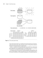
Data reduction attributes attributes
A1 A2 A3 A126
22, 32, 100, 59, 48 20.02, 0.32, 1.00, 0.59, 0.48
T1
T2
T3
T4
T2000
transactions
transactions
A1 A3
T1
T4
T1456
A115
Figure 2.1 Forms of data preprocessing.
a form of data reduction that is very useful for the automatic generation of concept hier-
archies from numerical data. This is described in Section 2.6, along with the automatic
generation of concept hierarchies for categorical data.
Figure 2.1 summarizes the data preprocessing steps described here. Note that the
above categorization is not mutually exclusive. For example, the removal of redundant
data may be seen as a form of data cleaning, as well as data reduction.
In summary, real-world data tend to be dirty, incomplete, and inconsistent. Data
preprocessing techniques can improve the quality of the data, thereby helping to improve
the accuracy and efficiency of the subsequent mining process. Data preprocessing is an
2.2 Descriptive Data Summarization 51
important step in the knowledge discovery process, because quality decisions must be
based on quality data. Detecting data anomalies, rectifying them early, and reducing the
data to be analyzed can lead to huge payoffs for decision making.
2.2
Descriptive Data Summarization
For data preprocessing to be successful, it is essential to have an overall picture of your
data. Descriptive data summarization techniques can be used to identify the typical prop-
erties of your data and highlight which data values should be treated as noise or outliers.
Thus, we first introduce the basic concepts of descriptive data summarization before get-
ting into the concrete workings of data preprocessing techniques.
For many data preprocessing tasks, users would like to learn about data character-
istics regarding both central tendency and dispersion of the data. Measures of central
tendency include mean, median, mode, and midrange, while measures of data dispersion
include quartiles, interquartile range (IQR), and variance. These descriptive statistics are
of great help in understanding the distribution of the data. Such measures have been
studied extensively in the statistical literature. From the data mining point of view, we
need to examine how they can be computed efficiently in large databases. In particular,
it is necessary to introduce the notions of distributive measure, algebraic measure, and
holistic measure. Knowing what kind of measure we are dealing with can help us choose
an efficient implementation for it.
2.2.1 Measuring the Central Tendency
In this section, we look at various ways to measure the central tendency of data. The
most common and most effective numerical measure of the “center” of a set of data is
the (arithmetic) mean. Let x
1
,x
2
, ,x
N
be a set of N values or observations, such as for
some attribute, like salary. The mean of this set of values is
x
=
N
∑
i=1
x
i
N
=
x
1
+ x
2
+ ···+ x
N
N
. (2.1)
This corresponds to the built-in aggregate function, average (avg() in SQL), provided in
relational database systems.
A distributive measure is a measure (i.e., function) that can be computed for a
given data set by partitioning the data into smaller subsets, computing the measure
for each subset, and then merging the results in order to arrive at the measure’s value
for the original (entire) data set. Both sum() and count() are distributive measures
because they can be computed in this manner. Other examples include max() and
min(). An algebraic measure is a measure that can be computed by applying an alge-
braic function to one or more distributive measures. Hence, average (or mean()) is
an algebraic measure because it can be computed by sum()/count(). When computing
52 Chapter 2 Data Preprocessing
data cubes
2
, sum() and count() are typically saved in precomputation. Thus, the
derivation of average for data cubes is straightforward.
Sometimes, each value x
i
in a set may be associated with a weight w
i
, for i = 1,. ,N.
The weights reflect the significance, importance, or occurrence frequency attached to
their respective values. In this case, we can compute
x
=
N
∑
i=1
w
i
x
i
N
∑
i=1
w
i
=
w
1
x
1
+ w
2
x
2
+ ···+ w
N
x
N
w
1
+ w
2
+ ···+ w
N
. (2.2)
This is called the weighted arithmetic mean or the weighted average. Note that the
weighted average is another example of an algebraic measure.
Although the mean is the single most useful quantity for describing a data set, it is not
always the best way of measuring the center of the data. A major problem with the mean
is its sensitivity to extreme (e.g., outlier) values. Even a small number of extreme values
can corrupt the mean. For example, the mean salary at a company may be substantially
pushed up by that of a few highly paid managers. Similarly, the average score of a class
in an exam could be pulled down quite a bit by a few very low scores. To offset the effect
caused by a small number of extreme values, we can instead use the trimmed mean,
which is the mean obtained after chopping off values at the high and low extremes. For
example, we can sort the values observed for salary and remove the top and bottom 2%
before computing the mean. We should avoid trimming too large a portion (such as
20%) at both ends as this can result in the loss of valuable information.
For skewed (asymmetric) data, a better measure of the center of data is the median.
Suppose that a given data set of N distinct values is sorted in numerical order. If N is odd,
then the median is the middle value of the ordered set; otherwise (i.e., if N is even), the
median is the average of the middle two values.
A holistic measure is a measure that must be computed on the entire data set as a
whole. It cannot be computed by partitioning the given data into subsets and merging
the values obtained for the measure in each subset. The median is an example of a holis-
tic measure. Holistic measures are much more expensive to compute than distributive
measures such as those listed above.
Wecan, however,easily approximatethemedianvalueof adataset.Assumethat dataare
grouped in intervals according to their x
i
data values and that the frequency (i.e., number
of data values) of each interval is known. For example, people may be grouped according
to their annual salary in intervals such as 10–20K, 20–30K, and so on. Let the interval that
contains the median frequency be the median interval. We can approximate the median
of the entire data set (e.g., the median salary) by interpolation using the formula:
median = L
1
+
N/2−(
∑
freq)
l
freq
median
width, (2.3)
2
Data cube computation is described in detail in Chapters 3 and 4.
2.2 Descriptive Data Summarization 53
Mode
Median
Mean
Mode
Median
Mean
Mean
Median
Mode
(a) symmetric data (b) positively skewed data
(c) negatively skewed data
Figure 2.2 Mean, median, and mode of symmetric versus positively and negatively skewed data.
where L
1
is the lower boundary of the median interval, N is the number of values in the
entire data set, (
∑
freq)
l
is the sum of the frequencies of all of the intervals that are lower
than the median interval, freq
median
is the frequency of the median interval, and width
is the width of the median interval.
Another measure of central tendency is the mode. The mode for a set of data is the
value that occurs most frequently in the set. It is possible for the greatest frequency to
correspond to several different values, which results in more than one mode. Data sets
with one, two, or three modes are respectively called unimodal, bimodal, and trimodal.
In general, a data set with two or more modes is multimodal. At the other extreme, if
each data value occurs only once, then there is no mode.
For unimodal frequency curves that are moderately skewed (asymmetrical), we have
the following empirical relation:
mean −mode = 3 ×(mean −median). (2.4)
This implies that the mode for unimodal frequency curves that are moderately skewed
can easily be computed if the mean and median values are known.
In a unimodal frequency curve with perfect symmetric data distribution, the mean,
median, and mode are all at the same center value, as shown in Figure 2.2(a). However,
data in most real applications are not symmetric. They may instead be either positively
skewed, where the mode occurs at a value that is smaller than the median (Figure 2.2(b)),
or negatively skewed, where the mode occurs at a value greater than the median
(Figure 2.2(c)).
The midrange can also be used to assess the central tendency of a data set. It is the
average of the largest and smallest values in the set. This algebraic measure is easy to
compute using the SQL aggregate functions, max() and min().
2.2.2 Measuring the Dispersion of Data
The degree to which numerical data tend to spread is called the dispersion, or variance of
the data. The most common measures of data dispersion are range, the five-number sum-
mary (based on quartiles), the interquartile range, and the standard deviation. Boxplots
54 Chapter 2 Data Preprocessing
can be plotted based on the five-number summary and are a useful tool for identifying
outliers.
Range, Quartiles, Outliers, and Boxplots
Let x
1
,x
2
, ., x
N
be a set of observations for some attribute. The range of the set is the
difference between the largest (max()) and smallest (min()) values. For the remainder of
this section, let’s assume that the data are sorted in increasing numerical order.
The kth percentile of a set of data in numerical order is the value x
i
having the property
that k percent of the data entries lie at or below x
i
. The median (discussed in the previous
subsection) is the 50th percentile.
The most commonly used percentiles other than the median are quartiles. The first
quartile, denoted by Q
1
, is the 25th percentile; the third quartile, denoted by Q
3
, is the
75th percentile. The quartiles, including the median, give some indication of the center,
spread, and shape of a distribution. The distance between the first and third quartiles is
a simple measure of spread that gives the range covered by the middle half of the data.
This distance is called the interquartile range (IQR) and is defined as
IQR = Q
3
−Q
1
. (2.5)
Based on reasoning similar to that in our analysis of the median in Section 2.2.1, we can
conclude that Q
1
and Q
3
are holistic measures, as is IQR.
No single numerical measure of spread, such as IQR, is very useful for describing
skewed distributions. The spreads of two sides of a skewed distribution are unequal
(Figure 2.2). Therefore, it is more informative to also provide the two quartiles Q
1
and
Q
3
, along with the median. A common rule of thumb for identifying suspected outliers
is to single out values falling at least 1.5×IQR above the third quartile or below the first
quartile.
Because Q
1
, the median, and Q
3
together contain no information about the endpoints
(e.g., tails) of the data, a fuller summary of the shape of a distribution can be obtained
by providing the lowest and highest data values as well. This is known as the five-number
summary. The five-number summary of a distribution consists of the median, the quar-
tiles Q
1
and Q
3
, and the smallest and largest individual observations, written in the order
Minimum, Q
1
, Median, Q
3
, Maximum.
Boxplots are a popular way of visualizing a distribution. A boxplot incorporates the
five-number summary as follows:
Typically, the ends of the box are at the quartiles, sothatthe box length is the interquar-
tile range, IQR.
The median is marked by a line within the box.
Two lines (called whiskers) outside the box extend to the smallest (Minimum) and
largest (Maximum) observations.
When dealing with a moderate number of observations, it is worthwhile to plot
potential outliers individually. To do this in a boxplot, the whiskers are extended to
2.2 Descriptive Data Summarization 55
20
40
60
80
100
120
140
160
180
200
Unit price ($)
Branch 1 Branch 4Branch 3Branch 2
Figure 2.3 Boxplot for the unit price data for items sold at four branches of AllElectronics during a given
time period.
the extreme low and high observations only if these values are less than 1.5 ×IQR
beyond the quartiles. Otherwise, the whiskers terminate at the most extreme obser-
vations occurring within 1.5 ×IQR of the quartiles. The remaining cases are plotted
individually. Boxplots can be used in the comparisons of several sets of compatible
data. Figure 2.3 shows boxplots for unit price data for items sold at four branches of
AllElectronics during a given time period. For branch 1, we see that the median price
of items sold is $80, Q
1
is $60, Q
3
is $100. Notice that two outlying observations for
this branch were plotted individually, as their values of 175 and 202 are more than
1.5 times the IQR here of 40. The efficient computation of boxplots, or even approximate
boxplots (based on approximates of the five-number summary), remains a
challenging issue for the mining of large data sets.
Variance and Standard Deviation
The variance of N observations, x
1
,x
2
, ., x
N
, is
σ
2
=
1
N
N
∑
i=1
(x
i
−
x
)
2
=
1
N
∑
x
2
i
−
1
N
(
∑
x
i
)
2
, (2.6)
where
x
is the mean value of the observations, as defined in Equation (2.1). The standard
deviation, σ, of the observations is the square root of the variance, σ
2
.
56 Chapter 2 Data Preprocessing
The basic properties of the standard deviation, σ, as a measure of spread are
σ measures spread about the mean and should be used only when the mean is chosen
as the measure of center.
σ = 0 only when there is no spread, that is, when all observations have the same value.
Otherwise σ > 0.
The variance and standard deviation are algebraic measures because they can be com-
puted from distributive measures. That is, N (which is count() in SQL),
∑
x
i
(which is
the sum() of x
i
), and
∑
x
2
i
(which is the sum() of x
2
i
) can be computed in any partition
and then merged to feed into the algebraic Equation (2.6). Thus the computation of the
variance and standard deviation is scalable in large databases.
2.2.3 Graphic Displays of Basic Descriptive Data Summaries
Aside from the bar charts, pie charts, and line graphs used in most statistical or graph-
ical data presentation software packages, there are other popular types of graphs for
the display of data summaries and distributions. These include histograms, quantile
plots, q-q plots, scatter plots, and loess curves. Such graphs are very helpful for the visual
inspection of your data.
Plotting histograms, or frequency histograms, is a graphical method for summariz-
ing the distribution of a given attribute. A histogram for an attribute A partitions the data
distribution of A into disjoint subsets, or buckets. Typically, the width of each bucket is
uniform. Each bucket is represented by a rectangle whose height is equal to the count or
relative frequency of the values at the bucket. If A is categoric, such as automobile
model
or item type, then one rectangle is drawn for each known value of A, and the resulting
graph is more commonly referred to as a bar chart. If A is numeric, the term histogram
is preferred. Partitioning rules for constructing histograms for numerical attributes are
discussed in Section 2.5.4. In an equal-width histogram, for example, each bucket rep-
resents an equal-width range of numerical attribute A.
Figure 2.4 shows a histogram for the data set of Table 2.1, where buckets are defined by
equal-width ranges representing $20 increments and the frequency is the count of items
sold. Histograms are at least a century old and are a widely used univariate graphical
method. However, they may not be as effective as the quantile plot, q-q plot, and boxplot
methods for comparing groups of univariate observations.
A quantile plot is a simple and effective way to have a first look at a univariate
data distribution. First, it displays all of the data for the given attribute (allowing the
user to assess both the overall behavior and unusual occurrences). Second, it plots
quantile information. The mechanism used in this step is slightly different from the
percentile computation discussed in Section 2.2.2. Let x
i
, for i = 1 to N, be the data
sorted in increasing order so that x
1
is the smallest observation and x
N
is the largest.
Each observation, x
i
, is paired with a percentage, f
i
, which indicates that approximately
100 f
i
% of the data are below or equal to the value, x
i
. We say “approximately” because
2.2 Descriptive Data Summarization 57
6000
5000
4000
3000
2000
1000
0
Count of items sold
40–59
60–79 80–99 100–119
120–139
Unit Price ($)
Figure 2.4 A histogram for the data set of Table 2.1.
Table 2.1 A set of unit price data for items sold at a branch of AllElectronics.
Unit price ($) Count of items sold
40 275
43 300
47 250
74 360
75 515
78 540
115 320
117 270
120 350
there may not be a value with exactly a fraction, f
i
, of the data below or equal to x
i
.
Note that the 0.25 quantile corresponds to quartile Q
1
, the 0.50 quantile is the median,
and the 0.75 quantile is Q
3
.
Let
f
i
=
i−0.5
N
. (2.7)
These numbers increase in equal steps of 1/N, ranging from 1/2N (which is slightly
above zero) to 1 −1/2N (which is slightly below one). On a quantile plot, x
i
is graphed
against f
i
. This allows us to compare different distributions based on their quantiles.
For example, given the quantile plots of sales data for two different time periods, we can
58 Chapter 2 Data Preprocessing
140
120
100
80
60
40
20
0
0.000
0.250 0.500 0.750 1.000
f-value
Unit price ($)
Figure 2.5 A quantile plot for the unit price data of Table 2.1.
compare their Q
1
, median, Q
3
, and other f
i
values at a glance. Figure 2.5 shows a quantile
plot for the unit price data of Table 2.1.
A quantile-quantile plot, or q-q plot, graphs the quantiles of one univariate
distribution against the corresponding quantiles of another. It is a powerful visualization
tool in that it allows the user to view whether there is a shift in going from one distribution
to another.
Suppose that we have two sets of observations for the variable unit price, taken from
two different branch locations. Let x
1
, ., x
N
be the data from the first branch, and
y
1
, ., y
M
be the data from the second, where each data set is sorted in increasing order.
If M = N (i.e., the number of points in each set is the same), then we simply plot y
i
against x
i
, where y
i
and x
i
are both (i−0.5)/N quantiles of their respective data sets.
If M < N (i.e., the second branch has fewer observations than the first), there can be
only M points on the q-q plot. Here, y
i
is the (i−0.5)/M quantile of the y data, which
is plotted against the (i −0.5)/M quantile of the x data. This computation typically
involves interpolation.
Figure 2.6 shows a quantile-quantile plot for unit price data of items sold at two dif-
ferent branches of AllElectronics during a given time period. Each point corresponds to
the same quantile for each data set and shows the unit price of items sold at branch 1
versus branch 2 for that quantile. For example, here the lowest point in the left corner
corresponds to the 0.03 quantile. (To aid in comparison, we also show a straight line that
represents the case of when, for each given quantile, the unit price at each branch is the
same. In addition, the darker points correspond to the data for Q
1
, the median, and Q
3
,
respectively.) We see that at this quantile, the unit price of items sold at branch 1 was
slightly less than that at branch 2. In other words, 3% of items sold at branch 1 were less
than or equal to $40, while 3% of items at branch 2 were less than or equal to $42. At the
highest quantile, we see that the unit price of items at branch 2 was slightly less than that
at branch 1. In general, we note that there is a shift in the distribution of branch 1 with
respect to branch 2 in that the unit prices of items sold at branch 1 tend to be lower than
those at branch 2.
2.2 Descriptive Data Summarization 59
120
110
100
90
80
70
60
50
40
40 50 60 70 80
Branch 1 (unit price $)
Branch 2 (unit price $)
90 100 110 120
Figure 2.6 A quantile-quantile plot for unit price data from two different branches.
Unit price ($)
Items sold
700
600
500
400
300
200
100
0
0 20 40 60 80 100 120 140
Figure 2.7 A scatter plot for the data set of Table 2.1.
A scatter plot is one of the most effective graphical methods for determining if there
appears to be a relationship, pattern, or trend between two numerical attributes. To
construct a scatter plot, each pair of values is treated as a pair of coordinates in an alge-
braic sense and plotted as points in the plane. Figure 2.7 shows a scatter plot for the set of
data in Table 2.1. The scatter plot is a useful method for providing a first look at bivariate
data to see clusters of points and outliers, or to explore the possibility of correlation rela-
tionships.
3
In Figure 2.8, we see examples of positive and negative correlations between
3
A statistical test for correlation is given in Section 2.4.1 on data integration (Equation (2.8)).
60 Chapter 2 Data Preprocessing
Figure 2.8 Scatter plots can be used to find (a) positive or (b) negative correlations between attributes.
Figure 2.9 Three cases where there is no observed correlation between the two plotted attributes in each
of the data sets.
two attributes in two different data sets. Figure 2.9 shows three cases for which there is
no correlation relationship between the two attributes in each of the given data sets.
When dealing with several attributes, the scatter-plot matrix is a useful extension to
the scatter plot. Given n attributes, a scatter-plot matrix is an n ×n grid of scatter plots
that provides a visualization of each attribute (or dimension) with every other attribute.
The scatter-plot matrix becomes less effective as the number of attributes under study
grows. In this case, user interactions such as zooming and panning become necessary to
help interpret the individual scatter plots effectively.
A loess curve is another important exploratory graphic aid that adds a smooth curve
to a scatter plot in order to provide better perception of the pattern of dependence. The
word loess is short for “local regression.” Figure 2.10 shows a loess curve for the set of
data in Table 2.1.
To fit a loess curve, values need to be set for two parameters—α, a smoothing param-
eter, and λ, the degree of the polynomials that are fitted by the regression. While αcan be
any positive number (typical values are between 1/4 and 1), λ can be 1 or 2. The goal in
choosing α is to produce a fit that is as smooth as possible without unduly distorting the
underlying pattern in the data. The curve becomes smoother as αincreases. There may be
some lackof fit, however,indicating possible “missing”data patterns. Ifαis very small, the
underlying pattern is tracked, yet overfitting of the data may occur where local “wiggles”
in the curve may not be supported by the data. If the underlying pattern of the data has a
2.3 Data Cleaning 61
Unit price ($)
Items sold
700
600
500
400
300
200
100
0
0 20 40 60 80 100 120 140
Figure 2.10 A loess curve for the data set of Table 2.1.
“gentle” curvature with no local maxima and minima, then local linear fitting is usually
sufficient (λ = 1). However, if there are local maxima or minima, then local quadratic
fitting (λ = 2) typically does a better job of following the pattern of the data and main-
taining local smoothness.
In conclusion, descriptive data summaries provide valuable insight into the overall
behavior of your data. By helping to identify noise and outliers, they are especially useful
for data cleaning.
2.3
Data Cleaning
Real-world data tend to be incomplete, noisy, and inconsistent. Data cleaning (or data
cleansing) routines attempt to fill in missing values, smooth out noise while identify-
ing outliers, and correct inconsistencies in the data. In this section, you will study basic
methods for data cleaning. Section 2.3.1 looks at ways of handling missing values.
Section 2.3.2 explains data smoothing techniques. Section 2.3.3 discusses approaches to
data cleaning as a process.
2.3.1 Missing Values
Imagine that you need to analyze AllElectronics sales and customer data. You note that
many tuples have no recorded value for several attributes, such as customer income. How
can you go about filling in the missing values for this attribute? Let’s look at the following
methods:
1. Ignore the tuple: This is usually done when the class label is missing (assuming the
mining task involves classification). This method is not very effective, unless the tuple
contains several attributes with missing values. It is especially poor when the percent-
age of missing values per attribute varies considerably.
62 Chapter 2 Data Preprocessing
2. Fill in the missing value manually: In general, this approach is time-consuming and
may not be feasible given a large data set with many missing values.
3. Use a global constant to fill in the missing value: Replace all missing attribute values
by the same constant, such as a label like “Unknown” or −∞. If missing values are
replaced by, say, “Unknown,” then the mining program may mistakenly think that
they form an interesting concept, since they all have a value in common—that of
“Unknown.” Hence, although this method is simple, it is not foolproof.
4. Use the attribute mean to fill in the missing value: For example, suppose that the
average income of AllElectronics customers is $56,000. Use this value to replace the
missing value for income.
5. Use the attribute mean for all samples belonging to the same class as the given tuple:
Forexample,if classifying customersaccordingto credit
risk, replace the missing value
with the average income value for customers in the same credit risk category as that
of the given tuple.
6. Use the most probable value to fill in the missing value: This may be determined
with regression, inference-based tools using a Bayesian formalism, or decision tree
induction. For example, using the other customer attributes in your data set, you
may construct a decision tree to predict the missing values for income. Decision
trees, regression, and Bayesian inference are described in detail in Chapter 6.
Methods 3 to 6 bias the data. The filled-in value may not be correct. Method 6,
however, is a popular strategy. In comparison to the other methods, it uses the most
information from the present data to predict missing values. By considering the values
of the other attributes in its estimation of the missing value for income, there is a greater
chance that the relationships between income and the other attributes are preserved.
It is important to note that, in some cases, a missing value may not imply an error
in the data! For example, when applying for a credit card, candidates may be asked to
supply their driver’s license number. Candidates who do not have a driver’s license may
naturally leave this field blank. Forms should allow respondents to specify values such as
“not applicable”. Software routines may also be used to uncover other null values, such
as “don’t know”, “?”, or “none”. Ideally, each attribute should have one or more rules
regarding the null condition. The rules may specify whether or not nulls are allowed,
and/or how such values should be handled or transformed. Fields may also be inten-
tionally left blank if they are to be provided in a later step of the business process. Hence,
although we can try our best to clean the data after it is seized, good design of databases
and of data entry procedures should help minimize the number of missing values or
errors in the first place.
2.3.2 Noisy Data
“What is noise?” Noise is a random error or variance in a measured variable. Given a
numerical attribute such as, say, price, how can we “smooth” out the data to remove the
noise? Let’s look at the following data smoothing techniques:
2.3 Data Cleaning 63
Sorted data for price (in dollars): 4, 8, 15, 21, 21, 24, 25, 28, 34
Partition into (equal-frequency) bins:
Bin 1: 4, 8, 15
Bin 2: 21, 21, 24
Bin 3: 25, 28, 34
Smoothing by bin means:
Bin 1: 9, 9, 9
Bin 2: 22, 22, 22
Bin 3: 29, 29, 29
Smoothing by bin boundaries:
Bin 1: 4, 4, 15
Bin 2: 21, 21, 24
Bin 3: 25, 25, 34
Figure 2.11 Binning methods for data smoothing.
1. Binning: Binning methods smooth a sorted data value by consulting its “neighbor-
hood,” that is, the values around it. The sorted values are distributed into a number
of “buckets,” or bins. Because binning methods consult the neighborhood of values,
they perform local smoothing. Figure 2.11 illustrates some binning techniques. In this
example, the data for price are first sorted and then partitioned into equal-frequency
bins of size 3 (i.e., each bin contains three values). In smoothing by bin means, each
value in a bin is replaced by the mean value of the bin. For example, the mean of the
values 4, 8, and 15 in Bin 1 is 9. Therefore, each original value in this bin is replaced
by the value 9. Similarly, smoothing by bin medians can be employed, in which each
bin value is replaced by the bin median. In smoothing by bin boundaries, the mini-
mum and maximum values in a given bin are identified as the bin boundaries. Each
bin value is then replaced by the closest boundary value. In general, the larger the
width, the greater the effect of the smoothing. Alternatively, bins may be equal-width,
where the interval range of values in each bin is constant. Binning is also used as a
discretization technique and is further discussed in Section 2.6.
2. Regression: Data can be smoothed by fitting the data to a function, such as with
regression. Linear regression involves finding the “best” line to fit two attributes (or
variables), so that one attribute can be used to predict the other. Multiple linear
regression is an extension of linear regression, where more than two attributes are
involved and the data are fit to a multidimensional surface. Regression is further
described in Section 2.5.4, as well as in Chapter 6.
64 Chapter 2 Data Preprocessing
Figure 2.12 A 2-D plot of customer data with respect to customer locations in a city, showing three
data clusters. Each cluster centroid is marked with a “+”, representing the average point
in space for that cluster. Outliers may be detected as values that fall outside of the sets
of clusters.
3. Clustering: Outliers may be detected by clustering, where similar values are organized
into groups, or “clusters.” Intuitively, values that fall outside of the set of clusters may
be considered outliers (Figure 2.12). Chapter 7 is dedicated to the topic of clustering
and outlier analysis.
Many methods for data smoothing are also methods for data reduction involv-
ing discretization. For example, the binning techniques described above reduce the
number of distinct values per attribute. This acts as a form of data reduction for
logic-based data mining methods, such as decision tree induction, which repeatedly
make value comparisons on sorted data. Concept hierarchies are a form of data dis-
cretization that can also be used for data smoothing. A concept hierarchy for price, for
example, may map real price values into inexpensive, moderately
priced, and expensive,
thereby reducing the number of data values to be handled by the mining process.
Data discretization is discussed in Section 2.6. Some methods of classification, such
as neural networks, have built-in data smoothing mechanisms. Classification is the
topic of Chapter 6.
2.3 Data Cleaning 65
2.3.3 Data Cleaning as a Process
Missing values, noise, and inconsistencies contribute to inaccurate data. So far, we have
looked at techniques for handling missing data and for smoothing data. “But data clean-
ing is a big job. What about data cleaning as a process? How exactly does one proceed in
tackling this task? Are there any tools out there to help?”
The first step in data cleaning as a process is discrepancy detection. Discrepancies can
be caused by several factors, including poorly designed data entry forms that have many
optionalfields,human errorin data entry,deliberateerrors(e.g.,respondentsnotwanting
to divulge information about themselves), and data decay (e.g., outdated addresses). Dis-
crepancies may also arise from inconsistent data representations and the inconsistent use
ofcodes.Errorsin instrumentationdevicesthatrecorddata,andsystemerrors,areanother
source of discrepancies. Errors can also occur when the data are (inadequately) used for
purposes other than originally intended. There may also be inconsistencies due to data
integration (e.g., where agivenattributecan havedifferent namesindifferent databases).
4
“So,howcan we proceed with discrepancy detection?” As a starting point, use any knowl-
edge you may already have regarding properties of the data. Such knowledge or “data
about data” is referred to as metadata. For example, what are the domain and data type of
each attribute? What are the acceptable values for each attribute? What is the range of the
length of values? Do all values fall within the expected range? Are there any known depen-
dencies between attributes? The descriptive data summaries presented in Section 2.2 are
useful here for grasping data trends and identifying anomalies. For example, values that
are more than two standard deviations away from the mean for a given attribute may
be flagged as potential outliers. In this step, you may write your own scripts and/or use
some of the tools that we discuss further below. From this, you may find noise, outliers,
and unusual values that need investigation.
Asadata analyst, you shouldbeon the lookout forthe inconsistentuse of codesand any
inconsistent data representations (such as “2004/12/25” and “25/12/2004” for date).Field
overloading is another sourceoferrorsthattypically results when developers squeeze new
attribute definitions into unused (bit) portions of already defined attributes (e.g., using
an unused bit of an attribute whose value range uses only, say, 31 out of 32 bits).
The data should also be examined regarding unique rules, consecutive rules, and null
rules. A unique rule says that each value of the given attribute must be different from
all other values for that attribute. A consecutive rule says that there can be no miss-
ing values between the lowest and highest values for the attribute, and that all values
must also be unique (e.g., as in check numbers). A null rule specifies the use of blanks,
question marks, special characters, or other strings that may indicate the null condi-
tion (e.g., where a value for a given attribute is not available), and how such values
should be handled. As mentioned in Section 2.3.1, reasons for missing values may include
(1) the person originally asked to provide a value for the attribute refuses and/or finds
4
Data integration and the removal of redundant data that can result from such integration are further
described in Section 2.4.1.
66 Chapter 2 Data Preprocessing
that the information requested is not applicable (e.g., a license-number attribute left blank
by nondrivers); (2) the data entry person does not know the correct value; or (3) the value
is to be provided by a later step of the process. The null rule should specify how to record
the null condition, for example, such as to store zero for numerical attributes, a blank
for character attributes, or any other conventions that may be in use (such as that entries
like “don’t know” or “?” should be transformed to blank).
There area number of different commercial tools that can aid in the step of discrepancy
detection. Data scrubbing tools use simple domain knowledge (e.g., knowledge of postal
addresses, and spell-checking) to detect errors and make corrections in the data. These
tools rely on parsing and fuzzy matching techniques when cleaning data from multiple
sources. Data auditing tools find discrepancies by analyzing the data to discover rules
and relationships, and detecting data that violate such conditions. They are variants of
data mining tools. For example, they may employ statistical analysis to find correlations,
or clustering to identify outliers. They may also use the descriptive data summaries that
were described in Section 2.2.
Some data inconsistencies may be corrected manually using external references. For
example, errors made at data entry may be corrected by performing a paper trace. Most
errors, however, will require data transformations. This is the second step in data cleaning
as a process. That is, once we find discrepancies, we typically need to define and apply
(a series of) transformations to correct them.
Commercial tools can assist in the data transformation step. Data migration tools
allow simple transformations to be specified, such as to replace the string “gender” by
“sex”. ETL (extraction/transformation/loading) tools allow users to specify transforms
through a graphical user interface (GUI). These tools typically support only a restricted
set of transforms so that, often, we may also choose to write custom scripts for this step
of the data cleaning process.
The two-step process of discrepancydetection and data transformation (to correct dis-
crepancies) iterates. This process, however, is error-prone and time-consuming. Some
transformations may introduce more discrepancies. Some nested discrepancies may only
be detected afterothershavebeenfixed. For example, a typo such as “20004” in a year field
may only surface once all date values have been converted to a uniform format. Transfor-
mations are often done as a batch process while the user waits without feedback. Only
after the transformation is complete can the user go back and check that no new anoma-
lies have been created by mistake. Typically, numerous iterations are required before the
userissatisfied. Anytuplesthatcannotbeautomaticallyhandledbyagiventransformation
aretypically written toa file without any explanationregarding thereasoning behindtheir
failure. As a result, the entire data cleaning process also suffers from a lack of interactivity.
New approachesto data cleaning emphasizeincreased interactivity.Potter’s Wheel, for
example, is a publicly available data cleaning tool (see />that integrates discrepancydetection andtransformation. Usersgradually build a series of
transformations by composing and debugging individual transformations, one step at a
time, on a spreadsheet-like interface. The transformations can be specified graphically or
by providing examples. Results are shown immediately on the records that are visible on
the screen. The user can choose to undo the transformations, so that transformations
2.4 Data Integration and Transformation 67
that introduced additional errors can be “erased.” The tool performs discrepancy
checking automatically in the background on the latest transformed view of the data.
Users can gradually develop and refine transformations as discrepancies are found,
leading to more effective and efficient data cleaning.
Another approach to increased interactivity in data cleaning is the development of
declarative languages for the specification of data transformation operators. Such work
focuses on defining powerful extensions to SQL and algorithms that enable users to
express data cleaning specifications efficiently.
As we discover more about the data, it is important to keep updating the metadata
to reflect this knowledge. This will help speed up data cleaning on future versions of the
same data store.
2.4
Data Integration and Transformation
Data mining often requires data integration—the merging of data from multiple data
stores. The data may also need to be transformed into forms appropriate for mining.
This section describes both data integration and data transformation.
2.4.1 Data Integration
It is likely that your data analysis task will involve data integration, which combines data
from multiple sources into a coherent data store, as in data warehousing. These sources
may include multiple databases, data cubes, or flat files.
There are a number of issues to consider during data integration. Schema integration
and object matching can be tricky. How can equivalent real-world entities from multiple
data sources be matched up? This is referred to as the entity identification problem.
For example, how can the data analyst or the computer be sure that customer
id in one
database and cust number in another refer to the same attribute? Examples of metadata
for each attribute include the name, meaning, data type, and range of values permitted
for the attribute, and null rules for handling blank, zero, or null values (Section 2.3).
Such metadata can be used to help avoid errors in schema integration. The metadata
may also be used to help transform the data (e.g., where data codes for pay
type in one
database may be “H” and “S”, and 1 and 2 in another). Hence, this step also relates to
data cleaning, as described earlier.
Redundancy is another important issue. An attribute (such as annual revenue, for
instance) may be redundant if it can be “derived” from another attribute or set of
attributes. Inconsistencies in attribute or dimension naming can also cause redundan-
cies in the resulting data set.
Some redundancies can be detected by correlation analysis. Giventwo attributes, such
analysis can measure how strongly one attribute implies the other, based on the available
data. For numerical attributes, we can evaluate the correlation between two attributes, A
and B, by computing the correlation coefficient (also known as Pearson’s product moment
coefficient, named after its inventer, Karl Pearson). This is
68 Chapter 2 Data Preprocessing
r
A,B
=
N
∑
i=1
(a
i
−
A
)(b
i
−
B
)
Nσ
A
σ
B
=
N
∑
i=1
(a
i
b
i
) −N
A
B
Nσ
A
σ
B
, (2.8)
where N is the number of tuples, a
i
and b
i
are the respective values of A and B in tuple i,
A
and
B
are the respective mean values of A and B, σ
A
and σ
B
are the respective standard
deviations of A and B (as defined in Section 2.2.2), and Σ(a
i
b
i
) is the sum of the AB
cross-product (that is, for each tuple, the value for A is multiplied by the value for B in
that tuple). Note that −1 ≤r
A,B
≤+1. If r
A,B
is greater than 0, then A and B are positively
correlated, meaning that the values of A increase as the values of B increase. The higher
the value, the stronger the correlation (i.e., the more each attribute implies the other).
Hence, a higher value may indicate that A (or B) may be removed as a redundancy. If the
resulting value is equal to 0, then A and B are independent and there is no correlation
between them. If the resulting value is less than 0, then A and B are negatively correlated,
where the values of one attribute increase as the values of the other attribute decrease.
This means that each attribute discourages the other. Scatter plots can also be used to
view correlations between attributes (Section 2.2.3).
Note that correlation does not imply causality. That is, if A and B are correlated, this
does not necessarily imply that A causes B or that B causes A. For example, in analyzing a
demographic database, we may find that attributes representing the number of hospitals
and the number of car thefts in a region are correlated. This does not mean that one
causes the other. Both are actually causally linked to a third attribute, namely, population.
For categorical (discrete) data, a correlation relationship between two attributes, A
and B, can be discovered by a χ
2
(chi-square) test. Suppose A has c distinct values, namely
a
1
,a
2
, .a
c
. B has r distinct values, namely b
1
,b
2
, .b
r
. The data tuples described by A
and B can be shown as a contingency table, with the c values of A making up the columns
and the r values of B making up the rows. Let (A
i
,B
j
) denote the event that attribute A
takes on value a
i
and attribute B takes on value b
j
, that is, where (A = a
i
,B = b
j
). Each
and every possible (A
i
,B
j
) joint event has its own cell (or slot) in the table. The χ
2
value
(also known as the Pearson χ
2
statistic) is computed as:
χ
2
=
c
∑
i=1
r
∑
j=1
(o
i j
−e
i j
)
2
e
i j
, (2.9)
where o
i j
is the observed frequency (i.e., actual count) of the joint event (A
i
,B
j
) and e
i j
is the expected frequency of (A
i
,B
j
), which can be computed as
e
i j
=
count(A = a
i
) ×count(B = b
j
)
N
, (2.10)
where N is the number of data tuples, count(A = a
i
) is the number of tuples having value
a
i
for A, and count(B = b
j
) is the number of tuples having value b
j
for B. The sum in
Equation (2.9) is computed over all of the r ×c cells. Note that the cells that contribute
the most to the χ
2
value are those whose actual count is very different from that expected.
2.4 Data Integration and Transformation 69
Table 2.2 A 2 ×2 contingency table for the data of Example 2.1.
Are gender and preferred
Reading correlated?
male female Total
fiction 250 (90) 200 (360) 450
non fiction 50 (210) 1000 (840) 1050
Total 300 1200 1500
The χ
2
statistic tests the hypothesis that A and B are independent. The test is based on
a significance level, with (r −1) ×(c−1) degrees of freedom. We will illustrate the use
of this statistic in an example below. If the hypothesis can be rejected, then we say that A
and B are statistically related or associated.
Let’s look at a concrete example.
Example 2.1
Correlation analysis of categorical attributes using χ
2
. Suppose that a group of 1,500
people was surveyed. The gender of each person was noted. Each person was polled as to
whether their preferred type of reading material was fiction or nonfiction. Thus, we have
two attributes, gender and preferred
reading. The observed frequency (or count) of each
possible joint event is summarized in the contingency table shown in Table 2.2, where
the numbers in parentheses are the expected frequencies (calculated based on the data
distribution for both attributes using Equation (2.10)).
Using Equation (2.10), we can verify the expected frequencies for each cell. For exam-
ple, the expected frequency for the cell (male, fiction) is
e
11
=
count(male) ×count(fiction)
N
=
300×450
1500
= 90,
and so on. Notice that in any row, the sum of the expected frequencies must equal the
total observed frequency for that row, and the sum of the expected frequencies in any col-
umn must also equal the total observed frequency for that column. Using Equation (2.9)
for χ
2
computation, we get
χ
2
=
(250−90)
2
90
+
(50−210)
2
210
+
(200−360)
2
360
+
(1000−840)
2
840
= 284.44+ 121.90+ 71.11+ 30.48 = 507.93.
For this 2 × 2 table, the degrees of freedom are (2 −1)(2 −1) = 1. For 1 degree of
freedom, the χ
2
value needed to reject the hypothesis at the 0.001 significance level is
10.828 (taken from the table of upper percentage points of the χ
2
distribution, typically
available from any textbook on statistics). Since our computed value is above this, we can
reject the hypothesis that gender and preferred
reading are independent and conclude that
the two attributes are (strongly) correlated for the given group of people.
In addition to detecting redundancies between attributes, duplication should also
be detected at the tuple level (e.g., where there are two or more identical tuples for a
70 Chapter 2 Data Preprocessing
given unique data entry case). The use of denormalized tables (often done to improve
performance by avoiding joins) is another source of data redundancy. Inconsistencies
often arise between various duplicates, due to inaccurate data entry or updating some
but not all of the occurrences of the data. For example, if a purchase order database con-
tains attributes for the purchaser’s name and address instead of a key to this information
in a purchaser database, discrepancies can occur, such as the same purchaser’s name
appearing with different addresses within the purchase order database.
A third important issue in data integration is the detection and resolution of data
value conflicts. For example, for the same real-world entity, attribute values from
different sources may differ. This may be due to differences in representation, scaling,
or encoding. For instance, a weight attribute may be stored in metric units in one
system and British imperial units in another. For a hotel chain, the price of rooms
in different cities may involve not only different currencies but also different services
(such as free breakfast) and taxes. An attribute in one system may be recorded at
a lower level of abstraction than the “same” attribute in another. For example, the
total
sales in one database may refer to one branch of All Electronics, while an attribute
of the same name in another database may refer to the total sales for All
Electronics
stores in a given region.
When matching attributes from one database to another during integration, special
attention must be paid to the structure of the data. This is to ensure that any attribute
functional dependencies and referential constraints in the source system match those in
the target system. For example, in one system, a discount may be applied to the order,
whereas in another system it is applied to each individual line item within the order.
If this is not caught before integration, items in the target system may be improperly
discounted.
The semantic heterogeneity and structure of data pose great challenges in data inte-
gration. Careful integration of the data from multiple sources can help reduce and avoid
redundancies and inconsistencies in the resulting data set. This can help improve the
accuracy and speed of the subsequent mining process.
2.4.2 Data Transformation
In data transformation, the data are transformed or consolidated into forms appropriate
for mining. Data transformation can involve the following:
Smoothing, which works to remove noise from the data. Such techniques include
binning, regression, and clustering.
Aggregation, where summary or aggregation operations are applied to the data. For
example, the daily sales data may be aggregated so as to compute monthly and annual
total amounts. This step is typically used in constructing a data cube for analysis of
the data at multiple granularities.
Generalization of the data, where low-level or “primitive” (raw) data are replaced by
higher-level concepts through the use of concept hierarchies. For example, categorical
2.4 Data Integration and Transformation 71
attributes, like street, can be generalized to higher-level concepts, like city or country.
Similarly, values for numerical attributes, like age, may be mapped to higher-level
concepts, like youth, middle-aged, and senior.
Normalization, where the attribute data are scaled so as to fall within a small specified
range, such as −1.0 to 1.0, or 0.0 to 1.0.
Attribute construction (or feature construction), where new attributes are constructed
and added from the given set of attributes to help the mining process.
Smoothing is a form of data cleaning and was addressed in Section 2.3.2. Section 2.3.3
on the data cleaning process also discussed ETL tools, where users specify transforma-
tions to correct data inconsistencies. Aggregation and generalization serve as forms of
data reduction and are discussed in Sections 2.5 and 2.6, respectively. In this section, we
therefore discuss normalization and attribute construction.
An attribute is normalized by scaling its values so that they fall within a small specified
range, such as 0.0 to 1.0. Normalization is particularly useful for classification algorithms
involving neural networks, or distance measurements such as nearest-neighbor classifi-
cation and clustering. If using the neural network backpropagation algorithm for clas-
sification mining (Chapter 6), normalizing the input values for each attribute measured
in the training tuples will help speed up the learning phase. For distance-based methods,
normalization helps prevent attributes with initially large ranges (e.g., income) from out-
weighing attributes with initially smaller ranges (e.g., binary attributes). There are many
methods for data normalization. We study three: min-max normalization, z-score nor-
malization, and normalization by decimal scaling.
Min-max normalization performs a linear transformation on the original data. Sup-
pose that min
A
and max
A
are the minimum and maximum values of an attribute, A.
Min-max normalization maps a value, v, of A to v
in the range [new
min
A
,new max
A
]
by computing
v
=
v−min
A
max
A
−min
A
(new max
A
−new min
A
) + new min
A
. (2.11)
Min-max normalization preserves the relationships among the original data values.
It will encounter an “out-of-bounds” error if a future input case for normalization falls
outside of the original data range for A.
Example 2.2
Min-max normalization. Suppose that the minimum and maximum values for the
attribute income are $12,000 and $98,000, respectively. We would like to map income to
the range [0.0,1.0]. By min-max normalization, a value of $73,600 for income is trans-
formed to
73,600−12,000
98,000−12,000
(1.0−0)+ 0 = 0.716.
In z-score normalization (or zero-mean normalization), the values for an attribute,
A, are normalized based on the mean and standard deviation of A. A value, v, of A is
normalized to v
by computing
72 Chapter 2 Data Preprocessing
v
=
v−
A
σ
A
, (2.12)
where
A
and σ
A
are the mean and standard deviation, respectively, of attribute A. This
method of normalization is useful when the actual minimum and maximum of attribute
A are unknown, or when there are outliers that dominate the min-max normalization.
Example 2.3
z-score normalization Suppose that the mean and standard deviation of the values for
the attribute income are $54,000 and $16,000, respectively. With z-score normalization,
a value of $73,600 for income is transformed to
73,600−54,000
16,000
= 1.225.
Normalization by decimal scaling normalizes by moving the decimal point of values
of attribute A. The number of decimal points moved depends on the maximum absolute
value of A. A value, v, of A is normalized to v
by computing
v
=
v
10
j
, (2.13)
where j is the smallest integer such that Max(|v
|) < 1.
Example 2.4
Decimal scaling. Suppose that the recorded values of A range from −986 to 917. The
maximum absolute value of A is 986. To normalize by decimal scaling, we thereforedivide
each value by 1,000 (i.e., j = 3) so that −986 normalizes to −0.986 and 917 normalizes
to 0.917.
Note that normalization can change the original data quite a bit, especially the lat-
ter two methods shown above. It is also necessary to save the normalization parameters
(such as the mean and standard deviation if using z-score normalization) so that future
data can be normalized in a uniform manner.
In attribute construction,
5
new attributes are constructed from the given attributes
and added in order to help improve the accuracy and understanding of structure in
high-dimensional data. For example, we may wish to add the attribute area based on
the attributes height and width. By combining attributes, attribute construction can dis-
cover missing information about the relationships between data attributes that can be
useful for knowledge discovery.
2.5
Data Reduction
Imagine that you have selected data from the AllElectronics data warehouse for analysis.
The data set will likely be huge! Complex data analysis and mining on huge amounts of
data can take a long time, making such analysis impractical or infeasible.
5
In the machine learning literature, attribute construction is known as feature construction.
2.5 Data Reduction 73
Data reduction techniques can be applied to obtain a reduced representation of the
data set that is much smaller in volume, yet closely maintains the integrity of the original
data. That is, mining on the reduced data set should be more efficient yet produce the
same (or almost the same) analytical results.
Strategies for data reduction include the following:
1. Data cube aggregation, where aggregation operations are applied to the data in the
construction of a data cube.
2. Attribute subset selection, where irrelevant, weakly relevant, or redundant attributes
or dimensions may be detected and removed.
3. Dimensionality reduction, where encoding mechanisms are used to reduce the data
set size.
4. Numerosity reduction, where the data are replaced or estimated by alternative, smaller
data representations such as parametric models (which need store only the model
parameters instead of the actual data) or nonparametric methods such as clustering,
sampling, and the use of histograms.
5. Discretization andconcept hierarchy generation, where raw data values for attributes
are replaced by ranges or higher conceptual levels. Data discretization is a form of
numerosity reduction that is very useful for the automatic generation of concept hier-
archies. Discretization and concept hierarchy generation are powerful tools for data
mining, in that they allow the mining of data at multiple levels of abstraction. We
therefore defer the discussion of discretization and concept hierarchy generation to
Section 2.6, which is devoted entirely to this topic.
Strategies 1 to 4 above are discussed in the remainder of this section. The computational
time spent on data reduction should not outweigh or “erase” the time saved by mining
on a reduced data set size.
2.5.1 Data Cube Aggregation
Imagine that you have collected the data for your analysis. These data consist of the
AllElectronics sales per quarter, for the years 2002 to 2004. You are, however, interested
in the annual sales (total per year), rather than the total per quarter. Thus the data
can be aggregated so that the resulting data summarize the total sales per year instead
of per quarter. This aggregation is illustrated in Figure 2.13. The resulting data set is
smaller in volume, without loss of information necessary for the analysis task.
Data cubes are discussed in detail in Chapter 3 on data warehousing. We briefly
introduce some concepts here. Data cubes store multidimensional aggregated infor-
mation. For example, Figure 2.14 shows a data cube for multidimensional analysis of
sales data with respect to annual sales per item type for each AllElectronics branch.
Each cell holds an aggregate data value, corresponding to the data point in mul-
tidimensional space. (For readability, only some cell values are shown.) Concept
74 Chapter 2 Data Preprocessing
Quarter
Year 2004
Sales
Q1
Q2
Q3
Q4
$224,000
$408,000
$350,000
$586,000
Quarter
Year 2003
Sales
Q1
Q2
Q3
Q4
$224,000
$408,000
$350,000
$586,000
Quarter
Year 2002
Sales
Q1
Q2
Q3
Q4
$224,000
$408,000
$350,000
$586,000
Year Sales
2002
2003
2004
$1,568,000
$2,356,000
$3,594,000
Figure 2.13 Sales data for a given branch of AllElectronics for the years 2002 to 2004. On the left, the sales
are shown per quarter. On the right, the data are aggregated to provide the annual sales.
568
A
B
C
D
750
150
50
home
entertainment
computer
phone
security
2002 2003
year
item type
branch
2004
Figure 2.14 A data cube for sales at AllElectronics.
hierarchies may exist for each attribute, allowing the analysis of data at multiple
levels of abstraction. For example, a hierarchy for branch could allow branches to
be grouped into regions, based on their address. Data cubes provide fast access to
precomputed, summarized data, thereby benefiting on-line analytical processing as
well as data mining.
The cube created at the lowest level of abstraction is referred to as the base
cuboid. The base cuboid should correspond to an individual entity of interest, such
as sales or customer. In other words, the lowest level should be usable, or useful
for the analysis. A cube at the highest level of abstraction is the apex cuboid. For
the sales data of Figure 2.14, the apex cuboid would give one total—the total sales