The Hidden Power of Photoshop Elements 4 PHẦN 4 pot
Bạn đang xem bản rút gọn của tài liệu. Xem và tải ngay bản đầy đủ của tài liệu tại đây (2.63 MB, 36 trang )
2. Duplicate the image (File
➔
Duplicate) so you can work on a copy. Check the Dupli-
cate Merged Only checkbox on the Duplicate Image dialog before accepting the
changes. This will merge the content of the image to a flattened file.
3. Change to RGB mode if the image is any other color mode (Image
➔
Mode
➔
RGB Color).
4. Create a new layer above the Background layer, and set the new layer mode to Color.
Name the layer Color (or name it according to the color or area of the image to which
you will be applying the color).
5. Change the foreground color to the color you would like to paint in the image (click
the Foreground swatch on the toolbar to open the Color Picker, or use the Eyedrop-
per to sample a color from another color image).
6. Choose the Brush tool (press B on the keyboard), and paint over the areas where you
would like to apply the color in the new layer.
7. To paint in another color, create a new layer above or below the current layer, change
the mode to color, name the layer appropriately, and repeat steps 5 and 6. Your layer
setup should look like Figure 4.21.
Background
Color
Figure 4.21
In this technique
color gets painted
over tone in new
layers.
applying color: hand-coloring ■ 83
4456c04.qxd 3/1/06 3:04 PM Page 83
The preceding steps let you paint with whatever colors you like. Colors could be added
all in a single layer or directly to the tone, but these options offer less opportunity to adjust
the colors later. For more flexibility, add all additional colors and changes to new layers,
as shown.
One drawback to this hand-coloring method is that tone tends to get flatly covered with
color. Although the color varies as you see it because of the underlying tone, it doesn’t
always map as you would expect—it can be weaker or stronger in areas because the tone
below it varies. To compensate and make more natural-looking results, you can try the
following:
• Layer color adjustments.
• Use layer grouping to target adjustments to a specific layer.
• Change the intensity and effect of color application using layer opacity and
blending modes.
• Change applied color with Hue/Saturation.
• Use freehand tools, such as Smudge and Eraser, to retouch and blend color
application.
• Use Gaussian Blur to feather color edges.
• Use Add Noise to spice up flat colors.
• Use brush dynamics and shape to create effects while painting.
Take a look at the
lily_handcolored.psd on the CD. This image should give you a few
ideas about how you can enhance applied color using layer properties and layer clipping
(which will be discussed more later). If nothing else, the example shows that imitating
reality may not be the only goal of hand-coloring. Shut off the view for individual layers in
the sample image to see what the layer adds to the composition. Some changes are subtle,
and some are not.
If you try hand-coloring in an image with people and attempt to replace the skin tones,
the flatness of the resulting skin tones will be quite evident and unnatural. Though you can
improve this result by adjusting the quality of the color you are applying (see “Managing
Image Noise” in chapter 5 where skin tone is adjusted using noise), the color isn’t as “smart”
as you might expect. A Gradient Map can often be a better choice for hand-coloring in
some situations.
When hand-coloring, you will usually want to work with layers so that the colors for the back-
ground of the image are at the bottom of the stack, and foreground element colors are at or
near the top. This will help dictate a priority as to how the color gets applied.
84 ■ chapter 4: Separating and Combining Image Components
4456c04.qxd 3/1/06 3:04 PM Page 84
EXPLORING COLOR AND TONE THROUGH THE COMPOSITE LAYER
The Composite layer in Hidden Power separations is used as a canvas for applying and mix-
ing separated components. If you fill the Composite layer with white, shut off the view for
Luminosity and leave Color viewed. The image will turn white, even though the visibility for
the color layer is still on. What many would expect is that the color for the image would be
applied to the white composite. This is actually what is happening, and the result is very
revealing about the relationship between color and tone. Because there is no tone in white,
there is nothing for the color to display.
The point is, the display of color is directly dependent on the tone: if you want color to
display differently (lighter or darker), you’ll have to manipulate the tone rather than the color.
Making the tone darker in an area of color will darken the color; lightening the tone will
lighten the color. If you want another hue (for example, if you want to turn green to blue),
you can change the color layer from the separation without affecting the tone.
Hand-Coloring with Gradient Maps
Usually, applying flat color is not the best way to hand-color images. Instead, you can use
gradients, which create a progressive change in color. Gradients can be applied using the
Gradient tool or Gradient Map adjustment layers. The Gradient tool applies the gradient
color according to the pattern selected in the Options bar and in the direction and for the
distance that you apply the tool. This tool is more likely to be used in creating effects. Gra-
dient Map adjustment layers replace colors and/or tones by using a customized color map-
ping. When a gradient map is applied, Elements replaces each level of gray with its
corresponding gradient color as you’ve set it up in the gradient mapping.
So, say you have a grayscale image, and you apply a gradient map that has 100% red
(R = 255, G = 0, B = 0) at the halfway point on the gradient (50% gray). All of the gray
pixels at 50% brightness will display as red. If this gradient blends evenly to black at 0%
and white at 100%, the red will fade to pink and then white where tones in the image get
lighter; the red will darken to brick and then black where tones in the image get darker.
Gradient application of color and tone can be infinitely more complex than this simple
example by using more complicated gradients. Simple toning can create duotone effects
(again see the
lily_handcolored.psd image and turn on the Sepia layer).
Remapping color and tone can work well in a limited area of an image. For example,
you might use selection or masking to target a specific area of an image for recoloring skin
tones. You can combine the effects of two or more different gradient maps in a single image
by using different maps with different selections or masks.
applying color: hand-coloring ■ 85
4456c04.qxd 3/1/06 3:04 PM Page 85
To work with gradient maps, you need to be able to create and manipulate gradients.
To work with gradients, you will use the Gradient Editor, which you can open from the
Gradient Map dialog box. Open the Gradient Map dialog box by applying a gradient map
as an adjustment layer (Layer
➔
New Adjustment Layer
➔
Gradient Map, and click OK).
When the Gradient Map dialog box opens, click the color bar under Gradient Used For
Grayscale Mapping to open the editor.
Once the Gradient Editor is open, you can edit the current gradient and create and save
custom gradients for reuse. New gradients are created by adding and removing color and
opacity stops to the preview bar, choosing a name, and clicking the New button. The new
gradients that you create are stored in the gradient library and are available whenever you
choose gradient functions.
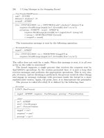
Figure 4.22 shows the Gradient Editor dialog box and a breakdown of the major features.
Features in the Gradient Editor include buttons, the Name field, opacity and color
stops, and Stops options.
Buttons
• Click More to reveal the Presets panel options menu. You can change the way the
swatches are viewed in the Presets panel or change the gradient sets that are viewed.
• Click OK to accept the current values and close the dialog box.
Gradient preview bar
Midpoint control
Active stop indicator
Name
Opacity stop
Color stop
Figure 4.22
The Gradient Editor
allows the creation
of custom color and
tone alterations
based on existing
image tone.
86 ■ chapter 4: Separating and Combining Image Components
4456c04.qxd 3/1/06 3:04 PM Page 86
• Click Cancel to close the editor without accepting changes.
• Click Load to load a gradient set.
• Click Save to save the current gradients as a set.
• Press the Alt/Option key to change the Cancel button to a Reset button. Click Reset
to eliminate all changes made since the editor was opened and revert to the original
values.
• Click New to create a new preset. This will save a swatch with the current settings
and name.
• Click Delete to remove an active color or opacity stop. See “Opacity and Color Stops”
below for more on stops.
Name
• Enter a name for the current gradient, and then click New to save the gradient (in its
current settings) to the Presets list.
Opacity and Color Stops
• Add a stop by clicking above or below the preview bar. Opacity stops are added by
clicking above the gradient preview bar; color stops are added by clicking below the
gradient preview bar.
• Remove a stop by clicking it, holding down the mouse button, and dragging the stop
off the preview bar. Alternatively, you can click the Delete button with the desired
stop active.
• Click a stop to activate it. The stop with its triangle colored black is the active stop
(the stop whose settings appear in the Stops section of the dialog box).
• Double-click a color stop to open the Color Picker.
Stops Options
• The Stops options on the top row of the Stops section show the values for the active
opacity stop. To set Opacity for a stop, activate the desired stop and enter a number
or click the arrow to drop down a slider.
• The Stops options on the bottom row apply to the active color stop. The Color swatch
provides a preview of the stop’s color; click it to open the Color Picker.
• Enter a Location value for either stop type to accurately position the stop (from 0 %
at the far left to 100 % at the far right).
• Click the Delete button to remove the active stop.
applying color: hand-coloring ■ 87
4456c04.qxd 3/1/06 3:04 PM Page 87
Editing Your Gradient
Setting up your gradient requires adding color stops to the bottom of the gradient bar to
control the application of color to the tones in the image. To add a color stop, click just
below the gradient bar and then drag the stop to the position on the gradient bar where
you want to locate it. The preview bar will immediately give you a preview of how your
mapping will look from black to white (left to right). If the Preview box on the Gradient
Map dialog has been checked, the effect of the mapping that you build will also preview
directly in the image. You can change the color of the stop in several ways:
• Sample color directly from the image (moving your cursor over the image changes it
to the sample tool).
• Double-click the color stop to open the Color Picker, and choose the color you want.
• Make a selection (Foreground, Background, or User Color) from the drop-down
menu next to the Color swatch.
You can control the opacity of the color application by the opacity stops set on the top
of the gradient bar. If you choose color carefully, the colors you apply should affect simply
the color you want to see.
The image to which you will be applying the gradient map can be converted to
grayscale if you like, but this isn’t necessary; the map will work on the image tonality inde-
pendently of the current color. In some cases, it may actually be easiest to leave the color
in the image so you can use the existing colors as sample color for the enhancement. Dif-
ferent images will require different handling depending on the color that exists and what
you want to accomplish. You may want to adjust image tone or separate out image areas
before applying gradient maps. You could also use gradient maps for tone adjustment as
you would curves or levels.
Applying a Gradient Map for Tone Adjustment
One of the simplest applications of a gradient is to use it to make tone adjustments in a
grayscale image. In fact, the Gradient Editor can be used just like a Levels or Curves adjust-
ment (we’ll look at how to make Levels and Curves adjustments in the next chapter).
Try this simple Gradient Map application to adjust image tone:
1. Open any flattened black-and-white image (or open a color image, flatten the image,
click the Custom Black-and-White Hidden Power tool in the Power_Separations
category of Effects, and flatten again). If the image is in Grayscale mode, change it
to RGB mode.
2. Press D on the keyboard to reset the Foreground and Background colors on the toolbox.
3. Open a gradient map by choosing Layer
➔
New Adjustment Layer
➔
Gradient Map.
Click OK on the New Layer dialog box. This opens the Gradient Map dialog box.
Choose the black to white gradient, if it is not already selected, by clicking on it.
88 ■ chapter 4: Separating and Combining Image Components
4456c04.qxd 3/1/06 3:04 PM Page 88
4. Click the Gradient Used For Grayscale Mapping preview on the dialog box. This
opens the Gradient Editor.
5. Click directly on the whitecolor stop at the right and on the bottom of the gradient
preview bar. This reveals a color midpoint (small gray diamond) in the center of the
bar at the bottom.
6. Position the Gradient Editor so you can see your image, and move the slider right
and then left of center while watching what happens to the image. (You may have to
release the slider to see the result). Moving the slider left should lighten the image,
and moving it right should darken it.
This simple application remaps the tone of the image based on the position of the
slider. You can create far more complex tonal adjustments by adding color and opacity
stops to the preview bar. Next, let’s use gradient maps to adjust the color in an image.
A Sample Color Adjustment
In the following exercise, you will use painting tools, layer modes, layer masking and gra-
dient maps for adjusting tone and color in our sample image. First you’ll want to apply
color, and then you’ll use that color as a mask to adjust color and tone with variations
(hue/color changes, changes in brightness, etc.), remembering that tone and color work
together. Once you’ve applied any color to the image, you can apply changes to get a dra-
matic color result.
Creating a Manual Color Mask
These steps apply to any image where you want to make a targeted color change. How-
ever, it is just one of many methods; this one uses your initial application as a mask for
later changes.
1. Open the image you want to adjust. This exercise will again use the lily, but we will
start from grayscale. Open
lily_grayscale.psd from the CD (this is the lily image
changed to grayscale using the Custom Black-and-White tool).
2. Create a new layer and call it Petal Color. To create the new layer, click the New
layer button on the Layers palette. Set the opacity of the layer to 70% and the layer
mode to Color.
When you click a stop to activate it, diamond-shaped markers appear on either side of the
stop, between it and the next stop. You can adjust these midpoints to affect the application
of the gradient. Shifting the midpoint to the left increases the influence of the right stop;
shifting the midpoint to the right increases the influence of the left stop. Adjust the color
markers while viewing the image to get the best results.
applying color: hand-coloring ■ 89
4456c04.qxd 3/1/06 3:04 PM Page 89
3. Choose the Brush tool (press B on your keyboard). Adjust the brush
options (click the More Options icon on the Options bar at the top
of the screen) so that the brush has 1% Spacing, 0 Fade, 0 Hue
Jitter, 85% Hardness, 0 Scatter, and 0 Angle, and 100% Roundness.
See the palette here. Before you close out of the More Options dialog,
click the Keep These Settings For All Brushes box at the bottom of the
menu. Be sure the Size is about 30 pixels (30 px), the Mode is Normal,
and Opacity is 100%. These other settings are found in the center of
the Options bar. The brush hardness of 85% gives you a little softness
at the edge of the brush so your color change will blend better with
the background and other color changes.
4. Begin carefully painting color on to the image over the flower in
the Petal Color layer. I use red (R: 255, G: 0, B: 0) for the brush color
out of habit and because it is very easy to see. Set the brush color by
choosing the color you want to apply in the Foreground swatch on
the toolbar (just click the box to open the Color Picker). The color
you use will ultimately be changed, so it really doesn’t matter. You
may find it an advantage to use color close to how you envision
the result.
You will need to take some time applying the petal color. You want to
get as tight as possible to the edge of the petals without going over. You
will want to switch back and forth between the Brush tool and the Eraser
(press E) to touch up the edges (Brush to add color, Eraser to remove it).
Cover the darker part of the petals, and leave other parts clear (stamen,
background, buds, and center of the lily; Figure 4.23).
Adding a Gradient Map
At the point where you have covered the petals where you want to apply color, you are
ready to add a gradient map.
5. Change the opacity of the Petal Color layer to 100% in the Layers palette. This
will intensify the color you have used in painting, but that will change in the
following steps.
6. Hold down the Command/Ctrl key and click the Petal Color layer thumbnail in the
Layers palette (Figure 4.24). This will create a selection from the solid area of the layer.
7. Create a Gradient Map adjustment layer by choosing Layer
➔
New Adjustment Layer
➔
Gradient Map. Change the Mode to Color in the New Layer dialog before you click
OK to create the new layer. This assures the changes will affect only color. The Gradi-
ent Map dialog box will open after you click OK.
90 ■ chapter 4: Separating and Combining Image Components
Figure 4.23
The layers should
look like this. As
you fill in color over
the petals, the color
of the petals will
change but you
will still be able to
see the tone below.
4456c04.qxd 3/1/06 3:04 PM Page 90
8. Open the Gradient Editor by clicking the preview bar in the Gradient
Used For Grayscale Mapping preview.
9. Create a gradient that you want to apply to the image to color the
petals. My settings were as shown here. Yours can be anything you
like. It can be adjusted later. Unless you are looking to create some
unusual effects, the gradient should be smooth and colors should be
darker toward the left of the gradient.
Red Green Blue Location
9 26 151 0
112 11 116 59
232 253 0 100
At this point the Gradient Editor should look something like Figure 4.25 if you
used the settings from the table.
10. Click OK on the Gradient Editor to close it and accept the changes to the gradient.
11. Click OK on the Gradient Map dialog box to close it and accept the changes for the
new layer.
Depending on the colors you have selected for the gradient,
you will get different effects. You can open the Gradient Editor
again to adjust the results (by double-clicking the Gradient
Map thumbnail, you will open the Gradient Map dialog). If
you’d like, you can add a Hue/Saturation layer to adjust the
color some; if you do, group the adjustment to the Gradient
Map layer. However, there are a few more steps we will take, so
don’t bother making too many adjustments just yet. You can
revisit the steps and make changes to the layers once you have
it all set up.
One of the great advantages of using layered corrections is
the ability to adjust them after the fact. Setting color markers is
obviously the most involved step in the process—and easily the
most arbitrary. It will be useful to go back and experiment by
adjusting the color and position of the gradient stops to see the
effect each adjustment has on the image. You may want to use
additional stops to create other changes you may prefer and to
experiment with Gradient Map opacity.
applying color: hand-coloring ■ 91
Figure 4.24
Place the cursor
directly over the
layer thumbnail,
hold the Command/
Ctrl key and click
to load the solid
area of the layer
as a selection.
Figure 4.25
The change in the
gradient increases
the influence of the
darker tones.
4456c04.qxd 3/1/06 3:04 PM Page 91
Adding Fringe Color
Another means of adding in some variation is to make enhancements based on layer clip-
ping. We talk about this in more depth later on, but you don’t need to know much about
it to see how it works here.
12. Create a new layer above the Gradient Map layer. Name the layer Petal Fringe, and
group the layer with the Gradient Map layer (if you added a Hue/Saturation adjust-
ment after the last set of steps, group the new layer above the Hue/Saturation layer).
13. Choose a color that you think will complement the current color of the petals by click-
ing the foreground color swatch on the toolbar. I chose pure red (R: 255, G: 0, B: 0).
14. Hold down the Command/CtrlCtrl key and click on the Petal Color thumbnail in the
Layers palette to load the layer as a selection again.
15. Invert the selection by pressing Command+Shift+I/Ctrl+Shift+I.
16. Fill the Petal Fringe layer with the color you chose in step 13. You can do this with
the Fill Selection function (Edit
➔
Fill Selection).
17. Deselect (press Command+D/Ctrl+D) and apply a Gaussian Blur. To apply the blur
effect, choose Filter
➔
Blur
➔
Gaussian Blur. Move the Radius slider as you preview the
image. Adjust the opacity of the Petal Fringe layer. I used a radius of 25 in the sample.
Adjust the color of the Petal Fringe layer using Hue/Saturation. Apply Hue/Saturation
directly to the layer (press Command+U/Ctrl+U with the Petal Fringe layer active). The
addition of the Petal Fringe layer will allow you to adjust the color at the fringe of the
petals separately from the center area of the petals. A general Hue/Saturation above the
adjustments you have already made will allow you to adjust all of the color you have applied
as a grouping. To do this, load the Petal Color layer as a selection, and then create a Hue/
Saturation adjustment layer. Creating the adjustment layer after making the selection
will mask the area outside the selection. The result is that this layer does not have to be
grouped with any of the previous layers as the mask will target the change to the colored
area defined by the Petal Color layer only. You will want to make the adjustment layer
Color mode to restrict changes to the color.
You can also adjust tone in a variety of ways. One of the easiest is to add a Levels
adjustment layer above the other corrections. To do this, load the Petal Color layer as a
selection, and then create the Levels adjustment layer (Layer
➔
New Adjustment Layer
➔
Levels). Again, this creates a masked adjustment layer. You can slide the center slider
to the right to darken the area (and darken the color) or left to lighten the area (and
lighten the color). Experimenting with these changes can give you flexibility with the
color additions and also some experience with the relationship between color and tone.
If you have added all the suggested layers, your Layers palette will look like Figure 4.26.
92 ■ chapter 4: Separating and Combining Image Components
4456c04.qxd 3/1/06 3:04 PM Page 92
You can revisit the changes in the adjustment layers at any time to fine-tune the color
application. To color other parts of the image, you will want to approach the changes
as described in this section—first creating the mask and then applying more
color based on the mask you created. Take a look at petal_color.psd on the
CD to see the complete image shown in Figure 4.26.
By using masking and multiple gradient layers to apply gradients and by
working with layer-blending modes and opacity, you can achieve complex
colorizing results. Of course, this example is only the tip of the iceberg when
it comes to applying color to tone. Combining these techniques with a variety
of other tools you will use for enhancing and replacing color (which we will
explore in later chapters), your ability to control the result is limitless.
A few points should be clear at this time: The interaction between color
and tone is the foundation for what you see in an image. You must be able
to control tone as a basis for image color. Targeting areas of change—with
separation, layer properties, or masking—can help you confine your correc-
tion to specific areas or components of your images so you can achieve better
results. In the next chapter, we’ll look at further exploiting the color and tone
relationship.
applying color: hand-coloring ■ 93
Figure 4.26
With all suggested
color adjustments
added, your Layers
palette should look
like this.
4456c04.qxd 3/1/06 3:04 PM Page 93
4456c04.qxd 3/1/06 3:04 PM Page 94
Chapter 5
Correcting Image Tone
Manipulating tone with confidence makes all the difference in getting the results you want
in black-and-white and color. Adjusting tone starts with evaluating the image to define
what you want to do and moves through steps to make changes based on that evaluation.
Two points to keep in mind:
• For every action, there is a reaction.
• You might have to break it to fix it.
The first point is an adaptation of one of Newton’s laws of physics. Every general
adjustment you make will affect what you are adjusting as well as other tones (and colors).
The second is based on my experience with “fixing” appliances by disabling broken func-
tions. In images, a fix doesn’t always make everything better, but it should improve the
appearance of the image. Sometimes you must do something destructive to an image to
enable a repair.
Doing Minor Cleanup First
Evaluating Image Tones
Redistributing Tone with Levels
Snapping and Fading Contrast with Curves
(Un)Sharpening and Boosting Contrast
Managing Image NoiseMasking with Image Tone
Soft Focus Effects Using Masking
Shaping Image Elements with Light and Shadow
4456c05.qxd 3/1/06 3:05 PM Page 95
Doing Minor Cleanup First
Before adjusting an image, it is often good to do a quick once-over to evaluate image
problems. This quick evaluation can involve first cropping the image and then removing,
or touching up, other obvious problems (tears, dust specks, etc.). Care in touch-up at this
point permanently removes unwanted elements so they will not be present later no matter
how you use the content of the image.
A simple, direct method of taking care of minor damage is cloning or duplicating exist-
ing image areas to cover up problems. With cloning, you sample information from one
part of an image and then apply that information to another part of the image. In this way,
you can patch areas that might be damaged, missing, or undesirable. It can solve any type
of minor damage, as long as you have something to clone from that is a close match to the
spot you are fixing. Careful cloning can enable you to patch an image seamlessly without
creating noticeable patterns or replacing damage with other flaws.
Image areas with tone and color complexities (such as skin tones) require careful selec-
tion of replacement areas in order to make unnoticeable repairs. Substitutions can come
from within the same image or from another image with similar qualities. All cloning and
duplication corrections follow the same basic steps:
1. Define the problem area.
2. Locate a suitable replacement.
3. Sample the replacement.
4. Apply the replacement to the problem area.
DO SOME DAMAGE CONTROL BY PLANNING AHEAD
You can avoid a lot of trouble with your digital images before you create them. Don’t get into
the habit of just thinking, “I’ll clean it up later digitally!” A quick wipe with a clean, lint-free
cloth can clear troublesome debris from an image you are scanning, or from the scanner
glass, just as you might wipe crumbs from a chair before you sit down. The same idea applies
to taking images with a digital camera; be sure your lens and sensor are clean before you
point the camera at anything, wipe off dusty or dirty objects that will be in your images, and
be sure you take the time to focus so your subject is as crisp and clear as possible (auto-focus
doesn’t always do what you want). Taking these steps can save a lot of detail work later.
Obviously you can’t expect anything to be pristine. Dust and finger smudges can insinu-
ate themselves at any point where the image makes a physical rather than electronic transfer
(on the subject, on your lens, on the scanner glass, on the surface of a print or negative, and
so forth). But once you’ve taken the image or scanned it, any minor nagging defects that
worked their way into your image will remain until you remove them.
The more time you spend preparing to create an image, the less you may have to worry
about correcting incidental problems, which can save lots of time at the computer.
96 ■ chapter 5: Correcting Image Tone
4456c05.qxd 3/1/06 3:05 PM Page 96
Correcting Problems Using the Clone Stamp Tool
The Clone Stamp tool samples from a spot that you define in the image and copies image
information in the shape of the brush you’ve chosen for the tool. All you do is sample
from a clean area of the image that matches (tone, color, and pattern) and then apply the
clean sample to the part of the image you want to replace. This tool will help you take care
of dust, flecked dirt, scratches, and many other image problems.
The Clone Stamp tool lets you do simple copying and pasting from one area of your
image to another in the shape of the currently selected brush and using brush dynamics.
Let’s start with a simple cloning and look at options for other variations.
1. Open the image you want to apply the Clone Stamp to in order to make a correction.
For a sample of an image that this type of correction might work on, see
icecream_spots
.psd in the Chapter 5 folder on the CD.
2. Choose the Clone Stamp tool (press S on the keyboard; press Shift+S to toggle to the
Clone Stamp from the Pattern Stamp if necessary) and make sure the settings are as
follows in the Options bar:
• Clone Stamp tool icon selected (the left tool)
• A soft or custom brush selected in the Presets menu. The selected brush should
be semi-soft (80%–90% hardness). A softer brush will help your clones blend
into the surroundings.
• Mode: Normal
• Opacity: 100%
• Aligned: Checked
• Use All Layers: Checked
3. Create a new, blank layer and name it Clone. In multilayered images, you would
move this Clone layer to the top of the layer stack.
Brush characteristics (hardness, spacing, fade, jitter, etc.) can be set only when using the Brush
tools (including Healing Brushes below). To create the brush you want for cloning, choose the
Brush tool, set the options (by clicking More Options on the Options bar), and then save
the brush by clicking the brush preview menu and choosing Save Brush from the pop-up
menu. After the brush is saved, you can use it with other tools.
Images can be cropped to remove damage, but also to improve composition. Composition is
discussed along with the tools in Chapter 7.
doing minor cleanup first ■ 97
4456c05.qxd 3/1/06 3:05 PM Page 97
4. Take a good look at the image, determine what needs to be replaced, and locate suit-
able sample areas.
5. Sample a replacement area. This should be an area that is clear of other damage or
detail (e.g., clothing seams, as in this example). To make the sample, hold down the
Option/Alt key and click the spot in the image that you want to use as the sample area.
6. Apply the sample by releasing the Option/Alt key, moving the cursor over the area
where the clone will be applied, and then clicking in that area.
Steps 5 and 6 will apply the clone to cover the target area by copying the sampled area
and painting it into the application area (see Figure 5.1).
Optimally, the size of the brush should be just slightly larger than the area you are hoping
to remove. You will usually use a slightly soft brush so that the changes blend into the back-
ground. Too soft a brush can lead to corrections that look blurred. For best results, be sure
that the color and tone are similar in the clone-from and clone-to areas and that the area
you are cloning from is already clear of defects. Checking the tone may require using the
Eyedropper and Info palette; failing to use a clean sample area will replicate defects to the
new area. It is a good idea to zoom in close and clean up with a small brush first, picking up
little bits of damage before moving on to larger patches. This will help clear sample areas for
larger cloning.
Original image area Target showing sample area Sample crosshair and destination
brush shape during application
Area duplicated from origin
to destination
Completed result Copied area isolated
Figure 5.1
Using the Clone
Stamp tool is just
a fancy, but conven-
ient, way of applying
copy/paste.
During application you can increase and decrease the size of the brush using the bracket
keys: [ and ]. The left bracket will decrease the size of the brush, the right bracket will increase
the size of the brush.
98 ■ chapter 5: Correcting Image Tone
4456c05.qxd 3/1/06 3:05 PM Page 98
For the most part, the areas you should target with
the Clone Stamp are the smaller spots. It isn’t the best
tool for cloning a subject’s head from one image to
another, for example. For larger areas, you will want to
use patching (as we do in the following section), as long
as there is a reasonable replacement area.
When you apply the Clone Stamp tool, click and
move rather than holding down the mouse button and
blowing away large areas of the image. You’ll want to
resample often, changing angles and position of the
sample so you clone from different areas (you’ll do this
far more often than changing the brush). This will
reduce the chances of creating undesirable patterns.
You will most often use the Clone Stamp tool in
Normal mode, but in some instances other modes can
serve a purpose. For example, to correct black specks,
use Lighten mode and stamp from a slightly darker por-
tion of the image. This will lighten the specks without
darkening lighter areas. If you are trying to fix light
specks, clone from an area a little lighter than the area
you are cloning to using Darken mode. The corrections
will tend to affect only the specks while keeping the gen-
eral tone of the area unchanged. At times, you’ll switch
modes to Color or Luminosity to help move only the
color or lightness component of the sample area rather
than both. For example, you may want to sample the
tone from one area and the color from another to get a good match to the original.
Making corrections is easier and more flexible if you apply the changes to another layer
as suggested in the steps. You can view the image before and after the changes by toggling
on and off the view for the layer. You can also erase cloning that you have done or make
other adjustments such as applying filters or changing layer modes while preserving your
original image. If you want to adjust only color or tone, you can set the layer to the appro-
priate mode (and use the brush in Normal mode).
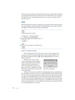
A practice image called
icecream_tone.psd is supplied in the Chapter 5 folder on the
CD. It is a black-and-white conversion for a picture of a young child on the playground
(see Figure 5.2). She’s had an altercation with a chocolate ice cream cone, and her light
clothes became quite spotted. It is a great image to practice Clone Stamp corrections on,
and we will be using it in the next few sections.
doing minor cleanup first ■ 99
Figure 5.2
This image offers
many obvious areas
that will require
correction.
4456c05.qxd 3/1/06 3:05 PM Page 99
Open the image and do your best to make corrections to the spotty mess using the
Clone Stamp. Pay close attention to the patterning and shading. This will be especially
important around the seams and stitching. Try and get the image to about the point
shown in Figure 5.3.
Take a better look at the many corrections made with this tool by opening the icecream_
fixes.psd on the CD. Turn on the Clone Stamp layer to see the suggested corrections.
Using Healing Tools
The Healing Brush tool and Spot Healing Brush tool are “smarter” cloning tools
that help users make changes by “intelligent” substitution between the sample and target
areas. The key difference between the tools is that the Healing Brush enables the user to
choose the sample area, and the Spot Healing Brush decides for the user where the sample
will come from. Especially with smaller corrections, these tools can help you swiftly cor-
rect damage without a lot of fuss in matching tone and pattern.
The Healing Brush
The Healing Brush is a very close relative of the Clone Stamp tool. You have to define a
sample area to clone from and then apply the tool to make the repair. The better your
selection of the clone-from area, the better your result will be. The real difference between
the Clone Stamp and Healing Brush is that when you release the mouse button, the heal-
ing function takes over, compares the sample with the target, and attempts to make the
best correction. This automates many steps of blending, comparison, and blurring that
achieve the final result—and it all happens in a blink.
While it is true these healing tools can help users make corrections, over-reliance on them
can damage images and create undesirable results. Don’t always reach for the Healing Brush
tool before the Clone Stamp or before considering manual patching.
The Mess Touched Up The Corrections
100 ■ chapter 5: Correcting Image Tone
Figure 5.3
Correct only the
smaller spots and
details as shown,
leaving some of the
larger problems
to techniques that
follow.
4456c05.qxd 3/1/06 3:05 PM Page 100
The Healing Brush is great for some types of damage (such as dust)
and for minor repairs (such as removing wrinkles from a forehead). There
are several limitations to how and where the healing tools can be applied.
To avoid any problems using the Healing Brush tool, use the following
guidelines:
• Use a hard brush; the tool takes care of blending.
• Use a single application of the tool to cover the whole area that is to be
replaced with a little to spare (use a brush that is 1.5 to 2 times the width
of the damage).
• Use the tools on isolated damage only; avoid application of the tool near
object edges. Remove a stray eyelash fallen on a cheek rather than stray
hairs at a hairline.
• Be sure the source can replace the tone/texture of the target area—color
isn’t a primary consideration in choosing a replacement area.
The application of the tool is almost identical to the Clone Stamp tool.
Just select the tool (press J; toggle the Healing Brush and Spot Healing Brush
tools using Shift+J), choose a brush size, choose the clone-from (or sample)
area, and apply the tool to cover the damage. Application of the tool can be
made to a separate blank layer by creating the new layer and choosing Use
All Layers in the Options bar. You will almost always use this tool in Normal
mode with the Sampled option selected instead of the Pattern option. Pat-
tern will be used in repairs only if you have created a source to use for repair
or if you are doing more creative enhancement.
Continuing on with the sample image, you can make a few corrections
with the Healing tool. Open icecream_fixes.psd, and turn on the Healing
layer to see what corrections are suggested (see Figure 5.4).
The Spot Healing Brush
The Spot Healing Brush, a variation on the Healing Brush, attempts to make it easier to
make spot corrections quickly. The tool decides for the user where the sample will be
taken from (with the Proximity Match option selected for Type) or synthesizes the sample
If you want to know more about how the Healing tool works, you can explore using the Hid-
den Power Mend tool at slower playback speeds. The Mend tool was made as a Healing sub-
stitute before Elements had a healing tool. While it is no longer necessary for Elements 4, it is
a great learning tool. Find it on the Hidden Power website:
/>downloads.html.
doing minor cleanup first ■ 101
Identify Problems
Identify Solutions
Apply the Tool
Figure 5.4
Healing can handle
select details, so
long as they are
matched. The
closer you work
with tone and
detail, the better.
4456c05.qxd 3/1/06 3:05 PM Page 101
(with the Create Texture option selected for Type), automatically replacing the area of the
image that you select by using the brush. It is meant to be used for spot correction—ergo
the name—meaning that you should consider it for tasks such as picking dust out of scans
rather than making larger damage corrections. It should be used only for quick correc-
tions that are not critical.
Because the Create Texture option synthesizes replacement information by some form
of averaging, you will most likely get better results by using the Proximity Match option.
However, unless the sample selection doesn’t matter, even the Proximity Match option is
somewhat suspect because the randomized behavior of the tool makes the result impossi-
ble to predict. Unless you are using the tool in an area of flat color and tone (a sky) or
where patterns will blend in (grass), the Healing Brush, Clone Stamp, and manual patch-
ing techniques discussed elsewhere will almost always produce a better result than using
the Spot Healing Brush.
Using Spot Healing is similar to using the Healing Brush, except that you do not have
to define a sample spot. It is as simple as selecting the tool and clicking on areas that you
want to replace in the image. The same suggestions as for the Healing Brush apply.
CHOOSING A DISPLAY CURSOR
Your setting for Painting Cursors on the Display & Cursors preferences (Edit
➔
Preferences
➔
Display & Cursors) will determine the way the Clone Stamp tool appears on your screen.
Make your selection under Painting Cursors. Standard shows the tool icon during appli-
cation, Precise shows a crosshair , Normal Brush Tip shows the shape of the brush being
applied where it is 50% or more opaque (when using a soft brush this will display a smaller
area than is affected by the brush) , and Full Size Brush Tip shows the shape of the
absolute size of brush being applied . All display options use the sample icon when
you hold down the Option/Alt key to sample the image. Checking the box will place a
crosshair inside the brush shape for either the normal or full brush size .
Correcting by Duplication (Patching)
It is sometimes advantageous to make corrections by copying and pasting larger areas of
an image rather than painstakingly removing each spot or speck of dust one at a time with
the Clone Stamp tool. This section looks at an option for patching an image that will work
on tears, holes, and other broad-area damage.
Start making the patch by preselecting the damaged area. This will define the shape and
size of the damage that you want to correct. Making a selection of the damaged area will
enable you to find the best available replacement. The order of your approach and some
102 ■ chapter 5: Correcting Image Tone
4456c05.qxd 3/1/06 3:05 PM Page 102
basic techniques will be similar to cloning with the Clone
Stamp tool:
1. Identify the problem area in the image and the intended
replacement.
2. Choose the Lasso tool. It is often a good choice for patch-
ing because it will make irregular selections, and irregular
patches tend to blend in less noticeably. Set the tool to
feather several pixels (2–10); this will soften the edge of the
sample. In general, you will want to use more feathering
with images that have higher resolution.
3. Make a selection with the Lasso around the general area
of the image you want to replace. Making this selection
will ensure that you get a patch that is sized to cover the
damage—like a template. Make the selection a bit larger
than the damage so you can have some leeway in blend-
ing pasted areas. See Figure 5.5.
4. Move the selection tool over the selection created in step 3,
and the icon will change to the Selection Move icon .
Click and drag the selection over to the area of the image
to be used as a replacement. Choosing exactly where to
place the selection can require rotating, flipping, or care-
fully sizing the selection. Note any changes you make so
you can reverse them after you paste the replacement in
step 6. The options bar will show these changes. See
Figure 5.6 for the sample area.
5. Copy the selected area.
6. Paste. This creates a new layer containing the image area
you are using as a patch. Because the patch is on its own
layer, you can size and position it (by reversing the
changes made in step 4), use the Eraser tool and a slightly
soft brush to blend the patch with the area being covered,
or transform the replacement (see Figure 5.7). Layer modes
can also be employed (for example, Lighten and Darken)
as you might use them with the Clone Stamp tool.
7. Repeat steps 1 through 6 as needed to create more patches
and repair the image.
doing minor cleanup first ■ 103
Figure 5.5
Make a selection around the area to be replaced.
Figure 5.6
Move the selection around the area to be used as a
replacement.
Figure 5.7
In this case, the patch area is transformed to fit in as a
solution. For more on transforming image areas, see
the section on “Transformations and Distortions” in
Chapter 7.
4456c05.qxd 3/1/06 3:05 PM Page 103
You may have more than one option for making the correction in any given image; you
might want to try several different solutions for the same problem area—especially if the
area that you are patching is large or important to the image. To compare, make the first
patch and then turn off the visibility for its layer. After making the next patch, you can
compare the two by turning the layer views on or off. Don’t be afraid to mix manual
patches—use more than one, if that improves the result. This patching technique can be
combined with Clone Stamp and Healing tool corrections (switch between tools using
the J and S shortcuts)—and with other techniques we have yet to look at.
If you take a look at the
icecream_fixes.psd image and turn on the Manual Patch layer,
you’ll see how the correction for this image works. It leaves only a few more spots to clean
up, which you can take care of with your choice of methods. You can see the final cleanup
of spots by turning on the Pocket Patches layer.
There is still more to do in the image, as discussed earlier in the chapter. If you turn on the
Leg Patches layer, you’ll see the pant leg straightens out, the sock straightens out, and the
tone and color of the leg even out. These changes were made using cloning techniques—
mostly patching. Attempting to make some of these corrections before going on to other
techniques may help give you some valuable experience.
Evaluating Image Tones
Evaluating the tone of an image can help you make better corrections. At times you’ll need
to make precise measurements of image information, and at others you’ll have to evaluate
the general appearance of the image. The Eyedropper tool (used in conjunction with the
Info palette) and the Histogram feature can provide just about all the image information
you’ll need to make sensible adjustments.
Using the Eyedropper for Tone Evaluation
The Eyedropper, located in the toolbox, makes it easy to gather information about indi-
vidual pixels or small pixel groupings. Simply click the Eyedropper tool and put the cursor
over the image area you want to measure, and the Eyedropper will sample the composite
of the visible layers and display the information in the Info palette (Figure 5.8). Such
measurements can be helpful in evaluating an image periodically throughout the correc-
tion process. For example, comparing grayscale values for sample and target areas before
cloning or duplicating can give you a good idea whether those areas are a good match
(similar tone) before you make the clone or patch.
When it comes to repairs, unlike general tone or color correction, it is often best to work on
removing smaller problems and then working up to larger ones. By first removing minor
problems, you can then use those corrected areas to repair larger areas without duplicating
old damage and problems.
104 ■ chapter 5: Correcting Image Tone
Figure 5.8
The Palette Options
pop-up menu on
the Info palette
enables you to
choose color refer-
ences: Grayscale
(luminosity), RGB
Color, Web Color,
and HSB Color.
4456c05.qxd 3/1/06 3:05 PM Page 104
From the drop-down list on the Options bar, you can select a sample size: Point Sample
(samples the pixel at the tip of the tool icon), 3 By 3 Average, and 5 By 5 Average. These
options are also available by pointing the Eyedropper at an image and clicking the right
mouse button. The Average options look at a square of pixels (with the tip of the tool icon
as the center pixel) and then average those to determine the result. If tone is noisy—for
example, as it is in skin tones—it is better to use a broader sample size to get a better aver-
age reading of the tones you are measuring. If you use a sample size that is too small when
measuring a noisy area, it might make for confusing samples: values between one pixel
and the next might change too rapidly to make sense or provide anything meaningful in
the way of a reading.
To make a sample measurement, follow these steps:
1. Select the Eyedropper tool (I).
2. Choose the sample size from the drop-down list on the options bar.
3. Bring the Info palette to the front by selecting it from the Window menu or by reveal-
ing it in the Palette Bin.
4. Choose a color mode in the palette pop-up menus.
5. Spot-check with the Eyedropper by passing the cursor over various areas of the image
while noting the values in the Info palette.
If you’re using this in conjunction with the Clone Stamp tool, for example, you could
sample the target area to determine the tone and then use the eyedropper to locate a donor
area that has very similar tone. In this way you can make better, less detectible, corrections.
Evaluating Images with Histograms
The Histogram feature (Window
➔
Histogram) displays a graph of image information. The
height of each column in the graph represents the number of pixels with a particular lumi-
nescence throughout the entire tonal range of the image. If a specific component is selected
in the Channels drop list, the graph displays only information for that component. A his-
togram is also available in the Levels dialog box (Enhance
➔
Adjust Lighting
➔
Levels). A
histogram can help describe the tonality and integrity of an image, pointing out both
image qualities and abnormalities that may need to be corrected.
For example, a histogram graph can tell you whether an image is naturally bright
(high-key) or dark (low-key), whether the contrast is neutral or high. If the qualities are
desirable, histograms can help you maintain those qualities by reevaluating the image
later in the correction process. Although image qualities such as high- or low-key may be
apparent to the naked eye, histograms also help you determine whether an image has been
damaged in processing or whether it shows some other limitation, such as not taking full
advantage of tonal range.
evaluating image tones ■ 105
4456c05.qxd 3/1/06 3:05 PM Page 105
Aberrations in the image information can present themselves as uncharacteristic shifts,
lack of balance, or gaps in the graph. A histogram that contains many peaks and valleys,
gaps in information, and/or clipping (spikes in information that bunch up at either end or
run off the chart) may represent some form of image damage, limitation, or loss of image
information. If the damage appears extreme, the image might need correction or be essen-
tially beyond repair. The graph can show insufficient tonal range for manipulation, cor-
rection, and use.
Evaluating a histogram is as easy as looking at it. Characteristics become obvious in a
quick visual evaluation of the graph. The following examples show a basic blueprint for
specific image types, such as high-key, low-key, high contrast, low contrast, and images
with damaged information.
A histogram that is weighted toward the black or dark end of the graph—and that does
not show gaps in tonality at the light end of the graph—represents a low-key (dark) image.
These are often images taken in low light, such as around a campfire or birthday cake.
Figure 5.9 shows an example of a low-key image and the histogram that represents it.
A histogram that is skewed to the light (right) end of the graph represents a high-key
(light) image, such as the one in Figure 5.10. Beach shots with lots of light sand or snowy
winter scenes are good examples of high-key images.
Figure 5.9
A low-key image
You can evaluate a section of an image by selecting it with the selection tools and then looking
at the histogram. The histogram charts results for only the active or selected portion of an image.
106 ■ chapter 5: Correcting Image Tone
Copyright © 2005 photosphere.com
4456c05.qxd 3/1/06 3:05 PM Page 106
A histogram that peaks in the dark and light areas while having lower pixel density in
the middle of the graph (like the one in Figure 5.11) represents a high-contrast image.
Harsh lighting in direct sunlight can create a chasm between lights and darks, which is a
typical example of high contrast—although not necessarily a desirable one. A silhouette,
in which a figure is shown lit from behind, is another example of high contrast.
Figure 5.11
A high-contrast
image
Figure 5.10
A high-key image
evaluating image tones ■ 107
Copyright © 2005 photosphere.com
Copyright © 2005 photosphere.com
4456c05.qxd 3/1/06 3:05 PM Page 107