The Hidden Power of Photoshop Elements 4 PHẦN 8 pdf
Bạn đang xem bản rút gọn của tài liệu. Xem và tải ngay bản đầy đủ của tài liệu tại đây (2.24 MB, 36 trang )
Making Custom Shapes
Say for some reason you want to make a custom shape—for example, a fishhook—that
you can’t find in the shape libraries, and you can’t imagine how to construct it by join-
ing shapes from these libraries. One task you can’t do with standard Photoshop Elements
Shape tools is to make freehand shapes. You could spend most of the day using the
existing shapes that are supplied—adding, subtracting, and combining—but creating
a custom shape this way will probably prove a little tough, will take lots of time, and
can be frustrating.
Hidden Power tools add some functionality that can help you change any selection to
a shape, and this gives you the power to make any custom shape you need.
All you have to do is make a selection (any shape or size, using tools you have), and
then double-click Shape From Selection in the Power_Paths category of the Hidden Power
tools on the Effects palette. This will turn the selection you made into a custom shape on
its own shape layer. Once the selection is a shape, you can use it just like any other shape
created with the Shape tool: copy and paste the shape to other shape layers, and size, mix,
and combine the shape with other shapes. The difference is that the shape you make can
be your own, unique from the limitations of the provided libraries.
Using this Hidden Power tool, you can create shapes from any selection, even highly
complex ones. One way to create custom shapes is by making a rough sketch of the shape
you want with a painting tool and then converting that shape to a selection (Command+
click the layer / Ctrl+click the layer where you have drawn the shape to load it as a selec-
tion). You can even refine the selection before conversion using other selection tools (the
Lasso tools are a favorite).
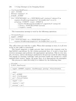
Figure 9.4 shows how a very rough sketch of a fishhook made in its own layer is turned
into the final fishhook illustration. The shape is roughed in with a painting tool and loaded
as a selection; the selection is refined with the Lasso tool and made into a new filled object.
Once the object is refined, the object is blurred to smooth out the curvature and edges,
and then a final selection is made and converted to a shape using the Hidden Power tool.
Tolerance settings on the Make Work Path dialog that appears after you click the Shape From
Selection tool allow you to choose how closely you want the vector to conform to the pixels.
Higher numbers simplify and smooth the vector while sacrificing accuracy; lower numbers
add vector anchors and may produce a blockier result. Shooting for a balance between the
two extremes will get the best results. It is sometimes best to increase the image size (upsam-
ple the image) to create the vector if you want to retain smooth vector results.
making custom shapes ■ 227
4456c09.qxd 3/1/06 3:06 PM Page 227
Shapes can be created from loaded selections, selections made with any selection tool,
selections made from layer transparency, and selections made with any combination
thereof. Once you have made the selection and converted it to a custom shape, you can
store the shape and use it as you might use one of the shapes from the shape libraries. The
process for storing your custom shapes is a little different from using shapes in the library
in that you will not save the shapes you create to a shape set for display in the submenu.
You will save the shape to a dedicated image where you can store the shapes as a library.
When you need a shape you have created, you just open the library image and then copy
and paste the shape from it as needed. The ability to store and reuse shapes that you create
gives you much greater flexibility with vectors than using shape libraries alone. For an
example of how to store shapes in a library image, see hiddenlibrary.psd on the CD. If
you have shapes that you want to store, follow these steps:
1. Have the image open in which you created the shape you want to store (e.g., the cus-
tom fishhook shape created from a selection).
2. Open the
hiddenlibrary_template.psd file on the Hidden Power CD, or you can create
your own library file. The file can be any size, but 500
× 500 pixels at 72 ppi will cover
what you need the file for, even if the original shape is larger than that size. The
advantage of using the Hidden Power template is that it will have a template layer for
use in step 8.
abcde
fghi j
Figure 9.4
A very rough sketch
(a) is used as a simple
guide for creating a
more refined selec-
tion (b) made with
the Polygonal Lasso
tool. The polygon
selection is refined
and smoothed by
filling with black (c)
and using Gaussian
Blur (d) and then
Threshold (e). Addi-
tional selections (f)
are used to make
alterations (g), and
the final selection
(h) is converted to a
shape (i). Once the
shape is in a layer,
layer effects can be
applied (j).
228 ■ chapter 9: Creating and Using Vectors
4456c09.qxd 3/1/06 3:06 PM Page 228
3. Save the image file with a name that reflects the shape types you expect to save
there (in other words, name your shape library what this image will contain). If you
will have only one shape library, you might name it something simple, like My Shape
Library.
4. Choose the Shape Selection tool.
5. Click on (highlight) the shape you want to store from the image in step 1 to activate
it. The shape can be from any open image.
6. Copy the shape (Command+C / Ctrl+C).
7. Activate the library image that you opened or created in step 2.
8. Create a new shape layer. If you’re using the template image provided, just duplicate
the template layer.
9. Paste in the shape copied in step 6.
10. Name the layer something meaningful so you will know what it is from the descrip-
tion. When you need to use the shape, you can just locate it by name and copy it to
the image in which you want to use it.
An alternative to the steps above would be to drag layers from the image that you want
to copy to the library. With both images in view on the screen, locate the shape you want to
copy in the source image in the Layers palette, click on it, hold down the Shift key, and
drag it to the library image window. This will copy any effects you have applied as well.
Shapes can be resized to fit the 500 × 500 pixel image you are using as a library, because
vector shapes do not change as they are scaled. If you have pasted or dragged and dropped
a path and you do not see the shape, zoom out from the image, be sure the layer is active,
and choose Free Transform. If you can see the outline of the path and the bounding box
(the Show Bounding Box option must be checked), hold down the Shift key and fit the
bounding box to the image. Holding down the Shift key will retain the ratio of height to
width for the path.
Another way to store shapes in a library is to save all the shapes as separate files in a
directory (for example, named
MyShapes) and then use Photoshop Elements’ Create Web
Photo Gallery function (see Photoshop Elements 4 Help) to create a preview of all the
shapes in the folder. This will be easy to update and will enable you to scan previews of
many shapes quickly in your web browser or in the Elements File Browser, rather than
having to remember the names or search through various library files.
If you use another image, you will have to create a new layer using one of the shape tools,
draw a shape, follow steps 9 and 10, and then delete the shape. Elements will not allow you
to create a shape layer that does not contain a vector.
making custom shapes ■ 229
4456c09.qxd 3/1/06 3:06 PM Page 229
Another handy tool provided with the Hidden Power tools is one that will make a
shape from any text you’ve created. The Shape From Text tool is located in the Power_
Paths category of the Hidden Power tools on the Effects palette.
Converting text to vectors may not seem to be much of an advantage when I tell you
that you won’t be able to edit the text anymore. However, converting text to vectors can
save you from having to worry about transferring fonts with your Elements images; vec-
torized fonts will show up correctly even on computers that don’t have the same fonts you
used to create the text, and the vectors will render the result without softening (as would
happen if you rasterized the text by converting it to pixels). Changing the fonts to vectors
locks the shape of the font and makes it a graphical part of the image, while still allowing
you to scale the image and not have a fuzzy font result. Vectors will produce sharper text
results than rasterized text when used correctly. Converting to vectors also puts to rest
some potentially annoying font errors.
The application of these Hidden Power vector-conversion tools should become clearer
in the following example, where we’ll use shapes to create scalable vector art.
Creating Scalable Vector Art
Pixel images are normally trapped by their content in that pixel content is inflexible and
must be interpolated to be resized. Interpolation can cause softening or loss of detail. Using
vectors can help you create art that can be scaled to any size while retaining sharpness in
the shape of objects. Although you can’t turn all elements of a standard photograph into
vectors, you can create artwork as vectors so it can be scaled to suit your needs.
Captain Hook’s Bait & Tackle is the name of an imaginary tackle shop. Let’s say the
owner wants a logo and asks you to make it. He wants to use the logo on his letterhead,
business card, and website and on promotional items such as caps and T-shirts. One other
thing the logo will be used for is a 10 foot
× 16 foot billboard next to the Fishingtown exit
from the I-1000 freeway. The only answer you get when you ask how big the logo will be
on the billboard is “Big.” So it’s safe to assume that the logo will run about 9 feet tall.
A 9-foot-tall image in Photoshop Elements at 100 ppi would be almost 11,000 pixels
square. That’s about 333 MB. It isn’t a file that you’ll want to transfer over the Internet
even if you have a fast connection. Interestingly, if you are careful, you can probably create
the file you need and do it in less than 1000 pixels square (technically, even smaller than
that!) and satisfy all of the client’s needs with one image.
Shapes can be another means of storing selections—as long as you want to store the selec-
tion without anti-aliasing, feathering, or other grayscale manipulations. Such hard selections
can be converted to shapes by using the Hidden Power tools, and the visibility can be turned
off. To create a selection from the stored shape, Command+click the layer / Ctrl+click the
layer where the shape is stored.
230 ■ chapter 9: Creating and Using Vectors
4456c09.qxd 3/1/06 3:06 PM Page 230
Follow these steps to create the logo:
1. Open a new, blank 1000-pixel-square image. Set the resolution to 72 ppi.
2. Click the Shape tool on the toolbar. Then on the Options bar choose the Ellipse Shape
tool. Create a new shape layer by drawing a circle to fill the square image. Start draw-
ing at the center. You can find this center of the image by opening the Info palette,
setting the measure to pixels, and then watching the coordinates change as you move
your cursor in the image window. The center will be at 500,500. When you have
located the center, hold down the Shift+Option / Shift+Alt keys and drag your shape;
the shape will constrain to a circle and draw from the center point, where you first
clicked. Leave 100 pixels or more at the edge of the image all the way around—you
may need some space to maneuver your shapes and artwork.
3. Click the Subtract From Shape Area button on the Options bar, locate the center
of the image again, and then draw a second circle from the center, about half the
diameter of the first. This will give you a torus—a donut shape—as a result of the two
shapes you created that inhabit the same layer. You should not have to adjust this, but
if you do, use the Shape Selection tool to click on the shape component you want to
move. When the component is highlighted, you can move it freehand by using the
Shape Selection tool, or you can change to the Move tool and use the keyboard arrows
to position the shape.
4. Create a hook using the technique described earlier in “Making Custom Shapes.”
Alternatively, you can copy in the hook you made during that exercise, if you’d like.
5. Create the text to be placed in the donut. This is the toughest part of the exercise,
because Elements does not offer a lot of type controls. Fitting the text to the donut
will take some experimentation. All you really have to work with are the Create
Warped Text function , point size, and Transform. It might be easiest to set one
word or phrase at a time.
To use the Create Warped Text function, type out your words and then click the icon on the
Options bar. Results in the example were achieved by setting the Arc at 100% for the top text
and –100% for the bottom text with about 30% Vertical Distortion. Add spaces before and
after the text evenly to shorten the arc and control horizontal distortion caused by the arc.
To add spaces at the beginning of the text, you have to add an extra junk character (use a
period) before the spaces, or the spaces will just move the text to the right—but don’t forget
later that the junk character is there, or it will show up in your final image. Once the text is
close using Arc and spaces, use Transform to fit it in place if it still needs adjustment. See
Figure 9.5 for a quick approximation of these steps.
creating scalable vector art ■ 231
4456c09.qxd 3/1/06 3:06 PM Page 231
6. Convert the text to shape layers by using Shape From Text on the Hidden Power
tools, found in the Power_Paths category of Effects. You may want to duplicate these
text layers and hide them before the conversion, in case you need to come back and
make changes.
7. Create the worm. Roughly sketch in its shape as it would appear wrapped around the
hook, using a soft brush (0% hardness) on a new layer. Merge with a new white layer
(created below the worm), and use Threshold to tighten up the edge. Load the hook
as a selection by Command+clicking the Hook layer / Ctrl+clicking the Hook layer
(created earlier). Use the selection to erase areas of the worm that would wrap
around the hook by using a hard brush (100%). You can’t just hit Delete because
you would remove the parts of the worm that appear in front of the hook as well.
See Figure 9.6.
Figure 9.6
Sketch the worm
roughly, and remove
parts you don’t
need by using the
hook as a selection
and guide.
232 ■ chapter 9: Creating and Using Vectors
Figure 9.5
Make the arc on the
bottom of the text
match the hole of
the donut, and then
rotate the text into
place. You may have
to make other tweaks
to the position.
4456c09.qxd 3/1/06 3:06 PM Page 232
8. Convert the worm to a shape layer. To do this, make a selection from the worm you
drew (Command+click the Worm / Ctrl+click the Worm layer), and then double-
click the Shape From Selection tool in the Hidden Power tools under the Power_
Paths category of Effects.
9. With all the elements in place, apply layer effects and color to achieve the desired
depth and effects. You can apply manual effects as long as you want the edges blurred
in the result. If you need a tight edge on any effect (such as a hard drop shadow), you
can duplicate a shape layer and adjust the color or effects. I used strong bevels on the
worm, hook, and donut, along with inner shadows and drop shadows.
At the end of this exercise, you should have something that looks like Figure 9.7. Keep
the layered version of the image, and store it safely. It is possible to change the size of the
image as necessary and correctly target the file for different types of output. Because
your image is essentially composed of all vectors, you can retain sharpness in your image
at any size. You can also temporarily shrink the image for moving it from one place to
another; as long as the person receiving the file has Photoshop Elements (or Photoshop),
they can expand the image again. The important edges remain defined by vectors. Any
blends and/or effects you used for coloring and shading will simply blur more without
damaging the result so long as you resize by using Bicubic or Bilinear interpolation. There
will be some difference between these two interpolation types depending on the content
of the image.
Figure 9.7
Separate layers were
used for each effect
by duplicating the
shape to which
the effect was to
be applied. See
captainhook.psd
on the CD.
creating scalable vector art ■ 233
4456c09.qxd 3/1/06 3:06 PM Page 233
If you wanted to add other details (for example, to define the worm segments), you
would have to do so by using an additional shape layer so that the effects would not blur
during resizing. When you resize, you will probably need to adjust layer effects to re-create
what you had. This is far easier than re-creating the entire image—and far better than just
resizing an image by upsampling dramatically.
“Oh, what’s the difference in using vectors?” you say! The difference is a quality image
rather than a soft one. Look at the comparison in Figure 9.8; these are depictions of the
same image. Image A was created at 1000 × 1000 pixels, flattened, and then resized to fit
our billboard. Image B was created at 1000 × 1000 pixels and then resized to fit the bill-
board by taking advantage of vectors: the image was resized with layers and vectors intact
and then flattened.
It should be apparent from the comparison that the vector image can be resized with-
out losing image quality, whereas pixel images will lose some definition. You can now take
your vector logo and happily resize the image for use on a billboard or business card with
equal success. You can use similar techniques and custom shapes to define your own
unique logos (for example, for use in watermarking your images, business cards, flyers,
letterhead, etc.).
Vectors not only shape the content of layers, they can actually harness the shape of
your entire image. Read on about applying clipping paths that you create from vector
shapes that adjust your image boundaries.
Applying a Clipping Path
Say you want to create an image that isn’t constricted to the rectangular shape of your
standard digital image. Suppose you want the image itself, and not just a layer, to be star-
shaped or circular. An easy way to do this is to make a selection of what you want to keep,
and then invert the selection and delete the area of the image that you don’t want. As long
as the background color is set to white, the image shape will appear to be a shape other
than a rectangle when printed. White areas of images don’t print with color (unless you
are printing with a spot white ink, and you’d know if you were doing that).
ab
Figure 9.8
This small segment
of the billboard was
magnified. Note the
softness, pixelation,
and lack of defini-
tion in the upsam-
pled image (a)
compared to the
vectors (b).
234 ■ chapter 9: Creating and Using Vectors
4456c09.qxd 3/1/06 3:06 PM Page 234
This easy solution is okay if you don’t have anything in the background below the
image. If you are printing your easy-shaped image over another image or other content in
the background of the digital file, using white won’t work. One thing a white background
will do in your rectangular image is whitewash anything behind it. If your image is like our
Captain Hook logo, and you want to bring it into a layout program to print over a back-
ground image, you might want to import just the shape of the logo rather than the whole
image. What you really want to do to the image is clip it out of the background and paste
it into the layout—as though you were making a collage.
Clipping paths do exactly what you want. These are vector shapes that redefine the
boundary of your images. They enable you to “float” an image over a background in layout
programs and clip the edge of the image with vector accuracy, just as if you’d used scissors.
This technique can work best with images that you create with shapes in mind (such as the
Captain Hook logo) and that contain text. All you have to do is save a vector in the image
as a path and then assign that path as the image-clipping path.
Again, the problem with clipping paths in Photoshop Elements is that the program
doesn’t let you work with them. You can’t save a path, and you can’t assign a clipping
path, because there are no tools in Elements that allow you to do those things. However,
the Hidden Power tools will allow you to create clipping paths from active paths or shapes
in your image.
To use a clipping path with our Captain Hook logo, follow these steps:
1. Prepare the image by creating the shape that you want to use for the clipping path.
This requires combining the separate paths for the hook, the worm, and the donut.
Use one of these two ways to do this:
• Make a merged selection by holding down Command+Shift / Ctrl+Shift while
clicking each shape layer in turn on the Layers palette (Figure 9.9). This will
merge the selections of each shape as you go.
• Copy all the shapes to a single shape layer, change the shape modes of each com-
ponent to Add, and then double-click Combine Vectors in the Power_Paths cate-
gory of Effects, or click the Simplify button on the Options bar (Figure 9.10).
Figure 9.9
You can multiple-
select your shape
layers…
applying a clipping path ■ 235
4456c09.qxd 3/1/06 3:06 PM Page 235
2. Assign the clipping path by double-clicking Make Clipping Path from the
Power_Paths category of Effects in the Hidden Power tools.
At this point, you’ll be ready to place your Elements image in the layout program.
Figure 9.11 shows what your Captain Hook billboard might look like. Be sure to save your
file in a format that is compatible with clipping paths, such as EPS or TIFF.
Figure 9.11
The clipping path
cuts away the white
portion of the logo
when the image
goes to print by
considering the clip-
ping path as the
absolute boundary
of the image.
To copy the shapes onto one layer, you’ll need to use the Shape Selection tool (part of
the Shape tool set) and the Copy and Paste commands. First, duplicate any one of the shape
layers you have created, and then get the components you created in the other layers one at
a time by copying and pasting them to the duplicate layer. When all the shapes are copied to
the duplicate layer, highlight them by clicking and dragging with the Selection tool. Once the
shapes are highlighted, add the components by clicking the Add option on the Options bar.
++
=
Figure 9.10
…or you can copy
them all to a single
shape layer and
combine them.
236 ■ chapter 9: Creating and Using Vectors
4456c09.qxd 3/1/06 3:06 PM Page 236
You may have noticed that this will remove your drop shadow in the printed result
because the shadow lies outside the boundary of the clipping path; even though you can
still see it in the image, it won’t show up in the result. If you want the shadow, you can
create it by using a little trick that will also enable you to place the shadow manually in
the layout.
1. Copy the clipping path to a new grayscale image that is the same size and resolution
as the final print file.
2. Make it a fill layer—filled with 75% black. (You may need to increase or decrease the
percentage of black to get the results you desire. The greater the percentage, the
darker the shadow result.)
3. Change the image to a bitmap by selecting Bitmap from the Color Mode menu. When
prompted, change the resolution to the output/printer dpi. Use the maximum capa-
bility of the printer.
4. Save the file as a bitmap (BMP) file by using Save As.
You can place this file in your layout program below the clipped image (how you do
this depends on the layout program you use). You will be able to manually move it sepa-
rately from the clipped image. It may not look very pretty in the layout preview, but the
result should look just fine on a high-resolution image setter or PostScript printer.
The success of printing images that have clipping paths depends on two other factors:
you have to save the file in a format that will respect the clipping path, and you have to
print in PostScript. The problem here is that most home printers are not PostScript. We’ll
look at a solution for testing PostScript output without a PostScript printer in Chapter 11.
The techniques you have learned here are essential for getting sharp text and graphics
in high-resolution PostScript printing. If you don’t need to create reusable shapes and will
not be printing with a device that respects PostScript encoding, you may never have to use
the techniques you’ve learned here. However, if you like to use illustration and text in
your photos, you can get results that surpass any pixel-based image with vectors. Next
we’ll look at converting color for printing.
applying a clipping path ■ 237
4456c09.qxd 3/1/06 3:06 PM Page 237
4456c09.qxd 3/1/06 3:06 PM Page 238
Chapter 10
Color Separations for Print
Up until this point,we have looked at working with images from the vantage of making
the image appear better on-screen by adjusting color, tone, contrast, and composition.
This often translates into better images in print, but there are special possibilities that arise
in the conversion to print colors that you may employ to improve printed results.
Images in print will require a conversion from light-based display to ink-based (unless
you will be using CRT or LED technologies discussed in Chapter 11) at some point dur-
ing the process of getting them on paper. This conversion can be conceptually simple,
but in reality it has a number of problems that often lead to choices as to how to best
represent color. In this chapter we will look at how to best handle color and color sepa-
ration for print.
Making Duotones
Separating CMYK Color
Using CMYK Components
4456c10.qxd 3/1/06 3:07 PM Page 239
Making Duotones
A duotone is an image in which two ink colors are applied as tone to create a colored effect.
The idea behind using two tones of ink is often to create a richer feel for black-and-white
images, perhaps to add a little color and maybe even increase the dynamic
range of the printed result. Duotone effects for photographic images have
traditionally been achieved by chemical processes that add tone to black-
and-white prints (e.g., sepia toning). On the printing press, true duotones
are created by applying two or more inks based on image tone rather than
to reconstruct natural color. We’ll look at how to control duotone results
digitally and in print.
Creating a duotone effect digitally in Photoshop Elements can be done a
number of ways. For example, you can rather quickly emulate a sepia tone by
opening Hue/Saturation, clicking the Colorize option, and shifting the slider
to achieve a duotone effect (see the Hue/Saturation palette in Figure 10.1).
When you print to an inkjet printer, the result will often be satisfactory—though not at all
optimized for print or taking advantage of using duotone inks.
You could apply a color in a fill layer that is set to Color mode, or you could experi-
ment with colorizing by using the Gradient Map function. Each of these methods may
achieve the effect of duotone color, and the image might print out and look just fine on
your home inkjet printer, but the methods do not produce a true duotone and may not be
the best solution. Certainly duotones can simply be pleasing to the eye, but true duotones
offer specific advantages in printing. Using more than one ink to print halftone images
on a press can take advantage of ink-screening angles and can produce a better richness
and depth in the result. Other advantages to using duotone over black ink alone in prints
include lessening the appearance of printer dots and increasing ink coverage on the page.
Duotone effects can also help to correct and emphasize subtle tonal detail where coloriz-
ing likely will not.
When duotone images are used in spot-color print jobs, the purpose is often to limit
color because of budget constraints. To create effective duotones for this purpose, you
have to be able to control the color separation for two inks (such as black and a spot
color). If not, you will have to pay a technician to do the separation for you, or worse,
When printing halftones with two or more inks, using two black inks can improve a printed
image because the two sets of dots will be screened differently (the rows of dots applied at
different angles). The increased number of halftone dots can result in a better application
of inks.
240 ■ chapter 10: Color Separations for Print
Figure 10.1
The default position
for the Hue slider
after clicking the
Colorize checkbox is
204. Changing the
Hue setting to
about 10 will give a
decent sepia tone to
any black-and-
white image.
4456c10.qxd 3/1/06 3:07 PM Page 240
you’ll have to pay for four-color work (CMYK printing) on a two-color job. Because there
is no built-in duotone handling in Photoshop Elements, there is really no direct way to
save the separate plates for duotone colors. Add to the difficulty the fact that there really
isn’t a means to handle spot color in Elements in the first place, and you have a problem.
Luckily, it is another problem that you can solve with Hidden Power tools.
Solving the problem and understanding the application require a little knowledge of
duotoning as well as working with separations and spot color. We’ll take a look at the
whole process, from how to break down and apply spot-color inks in preview to how to
get actual duotone print effects on your inkjet printer and on a press by using Photoshop
Elements alone.
Understanding Duotones
When you create a duotone, you replace the existing tone of an image with two tones. A
key to the difference between duotone color and four-color printing (CMYK) is that
CMYK color printing attempts to imitate natural color that already exists in the image or
a scene. Duotoning is different because it is often a means of adding color and richness to
black-and-white images to enhance the tone. Inks in a duotone are applied variations of
existing image tonality. The original tone is duplicated and altered to represent the density
of ink color components—something like using red, green, and blue components to rep-
resent color in RGB. The effect of duotoning a black-and-white image is more of a creative
endeavor in that the tone of the image is influenced by color rather than an attempt to
represent realistic color. The mix of the inks is controlled in Photoshop using Curves.
Since Elements 4 is limited to the Hidden Power Curve presets, we will create duotone
effects using Gradient Map to adjust tone components. In some cases, you may want to
experiment and use other adjustments, such as the Curve presets, Levels, and perhaps
even selection or masking. These latter possibilities come into play when you want to
adjust the inks not solely based on image tone.
The duotone effect is controlled by selecting and mixing colors successfully. Interplay
between the colors is often a subtle shift rather than a radical application. While other
tools can be used for creating the interplay between colors, Gradient Map will give you the
most control.
A third-party plug-in called Booster Elements is available from the Hidden Power website
that will allow users to work with Curves to make duotone adjustments (see the download
page: Other solutions will be posted there
as they become available. However, Gradient Map can do the job.
making duotones ■ 241
4456c10.qxd 3/1/06 3:07 PM Page 241
Setting the mapping without some sort of technique, method, or understanding of
what you are trying to achieve might prove quite fruitless and frustrating. Likewise, prob-
lems can result if you pick color you like rather than color that will be effective. Your plan
should be as follows:
1. Select inks that are compatible and that can accomplish your goal in duotoning.
2. Set up the image and apply a gradient map to make the most of the inks you have
chosen with consideration for the tonal qualities of the image.
Although there is a little art to experimenting with color selection and application,
there is some pretty straightforward science as well. A 25 percent gray ink at 100 percent
strength will be 25 percent gray when printed; it just covers 100 percent of the paper (see
Figure 10.2). It can never get darker than 25 percent gray unless mixed with another color.
With this in mind, any color affects an image mostly in tonal areas that are lighter than the
100 percent strength of the color. That is, a 25 percent gray ink will be able to more effec-
tively influence tonality in 1 percent–25 percent grays—although it will affect darker col-
ors that it mixes with, it will be less effective in manipulating the image over that tonal
range. A dark color can represent lighter tones, but the opposite can never happen. A rule
of thumb should be to use at least one dark color or black for your duotone so you can
maintain the dynamic range in the image.
When choosing color, opt for color that is harmonious and sensible. Select color that can
blend effectively to produce a smooth white-to-black tonal gradient (see Figure 10.3). You
will most often want to use colors with distinct tone rather than all dark or all medium-toned
inks. In a simplistic view, the lighter colors you use will emphasize the contrast and tone in the
brighter or highlight/midtone range of the image, and the darker colors will emphasize the
shadow details. If you select a light color and a dark color for a duotone, the light color can
be run with a greater density in the lighter image areas and the dark color in the shadows. This
will help you to most effectively work with (rather than against) image tone. For example,
for a straightforward duotone you might choose black and light orange (for something
resembling a sepia) or black and sky blue (for a cool tone).
Figure 10.3
Unrealistic expectations in color selection and appli-
cation can yield bad results in your duotones. You
want blended tones to be able to flow evenly from
light to dark (a). Bad choices can limit tonal range (b)
or lead to color being applied inappropriately (c).
Figure 10.2
Magnification shows black ink—100 percent black—
printed at 25 percent gray (left), and gray ink—
25 percent black—printed at 100 percent strength
in halftone printing (right)
a
b
c
242 ■ chapter 10: Color Separations for Print
4456c10.qxd 3/1/06 3:07 PM Page 242
Whatever colors you choose, the emphasis of the colors in the duotone should be in the
tonal range where the ink is most effective. Harmony between colors will make it easier to
set up blends that work with the image tones. If you choose difficult color combinations or
have unrealistic expectations, you can make much more work for yourself than necessary
in getting the blends to work—or you may simply make it impossible to get a good result.
Gradient maps serve as translators for how ink is to be applied. The mappings are used
to influence the tone of an image to increase or decrease the strength of an ink applied in a
specific range. Throughout the tonal range, the inks blend to form colors and tones, which
you finesse to the advantage of the image and your vision for it. A rule of thumb is that if you
want to apply a 25 percent gray ink, the application should show high intensity at 25 per-
cent for that ink (as shown in Figure 10.4).
Deciding how to set the mapping is part art and part science. Darker inks are often
steeply graded in the shadow tones, whereas lighter inks are more steeply graded in the
highlights. This will use the ink optimally in its most effective area and help it to render
the tone dynamically. Steep gradation over a short range will enhance the image contrast.
See Figure 10.5.
Figure 10.5
The map for this ink goes from full strength to
about 2 percent over the image midtones.
Figure 10.4
Depending on the color, desired effect, and
image, the gradient map can be even more
radical than shown here.
The colors used in duotones are often called spot colors, although commercial color book
names are also used (such as PANTONE, TRUMATCH, Focoltone, and so on). These colors are
standards and can be matched by your printing service. To use specific colors for duotones
that we will create in Elements, you’ll have to get an RGB equivalent to spot colors from a
color book or a printing service, or you can just eyeball the color using the Color Picker.
making duotones ■ 243
4456c10.qxd 3/1/06 3:07 PM Page 243
If you use two shades of black or two dark inks, you will want to de-emphasize the den-
sity of the inks (especially in the midtones), or you will darken the image. The effect would
be similar to taking a flattened black-and-white image, duplicating the background, and
setting the upper layer to Multiply mode. However, when using two dark inks, setting both
gradient maps the same way may not always take full advantage of potential dynamics in
the image. Figure 10.6 shows a sample of gradient map settings used in an actual scenario
with two dark inks.
Experimenting with gradient maps for application of inks can yield some pleasant and
subtle toning effects. Using some of the ideas here can help you apply the colors in a way
that makes sense. Now let’s look at creating a duotone effect in Elements.
Applying Duotone Effects
To build a separation-ready duotone in Photoshop Elements, you have to use an image’s
tonality along with some tricks; we’ve seen hints of both in using gradient maps and in
making RGB separations. Gradient maps are used to enhance the tone for the separate
inks, and preview techniques such as those used for RGB separations are used to look at
the results of how inks will combine. When the preview appears the way you want it to
look, you can provide separations to your printing service as grayscale images, or you can
print actual duotones on your home printer.
Follow these steps to create a duotone in Elements:
1. Open a black-and-white image or convert a color image to black-and-white by the
methods described in Chapter 4, and flatten the image. See the sample image shown
in Figure 10.7. This image is available on the CD (
duotoning.psd).
Figure 10.6
The gradient map
with the skew to the
left (a) increases
brightness and
contrast. The
second map (b) is
used to enhance
contrast, but it also
locks the tones in
the brightest por-
tion of the image so
those tones don’t
flatten out.
244 ■ chapter 10: Color Separations for Print
4456c10.qxd 3/1/06 3:07 PM Page 244
2. Create a new blank layer, name it Composite, and fill it with white. This layer will act
like white paper to which you will be applying inks.
3. Duplicate the Background layer once for each ink you will use. If you were creating a
tritone (three inks) or quadtone (four inks), you would duplicate the layer three or
four times, respectively. For this example, just use two inks and two layer duplicates.
4. Move the duplicate layers above the Composite layer in the layer stack.
5. Rename the layers to identify the colors/tones you expect to apply. In this example we
will use the layer names Black and Spot 1.
Be sure the image tone is corrected before you move through the setup process. You won’t
want to make corrections afterward because it will change the look of the duotone and will be
more cumbersome to manage since you will be replicating the source. The source should
be the same for each ink you plan to use.
Figure 10.7
People are often
good subjects for
duotones.
making duotones ■ 245
4456c10.qxd 3/1/06 3:07 PM Page 245
6. Change the mode of the Black and Spot 1 layers to Multiply. This will make the layer
content act like ink, darkening the composite layer below, as ink would when applied
to paper when printing.
7. Create a new layer above the Spot 1 layer, fill it with the color you want to apply, and
group it as a clipping layer (press Command+G / Ctrl+G). Name the layer according
to the color you are applying. In the example, to create something of a sepia tone I
used an orangey-brown color (R = 175, G = 100, B = 0). This layer will be used to
apply a color to the Spot 1 layer.
8. Change the mode of the color layer to Screen. Using Screen mode will lighten the
Spot 1 tone layer in accordance with the color you have selected. Because your source
is black, any color you use will be lighter, and Screen mode can only lighten the result.
9. Activate the Black layer by clicking it in the layers palette.
10. Double-click Gradient Map Curve in the Power_Adjustments category of Effects to
initiate the creation of a gradient map adjustment layer with preset color tabs. Be sure
the Group With The Previous Layer check box is checked in the New Layer dialog box
before continuing.
11. Adjust the gradient map to manipulate the toning results. You will have to remove
stops (just drag them off the preview bar) and adjust colors and positions of the
remaining stops. See Figure 10.8 for the mapping used in the example for the black
ink. The idea here is to lower the influence of the black overall, while using it to
emphasize contrast in the darker half of the image. The table below with the Color
Stop Position column represents the color stops, and the table with the Median
Markers column represents the position of the color midpoints.
Color Stop Position Tone (%) Color
0% 0%
33% 50%
65% 80%
100% 100%
Median Markers Position
0%–33% 40%
33%–65% 50%
65%–100% 50%
12. Activate the Spot 1 layer by clicking on it in the Layers palette.
When stacking colors, arrange them from darkest at the bottom to lightest at the top. This
will help your organization and the application of color as well.
246 ■ chapter 10: Color Separations for Print
4456c10.qxd 3/1/06 3:07 PM Page 246
13. Double-click Gradient Map Curves in the Power_Adjustments category of Effects to
initiate the creation of another adjustment layer. The Group With Previous Layer
check box should be checked already.
14. Adjust the gradient map to manipulate the toning results. The lighter ink should have
stronger influence and contrast in the lighter tones, and this is reflected in the use of
the mapping pictured in Figure 10.9.
Color Stop Position Tone (% Black) Color
0% 0%
58% 60%
87% 90%
100% 100%
Median Markers Position
0%–-58% 36%
58%–87% 64%
87%–100% 60%
Your Layers palette should look like Figure 10.10 when you are finished. As far as layer
order goes, the gradient maps should be immediately above the tone they are adjusting
and beneath its associated color layer. Should you need more adjustments, you can insert
adjustments between the spot color tone layer and its color. You can add as many adjust-
ments as you want and test different combinations by toggling the visibility for any of the
Figure 10.9
This mapping for the light ink strengthens the
influence in the lighter tones.
Figure 10.8
The mapping for the dark ink enhances con-
trast in mid and darker tones.
making duotones ■ 247
4456c10.qxd 3/1/06 3:07 PM Page 247
adjustment layers. If you want more spot colors (to create a tri-
tone or quadtone), duplicate the setup for Spot 1. If you want
black to be a spot color, add a color layer above the gradient
map for the Black layer (you may want to change the name for
the Black layer as well). The adjustments may require some fid-
dling before they look just right.
Again, this type of work on individual color separations can
serve many purposes: achieving the effect of adding color to a
black-and-white image, working within the limitations of a
two-color print job, enhancing printed results by using two
inks and screens rather than one, and gaining the opportunity
to enhance image tone by influencing ink coverage and ink contrasts. If you are colorizing
an image just to get a duotone effect, you probably won’t have to go through the trouble;
if you want a true duotone that can be separated into specific inks, this is the way to go.
Hidden Power tools provide functions for creating duotone images. Just start with a
flattened RGB image, and double-click the Basic Duotone Setup in the Power_Separations
category of Effects. The power tool will lead you through the process of setting up the
layer stack and creating a separated sepia tone. Be sure the black-and-white image is in
RGB color mode, not Grayscale, or you will not be able to apply color (the tool makes this
adjustment for you). You may want to do your own conversion to black-and-white before
using the tool by using any of the methods discussed in earlier chapters; the tool converts
color images to grayscale using luminosity by default.
Two other tools are included to allow you to easily create custom setups for using two
or more spot colors. These tools are Toning Setup and New Toning Layer, both found in
the Power_Separations category of Effects. The Toning Setup tool walks you through the
basic process of setting up any RGB image for toning, and the New Toning Layer tool
allows you to add colors one at a time.
One of the great advantages of using Gradient Map adjustment layers is that, unlike
Curve presets, these are editable and come with a gradient preview built in. Be sure to try
to blend inks by setting the color tabs so that the gradients appear to be smooth and so
that the influence of one ink will pick up where the next leaves off. While the gradient bar
provides a solution for individual inks, it is a pretty safe bet that if each ink gradient is
smooth, the result will be when they are combined.
It may be difficult to visualize what the mix of inks will look like. Hidden Power pro-
vides a means of previewing your setup as a gradient, using a gradient bar preview.
On the CD, there is a sample gradient bar (
Duotone_Preview_Bar.psd). You can use this
file to check how smooth your mixing is or to develop gradient maps for application in
duotones. To test your duotone gradient maps, just open the preview image and drag the
248 ■ chapter 10: Color Separations for Print
Figure 10.10
The result of the
example should look
like this in Layers.
4456c10.qxd 3/1/06 3:07 PM Page 248
adjustment layers and colors to it from the duotone on which you are working. You will
have to arrange and group the layers to match what you created. To use the sample
gradient bar to develop mappings, open
Duotone_Preview_Bar.psd and create the color fill
and adjustment layers right in the preview file; when you are satisfied, drag the color and
adjustment layers to the duotone you are creating. The gradient should appear relatively
smooth and even in the preview image—unless you are using the duotone for some type
of image correction or special effect. The bar is more useful for seeing where the adjust-
ments may be failing than in generating effective duotones. To test the duotone and pre-
view gradients directly in the image you are working on, you can use an additional Hidden
Power tool that is included to work with images set up using the Basic Duotone Setup
tool. Just double-click the Duotone Bar tool in the Power_Extras category of Effects. This
will create a duotone preview bar right in your image. Use the Delete Duotone Bar tool
also found in the Power_Extras category of Effects to remove the bar.
Even when applying the same duotone color scheme to different images, you can’t
always apply it with the same mapping adjustments. The result of toning really depends
on the image. What works fine for normal and low-key images may not work as well for
high-key images, which would probably suffer from the attention to shadow detail. You
need to create mappings that are dependent on the overall tonality of the image on an
individual image basis—otherwise, it could just be a pushbutton effect. Generally, high-
key images should be set to emphasize detail in the highlight areas, and low-key images
should be set to emphasize detail in the shadows. Experimenting and gaining experience
with setting the gradient maps will make creating duotones easier and more intuitive.
Now that you have created your duotone effect, you will need to know how to use it
optimally to achieve the results you want. We’ll look at how to accomplish this in the fol-
lowing section.
Printing Duotones
To print your duotones, you could just flatten them and send them to the printer, but
you’d have done all the extra work in creating a duotone separation for nothing. What you
have in the layers by the time you are finished with the duotone procedure is a bona fide
separation: each color component is held separately in the image. You should treat the
image as if it is a separation. This means using the inks separately and applying them to
the paper as separate inks.
Printing True Duotones at Home
A great experiment to try at home is to print the separated colors one at a time to see the
duotone results. To do this, you will want to create a separate file for each of the colors in
your duotone. Be sure you have safely stored the original, and then save the files for each
making duotones ■ 249
4456c10.qxd 3/1/06 3:07 PM Page 249
component. Just leave one of the duotone color layer sets on (see Figure 10.11), flatten the
image, and save the result as an RGB image with the name of the color. Repeat that step for
each color in the image, and save a separate flattened image for each color in your duotone.
When you are finished saving the components as separate files, print these color files
to your printer one at a time on the same sheet by running the sheet through the printer
once for each ink. Print light colors first, and follow with darker. You should use photo-
quality paper and allow sufficient drying time between printing each ink. If you use
lower-quality paper, the paper will likely not handle the ink well, and the result might
be murky and oversaturated.
In using the component colors separately and putting down the colors one at a time on
your paper, you will build your print similarly to the way it would be created on a printing
press that rolls out colors one at a time. As long as your printer has reasonably accurate
paper gripping, you’ll get a pretty refined result in your duotone and superior results to
just flattening the image and printing it out.
Figure 10.11
View only one color
result at a time
before flattening
and saving.
When saving black ink components or grays, you can sometimes get truer results by saving
the component as Grayscale mode and printing with black ink only. Some printers will
muddy up or even colorize RGB images that are grayscale because of attempts at separation
and if there is a fluctuation in the ink output.
250 ■ chapter 10: Color Separations for Print
4456c10.qxd 3/1/06 3:07 PM Page 250
Shadows areas of the image will probably be richer and darker when printed in this
multiple-pass style because the inks will go on heavier than they would if printed in a sin-
gle pass. The printed effect of multiple passes is a greater tonal range, because the blacks
will be darker—even though you are using the same number of grays in the image and
same number of inks in the printer. This works somewhat like putting on multiple coats
of paint.
Printing True Duotones on Press
To use your duotone separation with an imagesetter and for making film or creating
printing plates, you’ll want to make grayscale images from your duotone layers rather
than color. These grayscale images should represent the density of the ink rather than
the color.
To convert your separation in this case, leave one duotone component and its adjustments
visible in the layers, shut off any coloring for the component, flatten the image, and save it as
a grayscale with the name of the color. Do this for each component in the duotone. You’ll
note that the “light” layer components become dark when you do this (see Figure 10.12), and
that’s what is supposed to happen. What you are seeing is how the application of the color ink
will look in grayscale—as density of the ink rather than ink color.
As long as you tell your printing service which file is which, they can create film for
printing or impose the image without a lot of trouble. There is one other way to put these
files together to avoid problems when submitting them: by turning them into EPS DCS files.
We’ll take a closer look at that technique in the “Using CMYK Components” section later
in this chapter.
a
bc
making duotones ■ 251
Figure 10.12
Shutting off the
color and black
layers (a) and then
flattening gives
you a grayscale
depiction of the
Spot 1color plate.
The darker compo-
nent (b) is the Spot 1
plate and the lighter
(c) is the black.
4456c10.qxd 3/1/06 3:07 PM Page 251