User Interface Design for Mere Mortals PHẦN 5 pps
Bạn đang xem bản rút gọn của tài liệu. Xem và tải ngay bản đầy đủ của tài liệu tại đây (10.25 MB, 31 trang )
online help. Furthermore, for those who like to view paper documenta-
tion, online help usually doesn’t format well when printed, unlike PDF
documents.
•
Web site
—A Web site can be one that is available to the public, a private
Web site that is accessible only by entering a user ID and password, or
an intranet that is available only to customers within the company. Many
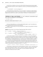
company Web sites, such as the Adobe product support Web site shown
in Figure 4.4, have additional customer support information available,
including documentation files, technical support issues, and frequently
asked questions (FAQs),which list commonly asked questions and
answers. It is tempting to replace customer service with a Web site. The
disadvantage is that if the user can’t find the answer to her question, she
feels like she wasted money on your product.
Good Design 101
Figure 4.4 The Adobe product support Web site.
© 2007 Adobe Systems Incorporated. All rights reserved. Adobe,the Adobe logo,Flash and
LiveCycle is/are either [a] registered trademark[s] or a trademark[s] of Adobe Systems
Incorporated in the United States and/or other countries
It’s important to understand what sort of documentation to include that
meets the needs of your audience. To do that, you need to interview your
users as often as possible.
Step 3: Interview Your Users Often
You may need to create different types of documentation to meet the needs
of your audience. For example, your documentation may include a printed
“quick start” guide, online help that’s accessible from the Help menu in the
software, documentation that can be printed or published to a PDF file, and
multimedia training simulations.
However, you won’t know what types of documentation you need until you
understand the needs of your users. You need to know who the software,
hardware, or Web site user experience level is before you determine what
needs your users have. You’ll learn more about user experience levels in
Chapter 6,“Analyzing Your Users.”
As you go through the design and development process,you’ll likely have pre-
ferred users test your product as you develop it and provide feedback. (In
software development, these preferred users are called beta testers.) Take
advantage of your testers by also having them review the documentation as
you develop it and send you feedback. The testers will provide invaluable
feedback that you can use to create better documentation before it’s released
to the general public. For example, you can ask your testers how many graph-
ics and screen shots to include, how to present information in the documen-
tation, and how well they find information (or not) in the documentation.
Step 4: Define Style Sheets and Formatting
After you know what documentation you need, you should define style
sheets and formatting conventions. Defining style sheets and formatting con-
ventions helps both your internal staff and your users. A defined style sheet
and formatting will help your team and subject matter experts (SMEs) under-
stand how you will structure and present information in the documentation.
Your users will benefit by seeing a clean and structured presentation that is
consistent in tone, style, grammar, and layout. The company may already have
style and formatting conventions that you can use in the creation of your doc-
umentation.
Step 5: Create an Outline
After you create the style and formatting guidelines,create a high-level outline
for each component of the documentation. For example, create outlines for
102 Chapter 4
Good Design 103
online help,printed documentation,and any training modules. Then circulate
these outlines to SMEs as well as the marketing and sales staff for feedback
and possibly other technical writers for peer feedback. High-level outlines
include header topics that provide a broad view of each document you’re
creating. After you receive the feedback, send the revised outline to the orig-
inal reviewers for a final review.
Step 6: Draft a Table of Contents
When the outline is complete, create a table of contents from it. In the table
of contents,you “drill down”by adding subtopics underneath the broad head-
lines that you created in your outline. It’s always a good idea to include sec-
tions for a glossary of terms and an index in printed or PDF user guides and
online help. You may also want to add appendixes that users can refer to in a
hurry, such as an appendix that contains answers to FAQs. When the draft is
ready, circulate it to the appropriate stakeholders for review.
Step 7: Acquire the Information
As you write the documentation,you will have to interview SMEs to fill in any
gaps that present themselves. If you do your homework about the contact
preferences of your SMEs in step 1, interviewing will be far less difficult than
it would be otherwise. As you gather information, it’s likely that you will
refine the table of contents to best present that information.
Step 8: Review Thoroughly
Users will recognize a poorly reviewed document right away. Therefore, it’s
important to have a structured,rigorous review process as you refine drafts of
your documentation. The review team should include members of your proj-
ect team,at least one person outside the team (for example,a sales engineer),
as well as beta testers.
Review your documentation in multiple stages to catch as many problems as
possible with accuracy, style, grammar, and the amount and appropriateness
of information. You may want to include a printed or online form with your
review copy so the reviewers can see what they need to check for, indicate
their approval, and write down changes. Be sure to tie all review stages to
strict deadlines so your document arrives on time and is as accurate and use-
ful as possible.
Why You Should Care About Good Design
In Chapter 3, you learned about the business reasons you should care about
good design. In sum, those reasons can be boiled down to three:
•
Save money you would unnecessarily spend trying to fix problems
caused by poor design
—These problems not only include users con-
tacting your customer support department asking how to use the prod-
uct, but they can also result in users using the product incorrectly,
which can lead to even greater problems.
•
Convince
e users that they s
hould use your product
—Users determine if
your software will be used. Even if users are required to use a software
product in their workplace, the usability of the software you design can
go a long way toward determining whether your customers will keep
making your software product, hardware product, or Web site.
•
Keep your existing users, and bring in new ones
— If your product
solves the user’s problems, she will feel that your company knows what
it’s doing and feel more confident in your company and your product. If
the product doesn’t help her, she will let others know through word of
mouth that your product isn’t good enough.
Today, the Web makes it easier than ever to share good and bad infor-
mation through such media as sites that let people share opinions
about products and services, as well as blogs (short for Web logs).
When you’re blogging, you’re sharing your ideas with hundreds or
thousands of other users on blog sites such as Blogger, WordPress, and
MySpace.
These rules, and the rules of good design, aren’t just for the first version of
your software, hardware, or Web site. If your company produces software and
Web sites, chances are that you update these products often to add new func-
tionality in response to what competitors are doing, and to prevent your cus-
tomers from gaining the impression that your products, and therefore your
company, are stale.
However, good intentions for the next version can go awry. How many times
have you upgraded your software to a new version that promised a better
user experience only to find that the feature you were used to no longer
works the same way—or isn’t included at all? You need to care about good
design and good design goals not only for your first version, but also for
104 Chapter 4
subsequent versions. That not only includes the design of the product—be it
hardware, software, or the Web site—but also any documentation you create
for the product. You’ll meet all three of the preceding guidelines, and you and
your company will be better for it.
Case Study: Creating a Paper Prototype Test
Now that the ROI statement is completed,Mike has given you the go-ahead to
construct the usability test, starting with updating information in the existing
database application. Mike has decided to work on upgrading the existing
application first so he can have all the internal issues worked out first before
making the capabilities available to his customers through his Web site.
Therefore,it’s time for you and Evan to start walking the project team through
the changes in the database application interface by using a paper prototype.
Evan purchased Susan Snyder’s Paper Prototyping from the neighborhood
bookstore to get more information about what’s needed to create a paper
prototype, including materials and steps for completing tasks.
You and Evan decided on the following office supplies to be purchased at the
nearby office supply store:
• White poster boards, which provide fixed backgrounds onto which
prototype session participants can place other elements.
• Blank paper for drawing larger prototype pieces and taking notes.
• Unlined index cards for smaller prototype pieces such as dialog boxes
and menus. Get 4 × 6-inch and 5 × 7-inch index cards in case you need
to cut them into several large pieces or if you need to write a lot of
information on one index card.
• Markers and pens to hand-draw parts of the prototype, such as new but-
tons.
• A highlighter pen to make a highlighted element on the screen.
• Scissors to cut screen shots into pieces as well as create smaller proto-
type pieces from pieces of paper and index cards.
• Restickable glue to keep elements of the prototype in place on the
page but which allow you to move those elements when you need to.
• Removable tape to write on and represent small amounts of text that
change, disabled buttons, and list elements.
Good Design 105
• Transparencies used with overhead projectors so you can hand-write
data on the transparencies without altering the prototype, which is use-
ful when you have a large number of fields to complete and you don’t
want to use a large amount of removable tape.
• Transparency pens for writing on the transparencies.
• Paper towel or cloth to wipe the transparencies.
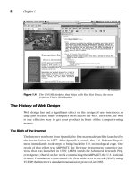
The good news with this project is that you and Evan can print current
screens,perhaps by taking screen shots and then enlarging them on a piece of
paper. These screen shots will serve as a basis to show what the interface
looks like, but you and Evan will also have to hand-draw parts of the proto-
type (see Figure 4.5).
106 Chapter 4
Figure 4.5 A mockup of the application screen.
The user interviews that you and Evan conducted that were discussed in
Chapter 3 resulted in a list of specific goals for the upgraded database. (For
example, the Parts Maintenance page should display visual cues that indicate
key status points for each part.) Each task must show a specific example of
meeting this goal.
Each task should be large enough for a user to achieve his goals but also have
a finite and predictable set of solutions with a clear end point. The task
should take only a few minutes for an expert to complete. For example, in the
Mike’s Bikes database application,one task could be to order a product online
by clicking the appropriate button in the product availability page.
Each task should be written down using the following template:
• The task number and task name.
• The goals or output of the task.
• Inputs and assumptions. For the Mike’s Bikes database application, you
need to list all the tangible and intangible information and resources
that the user needs to complete the task, such as a user ID and pass-
word to log into the application.
• The screen-level steps needed to complete the task. Each step will let
you and Evan know how many prototype pieces you need to create for
each screen in your prototype.
• The amount of time it would take an expert to complete the task.
• Instructions for the user to complete the task.
• Notes about the task, such as what you and Evan need to be aware of as
you conduct the test.
Using the template should yield a document like that shown in Figure 4.6.
The tasks should be written down as bullet points or as tersely as possible so
the tester learns only as much as he needs to know to complete the test and
so you and Evan can quickly refer to the steps in the task.
As you prepare the prototype,you need to prepare not only the blank screens
but also the data that will be associated with them. For example, you will
need to prepare a dialog box that contains the error that the user will see if he
does something wrong. Conversely, you will need to add the elements that
will appear if something works correctly. Because you’re updating an existing
application for Mike’s Bikes, it’s easy to see what sort of errors the application
returns by using the program. Mike has given you and Evan access to the
application to see how it works.
Good Design 107
108 Chapter 4
TASK WORKSHEET
Task Number/Task Name:
NAME DATE
Amount of time:
Task Goals and/or Output:
Instructions:
Notes:
Inputs and Assumptions:
Steps:
Figure 4.6 Documenting the tasks.
Note that if you have dummy text in the paper prototype that’s not important
to its functionality, such as content that will appear on the page, you can
“greek”the text by drawing lines that represent the text on the page.
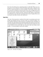
Organizing a paper prototype can result in a lot of clutter, so you and Evan
must decide on a strategy to organize all the paper prototype materials in one
place. You will place all the tasks and screens in a binder with dividers so you
can keep everything in check. The binder will also include a “pieces page”
(see Figure 4.7), which is strips of tape with data that stick to the page. You
and Evan will be able to remove the page from the binder, unstick the pieces
as necessary to place on the paper prototype, and then return those pieces to
the “pieces page.”
Good Design 109
PIECES PAGE
Figure 4.7 A pieces page.
All 10 team members will participate in the paper prototype test. Before you
perform a dry run of the test with yourself and Evan, you need to add more
information about the users’ conceptual model and apply it to the tasks you
want to offer in the paper prototype test. You’ll learn how to do that in the
next chapter.
Summary
This chapter began with a discussion about good design goals. You must
implement four good design goals into any user interface: to implement ethi-
cal, purposeful, pragmatic, and elegant designs. The benefits of user design
include lowering long-term production costs, focusing your energies on
improving the product instead of fixing problems after your users have com-
plained about them, and applying your design processes to other projects.
You learned about the constraints that users and designers face, and the gap
this causes in producing well-designed user interfaces. You should try to
bridge this gap as early in the process as possible, but if you can’t, you should
acquire as much information from the users as possible about whether the
designer’s outlook for the product matched the users’ outlook.
Paper prototyping and storyboarding were covered next. You learned about
the issues involved in creating a paper prototype, why it’s the most effective
means of developing and testing a user interface before you start developing
that interface, and the limitations of paper prototyping. You also learned how
to address skeptics’concerns,including being up front with the disadvantages
and making paper prototyping look more professional through the use of
stronger paper material so the prototype is more resistant to wear and tear.
You then learned about good documentation design and why it’s important
not only to good design overall, but a good user experience. Creating good
documentation is an 8-step process similar to a road map that takes you from
building your documentation team to reviewing the documentation thor-
oughly so you have documentation that looks good to your users, because
users will spot poorly reviewed documentation right away.
The chapter ended with a discussion about why you should care about good
user interface design. There are three primary reasons for good user interface
design: good design saves you and your team time and your company money,
convinces prospective customers to use your product, and keeps your exist-
ing customers happy. Note that good design goals for your product and your
110 Chapter 4
documentation don’t end with the first version; they continue with subse-
quent versions of your product that your company releases.
Review Questions
Now it’s time to review what you’ve learned in this chapter before you move
on to Chapter 5. Ask yourself the following questions, and refer to Appendix
A to double-check your answers.
1. Why should you resolve conflicts and constraints before you start the
design process?
2. Why does a user interface need to be elegant?
3. How do you bridge the gap between user and designer constraints?
4. Why should you use paper prototyping?
5. How do you give a paper prototyping exercise a professional look?
6. What are the advantages of paper prototyping?
7. What are the disadvantages of paper prototyping?
8. Why does a product require good documentation?
9. Why is good documentation design important?
10. Why is good design important?
Good Design 111
This page intentionally left blank This page intentionally left blank
5
How Users Behave
Those who cannot tell what they desire or expect, still sigh and
struggle with indefinite thoughts and vast wishes.
—Ralph Waldo Emerson
Topics Covered in This Chapter
The Psychology of User Actions
Knowledge: Brain Versus World
Task Structures
Conscious and Subconscious Behavior
Transforming Difficult Tasks into Simple Ones
Creating a Conceptual Model
Now that you’ve learned about good user design and what it takes to build
both a good user interface and good user documentation, you need to under-
stand how users behave so you can build a software product, hardware prod-
uct, or Web product to meet your users’ needs. When designers approach the
design of a product or documentation unaware of their users’mindset,a prod-
uct can become unusable very quickly. Only users who have more experience
with the way something works can figure it out.
There are plenty of stories about the trials of technology. In the olden days
before TiVo and digital video recorders, the “gold standard” of poor usability
was the VCR machine, where children often had a better grasp of how to use
one than their parents. If you have a great deal of experience with technol-
ogy, you also know that you’re the person who’s the live-in technology repair
department, especially within the family. Recently I visited my grandmother,
and she asked me to fix her radio. She unintentionally pushed a button and
113
lost her preprogrammed station (programmed by someone else in the family)
and the time on her clock. I got it working in a couple of minutes because I’m
used to playing with electronic gadgets that have a lot of buttons.
To understand your users’ needs, you’re going to have to delve a bit into psy-
chology. Users bring their experiences to a new task, and they bring those
experiences packed into a conceptual model of how they think the world
works. Users also bring their various personality types into every situation.
People have to manage their knowledge in their brain versus knowledge
that’s already in the world. Most of us deal with imprecise knowledge in our
brains, but we’re often reminded about knowledge that’s also in the world.
Sometimes we look for that world knowledge in other places, such as on the
Internet. Users’ perceptions of the world are reinforced every day as they
interact with it, and context affects perceptions, attitudes, and solutions.
There are trade-offs using knowledge in the brain versus knowledge in the
world.
According to Norman (2002), when people are presented with a new task,
they adhere to one of three different types of task structures. They also
adhere to previous information they’ve encountered and make their choices
based on this information on both a conscious and subconscious level.
You’ll see how to develop a user interface design by using several steps to
transform difficult tasks into simple ones and create a conceptual model of
what you’re creating.
The Psychology of User Actions
Everyone who has ever used anything or has tried to perform a task and failed
has felt helpless. Indeed, many people find reasons they can’t perform a task
using a product or object (Norman, 2002). These reasons include the follow-
ing:
•
Blaming oneself
—For example, I received a bill from my health insur-
ance carrier, so I believed that I had to pay it. However, I forgot that I
had signed up for the carrier’s automatic payment feature, so I was pay-
ing twice. I blamed myself for the error, but the health insurance com-
pany never printed anything obvious on the bill, such as “do not remit”
in the payment line. Instead, the bill contained small print saying I
114 Chapter 5
didn’t need to pay by check. The product, the bill, failed to impart this
information, and I paid twice as a result. (Fortunately, the insurance
company refunded the money I sent them by check.)
•
Adhering to misconceptions
—You could adhere to misconceptions
because that’s what you’re comfortable with and decide to blame the
product or company because that’s easier than reading the user guide
or finding information on the Web. For example, I had a router that I
thought wasn’t working, and I blamed the company. It was only later
after talking to the company’s technical support rep that I realized I’d
plugged the broadband network cable into the wrong router port.
•
Blaming the wrong cause
—Recently, my dryer was taking longer and
longer to dry. This dryer is part of a combination unit with the washer
on the bottom and the dryer on the top, and the dryer didn’t indicate
where the lint filter was. I adhered to a misconception and thought the
dryer automatically expunged lint because there wasn’t anything to
indicate where the filter was. It turned out that the dryer did have a lint
filter—it was just made to look like one of the vents at the back of the
unit. There was no mention of this anywhere on the dryer unit, and
when I searched the manufacturer’s Web site, I discovered that the
combination washer/dryer was obsolete and, since I live in an apart-
ment, I didn’t receive information from the management either. I was
amazed the dryer didn’t catch fire.
•
Helplessness
—The user learns this after he keeps failing at something
or learns it from past failures or poor design. For example, if you have
customers who want to do something on your site (such as make a pay-
ment) and you don’t follow the three-click rule for Web site design,
they may give up before they reach their destination because they’ve
encountered similar problems elsewhere, and they don’t have the toler-
ance to keep clicking and searching. However, people doing research
on the Web are more patient than people who are trying to perform a
specific task, so the three-click rule may not be as important to a per-
son doing research.
Psychological Types
You may be familiar with the Myers-Briggs Type Indicator (MBTI) method of
identifying and understanding personality type preferences. It was developed
during World War II by Katherine Briggs and her daughter, Isabelle Myers
How Users Behave 115
(Eisenberg and Eisenberg, 2006). The MBTI has been adopted by many com-
panies over the years as part of human relations training to show employees
what types of personalities are in the workplace and how to best get along
with people of each type. I remember going through the same type of manda-
tory MBTI training years ago.
The MBTI was based on psychological types pioneered by Carl Jung, and Hip-
pocrates before him (Eisenberg and Eisenberg, 2006). These psychological
types were split into four areas that Jung called feeler, thinker, sensor, and
intuitor.
Briggs and Myers expanded each of these four areas into two different
dichotomies, because people use their left and right brains to make deci-
sions. The use of these personality dichotomies reflects the dichotomy cre-
ated by the left brain, which is more logical and rational, and the right brain,
which is more creative and emotional. The current version of the test asks a
person 93 forced-choice questions, which means there are only two possible
answers. The tester then scores the test and places the information into one
of four dichotomies (Wikipedia, />Briggs_Type_Indicator):
•
Introversion and extroversion
—This dichotomy identifies where peo-
ple get their sources of energy. Introverts get their energy from an
internal view of ideas and impressions, and extroverts draw energy
from the outside world. An introvert can be worn down by long peri-
ods of social activity, whereas an extrovert is energized by it. The dis-
tinction does not reflect how much you like people or like to talk.
•
Intuition and sensing
—This dichotomy identifies how people acquire
information from the world. Sensing people get their information from
concrete information they acquire from the world. Intuitive people get
their information from hunches and emerging patterns based on their
experiences. Sensing is more of a conscious activity, and intuition is
more of a subconscious activity. You’ll learn more about the conscious
and subconscious later in this chapter. Often, a sensing person is more
mathematical in nature, whereas an intuitive person is one who can
better interpret literature.
•
Thinking and feeling
—Thinking people organize information logically
and make decisions about people and tasks subjectively. Feeling people
rely on their “gut” feeling, or instinct, about a person or task. However,
this doesn’t mean that thinking people don’t feel or feeling people
116 Chapter 5
don’t think—it’s more of a preference of whether people want to think
things through first or go with their instincts when they make a deci-
sion.
•
Judging and perceiving
—This dichotomy describes how people organ-
ize and structure their lives. If you like living an organized life with a
routine and only a few changes to keep a little variety in your life (like
going to a movie once in a while), you’re the judging type. However, if
you like to live a largely unstructured life and see where life takes you
during each day, you’re the perceiving type. Judging types like making a
decision; perceiving types like to gather information and explore all the
possibilities, so they take longer to make a decision.
Myers and Briggs combined these four dichotomies into 16 different person-
ality types because not everyone adheres to every type of personality charac-
teristic associated with the left brain and the right brain. For example, a
person can be an introvert but rely on her feelings when dealing with people
and tasks. Indeed, with eight different personality characteristics, there are
people on the extremes of the personality scale—those people who have
completely left-brained characteristics and those who have completely right-
brained characteristics—but most people are somewhere between both
extremes.
These personality types are not always predictive of how people will behave
in different situations,because context also drives behavior. For example,peo-
ple who are participating in a usability test may react differently because they
know they’re participating in a test. Those people may be more interested in
providing feedback about the product’s usability than they would be in the
real world, where they may just ask for a refund if they find the product’s
usability lacking.
The Four Primary Temperaments
Bryan and Jeffrey Eisenberg (2006) also discuss the development of tempera-
ment and character types by David Keirsey and Marilyn Bates,who were more
interested in long-term behavior patterns. These studies were later merged
with the Myers-Briggs personality tests to show how people put their person-
ality types to work when they make decisions. In Chapter 6,“Analyzing Your
Users,” you will learn how to create groups of user models called personas
that will include one or more of these personality types. From these models,
you will learn who your primary users are and determine what interface suits
How Users Behave 117
118 Chapter 5
those users best. For example, if your primary users are sensing people and
also the judging type, you may want to create an interface that is consistent
with interfaces that don’t introduce anything unfamiliar and provide visual
cues for completing tasks.
Keirsey and Bates identified the sensing and intuition types as the first type of
preference that people apply when they approach a task or situation,
because people want to know how to process information from the brain
and the world. (You’ll learn more about knowledge in the brain versus knowl-
edge in the world later in this chapter.) Keirsey and Bates then applied this
preference criterion against the four left-brain personality types to create
four primary temperaments (Eisenberg and Eisenberg, 2006):
• Sensing/judging
• Sensing/perceiving
• Intuitive/feeling
• Intuitive/thinking
Eisenberg and Eisenberg (2006) give each of these four primary tempera-
ments intuitive labels that provide a good idea of the behavior that each type
of user temperament exhibits when the user is faced with a new task or situ-
ation. These four types are as follows:
• Sensing/judging: methodical
• Sensing/perceiving: spontaneous
• Intuitive/Feeling: humanistic
• Intuitive/Thinking: competitive
Note
If you’ve been through personality training, you may recognize these per-
sonality types as being associated with different types of animals. When I
went through personality training as a contractor for a large high-tech
company, these four personality types were associated with different types
of birds. A methodical personality was associated with an owl, a sponta-
neous personality with a peacock, a humanistic personality with a dove,
and a competitive personality with an eagle.
Methodical
Methodical people are logical,and they approach a new situation slowly. They
exhibit the following characteristics (Eisenberg and Eisenberg, 2006):
• They have a detached attitude and are detail-oriented.
• They are disciplined about their time, and they methodically pace tasks
so they can get as much done during the day as possible.
• They want to know how a task or solution solves their problem. They
want to see hard evidence of that, and they want to see testimonials
and other evidence that you provide excellent customer service. In the
case of a user interface, methodical people want to see that you don’t
waste their time with unnecessary clicks.
• They believe that completing a task is its own reward.
• They despise disorganization and inefficiency.
Methodical people want you to answer the how questions:
• What is the process to complete this task?
• What are the details involved with completing this task?
• What proof do you have that this task will work?
Spontaneous
Spontaneous types live in the moment, which makes them impulsive when
they take action. They wish to make an immediate impact—they skip many of
the details and make a gut decision quickly. Spontaneous types exhibit the fol-
lowing characteristics (Eisenberg and Eisenberg, 2006):
• They have the personal touch, and they’re activity-oriented.
• They use time spontaneously and keep up a fast-paced lifestyle.
• They want to address immediate needs and want to be presented with
relevant and credible options so they can solve the problem right away.
They never read instructions.
Spontaneous types want you to answer the why and when questions:
• How can you get me what I need as quickly as possible?
How Users Behave 119
120 Chapter 5
• How can I narrow down my choices to make a decision as soon as pos-
sible?
• Can I customize how I work with your product?
Humanistic
Humanistic types put others before themselves, and they’re uncomfortable
with allowing anyone else to do work (or anything else) for them. Humanis-
tic types highly value relationships and enjoy helping others. They fear sepa-
ration, are creative and entertaining, and are good listeners, so it’s not
surprising that they have a wide circle of friends and acquaintances. Human-
istic types prefer to look at the big picture. They greatly value human devel-
opment in themselves and others.
Humanistic types exhibit the following characteristics (Eisenberg and Eisen-
berg, 2006):
• They have the personal touch, and their lives revolve around relation-
ships.
• Their time is open-ended, and they like to go at a slow pace. Humanists
generally are averse to deadlines.
• They want to know who else has used a solution to solve a problem,
and they want to learn what others’ experiences have been through
testimonials and other means of user feedback.
Humanistic types want you to answer the who questions:
• How will your product make me feel?
• Who will this product help?
• Can I customize how I work with your product?
• Can I trust you?
• Who is working on your staff to develop this product?
Competitive
Competitive types seek competence in themselves and others and desire not
only to understand life, but to control it. They enjoy overcoming challenges
and learning new things and look for methods to achieve their goals. Com-
petitive types are highly motivated and persuasive. They usually come to
decisions quickly after they feel they have all the information at hand.
Competitive types exhibit the following characteristics (Eisenberg and Eisen-
berg, 2006):
• They are power-oriented and businesslike.
• They are disciplined when it comes to time; they strategically manage
their time to get the most out of each day.
• They want to know what a proposed solution will do for them, and
they want you to provide rational options for overcoming challenges.
• They despise disorganization and inefficiency.
Competitive types want you to answer the what questions:
• Do you have a credible product backed by a credible company?
• How can you help me be more productive?
• What are your product’s competitive advantages?
The Seven Stages of Human Action
Many everyday tasks aren’t planned,but they’re opportunistic—on most days,
people simply decide to use something when they think about it. No matter if
you’ve used a product before or not,you may experience difficulties with that
product because of simple misunderstandings and misinterpretations.
These misunderstandings or misinterpretations can occur anywhere along
what Norman (2002) described as the seven stages of human action when
performing a task:
1.
Forming the goal
—For example, if you have a Web site with informa-
tion that the user wants, the user will consider the goal to be to find the
information on the site.
2.
Forming the intention
—If the user believes that the Web site contains
information she needs, she will make a decision to find that informa-
tion.
3.
Specifying the action
—The user needs to identify which link to click
on that she believes will get her closer to reaching the information on
the Web site.
4.
Executing the action
—The user clicks the link to get to the next level
in the Web site.
How Users Behave 121
5.
Perceiving the state of the world
—The new Web page appears in the
user’s Internet browser, and the user reads the page and perceives what
has happened as a result of executing the action.
6.
Interpreting the state of the world
—The user processes the informa-
tion on the new Web page and determines if the information on the
Web site is the information she seeks.
7.
Evaluating the outcome
—The user determines whether clicking the
link met the desired outcome. If it didn’t, she must decide whether
clicking another link on the new page will get her closer to the desired
outcome.
People can use one, some, or all of these stages when performing a task, and
there is a continuous feedback loop. Misunderstandings and misinterpreta-
tions can come from people who are not using all of the stages for some rea-
son, such as confidence that they’ve used a similar product in the past and
belief that their actions will work for a new product just as well. Other mis-
understandings and interpretations can come from poor design that fails to
account for how the user perceives the state of the world.
Knowledge: Brain Versus World
People rely on a dichotomy of two different preferences: sensing and intu-
ition (Eisenberg and Eisenberg, 2006). Sensing is based on knowledge that
people bring with them from information they gather through the world,
whereas intuition is based more on information they’ve stored in their brains,
such as patterns they’ve noticed from similar tasks.
Most people rely on imprecise knowledge to get around in the world. For
example, people know what a 10 dollar bill looks like because they see the
number 10 in the corners of the bill. However, if you ask a group of people
who the person is on the front of the bill or what the structure is on the back
of the bill, you won’t get many correct answers. People don’t need precise
knowledge in many cases. For example, if I see a $10 bill in my wallet to pay
for lunch, as shown in Figure 5.1, I don’t care who the person is on the front
of the bill because that information isn’t necessary to complete the transac-
tion. However, I need to know that the number 10 is in the corners of the bill
so that I use the right currency to pay for the transaction and get the food I
need to survive.
122 Chapter 5
Our brains can only accept so much information in our memories. Because of
that, we require constraints that break information up so our brains can
process it. For example, there are seven digits in phone numbers because our
human brains can process only seven digits at a time. As we perform more
complex tasks, we break up each task into smaller ones so we can keep track
of everything, such as when we’re assembling a new computer desk that has
a large number of parts and tasks.
People are also reminded about knowledge from the world—that is, from
external sources. If you’re like me, you use a calendar program like Microsoft
Outlook to remind you to perform tasks at a certain time. (And, like me, you
may have your calendar synchronized with your Palm Treo or other handheld
PC calendar.) There may also be instructions for a product that tell you how
to do something, such as the controls on your stove showing you which knob
controls the appropriate burner.
How much knowledge you use in your brain versus the world depends on
the context of the situation. For example, if you’re presented with a new Win-
dows program, you know how Windows works, so you’re likely to use more
of what’s stored in your brain about the use of Windows products to guide
you in the use of the program. There are trade-offs to using knowledge in
your brain versus knowledge available in the world. For example, knowledge
available in the world is easily retrievable as long as it’s visible or audible
and within your visual and auditory range. However, if you rely on your mem-
ory, you may have a difficult time remembering or become distracted by
How Users Behave 123
Figure 5.1 Can you name the person on the 10 dollar bill?
something else. Yet, after you do remember something, you’re efficient
because you know how to do the task. If you’re relying on instruction from
the world, such as from an assembly diagram that comes with a product,
you’re learning; therefore, you’re inefficient.
When you create personas in Chapter 6, you’ll learn more about how your
users see knowledge in their brains and in the world. Then you’ll use that
information to design an interface that helps your users complete tasks
quickly and efficiently.
Task Structures
So how do people manage others’knowledge in their brain versus knowledge
in the world to communicate as effectively as possible? They structure tasks,
which is something you learned in school. There are three types of task struc-
tures that people face when performing tasks (Norman, 2002):
•
Wide and deep structures that contain a large number of choices when
performing a task, such as in
n a game
—For example, the game of base-
ball involves many possible outcomes in every situation. If a hitter
comes up to hit, he could hit a home run, or he could hit within the
field of play. If he does hit within the field of play, he could hit a single,
double, or triple. Or he could try to stretch a single into a double and
make it to second base safely—or be called out. Or he could hit a foul
ball that will be caught by the opposing team—or not. Or he could pop
up or fly out to one of the nine defensive players. Or he could strike
out.
And these are only some of the possible outcomes.
•
Shallo
w structures that offer a few choices after a top-level choice
—For
example, a restaurant menu contains several top-level choices for you to
choose from, such as appetizers, salads, entrees, drinks, and desserts.
Underneath each top-level choice, you have a choice of other options,
such as beef, chicken, pork, fish, and vegetarian meals under the entrees
section. And under those options, you can decide what type of side
dish and vegetable you want. A menu bar on a window on your com-
puter is a shallow structure.
•
Deep and narro
ow structures, such as a recipe that requ
ires many steps
to be followed to complete the task
—These structures are commonly
used in user documentation when you’re teaching the user to do
124 Chapter 5
How Users Behave 125
something. A former boss of mine referred to this approach as the
“cookbook style” of documentation where you give the reader short,
step-by-step instructions for completing a task.
In general, people find wide and deep structures the most challenging and
the most time consuming when completing a task because there are so many
options available. The reason for that lies in how people behave consciously
and subconsciously.
Conscious and Subconscious Behavior
We handle a lot of our everyday behavior subconsciously (Norman, 2002).
After all, we’ve brushed our teeth, showered,dressed, and driven to work and
back many times. Sometimes we can’t even remember driving through an
intersection to get to work, even though we realize that we drove through
that intersection because we’re obviously at work! Subconscious work
depends on patterns and regularity, and our subconscious mind completes
tasks every day based on these patterns.
Sometimes our subconscious mind takes over unexpectedly. When I was in
grade school, I was so comfortable taking a spelling test that my conscious
mind decided to take a vacation for a couple of minutes, and I didn’t remem-
ber those two minutes. However, when I looked down at my paper, I found I
had written two more words, and both of them were spelled correctly.
Subconscious behavior can be fast, relies on longer-term memories, and can
make it seem as though solutions pop into your head instantaneously. Now
that I’m an adult, I find that my subconscious comes up with answers I
thought about days earlier but had forgotten about, but then an answer sud-
denly popped into my head and I wrote it down. Subconscious behavior can
also be the source of hunches about behavior or how something is supposed
to work, as opposed to the conscious method of acquiring information.
By contrast, conscious behavior is slow, serial, and relies on short-term mem-
ories, which are limited and can be unreliable. When you perform tasks using
your conscious mind, you have to be deliberate and go through the seven
stages of human action to perform a task, as you learned about earlier in this
chapter. The conscious mind also relies on the subconscious to see if there
are patterns it can apply to the task. This assumption of patterns can lead to
mistakes.