Volume 17 - Nondestructive Evaluation and Quality Control Part 20 pot
Bạn đang xem bản rút gọn của tài liệu. Xem và tải ngay bản đầy đủ của tài liệu tại đây (1.1 MB, 80 trang )
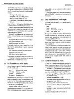
Fig. 17 Second revision control charts for Table 2
data with two more sample deletions (samples 1 and 11,
both of which exceed UCL in Fig. 16
) resulting from workpieces produced prior to machine being properly
warmed up. (a) -chart. (b) R-chart. Data now have k = 16, n = 5.
Importance of Using Both and R Control Charts. This example points to the importance of maintaining both
and R control charts and the significance of first focusing attention on the R-chart and establishing its stability. Initially,
no points fell outside the -chart control limits and one could be led to believe that this indicates that the process mean
exhibits good statistical control. However, the fact that the R-chart was initially not in control caused the limits on the -
chart to be somewhat wider because of two inordinately large R values. Once these special causes of variability were
removed, the limits on the -chart became narrower, and two values now fall outside these new limits. Special causes
were present in the data, but initially were not recognizable because of the excess variability as seen in the R-chart.
This example also points strongly to the need to have 25 or more samples before initiating control charts. In this case,
once special causes were removed, only 16 subgroups remained to construct the charts. This is simply not enough data.
Importance of Rational Sampling
Perhaps the most crucial issue to the successful use of the Shewhart control chart concept is the definition and collection
of the samples or subgroups. This section will discuss the concept of rational sampling, sample size, sampling frequency,
and sample collection methods and will review some classic misapplications of rational sampling. Also, a number of
practical examples of subgroup definition and selection will be presented to aid the reader in understanding and
implementing this central aspect of the control chart concept.
Concept of Rational Sampling. Rational subgroups or samples are collections of individual measurements whose
variation is attributable only to one unique constant system of common causes. In the development and continuing use of
control charts, subgroups or samples should be chosen in a way that provides the maximum opportunity for the
measurements within each subgroup to be alike and the maximum chance for the subgroups to differ from one another if
special causes arise between subgroups. Figure 18 illustrates the notion of a rational sample. Within the sample or
subgroup, only common cause variation should be present. Special causes/sporadic problems should arise between the
selection of one rational sample and another.
Fig. 18 Graphical depiction of a rational subgroup illustrating effect of special causes on mean.
(a) Unshifted.
(b) Shifted
Sample Size and Sampling Frequency Considerations. The size of the rational sample is governed by the
following considerations:
•
Subgroups should be subject to common cause variation. The sample size should be small to minimize
the chance of mixing data within one sample
from a controlled process and one that is out of control.
This generally means that consecutive sample selection should be used rather than distributing the
sample selection over a period of time. There are, however, certain situations where distributed
sampling may be preferred
•
Subgroups should ensure the presence of a normal distribution for the sample means. In general, the
larger the sample size, the better the
distribution is represented by the normal curve. In practice,
sample sizes of four or more ensure a good approximation to normality
•
Subgroups should ensure good sensitivity to the detection of assignable causes. The larger the sample
size, the more likely that a shift of a given magnitude will be detected
When the above factors are taken into consideration, a sample/subgroup size of four to six is likely to emerge. Five is the
most commonly used number because of the relative ease of further computation.
Sampling Frequency. The question of how frequently samples should be collected is one that requires careful thought.
In many applications of and R control charts, samples are selected too infrequently to be of much use in identifying and
solving problems. Some considerations in sample frequency determination are the following:
• If the process under study has not been charted
before and appears to exhibit somewhat erratic behavior,
samples should be taken quite frequently to increase the opportunity to quickly identify improvement
opportunities. As the process exhibits less and less erratic behavior, the sample interval can be
lengthened
•
It is important to identify and consider the frequency with which occurrences are taking place in the
process. This might include, for example, ambient condition fluctuations, raw material changes, and
process adjustments such as tool changes o
r wheel dressings. If the opportunity for special causes to
occur over a 15-min period is good, sampling twice a shift is likely to be of little value
•
Although it is dangerous to overemphasize the cost of sampling in the short term, clearly it cannot be
neglected
Common Pitfalls in Subgroup Selection. In many situations, it is inviting to combine the output of several parallel
and assumed-to-be-identical machines into a single sample to be used in maintaining a single control chart for the process.
Two variations of this approach can be particularly troublesome: stratification and mixing.
Stratification of the Sample. Here each machine contributes equally to the composition of the sample. For example,
one measurement each from four parallel machines yields a sample/subgroup of n = 4, as seen in Fig. 19. In this case,
there will be a tremendous opportunity for special causes (true differences among the machine) to occur within
subgroups.
Fig. 19 Block diagram depicting a stratified sample selection
When serious problems do arise, for example, for one or more of the machines, they will be very difficult to detect
because of the use of stratified samples. This problem can be detected, however, because of the unusual nature of the -
chart pattern (recall the previous pattern analysis) and can be rectified provided the concepts of rational sampling are
understood.
The R-charts developed from such data will usually show very good control. The corresponding control chart will show
very wide limits relative to the plotted values, and their control will therefore appear almost too good. The wide limits
result from the fact that the variability within subgroups is likely to be subject to more than merely common causes (Fig.
20).
Fig. 20 Typical control charts obtained for a stratified sample selection. (a) -chart. (b) R-chart
Mixing Production From Several Machines. Often it is inviting to combine the output of several parallel
machines/lines into a single stream of well-mixed product that is then sampled for the purposes of maintaining control
charts. This is illustrated in Fig. 21.
Fig. 21 Block diagram of sampling from a mixture
If every sample has exactly one data point from each machine, the result would be the same as that of stratified sampling.
If the sample size is smaller than the number of machines with different means or if most samples do not include data
from all machines, the within-sample variability will be too low, and the between-sample differences in the means tend to
be large. Thus, the -chart would give an appearance that the values are too far away from the centerline.
Statistical Quality Design and Control
Richard E. DeVor, University of Illinois, Urbana-Champaign; Tsong-how Chang, University of Wisconsin, Milwaukee
Zone Rules for Control Chart Analysis
Special causes often produce unnatural patterns that are not as clear cut as points beyond the control limits or obvious
regular patterns. Therefore, a more rigorous pattern analysis should be conducted. Several useful tests for the presence of
unnatural patterns (special causes) can be performed by dividing the distance between the upper and lower control limits
into zones defined by , 2 , and 3 boundaries, as shown in Fig. 22. Such zones are useful because the statistical
distribution of follows a very predictable pattern the normal distribution; therefore, certain proportions of the points
are expected to fall within the ± boundary, between and 2 , and so on.
The following sections discuss eight tests that can be applied
to the interpretation of and R control charts. Not all of
these tests follow/use the zones just described, but it is
useful to discuss all of these rules/tests together. These tests
provide the basis for the statistical signals that indicate that
the process has undergone a change in its mean level,
variability level, or both. Some of the tests are based
specifically on the zones defined in Fig. 22 and apply only to
the interpretation of the -chart patterns. Some of the tests
apply to both charts. Unless specifically identified to the
contrary, the tests/rules apply to the consideration of data to
one side of the centerline only.
When a sequence of points on the chart violates one of the
rules, the last point in the sequence is circled. This signifies
that the evidence is now sufficient to suggest that a special cause has occurred. The issue of when that special cause
actually occurred is another matter. A logical estimation of the time of occurrence may be the beginning of the sequence
in question. This is the interpretation that will be used here. It should be noted that some judgment and latitude should be
given. Figure 23 illustrates the following patterns:
• Test 1(extreme points): The existence of a single point beyond zone A signals the presence of an out-of-
control condition (Fig. 23a)
• Test 2 (2 out of 3 points in zone A or beyond):
The existence of 2 out of any 3 successive points in zone
A or beyond signals the presence of an out-of-control condition (Fig. 23b)
• Test 3 (4 out of 5 points in zone B or beyond):
A situation in which there are 4 out of 5 successive points
in zone B or beyond signals the presence of an out-of-control condition (Fig. 23c)
• Test 4 (runs above or below the centerline):
Long runs (7 or more successive points) either strictly
above or strictly below the centerline; this rule applies to both the and R control charts (Fig. 23d)
• Test 5 (trend identification): When 6 successive points on either the or the R co
ntrol chart show a
continuing increase or decrease, a systematic trend in the process is signaled (Fig. 23e)
• Test 6 (trend identification): When 14 successive points oscillate up and down on either the or R
control chart, a systematic trend in the process is signaled (Fig. 23f)
• Test 7 (avoidance of zone C test): When 8 successive points, occurring on either side of the center
line,
avoid zone C, an out-of-
control condition is signaled. This could also be the pattern due to mixed
sampling (discussed earlier), or it could also be signaling the presence of an over-
control situation at the
process (Fig. 23g)
• Test 8 (run in zone C test): When 15 successive points on the -
chart fall in zone C only, to either side
of the centerline, an out-of-
control condition is signaled; such a condition can arise from stratified
Fig. 22 Control chart zones to aid chart interpretation
sampling or from a change (decrease) in process variability (Fig. 23h)
The above tests are to be applied jointly in interpreting the charts. Several rules may be simultaneously broken for a given
data point, and that point may therefore be circled more than once, as shown in Fig. 24
Fig. 23 Pattern analysis of -charts. Circ
led points indicate last point in a sequence of points on a chart that
violates a specific rule.
Fig. 24 Example of simultaneous application of more than one test for out-of-
control conditions. Point A is a
violation of tests 3 and 4; point B is a violation of tests 2, 3, and 4; and point C is a violation of tests 1 and 3.
See text for discussion.
In Fig. 24, point A is circled twice because it is the end point of a run of 7 successive points above the centerline and the
end point of 4 of 5 successive points in zone B or beyond. In the second grouping in Fig. 24, point B is circled three times
because it is the end point of:
• A run of 7 successive points below the centerline
• 2 of 3 successive points in zone A or beyond
• 4 of 5 successive points in zone B or beyond
Point C in Fig. 24 is circled twice because it is an extreme point and the end point of a group of five successive points,
four of which are in zone B or beyond. Two other points (D, E) in these groupings are circled only once because they
violate only one rule.
Statistical Quality Design and Control
Richard E. DeVor, University of Illinois, Urbana-Champaign; Tsong-how Chang, University of Wisconsin, Milwaukee
Control Charts for Individual Measurements
In certain situations, the notion of taking several measurements to be formed into a rational sample of size greater than
one simply does not make sense, because only a single measurement is available or meaningful at each sampling. For
example, process characteristics such as oven temperature, suspended air particulates, and machine downtime may vary
during a short period at sampling. Even for those processes in which multiple measurements could be taken, they would
not provide valid within-sample variation for control chart construction. This is so because the variation among several
such measurements would be primarily attributed to variability in the measurement system. In such a case, special control
charts can be used. Commonly used control charts for individual measurements include:
• x, R
m
control charts
• Exponentially weighted moving average (EWMA) charts
• Cumulative sum charts (CuSum charts)
Both the EWMA (Ref 13, 14, 15, 16) and the CuSum (Ref 17, 18, 19, 20, 21) control charts can be used for charting
sample means and other statistics in addition to their use for charting individual measurements.
x and R
m
(Moving-Range) Control Charts. This is perhaps the simplest type of control chart that can be used for
the study of individual measurements. The construction of x and R
m
control charts is similar to that of and R control
charts except that x stands for the value of the individual measurements and R
m
for the moving range, which is the range
of a group of n consecutive individual measurements artificially combined to form a subgroup of size n (Fig. 25). The
moving range is usually comprised of the largest difference in two or three successive individual measurements. The
moving ranges are calculated as shown in Fig. 25 for the case of three consecutive measurements used to form the
artificial samples of size n = 3.
Fig. 25 Examples of three successive measurements used to determine the moving range
Because the moving range, R
m
, is calculated primarily for the purpose of estimating common cause variability of the
process, the artificial samples that are formed from successive measurements must be of very small size to minimize the
chance of mixing data from out-of-control conditions. It is noted that x and R
m
are not independent of each other and that
successive sample R
m
values are overlapping.
The following example illustrates the construction of x and R
m
control charts, assuming that x follows at least
approximately a normal distribution. Here, R
m
is based on two consecutive measurements; that is, the artificial sample
size is n = 2.
Example 2: x and R
m
Control Chart Construction for the Batch Processing of
White Millbase Component of a Topcoat.
The operators of a paint plant were studying the batch processing of white millbase used in the manufacture of topcoats.
The basic process begins by charging a sandgrinder premix tank with resin and pigment. The premix is agitated until a
homogeneous slurry is obtained and then pumped through the sandgrinder. The grinder output is sampled to check for
fineness and gloss. A batch may require adjustments by adding pigment or resin to achieve acceptable gloss. Through
statistical modeling of the results of some ash tests, a quantitative method was developed for determining the amount of
pigment or resin to be added when necessary, all based on the weight per unit volume (lb/gal.) of the batch. Therefore, it
became important to monitor the weight per unit volume for each batch to achieve millbase uniformity. Table 3 lists
weight per unit volume data for 27 consecutive batches.
Table 3 x and R
m
control chart data for the batch processing of white millbase topcoat component of
Example 2
Batch
x, lb/gal. R
m
(a)
1 14.04
2 13.94 0.10 (14.04 - 13.94 = 0.10)
3 13.82 0.12 (13.94 - 13.82 = 0.12)
4 14.11 0.29 (14.11 - 13.82 = 0.29)
5 13.86 0.25
6 13.62 0.24
7 13.66 0.04
8 13.85 0.19
9 13.67 0.18
10 13.80 0.13
11 13.84 0.04
12 13.98 0.14
13 13.40 0.58
14 13.60 0.20
15 13.80 0.20
16 13.66 0.14
17 13.93 0.27
18 13.45 0.48
19 13.90 0.45
20 13.83 0.07
21 13.64 0.19
22 13.62 0.02
23 13.97 0.35
24 13.80 0.17
25 13.70 0.10
26 13.71 0.01
27 13.67 0.04
= 13.77
m
= 0.19
(a)
Calculated, n = 2
In the calculation of averages in Table 3, is an average of all 27 individual measurements, while
m
is an average of 27
- 1 = 26 R
m
values because there are only 26 moving ranges for n = 2. If the artificial samples were of size n = 3, there
would be only 27 - 2 = 25 moving averages.
Once the and
m
values are calculated, they are used as centerline values of x and R
m
control charts, respectively. The
calculation of upper and lower control limits for the R
m
control chart is also the same as in , R control charts, using the
artificial sample size n to determine D
3
and D
4
values. However, the upper and lower control limits for the x chart should
always be based on a sample size of one, using
m
the same way as in control charts. These calculations are shown
below for the example data. For the R
m
-chart, for n = 2, D
3
= 0, and D
4
= 3.27:
CL =
m
= 4.99/26 = 0.192
UCL = D
4
m
= (3.27)(0.19) = 0.62
LCL = D
3
m
= 0
For the x-chart, an estimate of the standard deviation of x is equal to
m
/d
2
, where d
2
= 1.128 from Table 1 using n = 2.
Thus, 3 = (3/d
2
)
m
= (3/1.128)
m
= 2.66
m
:
CL
x
= 13.77
UCL
x
= + 2.66
m
= 13.77 + (2.66)(0.19)
= 14.28
LCL
x
= - 2.66
m
= 13.77 - (2.66)(0.19)
= 13.26
When the individual x values follow a normal distribution, the patterns on the x-chart are analyzed in the same manner as
the Shewhart -charts. A sample x is circled as a signal of out-of-control values if it falls outside a control limit, if it is
the end point of a sequence that violates any of the zone rules, or if it simply indicates a nonrandom sequence. However,
tests for unnatural patterns should be used with more caution on an x-chart than on an -chart because the individual
chart is sensitive to the actual shape of the distribution of the individuals, which may depart considerably from a true
normal distribution. Figures 26 and 27 show the x and R
m
control charts for the example data.
Fig. 26 R
m
control chart obtained for white millbase data in Table 3. Data are for k = 27, n = 2.
Fig. 27 x control chart obtained for white millbase data in Table 3. Data are for k = 27, n = 2.
References cited in this section
13.
S.W. Roberts, Control Charts Based on Geometric Moving Averages, Technometrics, Vol 1, 1959, p 234-
250
14.
A.L. Sweet, Control Charts Using Coupled Exponentially Weighted Moving Averages, Trans. IIE,
Vol 18
(No. 1), 1986, p 26-33
15.
A.W. Wortham and G.F. Heinrich, Control Charts Using Exponential Smoothing Techniques, Trans. ASQC,
Vol 26, 1972, p 451-458
16.
A.W. Wortham, The Use of Exponentially Smoothed Data in Continuous Process Control,
Int. J. Prod.
Res., Vol 10 (No. 4), 1972, p 393-400
17.
A.F. Bissell, An Introduction to CuSum Charts, The Institute of Statisticians, 1984
18.
"Guide To Data Analysis and Quality Control Using CuSum Techniques," BS5703 (4 parts), British
Standards Institution, 1980-1982
19.
J.M. Lucas, The Design and Use of V-Mask Control Scheme, J. Qual. Technol., Vol 8 (No. 1), 1976, p 1-12
20.
J. Murdoch, Control Charts, Macmillan, 1979
21.
J.S. Oakland, Statistical Process Control, William Heinemann, 1986
Statistical Quality Design and Control
Richard E. DeVor, University of Illinois, Urbana-Champaign; Tsong-how Chang, University of Wisconsin, Milwaukee
Shewhart Control Charts for Attribute Data
Many quality assessment criteria for manufactured goods are not of the variable measurement type. Rather, some quality
characteristics are more logically defined in a presence-of or absence-of sense. Such situations might include surface
flaws on a sheet metal panel; cracks in drawn wire; color inconsistencies on a painted surface; voids, flash, or spray on an
injection-molded part; or wrinkles on a sheet of vinyl.
Such nonconformities or defects are often observed visually or according to some sensory criteria and cause a part to be
defined simply as a defective part. In these cases, quality assessment is referred to as being made by attributes.
Many quality characteristics that could be made by measurements (variables) are often not done as such in the interest of
economy. A go/no-go gage can be used to determine whether or not a variable characteristic falls within the part
specification. Parts that fail such a test are simply labeled defective. Attribute measurements can be used to identify the
presence of problems, which can then be attacked by the use of and R control charts. The following definitions are
required in working with attribute data:
• Defect:
A fault that causes an article or an item to fail to meet specification requirements. Each instance
of the lack of conformity of an article to specification is a defect or nonconformity
• Defective: An item or article with one or more defects is a defective item
• Number of defects: In a sample of n items, c
is the number of defects in the sample. An item may be
subject to many different types of defects, each of which may occur several times
• Number of defectives: In a sample of n items, d is the number of defective items in the sample
• Fractional defective: The fractional defective, p
, of a sample is the ratio of the number of defectives in a
sample to the total number of items in the sample. Therefore, p = d/n
Operational Definitions
The most difficult aspect of quality characterization by attributes is the precise determination of what constitutes the
presence of a particular defect. This is so because many attribute defects are visual in nature and therefore require a
certain degree of judgment and because of the failure to discard the product control mentality. For example, a scratch that
is barely observable by the naked eye may not be considered a defect, but one that is readily seen is. Furthermore, human
variation is generally considerably larger in attribute characterization (for example, three different caliper readings of a
workpiece dimension by three inspectors and visual inspection of a part by these same individuals yield anywhere from
zero to ten defects). It is therefore important that precise and quantitative operational definitions be laid down for all to
observe uniformly when attribute quality characterization is being used. The length or depth of a scratch, the diameter of a
surface blemish, or the length of a flow line on a molded part can be specified.
The issue of the product control versus process control way of thinking about defects is a crucial one. From a product
control point of view, scratches on an automobile grille should be counted as defects only if they appear on visual
surfaces, which would directly influence part function. From a process control point of view, however, scratches on an
automobile grille should be counted as defects regardless of where they appear because the mechanism creating these
scratches does not differentiate between visual and concealed surfaces. By counting all scratches, the sensitivity of the
statistical charting instrument used to identify the presence of defects and to lead to their diagnosis will be considerably
increased.
A major problem with the product control way of thinking about part inspection is that when attribute quality
characterization is being used not all defects are observed and noted. The first occurrence of a defect that is detected
immediately causes the part to be scrapped. Often, such data are recorded in scrap logs, which then present a biased view
of what the problem may really be. One inspector may concentrate on scratch defects on a molded part and will therefore
tend to see these first. Another may think splay is more critical, so his data tend to reflect this type of defect more
frequently. The net result is that often such data may then mislead those who may be using it for process control purposes.
Figure 28 shows an example of the occurrence of multiple defects on a part. It is essential from a process control
standpoint to carefully observe and note each occurrence of each type of defect. Figure 29 shows a typical sample result
and the careful observation of each occurrence of each type of defect. In Fig. 29, the four basic measures used in attribute
quality characterization are defined for the sample in question.
Fig. 28 Typical multiple defects present on an en
gine valve seat blank to illustrate defect identification in an
attribute quality characterization situation
Fig. 29 Analysis
of four basic measures of attribute quality characterization used to illustrate the typical defects
present in the engine valve seat blank shown in Fig. 28
. Out of ten samples tested, four had no defects, three
had single defects, and three had multiple defects.
p-Chart: A Control Chart for Fraction Defective
Consider an injection-molding machine producing a molded part at a steady pace. Suppose the measure of quality
conformance of interest is the occurrence of flash and splay on the molded part. If a part has so much as one occurrence
of either flash or splay, it is considered to be nonconforming, that is, a defective part.
To establish the control chart, rational samples of size n = 50 parts are drawn from production periodically (perhaps, each
shift), and the sampled parts are inspected and classified as either defective (from either or both possible defects) or
nondefective. The number of defectives, d, is recorded for each sample. The process characteristic of interest is the true
process fraction defective p'. Each sample result is converted to a fraction defective:
(Eq 1)
The data (fraction defective p) are plotted for at least 25 successive samples of size n = 50. The individual values for the
sample fraction defective, p, vary considerably, and it is difficult to determine from the plot at this point if the variation
about the average fraction defective, , is solely due to the forces of common causes or special causes.
Control Limits for the p-Chart. It can be shown that for random sampling, under certain assumptions, the occurrence
of the number of defectives, d, in the sample of size n is explained probabilistically by the binominal distribution.
Because the sample fraction defective, p, is simply the number of defectives, d, divided by the sample size, n, the
occurrence of values for p also follows the binominal distribution. Given k rational samples of size n, the true fraction
defective, p', can be estimated by:
(Eq 2)
or
(Eq 3)
Equation 3 is more general because it is valid whether or not the sample size is the same for all samples. Equation 2
should be used only if the sample size, n, is the same for all k samples.
Therefore, given , the control limits for the p-chart are then given by:
UCL
p
= + 3
(Eq 4a)
LCP
p
= - 3
(Eq 4b)
Thus, only has to be calculated for at least 25 samples of size n to set up a p-chart. The binomial distribution is generally
not symmetric in quality control applications and has a lower bound of p = 0. Sometimes the calculation for the lower
control limit may yield a value of less than 0. In this case, a lower control limit of 0 is used.
Example 3: A p-Chart Applied to Evaluation of a Carburetor Assembly (Ref 22).
This example illustrates the construction of a p-chart. The data in Table 4 are inspection results on a type of carburetor at
the end of assembly; all types of defects except leaks were noted, and n = 100 for all samples. Samples taken numbered k
= 35.
Table 4 p-chart data for carburetor assembly of Example 3
Sample, k
(a)
d p
1 4 0.04
2 5 0.05
3 1 0.01
4 0
0.00
5 3 0.03
6 2 0.02
7 1 0.01
8 6 0.06
9 0
0.00
10 6 0.06
11 2 0.02
12 0
0.00
13 2 0.02
14 3 0.03
15 4 0.04
16 1 0.01
17 3 0.03
18 2 0.02
19 4 0.04
20 2 0.02
21 1 0.01
22 2 0.02
23 0
0.00
24 2 0.02
25 3 0.03
26 4 0.04
27 1 0.01
28 0
0.00
29 0
0.00
30 0
0.00
31 0
0.00
32 1 0.01
33 2 0.02
34 3 0.03
35 3 0.03
(a)
n = 100
Using this sample data to establish the p-chart:
Therefore:
UCL
p
= 0.02086 + 0.04287 = 0.06373
LCL
p
= 0.02086 - 0.04287 = -0.02201
That is:
LCL
p
= 0
The plot of the data on the corresponding p-chart is shown in Fig. 30. The process appears to be in statistical control,
although eight points lie on the lower control limit. In this case, results of p = 0 that fall on the lower control limit should
not be interpreted as signaling the presence of a special cause. For a sample size of n = 100 and a fraction defective p' =
0.02, the binomial distribution gives the probability of d = 0 defectives in a sample of 100 to be 0.133. Therefore, a
sample with zero defectives would be expected about one out of seven times.
Fig. 30 p control chart obtained for the evaluation of the carburetor assembly data in Table 4. Data are for k
=
35, n = 100.
In summary, the p-chart in this example seems to indicate good statistical control, having no extreme points (outside the
control limits), no significant trends or cycles, and no runs of sizable length above or below the centerline. At least over
this period of data collection, the process appears to be operating only under a common cause system of variation.
However, Fig. 30 shows that the process is consistently operating at a 2% defective rate.
Variable Sample Size Considerations for the p-Chart. It is often the case that the sample size may vary from
one time to another as data for the construction of a p-chart are obtained. This may be the case if the data have been
collected for other reasons (for example, acceptance sampling) or if a sample constitutes a day's production (essentially
100% inspection) and production rates vary from day to day. Because the limits on a p-chart depend on the sample size n,
some adjustments must be made to ensure that the chart is properly interpreted. There are several ways in which the
variable sample size problem can be handled. Some of the more common approaches are the following:
• Compute separate limits for each individual subgroup. This approach certainly
leads to a correct set of
limits for each sample, but requires continual calculation of the control limits and a somewhat messy-
looking control chart
• Determine an average sample size, , and a single set of control limits based on
. This method may be
appropriate if the sample sizes do
not vary greatly, perhaps no more than about 20%. However, if the
actual n is less than , a point above the control limit based on
may not be above its own true upper
control limit. Conversely, if the actual n is greater than
, a point may not show out of control when in
reality it is
• A third procedure for varying sampling size is to express the fraction defective
in standard deviation
units, that is, plot (p - )/
p
on a control chart where the centerline is zero and the control limits are set
at ±3.0. This stabilizes the plotted value even though n may be varying. Note that (p - )/
p
is a familiar
form; recall the standard normal (Z
) distribution. For this method, the continued calculation of the
stabilized variable is somewhat tedious, but the chart has a clean appearance, with constant limits of
always ±3.0 and constant centerline at 0.0
c-Chart: A Control Chart for Number of Defects
The p-chart deals with the notion of a defective part or item where defective means that the part has at least one
nonconformity or disqualifying defect. It must be recognized, however, that the incidence of any one of several possible
nonconformities would qualify a part for defective status. A part with ten defects, any one of which makes it a defective,
is on equal footing with a part with only one defect in terms of being a defective.
Often it is of interest to note every occurrence of every type of defect on a part and to chart the number of defects per
sample. A sample may only be one part, particularly if interest is focusing on final inspection of an assembled product,
such as an automobile, a lift truck, or perhaps a washing machine. Inspection may focus on one type of defect (such as
nonconforming rivets on an aircraft wing) or multiple defects (such as flash, splay, voids, and knit lines on an injection-
molded truck grille).
Considering an assembled product such as a lift truck, the opportunity for the occurrence of a defect is quite large,
perhaps to be considered infinite. However, the probability occurrence of a defect in any one spot arbitrarily chosen is
probably very, very small. In this case, the probability law that governs the incidence of defects is known as the Poisson
law or Poisson probability distribution, where c is the number of defects per sample. It is important that the opportunity
space for defects to occur be constant from sample to sample. The Poisson distribution defines the probability of
observing c defects in a sample where c' is the average rate of occurrence of defects per sample.
Construction of c-Charts From Sample Data. The number of defects, c, arises probabilistically according to the
Poisson distribution. One important property of the Poisson distribution is that the mean and variance are the same value.
Then given c', the true average number of defects per sample, the 3 limits for the c-chart are given by:
CL
c
= c' ± 3
(Eq 5)
Note that the standard deviation of the observed quantity c is the square root of c'. The Poisson distribution is a very
simple probability model, being completely described by a single parameter c'.
When c' is unknown, it must be estimated from the data. For a collection of k samples, each with an observed number of
defects c, the estimate of c' is:
(Eq 6)
Therefore, trial control limits for the c-chart can be established, with possible truncation of the lower control limit at zero,
from:
UCL
c
= + 3
LCL
c
= - 3
Example 4: c-Chart Construction for Continuous Testing of Plastic-Insulated Wire at a
Specified Test Voltage.
Table 5 lists the results of continuous testing of a certain type of plastic-covered wire at a specified test voltage. This test
causes breakdowns at weak spots in the insulation, which are cut out before shipment.
Table 5 c-chart data for plastic-insulated wire of Example 4
Sample number, k
Number of breakdowns
1 1
2 1
3 3
4 7
5 8
6 1
7 2
8 6
9 1
10 1
11 10
12 5
13 0
14 19
15 16
16 20
17 1
18 6
19 12
20 4
21 5
22 1
23 8
24 7
25 9
26 2
27 3
28 14
29 6
30 8
The original data consisted of the number of breakdowns in successive lengths of 1000 ft each. There may be 0, 1, 2, 3, . .
., breakdowns per length, depending on the number of weak spots in the insulation. However, so few defects were
obtained during a short period of production by using the 1000 ft length as a unit and the expectancy in terms of the
number of breakdowns per length was so small that a longer length of 10,000 ft was used for the unit size for the
corresponding c-chart. In general, it is desirable to select the sample size for the c-chart application such that on average
( ) at least one or two defects are occurring per sample.
In most applications, the centerline of the c-chart is based on the estimate of the average number of defects per sample.
This estimate can be calculated by:
The resulting c-chart in Fig. 31 shows the presence of special causes of variation.
Fig. 31 c control chart obtained for the evaluation of the plastic-insulated wire data (k = 30) in Table 5
u-Chart: A Control Chart for the Number of Defects per Unit
Although in c-chart applications it is common for a sample to consist of only a single unit or item, the sample or subgroup
can be comprised of several units. Further, from subgroup to subgroup, the number of units per subgroup may vary,
particularly if a subgroup is an amount of production for the shift or day, for example.
In such cases, the opportunity space for the occurrence of defects per subgroup changes from subgroup to subgroup,
violating the equal opportunity space assumption on which the standard c-chart is based. Therefore, it is necessary to
create some standardized statistic, and such a statistic may be the average number of defects per unit or item where n is
the number of items per subgroup. The symbol u is often used to denote average number of defects per unit, that is:
(Eq 7)
where c is the total number of defects per subgroup of n units. For k such subgroups gathered, the centerline on the u-
chart is:
(Eq 8)
The trial control limits for the u-chart are then given by:
CL
u
= ± 3
(Eq 9)
Example 5: Use of the u-Chart to Evaluate Leather Handbag Lots.
Table 6 lists inspection results in terms of defects observed in the inspection of 25 consecutive lots of leather handbags.
Because the number of handbags in each lot was different, a constant sample size of n = 10 was used. All defects were
counted even though two or more defects of the same or different type occurred on the same bag. The u-chart data are as
follows (Fig. 32):
Table 6 u-chart data for leather handbag lot production of Example 5
Sample number, k
(a)
Total number
of defects
Defects per unit
1 17
1.7
2 14
1.4
3 6
0.6
4 23
2.3
5 5
0.5
6 7
0.7
7 10
1.0