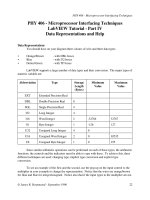
Statistical Process Control 5 Part 4 pptx
Bạn đang xem bản rút gọn của tài liệu. Xem và tải ngay bản đầy đủ của tài liệu tại đây (263.73 KB, 35 trang )
92 Variables and process variation
and when n = 4, SE = /2, i.e. half the spread of the parent distribution of
individual items. SE has the same characteristics as any standard deviation,
and normal tables may be used to evaluate probabilities related to the
distribution of sample averages. We call it by a different name to avoid
confusion with the population standard deviation.
The smaller spread of the distribution of sample averages provides the
basis for a useful means of detecting changes in processes. Any change in
the process mean, unless it is extremely large, will be difficult to detect
from individual results alone. The reason can be seen in Figure 5.5a, which
shows the parent distributions for two periods in a paint filling process
between which the average has risen from 1000 ml to 1012 ml. The shaded
portion is common to both process distributions and, if a volume estimate
occurs in the shaded portion, say at 1010 ml, it could suggest either a
volume above the average from the distribution centred at 1000 ml, or one
slightly below the average from the distribution centred at 1012 ml. A large
Figure 5.5 Effect of a shift in average fill level on individuals and sample means. Spread of
sample means is much less than spread of individuals
Variables and process variation 93
number of individual readings would, therefore, be necessary before such a
change was confirmed.
The distribution of sample means reveals the change much more quickly,
the overlap of the distributions for such a change being much smaller (Figure
5.5b). A sample mean of 1010 ml would almost certainly not come from the
distribution centred at 1000 ml. Therefore, on a chart for sample means,
plotted against time, the change in level would be revealed almost
immediately. For this reason sample means rather than individual values are
used, where possible and appropriate, to control the centring of processes.
The Central Limit Theorem
What happens when the measurements of the individual items are not
distributed normally? A very important piece of theory in statistical process
control is the central limit theorem. This states that if we draw samples of size
n, from a population with a mean µ and a standard deviation , then as n
increases in size, the distribution of sample means approaches a normal
distribution with a mean µ and a standard error of the means of /
ͱ
ස
n. This
tells us that, even if the individual values are not normally distributed, the
distribution of the means will tend to have a normal distribution, and the larger
the sample size the greater will be this tendency. It also tells us that the
Grand or Process Mean X will be a very good estimate of the true mean of
the population µ.
Even if n is as small as 4 and the population is not normally distributed, the
distribution of sample means will be very close to normal. This may be
illustrated by sketching the distributions of averages of 1000 samples of size
four taken from each of two boxes of strips of paper, one box containing a
rectangular distribution of lengths, and the other a triangular distribution
(Figure 5.6). The mathematical proof of the Central Limit Theorem is beyond
the scope of this book. The reader may perform the appropriate experimental
work if (s)he requires further evidence. The main point is that, when samples
of size n = 4 or more are taken from a process which is stable, we can assume
that the distribution of the sample means X will be very nearly normal, even
if the parent population is not normally distributed. This provides a sound
basis for the Mean Control Chart which, as mentioned in Chapter 4, has
decision ‘zones’ based on predetermined control limits. The setting of these
will be explained in the next chapter.
The Range Chart is very similar to the mean chart, the range of each
sample being plotted over time and compared to predetermined limits. The
development of a more serious fault than incorrect or changed centring can
lead to the situation illustrated in Figure 5.7, where the process collapses
from form A to form B, perhaps due to a change in the variation of
material. The ranges of the samples from B will have higher values than
94 Variables and process variation
Figure 5.6 The distribution of sample means from rectangular and triangular universes
Figure 5.7 Increase in spread of a process
Variables and process variation 95
ranges in samples taken from A. A range chart should be plotted in
conjunction with the mean chart.
Rational subgrouping of data
We have seen that a subgroup or sample is a small set of observations on a
process parameter or its output, taken together in time. The two major problems
with regard to choosing a subgroup relate to its size and the frequency of
sampling. The smaller the subgroup, the less opportunity there is for variation
within it, but the larger the sample size the narrower the distribution of the
means, and the more sensitive they become to detecting change.
A rational subgroup is a sample of items or measurements selected in a way
that minimizes variation among the items or results in the sample, and
maximizes the opportunity for detecting variation between the samples. With
a rational subgroup, assignable or special causes of variation are not likely to
be present, but all of the effects of the random or common causes are likely
to be shown. Generally, subgroups should be selected to keep the chance for
differences within the group to a minimum, and yet maximize the chance for
the subgroups to differ from one another.
The most common basis for subgrouping is the order of output or
production. When control charts are to be used, great care must be taken in the
selection of the subgroups, their frequency and size. It would not make sense,
for example, to take as a subgroup the chronologically ordered output from an
arbitrarily selected period of time, especially if this overlapped two or more
shifts, or a change over from one grade of product to another, or four different
machines. A difference in shifts, grades or machines may be an assignable
cause that may not be detected by the variation between samples, if irrational
subgrouping has been used.
An important consideration in the selection of subgroups is the type of
process – one-off, short run, batch or continuous flow, and the type of data
available. This will be considered further in Chapter 7, but at this stage it is
clear that, in any type of process control charting system, nothing is more
important than the careful selection of subgroups.
Chapter highlights
᭹ There are three main measures of the central value of a distribution
(accuracy). These are the mean µ (the average value), the median (the
middle value), the mode (the most common value). For symmetrical
distributions the values for mean, median and mode are identical. For
asymmetric or skewed distributions, the approximate relationship is mean
– mode = 3 (mean–median).
96 Variables and process variation
᭹ There are two main measures of the spread of a distribution of values
(precision). These are the range (the highest minus the lowest) and the
standard deviation . The range is limited in use but it is easy to
understand. The standard deviation gives a more accurate measure of
spread, but is less well understood.
᭹ Continuous variables usually form a normal or symmetrical distribution.
The normal distribution is explained by using the scale of the standard
deviation around the mean. Using the normal distribution, the proportion
falling in the ‘tail’ may be used to assess process capability or the amount
out-of-specification, or to set targets.
᭹ A failure to understand and manage variation often leads to unjustified
changes to the centring of processes, which results in an unnecessary
increase in the amount of variation.
᭹ Variation of the mean values of samples will show less scatter than
individual results. The Central Limit Theorem gives the relationship
between standard deviation (), sample size (n), and Standard Error of
Means (SE) as SE = /ͱn.
᭹ The grouping of data results in an increased sensitivity to the detection of
change, which is the basis of the mean chart.
᭹ The range chart may be used to check and control variation.
᭹ The choice of sample size is vital to the control chart system and depends
on the process under consideration.
References
Besterfield, D. (2000) Quality Control, 6th Edn, Prentice Hall, Englewood Cliffs NJ, USA.
Pyzdek, T. (1990) Pyzdek’s Guide to SPC, Vol. One: Fundamentals, ASQC Quality Press,
Milwaukee WI, USA.
Shewhart, W.A. (1931 – 50th Anniversary Commemorative Reissue 1980) Economic Control of
Quality of Manufactured Product, D. Van Nostrand, New York, USA.
Wheeler, D.J. and Chambers, D.S. (1992) Understanding Statistical Process Control, 2nd Edn,
SPC Press, Knoxville TN, USA.
Discussion questions
1 Calculate the mean and standard deviation of the melt flow rate data below
(g/10 min):
3.2 3.3 3.2 3.3 3.2
3.5 3.0 3.4 3.3 3.7
3.0 3.4 3.5 3.4 3.3
3.2 3.1 3.0 3.4 3.1
3.3 3.5 3.4 3.3 3.2
Variables and process variation 97
3.2 3.1 3.5 3.2
3.3 3.2 3.6 3.4
2.7 3.5 3.0 3.3
3.3 2.4 3.1 3.6
3.6 3.5 3.4 3.1
3.2 3.3 3.1 3.4
2.9 3.6 3.6 3.5
If the specification is 3.0 to 3.8g/10 min, comment on the capability of the
process.
2 Describe the characteristics of the normal distribution and construct an
example to show how these may be used in answering questions which
arise from discussions of specification limits for a product.
3 A bottle filling machine is being used to fill 150 ml bottles of a shampoo.
The actual bottles will hold 156 ml. The machine has been set to discharge
an average of 152 ml. It is known that the actual amounts discharged follow
a normal distribution with a standard deviation of 2 ml.
(a) What proportion of the bottles overflow?
(b) The overflow of bottles causes considerable problems and it has
therefore been suggested that the average discharge should be reduced
to 151 ml. In order to meet the weights and measures regulations,
however, not more than 1 in 40 bottles, on average, must contain less
than 146 ml. Will the weights and measures regulations be contravened
by the proposed changes?
You will need to consult Appendix A to answer these questions.
4 State the Central Limit Theorem and explain how it is used in statistical
process control.
5 To: International Chemicals Supplier
From: Senior Buyer, Perpexed Plastics Ltd
Subject: MFR Values of Polyglyptalene
As promised, I have now completed the examination of our delivery records
and have verified that the values we discussed were not in fact in
chronological order. They were simply recorded from a bundle of
Certificates of Analysis held in our Quality Records File. I have checked,
however, that the bundle did represent all the daily deliveries made by ICS
since you started to supply in October last year.
Using your own lot identification system I have put them into sequence as
manufactured:
98 Variables and process variation
1) 4.1
2) 4.0
3) 4.2
4) 4.2
5) 4.4
6) 4.2
7) 4.3
8) 4.2
9) 4.2
10) 4.1
11) 4.3
12) 4.1
13) 3.2
14) 3.5
15) 3.0
16) 3.2
17) 3.3
18) 3.2
19) 3.3
20) 2.7
21) 3.3
22) 3.6
23) 3.2
24) 2.9
25) 3.3
26) 3.0
27) 3.4
28) 3.1
29) 3.5
30) 3.1
31) 3.2
32) 3.5
33) 2.4
34) 3.5
35) 3.3
36) 3.6
37) 3.2
38) 3.4
39) 3.5
40) 3.0
41) 3.4
42) 3.5
43) 3.6
44) 3.0
45) 3.1
46) 3.4
47) 3.1
48) 3.6
49) 3.3
50) 3.3
51) 3.4
52) 3.4
53) 3.3
54) 3.2
55) 3.4
56) 3.3
57) 3.6
58) 3.1
59) 3.4
60) 3.5
61) 3.2
62) 3.7
63) 3.3
64) 3.1
I hope you can make use of this information.
Analyse the above data and report on the meaning of this information.
Worked examples using the normal distribution
1 Estimating proportion defective produced
In manufacturing it is frequently necessary to estimate the proportion of
product produced outside the tolerance limits, when a process is not capable
of meeting the requirements. The method to be used is illustrated in the
following example: 100 units were taken from a margarine packaging unit
which was ‘in statistical control’ or stable. The packets of margarine were
weighed and the mean weight, X = 255 g, the standard deviation, = 4.73 g.
If the product specification demanded a weight of 250 ± 10 g, how much
of the output of the packaging process would lie outside the tolerance
zone?
Figure 5.8 Determination of proportion defective produced
Variables and process variation 99
The situation is represented in Figure 5.8. Since the characteristics of the
normal distribution are measured in units of standard deviations, we must first
convert the distance between the process mean and the Upper Specification
Limit (USL) into units. This is done as follows:
Z = (USL – X)/,
where USL = Upper Specification Limit
X = Estimated Process Mean
= Estimated Process Standard Deviation
Z = Number of standard deviations between USL and X
(termed the standardized normal variate).
Hence, Z = (260 – 255)/4.73 = 1.057. Using the Table of Proportion Under the
Normal Curve in Appendix A, it is possible to determine that the proportion
of packages lying outside the USL was 0.145 or 14.5 per cent. There are two
contributory causes for this high level of rejects:
(i) the setting of the process, which should be centred at 250 g and not 255 g,
and
(ii) the spread of the process.
If the process were centred at 250 g, and with the same spread, one may
calculate using the above method the proportion of product which would
then lie outside the tolerance band. With a properly centred process, the
distance between both the specification limits and the process mean would
be 10 g. So:
Z = (USL – X )/ =(X – LSL)/ = 10/4.73 = 2.11.
Using this value of Z and the table in Appendix A the proportion lying outside
each specification limit would be 0.0175. Therefore, a total of 3.5 per cent of
product would be outside the tolerance band, even if the process mean was
adjusted to the correct target weight.
2 Setting targets
(a) It is still common in some industries to specify an Acceptable Quality
Level (AQL) – this is the proportion or percentage of product that the
producer/customer is prepared to accept outside the tolerance band. The
characteristics of the normal distribution may be used to determine the
target maximum standard deviation, when the target mean and AQL are
100 Variables and process variation
specified. For example, if the tolerance band for a filling process is 5 ml
and an AQL of 2.5 per cent is specified, then for a centred process:
Z = (USL – X )/ =(X – LSL)/ and
(USL – X )=(X – LSL) = 5/2 = 2.5 ml.
We now need to know at what value of Z we will find (2.5%/2) under the
tail – this is a proportion of 0.0125, and from Appendix A this is the
proportion when Z = 2.24. So rewriting the above equation we have:
max
= (USL – X )/Z = 2.5/2.24 = 1.12 ml.
In order to meet the specified tolerance band of 5 ml and an AQL of 2.5
per cent, we need a standard deviation, measured on the products, of at
most 1.12 ml.
(b) Consider a paint manufacturer who is filling nominal one-litre cans with
paint. The quantity of paint in the cans varies according to the normal
distribution with a standard deviation of 2 ml. If the stated minimum
quality in any can is 1000 ml, what quantity must be put into the cans on
average in order to ensure that the risk of underfill is 1 in 40?
1 in 40 in this case is the same as an AQL of 2.5 per cent or a
probability of non-conforming output of 0.025 – the specification is one-
sided. The 1 in 40 line must be set at 1000 ml. From Appendix A this
probability occurs at a value for Z of 1.96. So 1000 ml must be 1.96
below the average quantity. The process mean must be set at:
(1000 + 1.96) ml = 1000 + (1.96 ϫ 2) ml
= 1004 ml
This is illustrated in Figure 5.9.
A special type of graph paper, normal probability paper, which is also
described in Appendix A, can be of great assistance to the specialist in
handling normally distributed data.
3 Setting targets
A bagging line fills plastic bags with polyethylene pellets which are
automatically heat-sealed and packed in layers on a pallet. SPC charting of
Variables and process variation 101
the bag weights by packaging personnel has shown a standard deviation of
20 g. Assume the weights vary according to a normal distribution. If the
stated minimum quantity in one bag is 25 kg what must the average
quantity of resin put in a bag be if the risk for underfilling is to be about
one chance in 250?
The 1 in 250 (4 out of 1000 = 0.0040) line must be set at 25 000 g. From
Appendix A, Average – 2.65 = 25 000 g. Thus, the average target should be
25 000 + (2.65 ϫ 20) g = 25 053 g = 25.053 kg (see Figure 5.10).
Figure 5.9 Setting target fill quantity in paint process
Figure 5.10 Target setting for the pellet bagging process
Part 3
Process Control
6 Process control using variables
Objectives
᭹ To introduce the use of mean and range charts for the control of process
accuracy and precision for variables.
᭹ To provide the method by which process control limits may be calculated.
᭹ To set out the steps in assessing process stability and capability.
᭹ To examine the use of mean and range charts in the real-time control of
processes.
᭹ To look at alternative ways of calculating and using control charts limits.
6.1 Means, ranges and charts
To control a process using variable data, it is necessary to keep a check on the
current state of the accuracy (central tendency) and precision (spread) of the
distribution of the data. This may be achieved with the aid of control charts.
All too often processes are adjusted on the basis of a single result or
measurement (n = 1), a practice which can increase the apparent variability.
As pointed out in Chapter 4, a control chart is like a traffic signal, the
operation of which is based on evidence from process samples taken at
random intervals. A green light is given when the process should be allowed
to run without adjustment, only random or common causes of variation being
present. The equivalent of an amber light appears when trouble is possible.
The red light shows that there is practically no doubt that assignable or special
causes of variation have been introduced; the process has wandered.
Clearly, such a scheme can be introduced only when the process is ‘in
statistical control’, i.e. is not changing its characteristics of average and
spread. When interpreting the behaviour of a whole population from a sample,
often small and typically less than 10, there is a risk of error. It is important
to know the size of such a risk.
The American Shewhart was credited with the invention of control charts
for variable and attribute data in the 1920s, at the Bell Telephone Laboratories,
106 Process control using variables
and the term ‘Shewhart charts’ is in common use. The most frequently used
charts for variables are Mean and Range Charts which are used together.
There are, however, other control charts for special applications to variables
data. These are dealt with in Chapter 7. Control charts for attributes data are
to be found in Chapter 8.
We have seen in Chapter 5 that with variable parameters, to distinguish
between and control for accuracy and precision, it is advisable to group
results, and a sample size of n = 4 or more is preferred. This provides an
increased sensitivity with which we can detect changes of the mean of the
process and take suitable corrective action.
Is the process in control?
The operation of control charts for sample mean and range to detect the state of
control of a process proceeds as follows. Periodically, samples of a given size
(e.g. four steel rods, five tins of paint, eight tablets, four delivery times) are
taken from the process at reasonable intervals, when it is believed to be stable or
in-control and adjustments are not being made. The variable (length, volume,
weight, time, etc.) is measured for each item of the sample and the sample mean
and range recorded on a chart, the layout of which resembles Figure 6.1. The
layout of the chart makes sure the following information is presented:
᭹ chart identification;
᭹ any specification;
᭹ statistical data;
᭹ data collected or observed;
᭹ sample means and ranges;
᭹ plot of the sample mean values;
᭹ plot of the sample range values.
The grouped data on steel rod lengths from Table 5.1 have been plotted on
mean and range charts, without any statistical calculations being performed, in
Figure 6.2. Such a chart should be examined for any ‘fliers’, for which, at this
stage, only the data itself and the calculations should be checked. The sample
means and ranges are not constant; they vary a little about an average value.
Is this amount of variation acceptable or not? Clearly we need an indication
of what is acceptable, against which to judge the sample results.
Mean chart
We have seen in Chapter 5 that if the process is stable, we expect most of the
individual results to lie within the range X ± 3. Moreover, if we are sampling
from a stable process most of the sample means will lie within the range X ±
3SE. Figure 6.3 shows the principle of the mean control chart where we have
Figure 6.1 Layout of mean and range charts
108 Process control using variables
turned the distribution ‘bell’ onto its side and extrapolated the ±2SE and
±3SE lines as well as the Grand or Process Mean line. We can use this to
assess the degree of variation of the 25 estimates of the mean rod lengths,
taken over a period of supposed stability. This can be used as the ‘template’
to decide whether the means are varying by an expected or unexpected
amount, judged against the known degree of random variation. We can also
plan to use this in a control sense to estimate whether the means have moved
by an amount sufficient to require us to make a change to the process.
If the process is running satisfactorily, we expect from our knowledge of the
normal distribution that more than 99 per cent of the means of successive
samples will lie between the lines marked Upper Action and Lower Action.
These are set at a distance equal to 3SE on either side of the mean. The chance
of a point falling outside either of these lines is approximately 1 in 1000,
unless the process has altered during the sampling period.
Figure 6.2 Mean and range chart
Process control using variables 109
Figure 6.3 also shows Warning limits which have been set 2SE each side of
the process mean. The chance of a sample mean plotting outside either of
these limits is about 1 in 40, i.e. it is expected to happen but only once in
approximately 40 samples, if the process has remained stable.
So, as indicated in Chapter 4, there are three zones on the mean chart
(Figure 6.4). If the mean value based on four results lies in zone 1 – and
remember it is only an estimate of the actual mean position of the whole
family – this is a very likely place to find the estimate, if the true mean of the
population has not moved.
If the mean is plotted in zone 2 – there is, at most, a 1 in 40 chance that this
arises from a process which is still set at the calculated Process Mean value, X.
If the result of the mean of four lies in zone 3 there is only about a 1 in 1000
chance that this can occur without the population having moved, which
suggests that the process must be unstable or ‘out of control’. The chance of two
consecutive sample means plotting in zone 2 is approximately 1/40 ϫ 1/40 =
1/1600, which is even lower than the chance of a point in zone 3. Hence, two
consecutive warning signals suggest that the process is out of control.
The presence of unusual patterns, such as runs or trends, even when all
sample means and ranges are within zone 1, can be evidence of changes in
process average or spread. This may be the first warning of unfavourable
conditions which should be corrected even before points occur outside the
warning or action lines. Conversely, certain patterns or trends could be
favourable and should be studied for possible improvement of the process.
Figure 6.3 Principle of mean control chart
110 Process control using variables
Figure 6.4 The three zones on the mean chart
Figure 6.5 A rising or falling trend on a mean chart
Process control using variables 111
Runs are often signs that a process shift has taken place or has begun. A run
is defined as a succession of points which are above or below the average. A
trend is a succession of points on the chart which are rising or falling, and may
indicate gradual changes, such as tool wear. The rules concerning the
detection of runs and trends are based on finding a series of seven points in
a rising or falling trend (Figure 6.5), or in a run above or below the mean value
(Figure 6.6). These are treated as out of control signals.
The reason for choosing seven is associated with the risk of finding one
point above the average, but below the warning line being ca 0.475. The
probability of finding seven points in such a series will be (0.475)
7
= ca 0.005.
This indicates how a run or trend of seven has approximately the same
probability of occurring as a point outside an action line (zone 3). Similarly,
a warning signal is given by five consecutive points rising or falling, or in a
run above or below the mean value.
The formulae for setting the action and warning lines on mean charts are:
Upper Action Line at X + 3/
ͱ
ස
n
Upper Warning Line at X + 2/
ͱ
ස
n
Process or Grand Mean at X
Lower Warning Line at
X – 2/
ͱස
n
Lower Action Line at X – 3/
ͱස
n.
Figure 6.6 A run above or below the process mean value
112 Process control using variables
It is, however, possible to simplify the calculation of these control limits for
the mean chart. In statistical process control for variables, the sample size is
usually less than ten, and it becomes possible to use the alternative measure
of spread of the process – the mean range of samples R. Use may then be
made of Hartley’s conversion constant (d
n
or d
2
) for estimating the process
standard deviation. The individual range of each sample R
i
is calculated and
the average range (R ) is obtained from the individual sample ranges:
R = ∑
k
i=1
R
i
/k, where k = the number of samples of size n.
Then,
= R/d
n
or R/d
2
where d
n
or d
2
= Hartley’s constant.
Substituting = R/d
n
in the formulae for the control chart limits, they
become:
Action Lines at X ±
3
d
n
ͱ
ස
n
R
Warning Lines at X ±
2
d
n
ͱස
n
R
As 3, 2, d
n
and n are all constants for the same sample size, it is possible to
replace the numbers and symbols within the dotted boxes with just one
constant.
Hence,
3
d
n
ͱ
ස
n
=A
2
and
2
d
n
ͱ
ස
n
= 2/3 A
2
The control limits now become:
Action Lines at X ±A
2
R
Grand or Process Mean A constant Mean of
of sample means sample ranges
Warning Lines at
X ± 2/3 A
2
R
Process control using variables 113
The constants dn, A
2
, and 2/3 A
2
for sample sizes n = 2 to n = 12 have been
calculated and appear in Appendix B. For sample sizes up to n = 12, the range
method of estimating is relatively efficient. For values of n greater than 12,
the range loses efficiency rapidly as it ignores all the information in the
sample between the highest and lowest values. For the small sample sizes (n
= 4 or 5) often employed on variables control charts, it is entirely
satisfactory.
Using the data on lengths of steel rods in Table 5.1, we may now calculate
the action and warning limits for the mean chart for that process:
Process Mean, X =
147.5 + 147.0 + 144.75 + . . . + 150.5
25
= 150.1 mm.
Mean Range, R =
10+19+13+8+ +17
25
= 10.8 mm
From Appendix B, for a sample size n = 4; d
n
or d
2
= 2.059
Therefore, =
R
d
n
=
10.8
2.059
= 5.25 mm
and Upper Action Line = 150.1 + (3 ϫ 5.25/
ͱස
4)
= 157.98 mm
Upper Warning Line = 150.1 + (2 ϫ 5.25/
ͱ
ස
4)
= 155.35 mm
Lower Warning Line = 150.1 – (2 ϫ 5.25/
ͱ
ස
4)
= 144.85 mm
Lower Action Line = 150.1 – (3 ϫ 5.25/
ͱ
ස
4)
= 142.23 mm
Alternatively, the simplified formulae may be used if A
2
and 2/3 A
2
are
known:
114 Process control using variables
A
2
=
3
d
n
ͱස
n
=
3
2059
ͱ
ස
4
= 0.73,
and 2/3A
2
=
2
d
n
ͱ
ස
n
2
2.059
ͱ
ස
4
= 0.49.
Alternatively the values of 0.73 and 0.49 may be derived directly from
Appendix B.
Now,
Action Lines at
X ± A
2
R
therefore, Upper Action Line = 150.1 + (0.73 ϫ 10.8) mm
= 157.98 mm
and Lower Action Line = 150.1 – (0.73 ϫ 10.8) mm
= 142.22 mm
Similarly,
Warning Lines
X ± 2/3 A
2
R
therefore, Upper Warning Line = 150.1 + (0.49 ϫ 10.8) mm
= 155.40 mm,
and Lower Warning Line = 150.1 – (0.476 ϫ 10.8) mm
= 144.81 mm.
Range chart
The control limits on the range chart are asymmetrical about the mean range
since the distribution of sample ranges is a positively skewed distribution
(Figure 6.7). The table in Appendix C provides four constants D
1
.001
, D
1
.025
,
D
1
.975
and D
1
.999
which may be used to calculate the control limits for a range
chart. Thus:
Process control using variables 115
Upper Action Line at D
1
.001
R
Upper Warning Line at D
1
.025
R
Lower Warning Line at D
1
.975
R
Lower Action Line at D
1
.999
R.
For the steel rods, the sample size is four and the constants are thus:
D
1
.001
= 2.57 D
1
.025
= 1.93
D
1
.999
= 0.10 D
1
.975
= 0.29.
As the mean range R is 10.8 mm the control limits for range are:
Action Lines at 2.57 ϫ 10.8 = 27.8 mm
and 0.10 ϫ 10.8 = 1.1 mm,
Warning Lines at 1.93 ϫ 10.8 = 10.8 mm
and 0.29 ϫ 10.8 = 3.1 mm.
The action and warning limits for the mean and range charts for the steel rod
cutting process have been added to the data plots in Figure 6.8. Although the
statistical concepts behind control charts for mean and range may seem
complex to the non-mathematically inclined, the steps in setting up the charts
are remarkably simple:
Figure 6.7 Distribution of sample ranges
116 Process control using variables
Figure 6.8 Mean and range chart
Steps in assessing process stability
1 Select a series of random samples of size n (greater than 4 but less than
12) to give a total number of individual results between 50 and 100.
2 Measure the variable x for each individual item.
3 Calculate X, the sample mean and R, the sample range for each
sample.
4 Calculate the Process Mean X – the average value of X
and the Mean Range R – the average value of R
5 Plot all the values of X and R and examine the charts for any possible
miscalculations.
6 Look up: d
n
, A
2
, 2/3A
2
, D
1
.999
, D
1
.975
, D
1
.025
and D
1
.001
(see
Appendices B and C).
7 Calculate the values for the action and warning lines for the mean and
range charts. A typical X and R chart calculation form is shown in Table
6.1.
8 Draw the limits on the mean and range charts.
9 Examine charts again – is the process in statistical control?