Statistical Process Control 5 Part 9 potx
Bạn đang xem bản rút gọn của tài liệu. Xem và tải ngay bản đầy đủ của tài liệu tại đây (263.97 KB, 35 trang )
Process capability for variables and its measurement 267
᭹ Cpk = 1.67 Promising, non-conforming output will occur but there is a
very good chance that it will be detected.
᭹ Cpk = 2 High level of confidence in the producer, provided that
control charts are in regular use (Figure 10.2a).
10.4 The use of control chart and process capability data
The Cpk values so far calculated have been based on estimates of from R,
obtained over relatively short periods of data collection and should more
properly be known as the Cpk
(potential)
. Knowledge of the Cpk
(potential)
is
available only to those who have direct access to the process and can assess
the short-term variations which are typically measured during process
capability studies.
An estimate of the standard deviation may be obtained from any set of data
using a calculator. For example, a customer can measure the variation within
a delivered batch of material, or between batches of material supplied over
time, and use the data to calculate the corresponding standard deviation. This
will provide some knowledge of the process from which the examined product
was obtained. The customer may also estimate the process mean values and,
coupled with the specification, calculate a Cpk using the usual formula. This
practice is recommended, provided that the results are interpreted correctly.
An example may help to illustrate the various types of Cpks which may be
calculated. A pharmaceutical company carried out a process capability study
on the weight of tablets produced and showed that the process was in
statistical control with a process mean (X ) of 2504 mg and a mean range (R )
from samples of size n = 4 of 91 mg. The specification was USL = 2800 mg
and LSL = 2200 mg.
Hence, = R/d
n
= 91/2.059 = 44.2 mg
and Cpk
(potential)
= (USL – X )/3 = 296/3 ϫ 44.2 = 2.23.
The mean and range charts used to control the process on a particular day are
shown in Figure 10.6. In a total of 23 samples, there were four warning signals
and six action signals, from which it is clear that during this day the process
was no longer in statistical control. The data from which this chart was plotted
are given in Table 10.1. It is possible to use the tablet weights in Table 10.1
to compute the grand mean as 2 513 mg and the standard deviation as 68 mg.
Then:
Cpk =
USL – X
3
=
2800 – 2513
3 ϫ 68
= 1.41.
Figure 10.6 Mean and range control charts – tablet weights
Process capability for variables and its measurement 269
The standard deviation calculated by this method reflects various components,
including the common-cause variations, all the assignable causes apparent
from the mean and range chart, and the limitations introduced by using a
sample size of four. It clearly reflects more than the inherent random
variations and so the Cpk resulting from its use is not the Cpk
(potential)
, but the
Cpk
(production)
– a capability index of the day’s output and a useful way of
monitoring, over a period, the actual performance of any process. The symbol
Ppk is sometimes used to represent Cpk
(production)
which includes the common
and special causes of variation and cannot be greater than the Cpk
(potential)
. If
it appears to be greater, it can only be that the process has improved. A record
of the Cpk
(production)
reveals how the production performance varies and takes
account of both the process centring and the spread.
The mean and range control charts could be used to classify the product and
only products from ‘good’ periods could be despatched. If ‘bad’ product is
defined as that produced in periods prior to an action signal as well as any
periods prior to warning signals which were followed by action signals, from
Table 10.1 Samples of tablet weights (n = 4) with means and ranges
Sample
number
Weight in mg Mean Range
1 2501 2461 2512 2468 2485 51
2 2416 2602 2482 2526 2507 186
3 2487 2494 2428 2443 2463 66
4 2471 2462 2504 2499 2484 42
5 2510 2543 2464 2531 2512 79
6 2558 2412 2595 2482 2512 183
7 2518 2540 2555 2461 2519 94
8 2481 2540 2569 2571 2540 90
9 2504 2599 2634 2590 2582 130
10 2541 2463 2525 2559 2500 108
11 2556 2457 2554 2588 2539 131
12 2544 2598 2531 2586 2565 67
13 2591 2644 2666 2678 2645 87
14 2353 2373 2425 2410 2390 72
15 2460 2509 2433 2511 2478 78
16 2447 2490 2477 2498 2478 51
17 2523 2579 2488 2481 2518 98
18 2558 2472 2510 2540 2520 86
19 2579 2644 2394 2572 2547 250
20 2446 2438 2453 2475 2453 37
21 2402 2411 2470 2499 2446 97
22 2551 2454 2549 2584 2535 130
23 2590 2600 2574 2540 2576 60
270 Process capability for variables and its measurement
the charts in Figure 10.6 this requires eliminating the product from the periods
preceding samples 8, 9, 12, 13, 14, 19, 20, 21 and 23.
Excluding from Table 10.1 the weights corresponding to those periods, 56
tablet weights remain from which may be calculated the process mean at
2503 mg and the standard deviation at 49.4 mg. Then:
Cpk = (USL – X)/3 = (2800 – 2503)/(3 ϫ 49.4) = 2.0.
This is the Cpk
(delivery)
. If this selected output from the process were
despatched, the customer should find on sampling a similar process mean,
standard deviation and Cpk
(delivery)
and should be reasonably content. It is not
surprising that the Cpk should be increased by the elimination of the product
known to have been produced during ‘out-of-control’ periods. The term
Csk
(supplied)
is sometimes used to represent the Cpk
(delivery)
.
Only the producer can know the Cpk
(potential)
and the method of product
classification used. Not only the product, but the justification of its
classification should be available to the customer. One way in which the latter
may be achieved is by letting the customer have copies of the control charts
and the justification of the Cpk
(potential)
. Both of these requirements are
becoming standard in those industries which understand and have assimilated
the concepts of process capability and the use of control charts for
variables.
There are two important points which should be emphasized:
᭹ the use of control charts not only allows the process to be controlled, it
also provides all the information required to complete product
classification;
᭹ the producer, through the data coming from the process capability study
and the control charts, can judge the performance of a process – the
process performance cannot be judged equally well from the product
alone.
If a customer knows that a supplier has a Cpk
(potential)
value of at least 2 and
that the supplier uses control charts for both control and classification, then
the customer can have confidence in the supplier’s process and method of
product classification.
10.5 A service industry example – process capability
analysis in a bank
A project team in a small bank was studying the productivity of the cashier
operations. Work during the implementation of SPC had identified variation in
transaction (deposit/withdrawal) times as a potential area for improvement.
Process capability for variables and its measurement 271
The cashiers agreed to collect data on transaction times in order to study the
process.
Once an hour, each cashier recorded in time the seconds required to
complete the next seven transactions. After three days, the operators
developed control charts for this data. All the cashiers calculated control limits
for their own data. The totals of the Xs and Rs for 24 subgroups (three days
times eight hours per day) for one cashier were: ⌺ X= 5640 seconds, ⌺ R =
1 900 seconds. Control limits for this cashier’s X and R chart were calculated
and the process was shown to be stable.
An ‘efficiency standard’ had been laid down that transactions should
average three minutes (180 seconds), with a maximum of five minutes (300
seconds) for any one transaction. The process capability was calculated as
follows:
X =
⌺X
k
=
5640
24
= 235 seconds
R =
⌺R
k
=
1900
24
= 79.2 seconds
= R/d
n
, for n = 7, = 79.2/2.704 = 29.3 seconds
Cpk =
USL – X
3
=
300 – 235
3 ϫ 29.3
= 0.74.
i.e. not capable, and not centred on the target of 180 seconds.
As the process was not capable of meeting the requirements, management led
an effort to improve transaction efficiency. This began with a flowcharting of
the process (see Chapter 2). In addition, a brainstorming session involving the
cashiers was used to generate the cause and effect diagram (see Chapter 11).
A quality improvement team was formed, further data collected, and the
‘vital’ areas of incompletely understood procedures and cashier training were
tackled. This resulted over a period of six months, in a reduction in average
transaction time to 190 seconds, with standard deviation of 15 seconds
(Cpk = 2.44). (See also Chapter 11, Worked example 2.)
Chapter highlights
᭹ Process capability is assessed by comparing the width of the specification
tolerance band with the overall spread of the process. Processes may be
classified as low, medium or high relative precision.
᭹ Capability can be assessed by a comparison of the standard deviation ()
and the width of the tolerance band. This gives a process capability
index.
272 Process capability for variables and its measurement
᭹ The RPI is the relative precision index, the ratio of the tolerance band (2T)
to the mean sample range (R ).
᭹ The Cp index is the ratio of the tolerance band to six standard deviations
(6). The Cpk index is the ratio of the band between the process mean and
the closest tolerance limit, to three standard deviations (3).
᭹ Cp measures the potential capability of the process, if centred; Cpk
measures the capability of the process, including its centring. The Cpk
index can be used for one-sided specifications.
᭹ Values of the standard deviation, and hence the Cp and Cpk, depend on the
origin of the data used, as well as the method of calculation. Unless the
origin of the data and method is known the interpretation of the indices
will be confused.
᭹ If the data used is from a process which is in statistical control, the Cpk
calculation from R is the Cpk
(potential)
of the process.
᭹ The Cpk
(potential)
measures the confidence one may have in the control of
the process, and classification of the output, so that the presence of non-
conforming output is at an acceptable level.
᭹ For all sample sizes a Cpk
(potential)
of 1 or less is unacceptable, since the
generation of non-conforming output is inevitable.
᭹ If the Cpk
(potential)
is between 1 and 2, the control of the process and the
elimination of non-conforming output will be uncertain.
᭹ A Cpk value of 2 gives high confidence in the producer, provided that
control charts are in regular use.
᭹ If the standard deviation is estimated from all the data collected during
normal running of the process, it will give rise to a Cpk
(production)
, which
will be less than the Cpk
(potential)
. The Cpk
(production)
is a useful index of
the process performance during normal production.
᭹ If the standard deviation is based on data taken from selected deliveries of
an output it will result in a Cpk
(delivery)
which will also be less than the
Cpk
(potential)
, but may be greater than the Cpk
(production)
, as the result of
output selection. This can be a useful index of the delivery
performance.
᭹ A customer should seek from suppliers information concerning the
potential of their processes, the methods of control and the methods of
product classification used.
᭹ The concept of process capability may be used in service environments
and capability indices calculated.
References
Grant, E.L. and Leavenworth, R.S. (1996) Statistical Quality Control, 7th Edn, McGraw-Hill,
New York, USA.
Owen, M. (1993) SPC and Business Improvement, IFS Publications, Bedford, UK.
Process capability for variables and its measurement 273
Porter, L.J. and Oakland, J.S. (1991) ‘Process Capability Indices – An Overview of Theory and
Practice’, Quality and Reliability Engineering International, Vol. 7, pp. 437–449.
Pyzdek, T. (1990) Pyzdek’s Guide to SPC, Vol. One – Fundamentals, ASQC Quality Press,
Milwaukee WI, USA.
Wheeler, D.J. and Chambers, D.S. (1992) Understanding Statistical Process Control, 2nd Edn,
SPC Press, Knoxville TN, USA.
Discussion questions
1 (a) Using process capability studies, processes may be classified as being
in statistical control and capable. Explain the basis and meaning of this
classification.
(b) Define the process capability indices Cp and Cpk and describe how
they may be used to monitor the capability of a process, its actual
performance and its performance as perceived by a customer.
2 Using the data given in Discussion question No. 5 in Chapter 6, calculate
the appropriate process capability indices and comment on the results.
3 From the results of your analysis of the data in Discussion question No. 6,
Chapter 6, show quantitatively whether the process is capable of meeting
the specification given.
4 Calculate Cp and Cpk process capability indices for the data given in
Discussion question No. 8 in Chapter 6 and write a report to the
Development Chemist.
5 Show the difference, if any, between Machine I and Machine II in
Discussion question No. 9 in Chapter 6, by the calculation of appropriate
process capability indices.
6 In Discussion question No. 10 in Chapter 6, the specification was given as
540 mm ± 5 mm, comment further on the capability of the panel making
process using process capability indices to support your arguments.
Worked examples
1 Lathe operation
Using the data given in Worked example No. 1 (Lathe operation) in Chapter
6, answer question 1(b) with the aid of process capability indices.
274 Process capability for variables and its measurement
Solution
= R/d
n
= 0.0007/2.326 = 0.0003 cm
Cp = Cpk =
(USL – X )
3
=
(X – LSL)
3
=
0.002
0.0009
= 2.22.
2 Control of dissolved iron in a dyestuff
Using the data given in Worked example No. 2 (Control of dissolved iron in
a dyestuff) in Chapter 6, answer question 1(b) by calculating the Cpk
value.
Solution
Cpk =
USL – X
=
18.0 – 15.6
3 ϫ 1.445
= 0.55.
With such a low Cpk value, the process is not capable of achieving the
required specification of 18 ppm. The Cp index is not appropriate here as there
is a one-sided specification limit.
3 Pin manufacture
Using the data given in Worked example No. 3 (Pin manufacture) in Chapter
6, calculate Cp and Cpk values for the specification limits 0.820 cm and 0.840
cm, when the process is running with a mean of 0.834 cm.
Solution
Cp =
USL – LSL
6
=
0.84 – 0.82
6 ϫ 0.003
= 1.11.
The process is potentially capable of just meeting the specification.
Clearly the lower value of Cpk will be:
Cpk =
USL – X
3
=
0.84 – 0.834
3 ϫ 0.003
= 0.67.
The process is not centred and not capable of meeting the requirements.
Part 5
Process Improvement
11 Process problem solving and
improvement
Objectives
᭹ To introduce and provide a framework for process problem solving and
improvement.
᭹ To describe the major problem solving tools.
᭹ To illustrate the use of the tools with worked examples.
᭹ To provide an understanding of how the techniques can be used together
to aid process improvement.
11.1 Introduction
Process improvements are often achieved through specific opportunities,
commonly called problems, being identified or recognized. A focus on
improvement opportunities should lead to the creation of teams whose
membership is determined by their work on and detailed knowledge of the
process, and their ability to take improvement action. The teams must then be
provided with good leadership and the right tools to tackle the job.
By using reliable methods, creating a favourable environment for team-
based problem solving, and continuing to improve using systematic
techniques, the never-ending improvement cycle of plan, do, check, act will be
engaged. This approach demands the real time management of data, and
actions on processes – inputs, controls and resources, not outputs. It will
require a change in the language of many organizations from percentage
defects, percentage ‘prime’ product, and number of errors, to process
capability. The climate must change from the traditional approach of ‘If it
meets the specification, there are no problems and no further improvements
are necessary’. The driving force for this will be the need for better internal
and external customer satisfaction levels, which will lead to the continuous
improvement question, ‘Could we do the job better?’
278 Process problem solving and improvement
In Chapter 1 some basic tools and techniques were briefly introduced.
Certain of these are very useful in a problem identification and solving
context, namely Pareto analysis, cause and effect analysis, scatter diagrams
and stratification.
The effective use of these tools requires their application by the people who
actually work on the processes. Their commitment to this will be possible only
if they are assured that management cares about improving quality. Managers
must show they are serious by establishing a systematic approach and
providing the training and implementation support required.
The systematic approach mapped out in Figure 11.1 should lead to the use
of factual information, collected and presented by means of proven
techniques, to open a channel of communications not available to the many
organizations that do not follow this or a similar approach to problem solving
and improvement. Continuous improvements in the quality of products,
services, and processes can often be obtained without major capital
investment, if an organization marshals its resources, through an under-
standing and breakdown of its processes in this way.
Organizations which embrace the concepts of total quality and business
excellence should recognize the value of problem solving techniques in all
areas, including sales, purchasing, invoicing, finance, distribution, training,
etc., which are outside production or operations – the traditional area for SPC
use. A Pareto analysis, a histogram, a flowchart, or a control chart is a vehicle
for communication. Data are data and, whether the numbers represent defects
or invoice errors, the information relates to machine settings, process
variables, prices, quantities, discounts, customers, or supply points are
irrelevant, the techniques can always be used.
Some of the most exciting applications of SPC and problem-solving tools
have emerged from organizations and departments which, when first
introduced to the methods, could see little relevance to their own activities.
Following appropriate training, however, they have learned how to, for
example:
᭹ Pareto analyse sales turnover by product and injury data.
᭹ Brainstorm and cause and effect analyse reasons for late payment and
poor purchase invoice matching.
᭹ Histogram absenteeism and arrival times of trucks during the day.
᭹ Control chart the movement in currency and weekly demand of a
product.
Distribution staff have used p-charts to monitor the proportion of deliveries
which are late and Pareto analysis to look at complaints involving the
distribution system. Word processor operators have used cause and effect
analysis and histograms to represent errors in output from their service.
Process problem solving and improvement 279
Figure 11.1 Strategy for continuous process improvement
280 Process problem solving and improvement
Moving average and cusum charts have immense potential for improving
forecasting in all areas including marketing, demand, output, currency value
and commodity prices.
Those organizations which have made most progress in implementing a
company-wide approach to improvement have recognized at an early stage
that SPC is for the whole organization. Restricting it to traditional
manufacturing or operations activities means that a window of opportunity
has been closed. Applying the methods and techniques outside manufacturing
will make it easier, not harder, to gain maximum benefit from an SPC
programme.
Sales and marketing is one area which often resists training in SPC on the
basis that it is difficult to apply. Personnel in this vital function need to be
educated in SPC methods for two reasons:
(i) They need to understand the way the manufacturing and/or service
producing processes in their organizations work. This enables them to
have more meaningful and involved dialogues with customers about the
whole product/service system capability and control. It will also enable
them to influence customers’ thinking about specifications and create a
competitive advantage from improving process capabilities.
(ii) They need to identify and improve the marketing processes and activities.
A significant part of the sales and marketing effort is clearly associated
with building relationships, which are best based on facts (data) and not
opinions. There are also opportunities to use SPC techniques directly in
such areas as forecasting, demand levels, market requirements, monitor-
ing market penetration, marketing control and product development, all
of which must be viewed as processes.
SPC has considerable applications for non-manufacturing organizations, in
both the public and private sectors. Data and information on patients in
hospitals, students in universities and schools, people who pay (and do not
pay) tax, draw benefits, shop at Sainsbury’s or Macy’s are available in
abundance. If it were to be used in a systematic way, and all operations treated
as processes, far better decisions could be made concerning the past, present
and future performances of these operations.
11.2 Pareto analysis
In many things we do in life we find that most of our problems arise from a
few of the sources. The Italian economist Vilfredo Pareto used this concept
when he approached the distribution of wealth in his country at the turn of the
Process problem solving and improvement 281
century. He observed that 80–90 per cent of Italy’s wealth lay in the hands of
10–20 per cent of the population. A similar distribution has been found
empirically to be true in many other fields. For example, 80 per cent of the
defects will arise from 20 per cent of the causes; 80 per cent of the complaints
originate from 20 per cent of the customers. These observations have become
known as part of Pareto’s Law or the 80/20 rule.
The technique of arranging data according to priority or importance and
tying it to a problem-solving framework is called Pareto analysis. This is a
formal procedure which is readily teachable, easily understood and very
effective. Pareto diagrams or charts are used extensively by improvement
teams all over the world; indeed the technique has become fundamental to
their operation for identifying the really important problems and establishing
priorities for action.
Pareto analysis procedures
There are always many aspects of business operations that require improve-
ment: the number of errors, process capability, rework, sales, etc. Each
problem comprises many smaller problems and it is often difficult to know
which ones to tackle to be most effective. For example, Table 11.1 gives some
data on the reasons for batches of a dyestuff product being scrapped or
reworked. A definite procedure is needed to transform this data to form a basis
for action.
It is quite obvious that two types of Pareto analysis are possible here to
identify the areas which should receive priority attention. One is based on the
frequency of each cause of scrap/rework and the other is based on cost. It is
reasonable to assume that both types of analysis will be required. The
identification of the most frequently occurring reason should enable the total
number of batches scrapped or requiring rework to be reduced. This may be
necessary to improve plant operator morale which may be adversely affected
by a high proportion of output being rejected. Analysis using cost as the basis
will be necessary to derive the greatest financial benefit from the effort
exerted. We shall use a generalizable stepwise procedure to perform both of
these analyses.
Step 1. List all the elements
This list should be exhaustive to preclude the inadvertent drawing of
inappropriate conclusions. In this case the reasons may be listed as they occur
in Table 11.1. They are: moisture content high, excess insoluble matter,
dyestuff contamination, low melting point, conversion process failure, high
iron content, phenol content >1 per cent, unacceptable application, unaccept-
able absorption spectrum, unacceptable chromatogram.
282 Process problem solving and improvement
Table 11.1
SCRIPTAGREEN – A
Plant B
Batches scrapped/reworked
Period 05–07 incl.
Batch No. Reason for scrap/rework Labour
cost (£)
Material
cost (£)
Plant
cost (£)
05–005 Moisture content high 500 50 100
05 – 011 Excess insoluble matter 500 nil 125
05–018 Dyestuff contamination 4000 22 000 14 000
05–022 Excess insoluble matter 500 nil 125
05–029 Low melting point 1000 500 3 500
05–035 Moisture content high 500 50 100
05–047 Conversion process failure 4000 22 000 14 000
05–058 Excess insoluble matter 500 nil 125
05–064 Excess insoluble matter 500 nil 125
05–066 Excess insoluble matter 500 nil 125
05–076 Low melting point 1000 500 3 500
05–081 Moisture content high 500 50 100
05–086 Moisture content high 500 50 100
05–104 High iron content 500 nil 2 000
05–107 Excess insoluble matter 500 nil 125
05–111 Excess insoluble matter 500 nil 125
05–132 Moisture content high 500 50 100
05–140 Low melting point 1000 500 3 500
05–150 Dyestuff contamination 4000 22 000 14 000
05–168 Excess insoluble matter 500 nil 125
05–170 Excess insoluble matter 500 nil 125
05–178 Moisture content high 500 50 100
05–179 Excess insoluble matter 500 nil 125
05–179 Excess insoluble matter 500 nil 125
05–189 Low melting point 1000 500 3 500
05–192 Moisture content high 500 50 100
05–208 Moisture content high 500 50 100
06–001 Conversion process failure 4000 22 000 14 000
06–003 Excess insoluble matter 500 nil 125
06–015 Phenol content >1% 1500 1 300 2 000
06–024 Moisture content high 500 50 100
06–032 Unacceptable application 2000 4 000 4 000
06–041 Excess insoluble matter 500 nil 125
06–057 Moisture content high 500 50 100
06–061 Excess insoluble matter 500 nil 125
06–064 Low melting point 1000 500 3 500
06–069 Moisture content high 500 50 100
06–071 Moisture content high 500 50 100
06–078 Excess insoluble matter 500 nil 125
06–082 Excess insoluble matter 500 nil 125
06–904 Low melting point 1000 500 3 500
Process problem solving and improvement 283
Table 11.1 Continued
SCRIPTAGREEN – A
Plant B
Batches scrapped/reworked
Period 05 – 07 incl.
Batch No. Reason for scrap/rework Labour
cost (£)
Material
cost (£)
Plant
cost (£)
06–103 Low melting point 1000 500 3 500
06–112 Excess insoluble matter 500 nil 125
06–126 Excess insoluble matter 500 nil 125
06–131 Moisture content high 500 50 100
06–147 Unacceptable absorbtion spectrum 500 50 400
06–150 Excess insoluble matter 500 nil 125
06–151 Moisture content high 500 50 100
06–161 Excess insoluble matter 500 nil 125
06–165 Moisture content high 500 50 100
06–172 Moisture content high 500 50 100
06–186 Excess insoluble matter 500 nil 125
06–198 Low melting point 1000 500 3 500
06–202 Dyestuff contamination 4000 22 000 14 000
06–214 Excess insoluble matter 500 nil 125
07–010 Excess insoluble matter 500 nil 125
07–021 Conversion process failure 4000 22 000 14 000
07–033 Excess insoluble matter 500 nil 125
07–051 Excess insoluble matter 500 nil 125
07–057 Phenol content >1% 1500 1 300 2 000
07–068 Moisture content high 500 50 100
07–072 Dyestuff contamination 4000 22 000 14 000
07–077 Excess insoluble matter 500 nil 125
07–082 Moisture content high 500 50 100
07–087 Low melting point 1000 500 3 500
07–097 Moisture content high 500 50 100
07–116 Excess insoluble matter 500 nil 125
07–117 Excess insoluble matter 500 nil 125
07–118 Excess insoluble matter 500 nil 125
07–121 Low melting point 1000 500 3 500
07–131 High iron content 500 nil 2 000
07–138 Excess insoluble matter 500 nil 125
07–153 Moisture content high 500 50 100
07–159 Low melting point 1000 500 3 500
07–162 Excess insoluble matter 500 nil 125
07–168 Moisture content high 500 50 100
07–174 Excess insoluble matter 500 nil 125
07–178 Moisture content high 500 50 100
07–185 Unacceptable chromatogram 500 1 750 2250
07–195 Excess insoluble matter 500 nil 125
07–197 Moisture content high 500 50 100
Table 11.2 Frequency distribution and total cost of dyestuff batches scrapped/reworked
Reason for scrap/rework Tally Frequency Cost per
batch (£)
Total
cost (£)
Moisture content high | | | | | | | | | | | | | | | | | | | 23 650 14 950
Excess insoluble matter
| | | | | | | | | | | | | | | | | | | | | | | | | | 32 625 20 000
Dyestuff contamination | | | | 4 40 000 160 000
Low melting point
| | | | | | | | | 11 5 000 55 000
Conversion process failure | | | 3 40 000 120 000
High iron content | | 2 2 500 5 000
Phenol content > 1% | | 2 4 800 9 600
Unacceptable application | 1 10 000 10 000
Unacceptable absorption spectrum | 1 950 950
Unacceptable chromatogram | 1 4 500 4 500
Process problem solving and improvement 285
Step 2. Measure the elements
It is essential to use the same unit of measure for each element. It may be in
cash value, time, frequency, number or amount, depending on the element. In
the scrap and rework case, the elements – reasons – may be measured in terms
of frequency, labour cost, material cost, plant cost and total cost. We shall use
the first and the last – frequency and total cost. The tally chart, frequency
distribution and cost calculations are shown in Table 11.2.
Step 3. Rank the elements
This ordering takes place according to the measures and not the classification.
This is the crucial difference between a Pareto distribution and the usual
frequency distribution and is particularly important for numerically classified
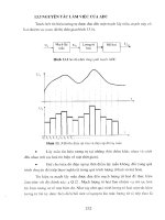
elements. For example, Figure 11.2 shows the comparison between the
frequency and Pareto distributions from the same data on pin lengths. The two
distributions are ordered in contrasting fashion with the frequency distribution
structured by element value and the Pareto arranged by the measurement
values on the element.
To return to the scrap and rework case, Table 11.3 shows the reasons ranked
according to frequency of occurrence, whilst Table 11.4 has them in order of
decreasing cost.
Step 4. Create cumulative distributions
The measures are cumulated from the highest ranked to the lowest, and each
cumulative frequency shown as a percentage of the total. The elements are
Figure 11.2 Comparison between frequency and Pareto distribution (pin lengths)
286 Process problem solving and improvement
also cumulated and shown as a percentage of the total. Tables 11.3 and 11.4
show these calculations for the scrap and rework data – for frequency of
occurrence and total cost respectively. The important thing to remember about
the cumulative element distribution is that the gaps between each element
should be equal. If they are not, then an error has been made in the
calculations or reasoning. The most common mistake is to confuse the
frequency of measure with elements.
Step 5. Draw the Pareto curve
The cumulative percentage distributions are plotted on linear graph paper. The
cumulative percentage measure is plotted on the vertical axis against the
Table 11.3 Scrap/rework – Pareto analysis of frequency of reasons
Reason for scrap/rework Frequency Cum.
freq.
% of
total
Excess insoluble matter 32 32 40.00
Moisture content high 23 55 68.75
Low melting point 11 66 82.50
Dyestuff contamination 4 70 87.50
Conversion process failure 3 73 91.25
High iron content 2 75 93.75
Phenol content >1% 2 77 96.25
Unacceptable:
Absorption spectrum 1 78 97.50
Application 1 79 98.75
Chromatogram 1 80 100.00
Table 11.4 Scrap/rework – Pareto analysis of total costs
Reason for scrap/rework Total
cost
Cum.
cost
Cum. % of
grand total
Dyestuff contamination 160 000 160 000 40.0
Conversion process failure 120 000 280 000 70.0
Low melting point 55 000 335 000 83.75
Excess insoluble matter 20 000 355 000 88.75
Moisture content high 14 950 369 950 92.5
Unacceptable application 10 000 379 950 95.0
Phenol content >1% 9 600 389 550 97.4
High iron content 5 000 395 550 98.65
Unacceptable chromatogram 4 500 399 050 99.75
Unacceptable abs. spectrum 950 400 000 100.0
Process problem solving and improvement 287
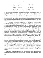
cumulative percentage element along the horizontal axis. Figures 11.3 and
11.4 are the respective Pareto curves for frequency and total cost of reasons
for the scrapped/reworked batches of dyestuff product.
Step 6. Interpret the Pareto curves
The aim of Pareto analysis in problem solving is to highlight the elements
which should be examined first. A useful first step is to draw a vertical line
from the 20–30 per cent area of the horizontal axis. This has been done in both
Figures 11.3 and 11.4 and shows that:
1 30 per cent of the reasons are responsible for 82.5 per cent of all the batches
being scrapped or requiring rework. The reasons are:
Figure 11.3 Pareto analysis by frequency – reasons for scrap/rework
288 Process problem solving and improvement
excess insoluble matter (40 per cent)
moisture content high (28.75 per cent), and
low melting point (13.75 per cent).
2 30 per cent of the reasons for scrapped or reworked batches cause 83.75 per
cent of the total cost. The reasons are:
dyestuff contamination (40 per cent)
conversion process failure (30 per cent), and
low melting point (13.75 per cent).
These are often called the ‘A’ items or the ‘vital few’ which have been
highlighted for special attention. It is quite clear that, if the objective is to
reduce costs, then contamination must be tackled as a priority. Even though
Figure 11.4 Pareto analysis by costs of scrap/rework
Process problem solving and improvement 289
this has occurred only four times in 80 batches, the costs of scrapping the
whole batch are relatively very large. Similarly, concentration on the problem
of excess insoluble matter will have the biggest effect on reducing the number
of batches which require to be reworked.
It is conventional to further arbitrarily divide the remaining 70–80 per cent
of elements into two classifications – the B elements and the C elements, the
so-called ‘trivial many’. This may be done by drawing a vertical line from the
50–60 per cent mark on the horizontal axis. In this case only 5 per cent of the
costs come from the 50 per cent of the ‘C’ reasons. This type of classification
of elements gives rise to the alternative name for this technique – ABC
analysis.
Procedural note
ABC or Pareto analysis is a powerful ‘narrowing down’ tool but it is based on
empirical rules which have no mathematical foundation. It should always be
remembered, when using the concept, that it is not rigorous and that elements
or reasons for problems need not stand in line until higher ranked ones have
been tackled. In the scrap and rework case, for example, if the problem of
phenol content >1 per cent can be removed by easily replacing a filter costing
a few pounds, then let it be done straight away. The aim of the Pareto
technique is simply to ensure that the maximum reward is returned for the
effort expelled, but it is not a requirement of the systematic approach that
‘small’, easily solved problems must be made to wait until the larger ones
have been resolved.
11.3 Cause and effect analysis
In any study of a problem, the effect – such as a particular defect or a certain
process failure – is usually known. Cause and effect analysis may be used to
elicit all possible contributing factors, or causes of the effect. This technique
comprises usage of cause and effect diagrams and brainstorming.
The cause and effect diagram is often mentioned in passing as, ‘one of the
techniques used by quality circles’. Whilst this statement is true, it is also
needlessly limiting in its scope of the application of this most useful and
versatile tool. The cause and effect diagram, also known as the Ishikawa
diagram (after its inventor), or the fishbone diagram (after its appearance),
shows the effect at the head of a central ‘spine’ with the causes at the ends of
the ‘ribs’ which branch from it. The basic form is shown in Figure 11.5. The
principal factors or causes are listed first and then reduced to their sub-causes,
and sub-sub-causes if necessary. This process is continued until all the
conceivable causes have been included.
290 Process problem solving and improvement
The factors are then critically analysed in light of their probable
contribution to the effect. The factors selected as most likely causes of the
effect are then subjected to experimentation to determine the validity of their
selection. This analytical process is repeated until the true causes are
identified.
Constructing the cause and effect diagram
An essential feature of the cause and effect technique is brainstorming, which
is used to bring ideas on causes out into the open. A group of people freely
exchanging ideas bring originality and enthusiasm to problem solving. Wild
ideas are welcomed and safe to offer, as criticism or ridicule is not permitted
during a brainstorming session. To obtain the greatest results from the session,
all members of the group should participate equally and all ideas offered are
recorded for subsequent analysis.
The construction of a cause and effect diagram is best illustrated with an
example.
The production manager in a tea-bag manufacturing firm was extremely
concerned about the amount of wastage of tea which was taking place. A study
group had been set up to investigate the problem but had made little progress,
even after several meetings. The lack of progress was attributed to a
combination of too much talk, arm-waving and shouting down – typical
symptoms of a non-systematic approach. The problem was handed to a newly
appointed management trainee who used the following step-wise approach.
Step 1. Identify the effect
This sounds simple enough but, in fact, is often so poorly done that much time
is wasted in the later steps of the process. It is vital that the effect or problem
is stated in clear, concise terminology. This will help to avoid the situation
where the ‘causes’ are identified and eliminated, only to find that the
Figure 11.5 Basic form of cause and effect diagram
Process problem solving and improvement 291
‘problem’ still exists. In the tea-bag company, the effect was defined as ‘Waste
– unrecovered tea wasted during the tea-bag manufacture’. Effect statements
such as this may be arrived at via a number of routes, but the most common
are: consensus obtained through brainstorming, one of the ‘vital few’ on a
Pareto diagram, and sources outside the production department.
Step 2. Establish goals
The importance of establishing realistic, meaningful goals at the outset of any
problem-solving activity cannot be over-emphasized. Problem solving is not
a self-perpetuating endeavour. Most people need to know that their efforts are
achieving some good in order for them to continue to participate. A goal
should, therefore, be stated in some terms of measurement related to the
problem and this must include a time limit. In the tea-bag firm, the goal was
‘a 50 per cent reduction in waste in nine months’. This requires, of course, a
good understanding of the situation prior to setting the goal. It is necessary to
establish the baseline in order to know, for example, when a 50 per cent
reduction has been achieved. The tea waste was running at 2 per cent of tea
usage at the commencement of the project.
Step 3. Construct the diagram framework
The framework on which the causes are to be listed can be very helpful to the
creative thinking process. The author has found the use of the five ‘Ps’ of
production management* very useful in the construction of cause and effect
diagrams. The five components of any operational task are the:
᭹ Product, including services, materials and any intermediates.
᭹ Processes or methods of transformation.
᭹ Plant, i.e. the building and equipment.
᭹ Programmes or timetables for operations.
᭹ People, operators, staff and managers.
These are placed on the main ribs of the diagram with the effect at the end of
the spine of the diagram (Figure 11.6). The grouping of the sub-causes under
the five ‘P’ headings can be valuable in subsequent analysis of the
diagram.
Step 4. Record the causes
It is often difficult to know just where to begin listing causes. In a
brainstorming session, the group leader may ask each member, in turn, to
* See Production and Operations Management, 6 Edn, by K.G. Lockyer, A.P. Muhlemann, and J.S. Oakland,
Pitman, London, 1992.