HOW TO DESIGN AND WRITE WEB PAGES TODAY phần 3 doc
Bạn đang xem bản rút gọn của tài liệu. Xem và tải ngay bản đầy đủ của tài liệu tại đây (1.46 MB, 33 trang )
44 HOW TO DESIGN AND WRITE WEB PAGES TODAY
• Syntax highlighting, or functionality that recognizes XHTML
tags and other language features, and colors them according to
their purpose. Different editors highlight XHTML and CSS in
different ways, using different colors. The colors do not mat-
ter, but the coloring does: it makes XHTML and CSS easier to
read, and much easier to fi nd errors in your code.
• Line numbering, which displays a line number next to each
line in your XHTML and CSS (note that the numbers are not
part of your XHTML and CSS fi les, though). This feature is
very useful for correcting errors discovered in XHTML and CSS
validators, which report errors by the line they appear on.
• Function reference/completion is a feature not available in all
Web editors, but it suggests XHTML tags and CSS properties
as you type or on a particular key command. Note, however,
PORTABLE APPLICATIONS
If you work with different computers at home and at work, or even if you have no
computer of your own but rely on school or public libraries for computer access,
portable applications enable you to use the same applications wherever you go.
Portable applications are software programs that you can run on a USB drive
(sometimes called a “thumb” or “jump” drive) or even an iPod. A 2GB or larger
USB drive provides suffi cient space to install your own set of applications and
take them wherever you go.
There are numerous Web sites that list portable applications that you can
download, but these two sites offer extensive lists:
• For Windows, PortableApps.com (
lets you download an entire suite of applications, or via the Applications
page, download individual applications. PortableApps.com lists portable ver-
sions of just about every kind of software you need to do Web development:
image editors, audio editors, text editors, and so on.
• For Mac, the best collection of portable applications that I have found
is housed at FreeSMUG.org (
/>portableapps/).
(Note that if you switch between Mac and Windows computers, you might have
to keep two copies of each application, one for each operating system.)
PREPARING TO WRITE AND DESIGN 45
that some Web editors with this feature may suggest nonstan-
dard tags, so always have a Web-available language reference
with you as you work (see Chapters 9, 10, and 19).
• A built-in File Transfer Protocol (FTP) or Secure File Trans-
fer Protocol (SFTP) client makes it easier to move fi les from
your computer or USB drive to your hosted Web space. Not
all editors have an FTP client built in, but there are plenty of
stand-alone FTP/SFTP clients available.
With those features in mind, here are the free and open-source Web
editors and FTP/SFTP clients I recommend to my students:
• Windows: Notepad++ makes writing XHTML and CSS very
simple through syntax highlighting and other features. It has
a built-in FTP client, but if your Web host requires SFTP, try
WinSCP.
4
If you plan to use the lunch hour at work to do Web
development and/or if you want to use the program on a public
computer in a library or a cyber cafe, Notepad++ can be
run from your USB drive (see the “Portable Applications”
sidebar).
• Mac OS X: TextWrangler is a great free editor, also with a
built-in FTP client.
5
A solid stand-alone FTP/SFTP program
for Mac is CyberDuck.
6
You are not limited to these, of course; there are hundreds more that
a Google search for Web text editor and SFTP client will turn up. Just keep
in mind the features listed above if you choose to use a different one.
NAMING AND ORGANIZING FILES AND FOLDERS
File naming and organization is essential to keep yourself sane while
developing your Web site, and to make sure that you have meaning-
ful URLs on your site that are easy to share. Follow these rules to make
your fi les and folders Web ready:
• Show fi le extensions in your operating system. This is critical.
Many operating systems (Windows, Mac, and Linux) hide fi le
46 HOW TO DESIGN AND WRITE WEB PAGES TODAY
extensions by default. So rather than seeing myfi le.htm listed
in your folder, you’ll see only
myfi le. You might also think
you’re saving a fi le as
myfi le.htm, when in reality it’s been
saved as
myfi le.htm.txt! Do a Google search for “show fi le
extensions” and the name of your operating system to learn
how to reveal fi le extensions on your computer.
• Use only lowercase letters, numbers, and the hyphen. Most
Web servers are case-sensitive, meaning that
MyFile.htm is
different from
myfi le.htm. By always using lowercase letters,
you and your audience never have to guess the capitalization
on your site’s URLs: there is none. Numbers are safe, as are
hyphens. Do not use any other symbols or punctuation in your
fi le names, as almost all of them (?, &, +, =, etc.) have special
meaning to Web servers.
• Never use spaces in fi le and folder names. All operating sys-
tems allow spaces in fi le and folder names. But spaces cause
trouble on the Web. A fi le saved as
research interests.
htm on a computer translates to research%20inter
ests.htm in a Web browser. Instead of spaces, use hyphens:
research-interests.htm
• Make fi le and folder names as short, direct, and memorable
as possible.
resume.htm is preferable to my-complete-
resume.htm or even my-resume.htm. You want to be able
to tell someone, My resume is at myname dot com slash resume
dot htm.
• Never use “new,” “old,” “current,” or other references to
time or versions in fi le names.
new-photos.htm will one
day not be new.
• Use numbers with one or more leading zeros. Serialized
fi le or folder names should begin with one leading zero (e.g.,
photo01.jpg, photo02.jpg) if you expect less than 100
items, or two leading zeros (e.g.,
photo001.jpg) if you expect
less than 1,000 items. That helps organize the listing of serial-
ized fi les in FTP clients and other fi le and folder views on your
computer.
• Use
.htm or .html fi le extension, but not both. Consistency
is key to staying sane. I recommend using
.htm on XHTML
PREPARING TO WRITE AND DESIGN 47
fi les, but if you opt to use .html, always use .html. CSS fi les
should all end in
.css; JavaScript fi les should all end in .js.
Again, set your operating system to show fi le extensions.
Be sure to follow those rules for your XHTML and CSS fi les and
your image, audio, and other media fi les, too. One shorthand summary:
name fi les and folders as though you have no shift key or space bar.
SELECTING A BASELINE DEVELOPMENT BROWSER
The next most important piece of equipment in your custom Web
design setup is a baseline development browser. I recommend Mozilla
Firefox. Because Mozilla Firefox runs on Windows, Mac, and Linux
systems, it is available to everyone. It doesn’t have more advanced
ESSENTIAL FOLDERS
Keeping organized is essential to managing the many components of a Web site.
The Rapid Prototyping Kit (see Chapter 11) uses these folders:
•
css: A folder for storing all of your site’s .css fi l e s .
•
gfx: A folder inside of css, which is for storing all of the graphics for your
site. By “graphics,” I mean images that are part of the design and referred to
in the CSS. Photographs and other content images are stored in the media
folder (below).
•
js: A folder for storing all of the JavaScript fi les for your site.
•
media: A folder for storing all of the media content on your site. The media
folder contains fi ve different folders to help you keep your content organized,
specifi cally:
•
audio: A folder for storing any audio content for your site.
•
img: A folder for storing any photographs and other content images. The
folder is called
img as a reminder to you that these are images used with
the XHTML
<img /> (image) tag (see Chapter 18).
•
pdf: A folder for storing any PDF fi les that your site’s pages link to.
•
swf: A folder for storing any published Flash movies that appear on your
site.
•
video: A folder for storing any video content that appears on your site.
48 HOW TO DESIGN AND WRITE WEB PAGES TODAY
standards support, particularly for CSS3, that Mac’s Safari has, but it is
free of the odd bugs that Microsoft’s Internet Explorer is notorious for
(see QuirksMode.org
7
).
And because Firefox is an open-source Web browser, a large devel-
oper community has developed all kinds of add-ons for Firefox. Many
of these add-ons, like Chris Pederick’s Web Developer Add-on, are tai-
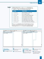
lored specifi cally for Web development (see Figure 5.1).
Note that using Firefox as a baseline development browser does not
mean a return to designing for one specifi c browser. Rather, Firefox is
the Goldilocks choice: not too advanced, not too buggy, but just right.
Web development is a complex activity; limiting early development to
one good browser is a wise choice. My experience has been that Safari
will handle everything that Firefox will, in terms of CSS and DOM
Scripting. Internet Explorer’s oddities are easily and sustainably fi xed
using conditional comments to load a few additional CSS styles (see
Chapter 23).
Figure 5.1. Pederick’s Web Developer Add-on lets you do things like edit CSS
and see your changes instantly in the browser.
PREPARING TO WRITE AND DESIGN 49
SETTING UP MULTIPLE BROWSERS FOR TESTING
Although Firefox’s popularity is growing (with about 24% mar-
ket share compared to IE’s 60% share in 2010, according to Net
Applications’ Net Market Share statistics
8
), there are many other
browsers in the world. Once your site is almost ready for posting
to the Web, you will want to have multiple browsers available to
check your site in. (See the sidebar “A Web-Reading Toolkit” in
Chapter 2.)
The one key problem for Web designers who use Macs is that there
is no way, short of running Windows on the Mac itself, to test Internet
Explorer. However, Windows computers are everywhere. Check with
your local library or even your friends and family. Someone is bound
to have a Windows machine. In a pinch, you can look into certain
browser-compatibility services, which provide a snapshot of how your
page appears in IE browsers. While most services cost money, there are
a few free ones, such as IE NetRenderer.
9
BUYING A DOMAIN NAME AND WEB HOSTING
The last key component of a Web setup is your domain and Web
hosting. These are two very different things, but they are often
confused.
• Your domain name is sort of like a welcome mat for a house.
Anyone can go to the hardware store and order a mat that
reads “The Smiths.” But throwing it in front of a random door
doesn’t get you the house!
• Your Web hosting, then, is more like the house. It is the actual
server space where your fi les are stored and perhaps where you
run blogging software like WordPress. With most hosts, your
site is located at a numeric address, or perhaps a URL created
by the hosting company. Neither a numeric address nor a host-
ing company’s URL is particularly memorable, though, so that
is why it’s important to buy the “welcome mat”—the domain
name—that you want to use to direct people to your “house”—
the contents of your Web site.
50 HOW TO DESIGN AND WRITE WEB PAGES TODAY
There are numerous domain name registration sites on the Web. I
will not recommend one particular site over another, but do consider
the following cautions when choosing a company to register your
domain name:
SCHOOL/BUSINESS WEB ACCOUNTS
Many colleges and universities, and even some high schools and businesses,
provide free Web accounts to students and employees. Avoid these. Thank the
school or business for their generosity, but buy your own domain and hosting.
Here’s why:
• Your Web identity should be independent of your school or employer.
People graduate or change schools, and they certainly leave their jobs. When
that happens, your identity should no longer be associated with the school or
employer (they will probably delete your account and along with it, the iden-
tity you’ve established in search engines). When you own your own domain
name and your own hosting, changing schools or jobs will not impact your
Web identity.
• Free Web accounts rarely have advanced Web server features. You can
usually only store XHTML, CSS, JavaScript, and media fi les on free accounts
(and sometimes, only a few megabytes’ worth); most do not make a database
available to you, and many do not even allow you to run PHP or other server-
side scripts.
• The URLs are ugly and are a pain to work with. The URLs of free
Web accounts tend to be something like
http://example
.edu/~yourusername/. That makes using root-relative paths impos-
sible (see Chapter 20), and sometimes the tilde (
~) gets encoded by other Web
sites or email programs as
%7E, making the URL even uglier, e.g, http://
example.edu/%7Eyourusername/.
• Universities may change the URL structure for accounts at a moment’s no-
tice, or disable certain features. This happened to me when I was in gradu-
ate school; my university one day stopped supporting certain features that
I’d been suggesting to colleagues and students, all of whom had their sites
break. When you purchase hosting, the host wants to keep your business, so
those types of unpleasant surprises are almost unheard of.
If you do anything with a free account, limit yourself to posting a nice standards-
compliant page linking to the site you host at your own domain.
PREPARING TO WRITE AND DESIGN 51
• Never pay much more than $10 a year for each of the .com,
.org, or .net top-level domains (TLDs) that you buy—and
do buy all three of those TLDs together, if you can afford it.
• Never opt in to any promises of search engine optimization
or other services that registration (or hosting) companies may
offer. Register your domain, and that’s it.
• Buy your domain name from one company, and your hosting
from another. Many Web hosting companies invite you to regis-
ter your domain name with them or to transfer registration for a
domain you purchased elsewhere. My suggestion is to avoid this;
buying your domain name from your Web host might make it
diffi cult for you to move to other hosts in the future. Keep those
two transactions separate, and you will never have to worry
about losing your domain name to a bad hosting company.
There are also thousands of Web hosting companies to choose from.
Here are some general things to know as you select a Web host:
• Hosting generally runs between $5 and $20 a month. Most
reputable hosting will be somewhere within that range. Beware
of hosting that’s cheaper than $5 a month; the old rule of “You
get what you pay for” applies.
• Large or unlimited storage is not necessarily a good thing. A
terabyte of storage might sound like a good thing, but it invites
abuse from people posting huge music or photo collections,
which may slow down the same server your site is on. Unlim-
ited storage might also be used to defl ect customers’ attention
from less attractive features of the hosting service. Generally,
anywhere from 1 to 10 gigabytes (GB) of storage is more than
suffi cient.
• Unlimited transfer or traffi c can also be a bad thing. Again, it
invites abusive customers; 500GB of transfer a month is plenty
for most sites—and fi nd out in advance how much the company
charges for overage fees beyond your allotted data transfer.
Most Web hosts showcase Web sites that are hosted on their servers.
Look through those sites: note how fast they load in particular. While
52 HOW TO DESIGN AND WRITE WEB PAGES TODAY
slow-loading pages on one or two of the sites may not necessarily be
the host’s fault, if all of their featured sites load slowly, look for hosting
elsewhere.
So what features do you look for? Here are some baseline hosting fea-
tures for the long-term growth of your site:
• Linux or Unix-based servers; this information can be hard to
determine for some hosts, so look hard. A Google search for
the hosting company’s name and “operating system” can often
help you discover this information.
• MySQL 5.1 database. Be sure you can have at least three data-
bases. These will be useful if you decide to run blogging or wiki
software.
• Secure Shell access (also known as SSH). Some hosts enable
this by default, but most require you to ask for it. Shell ac-
cess lets you access your server to run certain commands and
is important to have for setting up certain blogging, wiki, or
content management system software.
• SFTP access. Hosts generally offer FTP access, but FTP
transmits your password in the clear (without encryption),
which can be a security risk to your site. SFTP stands for
“ Secure FTP,” and is often found with hosts that also grant
SSH access.
• PHP 5. Watch out for hosts that are still only offering PHP 4;
good hosts will offer PHP 4 and 5, but encourage you to use 5.
• The Apache Web server with support for per-directory
confi guration fi les using
.htaccess. This feature lets you
customize certain aspects of how your Web site and Web server
function.
Depending on your needs, you might also consider whether a host
offers:
• Log fi les and server statistics; these can help you see who’s
linking to your site, or what search terms they used to fi nd it
(see Chapter 24).
• Email accounts (most hosts offer this).
PREPARING TO WRITE AND DESIGN 53
• Email lists (essential for business and organizational Web
sites).
• Secure socket layer (SSL), which is essential for e-commerce.
• Hosting multiple domain names; this will allow you to host
your own Web site and perhaps another, such as a community
organization you belong to.
NEXT STEPS
Now that you have an idea of the basic tools and services required for
Web writing and design, know that you’ll discover your own preferences
as you write and design your pages. The great thing about standards-
based Web design is that switching text editors, baseline development
browsers, and even Web hosts will not harm your site (although you
may have to relearn some things). Finding a setup that works for you
and that you’re comfortable with is essential. At the same time, give
yourself time to learn all about the setup you choose. No one under-
stands these things immediately.
In the next few chapters, we will look at accessibility, usability, and
sustainability—a trio of important concerns that everyone writing and
designing for the Web needs to consider.
NOTES
1. Chris Pederick, Web Developer Add-on for Firefox, https://addons
.mozilla.org/en-US/fi refox/addon/60
2. Notepad++, />3. XAMPP, />4. WinSCP, />5. TextWrangler, />6. CyberDuck, />7. QuirksMode.org, />8. Net Applications, Net Market Share, “Browser Market Share,” http://
marketshare.hitslink.com/browser-market-share.aspx?qprid=0&qptimeframe=Y
9. IE NetRenderer, o/netrenderer/
PART II
ISSUES AND CHALLENGES
Accessibility, usability, and sustainability. Those are the three overarch-
ing and interrelated issues that largely determine the rhetorical success
of a Web site. While having an accessible, usable, and sustainable site
is no guarantee of rhetorical success, having an inaccessible, unusable,
and/or unsustainable site is usually a recipe for rhetorical disaster.
All three issues are often treated as matters of assessment (is this site
accessible? usable? sustainable?) and are therefore considered only after
the completion of a site. However, accessibility, usability, and sustain-
ability provide powerful guides to the choices you will have to make
throughout the process of Web writing and design. Rather than simple
matters of assessment, all three concerns present long-term, ongoing
challenges.
The writing and design advice given in this book urges you to con-
sider access, use, and sustainability in every choice that you make, at
every step of the process. And as we will see, making a site accessible,
usable, and sustainable does not have to be a thankless chore, but can
actually help you clarify your work to yourself as you write and design.
Here is a brief overview of each of the three concerns:
• Accessibility. Although accessibility is often discussed in terms
of addressing only the needs of disabled people, accessibility is
about equitable access for all, regardless of physical abilities or
means of access. Contemporary Web sites must work on fast
and slow Internet connections, on ultra widescreen desktop
computers and miniature cell phone screens, with keyboards,
56 HOW TO DESIGN AND WRITE WEB PAGES TODAY
touchpads/touchscreens, and mice. Sites must also be accessible
to search engines, or your content will never be found or in-
dexed for others to fi nd in a Web search.
• Usability. Usability is often associated with “usability testing,”
where trained experts observe targeted users interacting with
a Web site. But usability can also inform your approach to de-
signing for site performance and user expectations. A site that
takes forever to load or otherwise performs poorly makes its use
diffi cult or impossible. If user expectations are not met, as when
site navigation has confusing or even misleading buttons, users
may become frustrated with the site and leave. Beyond sim-
ply ensuring that users can complete a task, usability helps you
earn the good will and attention of your audience. But usability
is not function alone: people like things that function well,
but they like fun and pleasing things even more—Web sites
included.
• Sustainability. A site that is accessible and usable today must
continue to be so. Digital technologies change quickly and
without much notice, it is true. Still, there are certain design
practices and choices that will better future-proof your Web
site. Sustainability is also about the access and use of a site as
the site grows, or scales. Certain writing and design choices
may be accessible and usable on a site of only fi ve pages. But
what if the site grows to 50 pages? Or 500?
Each of those issues will be treated in the next three chapters. Refer
to them often as you work on the design of your site, and as you work
through some of the technical matters in the chapters in “Strategies for
Success.”
CHAPTER 6
Accessibility
Some Web designers dislike the word accessibility , because it can easily
be misunderstood as forcing unacceptable limits on artistic creativity
or even promoting a bleeding-heart political agenda. But this chapter
reframes accessibility in a much broader scope and shows that acces-
sibility can actually encourage creativity, not limit it. We will also see
that accessibility is not beholden to any political agenda, but rather a
rhetorical one: accessibility maximizes the potential size and range of a
Web site’s audience.
WHAT IS ACCESSIBILITY?
Accessibility is a Web standard, similar to XHTML and CSS (see
Chapter 4). The World Wide Web Consortium has a group dedicated
to accessibility: the Web Accessibility Initiative (WAI). The WAI’s in-
troduction to accessibility declares that “Web accessibility means that
people with disabilities can use the Web.”
1
That’s a very limited defi nition. And if a Web designer believes that
disabled people do not use the Web, or that disabled people represent
such a small minority of users that their needs aren’t worth taking the
time to design for, odds are that designer will skip over accessibility
matters entirely. But a remarkable study from 2004 found that some
57 percent of working-age adults in the United States benefi t from ac-
cessible technology, and that this percentage is all but certain to increase
as the population ages.
2
The fact is that 57 percent is no minority.
Accessible design addresses the needs of disabled users, yes, but
as a product of serving the needs of all people. The accessibility and
58 HOW TO DESIGN AND WRITE WEB PAGES TODAY
accessible design techniques presented below aim to make sites avail-
able to all users, “without special adaptation or modifi cation” and re-
gardless of their computer equipment or physical ability.
3
Accessible design accounts for the full range of conditions of user
access. User access is determined both by human conditions, such as
physical or sensory abilities, as well as technological conditions, such
as computer equipment, network connection speeds, and so on. In cer-
tain cases, human and technological conditions are closely related, as
when a particular human condition (such as low vision) necessitates a
technological condition in the form of an assistive technology (such as
a screen reader).
ACCESSIBILITY STANDARDS
There are three key resources for accessibility on the Web. Although primarily
oriented toward addressing the needs of disabled people, it is worth your time
to explore each of these:
• Web Accessibility Initiative (WAI) (
): The
WAI, an organization that publishes a wealth of information on accessibility,
is one of the primary advocates for Web accessibility.
• Web Content Accessibility Guidelines (WCAG) (
/>WCAG/ ): Released as W3C Recommendation WCAG 2.0 in December 2008,
WCAG is a very technical document. Because of this, the design commu-
nity has reacted quite negatively to it, as in Joe Clark’s article “To Hell with
WCAG 2.”*
• Section 508 (
): “Section 508” refers
to a 1998 amendment to the Rehabilitation Act of 1973, which was meant to
end discrimination based on physical ability within the federal government
and federally funded agencies. Section 508 is specifi cally about information
technologies, such as government Web sites. While Section 508 is not ap-
plied as law to nongovernmental Web sites, the Section 508 guidelines and
technical standards (
/>standards.htm
) are still useful to consider when building an acces-
sible Web site.
*Joe Clark, “To Hell with WCAG 2,” A List Apart: For People Who Make Web Sites , No. 217 (May 23, 2006),
ACCESSIBILITY 59
But in almost all cases, conditions of access—both human and
technological—are nonnegotiable. They are states. Web designers, no
matter how talented, cannot leverage the technologies of the Web to
transform the computer someone uses to read the Web, any more than
they can change someone’s physical or sensory abilities. Access condi-
tions are states that design should account for, but cannot alter.
ACCESSIBILITY AS UNIVERSAL DESIGN
I prefer to treat accessibility as synonymous with a design approach
known as universal design. Universal design, in its best forms, attempts
to serve the needs of all users through a single design—rather than
through multiple designs tailored to different users. The Center for
Universal Design’s Universal Design Defi nition reads:
The design of products and environments to be usable by all peo-
ple, to the greatest extent possible, without the need for adapta-
tion or specialized design.
4
One classic example of universal design is a sidewalk that gently slopes
into the curb, down to street level. Not only does that design serve
the needs of people in wheelchairs, but also parents pushing strollers,
travelers pulling roller luggage, and klutzy people (like me) who tend
to trip a lot.
Certain cities enhance sloping sidewalks with special materials that
both signal the sloping sidewalk’s approach and prevent slipping and
falling in icy weather. In Chicago, where I live, reddish cement plates
with large round bumps are embedded into the slopes; those bumps
are a lifesaver during icy Chicago winters. As an added effect, because
of their red color, the plates add a little visual interest to what would
other wise be the drab gray of city sidewalks.
But sidewalks are a physical medium and therefore bound to the limi-
tations of the physical world, where one design serves all and is the same
for all. In the digital medium, the Web is in a class by itself in terms of
supporting design techniques that lend themselves to universal design:
one single page or one site serves the needs of all users, but it serves each
user differently. If the sloping sidewalk example were like a universally
60 HOW TO DESIGN AND WRITE WEB PAGES TODAY
designed Web site, the sidewalk would actually change its properties,
automatically, to best accommodate the needs of each pedestrian.
So while you may encounter advice from accessibility advocates who
suggest creating separate, specialized versions of pages that are geared
for particular devices, for printing, or for people with specifi c disabili-
ties, standards-based Web design enables you to create a single page
that anticipates and addresses the access conditions of all users.
ACCESSIBLE DESIGN APPROACHES BEGIN
WITH FILE FORMATS
The Web is an equal-opportunity storehouse, in that you can post just
about any type of digital fi le you’d like to the Web. But just because you
can post any type of fi le does not mean you shouldn’t be thoughtful and
selective about what you do post.
What has become known as Postel’s Law can guide, among other
things, your choice of digital formats for the Web:
5
Be conservative in
what you do, be liberal in what you allow others to do .
6
“Be liberal in what you allow others to do” is a foundational user-
centered principle for Web writers and designers: people should be able
to visit your site with whatever browser or device they choose, using
whatever assistive technology they need, and according to any personal
preferences (no JavaScript, no Flash plugin, having text enlarged). To
be liberal in your treatment of site visitors, though, you as a Web de-
signer must be conservative in how you build your site.
In terms of fi le formats and content, to be conservative in content
construction, build pages with the following:
• Content structured in XHTML. On the Web, text presented
in well-structured XHTML is the only content that you can rely
on to be accessible, because XHTML is the only format that all
Web browsers, Web-enabled devices, and assistive technolo-
gies can render. That does not mean that designers are limited
only to XHTML and text, but rather that any content must be
presented in XHTML (or another fl avor of HTML).
• Images presented as JPEGs, PNGs, or GIFs. Most graphics
packages can save images in dozens and dozens of formats. But
ACCESSIBILITY 61
there are only three that work reliably in all Web browsers.
JPEG and PNG images are generally preferable to GIFs, as
GIFs are limited to 256 colors. (See Chapters 3 and 18 for ad-
ditional information about image formats.) All content images
should have alternative text in XHTML, too.
And that is it for the conservative list, as far as content goes.
What’s missing from this list? Plenty, including some very popular
formats, such as word processor documents and PDFs, sound and video
fi les, and Adobe Flash.
It’s not that your site cannot use those formats; countless Web
sites do. However, anything beyond XHTML text and the three com-
mon image formats must be treated carefully. The challenge is that
no content other than XHTML text and common image formats can
be viewed directly in most browsers without the use of a plugin (e.g.,
the Flash Player) or other third-party application (e.g., Adobe Ac-
robat Reader). If a mobile phone does not have a word processor ap-
plication on it, it will be unable to access word processor documents
posted to the Web. The same problem affects PDFs, Flash, and audio
and video fi les, too: without the appropriate application, or without
a certain level of sight or hearing, people may not be able to access
those formats.
If you must post PDFs or word processor documents, be sure to alert
users which links point to those kinds of fi les, perhaps by placing the
fi le format in parentheses. You should also include links to download
the Flash Player, Acrobat Reader, or other software required to view
your fi les. Remember, though, not all users will be able to install soft-
ware. So keep your crucial content in XHTML.
BUILD FROM ACCESSIBILITY, NOT BACK TOWARD IT
One of the mistakes both beginning and advanced Web designers
make is to delay accessibility considerations until a design is almost
completed. I have learned from observing students in my Web design
classes that this is probably why some designers see accessibility as such
a pain: if addressed only after a design is otherwise in place and ready to
go, building back toward accessibility only slows you down and, worse,
62 HOW TO DESIGN AND WRITE WEB PAGES TODAY
might force you to scrap design components that represent a signifi cant
investment of time and effort.
Particularly among Web designers who work with DOM scripting
(see Chapter 19), there are two related concepts that are instructive
for building from accessibility, and not back toward it: progressive en-
hancement and its user counterpart, graceful degradation.
7
• Progressive enhancement is the design approach: each com-
ponent of a Web page builds on another: rather than putting
design instructions directly in XHTML, for example, you build
a really solid structure for your content in XHTML. Then the
design component, written in CSS and kept in its own sepa-
rate
.css fi le, is layered by capable Web browsers on top of
the XHTML.
• Graceful degradation is the corresponding user experience:
all browsers read XHTML; most read CSS. Users with CSS-
enabled browsers have a progressively enhanced experience.
But users with XHTML-only browsers are not punished by the
presence of CSS if the site “degrades” to XHTML-only pre-
sentation. Note that an XHTML-only device, such as a screen
reader, will not provide what seems to a user to be a degraded
experience. Rather, graceful degradation enables an optimal
experience for an XHTML-only device.
Let me share an example of graceful degradation: After redesigning
a major online writing lab Web site, I received an email from a blind
student who wished to express her gratitude that the new site contained
no design images. (The old site had many, and made it diffi cult for her
to use.) In truth, there were actually plenty of design images on the
site; the difference was that the new site presented them in such a way
that they would improve the experience of users who can benefi t from
a graphical display, without punishing users who cannot. That the stu-
dent thought there were no design images on the site is exactly what
she should have thought (content images, however, are a different mat-
ter; users must be made aware of those if they cannot view them). Fig-
ures 6.1 and 6.2 show how a design-image rich site (Figure 16.1) de-
grades gracefully for text-only display.
Figure 6.1. A fl yer the author created to promote a course. The page makes
extensive use of CSS background images.
Figure 6.2. The same page as Figure 6.1, but viewed in Lynx. All of the con-
tent is there, with no intrusion by the graphics in 6.1.
64 HOW TO DESIGN AND WRITE WEB PAGES TODAY
Progressive enhancement, then, is how you should design: start with
a solid foundation of content marked up in XHTML; add design in
CSS; and fi nally, add any advanced functionality that your site needs
using unobtrusive JavaScript (see Chapter 19). Progressive enhance-
ment returns us to Postel’s Law from the last section: Be conservative
in what you do, be liberal in what you allow others to do . In many ways,
what I advocate in terms of accessible design is a very conservative ap-
proach: it is not about using some trendy method to design pages. But
it is a very liberal approach in its view of what users should be able to
do: let them view the page in whatever browser or assistive technology
they have available.
Once you have designed with progressive enhancement in mind,
graceful degradation is what you should test for: view your site in Lynx,
or in Firefox with the Web Developer Add-on, which allows you to
disable images, CSS, JavaScript, or any combination thereof. (We saw
those accessibility tests in action in Chapter 2; apply them to your own
site, too.) If the site content and controls are still accessible under all
of those conditions, congratulations: your site gracefully degrades, and
your visitors should have few problems accessing it. Continue to test
your site over time, and consider providing your email address or an-
other means for visitors to contact you in case they encounter acces-
sibility problems.
GOING FURTHER: ACCESSIBLE ENHANCEMENT
So far, this chapter has looked at fi le formats and a general, progressive
enhancement approach to design. While this chapter has discussed
them in the abstract, later chapters will treat fi le formats and progres-
sive enhancement much more concretely. Here, though, are some
additional, concrete features you can add to pages to increase their ac-
cessibility: in-page navigation, accessibility attributes in XHTML, and
accessibility-minded uses of CSS and JavaScript.
In-Page Navigation
For people who routinely browse the Web on desktop and laptop com-
puters, moving through the contents of a single Web page is usually a
simple matter of using the scrollbars on the browser, the scrollwheel on
a mouse, or in certain cases, the touch pad on a laptop.
ACCESSIBILITY 65
On certain devices, such as screen readers and some mobile phones,
scrolling down long pages might be diffi cult or time-consuming. To ac-
count for this, it’s preferable to design sites that have a short accessible nav-
igation area near the top of each page that allows users to jump to major
sections of the page, such as the main content area or the site navigation.
In the Rapid Prototyping Kit (RPK, see Chapter 11), the header
area of the XHTML includes an unordered list with a class of
accessibility . There are two links that allow a device to jump
either to the page content or the site navigation. These accessible links
save users with screen readers from having to listen to all of a page’s
content before they can access the navigation or, conversely, to jump
to the content without having the navigation read aloud fi rst.
In the RPK, the content area immediately follows the accessible nav-
igation; given that, it might seem silly to have a “Skip to Content” link.
However, the idea behind including it is to inspire confi dence in users,
whether of assistive or mobile devices, that they can control their brows-
ing experience and get right to the part of the page that they seek.
For graphical browsers, CSS can be used to hide the accessible navi-
gation from view, using a technique discussed in Chapter 14. Sites that
use that technique enable assistive technologies to read aloud the con-
tents of the accessible navigation, while keeping the page from being
cluttered by another navigation element that would be unnecessary for
people experiencing the page graphically on a desktop browser.
Accessibility Attributes
The most well-known accessibility attribute in HTML and XHTML
is
alt , which provides alternate text for content images loaded in the
image tag,
<img /> . Your XHTML will not validate if you do not have
an
alt attribute on all of your images (attributes and other parts of
XHTML are discussed in Chapter 9). However,
alt text is supposed to
be limited to 100 characters.
8
Given the old cliché says that a picture
is worth a thousand words, well, you can see the issue here: 100 charac-
ters (not words) will not come close. (That’s 40 fewer characters than
a Twitter post allows.)
There are some different options to addressing the limitation of
alt ;
the fi rst is the
title attribute. It, too, is very limited in length; most
browsers will display title attribute text as a tooltip, but some may limit
66 HOW TO DESIGN AND WRITE WEB PAGES TODAY
the text to 85 characters. There is another attribute, long description
(
longdescrip ), which allows devices to follow a link to a com-
plete Web page with a longer description. Maintaining separate pages
of description for each of your images is not a very manageable solu-
tion, though, especially given that not all assistive devices support it.
Chapter 18 suggests other ways to prepare images and other media with
additional text for all users.
The image tag is not the only XHTML tag with special accessibil-
ity attributes. There are two attributes that can be added to the anchor
tags to assist users in activating page navigation and other important
links:
tab index and accesskey .
•
tabindex helps change the order in which links are activated
by using the Tab key on the keyboard; my preference is to run
the tab index on the navigation items, although arguments
could be made in favor of eliminating this entirely.
•
accesskey is an attribute that allows someone to use a key-
board combination to activate a particular link, usually in the
navigation area.
See the book’s companion Web site at
http://sustainableweb
design.com/book/ for examples of using those two attributes to in-
crease the accessibility of your links and navigation.
CSS and JavaScript to Enhance Accessibility
CSS and JavaScript do not have to be stumbling blocks to accessibil-
ity. Used appropriately in the right circumstances, CSS and JavaScript
can actually enhance the accessibility of a Web page for users with
capable browsers. For example, CSS enables you to design text to be
far more readable than the default styling Web browsers apply. And
JavaScript allows you to add simple mechanisms that, for example, in-
crease the font size on your pages. I use JavaScript in tandem with CSS
on my course Web sites for just this purpose (see Figures 6.3 and 6.4):
it makes it easy to enlarge the text for projecting during class. But that
enhancement also serves any low-vision students who need an easy way
to view the site in larger font sizes. It’s also possible to refer to alternate
CSS fi les on your pages, a technique that’s mentioned in Chapter 10
Figure 6.3. The course site for the author’s Web design course.
Figure 6.4. DOM Scripting makes the course site more accessible for low-
vision visitors, but also aids in projecting content in the classroom. Notice the
sidebar disappears in this mode.
68 HOW TO DESIGN AND WRITE WEB PAGES TODAY
and presented with examples at the book’s companion site, http://
sustainablewebdesign.com/book/
.
NEXT STEPS
Accessibility and universal design form the foundation for a rhetori-
cally effective Web site, but ensuring equitable access to a site is only
the fi rst step. Designers and writers must also be concerned about how
and under what conditions users use Web sites, too. In the next chap-
ter, we will look at usability-driven design approaches for creating
usable sites.
NOTES
1 . W3C Web Accessibility Initiative, “Introduction to Web Accessibil-
ity,”
2 . Microsoft PressPass, “New Research Shows 57 Percent of Adult Com-
puter Users Can Benefi t from Accessible Technology,” rosoft
.com/presspass/press/2004/feb04/02-02AdultUserBenefi tsPR.mspx
3 . William Lidwell, Kritina Holden, and Jill Butler, Universal Principles of
Design (Gloucester, MA: Rockport Publishers, 2003), 14.
4 . The Center for Universal Design, “Universal Design Principles,” http://
www.design.ncsu.edu/cud/about_ud/udprincipleshtmlformat.html
5 . Ironick, “My History of the (Internet) Robustness Principle,” Ironick:
Contingency, Irony, and Solidarity (2005), />2005/05/my_history_of_t.html
6 . Information Sciences Institute, Internet Protocol (1979), http://www
.postel.org/ien/txt/ien111.txt
7 . Jeremy Keith, DOM Scripting: Web Design with JavaScript and the Docu-
ment Object Model (Berkeley, CA: Friends of Ed/Apress, 2005), 85–86.
8 . W3C, “HTML Test Suite for WCAG 2.0: Test 3—Image Alt Text Is
Short” (2005),


