Mobile Web Development phần 3 pot
Bạn đang xem bản rút gọn của tài liệu. Xem và tải ngay bản đầy đủ của tài liệu tại đây (756.84 KB, 23 trang )
Chapter 2
[ 35 ]
There is another interesting thing you will notice when you test on different devices!
Different devices have different browsers, and different browser versions have
different features (and bugs). You will experience a wide variety in terms of colors,
fonts, layout and table support, image handling, and standards compliance—in
other words, you may have many hair pulling experiences making things work on
different devices! But you will learn a lot! You need to host the application on the
public Internet to test from real devices, and it will also give you the opportunity to
test the speed of the application.
DeviceAnywhere is a cheap and effective way to test on real devices!
One great service that allows you to test on a variety of real devices is
DeviceAnywhere (www.deviceanywhere.com). They give you access
to real devices from your desktop computer. You also have more than
300 devices that you can choose from, and quite a few network operators.
Using the DeviceAnywhere Studio, you can connect to a remote device.
The Studio will take input from your desktop to the device and stream the
output screens from the device back to your desktop. This is a superb way
of testing on real devices at a fraction of the cost!
Bottomline: It's best to test with actual devices, but test on ve different simulators
as well.
Hosting Your Mobile Site is Trivial
If you are wondering how to put up your site on a server to access it from
browser-based simulators and real devices, don't worry! You can host your mobile
site just like a normal site. Unlike the old days, you do not have to do any special
server setup. You can simply FTP the les to your server, and access them from a
mobile browser.
There is also a special top-level domain for mobile sites—.mobi. You can buy that,
and also host your site with dotMobi (www.dotmobi.com). One recommendation is to
keep the mobile site URL short, so that users can easily type it.
is better than You
can also implement a browser detection routine on that
automatically redirects the user to the mobile version of the site if they access it from
a mobile device.
POTR Mobile Homepage
Luigi is now excited to build his mobile site. Let's put up a "coming soon" page for
him. Check the following code.
Starting Your Mobile Site
[ 36 ]
<?xml version="1.0" encoding="UTF-8"?>
<!DOCTYPE html PUBLIC "-//WAPFORUM//DTD XHTML Mobile 1.0//EN"
" /><html xmlns=" /> <head>
<title>Luigi's Pizza On The Run</title>
</head>
<body>
<img src="potr_logo.jpg" width="120" height="42"
alt="Luigi's Pizza On The Run" />
<p>Mobile ordering coming soon!</p>
<p>If you're already hungry, call
<a href="wtai://wp/mc;+18007687669">+1-800-POTRNOW</a></p>
</body>
</html>
Here's how the code will show up in Openwave browser simulator:
and in Opera's desktop web browser in Small screen mode:
Chapter 2
[ 37 ]
Making a Call is as Simple as Email
Did you notice the link on the POTR homepage to make a call? If the user wants
to place an order, she or he can simply follow the link and get connected to Luigi's
shop. Most mobile devices can make a call or send a text message. Adding a call link
is as simple as a mailto link! Here's the code to do a single-click call:
<a href="wtai://wp/mc;+18007687669">+1-800-POTRNOW</a>
There is a simpler method as well:
<a href="tel:+18007687669">+1-800-POTRNOW</a>
Either of these will work on most devices. Some phones do not support it, and some
others work with one method. You may need to use device-based adaptation to
determine the best way (and we will learn to do that in the fourth chapter). If you
want to keep things simple, just go ahead with the tel method.
Understanding the Homepage
You may have noticed the similarities between HTML and XHTML MP code by now!
The homepage also shows up as the same in both mobile and desktop browsers. Let
us examine different parts of the code now.
Document Structure
The rst two lines of the code are the XHTML prolog. They declare the XML version
and the DOCTYPE of the document. The DOCTYPE species the DTD (Document
Type Denition) for the XML document—dening the grammatical rules for the
XML that follows. A validating browser may download the DTD and check that
against the XML to ensure it's in proper format. The character set in the XML
declaration line tells the language encoding for the le. You should be ne with
UTF-8 in most cases. Also, notice that you do not need to close these two elements;
<?xml version="1.0" encoding="UTF-8"?>
<!DOCTYPE html PUBLIC "-//WAPFORUM//DTD XHTML Mobile 1.0//EN"
" />The rest is very much like HTML. It is mandatory for an XHTML MP document to
have html, head, title, and body elements. You can specify meta tags and other
document-specic information within the head element. The body element must
have at least one element in it.
Yes, it's that simple!
Starting Your Mobile Site
[ 38 ]
Fundamentals of XHTML MP
Now that we have seen how the homepage works, let us learn some more about
XHTML MP.
Before Writing Further Code, Let's Learn
Some Grammar
Since XHTML MP is based on XHTML, certain syntactical rules must be followed.
Making syntactical errors is a good way to learn a programming language, but so
that you don't get frustrated with them, here are some rules you must follow with
XHTML MP! Remember, HTML is very forgiving in terms of syntax, but make a
small syntax error in XHTML MP and the browser may refuse to show your page!
Overall, XHTML elements consist of a start tag—element name and its attributes,
element content, and closing tag. The format is like:
<element attribute="value">element content</element>
XHTML Documents Must be Well Formed
Since XHTML is based on XML, all XHTML documents must adhere to the
asic XML syntax and be well formed. The document must also have a
DOCTYPE declaration.
Tags Must be Closed!
All open tags must be closed. Even if it is an empty tag like "<br>", it must be used
in the self-closed form like "<br />". Note the extra space before the slash. It's not
mandatory, but makes things work with some older browsers. If you can validate
within your editor, make it a practice to do that. Also cultivate the habit of closing a
tag that you start immediately—even before you put in the content. That will ensure
you don't miss closing it later on!
Elements Must be Properly Nested
You cannot start a new paragraph until you complete the previous one. You must
close tags to ensure correct nesting. Overlapping is not allowed. So the following is
not valid in XHTML MP:
<p><b>Pizzas are <i>good</b>.</i></p>
It should be written as:
<p><b>Pizzas are <i>good</i>.</b></p>
Chapter 2
[ 39 ]
Elements and Attributes Must be in Lowercase
XHTML MP is case sensitive. And you must keep all the element tags and all their
attributes in lowercase, although values and content can be in any case.
Attribute Values Must be Enclosed within Quotes
HTML allowed skipping the quotation marks around attribute values. This will
not work with XHTML MP as all attribute values must be enclosed within
quotes—either single or double. So this will not work:
<div align=center>Let things be centered!</div>
It must be written as:
<div align=”center”>Let things be centered!</div>
Attributes Cannot be Minimized
Consider how you would do a drop down in HTML:
<select>
<option value="none">No toppings</option>
<option value="cheese" selected>Extra Cheese</option>
<option value="olive">Olive</option>
<option value="capsicum">Capsicum</option>
</select>
The same drop down in XHTML is done as:
<select>
<option value="none">No toppings</option>
<option value="cheese" selected="selected">Extra Cheese</option>
<option value="olive">Olive</option>
<option value="capsicum">Capsicum</option>
</select>
The "selected" attribute of the "option" element has only one possible value and, with
HTML, you can minimize the attribute and specify only the attribute without its
value. This is not allowed in XHTML, so you must specify the attribute as well
as its value, enclosed in quotes. Another similar case is the "checked" attribute in
check boxes.
XHTML Entities Must be Handled Properly
If you want to use an ampersand in your XHTML code, you must use it as & and
not just &.
Starting Your Mobile Site
[ 40 ]
& is used as a starting character for HTML entities—e.g. , ", <, >
etc. Just using & to denote an ampersand confuses the XML parser and breaks it.
Similarly, use proper HTML Entities instead of quotation marks, less than/greater
than signs, and other such characters. You can refer to standards.
org/learn/reference/charts/entities/ for more information on XHTML entities
Most Common HTML Elements are Supported
The following table lists different modules in HTML and the elements within them
that are supported in XHTML MP version 1.2. You can use this as a quick reference
to check what's supported.
Module Element
Structure
body, head, html, title
Text
abbr, acronym, address, blockquote,
br, cite, code, dfn, div, em, h1, h2,
h3, h4, h5, h6, kbd, p, pre, q, samp,
span, strong, var
Presentation
b, big, hr, i, small
Style Sheet style element and style attribute
Hypertext
a
List
dl, dt, dd, ol, ul, li
Basic Forms
form, input, label, select, option,
textarea, fieldset, optgroupfieldset, optgroup
Basic Tables
caption, table, td, th, tr
Image
img
Object
object, param
Meta Information
meta
Link
link
Base
base
Legacy start attribute on ol, value attribute on li
Most of these elements and their attributes work as in HTML. Table support in
mobile browsers is aky, so you should avoid tables or use them minimally. We will
discuss specic issues of individual elements as we go further.
Chapter 2
[ 41 ]
XHTML MP Does Not Support Many WML
Features
If you have developed WAP applications, you would be interested in nding the
differences between WML (Wireless Markup Language—the predecessor of XHTML
MP) and XHTML MP; apart from the obvious syntactical differences. You need to
understand this also while porting an existing WML-based application to XHTML
MP. Most of WML is easily portable to XHTML MP, but some features require
workarounds. Some features are not supported at all, so if you need them, you
should use WML instead of XHTML MP. WML 1.x will be supported in any mobile
device that conforms to XHTML MP standards.
Here is a list of important WML features that are not available in XHTML MP:
There is no metaphor of decks and cards. Everything is a page. This means
you cannot pre-fetch content in different cards and show a card based on
some action. With XHTML MP, you either have to make a new server request
for getting new content, or use named anchors and link within the page.
You could use the <do> tag in WML to program the left and right softkeys on
the mobile device. Programming softkeys is not supported in XHTML MP;
the alternative is to use accesskey attribute in the anchor tag (<a>) to specify
a key shortcut for a link.
WML also supports client-side scripting using WMLScript—a language
similar to JavaScript. This is not supported in XHTML MP yet, but will come
in near future in the form of ECMA Script Mobile Prole (ECMP).
WML also supported client-side variables. This made it easier to process
form data, validate them on the client side, and to reuse user-lled data
across cards. This is not supported in XHTML MP.
With XHTML MP, you have to submit a form with a submit button. WML
allowed this on a link. WML also had a format attribute on the input
tag—specifying the format in which input should be accepted. You need
to use CSS to achieve this with XHTML MP.
There are no timers in XHTML MP. This was a useful WML feature making
it easier to activate certain things based on a timer. You can achieve a similar
effect in XHTML MP using a meta refresh tag.
The WML events ontimer, onenterbackward, onenterforward, and onpick
are not available in XHTML MP. You can do a workaround for the
ontimer event, but if you need others, you have to stick to using WML for
development.
XHTML MP also does not support the <u> tag, or align attribute on the <p>
tag, and some other formatting options. All these effects can be achieved
using CSS though.
•
•
•
•
•
•
•
•
Starting Your Mobile Site
[ 42 ]
Summary
In this chapter, we learned the basics of developing mobile web applications.
We even created a temporary homepage for Luigi! Specically, we learned:
Different methods of mobile web development—doing nothing,
simplication, CSS, and mobile-specic sites
Designing information architecture and navigation for mobile
Setting up a development environment, including simulators
Hosting your mobile site
Creating XHTML MP documents, the subset of XHTML that works on
the web
An easy way to make "clickable" phone numbers in your web apps
Supported elements and language rules of XHTML MP
In the next chapter, we will implement most of the POTR mobile site. We will look at
the graphic design and beautify our site using Wireless CSS!
•
•
•
•
•
•
•
Building Pizza On The Run
We are now ready to build a mobile pizza ordering system for Luigi's Pizza On
The Run. We have the site structure chalked out, and have also done the basics of
XHTML MP.
In this chapter, we will look at:
Designing layouts for the mobile web
Using Wireless CSS in design
Being aware of differences in mobile browsers
Creating the database and code architecture for POTR
Using forms on the mobile web
Handling user authentication
Testing our work in simulators
Constraining user input with Wireless CSS
Applying special effects using Wireless CSS
By the end of the chapter, you will be able to build database-driven mobile web
applications on your own.
Luigi's Pizza On The Run
Luigi has put up a teaser mobile homepage now, and posted a note about it on his
website. Customers have already started calling via the mobile homepage. It's much
easier for them to click a link and call! Luigi showed the proposed site structure to a
few customers and they are excited to learn how quickly they can order through their
mobiles. Luigi is now ready to build a full-edged mobile pizza ordering system!
•
•
•
•
•
•
•
•
•
Building Pizza On The Run
[ 44 ]
Designing Layouts for the Mobile Web
Design is an important element of any software. In today's competitive world, where
everyone can offer the same service, design has become a differentiator. People want
to look at beautifully designed pages; their condence in the product is higher if it is
well designed. How many of us would buy an iPhone just for its features? There are
other phones that provide similar or better features, but we would like to have an
iPhone because of its excellent design.
Web applications have witnessed many design trends. Designs in the sites that are
often classied as Web 2.0 sites have gradients, rounded corners, large types, CSS
designs, and fresh colors. This style of design has worked and designers now make
desktop applications as well using such styles.
You certainly want to make your mobile website look beautiful. One of the rst
questions you have to answer is: what will be the size of the application? 1024x768
pixels is standard resolution of most desktops. What's the standard resolution for
mobile devices? Well, it depends; let's look at why!
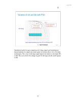
Mobile Screen Sizes
The pixel resolution available on mobiles is increasing. 176x208 pixels was the
norm a while ago, but 240x320 is almost everywhere nowadays. Apple's iPhone
is 320x480 and some Smartphones now sport a VGA resolution of 480x640 pixels
(refer to the following gure). Within two years, mobiles may touch our current
desktop resolutions.
Chapter 3
[ 45 ]
While the resolution is growing, the absolute screen size is not. Even if you have more
pixels to play with, you only have 3 to 5 inches. Mobiles are also typically used at a
hand's distance; something too small may not be usable. Mobile devices are normally
taller than they are wide, and horizontal scrolling is not supported on some
devices—so if the width of application is more than the device size, part of the
application will not be shown. 150 pixels is a safe width for today, but you should
check the target customers and the kind of device they will be using before making
a decision.
Colors, Images, Page Sizes, and More
Expect at least 256 colors on a mobile device. Most mobiles support images
well—GIF and JPG are universal. As the RAM and processor capabilities are limited,
many devices keep a limit on the total size of a page—including WCSS, XHTML MP,
and images. 10 kilobytes is the minimum you can expect, but it's best to keep the
page sizes as small as possible—less than 30K is recommended. Many users browse
with images turned off to save bandwidth costs. Hence our application must not
rely on images for navigation or critical operations. Giving proper alternative text to
images becomes a must.
We also need to remember the input and navigation methods while designing a
mobile site—will the user have arrow keys for navigation or a stylus? Or would she
or he be tapping with her or his ngers? It is critical to know your customers and
design the site accordingly. Remember, mobile pages are not purely about design;
they are more about functionality and usability! Remove all unnecessary images,
CSS, and even XHTML code! Keep the design lean.
To Mobile or Not to Mobile?
Luigi is not sure what to do! He has seen Opera's small screen rendering that can
scale and fold websites to show them neatly on a mobile browser. He's got himself
an iPhone and likes the way Safari scales down websites. He keeps talking about
how he can zoom in and pan by tapping and dragging ngers. Some of his friends
are telling him about "One Web", and how users should have access to the same web
content from any device—including mobile devices. He is confused. Should Luigi
build a mobile version of the site or not?
Mobiles are becoming powerful and bandwidth cheaper. But then, how many people
really have access to such powerful devices today? The majority are still using
feature phones they bought a couple of years ago. They still have old browsers. But
they do want to order pizzas from anywhere!
Building Pizza On The Run
[ 46 ]
That's a very good argument, Luigi says. And he decides to go ahead with a
mobile-specic version of Pizza On The Run. The design will be done keeping in
mind a mobile user who wants to quickly order a pizza. We will keep things simple
and easy, just focussing on getting the task done.
Web Layouts Don't Work on Mobile Devices
Typical webpage layouts won't t mobile devices. Given there is no mouse or
keyboard, and a small screen on the mobile device, we must choose a layout that can
ow well. A website header normally has navigation links and branding graphics.
But header links can be an overkill for mobiles. On most mobile browsers, you
navigate by clicking the arrow key. You need to keep clicking to move from one link
to another. Would you like to skip through 10 links to reach the actual content of the
page? May be not! An ideal mobile web layout would ow vertically with distinct
blocks for different page elements.
Simple links at the top of the page are great for the rst page of a mobile site, and
may not be needed on the inside pages. The sequence of clicks the user has to go
through to reach a particular page (referred to as the clickstream) must be short.
The most frequently used options should come up rst. It's best to provide a header
and minimal textual navigation at the top. Links to home and other important
pages can be placed in the footer. Even the content should be broken down into
easy-to-comprehend sections. You should avoid putting the same text content from
your website onto the mobile web. It is best to rewrite the text copy of the site to
serve the mobile users better.
Chapter 3
[ 47 ]
Remember: As a mobile web developer, you must understand users. The
entire design for the mobile site must be done for the user. Give them
what they want and make it simple to get it. And keep learning from
your experiences.
We will use simple vertical blocks for designing POTR. We will also keep images to
the minimum and use clean XHTML code.
Using Wireless CSS as the Silver Bullet,
Almost!
Most of us extensively use tables for layout design on websites. Tables are supported
on most mobile browsers, but nested tables may not work. On the Web, CSS is
preferred for designing page layouts. Fortunately, XHTML MP-compliant browsers
too support Wireless CSS (WCSS), a subset of CSS 2.1. WCSS is very effective in
controlling the layout of the site and should be used to ow the page in blocks and
decorate elements. If you currently use CSS to style your documents, WCSS will
not be a problem at all—it's just the same actually! We will talk about some special
styles useful in mobile development as we build the POTR application. If you
want to learn more about WCSS, Developers' Home has an excellent tutorial at:
/>You can style your current website to render well on a mobile device using CSS. You
may hide certain portions with display: none or size images and text to t well on
a mobile device. However, keep in mind that even when you scale images or hide
content blocks with CSS, they still download to the mobile browser before CSS is
applied. This means your users may have to wait longer for the page to render and
pay higher bandwidth charges.
Another important thing about CSS on mobile platforms: many browsers will render
the page in two passes: rst to load the content, and then to apply the style sheet. So
the user may see basic HTML formatting before the style sheet is loaded and applied.
This is especially true if you are loading an external style sheet.
Here are the ve ways you can apply CSS in an XHTML MP page:
1. Linking to an external style sheet:
<link rel="stylesheet" href="site.css"
type="text/css" media="handheld">
2. Style denition within the document:
<style type="text/css" media="handheld"> </style>
Building Pizza On The Run
[ 48 ]
3. Document style sheet with @media qualier:
<style type="text/css">
@media handheld { }
</style>
4. Importing an external style sheet to the document:
<style type="text/css">
@import url( ) handheld;
</style>
5. Inline style for an element:
<p style="align: left">Some text</p>
The preferred method is to link to an external style sheet and use inline styles to
override. The following code denes the CSS we will use for POTR:
/* POTR Mobile Style sheet */
body, td, p {
/* Most devices have their own fonts, but let's give it a shot */
font-family: Verdana, Arial, Helvetica, sans-serif;
font-size:1em
}
h1, h2 {
color:#660033;
border-bottom: 1px #000000 solid
}
h1 {
font-size:1.4em
}
h2 {
font-size:1.2em
}
h3 {
font-size:1em;
font-weight: bold
}
ul li {
list-style: square
}
img {
border: none
}
.error {
color:#CC0000;
Chapter 3
[ 49 ]
border: 1px #FF0000 solid;
font-size: 0.8em;
padding-left: 20px;
background: left no-repeat url(error.gif) #FFFF99
}
.debug {
background-color:#EEEEEE;
border: 1px #FF0000 solid
}
.button {
border: 1px #FF6600 solid;
background-color:#CCCCCC;
font-size: 1.2em;
font-weight: bold;
margin-top: 0.5em;
padding-left: 1em;
padding-right: 1em
}
Consider that a mobile device may not have many fonts, especially not the ones
we are used to. Typical devices have a few non-generic fonts, and at least one font
from serif, sans-serif, and monospace families. Hence, our designs must not rely
on particular fonts. When you are creating images and need to put text in them,
bitmapped fonts will work better at small sizes.
Notice that we have used em as the measurement unit in most cases. Dening sizes
relative to element size is very exible and will render well across multiple browsers.
We use standard heading tags and other HTML elements for formatting so that even
if the browser does not have CSS support, our page will render acceptably.
We have dened custom styles for form buttons, errors, and debug messages. We
have increased the size of the font in the button and given it some extra padding
on the left and right to make the button larger. This will make it easier to locate and
use the button.
How will this CSS look? Let's create a sample page and test it in different browsers.
<?xml version="1.0" encoding="UTF-8"?>
<!DOCTYPE html PUBLIC "-//WAPFORUM//DTD XHTML Mobile 1.0//EN"
" /><html xmlns=" /><head>
<title>CSS / Forms Testpage</title>
<link rel="stylesheet" href="assets/mobile.css" type="text/css" />
</head>
<body>
<p class="error">Sorry, this is an error sample!</p>
<h1>h1 heading</h1>
<h2>h2 heading</h2>
Building Pizza On The Run
[ 50 ]
<p>Normally you will have some text after the heading.
This is a sample of that.</p>
<img src="assets/potr_logo.jpg" alt="Luigi's Pizza on the Run"
width="120" height="42"/>
<h3>h3 heading</h3><p>Sample text after smaller heading.</p>
<table><tr><td>
<ul><li>List item</li><li>List item</li><li>List item</li></ul>
</td><td>
<ol><li>List item</li><li>List item</li><li>List item</li></ol>
</td></tr></table>
<form><fieldset>
Text field: <input type="text" /><br />
Select box: <select><option value="1">First option</option>
<option value="2">Second option</option><option value="3">Third
option</option></select><br />
<input type="radio" name="handsetType" checked="checked" />Phone
<input type="radio" name="handsetType" />SmartPhone<br />
Text area: <textarea rows="3" cols="30" name="details">Some
details here.</textarea><br />
<input type="checkbox" name="terms" value="1" />I agree
to the terms<br />
<input type="submit" value="Send" class="button"/>
</fieldset></form>
</body></html>
Internet Explorer Openwave Opera Mini 4
Chapter 3
[ 51 ]
The CSS renders well for these browsers, though margins, font sizes, and form
element rendering are inconsistent. Table support is present, and basic HTML
elements render very well. The error message at the top has the most complicated
CSS, but it shows up perfectly! Overall, we are good! We can now plan the back end
for POTR.
Creating the Database and Code
Architecture for POTR
We have learned the basics of graphic design and layout for mobile web applications.
Now, we will build the back end for Pizza On The Run. We want to allow easy
ordering of pizzas from mobile devices. We don't need to make the back end much
different from what it would have been for a website, so we will quickly go through
the common parts and look at the differences in detail.
Classes for POTR
We need to retrieve menu data from the database and save order information. We
also need to provide user authentication. Most operations in our POTR site are
related to the database, and are repeated. The Create, Retrieve, Update, and Delete
(CRUD) operations are most common. So let us create a common class that others
can extend—the common class will have all database-related functions and other
frequently used methods.
Building Pizza On The Run
[ 52 ]
One order can contain multiple pizzas. Each pizza has a base price and the user can
customize the size, crust, and toppings, which add to the price. Thinking about all
this, we can have a class structure as shown in the following gure:
Database Schema
Deriving from the class structure, we can have a database schema as in the following
gure. A few important notes:
Product categories will be Pizzas, Side Dishes, and Beverages.
The Products table will contain details of individual products. Variations are
possible only on pizzas, so we don't need to relate them with all products.
The variation type will decide what type of variation it is—Size, Crust,
or Toppings.
•
•
•
Chapter 3
[ 53 ]
Each order may have one or more products in it, and if the order item is a
pizza, it will have variations.
Coding Framework
We will use a simple fusebox-style coding framework. You may already be familiar
with this style, but if you are not, it's easy to understand. Take a look at the following
gure. All requests will pass through a central controller—index.php. Based on the
value of the "action" variable, it will include another le. This action-specic le will
carry out the business logic. At the end, the resulting XHTML will be sent back to the
user's browser. Layout design is dened mainly in the header and footer les.
Request / Response
index.php
Central Controller
header.inc.php
XHTML prolog, CSS,
header markup
footer.inc.php
Footer navigation,
Debug output
prepend.inc.php
Configuration, include
class definitions
action.inc.php
Handler for specific
action. Instantiate
classes and perform
business logic. Also
output XHTML result
Database
•
Building Pizza On The Run
[ 54 ]
Redoing the POTR Homepage
We now know enough to start the actual code. The current POTR homepage promises
people that online ordering will start soon. Let's start by spicing up the homepage!
Our homepage le will be called home.inc.php and will be the default action.
Let's look at the various parts of home.inc.php.
<img src="assets/potr_logo.jpg" alt="Welcome to Luigi's Pizza On The
Run" width="120" height="42"/>
<ol>
<li><a href="#orderForm" accesskey="1">Order Pizzas</a></li>
<li><a href="#loginForm" accesskey="2">Login</a></li>
<li><a href="?action=contact" accesskey="4">Call Us / Directions</a></
li>
<li><a href="?action=offers" accesskey="4">Special Offers</a></li>
</ol>
The rst line shows our logo. We then use an ordered list to show a navigation
menu. This will make sure the menu shows consistently across browsers. The
accesskey attribute in each link provides a shortcut key for that link. Pressing the
'accesskey' will activate a particular link without needing to navigate with arrows.
We have ordered the links by priority so that the user can perform the desired action
faster. The rst two links point to forms on the same page, while the next two load
a new page by passing the action parameter to the same index.php le. Notice
that this navigation is only in the homepage. We do not repeat this on other pages;
otherwise we could put this in the header.inc.php.
The "name" attribute on <a> is not a valid XHTML MP markup. Use
"id" instead for anchored links.
We start the ordering process right on the homepage. The following code shows
the code for selecting the number of pizzas you want to order. On a mobile device,
navigating through links is easier than using a select drop-down menu. So, we show
normal links to select up to 4 pizzas. Then we provide a select box to select up to
9 pizzas. We use selected="selected"—full XHTML compliant form—to select
5 as default quantity in the drop down. All attributes are lower case and values are
enclosed in double quotes. Also notice that & is escaped correctly in the links.
<a id="orderForm" />
<h2>Order:</h2>
<form method="post" action="index.php">
<fieldset>
<input type="hidden" name="action" value="order" />
Chapter 3
[ 55 ]
<input type="hidden" name="step" value="1" />
<p>How many pizzas?
<a href="?action=order&step=1&numPizza=1">1</a> -
<a href="?action=order&step=1&numPizza=2">2</a> -
<a href="?action=order&step=1&numPizza=3">3</a> -
<a href="?action=order&step=1&numPizza=4">4</a> -
<select name="numPizza">
<option value="1">1</option>
<option value="2">2</option>
<option value="3">3</option>
<option value="4">4</option>
<option value="5" selected="selected">5</option>
<option value="6">6</option>
<option value="7">7</option>
<option value="8">8</option>
<option value="9">9</option>
</select>
<input type="submit" name="option" value="Select"/>
</fieldset>
</form>
</p>
On the homepage, we also want to show the login form. We include the login.
inc.php le for this. We are including a separate le because the login form will be
needed in the checkout process too. So if we have a separate le, we can use the same
code at both these places.
<?php
include("login.inc.php");
?>
Let's s now see the code in login.inc.php.
<?php
// If we can find the username / password in the cookie (
// stored on last login), or if the page
// is called again - on a failed login - fill them up automatically
// Ideally, we should clean up and validate these variables
// before using them
$myUsername = ($_COOKIE["potrUsername"] != "")? $_
COOKIE["potrUsername"] : $_POST["username"];
$myPassword = ($_COOKIE["potrPassword"] != "")? $_
COOKIE["potrPassword"] : $_POST["password"];
$returnUrl = isset($_REQUEST["return"]) ? $_REQUEST[
"return"] : $return;
?>
Building Pizza On The Run
[ 56 ]
<h2>Login</h2>
<p>Login to repeat your last orders and speed up checkout.</p>
<a id="loginForm" />
<form action="index.php" method="post">
<fieldset>
<input type="hidden" name="action" value="login" />
<input type="hidden" name="return" value="<?php
echo $returnUrl; ?>" />
User: <input type="text" name="username" maxlength="15" value=
"<?php echo $myUsername; ?>" /><br />
Password: <input type="password" name="password" maxlength="15"
value="<?php echo $myPassword; ?>" /><br />
<input type="checkbox" value="1" name="remember"
checked="checked" />Remember login details<br />
<input type="submit" value="Login" />
</fieldset>
</form>
We allow saving the username and password in a cookie to automatically populate
elds from the cookie, next time. We are not using cookies for authentication; just to
store this information to make it faster to log in next time. Also, we do not want to
make it mandatory to log in to select products. This may be a roadblock in usability.
In the ordering process, we will give an option to register automatically if the user
wants. After the rst order, she or he can log in either at the start, or while checking
out, and the delivery address will be auto-lled. We have provisioned for a return
URL in the login form so that we can redirect to that page on successful login.
Form Elements Don't Look the Same
Across Browsers
While the XHTML code for forms is same for standard web and mobile web, the way
form elements are rendered differs from browser to browser. Some browsers show
the select drop down as a list of radio buttons, some show it like a menu. If you use
<optgroup> in select options, some will render it as a nested menu.
Some browsers allow inline editing of text elds, some get into a full screen editing
mode. Many render large text boxes. We have already seen how forms render in
Openwave and Opera Mini. Check out the following screenshots of how the POTR
homepage and login form are rendered in different browsers.
Chapter 3
[ 57 ]
Here's a run down on the screenshots (from top left):
1. Opera Mini—test page—clicking to edit a text eld
2. Opera Mini—test page—full screen text eld editing
3. Opera Mini—test page—select drop down
4. Opera Mini—test page—full screen view of select options
5. Opera Mini—test page—text area, checkbox, and submit button activation
6. Motorola v3i—POTR homepage—navigation menu
7. Motorola v3i—POTR homepage—links, select drop down
8. Motorola v3i—POTR homepage—radio button style select drop
down rendering


