Macromedia Flash MX Game Design Demystified phần 6 potx
Bạn đang xem bản rút gọn của tài liệu. Xem và tải ngay bản đầy đủ của tài liệu tại đây (2.17 MB, 38 trang )
7.
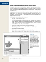
Select the 30% alpha #016D3D color swatch and apply it to the outer outline. Use the arrow tool to
select the red outline and delete it.
For the greatest optimization of vector graphics, be sure to draw only as much detail
is appropriate for the size at which the object is going to be displayed. For instance,
notice that I didn't draw any spots or little scratches on the apple. Most apples have
these characteristics, but this particular one doesn't need them because it will be
viewed at a small size. Including that level of detail would only make my apple file
larger and more processor intensive when animated. In short, don't put detail where
you don't need it!
Remember that this technique can be applied to almost everything you draw. Adding lighting and shadows
give your work a more professional look, and it's a finishing touch that will make your gaming graphics stand
out from the rest.
Adding Depth
Adding the illusion of depth to the graphics in your games is a good way to make objects appear more real
engaging, and to encourage the user to pay attention to certain objects at certain times. In short, depth can
make your gaming world a more captivating environment and a more exciting experience.
To give the illusion of depth to any of your gaming graphics, you mainly manipulate the attributes of color,
focus, or speed. We'll examine each of these areas here, and I'll use the example of the platform game Ice
World (see
Chapter 15, "Ice World: A Platform Game"). In every game, of course, the user controls or
manipulates the main character. In some games, the user also has control over other environment
such as platforms, bad
g
uys, items to collect, and back
g
round elements. By workin
g
with depth, you will be
able to show dramatic changes in characters and environments, where you can attract the user's attention
whatever elements you choose.
Color
Color (and color changes) can make your most important game elements pop out. Typically, the main
character, bad guys, and collectable items are the main focus of a game, and therefore the ones you want to
design to receive the most attention.
Though it's not so apparent here in black and white, the game characters and elements with which the user interacts
most are the most brightly colored.
Choose bright, bold colors and lots of contrast to make your main characters stand out. To have the
pop even more, you can apply a black outline to them. This provides great contrast between the characters
the environment elements.
If the main characters are the ones you want to bring forward, it stands to reason you'd want to downplay
background elements, such as platforms and ledges. I use more muted colors for these elements. It's also a
good idea to remove their outline paths to help them blend into the environment.
You can divide up the background elements among layers to create an illusion of depth. In our example, I've
limited m
y
self to two la
y
ers, because multi
p
le la
y
ers can be ver
y
p
rocessor intensive. To visuall
y
se
p
arate the
two, I used the visual convention of making the elements darker the further they are in the background. If
have already drawn your background in Photoshop, you can darken it easily by simply adjusting the
If you want to make this adjustment in Flash, you can convert your background into a symbol and add a Tint
effect (from the Color drop-down menu in the Properties panel). Tint it with a darkish color that works for
design. Make sure the percentage of the tint is between 10 and 90 so that you can really see the effect—
outside of that range the effects are not very apparent.
Focus and blur
Focus is a very important feature in your world; it's a fairly easy way to help you add great depth to the
environment and to call attention to central elements. You can add or remove focus from your elements by
applying a blur effect. This is best done in a raster program. Although the effect can be achieved to a certain
level in Flash, blurred vector graphics are often too processor intensive to use in your game. For optimum
p
erformance, it's best to blur onl
y
back
g
round elements so that
y
ou can
g
et awa
y
with usin
g
raster blurs, and
keep Flash from having to do any blurring at all.
Speed
Drop Shadows
Where you may run into some difficulty with raster-ima
g
e inte
g
ration is in the area of
performance. JPEGs are the most optimal raster format to import in terms of size, so
we have to deal with their limitations in other areas. Specifically, JPEGs don't support
an alpha channel (so, no transparency), and they come in with a rectangular outline
bounding box, unless you trim them in Flash, as we discussed earlier in this chapter.
you wanted to blur a main character, you'd need the transparency of an alpha
to help blend it in. Unfortunately, transparency and alpha channels are only
in formats that are larger in size and therefore not great options for use in Flash.
However, of those larger formats, PNG is the most manageable and therefore most
useful (as opposed to TIFF, which supports great-looking alpha channels but is not
recommended for import into Flash).
The property of speed comes into play when the user interacts with the game and
off a chain of reactions that cause the elements of the game world to animate. The
illusion of speed is created in the ActionScript, which is written to make the graphics
move, and move at the right speed. To give you a simple example from our platform
game, open the ice_world.swf file in the Chapter15 directory. Notice that as the main
character walks forward, the elements further in the background appear to move
slowly than the elements closer to the user.
The Quest for Realism
Making your game look more realistic can be a challenge when you're working within Flash's
drawing limitations. You can draw realistic-looking graphics in Flash as vector art, but in most
cases that would actually be too processor-intensive for Flash to handle. The most common way
create realistic graphics is by working with a raster program like Photoshop, and then importing
them into Flash as JPEGs. But beware: Even with the compression abilities of JPEGs, if you use
many raster files, your game file size could get out of hand. So, predictably, you have to make
trade-offs. I usuall
y
recommend usin
g
a combination of both formats, wei
g
hted toward one or the
other format type depending on the look you are going for. For example, let's say you're creating
g
ra
p
hics for an isometric world. You could make all
y
our back
g
round and environment
g
ra
p
hics in
raster format, and your characters in vector format. The fact that background and environment
graphics are mostly static and rectangular will probably work in your favor; given that when
graphics are imported into Flash they are rectangular, that's a lot less trimming you may have to
do. As for the characters, because they are mostly small and, once animated, will need quite a
frames, you'll need to fill in less detail and will also benefit from the vector graphic's small file
You can create a basic drop shadow from a couple of gradient shapes. For our example, we will apply the
shadow to a floatin
g
menu, but
y
ou can a
pp
l
y
this basic conce
p
t to
y
our own user interfaces and also to more
complex shapes.
1.
Using the rectangle tool (R) with a bevel of 10 pixels, create a rectangle in the middle of the stage. To
set your bevel, before you draw the rectangle click the Round Rectangle Radius button, located in the
Options section of the Tools panel, and enter a value for the Corner Radius setting in the text dialog
that pops up.
2.
With the arrow tool (V), select the stroke of one edge of the rectangle and scale it by 200% (Ctrl-Alt-S
Windows or Command-Option-S on the Macintosh). While the line is still selected, and with Snap to
Objects selected in the View menu, move the line to connect with the place where the line and the
corner curve meet.
If you use Flash's quick keys, this exercise goes very quickly. Here we're assuming
you have your keyboard shortcuts set to default.
3.
While the line is still selected, copy it (Ctrl-C in Windows or Command-C on the Mac), paste it in place
(Ctrl-Shift-V in Windows or Command-Shift-V on the Mac), and move it outside the rectangle, creating
the start of a border around the rectangle.
4.
Repeat steps 1–3 for the strokes on the other edges.
5.
Create your drop-shadow gradients.
Make a linear gradient from #000000 100% alpha to #000000 0% alpha, and add it to the Color
Swatches panel. Then make a radial gradient from #000000 100% alpha to #000000 0% alpha. Place
the #000000 100% alpha color for both linear and radial gradients in the middle of the gradient
spectrum, and add it to the Color Swatches panel.
6.
Grab the paint bucket tool (K), select the linear gradient you just made, and apply the gradient to the
long top area.
7.
Select the fill transform tool (F), and use the transformation knobs to edit the gradient so that it fades
from 0% alpha at the top to 100% alpha at the bottom.
8.
Repeat steps 6 and 7 for the bottom, left, and right sides.
9.
Grab the paint bucket tool (K) again, select the radial gradient that you made, and apply it to all the
corner sections.
10.
Select the fill transform tool (F), and edit your radial gradients so that the center of the gradient
intersects with the hairline strokes.
11.
Still using the fill transform tool, move the scale and stretch handles until all the gradients meet
seamlessly. (Go ahead and delete the lines; you will be able to see your gradients much more easily.)
You should be able to apply this technique to just about anything. Try modifying the colors and the alpha
percentage to get different looks.
The same drop-shadow technique, applied to a user-interface item.
User-Interface Lighting
Giving your user interface some highlights with gradient fills can be simple and effective, although it may
bit of
p
ractice. This t
yp
e of li
g
htin
g
effect is
g
reat for relativel
y
lar
g
e ob
j
ects, because such ob
j
ects have room
to display the fine gradations of color in a gradient. (On smaller objects viewed at 100%, sometimes the
gradients look a little odd, since they don't have room to display properly.) To show you how to use this
technique, we will walk through adding a gradient highlight to our existing rectangle that has the drop
1.
Open the existing rectangle (if it isn't open already), grab the ink bottle tool (S), and apply a red
stroke to the outside of the rectangle.
2.
With the arrow tool, select the vertical stroke at the left of the rectangle, copy it, paste in place, move
to the right, and scale it to about 200%.
3.
With Snap to Objects on, attach the line to where the top curve meets the horizontal line.
4.
Repeat steps 2–3 to create guidelines for the right, top, and bottom sides of the rectangle.
5.
Create your highlight gradients: Make a linear gradient from #3399FF at 100% alpha to #92C9FF at
100% alpha, and add it to the Color Swatches panel. Then make a radial gradient from #3399FF at
100% alpha to #92C9FF at 100% alpha, and add that to the Color Swatches panel, too.
6.
Grab the paint bucket tool (K) and select the linear gradient you just made. Apply it to the long top
bottom areas and to the left and right vertical areas.
Make sure the Lock Fill button near the bottom of the main tool panel is not selected,
or else when you apply your fills, they will look quite odd.
7.
With the paint bucket tool still active, select the radial gradient you just made, and then apply it to all
the corner areas.
8.
Select the fill transform tool (F), and edit your linear and radial gradients so that they match up
seamlessly.
9.
Use the arrow tool to select the red
g
uidelines
y
ou made earlier, and then delete them. If the
g
radients
don't match up perfectly, try adjusting where the colors start and stop in your gradient spectrum.
10.
Select the center color, and change it to a solid fill of #3399FF so that it blends with the gradients
you've just applied.
That's it! Try this technique on your user-interface items; you'll achieve that raster look with the small file
of vector graphics.
Putting Text in Perspective
Don't waste your time with 3D programs or third-party plug-ins trying to make killer 3D text when you can
do it in Flash! It doesn't take an artist to pull this off; just follow this easy procedure, and you'll soon be able
take a basic font and give it perspective.
1.
Using the text tool, type the word "HELLO" in 40-point Arial Black, in red. Break the font elements all
way down (Ctrl-B in Windows or Command-B on the Mac) until they are just fill shapes.
2.
Figure out where you want the vanishing point to be. For this example, I placed mine in the middle
below the text (see the crosshairs).
3.
Grab the line tool, and with Snap to Objects on, start connecting the points between the vanishing
and the corners of the text characters. As you go along, you can delete any lines that overlap (which
just get in the way of other lines).
4.
Decide how thick (deep) you want the 3D text to be. Use the line tool to draw a horizontal line all the
way across your stage. Apply that same thickness to the top and bottom of each letter.
5.
Use the paint bucket tool to apply color in between the guidelines you created.
Think back to the "
Light and Shadow" section—apply brighter variations of one color to signify where
light is coming from. Our example assumes that the main light source is coming from the top left.
the fills have been applied, delete all the guidelines.
Now you have given your text some perspective, but it still seems kind of flat. Let's take it to the
level and simulate more depth and real light.
6.
Using different variations on your original text colors, create and apply some linear gradients to the
Always keep in mind where your main light source is.
This lesson is just the beginning. Try adding some perspective to your game's user interface, or let it help
to set your perspective for a 3D environment.
Tint Change
Here's a tint-change technique that will enable you to create one graphic and, using code, edit its color as
times as
y
ou want. This is ver
y
hel
p
ful if
y
ou have one
g
ra
p
hic that needs to be dis
p
la
y
ed in man
y
colors. For
example, in a game of 9-ball, you could create just one ball and use tint changes to make nine different-
balls. A tint change is also very efficient in terms of file size, as it only involves one graphic. In the following
example, we are going to prepare (visually, not with code) a simple ball graphic for a tint shift.
1.
Grab the oval tool, and create a circle with no stroke and a fill of black.
2.
Select the circle you just made. With it selected, convert it into a symbol (F8) with the behavior of
Clip. Right-click or Control-click the circle to see the contextual menu, and choose Edit in Place. Select
the circle that is inside this symbol you are now editing, and copy it. Create a new layer above the
existing one and choose Edit > Paste in Place to lay down the circle you just copied. Hide the bottom
layer.
3.
Open the Color Mixer; create a radial gradient from #000000 100% alpha outside (right marker) to
#000000 0% alpha inside (left marker), and apply it to the new circle you just pasted.
4.
Grab the fill transform tool, and move the center of the gradient up and a little bit to the left. Grab the
scale controller handle and move it until it touches the outside of the circle.
5.
Hide the top layer and unhide the bottom layer. Select the black circle on the bottom layer, and
it to a movie-clip symbol. This symbol will be the movie clip to which the ActionScript programmer will
apply the tint change. (The idea is for the programmer to change only the circle with the flat color
applied—the gradient can be applied, as is, to any iteration of that circle to give it the depth and
dimension you want.)
That's it for the graphic aspect of this technique! All that's left is for the programmer
add the necessary code to edit the tint value of the movie clip to change its color. To
see the ActionScript involved, you can open programmed_example.fla in the
directory on the CD.
The variations on this technique are endless, and the file-size benefits are amazing. Try applying this
to a game character that needs to appear many times but in different colors. Or use it to make elements of
your game editable by the user.
Tiling
Tiles come in two shapes, to be used in two different scenarios. As shown below, for isometric games they
drawn in diamond shapes; for non-isometric games they are drawn as squares.
Tiles used in an isometric game (top row), and tiles used in a non-isometric game.
When it comes to creating the perfect tile, the most important factors to keep in mind are how well one tile
flows into the next, and how to manage and control the complexity and file size of all the tiles.
The resolution of a tile typically ranges from 10 by 10 pixels to 30 by 30 pixels, and depends on the size of
game's viewable area. The recommended file size for a single tile can range from 500 bytes to 5,000 bytes!
What size is best for your game? Wouldn't we all like to have an easy formula for that! But you've got to find
out for yourself what works best for your game; each setup (not to mention each game) is going to be
different.
To keep your file size to a minimum, it's highly recommended that you use symbols to create the effect of
textures and other re
p
eatable
p
atterns and elements in
y
our desi
g
ns. For exam
p
le, the sim
p
le circle re
p
eated
the fi
g
ure above is a librar
y
s
y
mbol. I du
p
licated it throu
g
hout the diamond, and a
pp
lied a tint effect to make
the instances different colors. This is going to save me a lot of time and space. Still, the more symbols and
vectors you add to your tile, the more processor intensive it may become, so use as few as possible to
the effects you want.
Sample "transition" tiles you could use to go from grass to concrete.
Now that you have an idea of how big to make your tiles and how they should be constructed, what about
putting them all together? Let's say you've created a pointy grass tile and a spotted concrete tile for your
g
ame. How are
y
ou
g
oin
g
to inte
g
rate those two tiles seamlessl
y
in
y
our
g
amin
g
world? You will need to draw
few other types of tiles in order to make the transition from grass to concrete appear more natural.
Putting it all together.
Game Animations
There are two different ways in which animations are integrated in a game: externally and internally.
The guidelines for tile size, resolution, and integration for vector graphics can also be
applied to raster graphic tiles.
External animations are found on common screens of a game (such as the splash screen, instruction screen,
credit screen). For example, animations within a game introduction, on main menu areas, or in character-
selection areas would be considered external. External animations do not necessarily need to be optimized or
restricted to a certain resolution.
Typically, you will find internal animations in a game engine. For example, any character animations and
animations with which the user interacts within the game engine are internal. Internal animations must be
optimized to achieve the best possible gaming experience.
Here we will analyze an internal animation used in the engine for the unfinished game Grave Robber, shown
Chapter 9. It is a character that the user controls with the arrow keys. This character consists of three
animations: walk up, walk left, and walk down. For example purposes we will see how much we can
the walk-left animation.
With a movie frame rate of 24 frames per second (fps), the optimal rate for games, I started out with an
frame walk animation. There are a few ways you can optimize this series.
Important keyframes— Draw the fewest frames needed to achieve the motion you want to create. For
example, the minimum feasible frames in a walk animation show legs in and legs out (the first and third
keyframes in the Optimized Walking Animation figure above).
Extending a keyframe— By extending a keyframe for more than one frame, you can get away with using
smallest possible number of keyframes. Especially at 24 fps, the frames go by fast enough that the human
will not notice a difference between eight individual keyframes and four keyframes extended to two frames
each.
Symbols— When you create an animation, sometimes you will have to—or want to—reuse certain frames.
When this happens, be sure to convert the graphics you intend to reuse into symbols, to be stored in the
document's library. You'll notice in the Optimized Walking Animation above that frames 2 and 4 are both
same symbol.
With these three techniques I was able to reduce the number of frames in this animation from eight to
with a difference of almost 4 KB. That's only one small file, but if you apply these techniques to all the
animations in your game, you stand to save quite a lot more.
I l
@ve RuBoard
I l
@ve RuBoard
Points to Remembe
r
z
Having great communication between your art team and your programming team is key if you wish to
have smooth implementation of your graphics and animation.
z
Raster and vector graphics allow you to create and use very different styles of graphics, and also offer
you different levels of performance.
z
Identify what tools you'll need up front so that you don't have to stop midway to add another
to your workflow.
z
Graphics and drawing techniques can give your game depth and life.
z
Setting up flexible, code-based techniques for implementing dynamic changes such as color shifts or
tiling will save you a lot of work, keep operations consistent, and improve performance.
z
Taking the time to optimize your graphics will save you a lot of time and effort, and of course will
improve your game's performance. Think about optimization at every stage of your game
from the actual drawing of the figures through the prep stage, when you situate your graphics and
animations within Flash, convert them to symbols and movie clips, and ready them for the