Mastering Microsoft Visual Basic 2010 phần 3 pdf
Bạn đang xem bản rút gọn của tài liệu. Xem và tải ngay bản đầy đủ của tài liệu tại đây (1.08 MB, 105 trang )
178 CHAPTER 5 BASIC WINDOWS CONTROLS
Listing 5.8: KeyUp event examples
Private Sub txtEditor_KeyUp(ByVal sender As Object,
ByVal e As System.Windows.Forms.KeyEventArgs)
Handles txtEditor.KeyUp
Select Case e.KeyCode
Case Keys.F5 :
txtEditor.SelectedText =
Now().ToLongDateString
Case Keys.F6 :
txtEditor.SelectedText =
Now().ToLongTimeString
Case Keys.F7 :
txtEditor.SelectedText =
"MicroWeb Designs, Inc."
Case Keys.F8 :
txtEditor.SelectedText =
"Another user-supplied string"
End Select
End Sub
Windows already uses some of the function keys (for example, the F1 key for help), and you
shouldn’t modify their original functions. With a little additional effort, you can provide users
with a dialog box that lets them assign their own strings to function keys. You’ll probably have
to take into consideration the status of the Shift, Control,andAlt properties of the event’s e
argument. To find out whether two of the modifier keys are pressed along with a key, use the
AND operator with the appropriate properties of the e argument. The following If clause detects
the Ctrl and Alt keys:
If e.Control AND e.Alt Then
{ Both Alt and Control keys were down}
End If
If you need to control the keystrokes from within your code (a rather common scenario in
an advanced, functional user interface design),youshouldbeawareoftheorderoftheevents
fired every time a key is pressed. First, the KeyDown event is fired; this event is fired before the
keystroke is passed to the control. This is the event in which you should ‘‘kill’’ any keystrokes
that you don’t want to be processed normally by the control, or replace them with a different
key. Then the KeyPress event is fired, if the keystroke corresponds to a character, number, or
symbol but not a control key. Finally, the KeyUp event is fired. By that time, the keystroke has
already been processed by the control and it’s too late to kill or replace the original keystroke.
Can you guess what will happen if you insert the following statements in a TextBox control’s
(or Form’s) KeyDown event handler?
If e.KeyCode = Keys.A Then
e.SuppressKeyPress = True
End If
The A key will never be processed, as if the keyboard isn’t working with this application.
THE TEXTBOX CONTROL 179
Autocomplete Properties
One set of interesting properties of the TextBox control are the autocomplete properties. Have
you noticed how Internet Explorer prompts you with possible matches as soon as you start typ-
ing an address or your username in a text box (or in the address bar of the browser)? You can
easily implement such boxes with a single-line TextBox control and the autocomplete proper-
ties. Please note that these properties apply to single-line TextBoxes only.
Let me review the properties that relate to automatic completion. You may wish to open the
AutoCompleteTextBoxes project (available for download from www.sybex.com/go/mastering-
vb2010) to experiment with the settings of these properties while reading the text. The Auto-
CompleteMode property determines whether, and how, the TextBox control will prompt
users, and its setting is a member of the AutoCompleteMode enumeration: Suggest, Append,
SuggestAppend,andNone.InAppend mode, the TextBox control selects the first matching item
in the list of suggestions and completes the text. In SuggestAppend mode, the control suggests
the first matching item in the list, as before, but it also expands the list. In Suggest mode, the
control simply opens a list with the matching items but doesn’t select any of them. Regular
TextBox controls have their AutoCompleteMode property set to None.
The AutoCompleteSource property determines where the list of suggestions comes
from; its value is a member of the AutoCompleteSource enumeration, which is shown in
Table 5.2.
Table 5.2: The members of the AutoCompleteSource enumeration
Member Description
AllSystemSources The suggested items are the names of system resources.
AllUrl The suggested items are the URLs visited by the target computer. Does
not work if you’re deleting the recently viewed pages.
CustomSource The suggested items come from a custom collection.
FileSystem The suggested items are filenames.
HistoryList The suggested items come from the computer’s history list.
RecentlyUsedList The suggested items come from the Recently Used folder.
None The control doesn’t suggest any items.
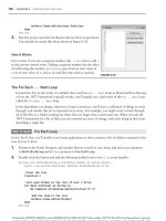
To demonstrate the basics of the autocomplete properties, I’ve included the AutoComplete-
TextBoxes project, which you can download from www.sybex.com/go/masteringvb2010.The
main form of the project is shown in Figure 5.4. This project allows you to set the autocomplete
mode and source for a single-line TextBox control. The top TextBox control uses a custom list
of words, while the lower one uses one of the built-in autocomplete sources (file system, URLs,
and so on).
Once you set the AutoCompleteSource to CustomSource, you must also populate an
AutoCompleteStringCollection object with the desired suggestions and assign it to the
180 CHAPTER 5 BASIC WINDOWS CONTROLS
AutoCompleteCustomSource property. The AutoCompleteStringCollection is just a collection
of strings. Listing 5.9 shows statements in a form’s Load event that prepare such a list and use
it with the TextBox1 control.
Figure 5.4
Suggesting
words with the
AutoCompleteSource
property
Listing 5.9: Populating a custom AutoCompleteSource property
Private Sub Form1_Load(…) Handles MyBase.Load
Dim knownWords As New AutoCompleteStringCollection
knownWords.Add("Visual Basic 2008")
knownWords.Add("Visual Basic .NET")
knownWords.Add("Visual Basic 6")
knownWords.Add("Visual Basic")
knownWords.Add("Framework")
TextBox1.AutoCompleteCustomSource = knownWords
TextBox1.AutoCompleteSource = AutoCompleteSource.CustomSource
TextBox1.AutoCompleteMode = AutoCompleteMode.Suggest
TextBox2.AutoCompleteSource = AutoCompleteSource.RecentlyUsedList
TextBox2.AutoCompleteMode = AutoCompleteMode.Suggest
End Sub
The TextBox1 control on the form will open a drop-down list with all possible matches in
the knownWords collection as soon as the user starts typing in the control, as shown in the top
part of Figure 5.4.
THE TEXTBOX CONTROL 181
Data-Entry Applications
Typical business applications contain numerous forms for data entry, and the most common
element on data-entry forms is the TextBox control. Data-entry operators are very efficient
with the keyboard, and they should be able to use your application without reaching for the
mouse.
Seasoned data-entry operators can’t live without the Enter key; they reach for this key at the
end of each operation. In my experience, a functional interface should add intelligence to this
keystroke: the Enter key should perform the obvious or most likely operation at any time.
When data is being entered, for example, it should take the user to the next control in the Tab
order. Consider a data-entry screen like the one shown in the following image, which contains
several TextBox controls, a DataTimePicker control for entering dates, and two CheckBox
controls. This is the main form of the Simple Data Entry Form sample project, which you will
find at www.sybex.com/go/masteringvb2010 along with the other projects available for use
with this book.
The application demonstrates how to use the Enter key intelligently: Every time the Enter key
is pressed, the focus is moved to the next control in the Tab order. Even if the current control
is a CheckBox, this keystroke doesn’t change the status of the CheckBox controls; it simply
movesthefocusforward.
You could program the KeyUp event of each control to react to the Enter key, but this app-
roach can lead to maintenance problems if you add new controls to an existing form. The best
approach is to intercept the Enter keystroke at the form level, before it reaches a control. To
do so, you must set the KeyPreview property of the form to True. This setting causes the key
events to be fired first at the form level and then at the control that has the focus. In essence,
it allows you to handle certain keystrokes for multiple controls at once. The KeyUp event
handler of the sample project’s main form intercepts the Enter keystroke and reacts to it by
moving the focus to the next control in the Tab order via the ProcessTabKey method. This
method simulates the pressing of the Tab key, and it’s called with a single argument, which is
a Boolean value: True moves the focus forward, and False moves it backward. Here’s the code
in the KeyDown event handler of the application’s form that makes the interface much more
182 CHAPTER 5 BASIC WINDOWS CONTROLS
functional and intuitive (you can open the DataEntry project, examine all of the code, and see
how it functions):
Private Sub frmDataEntry_KeyDown(
ByVal sender As Object,
ByVal e As System.Windows.Forms.KeyEventArgs)
Handles Me.KeyUp
If e.KeyCode = Keys.Enter And Not (e.Alt Or e.Control) Then
If Me.ActiveControl.GetType Is GetType(TextBox) Or
Me.ActiveControl.GetType Is GetType(CheckBox) Or
Me.ActiveControl.GetType Is
GetType(DateTimePicker) Then
If e.Shift Then
Me.ProcessTabKey(False)
Else
Me.ProcessTabKey(True)
End If
End If
End If
End Sub
It’s important to program the KeyDown event if you want to be able to process keystrokes
before the control captures them, or even if you want to cancel keystrokes. If you insert the
same code in the KeyUp event, the keystrokes will be processed by the control first and then
by your code. There are a couple of things you should notice about this handler. First, it
doesn’t react to the Enter key if it was pressed along with the Alt or Ctrl key. The Shift key,
on the other hand, is used to control the direction in the Tab order. The focus moves forward
with the Enter keystroke and moves backward with the Shift + Enter keystroke. Also, the
focus is handled automatically only for th e TextBox, CheckBox, and DataTimePicker controls.
When the user presses the Enter key when a button has the focus, the program reacts as
expected by invoking the button’s Click event handler.
The ListBox, CheckedListBox, and ComboBox Controls
The ListBox, CheckedListBox, and ComboBox controls present lists of choices from which the
user can select one or more of the items. The first two are illustrated in Figure 5.5.
Figure 5.5
The ListBox and
CheckedListBox controls
THE LISTBOX, CHECKEDLISTBOX, AND COMBOBOX CONTROLS 183
The ListBox control occupies a user-specified amount of space on the form and is populated
with a list of items. If the list of items is longer than can fit on the control, a vertical scroll bar
appears automatically.
The CheckedListBox control is a variation of the ListBox control. It’s identical to the List-
Box control, but a check box appears in front of each item. The user can select any number of
items by checking or clearing the boxes. As you know, you can also select multiple items from
a ListBox control by pressing the Shift or Ctrl key.
The ComboBox control also contains multiple items but typically occupies less space on
the screen. The ComboBox control is an expandable ListBox control: The user can expand it to
make a selection and collapse it after the selection is made. The real advantage of the Combo-
Box control, however, is that the user can enter new information in the ComboBox rather than
being forced to select from the items listed.
To add items to any of the three controls at design time, locate the Items property in the
Properties window for the control and click the ellipsis button. When the String Collection
Editor window pops up, you can add the items you want to display in the list. Each item must
appear on a separate text line, and blank text lines will result in blank lines in the list. These
items will appear in the list when the form is loaded, but you can add more items (or remove
existing ones) from within your code at any time. They appear in the same order as entered on
the String Collection Editor window unless the control has its Sorted property set to True, in
which case the items are automatically sorted regardless of the order in which you’ve specified
them.
The next sections explore the ListBox control’s properties and methods. Later in the chapter,
you’ll see how the same properties and methods can be used with the ComboBox control.
Basic Properties
In the following sections, you’ll find the properties that determine the functionality of the List-
Box, CheckedListBox, and ComboBox controls. These properties are usually set at design time,
but you can change the settings from within your application’s code.
IntegralHeight
This property can be set to a True/False value that indicates whether the control’s height will
be adjusted to avoid the partial display of the last item. When IntegralHeight is set to True,
the control’s actual height changes in multiples of the height of a single line, so only an integer
number of rows are displayed at all times.
Items
The Items property is a collection that holds the list items for the control. At design time, you
can populate this list through the String Collection Editor window. At runtime, you can access
and manipulate the items through the methods and properties of the Items collection, which
are described in the section ‘‘Manipulating the Items Collection’’ later in this chapter.
MultiColumn
A ListBox control can display its items in multiple columns if you set its MultiColumn prop-
erty to True. The problem with multicolumn ListBoxes is that you can’t specify the column
in which each item will appear. ListBoxes (and CheckedListBoxes) with many items and the
MultiColumn property set to True expand horizontally, not vertically. A horizontal scroll bar
184 CHAPTER 5 BASIC WINDOWS CONTROLS
will be attached to a multicolumn ListBox so that users can bring any column into view. This
property does not apply to the ComboBox control.
SelectionMode
This property, which applies to the ListBox and CheckedListBox controls only, determines
how the user can select the list’s items. The possiblevaluesofthisproperty—membersofthe
SelectionMode enumeration — are shown in Table 5.3.
Table 5.3: The SelectionMode enumeration
Value Description
None No selection at all is allowed.
One (Default) Only a single item can be selected.
MultiSimple Simple multiple selection: A mouse click (or pressing the spacebar) selects or
deselects an item in the list. You must click all the items you want to select.
MultiExtended Extended multiple selection: Press Shift and click the mouse (or press one of the
arrow keys) to select multiple contiguous items. This process highlights all the items
between the previously selected item and the current selection. Press Ctrl and click
the mouse to select or deselect multiple single items in the list.
Sorted
When this property is True, the items remain sorted at all times. The default is False because
it takes longer to insert new items in their proper location. This property’s value can be set at
design time as well as runtime. The items in a sorted ListBox control are sorted in ascending
and case-sensitive order, also known as phone book order. Because of this, the ListBox con-
trol won’t sort numeric data. The number 10 will appear in front of the number 5 because the
numeric value of the string 10 is smaller than the numeric value of the string 5. If the numbers
are formatted as 010 and 005, they will be sorted correctly.
Text
The Text property returns the selected text on the control. Although you can set the Text prop-
erty for the ComboBox control at design time, this property is available only at runtime for the
other two controls. Notice that the items need not be strings. By default, each item is an object.
For each object, however, the control displays a string, which is the same string returned by the
object’s ToString method.
Manipulating the Items Collection
To manipulate a ListBox control from within your application, you should be able to do the
following:
◆ Add items to the list
◆ Remove items from the list
◆ Access individual items in the list
THE LISTBOX, CHECKEDLISTBOX, AND COMBOBOX CONTROLS 185
The items in the list are represented by the Items collection. You use the members of the
Items collection to access the control’s items and to add or remove items. The Items property
exposes the standard members of a collection, which are described later in this section.
Each member of the Items collection is an object. In most cases, we use ListBox controls to
store strings, but it’s also common to store objects to this control. When you add an object to a
ListBox control, a string is displayed on the corresponding line of the control. This is the string
returned by the object’s ToString method. You can display any other property of the object by
setting the control’s ValueMember property to the name of the property.
If you add a Font object and a Rectangle object to the Items collection with the statements
ListBox1.Items.Add(New Font("Verdana", 12, FontStyle.Bold))
ListBox1.Items.Add(New Rectangle(0, 0, 100, 100))
then the following strings appear on the first two lines of the control:
[Font: Name=Verdana, Size=12, Units=3, GdiCharSet=1, gdiVerticalFont=False]
{X=0, Y=0, Width=100, Height=100}
However, you can access the members of the two objects because the ListBox stores objects,
not their descriptions. The following statement prints the width of the Rectangle object (the out-
put produced by the statement is highlighted):
Debug.WriteLine(ListBox1.Items.Item(1).Width)
100
The expression in the preceding statement is late-bound, which means that the compiler
doesn’t know whether the first object in the Items collection is a Rectangle object and it can’t
verify the member Width. If you attempt to call the Width property of the first item in the
collection, you’ll get an exception at runtime indicating that the code has attempted to access a
missing member. The missing member is the Width property of the Font object.
The proper way to read the objects stored in a ListBox control is to examine the type of the
object first and then attempt to retrieve a property (or call a method) of the object, but only
if it’s of the appropriate type. Here’s how you would read the Width property of a Rectangle
object:
If ListBox1.Items.Item(0).GetType Is
GetType(Rectangle) Then
Debug.WriteLine(CType(ListBox1.Items.Item(0), Rectangle).Width)
End If
The Add Method
To add items to the list, use the Items.Add or Items.Insert method. The Add method accepts
as an argument the object to be added to the list. New items are appended to the end of the
list, unless the Sorted property has been set to True. The following loop adds the elements of
the array words to a ListBox control, one at a time:
Dim words(100) As String
{ statements to populate array }
186 CHAPTER 5 BASIC WINDOWS CONTROLS
Dim i As Integer
Fori=0To99
ListBox1.Items.Add(words(i))
Next
Then, to iterate through all the items on the control, use a loop such as the following:
Dim i As Integer
Fori=0ToListBox1.Items.Count - 1
{ statements to process item ListBox1.Items(i) }
Next
You can also use the For Each…Next statement to iterate through the Items collection, as
shown here:
Dim itm As Object
For Each itm In ListBox1.Items
{ process the current item, represented by the itm variable }
Next
When you populate a ListBox control with a large number of items, call the BeginUpdate
method before starting the loop and call the EndUpdate method when you’re done. These
two methods turn off the visual update of the control while you’re populating it, and they
speed up the process considerably. When the EndUpdate method is called, the control is
redrawn with all the items.
The Insert Method
To insert an item at a specific location, use the Insert method, whose syntax is as follows:
ListBox1.Items.Insert(index, item)
Remember that you must declare the item prior to using it. If you don’t initialize it, you will
get a null ref.
The item parameter is the object to be added, and index is the location of the new item.
(The first item’s index in the list is zero).
The Clear Method
The Clear method removes all the items from the control. Its syntax is quite simple:
ListBox1.Items.Clear
The Count Property
This is the number of items in the list. If you want to access all the items with a For…Next
loop, the loop’s counter must go from 0 to ListBox.Items.Count – 1, as shown in the example
of the Add method.
THE LISTBOX, CHECKEDLISTBOX, AND COMBOBOX CONTROLS 187
The CopyTo Method
The CopyTo method of the Items collection retrieves all the items from a ListBox control and
stores them in the array passed to the method as an argument. The syntax of the CopyTo
method is as follows, where destination is the name of the array that will accept the items,
and index is the index of an element in the array where the first item will be stored:
ListBox1.CopyTo(destination, index)
The array that will hold the items of the control must be declared explicitly and must be large
enough to hold all the items.
The Remove and RemoveAt Methods
To remove an item from the list, you can simply call the Items collection’s Remove method,
passing the object to be removed as an argument. If the control contains strings, pass the string
to be removed. If the same string appears multiple times on the control, only the first instance
will be removed.
You can also remove an item by specifying its position in the list via the RemoveAt method,
which accepts as argument the position of the item to be removed:
ListBox1.Items.RemoveAt(index)
The index parameter is the order of the item to be removed, and the first item’s order is 0.
The Contains Method
The Contains method of the Items collection — not to be confused with the control’s Contains
method — accepts an object as an argument and returns a True/False value that indicates
whether the collection contains this object. Use the Contains method to avoid the insertion of
identical objects into the ListBox control. The following statements add a string to the Items
collection only if the string isn’t already part of the collection:
Dim itm As String = "Remote Computing"
If Not ListBox1.Items.Contains(itm) Then
ListBox1.Items.Add(itm)
End If
Selecting Items
The ListBox control allows the user to select either one or multiple items, depending on the set-
ting of the SelectionMode property. In a single-selection ListBox control, you can retrieve the
selected item by using the SelectedItem property and its index by using the SelectedIndex
property. SelectedItem returns the selected item, which is an object. The text of the selected
item is reported by the Text property.
If the control allows the selection of multiple items, they’re reported with the Selected-
Items property. This property is a collection of objects and exposes the same members as the
Items collection. Because the ComboBox does not allow the selection of multiple items, it pro-
vides only the SelectedIndex and SelectedItem properties.
188 CHAPTER 5 BASIC WINDOWS CONTROLS
To iterate through all the selected items in a multiselection ListBox control, use a loop such
as the following:
For Each itm As Object In ListBox1.SelectedItems
Debug.WriteLine(itm)
Next
The itm variable should be declared as Object because the items in the ListBox control are
objects. If they’re all of the same type, you can convert them to the specific type and then call
their methods. If all the items are of the Rectangle type, you can use a loop like the following
to print the area of each rectangle:
For Each itm As Rectangle In ListBox1.SelectedItems
Debug.WriteLine(itm.Width * itm.Height)
Next
VB 2010 at Work: The ListBox Demo Project
The ListBox Demo application (shown in Figure 5.6) demonstrates the basic operations of the
ListBox control. The two ListBox controls on the form operate slightly differently. The first has
the default configuration: Only one item can be selected at a time, and new items are appended
after the existing item. The second ListBox control has its Sorted property set to True and its
MultiSelect property set according to the values of the two RadioButton controls at the bot-
tom of the form.
Figure 5.6
ListBox Demo demon-
strates most of the
operations you’ll per-
form with ListBoxes.
THE LISTBOX, CHECKEDLISTBOX, AND COMBOBOX CONTROLS 189
The code for the ListBox Demo application contains much of the logic you’ll need in your
ListBox manipulation routines. It shows you how to do the following:
◆ Add and remove items at runtime
◆ Transfer items between lists at runtime
◆ Handle multiple selected items
◆ Maintain sorted lists
The Add Item Buttons
The Add Item buttons use the InputBox() function to prompt the user for input, and then they
add the user-supplied string to the ListBox control. The code is identical for both buttons (see
Listing 5.10).
Listing 5.10: The Add Item buttons
Private Sub bttnSourceAdd_Click(…)
Handles bttnSourceAdd.Click
Dim ListItem As String
ListItem = InputBox("Enter new item’s name")
If ListItem.Trim <> "" Then
sourceList.Items.Add(ListItem)
End If
End Sub
Notice that the subroutine examines the data entered by the user to avoid adding blank
strings to the list. The code for the Clear buttons is also straightforward; it simply calls the
Clear method of the Items collection to remove all entries from the corresponding list.
Removing Items from the Two Lists
The code for the Remove Selected Item button is different from that for the Remove Selected
Items button (both are presented in Listing 5.11). The code for the Remove Selected Item button
removes the selected item, while the Remove Selected Items buttons must scan all the items of
the left list and remove the selected one(s).
Listing 5.11: The Remove buttons
Private Sub bttnDestinationRemove_Click(…)
Handles bttnDestinationRemove.Click
destinationList.Items.Remove( destinationList.SelectedItem)
End Sub
190 CHAPTER 5 BASIC WINDOWS CONTROLS
Private Sub bttnSourceRemove_Click(…)
Handles bttnSourceRemove.Click
Dim i As Integer
Fori=0TosourceList.SelectedIndices.Count - 1
sourceList.Items.RemoveAt( sourceList.SelectedIndices(0))
Next
End Sub
Notice that the code of the second event handler (the one that removes multiple selected
items) always removes the first item in the SelectedIndices collection. If you attempt to remove
the item SelectedIndices(i), you will remove the first selected item during the first itera-
tion. After an item is removed from the selection, the remaining items are no longer at the same
locations. (In effect, you have to refresh the SelectedIndices collection.) The second selected
item will take the place of the first selected item, which was just deleted, and so on. By remov-
ing the first item in the SelectedIndices collection, we make sure that all selected items, and
only those items, will be eventually removed.
Moving Items Between Lists
The two single-arrow buttons (located between the ListBox controls shown in Figure 5.6) trans-
fer selected items from one list to another. The button with the single arrow pointing to the
right transfers the items selected in the left list after it ensures that the list contains at least one
selected item. Its code is presented in Listing 5.12. First, it adds the item to the second list, and
then it removes the item from the original list. Notice that the code removes an item by passing
it as an argument to the Remove method because it doesn’t make any difference which one of
two identical objects will be removed.
Listing 5.12: Moving the selected items
Private Sub bttnSourceMove_Click(…)
Handles bttnSourceMove.Click
While sourceList.SelectedIndices.Count > 0
destinationList.Items.Add(sourceList.Items(
sourceList.SelectedIndices(0)))
sourceList.Items.Remove(sourceList.Items(
sourceList.SelectedIndices(0)))
End While
End Sub
The second single-arrow button transfers items in the opposite direction. The destination
control (the one on the right) doesn’t allow the selection of multiple items, so you can use the
SelectedIndex and SelectedItem properties. The event handler that moves a single item from
the right to the left ListBox is shown next:
sourceList.Items.Add(destinationList.SelectedItem)
destinationList.Items.RemoveAt(destinationList.SelectedIndex)
THE LISTBOX, CHECKEDLISTBOX, AND COMBOBOX CONTROLS 191
Searching the ListBox
Two of the most useful methods of the ListBox control are the FindString and FindString-
Exact methods, which allow you to quickly locate any item in the list. The FindString method
locates a string that partially matches the one you’re searching for; FindStringExact finds an
exact match. If you’re searching for Man and the control contains a name such as Mansfield,
FindString matches the item but FindStringExact does not.
Both the FindString and FindStringExact methods perform case-insensitive searches. If
you’re searching for visual and the list contains the item Visual, both methods will locate it. The
syntax for both methods is the same, where searchStr is the string you’re searching for:
itemIndex = ListBox1.FindString(searchStr)
An alternative form of both methods allows you to specify the index where the search begins:
itemIndex = ListBox1.FindString(searchStr,
startIndex)
The FindString and FindStringExact methods work even if the ListBox control is not
sorted. You need not set the Sorted property to True before you call one of the searching meth-
ods on the control. Sorting the list will help the search operation, but it takes the control less
than 100 milliseconds to find an item in a list of 100,000 items, so the time spent to sort the list
isn’t worth it. Before you load thousands of items in a ListBox control, however, you should
probably consider a more-functional interface.
VB 2010 at Work: The ListBoxFind Application
The application you’ll build in this section (seen in Figure 5.7) populates a list with a large
number of items and then locates any string you specify. Click the button Populate List to pop-
ulate the ListBox control with 10,000 random strings. This process will take a few seconds and
will populate the control with different random strings every time. Then, you can enter a string
in the TextBox control at the bottom of the form. As you type characters (or even delete charac-
ters in the TextBox), the program will locate the closest match in the list and select (highlight)
this item.
Figure 5.7
The ListBoxFind
application
192 CHAPTER 5 BASIC WINDOWS CONTROLS
The sample application reacts to each keystroke in the TextBox control and locates the string
you’re searching for as you enter characters. The Find Item button does the same, but I thought
I should demonstrate the efficiency of the ListBox control and the type of functionality you’d
expect in a rich client application.
The code (shown in Listing 5.13) attempts to locate an exact match via the FindStringExact
method. If it succeeds, it reports the index of the matching element. If not, it attempts to locate
a near match with the FindString method. If it succeeds, it reports the index of the near
match (which is the first item on the control that partially matches the search argument) and
terminates. If it fails to find either an exact or a near match, it reports that the string wasn’t
found in the list.
Listing 5.13: Searching the list
Private Sub TextBox1_TextChanged(…) Handles TextBox1.TextChanged
Dim srchWord As String = TextBox1.Text.Trim
If srchWord.Length = 0 Then Exit Sub
Dim wordIndex As Integer
wordIndex = ListBox1.FindStringExact(srchWord)
If wordIndex >= 0 Then
ListBox1.TopIndex = wordIndex
ListBox1.SelectedIndex = wordIndex
Else
wordIndex = ListBox1.FindString(srchWord)
If wordIndex >= 0 Then
ListBox1.TopIndex = wordIndex
ListBox1.SelectedIndex = wordIndex
Else
Debug.WriteLine("Item " & srchWord &
" is not in the list")
End If
End If
End Sub
If you search for SAC, for example, and the control contains a string such as SAC or sac or
sAc, the program will return the index of the item in the list and will report an exact match. If
no exact match can be found, the program will return something like SACDEF,ifsuchastring
exists on the control, as a near match. If none of the strings on the control starts with the char-
acters SAC, the search will fail.
The application is quite responsive even if you increase the size of the ListBox control to
100,000 items, except that the process of generating the random strings and populating the con-
trol takes considerably longer. In a practical application, however, you should never have to
display that many items to the user. (Consider an overhaul of your application interface before
you present the user with an enormous list.)
The Populate List button creates 10,000 random items with the help of the Random class.
First, it generates a random value in the range 1 through 20, which is the length of the string
(not all strings have the same length). Then the program generates as many random charac-
ters as the length of the string and builds the string by appending each character to it. These
THE LISTBOX, CHECKEDLISTBOX, AND COMBOBOX CONTROLS 193
random numbers are in the range of 65 to 91 and they’re the ANSI values of the uppercase
characters.
By the way, this technique for generating random strings is not a contrived sample of VB
code. I’ve used similar techniques on several occasions to populate large database tables with
data and optimize my queries and data-driven applications for performance.
The ComboBox Control
The ComboBox control is similar to the ListBox control in the sense that it contains multiple
items and the user may select one, but it typically occupies less space onscreen. The ComboBox
is practically an expandable ListBox control, which can grow when the user wants to make a
selection and retract after the selection is made. Normally, the ComboBox control displays one
line with the selected item because this control doesn’t allow multiple-item selection. The essen-
tial difference, however, between ComboBox and ListBox controls is that the ComboBox allows
the user to specify items that don’t exist in the list.
There are three types of ComboBox controls. The value of the control’s DropDownStyle prop-
erty determines which box is used; these values are shown in Table 5.4.
Table 5.4: DropDownStyle options for the ComboBox control
Value Effect
DropDown (Default) The control is made up of a drop-down list, which is visible at all
times, and a text box. The user can select an item from the list or type a new
one in the text box.
DropDownList This style is a drop-down list from which the user can select one of its items but
can’t enter a new one. The control displa ys a single item, and the list is expan-
ded as needed.
Simple The control includes a text box and a list that doesn’t drop down. The user can
select from the list or type in the text box.
The ComboBox Styles project, shown in Figure 5.8, demonstrates the three styles of the
ComboBox control. This is another common element of the Windows interface, and its pro-
perties and methods are identical to those of the ListBox control. Load the ComboBox Styles
project in the Visual Basic IDE and experiment with the three styles of the ComboBox control.
The DropDown and Simple ComboBox styles allow the user to select an item from the list or
enter a new one in the edit box of the control. Moreover, they’re collapsed by default and they
display a single item unless the user expands the list of items to make a selection. The Drop-
DownList style is similar to a ListBox control in the sense that it restricts the user to selecting
an item (the user cannot enter a new one). However, it takes much less space on the form than
a ListBox does because normally it displays a single item. When the user wants to make a selec-
tion, the DropDownList expands to display more items. After the user has made a selection,
the list contracts to a single line again. Finally, the DropDownList style of the control doesn’t
194 CHAPTER 5 BASIC WINDOWS CONTROLS
allow the user to enter a new string in the edit area; users are restricted to selecting one of the
existing items.
Figure 5.8
The ComboBox Styles
project
Most of the properties and methods of the ListBox control also apply to the ComboBox con-
trol, shown in Figure 5.9. The Items collection gives you access to the control’s items, and the
SelectedIndex and SelectedItem properties give you access to the current selection. You can
also use the FindString and FindStringExact methods to locate any item in the control from
within your code. Both methods return the index of the item you’re searching for on the con-
trol, or the value –1 if no such item exists.
Figure 5.9
You can use the
DropDownWidth prop-
erty to save space.
THE LISTBOX, CHECKEDLISTBOX, AND COMBOBOX CONTROLS 195
There’s one aspect worth mentioning regarding the operation of the control. Although the
edit box at the top allows you to enter a new string, the new string doesn’t become a new item
in the list. It remains there until you select another item or you clear the edit box. You can pro-
vide some code to add any string entered by the user in the control’s edit box to the list of
existing items.
The most common use of the ComboBox control is as a lookup table. The ComboBox control
takes up very little space on the form, but it can be expanded at will. You can save even more
space when the ComboBox is contracted by setting it to a width that’s too small for the longest
item. Use the DropDownWidth property, which is the width of the segment of the drop-down
list. By default, this property is equal to the control’s Width property. The second ComboBox
control in Figure 5.9 contains an unusually long item. The control is wide enough to display the
default selection. When the user clicks the arrow to expand the control, the drop-down section
of the control is wider than the default width so that the long items can be read.
Adding Items to a ComboBox at Runtime
Although the ComboBox control allows users to enter text in the control’s edit box, it doesn’t
provide a simple mechanism for adding new items at runtime. Let’s say you provide a Combo-
Box with city names. Users can type the first few characters and quickly locate the desired item.
But what if they want to specify a new city name? You can provide this capability with two
simple techniques. The simpler one is to place a button with an ellipsis (three periods) right
next to the control. When users want to add a new item to the control, they can click the button
and be prompted for the new item.
A more-elegant and user-friendly approach is to examine the control’s Text property as soon
as the control loses focus or the user presses the Enter key. If the string entered by the user
doesn’t match an item on the control, you must add a new item to the control’s Items collec-
tion and select the new item from within your code. The FlexComboBox project demonstrates
how to use both techniques in your code. The main form of the project, which is shown in
Figure 5.10, is a simple data-entry screen. It’s not the best data-entry form, but it’s meant for
demonstration purposes.
Figure 5.10
The FlexComboBox
project demonstrates
two techniques for
adding new items to
a ComboBox at runtime.
You can either enter a city name (or country name) and press the Tab key to move to
another control or click the button next to the control to be prompted for a new city/country
196 CHAPTER 5 BASIC WINDOWS CONTROLS
name. The application will let you enter any city/country combination. You should provide
code to limit the cities within the selected country, but this is a nontrivial task. You also need
to store the new city names entered on the first ComboBox control to a file (or a database
table) so users will find them there the next time they run the application. I haven’t made the
application elaborate; I’ve added the code only to demonstrate how to add new items to a
ComboBox control at runtime.
VB 2010 At Work: The FlexCombo Project
The ellipsis button next to the City ComboBox control prompts the user for the new item
via the InputBox() function. Then it searches the Items collection of the control via the
FindString method, and if the new item isn’t found, it’s added to the control. Then the code
selects the new item in the list. Todoso,itsetsthecontrol’sSelectedIndex property to the
value returned by the Items.Add method or the value returned by the FindString method,
depending on whether the item was located or added to the list. Listing 5.14 shows the code
behind the ellipsis button.
Listing 5.14: Adding a new item to the ComboBox control at runtime
Private Sub Button1_Click(…) Button1.Click
Dim itm As String
itm = InputBox("Enter new item", "New Item")
If itm.Trim <> "" Then AddElement(ComboBox1, itm)
End Sub
The AddElement() subroutine, which accepts the control you are adding to and a string as
arguments and adds the string to the control, is shown in Listing 5.15. If the item doesn’t exist
in the control, it’s added to the Items collection. If the item is already a member of the Items
collection, it’s selected. As you will see, the same subroutine will be used by the second method
for adding items to the control at runtime.
Listing 5.15: The AddElement() subroutine
Sub AddElement(ByRef control As ComboBox, ByVal newItem As String)
Dim idx As Integer
If ComboBox1.FindString(newItem) > 0 Then
idx = control.FindString(newItem)
Else
idx = control.Items.Add(newItem)
End If
control.SelectedIndex = idx
End Sub
THE SCROLLBAR AND TRACKBAR CONTROLS 197
You can also add new items at runtime by adding the same code in the control’s LostFocus
event handler:
Private Sub ComboBox1_LostFocus(…) Handles ComboBox1.LostFocus
Dim newItem As String = ComboBox1.Text
AddElement(ComboBox1, newItem)
For an even more functional interface, capture the Enter keystroke in the control’s KeyUp
event, add the new item to the list (if needed), and then move the focus to the next control on
the form, as discussed earlier in this chapter.
The ScrollBar and TrackBar Controls
The ScrollBar and TrackBar controls let the user specify a magnitude by moving a selector
between its minimum and maximum values. In some situations, the user doesn’t know in
advance the exact value of the quantity to specify (and in this case, a text box would suffice),
so your application must provide a more-flexible mechanism for specifying a value along with
some type of visual feedback.
The vertical scroll bar that lets a user move up and down a long document is a typical
example of the use of the ScrollBar control. The scroll bar and visual feedback are the prime
mechanisms for repositioning the view in a long document or in a large picture that won’t fit
entirely in a window.
The TrackBar control is similar to the ScrollBar control, but it doesn’t cover a continuous
range of values. The TrackBar control has a fixed number of tick marks and users can place the
slider’s indicator to the desired value.
In short, the ScrollBar control should be used when the exact value isn’t as important as the
value’s effect on another object or data element. The TrackBar control should be used when the
user can type a numeric value and the value your application expects is a number in a specific
range — for example, integers between 0 and 100 or a value between 0 and 5 inches in steps
of 0.1 inches (0.0, 0.1, 0.2 5.0). The TrackBar control is preferred to the TextBox control in
similar situations because there’s no need for data validation on your part. The user can specify
only valid numeric values with the mouse.
The ScrollBar Control
There’s no ScrollBar control per se in the Toolbox; instead, there are two versions of it: the
HScrollBar and VScrollBar controls. They differ only in their orientation, but because they share
the same members, I will refer to both controls collectively as ScrollBar controls. Actually, both
controls inherit from the ScrollBar control, which is an abstract control: It is used to imple-
ment vertical and horizontal scroll bars, but it can’t be used directly on a form. Moreover, the
HScrollBar and VScrollBar controls are not displayed in the Common Controls tab of the Tool-
box. You have to open the All Windows Forms tab to locate these two controls.
The ScrollBar control is a long stripe, which allows users to select a value between the two
ends of the control. The left (or bottom) end of the control corresponds to its minimum value;
the other end is the control’s maximum value. The current value of the control is determined
by the position of the indicator, which can be scrolled between the minimum and maximum
values. The basic properties of the ScrollBar control, therefore, are properly named Minimum,
Maximum,andValue.
198 CHAPTER 5 BASIC WINDOWS CONTROLS
Minimum The control’s minimum value. The default value is 0, but because this is an Integer
value, you can set it to negative values as well.
Maximum The control’s maximum value. The default value is 100, but you can set it to any
value that you can represent with the Integer data type.
Value The control’s current value, specified by the indicator’s position.
To cover a range of non-integers, you must supply the code to map the actual values to Inte-
ger values. For example, to cover a range from 2.5 to 8.5, set the Minimum property to 25, set
the Maximum property to 85, and divide the control’s value by 10. If the range you need is from
–2.5 to 8.5, set the Minimum property to –25 and the Maximum value to 85, and divide the Value
property by 10.
There are two more properties that allow you to control the movement of the indicator:
the SmallChange and LargeChange properties. The first property is the amount by which the
indicator changes when the user clicks one of the arrows at the two ends of the control. The
LargeChange property is the displacement of the indicator when the user clicks somewhere in
the scroll bar itself. You can manipulate a scroll bar by using the keyboard as well. Press the
arrow keys to move the indicator in the corresponding direction by SmallChange and the Page
Up/Page Down keys to move the indicator by LargeChange.
VB 2010 at Work: The Colors Project
Figure 5.11 shows the main form of the Colors sample project, which lets the user specify a
color by manipulating the value of its basic colors (red, green, and blue) through scroll bars.
Each basic color is controlled by a scroll bar and has a minimum value of 0 and a maximum
value of 255. By adjusting the value of each of the basic colors, you can create (almost) any
color imaginable. This is what the Colors application does.
Figure 5.11
The Colors application
demonstrates the use of
the ScrollBar control.
As the scroll bar is moved, the corresponding color is displayed, and the user can easily
specify a color without knowing the exact values of its primary components. All the user needs
to know is whether the desired color contains, for example, too much red or too little green.
With the help of the scroll bars and the immediate feedback from the application, the user can
easily pinpoint the desired color.
THE SCROLLBAR AND TRACKBAR CONTROLS 199
The ScrollBar Control’s Events
You can monitor the changes of the ScrollBar’s value from within your code by using two
events: ValueChanged and Scroll. Both events are fired every time the indicator’s position
is changed. If you change the control’s value from within your code, only the ValueChanged
event will be fired.
The Scroll event can be fired in response to many different actions, such as the scrolling of
the indicator with the mouse, a click on one of the two buttons at the ends of the scroll bars,
and so on. If you want to know the action that caused this event, you can examine the Type
property of the second argument of the event handler. The value of the e.Type property is a
member of the ScrollEventType enumeration (LargeDecrement, SmallIncrement, Track,and
so on).
Handling the Events in the Colors Application
The two PictureBox controls display the color designed with the three scroll bars. The left
PictureBox is colored from within the Scroll event, whereas the other one is colored from
within the ValueChanged event. Both events are fired as the user scrolls the scroll bar’s indi-
cator, but in the Scroll event handler of the three scroll bars, the code examines the value of
the e.Type property and reacts to it only if the event was fired because the scrolling of the
indicator has ended. For all other actions, the event handler doesn’t update the color of the left
PictureBox.
If the user attempts to change the Color value by clicking the two arrows of the scroll bars
or by clicking in the area to the left or to the right of the indicator, both PictureBox controls are
updated. While the user slides the indicator or keeps pressing one of the end arrows, only the
PictureBox to the right is updated.
The conclusion from this experiment is that you can program either event to provide contin-
uous feedback to the user. If this feedback requires too many calculations, which would slow
down the reaction of the corresponding event handler, you can postpone the reaction until the
user has stopped scrolling the indicator. You can detect this condition by examining the value
of the e.Type property. When it’s ScrollEventType.EndScroll, you can execute the appropri-
ate statements. Listing 5.16 shows the code behind the Scroll and ValueChanged events of the
scroll bar that controls the red component of the color. The code of the corresponding events of
the other two controls is identical.
Listing 5.16: Programming the ScrollBar control’s scroll event
Private Sub redBar_Scroll(…) Handles redBar.Scroll
If e.Type = ScrollEventType.EndScroll Then
ColorBox1()
lblRed.Text = "RED " & redBar.Value.ToString("###")
End If
End Sub
Private Sub redBar_ValueChanged(…) Handles redBar.ValueChanged
ColorBox2()
End Sub
200 CHAPTER 5 BASIC WINDOWS CONTROLS
The ColorBox1() and ColorBox2() subroutines update the color of the two PictureBox con-
trols by setting their background colors. You can open the Colors project in Visual Studio and
examine the code of these two routines.
The TrackBar Control
The TrackBar control is similar to the ScrollBar control, but it lacks the granularity of ScrollBar.
Suppose that you want the user of an application to supply a value in a specific range, such as
the speed of a moving object. Moreover, you don’t want to allow extreme precision; you need
only a few distinct settings. The user can set the control’s value by sliding the indicator or by
clicking on either side of an indicator like the one shown in Figure 5.12.
Figure 5.12
The Inches application
demonstrates the use
of the TrackBar control
in specifying an exact
value in a specific range.
Granularity determines how specific you want to be in measuring. In measuring distances
between towns, a granularity of a mile is quite adequate. In measuring (or specifying) the
dimensions of a building, the granularity could be on the order of a foot or an inch. The
TrackBar control lets you set the type of granularity that’s necessary for your application.
Similar to the ScrollBar control, SmallChange and LargeChange properties are available.
SmallChange is the smallest increment by which the Slider value can change. The user can
change the slider by the SmallChange value only by sliding the indicator. (Unlike with the
ScrollBar control, there are no arrows at the two ends of the Slider control.) To change the
Slider’s value by LargeChange, the user can click on either side of the indicator.
VB 2010 at Work: The Inches Project
Figure 5.12 demonstrates a typical use of the TrackBar control. The form in the figure is an
element of a program’s user interface that lets the user specify a distance between 0 and 10
inches in increments of 0.2 inches. As the user slides the indicator, the current value is dis-
played on a Label control below the TrackBar. If you open the Inches application, you’ll notice
that there are more stops than there are tick marks on the control. This is made possible with
the TickFrequency property, which determines the frequency of the visible tick marks.
You might specify that the control has 50 stops (divisions) but that only 10 of them will be
visible. The user can, however, position the indicator on any of the 40 invisible tick marks. You
can think of the visible marks as the major tick marks and the invisible ones as the minor tick
marks. If the TickFrequency property is 5, only every fifth mark will be visible. The slider’s
indicator, however, will stop at all tick marks.
When using the TrackBar control on your interfaces, you should set the TickFrequency
property to a value that helps the user select the desired setting. Too many tick marks are con-
fusing and difficult to read. Without tick marks, the control isn’t of much help. You might also
THE BOTTOM LINE 201
consider placing a few labels to indicate the value of selected tick marks, as I have done in
this example.
The properties of the TrackBar control in the Inches application are as follows:
Minimum = 0
Maximum = 50
SmallChange = 1
LargeChange = 5
TickFrequency = 5
The TrackBar needs to cover a range of 10 inches in increments of 0.2 inches. If you set the
SmallChange property to 1, you have to set LargeChange to 5. Moreover, the TickFrequency
is set to 5, so there will be a total of five divisions in every inch. The numbers below the tick
marks were placed there with properly aligned Label controls.
The label at the bottom needs to be updated as the TrackBar’s value changes. This is sig-
naled to the application with the Change event, which occurs every time the value of the control
changes, either through scrolling or from within your code. The ValueChanged event handler of
the TrackBar control is shown next:
Private Sub TrackBar1_ValueChanged(…) Handles TrackBar1.ValueChanged
lblInches.Text = "Length in inches = " &
Format(TrackBar1.Value / 5, "#.00")
End Sub
The Label controls below the tick marks can also be used to set the value of the control.
Every time you click one of the labels, the following statement sets the TrackBar control’s value.
Notice that all the Label controls’ Click events are handled by a common handler. (There are
more event handlers following the Handles keyword in the listing.)
Private Sub Label_Click(…) Handles Label1.Click, Label2.Click, …
TrackBar1.Value = CInt(CType(sender, Label).text) * 5
End Sub
The code is a bit complicated, but it will compile with the Strict option on. The CType()
function converts its argument, which is an Object variable and may represent any of the
Labels on the form, to a Label object. Then it converts the Label’s caption to an integer value
(the string "1" to the numeric value 1, and so on) by calling the CInt() function. CInt() is
a VB function; the equivalent method of the Framework is System.Convert.ToInt32.The
captions of all Labels are numbers by design, so the conversion will never fail. This value is
then assigned to the Value property of the TrackBar control.
The Bottom Line
Use the TextBox control as a data-entry and text-editing tool. The TextBox control is the
most common element of the Windows interface, short of the Button control, and it’s used to
display and edit text. You can use a TextBox control to prompt users for a single line of text
(such as a product name) or a small document (a product’s detailed description). You can
202 CHAPTER 5 BASIC WINDOWS CONTROLS
actually implement a functional text editor by placing a TextBox control on a form and setting
a few of its properties.
Master It What are the most important properties of the TextBox control? Which ones
would you set in the Properties windows at design time?
Master It How would you implement a control that suggests lists of words matching the
characters entered by the user?
Use the ListBox, CheckedListBox, and ComboBox controls t o present lists of items. The
ListBox control contains a list of items from which the user can select one or more, depending
on the setting of the SelectionMode property.
Master It How would you locate an item in a ListBox control?
Use the ScrollBar and TrackBar controls to enable users to specify sizes and positions with
the mouse. The ScrollBar and TrackBar controls let the user specify a magnitude by scrolling
a selector between its minimum and maximum values. The ScrollBar control uses some visual
feedback to display the effects of scrolling on another entity, such as the current view in a long
document.
Master It Which event of the ScrollBar control would you code to provide visual feedback
to the user?


