User Interface Design for Programmers 2011 phần 3 ppsx
Bạn đang xem bản rút gọn của tài liệu. Xem và tải ngay bản đầy đủ của tài liệu tại đây (486.99 KB, 10 trang )
look without affecting the way anything functions, and since users are completely free to
ignore the choice and get their work done anyway, this is a good use of options.
20
Chapter 4: Affordances and Metaphors
Overview
Developing a user interface where the program model matches the user model is not easy.
Sometimes, your users might not have a concrete expectation of how the program works
and what it's supposed to do. There is no user model.
When the user model is incomplete or wrong, the program can use
affordances or metaphors to show the user its model.
In these cases, you are going to have to find ways to give the user clues about how
something works. With graphical interfaces, a common way to solve this problem is with
metaphors. But not all metaphors are created equal, and it's important to understand why
metaphors work so you know if you've got a good one.
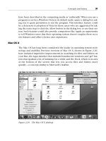
The most famous metaphor is the "desktop metaphor" used in Windows and the Macintosh
(see
Figure 4-1). The computer screen behaves something like a real world desk. You have
these little folders with little files in them, which you can drag around into trash cans, and
cute little pictures of real world objects like printers. To the extent that this metaphor works,
it's because the little pictures of folders actually remind people of folders, which makes them
realize that they can put documents into them.
Figure 4-1: The classic desktop metaphor
Take a look at
Figure 4-2, a screenshot from Kai's Photo Soap. Can you guess how to zoom
in?
21
Figure 4-2: Can you guess how to zoom in with Kai's Photo Soap?
It's not very hard. The magnifying glass is a real world metaphor. People know what
magnifying glasses do. And there's no fear that the zoom operation is actually changing the
size of the underlying image, since that's not what magnifying glasses do.
A metaphor, even an imperfect one, works a lot better than none at all. Can you figure out
how to zoom in with Microsoft Word, as shown in
Figure 4-3?
Figure 4-3: OK, now how do you zoom in with Microsoft Word?
Word has two tiny magnifying glasses in their interface. One of them is on the
Preview
button, which actually zooms out, and the other is on the Document Map button,
whatever that is. The actual way to change the zoom level here is with the dropdown box
that is currently showing "100%." There's no attempt at a metaphor, so it's harder for users
to guess how to zoom. This is not necessarily a bad thing; zooming is probably not important
enough in a word processing application to justify as much screen space as Kai gives it. But
it's a safe bet that more Kai users will be able to zoom in than Word users.
Affordances
22
Well-designed objects make it clear how they work just by looking at them. Some doors have
big metal plates at arm-level. The only thing you can do to a metal plate is push it. You can't
pull it. You can't rotate it. In the words of usability expert Donald Norman, the plate affords
pushing. Other doors have big, rounded handles that just make you want to pull them. They
even imply how they want you to place your hand on the handle. The handle affords pulling.
It makes you want to pull it.
Other objects aren't designed so well and you can't tell what you're supposed to do. The
quintessential example is the CD jewel case, which requires you to place your thumbs just
so and pull in a certain direction. Nothing about the design of the box would indicate how
you're supposed to open it. If you don't know the trick, it's very frustrating, because the box
just won't open.
The best way to create an affordance is to echo the shape of the human hand in "negative
space." Look closely at the (excellent) Kodak DC-290 digital camera, shown in
Figures 4-4
and
4-5.
Figure 4-4: The Kodak DC290 Digital Camera, front view. Notice the rubber grip at left
and the rubber nubbin in the lower right.
23
Figure 4-5: Back view. See the thumbprint in the lower left?
On the front, you can see a big rubber grip that looks like your right fingers should fit there.
Even smarter, on the back in the lower left corner you can see an indent that looks uncannily
like a thumbprint. When you put your left thumb there, your left index finger curls snugly on
the front of the camera, between the lens and another rubber nubbin. It provides a kind of
comforting feeling you haven't felt since you sucked your thumb (and curled your index
finger around your nose).
The Kodak engineers are just trying to persuade you to hold the camera with both hands, in
a position that ensures the camera will be more stable and even keeps stray fingers from
blocking the lens by mistake. All this rubber is not functional; its sole purpose is to
encourage you to hold the camera correctly.
Good computer UI uses affordances, too. About ten years ago, most push buttons went
"3D." Using shades of grey, they appear to pop out of the screen. This is not just to look
cool: it's important because 3D buttons afford pushing. They look like they stick out and they
look like the way to operate them is by clicking on them. Unfortunately, many Web sites
these days (unaware of the value of affordances) would rather have buttons that look cool
rather than buttons which look pushable; as a result, you sometimes have to hunt around to
figure out where to click. Look at the very top of the E*TRADE home page shown in
Figure
4-6
.
24
Figure 4-6: The E*TRADE home page.Which parts of the black banner are clickable?
On the black banner at the top, The
GO and LOG ON buttons pop out and look like you can
click on them. The
SITE MAP and HELP buttons don't look so clickable; in fact, they look
exactly like the
QUOTES label, which isn't clickable.
About four years ago, many windows started sprouting three little ridges that look like a grip
on the lower right corner (see
Figure 4-7).
Figure 4-7: The grip in the lower right corner affords dragging.
It looks like the kind of thing somebody would put on a slide switch to increase the friction. It
affords dragging. It just begs to be dragged to stretch the window.
Tabbed Dialogs
A problem that seems to vex programmers (especially the ones who neglected to buy this
book and read
Chapter 3) is dialog boxes with just too many settings to fit on the screen.
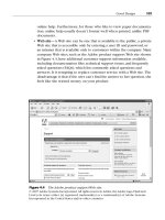
The only way to deal with this is to create a dialog that changes dynamically. For example,
look closely at the Preferences dialog from Netscape Navigator shown in
Figure 4-8.
25
Figure 4-8: Netscape's way of dealing with too many options.
Now, you and I are elite programming hackers with a lot of experience with these kinds of
dialogs. So when we look at
Figure 4-8, we immediately understand that choosing one of the
categories from the left hand part of the screen is going to magically change which options
are available on the right hand part of the screen.
For some reason, this type of indirection was incredibly logical to the programmers who
designed it, but many users didn't understand it. The problem? Well, most people are not
elite programming hackers.
Most people would never guess that choosing something from the list on the left is supposed
to change the contents of the dialog on the right: there's no visual reason to think that. In
fact, what most people think is that the list on the left is nothing more than another setting,
and they are afraid to touch it because it seems like a pretty scary setting that they don't
understand.
When you do usability tests with dialogs like that, and you ask people to change one of the
settings not actually shown on the main page (in this case, "Navigator"), you'll find that a
remarkable number of people just can't figure out how to do it. When Microsoft did a usability
test with a similar dialog from an old version of Microsoft Word, only 30% of the users
succeeded at the task. A full 70% simply gave up without accomplishing the task they were
given.
So, the Microsoft Word team switched to the famous tabbed dialogs like the one shown in
Figure 4-9.
26
Figure 4-9: Internet Explorer uses tabs.
When they tried the tabbed dialogs in the usability lab, usability shot up from 30% to 100%.
Let me tell you from experience that there are just not a whole lot of things that you can do
that will improve your usability from 30% all the way to 100%.
Tabbed dialogs are a great affordance. It's really obvious from
Figure 4-9 that you have six
tabs; it's really obvious which tab you're on, and it's really obvious how to switch to a
different tab. Given the remarkable success of this metaphor and the fact that the code for
tabbed dialogs is built into modern operating systems and available practically for free, it's a
wonder you still see applications that don't take advantage of them. These applications
suffer from actual, measurable, real world usability problems because they refuse to get with
the program.
27
Figure 4-10: The Napster 2.0 user interface has five separate screens (Chat, Library,
Search, Hot List, and Transfer), and you use the buttons at the top to switch among
them. This is an obvious candidate for tabs. Here's the weird thing: the Napster code is
actually using the Windows tabbed dialog control, but for some reason, it's running in a
funny mode that displays as buttons rather than tabs. So Shawn Fanning, the Napster
programmer, could have literally flipped one bit to get a more usable interface.
28
Chapter 5: Broken Metaphors
Overview
Remember the briefcase from Windows 95? (See Figure 5-1.) That cute little icon that
occupied a square inch or so on everybody's desktop for a few years until Microsoft realized
that nobody wanted one? Nobody wanted one because it was a broken metaphor. It was
supposed to be a "briefcase" where you put files to take home. But when you took the files
home, you still had to put them on a floppy disk. So, do you put them in the briefcase or on a
floppy disk? I'm not sure. I never could get it to work.
Figure 5-1: Windows' unloved briefcase
A metaphor badly chosen is worse than no metaphor at all. Unfortunately, desktop user
interface designers feel that they're breaking some kind of law if they don't use metaphors,
so they would rather pick a wrong metaphor than go without.
When you use metaphors, try to make them behave in predictable ways like
objects in the real world.Violating reality is just confusing.
What's the purpose of a metaphor in the first place? To teach users what the program model
is so that the program model and the user model come into agreement. If you use the wrong
metaphor, you are actually teaching the user the wrong thing about how the program works,
so you're creating more trouble than you're solving. There's some historical evidence that the
Windows 95 briefcase metaphor just didn't work: later versions of Windows have tried to
compensate for the bad metaphor by forcing you to read a screen full of instructions
whenever you drag files into that dang doohickey.
Guess what? Nobody reads instructions. My new Cuisinart food processor must have three
hundred stickers on it that say "Do Not Even Think of Operating This Device without
Reading the Instructions, and That Means You!" Which, we know as anthropologists,
actually means that millions of people use Cuisinarts without reading the instructions. I'll go
into that more soon. For now, I'd like to talk about broken metaphors like the briefcase and
what a doggone nuisance they can be.
Obeying Physics
29


