User Interface Design for Programmers 2011 phần 6 potx
Bạn đang xem bản rút gọn của tài liệu. Xem và tải ngay bản đầy đủ của tài liệu tại đây (281.9 KB, 10 trang )
Chapter 9: People Can't Read
When you design user interfaces, it's a good idea to keep two principles in mind:
1. Users don't have the manual, and if they did, they wouldn't read it.
2. In fact, users can't read anything, and if they could, they wouldn't want to.
These are not, strictly speaking, facts, but you should act as if they are facts, for it will make
your program easier and friendlier.
Users don't read the manual.
First of all, they may not actually have the manual. There may not be a manual. If there is
one, the user might not have it for all kinds of logical reasons: they're on a plane; they're
using a downloaded demo version from your Web site; they're at the beach and the manual
is at work; their IS department never gave them the manual. Even if they have the manual,
frankly, they are not going to read it unless they absolutely have no other choice (and maybe
not even then). With very few exceptions, users will not cuddle up with your manual and read
it through before they begin to use your software. In general, your users are trying to get
something done, and they see reading the manual as a waste of time, or at the very least, a
distraction that keeps them from getting their task done.
The very fact that you're reading this book puts you in an elite group of highly literate people.
Yes, I know, people who use computers are by and large able to read, but I guarantee you
that a good percentage of them will find reading a chore. The language in which the manual
is written may not be their first language, and they may not be totally fluent. They may be
kids! They can decipher the manual if they really must, but they sure ain't gonna read it if
they don't have to. Users do just-in-time reading on a strictly need-to-know basis.
The upshot of all this is that you probably have no choice but to design your software so it
doesn't need a manual in the first place. The only exception I can think of is if your users do
not have any domain knowledge—they don't really understand what the program is intended
to do, but they know that they better learn. A great example of this is Intuit's immensely
popular small-business accounting program, QuickBooks. Many people who use this
program are small-business owners who simply have no idea what's involved in accounting.
The manual for QuickBooks assumes this and assumes that it will have to teach people
basic accounting principles. There's no other way to do it. If a small business owner wants to
learn accounting, they actually might just curl up with the QuickBooks manual in a
comfortable chair and read it cover to cover. Still, for people who do understand accounting,
QuickBooks is reasonably easy to use without the manual.
In fact, users don't read anything.
This may sound a little harsh, but you'll see when you do usability tests that there are quite a
few users who simply do not read words that you put on the screen. If you pop up an error
box of any sort, they simply will not read it. This may be disconcerting to you as a
programmer because you imagine yourself conducting a dialog with the user. "Hey, user!"
you say. "You can't open that file, we don't support that file format!" Still, experience shows
that the more words you put on a dialog box, the fewer people will actually read it.
The fact that users do not read the manual leads many software designers to assume that
they are going to have to educate users by verbosely describing things as they go along.
You see this all over the place in programs. In principle it's OK, but in reality, people's
aversion to reading means that this will almost always get you in trouble. Experienced UI
designers literally try to minimize the number of words in dialogs to increase the chances
that they will get read. When I worked on Juno, the UI people understood this principle and
tried to write short, clear, simple text. Sadly, the CEO had been an English major at an Ivy
50
League college; he had no training in UI design or software engineering, but he sure thought
he was a good editor of prose. So, he vetoed the wording done by the professional UI
designers and added a lot of his own verbiage. A typical dialog in Juno looks like the one
shown in
Figure 9-1. Compare that to the equivalent dialog in Microsoft Windows shown in
Figure 9-2.
Figure 9-1: The modem dialog from Juno 4.0. Nobody reads these things.
51
Figure 9-2: The equivalent dialog from Microsoft Windows. Although it contains far
fewer words, it's much more usable.
Intuitively, you might guess that the Juno version, with eighty words of instructions, would be
"superior" (in other words, easier to use) than the Windows version with its five words of
instructions. In reality, when you run a usability test on this kind of thing, you'll find that:
1. Advanced users skip over the instructions. They assume they know how to use things
and don't have time to read complicated instructions.
2. Most novice users skip over the instructions. They don't like reading too much and
hope that the defaults will be OK.
3. The few novice users who do earnestly try to read the instructions (some of whom are
only reading them because it's a usability test and they feel obliged) are often
confused by the sheer number of words and concepts. So, even if they were pretty
confident that they would be able to use the dialog when it first came up, the
instructions actually confused them even more.
Lesson number one is that if you're an English major from a fancy university, then you are in
a whole different league of literacy than the average Joe and you should be very careful
about wording dialogs that seem like they might be helpful to you. Shorten it, dumb it down,
simplify, get rid of the complicated clauses in parentheses, and do usability tests. But do not
write things that look like Ivy League faculty memos. Even adding the word "please" to a
dialog, which may seem helpful and polite, will slow people down: the increased bulk of the
wording is going to reduce, by some measurable percentage, the number of people who try
read the text.
52
Another important point is that many people are intimidated by computers. You probably
know this, right? But you may not realize the implications of this. I was watching a friend try
to exit Juno. For some reason, she was having quite a bit of trouble. I noticed that when you
try to exit Juno, a dialog pops up, as shown in
Figure 9-3, saying "Thanks for using Juno.
Are you sure you want to exit?"
Figure 9-3: The Juno exit confirmation dialog doesn't get read, either.
She was hitting
No, and then she was kind of surprised that Juno hadn't exited. The very fact
that Juno was questioning her choice made her immediately assume that she was doing
something wrong. Usually, when programs ask you to confirm a command, it's because
you're about to do something that you might regret. She had assumed that if the computer
was questioning her judgment, then the computer must have been right, because, after all,
computers are computers, whereas she was merely a human, so she hit
No.
Is it too much to ask people to read eleven lousy words? Well, apparently. First of all, since
exiting Juno has no deleterious effects, Juno should have just exited without prompting for
confirmation, like every other GUI program on the planet. But even if you are convinced that
it is crucial that people confirm before exiting, you could do it in two words instead of eleven,
as shown in
Figure 9-4. Without the completely unnecessary "Thank you" and the remorse-
inspiring "Are you sure?" this dialog is a lot less likely to cause problems. Users will certainly
read the two words, say "um, duh?" to the program and pound the
Yes key.
Figure 9-4: Two words are much more likely to be read than eleven.
Sure, you say, the Juno Exit Confirmation dialog trips up a few people, but is it that big a
deal? Everyone will eventually manage to get out of the program. But herein lies the
difference between a program that is possible to use versus a program that is easy to use.
Even smart, experienced, advanced users will appreciate things that you do to make it easy
for the distracted, inexperienced, beginner users. Hotel bathtubs have big grab bars. They're
just there to help disabled people, but everybody uses them anyway to get out of the tub.
They make life easier, even for the physically fit.
In the
next chapter, I'll talk a bit about the mouse. Just as users can't or won't read, users are
not very good at using the mouse either, so, you have to accommodate them.
53
Chapter 10: People Can't Control the Mouse
Overview
When the Macintosh was young, Bruce "Tog" Tognazzini wrote a regular column in Apple's
developer magazine on UI design. In his column, people wrote in with lots of interesting UI
design problems, which he discussed. These columns continue to this day on his Web site
(
). They've also been collected and embellished in a couple of great
books like Tog on Software Design (Addison-Wesley, 1995), which is a lot of fun and a great
introduction to UI design, and Tog on Interface (Addison-Wesley, 1992).
Tog invented the concept of the mile-high menu bar to explain why the menu bar on the
Macintosh, which is always glued to the top of the physical screen, is so much easier to use
than menu bars on Windows, which appear inside each application window. When you want
to point to the File menu on Windows, you have a target about half an inch wide and a
quarter of an inch high to acquire. (The term "acquiring a target" comes from gunnery.) You
must move and position the mouse rather precisely in both the vertical and the horizontal
dimensions. See
Figure 10-1. (While I was preparing this screen shot, Rocky, the Office
Assistant, was trying to bust loose. Please don't let that distract you. He has been
apprehended and returned to his rightful place scratching himself in the corner of the
screen.)
Figure 10-1: On Windows computers, each window has its own menu bar. To acquire
the "File" menu, for example, you have a target that is about 30 × 15 pixels in size.
54
Figure 10-2: On the Macintosh, the menu bar is snug at the top of the screen, so the
target is 30 × infinity pixels in size.
But on a Macintosh, you can slam the mouse up to the top of the screen without regard to
how high you slam it, and it will stop at the physical edge of the screen—the correct vertical
position for using the menu. Effectively, you have a target that is still half an inch wide, but a
mile high. Now you only need to worry about positioning the cursor horizontally, not
vertically, so the task of clicking on a menu item is that much easier.
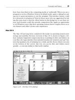
Based on this principle, Tog has a pop quiz: what are the five spots on the screen that are
easiest to acquire (point to) with the mouse? The answer: all four corners of the screen
(where you can literally slam the mouse in one fell swoop without any pointing at all), plus
the current position of the mouse, because it's already there.
The principle of the mile-high menu bar is fairly well known. However, it must not be entirely
obvious because the Windows 95 team missed the point completely with the
Start push-
button, which sits almost (but not exactly) in the bottom left corner of the screen. In fact, it's
about two pixels away from the bottom and two pixels from the left of the screen. So, for the
sake of a couple of pixels, Tog writes, Microsoft literally "snatches defeat from the jaws of
victory" and makes it that much harder to acquire the
Start button. It could have been a
mile square, absolutely trivial to hit with the mouse. For some reason, I don't know why, it's
not. Even five years later, after many major releases of Windows, nobody has bothered to fix
the Start button to make it easier to hit.
In the
previous chapter, we talked about how users hate reading and will avoid it unless they
absolutely cannot accomplish their task. Similarly:
Users can't control the mouse very well.
I don't mean this literally. What I mean is, you should design your program so that it does not
require a tremendous amount of mouse-agility to use correctly. The top six reasons for this
are:
55
1. Some people use suboptimal pointing devices, such as track-balls, touchpads, and the
little red thingy on a ThinkPad, all of which are harder to control than standard mice.
2. Sometimes people use mice under bad conditions: on a crowded desk; with a dirty
trackball that makes the mouse skip; or with a mouse that is just a five-dollar clone
and doesn't track properly.
3. Some people are new to computers and have not yet developed the motor skills to use
mice accurately.
4. Some people will literally never have the motor skills to use mice precisely. They may
be very young or very old; they may have arthritis, tremors, carpal tunnel syndrome;
or they may suffer from any number of disabilities.
5. Many people find that it is extremely difficult to double-click without moving the mouse
slightly. As a result, they often drag things around on their screen when they mean to
launch applications. You can often spot these people by their messy desktops
because half the time they try to launch something, they wind up moving it instead.
6. Even in the best of situations, using the mouse a lot feels slow to people. If you force
people to perform a multistep operation using the mouse, they may feel like they are
being stalled, which in turn makes the UI feel unresponsive. This, as you should know
by know, makes people unhappy.
In ye olden days, when I worked on Excel, laptops didn't come with pointing devices built in,
so Microsoft made a clip-on trackball that clipped to the side of the keyboard. A normal
mouse is controlled with the wrist and most of the fingers. This is much like writing, and you
probably developed very accurate motor skills for writing in elementary school. But a
trackball is controlled entirely with the thumb. As a result, it's much harder to control a
trackball to the same degree of accuracy as a mouse. Most people find that they can control
a mouse to within one or two pixels but can only control a trackball to within three or four
pixels. On the Excel design team, I always urged people to try out their new UIs with the
trackball instead of only with a mouse, to see how it would feel to people who are not able to
move the mouse exactly where they want it.
One of the great UI crimes against humanity is the dropdown list-box, shown closed and
then open in
Figure 10-3.
Figure 10-3: The dropdown list-box in its normal state and expanded.
Think about how many detailed mouse clicks it will take to choose, say, Wingdings. First,
you must click on the down arrow to make the list appear. Then, using the scroll bar, you
must carefully scroll until Wingdings appears in view. Many of these dropdowns are
carelessly designed to show only two or three items at a time, so this scrolling is none too
easy, especially if you have a lot of fonts. It involves either carefully dragging the position
indicator (with such a small range of movement, it's probably unlikely that this will work); or
56
clicking repeatedly on the second down arrow; or trying to click in the area between the
thumb and the down arrow—which will eventually stop working when the thumb gets low
enough, annoying you even further. Finally, if you do manage to get Wingdings into view,
you have to click on it. If you miss, you get to start all over again. Now multiply this process
by ten if, say, you want to use a fancy font for the first letter in each of your chapters. Then
you're really unhappy.
The poxy dropdown listbox is even more annoying because there's such an easy solution:
just make the dropdown part high enough to show all of the options at once. Ninety percent
of the combo boxes out there don't even use all the available space to drop down, which is a
sin. If there is not enough room between the main edit box and the bottom of the screen, the
dropdown should grow up until it fits all the items, even if it has to go all the way from the top
of the physical screen to the bottom. And then, if there are still more items than there's room
for, it should scroll automatically as the mouse approaches the edge rather than requiring
the poor user to mess with a teensy weensy scrollbar.
Furthermore, don't make me click on the little tiny arrow to the right of the edit box before
you pop up the dropdown—let me click anywhere on the edit box! This expands the click
target about tenfold and makes it that much easier to acquire the target with the mouse
pointer.
Let's look at another problem with mousing: edit boxes. You may have noticed that almost
every edit box on the Macintosh uses a
really fat, bold font called Chicago, which
looks kind of ugly and distresses graphic designers to no end. Graphic designers (unlike UI
designers) have been taught that thin, variable spaced fonts are more gracious, look better,
and are easier to read. All this is true. But graphic designers learned their skills on paper, not
on the screen. When you need to edit text, monospaced text (that is, text in which every
letter is the same width) has a major advantage over variable spaced fonts: it's easier to see
and select narrow letters like ‘l’ and ‘i’. I learned this lesson after watching a sixty-year-old
man in a usability test painfully trying to edit the name of his street, which was something like
Fillmore Street. We were using 8-point Arial font, so the edit box looked like
Figure 10-4.
Figure 10-4: When you use a font like 8-point Arial or the Windows default MS Sans
Serif, lowercase ‘L's are only one pixel wide.
Notice that the ‘I’ and the ‘L's are literally one pixel wide. The difference between a
lowercase ‘I’ and a lowercase ‘L’ is literally one pixel. (Similarly, it is almost impossible to see
the difference between ‘RN’ and ‘M’ in lowercase, so this edit box might actually say
Fillrnore.)
There are very few people who would notice if they mistyped
Flilmore or Fiilmore or
Fillrnore, and even if they did, they would have a heck of a time trying to use the mouse
to select the offending letter and correct it. In fact, they would even have a hard time using
the blinking cursor, which is two pixels wide, to select a single letter. Look at
Figure 10-5 to
57
see how much easier it would have been if we had used a fat font (shown here as Courier
Bold).
Figure 10-5: A larger, mono-spaced, bold font like Courier is a lot easier to edit.
OK, so it takes up more space and doesn't look as cool to your graphic designers. Deal with
it! It's much easier to use. It even feels better, because as the user types, they get sharp,
clear text. And it's so much easier to edit when you have a typo.
Snap to Border
Here's a common programmer thought pattern: there are only three numbers: 0, 1, and n. If
n is allowed, all n's are equally likely. This thought pattern comes from the old coding
convention (probably smart) that you shouldn't have any numeric constants in your code
except for 0 and 1. (Constants other than 0 and 1 are referred to as "magic numbers." I don't
even want to get into the psychology of that.) For example, programmers tend to think that if
your program allows you to open multiple documents, it must allow you to open infinite
documents (as memory allows), or at least 2
32
, the only magic number programmers
concede. A programmer would tend to look with disdain on a program that limited you to
twenty open documents. "Twenty?! Why twenty? It's not even a power of two!"
Another implication of all n's are equally likely is that programmers tend to think that if users
are allowed to resize and move windows, they should have complete flexibility over where
these windows go, right down to the last pixel. After all, positioning a window two pixels from
the top of the screen is "equally likely" as positioning a window exactly at the top of the
screen.
But it's not true. As it turns out, it's not equally likely. There are many good reasons why you
might want a window exactly at the top of the screen (it maximizes screen real estate), but
there really aren't any reasons to leave two pixels between the top of the screen and the top
of the window. So, in reality, 0 is much more likely than 2.
The programmers over at Nullsoft, creators of WinAmp, managed to somehow avoid the
programmer-think that has imprisoned the rest of us for a decade. WinAmp has a great
feature. When you start to drag the window near the edge of the screen (coming within a few
pixels), it automatically snaps to the edge of the screen perfectly, which is probably exactly
what you wanted since 0 is so much more likely than 2.
The Juno main window has a similar feature: it's the only application I've ever seen that is
"locked in a box" on the screen and cannot be dragged beyond the edge. This is a great
idea. What are the chances that you really wanted your application to be hanging halfway off
the screen? You lose a little bit of flexibility, but in exchange, you get a user interface that
recognizes that precisely controlling the mouse is hard, so why should you have to? This
innovation (which every program could use) eases the burden of window management in an
intelligent way.
58
Look closely at your program's user interface and give us all a break. Pretend that we are
gorillas or maybe smart orangutans and that we have trouble with the mouse. Then, design
your interface so that it's good enough to gesture with the mouse instead of controlling it
precisely like a surgeon's scalpel, and we'll be much more productive.
59