filemaker pro 11 the missing manual phần 8 pps
Bạn đang xem bản rút gọn của tài liệu. Xem và tải ngay bản đầy đủ của tài liệu tại đây (1.74 MB, 91 trang )
613
:
Web Viewer Objects
FREQUENTLY ASKED QUESTION
FileMaker’s Web Browser
Is the web viewer a modern browser? Is it standards-
compliant? Can it run JavaScript, or use browser plug-ins?
Should I be worried about compatibility with various
pages?
FileMaker doesn’t actually have a web browser of its own
lurking underneath your layout. Instead, it calls upon the
services of the web browser engine most readily avail-
able—the one that came with your computer. In Windows,
FileMaker uses Internet Explorer as its underlying browser
technology. In Mac OS X, it uses Safari instead. This ar-
rangement has a few important implications:
• FileMaker is using a tried-and-true browser technol-
ogy, so you know it works well with most web pages.
It has support for all the major web technologies, just
like its real web browser counterparts.
• If you install any plug-ins for your web browser, File-
Maker web viewers can utilize them as well.
• If you upgrade your operating system or web brows-
er, FileMaker’s web viewer gets the benefits of the
upgrade as well. For example, if you install Internet
Explorer 7 (or use Windows 7), then the web viewer
gets all its page-handling capabilities. If you have In-
ternet Explorer 6 installed instead, your web viewer
has its limitations.
Instead, simply ask FileMaker to go get the maps from the Internet for you. Using
a FileMaker web viewer, you can get FileMaker to automatically and instantly fetch
almost anything available on the Web and display it directly on the layout. FileMaker
even takes care of keeping things up to date: Every time you visit a record on the
layout, it checks to see if newer information is available, and automatically fetches
the most up-to-date version, just like your web browser.
You create web viewers with the web viewer tool. This globe-decorated tool button
lives on the Status toolbar near the field tool. It works like most FileMaker tools:
First, in the Status toolbar, click the globe button, and then, on the layout, drag a
rectangle to tell FileMaker where to put the web viewer, and how big to make it.
Putting a Web Viewer on a Layout
Your People database could use a map on the People Detail layout. Here’s how to put
one there.
1. Switch to the People Detail layout, and then (if necessary) switch to Layout
mode.
Since a map can be large, it makes sense to put it on the Detail layout, where you
have some room to work with.
2. Make the Body part much taller by dragging its label downward.
The idea is to make room for the web viewer on this otherwise crowded layout.
614
FM P : T M M
Web Viewer Objects
3. In the Status toolbar, select the Web Viewer tool, and then draw a rectangle
on the page roughly the same width as the Notes field and a few inches tall.
As usual, you’re free to tweak the exact size and position of the web viewer any
time you want, so you don’t have to be perfect here. As soon as you let go of
the mouse button, FileMaker shows you the Web Viewer Setup dialog box
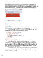
(Figure 14-9).
Figure 14-9:
The Web Viewer Setup dialog box has a
lot of options. First, from the list on the
left, pick the website you want to show.
Then fill in the appropriate boxes on the
right. If you choose Custom Web Ad-
dress, then, at the bottom of the window,
you can use the Web Address box to type
any URL you want.
4. In the “Choose a Website” list, select Google Maps (US).
You’re telling FileMaker you want this web viewer to show information from the
Google Maps website. As soon as you make this selection, several entry boxes
appear on the dialog box’s right side.
5. To the right of the Address entry box, click the square button, and then, from
the resulting pop-up menu, choose Specify Field.
FileMaker pops up the standard Specify Field dialog box. Here you tell File-
Maker which field to pull the street address from when it goes to find a map.
615
:
Web Viewer Objects
6. In the Specify Field window, select Street Address, and then click OK.
FileMaker now knows the first piece of information it needs to find the ap-
propriate map. Notice that the Address box now shows People::Street Address.
7. Repeat step 7 for the City, State, and Zip Code boxes. In each case, pick the
appropriate field.
As you make selections, FileMaker fills in the various boxes. The Web Address
box at the bottom of the window also changes, but you don’t need to concern
yourself with that just yet.
8. Click OK.
The Web Viewer Setup window disappears, and the web viewer appears on the
layout.
9. Select the web viewer, and then anchor it to the left, bottom, and right (but
not the top) using the Inspector.
To keep the web viewer from bumping into the expanding Notes field when the
window is resized, you need to tell it to stick to the bottom of the window.
If you switch to Browse mode, and your computer is connected to the Internet, then
you should see the Google Maps page with a map for the current person record
(Figure 14-10). You may need to make the window bigger for the map to display
properly. If you fiddle with the database a bit, then you notice a few important things:
• When you switch to a new record, the web viewer changes its contents to reflect
the address information on the new record. Likewise, if you change the data in
any of the address fields, then the map instantly updates to show the new address.
• Status information shows at the bottom of the web viewer while the page loads.
• You’re free to click links in the web page, and the web viewer dutifully follows
your clicks and shows a new page.
• Although the web viewer isn’t a full-fledged browser (it doesn’t have a Back
button, for instance) you can access most typical browsing commands by right-
clicking (Windows) or Control-clicking (Mac) anywhere on the web page. In
fact, the menu that appears when you do is just like the one you’d see if you did
the same in your real web browser. For instance, choose Back from this menu
to go to the previous page.
Web Viewer Options
FileMaker offers up a few configuration options for web viewers in addition to the
page they should load. The bottom of the Web Viewer Setup dialog box (Figure
14-9) includes four checkboxes to adjust the behavior of this particular web viewer.
616
FM P : T M M
Web Viewer Objects
Figure 14-10:
The People database
now has a Google
Maps web page
showing right on the
detail layout. File-
Maker’s web viewer
lets you embed any
web page on the
layout, so you can
save countless trips
to your favorite web
resources. Unfortu-
nately, web pages
tend to be big. You’ll
learn how to give this
map more breath-
ing room without
investing in a 30-inch
screen on page 618.
Allow interaction with web viewer content
When the “Allow interaction with web viewer content” option is turned on (as it is
for your map), FileMaker lets you actually use the web page it loads. Specifically, you
can click a link on the page to navigate to a new page. You can also use shopping
carts, send email messages, watch video, or use any other features on the page.
When you turn this option off, all page behavior is deactivated. Clicking the page
produces no more response than clicking a blank spot on the layout. You can’t even
scroll the page. If a page is too big to fit in the space you’ve given it on the layout,
then FileMaker simply cuts it off.
617
:
Web Viewer Objects
Turn this option on when the page you’re showing is just a starting point (like the
login screen for your Orders web page, or the first step in the application process).
You should also leave this option on when the page is larger or its size is variable. On
the other hand, you can turn “Allow interaction with web viewer content” off when
you’re showing a small page that contains all the information needed.
POWER USERS’ CLINIC
Beyond the Built-in Sites
When you added a Google Maps page to your layout, you
didn’t have to figure out how Google expects to receive
address information. Instead, you simply picked Google
Maps from a list, and then filled in the blanks. This easy-to-
integrate approach is possible because FileMaker already
knows how to connect to Google Maps. FileMaker has
built-in support for several popular websites (you see each
one listed in the Web Viewer Setup dialog box). When you
pick from this list, FileMaker shows a series of entry boxes
appropriate for that site. For example, with Google Maps
selected, the dialog box asks for Address, City, State, Zip
Code, and Country. If you pick FedEx instead, FileMaker
asks for a Tracking Number. In every case, you can pick a
field FileMaker should use to get the data it wants, or you
can type a value instead, like USA for Country if all your
addresses are in the United States.
But don’t let FileMaker’s list of companion sites trick you
into thinking they’re the only ones that work. You can con-
nect a web viewer to any site. At the top of the “Choose a
Website” list, just choose Custom Web Address. Then, in
the Web Address box at the bottom of the window, type
any URL you want (or copy one from a web page, and then
paste it in).
Unfortunately, if you want the exact page information tied
to data in the record (just like the Google Maps example),
then you have to supply a calculation for the Web Address.
Chapters 8, 9, and 15 have everything you need to master
calculations.
Display content in Find mode
Normally, when you switch to Find mode, the web viewer just goes blank. Which
makes sense, since a web viewer is usually showing a page associated with data in the
current record. After all, if you go to Find mode, where you’re no longer necessarily
looking at a particular record, then FileMaker may not be able to tell which web ad-
dress goes in the web viewer.
You can change this behavior, though, by turning on “Display content in Find mode”.
When you do, FileMaker makes its best effort to display the web page even when
you’re in Find mode. For example, if you’ve typed a URL directly into the Web Viewer
Setup dialog box, then FileMaker can continue to display the page properly no mat-
ter which mode you use (except Layout mode). If you’re using a website that needs
information from the database, then FileMaker feeds it the data from the find re-
quest instead. This behavior could come in handy if the web page information would
be helpful to a person trying to construct a find request, but usually you want to
leave this option off. It can be jarring to watch a web viewer constantly refresh itself
as you enter your find criteria.
618
FM P : T M M
Conditional
Formatting
Display progress bar
Unlike everything else on your layout, web page content isn’t always immediately
accessible by FileMaker. The program has to go to the Internet and pull up the page,
which can take some time (just as it takes time for a page to load in your browser).
If you turn on “Display progress bar” (it’s on until you turn it off, in fact), then File-
Maker shows a subtle progress bar at the bottom of the web viewer (Figure 14-11).
Display status messages
Another option that FileMaker automatically turns on is the “Display status mes-
sages” checkbox. This option tells the web viewer to reserve a little space along its
bottom edge to show status information (Figure 14-11). Status information typically
means the “Loading…” messages you see at the bottom of a web browser window.
Turn this option off if you’d rather not sacrifice precious layout space for not much
more information than what the progress bar already gives you. That way, the web
viewer can use all its space on the layout for web page content.
Conditional Formatting
Sometimes you want the formatting (color, font, style, and so forth) of a layout ob-
ject to change depending on certain criteria. For example, you might want the Status
field to change color depending on its value, turning red if the person is deceased.
That way you easily spot this fact whenever you look at the record.
FileMaker’s conditional formatting feature lets you make database objects change
when, well, conditions change. It works by letting you specify a series of criteria and
the specific formatting changes that go along with them. FileMaker means condition
in the “I’ll give you a hand on one condition…” sense. As long as certain restrictions
are met, the formatting applies.
Conditional Formatting of Fields
You can apply conditional formatting to any text object, button, field, or web viewer.
Follow these steps to make your status field more dynamic:
1. On the List layout, select the Status field, and then choose Format➝Conditional.
You see the Conditional Formatting dialog box pictured in Figure 14-12.
2. Click Add.
A new condition appears in the list at the top of the window. Also, the dialog
box’s Condition and Format sections become active (they were grayed out until
now).
3. From the first pop-up menu under Condition, make sure “Value is” is chosen.
You can configure your condition in two different ways. Either you place simple
rules on the value of a field, or, if your needs are more complex, you use a for-
mula. You’ll start with the easy kind.
619
:
Conditional
Formatting
Figure 14-11:
If you turn on the
right options, the web
viewer can show a
status message (that
text at the very bot-
tom) and/or progress
bar (the black line
just above the status
bar) as the web page
loads. If you prefer
a minimalist look, in
the Web Viewer Setup
dialog box, turn off
both “Display status
message” and “Dis-
play progress bar”.
Figure 14-12:
The Conditional Formatting
dialog box lets you assign
formatting to a field, button,
or text object that kicks in
only when certain condi-
tions are met. Simply click
Add to add a new condition.
Use the pop-up menus and
boxes below the Condition
line to tell FileMaker under
what conditions the format-
ting should apply, and tell it
what formatting you want
by tweaking the options
under Format.
620
FM P : T M M
Conditional
Formatting
4. From the second pop-up menu under Condition, choose “equal to”.
In this case, you want the conditional formatting to apply when the Status is
“Deceased”, so you tell FileMaker that’s the kind of comparison it should do.
5. To the right of the pop-up menu, in the box, type Deceased.
Here’s where you enter the comparison value. (If you choose a comparison type
other than “equal to”, then the dialog box may show you different options.)
FileMaker adjusts the display of the dialog box so that the condition line reads
like a meaningful sentence: “Value is➝equal to➝Deceased.”
6. From the Fill Color pop-up menu, choose a dark red color. Then from the
Text Color pop-up menu, choose white.
As soon as you make a selection from either pop-up menu, FileMaker turns on
the checkbox to the left of its label. This checkbox tells FileMaker you want it to
go ahead and apply this style when the condition is met. If you decide you don’t
want to change the fill color after all, you can simply uncheck the box.
Note: You don’t have to provide any formatting rules for other values in the Status field. When none
of the conditions in the Conditional Formatting dialog box apply (you can add as many as you want),
FileMaker leaves the object formatted as it is in Layout mode, so you don’t need to add a condition for the
normal case.
7. Click OK.
The Conditional Formatting dialog box disappears, and your field now sports
a Conditional Formatting badge. That little red and blue diamond on the right
side of the field lets you know Conditional Formatting is used on this field.
Although the layout looks unchanged, if you switch to Browse mode, then you see it
works as advertised. Every person with a status of Deceased shows in red.
Conditional Formatting of Text Objects
You can apply conditional formatting to many kinds of layout objects—fields, text
objects, buttons, and web viewers, some of which you’ll learn about later in this
chapter. But typically when you format something other than a field, you need to use
a formula for the condition, since those objects don’t have values that change.
Note: Text objects are the exception. You can use conditional formatting rules on text objects, and they
apply based on the text you type into the object. However, conditional formatting of text objects is most
useful when they contain symbols (page 162) or merge fields. You can set up the text object’s appearance
to change when its contents change.
621
:
Conditional
Formatting
To show a formula-based conditional formatting rule, you’ll add conditional format-
ting to your database in a surprising place. Take a peek at Figure 14-13 to see the
problem you need to fix.
Figure 14-13:
Take a look at the
text under Robert
Johnson. You see two
extraneous commas
floating in the middle
of nowhere. These
commas separate
the address, city, and
state in the address
line. In this case, all
the address fields are
empty, so just the
commas show up.
Most people wouldn’t think of it right away, but conditional formatting can help
clean up a little mess like commas between empty fields. If the address fields are
empty—and that’s a condition—you don’t want the commas to show up. FileMaker
doesn’t have the power to make layout objects disappear completely, but you can
turn the text white. Then, even though the commas are technically there, no one can
see them. Since the formatting is applied conditionally, as soon as address informa-
tion is entered for a record, the data (commas and all) appears normally.
Tip: You have other ways to solve this same problem. For example, you can add a calculation field (page
131) to your database that intelligently assembles the address info into a compact line.
Using conditional formatting, you’ll make the text color turn white when the address
fields are empty. This tactic requires a relatively simple formula. Here are the steps:
1. Select the text object containing the address merge fields, and then choose
Format➝Conditional.
The Conditional Formatting dialog box reappears.
622
FM P : T M M
Conditional
Formatting
2. Click Add to add a new condition to the list.
Once again, a line appears in the list at the top of the window.
3. Switch the first pop-up menu to “Formula is”.
The remaining pop-up menu disappears, and a new larger box appears in its
place, where you’ll type your formula.
4. In the formula box, type the following:
IsEmpty(People::Street Address) and IsEmpty(People::City) and
IsEmpty(People::State) and IsEmpty(People::Zip Code)
It’s important to type the formula exactly, since typos may prevent the whole
thing from working. This formula checks to see that all the address fields are
empty. (Everything you need to know about formulas is in Chapter 8.)
5. From the Text Color pop-up menu, choose the white tile, and then click OK.
The Conditional Formatting dialog box goes away.
Tip: If you get an error message, clear the formula box, and then try typing over the formula again.
Now if you switch to Browse mode, you see that the mysterious commas have disap-
peared. See Figure 14-14 for proof. This technique of hiding things is surprisingly
common among more advanced FileMaker developers because it helps build more
data-rich layouts with less clutter.
Advanced Conditional Formatting
In both of the previous examples, you added only one condition to the list in the
Conditional Formatting dialog box. But it isn’t a list if you can’t add more than one.
When you do, FileMaker looks at every condition on the list, and makes the format-
ting changes for each one that applies. As a result, you can easily create several dif-
ferent formats for several different conditions. For example, you can make numbers
in your budget database turn red when you’re getting behind, stay black when you’re
right on target, and turn green when you’re beating expectations.
Two matching conditions can even have competing formatting rules. For instance,
you can set the text color to something different in each rule, even though they
both apply to the same values. In that case, FileMaker chooses the format from the
condition that comes last in the list. You can move these conditions around using
their little arrows to influence its decision. Just put the condition that should take
precedence lower in the list.
Also, in the Conditional Formatting dialog box, if you don’t see the formatting
choice you want, just click More Formatting, and chances are you’ll find what you
want. This button opens a dialog box that lets you adjust additional formatting, in-
cluding font, size, and a few extra styles.
623
:
Conditional
Formatting
Figure 14-14:
Using conditional
formatting, you can
“hide” text on the
layout under certain
conditions. Just
make it turn white
(or whatever your
background color is).
Compare this picture
with Figure 14-13—no
more stray commas!
Removing Conditional Formatting
If an object has conditional formatting behavior that you don’t want anymore (which
often happens if you duplicate one field and change it to another), then you can eas-
ily turn it off. Just select the object, choose Format➝Conditional, and then delete the
conditions from the list. You can Shift-click to delete them all at once, or just click
the first, and then click Delete repeatedly until they’re all gone.
If you spent long hours adding complex conditions and you’re not quite ready to
commit to losing them forever, then you can turn them off instead. Each condition
in the list has a checkbox beside it. If you turn off a condition’s checkbox, FileMaker
no longer uses that condition. You can always get the condition back later by turning
it back on. You can turn multiple checkboxes on or off at once as well: Just Shift-click
the conditions you want to switch so they’re all selected. Then turn off the checkbox
beside one of them, and FileMaker turns all the others off as well.
624
FM P : T M M
Basic Charting
(Found Set Charts)
Basic Charting (Found Set Charts)
Summary reports are just dandy, but there comes a time when text and numbers just
don’t cut it. Often, the people who want the summary information don’t take the
time to study and interpret those numbers. Other times, you may need to punch up
the presentation to make a point. That’s when charts come in handy. Consider Fig-
ure 14-15. If you’re trying to impress upon the Lawnmower Museum’s curator just
how little enthusiasm the public is displaying for the “Pull Cords Through the Ages”
exhibit, which approach do you suppose will have the greater impact?
FileMaker offers five fundamental chart types, each with some formatting options
to make them your own.
Bar
The Bar chart is the classic method for visualizing data: a column for each thing
you’re counting and the taller it is, the more there are. You can set your Bars to be flat
or 3D, shaded or solid-colored. When you have multiple data series’ (see the steps on
page 638), FileMaker will group and color them together.
Horizontal Bar
Distinguished by their lateral proclivities, Horizontal Bar charts are the same as the
implicitly vertical Bar charts described above, just turned by 90 degrees. All the for-
matting options are identical.
Line
Line charts are a classic tool for showing change over time. Trending information
like historical stock market performance, or annual snowfall is particularly apt for
Line charts. FileMaker can draw your lines in smooth curves or sharp angles, but
that’s about all you can customize.
Area
A close cousin of the Line is the Area chart. In fact, it’s just an angular Line chart with
color filled in beneath the line. Like the Bar charts, Area charts can be flat or 3D. If
the data you’re plotting ever crosses (say you’re showing digital music sales rising
and CD sales fall) you’ll want to take advantage of the “Semi-transparent” option to
ensure all series’ remain visible.
Pie
Unlike the other four chart choices, Pie charts always display one thing—the rela-
tive portions that make up a whole. Throw a set of data at it and FileMaker helpfully
calculates each item’s percentage contribution and slices the pie for you. The increas-
ingly familiar flat/3D solid/shaded formatting choices apply here as well.
625
:
Basic Charting
(Found Set Charts)
Figure 14-15:
The Lawnmower museum’s at-
tendance figures are presented
as a summary report (above)
and a chart (below). It’s
instantly obvious which exhibit
isn’t drawing the crowds when
the information is visualized as
a chart.
For this exercise, you can download the Charts.fp7 file from this book’s Missing CD
page at www.missingmanuals.com/cds. Here’s how to set up a simple Bar chart for the
museum attendance database:
1. Open the Charts.fp7 database, and then switch to the Facility layout.
626
FM P : T M M
Basic Charting
(Found Set Charts)
2. In Layout Mode, select the Chart tool, and then drag to create a chart using
most of the space below the fields.
If you don’t see all your tools, it usually means you need to make the window a
bit wider.
The Chart Setup dialog box appears. Leave the Chart Type set to Bar.
3. In the Chart Title box, type Museum Attendance. For the Horizontal (X) Axis,
click the button to the right of the field and select Specify Field Name from
the pop-up menu shown in Figure 14-16.
A list of fields appears.
Figure 14-16:
The axes of a chart
can draw their data
from a particular
field as shown here,
or from a calculation
you construct.
4. Click the Facility field, and then click OK.
You see Facility::Facility Name in the Horizontal (X) Axis field.
5. Moving down to Vertical (Y) Axis, click the button to its right, select Specify
Field Name, and then choose the field named Visitor Sum. Click OK.
Facility::Visitor Sum appears in the Vertical (Y) Axis box.
6. Leave all the other settings unchanged, click OK on the Chart Setup dialog
box, and then switch to Browse mode.
You should see a chart like the one on Figure 14-17. The bars are accurate, but
the chart isn’t usable yet.
Gazing upon your first chart, some flaws are immediately apparent. The labels along
the bottom overlap so you can’t read them. The vertical axis shows no unit of
measurement. And the whole thing is squished into a small space. Fortunately, File-
Maker doesn’t leave you without some options for whipping this chart into shape.
627
:
Basic Charting
(Found Set Charts)
1. Return to Layout mode and click once on your chart to select it. Over in the
Inspector window, select the Position tab and, in the Autosizing section, acti-
vate the bottom and right anchors.
All four anchors should now be active. This will cause your chart to stretch with
the size of your window when you’re back in Browse mode.
2. Before you switch to Browse mode, however, select Format➝Chart Setup (or
simply double click the chart).
You return to the aptly named Chart Setup dialog box.
Figure 14-17:
Sure it’s a chart, but is
it art? This chart’s X axis
contains some unfor-
tunately long museum
names. FileMaker isn’t
quite crafty enough to
sort this problem out
by itself, but the tools
to correct it lie in the
Format Chart options.
On the right side of the dialog box, just below the example chart, click the For-
mat Chart button (Figure 14-16).
On the left side of the Format Chart dialog box, you see five items listed: Chart
Appearance, Legend, Horizontal (X) Axis, Vertical (Y) Axis, and (Y) Series 1.
3. Click Horizontal (X) Axis.
Your chart’s X Axis lists the various museums in the report.
4. In the X-Axis Title box, type Museum Name. Set the Label Angle pop-up
menu to 45° to pretty it up.
It looks like Figure 14-18.
5. From the list of choices on the left, click Vertical (Y) Axis. For its title, type
Attendees.
They Y axis graphs the number of people who attended each museum.
628
FM P : T M M
Basic Charting
(Found Set Charts)
Figure 14-18:
The Format Chart dia-
log box is where the
real magic happens.
Essential components
of a well-made chart
like axis titles for xy
charts and series
legends for pie charts
are configured here.
6. Turn on the Set Y-Axis checkbox, and then enter 0 for the minimum and 3000
for the maximum.
Because none of the museums saw more than 3,000 visitors, you can restrict the
range of the Y Axis to go no higher (Figure 14-19).
7. Switch back into Browse mode to admire your handiwork.
Now you’ve got a usable chart that’s clean, readable and appropriately labeled, your
chart should look something like Figure 14-20.
Figure 14-19:
Generally when
setting the range of
a Y axis, it’s best to
have a minimum of
zero, or, if your data
includes negative
numbers, the lowest
value in the set. The
high should be just
slightly higher than
the largest number
in your data. If your
data is subject to
a lot of variability,
just leave this option
unchecked—FileMaker
does a pretty good
job of setting the
range automatically.
629
:
Chart Formatting
Figure 14-20:
With X axis labels
turned 45º, the col-
umns are now clearly
identified. The axis
titles you added make
it abundantly clear
to the viewer that
museum names run
along the X axis, and
attendance numbers
the Y axis.
Chart Formatting
While you were working in the Format Chart dialog box in the previous section,
chances are you were enticed by the Chart Appearance options. Now is a great time
to try out some of those cool formatting possibilities. You can change your font,
color scheme, and background. You have wide artistic latitude here, but remember,
your goal is to enhance your chart and make it easier to read. Less is more.
To dig into all those possibilities, shift over to Layout mode, and then double click
your chart. In the Chart Setup dialog box, click that Format Chart button on the
right. Here in the Chart Appearance settings, Figure 14-21, you can ditch Helvetica
for a more interesting font—but again, your goal is to be readable, not fancy. The
Chart Title field just below the Font pop-up menu is the font’s point size. And the
dark rectangle immediately to the right of that is the font color. Click it to reveal a
palette of hues to choose from.
630
FM P : T M M
Chart Formatting
Figure 14-21:
The Chart Appearance
section of the Format Chart
dialog box is were you
can beautify your chart.
FileMaker gives you wide
latitude to customize your
chart however you wish, but
this isn’t the place to aban-
don restraint. Choose your
font and colors carefully lest
you end up with seizure-
inducing contrasts.
Tip: If you’re a fan of seeing sample data while working in Layout mode (View➝Show➝Sample
Data), brace up for a little disappointment. Graphs in Layout mode will faithfully display your formatting
decisions like chart type, font sizes and color schemes, but you won’t see actual data until you return to
Browse or Preview mode.
The Chart Style pop-up menu varies by chart type, but generally offers solid or shaded
coloring, and flat or 3D style presentation. Moving down to the Color Scheme pop-
up menu, you’ll find that FileMaker has furnished you with 20 color schemes with
florid names like Muted Rainbow and Sea Glass. If you don’t see a theme you like,
find one you can settle for, because this is as custom as your colors are going to get.
You can’t set colors for individual graph elements, and you can’t create your own
themes. Happily, you’re not stuck with a plain white background for every chart you
make. The Background pop-up menu allows you to choose your own background
color, or one of eight gradient style backgrounds that fade gradually from one color
to another.
Note: Those two boxes just below the Background pop-up menu are used to set the gradient colors. But
they’re both automatically set to white. And the gradient that transitions from white to white is no gradi-
ent at all. As you try out different gradients from the Background pop-up menu, the background in the
preview remains solid white. To see a meaningful preview, simply set either of those colors to something
that isn’t white before you choose a gradient.
You can also set the background to transparent, thus allowing the chart to blend in
with the background of the layout you place it on. This option helps gives your da-
tabase a consistent appearance. It works really well if your layout has a quiet, subtle
background. If your background is a photo of your cat, not so much.
631
:
Charting and Reports
UP TO SPEED
Charting 101
Throwing together a simple chart is easy enough, but creat-
ing a useful and meaningful chart takes a little thought.
Indeed, a poorly conceived chart can obscure or even con-
tradict the information you want to communicate. Visual-
ized data is also subject to cultural context, and more than
you might think. Imagine you’ve invested in my ostrich
ranch and I’ve presented you with a chart showing your
financial return in the form of Figure 14-22. Would you give
me the stink-eye or a hug? If you’re from a western culture
and read from left to right, that chart looks like bad news.
Look a little closer.
Here are a few basic charting concepts to consider:
• The passage of time is usually charted in the X (hori-
zontal) axis starting with the earliest date or time on
the left and proceeding to the most recent on the
right.
• Numerical values are best suited to the Y (vertical)
axis with the lowest values at the bottom of the chart
range. FileMaker won’t even let you order values any
other way. If you sort your values in descending or-
der, the Y-axis won’t change.
• Multiple items in the Y-axis of a chart are called series.
Consider a line graph with one line showing a par-
ticular stock’s performance over time and a second
line showing overall market performance. The stock
is one series and the overall market is the second.
Series are terrific for comparing multiple entities, but
all the entities have to use the same unit of measure-
ment. An individual stock and the whole stock market
are both measured in currency (dollars, yen, euros,
etc.) making them well suited to being series on the
same chart. Other series just don’t pair up, like a com-
mute (measuring distance) and the capacity of a gas
tank (measuring volume). One final thought about
series– sometimes, even series that share the same
unit of measurement don’t chart well together. For
example, if your database calculates the distances
from various Italian cities to other Italian and South
African cities, your unit of measurement will be the
same. But most Italian cities are within a few hundred
kilometers of each other while South Africa is at least
7,000 kilometers away. Such a vast gap between data
sets doesn’t generally lend itself to charting.
• Pies portray percentages. Pie charts show the propor-
tional composition of a whole. That “whole” can be
second quarter sales, Ray Bradbury’s oeuvre, or your
retirement savings. The slices can represent sales
reps, editors, or mutual funds. The important thing
is that you clearly define what the slices are and how
they add up to 100 percent of something. FileMaker
helps you stay clear of the temptation to use raw
numbers instead of percentages for your pie charts
by computing and displaying each slice’s percent
contribution automatically.
Charting and Reports
Charts and graphs are classic tools for boiling a whole lot of data down to easily
understandable information. When it comes to FileMaker, concisely presenting a
large data set is going to involve Summary fields (page 601), and Summary parts on
layouts (page 608). Lucky for you, charts feel right at home in Summary reports. It’s
important, however, to craft your charts carefully, and then place them on the right
layout parts. Take a look at Figure 14-23. Each image shows the exact same chart
632
FM P : T M M
Charting and Reports
drawing from the exact same data. The only difference between them is the layout
part they’ve been placed in. Now consider Figure 14-24. These images display the
same chart and data set, but with different sort orders. Ultimately, producing an ac-
curate chart comes down to three main rules: Pick the right fields, place the chart on
the appropriate layout part, and use the correct sort order.
Figure 14-22:
At first glance, this
chart of returns on
your 10-year invest-
ment in an ostrich
ranch looks pretty
grim. But it’s actually
a perfectly valid and
accurate (albeit imagi-
nary) chart showing
a return of over six
million dollars! When
we see a chart, we
tend to assume that
time is displayed
horizontally from left
to right and values
are in the vertical axis.
This ill-conceived chart
runs counter to those
norms and risks being
gravely misinterpreted.
Figure 14-23:
A chart designed for use in a Sub-summary part has been
copied and pasted into the Body and Trailing Grand Sum-
mary parts of the same layout. Seen here in Browse mode,
it’s pretty clear that what works in the Sub-summary doesn’t
directly translate to the other parts.
633
:
Charting and Reports
Picking the Right Fields
Picking the right fields might, on its face, seem to be a pointless rule. After all, you
know which fields contain the information you want charted, right? And FileMaker
won’t let you make an invalid chart, so what’s the problem? The problem is that
no product can prevent you from creating a confusing or even meaningless chart.
Choose fields that have accurate and consistent data. If your chart appears in a lay-
out’s Body part, be sure you’re not trying to use a summary field for one of the axes
or you’ll end up displaying the same values in every record. Caution is also advised
when charting fields with related data—see Advanced Charting later in this chapter
for details.
Choosing an Appropriate Layout Part
Earlier in this chapter you learned how one field can display a variety of different
values depending on the layout part it’s in. Charts exhibit very similar behavior.
Identically configured charts can display very different values whether placed in the
Body, Sub-summary, or Grand Summary parts of the same layout (check out Figure
14-23). Still selecting the appropriate layout part needn’t be a headache.
If you wish to graph information from a single record, or non-aggregate data from
a found set of records, Body is the layout part of choice. If your aim is to visualize
summarized information for groups of similar records, you’ll want to set up a Sub-
summary part on your layout as described on page 608 and give your chart a home
there. Finally, should you want to show summarized data for the entire found set of
records, you’ll want to use a Grand Summary part.
Tip: When working with related data, that is, fields from another table in your database, the guidelines
here don’t apply quite so rigidly. For example, it’s possible to display summary data for related records in
a Body part using calculation fields—no Summary fields or Summary parts necessary.
Using the Correct Sort Order
Regardless of where you place a chart, unsorted or incorrectly sorted records can
take a dandy chart and render it useless. If your chart is located in a Sub-summary
part, you need only sort by the field you associated with the Sub-summary part at
the time you defined it. With Body part charts, you’ll generally sort by the fields
charted in the X axis. See Figure 14-24 for more.
634
FM P : T M M
Charting and Reports
Figure 14-24:
The correct sort order is crucial to the accuracy of your charts.
Top: The Chart Setup dialog box specifies the field named
“exhibit” for the X (horizontal) axis and “Show data points for
groups of records when sorted” is turned on.
Middle: When the exhibit field isn’t first in the sort order, you
get a rather pointless one-bar chart.
Bottom: Change the sort order to put exhibit on top, and the
chart instantly changes to reflect total attendance for the three
exhibits in the current found set.
635
:
Advanced Charting
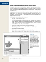
Advanced Charting
So far, you’ve been charting data from multiple records in a single table, but File-
Maker offers two other data sources for visualizing—Delimited data and Related
records. You can select either from the Chart Setup dialog box (Figure 14-25). To see
them, enter Layout mode, and then double click any existing chart. Both are choices
in the Use Data From pop-up menu.
Delimited Data
The “Current Record (delimited data)” option in the Chart Setup dialog box tells
FileMaker to look at fields in the current record when drawing a chart. The data to
be charted has to take the form of a return separated list. That is, each value has to be
separated from adjacent values by a return character. When a particular character
is designated to show where one list item ends and the next one begins, computer
geeks call that a delimiter. In theory, any character, a comma, a tab, even the letter
q can be a delimiter. FileMaker has settled on the return character for the purposes
of charting.
Figure 14-25:
The Use Data From pop-up menu
is where you can configure your
chart to draw from the current
found set of records, lists of data
in the current record, or records
from a related table.
Note: If you have repeating fields in your database, they might seem like a natural source for delimited
data. Quite often, a repeating field even looks like a return separated list on a layout. Alas, repeating fields
aren’t return separated, and you can’t use them as such when charting.
636
FM P : T M M
Advanced Charting
Creating a chart of delimited data is generally straightforward. In the example data-
base, switch over to the layout entitled “Delimited” depicted in Figure 14-26. Here
you’ll find two text fields with return separated lists already in them. The Chart
Labels field contains the names of five Ostriches. Chart Data shows the average
number of eggs each bird lays each month. You’re going to chart that data.
Figure 14-26:
In the FileMaker
charting world, “De-
limited” just means a
list of values with line
breaks between them.
The link between
the delimited values
of these two fields
is simply the order
they’re listed in. Were
you to rearrange the
names on the left to
be in alphabetical
order, the numbers
on the right wouldn’t
automatically change
with them.
1. Choose View➝Layout Mode, and then select the Chart tool from the Status toolbar.
It’s the button that looks like a tiny bar chart.
2. Below the fields on the layout, drag out a box roughly the combined width
of the fields already on the layout and down to about the bottom of the Body
part.
The Chart Setup dialog box appears (Figure 14-27).
3. Click the box to the right of the Chart Title field, and then select Specify Field
Name from the list of fields that pops up, choose “chart title”, and then click
OK.
Repeat step 3 for the X-axis, selecting the “chart labels” field and the Y-axis,
choosing “chart data.”
4. Finally, set the Use Data From pop-up menu to “Current Record (delimited
data)”, and then click OK.
The dialog box should look like Figure 14-27.
Switch back to Browse mode to admire your chart. If you modify data in any of the
fields, the chart will reflect your new data as soon as you commit the changes by
clicking some empty space or pressing enter on your numeric keypad.
637
:
Advanced Charting
The beauty of charting delimited data is that you can use FileMaker’s calculation
tools and scripting capabilities to pull together a chart’s raw data on demand. And
because FileMaker draws the data exactly the way it appears in the fields, delimited
data charts don’t require a sorted found set.
Figure 14-27:
The mechanics of chart-
ing delimited data isn’t
all that different from a
chart based on records.
The salient difference
is that the fields or cal-
culations specified here
must be a list of values
separated by returns.
Delimited data charts work the same way regardless of the layout part you place
them in. But when placed on a part that isn’t a Body, FileMaker must choose which
record’s data to use. Table 14-1 shows how it decides.
Table 14-1. When a chart that’s based on delimited data is placed outside of a Body layout part, File-
Maker has to make an educated guess as to which record it should draw data from to create the chart.
Layout Part Delimited Chart Data Source
Leading Grand Summary First record in found set
Trailing Grand Summary Last record in found set
Header Current selected record
Footer Current selected record
Leading Sub-summary First record in summary group
Trailing Sub-summary Last record in summary group
Title Header First record in found set
Title Footer First record in found set