Creating Cool Web Sites with HTML, XHTML, and CSS apr phần 8 ppsx
Bạn đang xem bản rút gọn của tài liệu. Xem và tải ngay bản đầy đủ của tài liệu tại đây (1.83 MB, 43 trang )
557386 Ch12.qxd 4/2/04 10:16 AM Page 276
Ł
276
Creating Cool Web Sites with HTML, XHTML, and CSS
I don’t know about you, but Figure 12-9 gives me a bit of a headache! The good news is that
you have a couple of different ways to address the overlapping container problem. The fastest
solution is to simply restore the background color so that you can’t see the text of the second
paragraph, which the following example accomplishes:
<p style=”width: 50%; margin: 10px; background-color: #C9F;
position: absolute; top: -6px; left: -6px;
border: 1px solid; padding: 2px;”>
When the preceding code replaces the previous <p> tag and style attributes, the result is as
shown in Figure 12-10. You can see this is considerably easier on the eye.
Figure 12-10: Specifying a background color hides the overlapping text problem.
It’s not a completely satisfying solution, however, because you still face the issue of the miss-
ing text. In this particular example, the best solution is to use the
float: left CSS attribute.
Experiment with it yourself and find what works best for you.
Relative positioning
Absolute positioning is absolute only within the parent container, and most DHTML designers
prefer relative positioning, which they consider part of the normal flow of the document for
layout. In the example in the preceding section, switching from absolute to relative solves the
overlap problem, but in a somewhat inelegant manner (leaving a big empty space to the right
of the purple box), as follows:
<p style=”width: 50%; margin: 10px; background-color: #C9F;
position: relative; top: -6px; left: -6px;
border: 1px solid; padding: 2px;”>
Figure 12-11 shows the result of replacing the existing <p> tag style attribute with the val-
ues shown in the preceding code.
557386 Ch12.qxd 4/2/04 10:16 AM Page 277
277
Ł
Chapter 12: Advanced Cascading Style Sheets
Figure 12-11: Relative positioning makes the container part of the regular document flow.
In this case, float: left produces a more attractive result.
So what’s the point?
To see why the positioning of elements can prove so useful, I need to change the perspective
a bit. Instead of merely providing you with a tool to create big containers of information, rela-
tive positioning can actually become your best friend when you want to exert fine control over
the positioning of inline elements.
The
vertical-align CSS attribute enables you to change the relative location of an element,
such as the trademark symbol, in a line of text. Relative positioning offers far greater control
over inline positioning, and that’s its greatest value, as the following example shows:
<style type=”text/css”>
.tm { position: relative; top: -2.2em; left: -2em;
font: 8pt bold; border: 1px red groove; padding: 1px;
background-color: #009; color: white; }
</style>
</head>
<body>
<p style=”font: 36pt bold Courier;”>
This book has been brought to you by
J. Wiley & Sons, Inc.
<a href=”trademark-info.html” target=”new” class=”tm”>tm</A>—
formerly Hungry Minds, Inc., formerly IDG Books, Inc.
</p>
Here I create a new class, .tm, that creates a small blue box with white tm lettering inside
that’s actually a hyperlink to the trademark information on the site. By using the
top and
left attributes, I can carefully tune exactly where the box appears on the layout, pixel by
pixel.
557386 Ch12.qxd 4/2/04 10:16 AM Page 278
Ł
278
Creating Cool Web Sites with HTML, XHTML, and CSS
Ł
A figure illustrating this example appears on the book’s Web site at http://
on the
www.intuitive.com/coolsites/
.
web
Fixed positioning
You have one more possible positioning value, fixed. This position is essentially the same as
absolute positioning with one spiffy difference: Fixed containers don’t scroll as the rest of the
page scrolls.
Fixed positioning offers another way to get around the hidden text problem: Simply let the
user scroll to reveal the otherwise hidden text. Probably not the most user-friendly solution,
but it works!
Here’s a nifty fixed header example that shows up on this book’s Web site (at
http://www.
intuitive.com/coolsites/
, in Chapter 12).
Ł
Before you jump up and try this fixed position example on your computer, I give
caution
you fair warning: Windows browsers don’t support fixed positioning in my tests.
overflow, and it offers three possible values: hidden, visible, and scroll hid-
den
or scroll clip
If not, the material is hidden.
Now for the bad news:
overflow or clip as the CSS
clip attribute as rect(top, right, bottom, left), but Microsoft
clip
rect(top,
left, width, height)
.
I encourage you to experiment with a combination of
size, overflow, and clip values to see
Clipping Containers
The capability to size and position containers with a high degree of precision is useful, but if the con-
tents are larger than the container parameters, browsers ignore the specified dimensions. Two CSS
attributes offer control over what happens if the contents of a container are larger than the size that
you specify for the container itself.
The first is
. For
to work, you must define a clipping region, using the CSS attribute. You define
the clipping region as a rectangle. Think of it as a stencil cutout superimposed atop the region, with its
top left and bottom right vertices defined. If the material can be seen through the cutout, it’s displayed.
Very few of the browsers available as of this writing support either
specification defines them. Worse, the Cascading Style Sheet 2.0 specification defines the rectangular
region associated with the
Internet Explorer, in its flaky implementation of , expects a rectangular definition of
whether you obtain results that are a reasonable solution for your specific design needs!
557386 Ch12.qxd 4/2/04 10:16 AM Page 279
279
Ł
Chapter 12: Advanced Cascading Style Sheets
Here’s how fixed positioning looks in HTML:
<p style=”position: fixed; width: 75%;
top: -25px; left: 12%; background-color: #CFC;
font: 18pt bold Arial; padding: 8px;
border: 3px dashed #090; text-align: center;”>
ADVENTURE II. THE RED-HEADED LEAGUE
</p>
Hide Containers with the Visibility: Attribute
Examples in preceding sections demonstrate how you can assign containers a wide vari-
ety of layout attributes and can even make them float above other containers by setting
position changes. Something that you may find remarkable is that every container also has
a
visibility: attribute—one that controls whether its contents appear on-screen or remain
hidden to the viewer.
The following example shows how this
visibility attribute works:
<p>
As he spoke there was the sharp sound of horses’
hoofs and grating wheels against the curb, followed
by a sharp pull at the bell. Holmes whistled.</p>
<p style=”visibility: hidden;” ID=”holmes1”>
“A pair, by the sound,” said he. “Yes,” he continued,
glancing out of the window. “A nice little brougham
and a pair of beauties. A hundred and fifty guineas
apiece. There’s money in
this case, Watson, if there is nothing else.”
</p>
<p>
“I think that I had better go, Holmes.”
</p><p>
“Not a bit, Doctor. Stay where you are. I am lost
without my Boswell. And this promises to be interesting.
It would be a pity to miss it.”
</p>
Figure 12-12 shows the results.
557386 Ch12.qxd 4/2/04 10:16 AM Page 280
Ł
Ł
280
Creating Cool Web Sites with HTML, XHTML, and CSS
Figure 12-12: You still must allocate space even for hidden containers.
The most important thing to notice about Figure 12-12 is that the paragraph of information
that’s hidden still has its space allocated in the layout of the page. To work with the
visibility:
of a container, you specify a unique ID (in this case, “holmes1”).
To go further, you must jump into the world of JavaScript . . .
Controlling visibility with JavaScript
The visibility: attribute isn’t of much use unless you can make it visible on demand. To
accomplish any event-based scripting on a Web page requires JavaScript, the official scripting
language of HTML 4.0 and CSS 2.0.
x-ref
For a refresher on JavaScript, flip back to Chapter 11.
The Web browser uses a document object model (DOM), and every container and element
on the page is accessible through an appropriate reference to that element in the DOM.
Ł
To learn more about document object models, surf over to
on the
DOM/
.
web
To switch the value of the
visibility: attribute from hidden to visible, reference the
paragraph by ID through the circuitous route of the DOM itself, as follows:
document.all.holmes1.style.visibility=”visible”;
I’d better explain.
557386 Ch12.qxd 4/2/04 10:16 AM Page 281
281
Ł
Chapter 12: Advanced Cascading Style Sheets
You’re already familiar with the idea that a series of nested containers surrounds a given
element on your Web page, right? Simply imagine that you now want a method of referring
uniquely to any of the elements in any of the containers, and you see that this dot notation
(that is, separating elements with a period) makes sense. In fact, by using a unique
ID value,
all you really have in the preceding line is the following:
document.all.holmes1
This line refers uniquely to the container (paragraph) that you designate as holmes1 on the
Web page.
After you initially specify a unique element, you can access a wide variety of different attributes
of that container by further utilizing the dot notation. To get to
visibility:, you must use the
.style element and then specify the exact name of the attribute that you want. Conceptually,
it’s as follows:
unique container descriptor.style.visibility
After you specify the visibility: attribute of the style of the holmes1 paragraph, you can
change its value by using a simple assignment statement in JavaScript, as follows:
document.all.holmes1.style.visibility = “visible”;
I hope that makes a bit more sense.
Ł
If you can’t get the examples in this session to work, perhaps your Web browser is
tip
using an older document model. If that’s the case, try using
document.holmes.
visibility = “visible”;
instead.
JavaScript is all eventbased, so to test this snippet of code, I’m going to associate the reas-
signment of
visible to a simple event that occurs on all Web pages: onload. After you spec-
ify this event in the
<body> tag of a page, onload enables you to easily specify JavaScript to
execute as soon as the Web browser receives every element of the page from the network.
Inline JavaScript looks a little bit different from inline CSS because you don’t have a single
attribute that you always use,
style. Instead, you list the desired event, with the associated
JavaScript code on the right-hand side of the statement.
The
<body> tag of your page may look like this:
<body onload=”document.all.holmes1.style.visibility=’visible’;”>
By convention, many people write JavaScript events in mixed upper- and lower-
note
case letters, although to ensure that your page remains fully XHTML compliant,
Ł
JavaScript events should be all lowercase.
557386 Ch12.qxd 4/2/04 10:16 AM Page 282
Ł
282
Creating Cool Web Sites with HTML, XHTML, and CSS
Following is a complete listing of the source for Figure 12-13:
<body onload=”document.all.holmes1.style.visibility=’visible’;”>
As he spoke there was the sharp sound of horses’
hoofs and grating wheels against the curb, followed
by a sharp pull at the bell. Holmes whistled.
<p style=”visibility: hidden;” id=”holmes1”>
“A pair, by the sound,” said he. “Yes,” he continued,
glancing out of the window. “A nice little brougham
and a pair of beauties. A hundred and fifty guineas
apiece. There’s money in
this case, Watson, if there is nothing else.”
</p>
<p>
“I think that I had better go, Holmes.”
</p><p>
“Not a bit, Doctor. Stay where you are. I am lost
without my Boswell. And this promises to be interesting.
It would be a pity to miss it.”</p>
If you view this example in a Web browser, you may expect the hidden paragraph to appear
along with the other paragraphs of material.
Figure 12-13: JavaScript materializes the otherwise invisible paragraph.
This example isn’t too scintillating, but what if you add the following two hypertext reference
links to this page? They both associate with the
onmouseover event, which triggers whenever
the user moves the cursor over the highlighted text.
<a href=”#” onmouseover=”document.all.holmes1.style.visibility=’visible’;”>
make it visible</a> |
<a href=”#” onmouseover=”document.all.holmes1.style.visibility=’hidden’;”>
hide it</a>
557386 Ch12.qxd 4/2/04 10:16 AM Page 283
283
Ł
Chapter 12: Advanced Cascading Style Sheets
Now you can start to see where CSS plus JavaScript can really give you a tremendous
amount of power! In this example, moving your cursor over the link
hide it sets the
visibility: of the holmes1 element to hidden, hiding the paragraph of text. Move your
cursor over
make it visible and the visibility: of holmes1 is set to visible, revealing
the paragraph again.
Ł
The
href=”#” is a common trick for a null hypertext reference that you tie to a
note
JavaScript event. If you click it, you go to the same Web page, effectively making
it an empty reference.
You can also use
<span> to tie a JavaScript event to a container, as in the following example:
“Not a bit, Doctor.
<span onmouseover=”document.all.holmes1.style.visibility=’visible’;”>Stay
where you are.</span>
I am lost without my
Boswell. And this promises to be interesting.
<span onmouseover =”document.all.holmes1.style.visibility=’hidden’;”>
It would be a pity to miss it.”</span>
The interesting thing about using <span> is that the enabled text appears completely identical
to the surrounding text. Go back to Figure 12-13 and look closely at the two sentences shown
in the preceding example:
Stay where you are. and It would be a pity to miss it.
You can see no visible indicator that they’re turbocharged, capable of hiding or displaying a
paragraph of the text on the user’s whim!
The display: attribute controls visibility and flow
Although the visibility: attribute is definitely valuable, it has one characteristic that makes
it less than the ideal layout element: The browser allocates space for the invisible element
even if it never appears on-screen. You can see that in Figure 12-12.
CSS offers a second style attribute that enables you to simultaneously control the visibility
and whether the space for the element is allocated:
display:.
According to the CSS 2.0 specification, the
display: attribute offers a whole group of possi-
ble values, as enumerated in Table 12-2.
Table 12-2: Possible Values for Display
Value Explanation
inline Container with no break before or after.
block Container with a forced line break above and below.
list-item Element that creates both a box and list-item box (indented).
Continued
557386 Ch12.qxd 4/2/04 10:16 AM Page 284
Ł
284
Creating Cool Web Sites with HTML, XHTML, and CSS
Table 12-2: Continued
Value Explanation
run-in Element that you can insert into the subsequent container.
compact Element that you can place adjacent to the subsequent container.
marker Used for pseudocontainer references.
inline-table Inline table container (not possible in regular HTML; regular tables are
always block elements).
table Table container.
table-cell Table data-cell container.
table-row Table data-row container.
table-row-group Table data-row group container.
table-column Table column container.
table-column-group Table column group container.
table-header-group Table header group container.
table-footer-group Table footer group container.
table-caption Table caption container.
none Invisible container that gets no allocation for layout and flow.
The only values that need interest you are
none, block, and inline. The attribute display:
none
sets the visibility: of the element to hidden and frees up any allocated space for
the container in the page layout. The other two possibilities,
block and inline, illustrate the
same distinction that differentiates
<div> and <span>: The former forces a blank line above
and below, whereas the latter displays no break from the surrounding material.
Here’s how you can use
display: none with the <span> buttons of the last paragraph as
your inspiration for this approach:
<body>
<p>
As he spoke there was the sharp sound of horses’
hoofs and grating wheels against the curb, followed
by a sharp pull at the bell. Holmes whistled.
</p>
<div id=”holmes1”
style=”display: none; font-style: italic;”>
“A pair, by the sound,” said he. “Yes,” he continued,
glancing out of the window. “A nice little brougham
and a pair of beauties. A hundred and fifty guineas
apiece. There’s money in
this case, Watson, if there is nothing else.”
</div>
557386 Ch12.qxd 4/2/04 10:17 AM Page 285
285
Ł
Chapter 12: Advanced Cascading Style Sheets
<p>
“I think that I had better go, Holmes.”
</p><p>
“Not a bit, Doctor.
<span onmouseover=”document.all.holmes1.style.display=’block’;”>
Stay where you are.</span>
I am lost without my
Boswell. And this promises to be interesting.
<span
onmouseover=”document.all.holmes1.style.display=’none’;”>
It would be a pity to miss it.”</span>
</p>
</body>
This example is particularly interesting to experiment with on your own computer, but
Figures 12-14 and 12-15 show how the page initially loads and how the page looks after
I move my cursor over the sentence
Stay where you are.
Figure 12-14: The default layout with the <div> block hidden from view.
Notice how no space or other indication in Figure 12-14 hints at anything lurking beneath the
surface on this Web page; then take a look at Figure 12-15.
Figure 12-15: The mouse is over the magic phrase, so the hidden paragraph emerges.
557386 Ch12.qxd 4/2/04 10:17 AM Page 286
Ł
286
Creating Cool Web Sites with HTML, XHTML, and CSS
In this case, the JavaScript is different because I’m working with a different CSS attribute.
Instead of
visibility: hidden and visibility: visible, the settings are display:
none
and display: block. Inline elements use display: inline instead.
Here’s how you can use
display: inline to make acronyms automatically spell themselves
out if someone puts the cursor over the acronym:
<span
onmouseover=”document.all.css.style.display=’inline’;”
onmouseout=”document.all.css.style.display=’none’;”>
CSS</span>
<span id=”css” style=”display: none;”>
(Cascading Style Sheets)</span>
Type this small code snippet in and try it yourself; you’re sure to like the results!
Notice the addition of a second JavaScript event:
onmouseout triggers after the cursor moves
out of the container. In essence, I set
display to inline if the cursor is over the abbreviation
CSS and reset it to none after the cursor moves out.
Stacking: Using z-indexes for a 3D page
I know it may have been years ago, but do you remember your high school geometry class?
In the class, you undoubtedly learned about the three primary axes or dimensions of our
physical space. Other dimensions exist, notably time (duration), that also affect physical
space, but fortunately, I’m going to just look at the three core dimensions: height, width,
and depth.
Imagine that each container on a Web page has its own depth value and that, the deeper the
element, the lower that depth value. A depth of zero is on the bottom, and a depth of 100 is
on the topmost layer. If you have three layers, the depth values (which are known as z-index
values in DHTML) may be
z=0 for the bottom, z=1 for the middle, and z=2 for the topmost
layer.
The attribute
z-index easily translates this concept into CSS nomenclature. The z-index
attribute accepts a single integer value from zero to 100, with higher values positioned above
lower values on the Web page.
Here’s an example:
<div style=”position: absolute; z-index: 0;
background-color: blue; width: 250; height: 100;
top: 105px; left: 14px;”></div>
<div style=”position: absolute; z-index: 1;
background-color: red; width: 200; height: 150;
557386 Ch12.qxd 4/2/04 10:17 AM Page 287
287
Ł
Chapter 12: Advanced Cascading Style Sheets
top: 80px; left: 40px;”></div>
<div style=”position: absolute; z-index: 2;
background-color: green; width: 100; height: 325;
top: 10px; left: 90px;”></div>
Figure 12-16 shows the result, which, on your computer screen, is quite attractive, particu-
larly if you remember that each colored box is actually a full dynamic HTML container and
can hold graphics, hypertext links, or whatever else you want.
Figure 12-16: Three boxes, neatly stacked atop each other.
Using JavaScript to change z-index values
You can initially set z-index values within the CSS, but to dynamically change them, you
must jump into JavaScript again. The
onclick JavaScript event triggers the associated
script after the cursor moves into the element and the user clicks the mouse button, as the
following example demonstrates:
<div id=”blue”
style=”position: absolute; z-index: 2;
background-color: blue; width: 250;
height: 100; top: 105px; left: 14px;”
onclick=”document.all.blue.style.zIndex=100;”>
</div>
<div id=”red”
style=”position: absolute; z-index: 1;
background-color: red; width: 200;
Continued
557386 Ch12.qxd 4/2/04 10:17 AM Page 288
Ł
288
Creating Cool Web Sites with HTML, XHTML, and CSS
Continued
height: 150; top: 80px; left: 40px;”
onclick=”document.all.red.style.zIndex=100;”></div>
<div id=”green”
style=”position: absolute; z-index: 0;
background-color: green; width: 100;
height: 325; top: 10px; left: 90px;”
onclick=”document.all.green.style.zIndex=100;”></div>
This change appears to achieve the result that you want. You create layers that you can click
to bring to the foreground. If you try actually changing the z-index of the different layers in
your browser, however, you quickly find that, after you move all three to the z-index of 100,
they can’t move farther towards the top—so nothing changes.
One solution to this problem is to make each layer move the other layers back to their original
settings as it rises, so that each onclick looks more like the following example:
onclick=”document.all.green.style.zIndex=100;
document.all.blue.style.zIndex=2;
document.all.red.style.zIndex=1;”
This solution works (sort of), but although each layer that you click does indeed jump to the
front after you click it, your browser loses the relative z-index values of the other two layers
after they automatically reset to their original values.
A more sophisticated approach to this situation makes the requested layer’s z-index increment
by one and the z-index of the other layers decrement by one, as follows:
onclick=”document.all.green.style.zIndex += 1;
document.all.blue.style.zIndex -= 1;
document.all.red.style.zIndex -= 1;”
Ł
Here I’m using a convenient JavaScript shorthand: The += is an increment, so a+=1
tip
is exactly the same as a = a + 1; it’s just more succinct.
This solves the problem, but now a new problem appears. You don’t want any layers to ever
have a z-index of less than zero, because that’s an illegal value. If you blindly subtract from a
zIndex, you could easily end up with a negative number.
Another level of JavaScript sophistication can constrain the decrement statements so that the
script checks for a zero value before deciding to subtract one, as in the following examples:
onclick=”document.all.blue.style.zIndex += 1;
if (document.all.green.style.zIndex > 0) {
document.all.green.style.zIndex -= 1; }
if (document.all.red.style.zIndex > 0) {
document.all.red.style.zIndex -= 1; }”
557386 Ch12.qxd 4/2/04 10:17 AM Page 289
289
Ł
Chapter 12: Advanced Cascading Style Sheets
In addition to ensuring that nothing is ever less than zero, you must also be sure that nothing
is ever greater than 100, the maximum z-index value that you can have, as the following
example shows:
onclick=”if (document.all.blue.style.zIndex < 100 {
document.all.blue.style.zIndex += 1; }
if (document.all.green.style.zIndex > 0) {
document.all.green.style.zIndex -= 1; }
if (document.all.red.style.zIndex > 0) {
document.all.red.style.zIndex -= 1; }
To understand what’s wrong with this seemingly reasonable solution, open this example from
the book’s Web site (
and click the red layer a
half-dozen times, then click the blue layer.
The result that you want is for the blue layer to move to the front after you click, but it doesn’t
work. Clicking the red layer a half-dozen times increments its z-index each time, resulting in
a red z-index of 7 (after starting out at
z-index: 1, remember). Clicking blue then sets its
z-index to 1 (after starting at 2 but decrementing to zero because of the clicks on red) and
decrements the red layer from 7 to 6. Four more clicks on the blue region are necessary before
the blue layer correctly moves to the top.
The complete solution is actually to write a sophisticated JavaScript function that checks the
value of the other layers and ensures that the layer that you want increments sufficiently to move
to the front. Subsequently clicking that layer doesn’t result in any change in z-index values.
Ł
Netscape Navigator includes a built-in method (a fancy name for a subroutine) to
accomplish what you want:
moveAbove(id). However, it requires that you use the
note
Netscape
<layer> approach to layers rather than the more standard CSS <div>
tags, as shown here.
A JavaScript function implementing the
moveAbove concept might look like this:
<script language=”JavaScript”>
function moveAboveIt(id1, id2) {
id1o = eval(“document.all.”+id1+”.style”);
id2o = eval(“document.all.”+id2+”.style”);
if (id1o.zIndex > id2o.zIndex) {
return 1; // already above, nothing to do
}
if (id2o.zIndex == 100) { id2o.zIndex -= 1; }
id1o.zIndex = id2o.zIndex + 1;
return 1;
}
</script>
557386 Ch12.qxd 4/2/04 10:17 AM Page 290
Ł
290
Creating Cool Web Sites with HTML, XHTML, and CSS
This example represents quite a lot of JavaScript, but it’s really rather straightforward: If id1
already has a higher z-index value than id2, the function has nothing to do and exits directly.
If
id2 is already at 100, id1 can’t be one higher, so id2 must decrement by one, which you
do by using the
-=1 shortcut. Finally, id1’s z-index is set so that it’s one higher than id2’s
z-index.
Meaning
margin
margin-left
margin-right
margin-top
margin-bottom
padding
padding-left Specifies left padding setting only
padding-right Specifies right padding setting only
padding-top Specifies top padding setting only
padding-bottom Specifies bottom padding setting only
border
include
border-left, border-right, border-top, or border-
bottom).
width
height
float
position
top
left
overflow
clip)
clip overflow attribute
visibility
display
zindex
Table 12-3: CSS Styles Covered in This Chapter
Tag
Specifies spacing between container contents and surrounding material
Specifies left margin setting only
Specifies right margin setting only
Specifies top margin setting only
Specifies bottom margin setting only
Specifies spacing between container contents and container edge
Specifies color, style, and size of container border element (other values
Specifies container width
Specifies container height
Specifies container’s relationship container to surrounding material
Specifies container’s position on page.
Specifies position of container’s top relative to its parent container
Specifies position container left side relative to its parent container
Determines what Web browser does with content that doesn’t fit in con-
tainer (must define a clipping region with
Defines a clipping region to use with
Indicates whether container is visible or not
Controls container visibility and flow in page layout
Specifies container’s relative z-index value
557386 Ch12.qxd 4/2/04 10:17 AM Page 291
Ł
Chapter 12: Advanced Cascading Style Sheets
291
you delved into positioning containers on your pages, and how working
Ł
Summary
In this chapter, you learned how containers function within CSS and
the myriad ways you can control and modify a container’s presentation
on your Web pages. Not only did you explore the difference between
borders, margins, and padding as they relate to containers, you also
examined how content flows both within and around containers. Finally,
with z-index values affects where a container’s content appears on your
Web pages. In Chapter 13, you will learn about weblog, a different and
increasingly popular way to manage your Web site.
557386 Ch12.qxd 4/2/04 10:17 AM Page 292
557386 Ch13.qxd 4/2/04 9:56 AM Page 293
Ł
13
Development
chapter
Site
with Weblogs
Creating a weblog
Ł
In This Chapter
Understanding weblogs?
Getting a handle on RSS
Ensuring valid RSS feeds
O
f the many trends to hit the Web in the last few years, few have had more
impact on the daily experience of Web surfers than weblogs, or blogs as
they’re commonly known. Initially used as a system for creating online diaries,
they’ve expanded to encompass business and other professional uses, and you
can find weblogs at Yahoo!, the BBC World Service, Google, CNN, and many
more sites.
But don’t be intimidated! At its most fundamental, a weblog is a content manage-
ment system that lets you design the site once and then focus on the content, on
what you want to say, without worrying about CSS, HTML, and similar concerns.
To demonstrate, I will give you a guided tour of my own weblog, The Intuitive Life,
and show you how it’s built and how I can add new weblog entries with just a few
clicks. I explore RSS feeds, a core underpinning of weblog popularity. The chapter
wraps up with a quick examination of how to build your own RSS feed and vali-
date it so that even if you don’t want to use a blog, you can still reap the benefit
of these new technologies on your own site.
557386 Ch13.qxd 4/2/04 9:56 AM Page 294
Ł
294
Creating Cool Web Sites with HTML, XHTML, and CSS
What Is a Weblog?
Imagine a system that automatically does the following:
• Creates new Web pages that are visually consistent with the existing site
• Links all pages together
• Organizes content based on the entry date and user-defined categories
• Offers readers alternative methods of keeping track of what’s new
• Works within a Web browser
Wouldn’t that be a nice extension to your site?
These criteria are the fundamental elements of most weblog systems, and it should be imme-
diately obvious why so many people are moving towards weblog as a content management
system.
Before I proceed too much further, I want to highlight that two classes of weblog solutions are
available. The first is hosted solutions: the weblog lives on a different server. The second is
software solutions, which means a package is installed and configured on your own server
(by you or your Internet Service Provider), and the weblog lives on your own server. Both
have merit, but overall the tradeoff is that hosted solutions tend to be less flexible, whereas
software solutions are more powerful, but more complex to install.
Two examples of hosted solutions are the very popular Blogger system, now owned by
Google, and TypePad, from SixApart (the same company that produces Movable Type, a
tremendously popular software solution). Figure 13-1 shows Tim Harrington’s Blogger Web
site, and Figure 13-2 shows David Lawrence’s TypePad blog site. Both are attractive and
quite easy to read.
Which of these solutions is better? It depends on whether you want to “serve your own” or
depend on an outside server. If you’re reading this book, I’m guessing that you’re going to be
more excited about having a software solution, a weblog system that lives on your server and
lets you have complete and ultimate control over what appears, how it appears, and more.
For software solutions, the de facto standard seems to be Movable Type from SixApart. I use
Movable Type to run four different weblogs: three public and one password-protected for a
private community. Other software solutions exist, but I’m going to stick with Movable Type
in this chapter to keep things simple. The alternative software programs have the same basic
challenge of installation and configuration, followed by a typically similar interface for day-
to-day use.
557386 Ch13.qxd 4/2/04 9:56 AM Page 295
295
Ł
Chapter 13: Site Development with Weblogs
Figure 13-1: TokyoTim’s Blogger site:
Figure 13-2: Thug #4’s TypePad site:
557386 Ch13.qxd 4/2/04 9:56 AM Page 296
Ł
296
Creating Cool Web Sites with HTML, XHTML, and CSS
The key capability of weblogs is how much they let you customize the interface. Consider
Figures 13-3 and 13-4; both are weblogs running under Movable Type, but they’re quite dif-
ferent in appearance! This capability to customize the appearance is one of the great strengths
of Movable Type.
Figure 13-3: The Intuitive Life, a weblog by this author that uses Movable Type.
The next section digs into how a weblog works, and you can begin to see how weblogs can
improve your Web site design and deployment.
557386 Ch13.qxd 4/2/04 9:56 AM Page 297
297
Ł
Chapter 13: Site Development with Weblogs
Figure 13-4: Dave Taylor’s Booktalk, another weblog by this author that also uses Movable Type.
Working with a Weblog
Consider three areas when working with a weblog of your own: installation, configuration, and
day-to-day entries and additions. This section looks at each in turn.
Installing a weblog
If you’ve opted for a hosted solution like TypePad or Blogger, you have no installation con-
cerns. You can go straight to work on configuration.
If you’re going to use Movable Type or a similar software solution, you must be fairly proficient
at working in the depths of your Web server, or you need to contract with someone to install
the application for you. When I installed Movable Type on my server, I followed the detailed
installation instructions from SixApart, and it took me a few hours to get everything installed
correctly.
557386 Ch13.qxd 4/2/04 9:56 AM Page 298
Ł
298
Creating Cool Web Sites with HTML, XHTML, and CSS
Ł
You can contract directly with SixApart to have one of their experts install the pack-
tip
age on your server if you’re so inclined. You have to share your account password
with them, however, so be careful; that might violate the account usage policy of
your ISP.
Configuring a weblog
Both hosted and software solutions use the same basic model for configuration: You pick a
template for your site from a range of possibilities and then do either a small amount or a ton
of fine-tuning to complete things to your liking.
Configuration is really where you’ll spend lots of time. And I do mean lots of time. I probably
spent upwards of 100 hours tweaking and fiddling with the various components of my weblog
before I could finally move to another project. When I redesign my site, I’m sure I’ll once more
find the MTtemplates to be a veritable black hole.
The configuration time varies significantly based on how much you want to have your weblog
look like your existing site (and/or want it to not look like everyone else’s weblog). If you just
use a predefined template, inevitably other sites on the Web may have the same column design,
color scheme, type treatment, and so on. If that’s okay with you, you can almost completely
sidestep configuration and move onto the fun part of blogging: writing entries and beginning
to share your ideas, thoughts, and vision with others.
If you are going to dig into the design, and you’re running Movable Type, learn about the
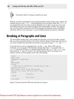
many templates the software uses. Figure 13-5 shows the basic administrative interface for
my Intuitive Life weblog. Again, other systems have similar configuration menus.
From a configuration perspective, the buttons on the left are the most important. Start with
WEBLOG CONFIG to ensure that the basics of your weblog name, archiving policy, whether
you allow people to add comments to your blogs, and similar settings are all set to your liking.
Then define your categories with CATEGORIES and finally move into the central design area,
TEMPLATES.
Ł
Think twice about allowing people to add comments to your weblog. In the last
year or so blogspam, junk postings to weblogs that promote unrelated sites or busi-
caution
nesses, has exploded. You can use some elegant solutions that you can learn more
about from the blog vendors, but you should anticipate that this could be a problem
as your site gets more popular.
Like many modern software systems, Movable Type is built atop a set of templates, essentially
HTML pages with lots of CSS sprinkled in, and a special scripting language that says “insert
new entry title here,” “insert entry here,” “link to archived articles here,” and so on. These are
a bit tricky to learn, but the good news is that many bloggers (as people who maintain weblogs
are called) never touch any of the scripting code and just focus instead on fine-tuning the
templates to get the look and feel they want.
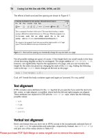
Figure 13-6 shows the list of the main templates, including the two RSS feed templates,
which I discuss a bit later in this chapter. For now, focus on the main templates. The RSS
material isn’t directly read by humans so you won’t have to touch it.
557386 Ch13.qxd 4/2/04 9:56 AM Page 299
299
Ł
Chapter 13: Site Development with Weblogs
Figure 13-5: The Movable Type administrative interface.
Figure 13-6: Editing templates in Movable Type.
557386 Ch13.qxd 4/2/04 9:56 AM Page 300
Ł
300
Creating Cool Web Sites with HTML, XHTML, and CSS
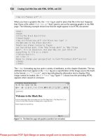
To edit a specific template, click on its name and something similar to Figure 13-7 is
displayed.
Figure 13-7: Viewing the CSS within Movable Type.
If you’re looking at Figure 13-7 and thinking that it looks a bit tedious, well, it is. Bloggers
who opt to really fine-tune their layout and site presentation end up spending a lot of time
getting everything to be attractive. But in defense of that, I have to say that I found the
process rather fun.
I have far too little space in this book to do justice to the complexity and capabilities of any
blogging tool, whether it’s a rudimentary hosting solution like Blogger or a sophisticated soft-
ware package like Movable Type. Instead, let me just share how easy it is to add a new entry
to the weblog after everything is configured properly!
Adding a weblog entry
The complexities of configuration are all worth it when you see how incredibly simple it is to
add a new entry to a weblog. On my browser, I have a favorites link that takes me directly to
the New Entry page. When I click that link (or click NEW ENTRY within any other area of
Movable Type), I’m taken to a page that looks like Figure 13-8:


