IELTS WRITING TASK 1 THEO DẠNG ĐỀ
Bạn đang xem bản rút gọn của tài liệu. Xem và tải ngay bản đầy đủ của tài liệu tại đây (566.68 KB, 52 trang )
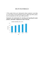
IELTS TASK 1 THEO DẠNG
1.
BAR CHART
Test Tip
When writing a Task 1 answer, it is important to describe numbers and
data in different ways to avoid repetition. You will be given credit for doing
this, as it will show you have a wider range of vocabulary.
ĐỀ BÀI VÀ BÀI MẪU
You should spend about 20 minutes on this task.
The chart below gives information about Someland's main exports in 2005,
2015,
and
future
projections
for
2025.
Summarise the information by selecting and reporting the main features,
and make comparisons where relevant.
Write at least 150 words.
Model answer
This bar chart illustrates the performance of Someland's primary exports in
2005 and 2015. It also indicates future projections for 2025. According to
the data, it seems likely that international tourism will become the
dominant industry, although dairy exports will remain strong. In 2005, we
can see that tourism was the greatest exports earner of the three industries,
with revenue standing at just over $6 billion.
This figure has increased slightly, so that now, in 2015, it has reached
almost $7 billion. It is estimated that international tourism will continue to
grow, so that by 2025, it will be earning around $8 billion for the country. In
2000, dairy exports were worth around $5 billion, but since then there has
been a dramatic increase, and sales for this year are approximately $8
billion. Experts are predicting that exports in this area may fall slightly, so a
figure of $7.5 billion is expected for 2025. Meat products are the third key
industry in Someland, but sales have dropped since 2000 and now stand at
$3.5 billion. It is expected that sales will continue to decrease in the future.
(187 words)
Writing Exam Tip
You do not have to write very long sentences to do well in your Writing test.
If sentences are too long, they will become less coherent and also make it
harder for you to control the grammar.
You should spend about 20 minutes on this task.
The chart below shows the number of travellers using three major airports
in
New
York
City
between
1995
and
2000.
Summarise the information by selecting and reporting the main features,
and make comparisons where relevant.
Write at least 150 words.
Model answer
The bar chart gives information about how many people visited New York
City through three major airports, over a six-year period between 1995 and
2000.
Overall, it can be seen that over the period, there was a fluctuant trend in
the number of passengers who travelled via John F. Kennedy airport, while
the other two airports saw an upward trend. Another interesting point is
that LaGuardia airport was the most popular at the end.
Looking at the detail, the number of travellers at John F. Kennedy airport
started at 26m in 1995, and then increased remarkably to reach the highest
point of 47m in 1997. In 1999, the figure dipped to 32m. At the last year,
there was a slight growth to 44m. On the other hand, LaGuardia began at
35m in 1995, after that it rose remarkably for the next three years, at 46m.
In 2000, LaGuardia hit the peak point at 68m travellers.
However, if we look at Newark airport, it started at the lowest point of 16m
passengers in the first year. After this point, the trend increased
significantly to 42m in 1998. In the last two years it remained stable at 42m
travellers.
(197 words)
You should spend about 20 minutes on this task.
The bar chart below shows shares of expenditures for five major categories
in the United States, Canada, the United Kingdom, and Japan in the year
2009.
Write a report for a university lecturer describing the information below.
Write at least 150 words.
Source: U.S. Bureau of Labor Statistics
Test Tip
In Writing Task 1, it is a good idea to end your answer by summarizing the
main information shown by the diagram. You are not required to explain
this information.
Read the following sample answer. Complete the answer by filling
the gaps with the words in the box.
by contrast
Indicates
lowest
compares
overall
Whereas
except
higher
highest
However
largest
among
The bar chart ........... how consumers in the United States, Canada, the
United Kingdom, and Japan allocated different shares of total spending to
categories such as food, housing, and transportation in 2009.
We can see that the United States had the ........... housing expenditure share,
26% of total expenditures in 2009. The United Kingdom and Japan followed,
with 24% and 22%, respectively. Canada had the ........... housing share at
21%. Housing was the ........... expenditure component in all
countries ........... Japan.
..........., Canada had the largest transportation share of all four countries at
20%. The United States and the United Kingdom had the next-highest
transportation shares, 17% and 15%, respectively. Japan had the lowest, at
10%.
..........., in Japan, consumers spent 23% of their total expenditures on food in
2009. The United Kingdom had the second-highest share at 20%. Canada,
with 15%, and the United States, with 14% had the lowest food expenditure
shares
among
the
countries
studied.
..........., the data ........... that housing and health care shares of total
expenditures were ........... in the United States than in Canada, the United
Kingdom, and Japan in 2009, ........... Americans had the lowest clothing
share. Canada had the highest clothing and transportation shares, and
Japan had the highest food share, ........... the countries compared.
Show Answers - Hide Answers
(214 words)
You should spend about 20 minutes on this task.
The chart below shows the percentage change in the share of international
students among university graduates in different Canadian provinces
between
2001
and
2006.
Summarise the information by selecting and reporting the main features,
and make comparisons where relevant.
Write at least 150 words.
Source: Statistics Canada, Postsecondary Student Information System
Test Tip
In Task 1 of the IELTS Writing modules, you may be asked to describe a
graph which shows changes over a period of time. To do this you need to use
language expressing change and appropriate tenses. In the exam, make
sure you leave time to edit your written answer. You will lose marks if you
make too many mistakes in grammar and vocabulary.
Model answer
The chart shows changes in the share of international students who
graduated from universities in different Canadian provinces over a period
of
5
years.
In 2001, this share had a relatively narrow range, from 3% in Ontario to
7.0% in New Brunswick. Nova Scotia had the second highest proportion at
6.5%. Five years later, the figures for most provinces had risen, with the
exception of Alberta. There, the figures fell by 1% to just over 4%.
By 2006, some parts of Canada experienced a considerable increase in their
share of international graduates. Growth in this share was especially strong
in the case of New Brunswick, where the figures rose from 7% to 12%. The
largest growth occurred in British Columbia, where it more than doubled to
11%.
Over this five-year period, changes in the proportion of international
graduates have been very uneven across the provinces of Canada. However,
New Brunswick remained the province with the highest percentage overall.
(158 words)
Test Tip
This chart does not provide information about population size. If you
choose to include information in your answer that is not given in the task,
you will not get extra marks. In fact, it may be considered irrelevant and
you may be penalised if you make detailed comments about information
that is not provided in the chart.
You should spend about 20 minutes on this task.
The chart below gives information about the most common sports played in
New
Zealand
in
2002.
Summarise the information by selecting and reporting the main features,
and make comparisons where relevant.
Write at least 150 words.
Model answer
The bar graph provides information about the most Common sports played
in New Zealand in 2002. It gives figures for both boys and girls and clearly
shows that their participation in sports is fairly equal. However, their
sporting preferences tend to be different.
According to the graph, the most popular sport among girls is netball, with
participation rates reaching 25 per cent. A similar percentage of boys
prefer soccer, which is clearly their favourite sport. Ten per cent of boys also
enjoy playing cricket but hardly any girls take part in this game. While
swimming is popular among both boys and girls, fewer boys participate in
this sport - about 13 per cent compared to approximately 22 per cent of
girls.
Other sports such as tennis, basketball and martial arts have lower levels of
popularity, and a significant percentage of boys and girls say they enjoy
sports not referred to on the chart.
(153 words)
IELTS Tip
1) Focus on the most important aspects of any data you are given. Do not
quote the data mechanically. Link your ideas together naturally while
referring
to
specific
data.
2) Think about the most significant changes over time or the key points of
comparison
between
different
categories.
3) Organise your description of the data around these key points, and
include any relevant secondary points.
You should spend about 20 minutes on this task.
The bar chart below shows the percentage of students who passed their
high school competency exams, by subject and gender, during the period
2010-2011.
Summarise the information by selecting and reporting the main features,
and make comparisons where relevant.
Write at least 150 words.
Students passing high school competency exams, by subject and gender,
2010-2011
*includes French, German and Spanish
Look at the graph and complete the following model answer by
writing NO MORE THAN THREE WORDS in each space.
Model answer
The graph shows the percentages of boys and girls who were successful in
their high school competency exams in the period from 2010 to 2011, by
subject.
Overall, students of both sexes .......... best in Computer Science, Mathematics,
and Foreign Languages, .......... French, German and Spanish. Results for boys
and girls were roughly .......... in Computer Science and Mathematics. In other
subjects, .........., there were some significant ...........
Girls achieved by far their .......... in Computer Science, with a pass rate
of .........., which was ..........than the boys. The difference was even .......... in
Chemistry, where .......... more girls passed. ..........subject where boys’ results
were better than girls was .......... where they achieved a pass rate of..........,
which was 10% higher than .......... for girls.
In general, .......... that during the period in question girls performed better in
most subjects in the competency exams than boys.
Writing Exam Tip
When you first see a bar chart, ask yourself the following questions:
1) What do the numbers on the
2) How is the information
3) What do the different
4)
When
was
vertical/horizontal axis measures?
grouped on the other axis?
shades of the bars show?
the
data
collected?
The answers will give you the essential information for understanding it.
Make sure you know which units are being used to measure quantities.
You should spend about 20 minutes on this task.
The chart below gives information about the UK's ageing population in
1985
and
makes
predictions
for
2035.
Summarise the information by selecting and reporting the main features,
and make comparisons where relevant.
Write at least 150 words.
Source: Office for National Statistics, National Records of Scotland,
Northern Ireland Statistics and Research Agency
Exam Tip
In Writing Task 1, it is essential to understand what the graph or chart is
representing. Look closely at the information in the instructions as well as
all
details
of
the
graph
or
chart.
The graph in this task shows the percentage of over 65s in each country of
the UK. The following are incorrect statements:
•
Wales had more over 65s than England. (The graph is in percentages,
not numbers)
•
Northern Ireland had 12% of over 65s in 1985. (The countries do not
add up to 100% so Northern Ireland did not have 12% of all over 65s. The
graph shows that 12% of thepopulation of Northern Ireland was over 65.)
Model answer
The graph shows how the size and distribution of the UK's ageing
population is likely to change over a 50-year period.
Overall, the proportions are predicted to increase in all UK countries. In
1985, 15 per cent of the UK population was over 65, but by 2035, this will
account
for
23
per
cent
of
the
total
population.
A closer look at the data reveals that the ageing population is expected to
rise more in some parts of the UK than in other. In 1985, Wales had the
highest percentage of people aged 65 and over, at 16 per cent. The secondlargest group could be found in England and the third in Scotland. Northern
Ireland had lowest proportion, with 12 per cent aged 65 and over.
By 2035, Wales is still going to have by far the greatest percentage of over
65s, with figures likely to reach 26 per cent. However, the biggest increases
in this age group, relative to the rest of the population, are predicted to
occur in Northern Ireland and Scotland. In Northern Ireland, for example,
this figure will increase almost double to 23 per cent.
(189 words)
You should spend about 20 minutes on this task.
The chart below gives information about science qualifications held by
people
in
two
countries.
Summarise the information by selecting and reporting the main features,
and make comparisons where relevant.
Write at least 150 words.
Model answer
The bar chart illustrates the percentage of people who hold a science
qualification in Singapore and Malaysia. A prominent feature is that a
significantly low percentage of people hold science qualifications, that is
Master’s and Bachelor’s degrees in science from university level studies in
both countries. Less than 5% of people hold a qualification in science at
Master’s degree level in both Singapore and Malaysia.
There is a significant difference in the percentage of people holding science
qualifications at Bachelor level between the two countries; while this
number is 20% in Singapore, in Malaysia it is a mere 10%. The percentage
of people with school leaving exams in science is slightly higher in Malaysia
than in Singapore. 35% of people in Malaysia have a science qualification
at this level, whereas the number in Singapore is 5% lower. Finally, more
than half the people in both countries hold no science qualification at all.
(152 words)
describing visual information in Task 1, it is important to think about what
tenses you will need. If the diagram includes time references (dates, years)
you will need a range of pastand present tenses. If the graph has no past
time reference, you will need to use the present simple tense only.
You should spend about 20 minutes on this task.
The graph below shows female unemployment rates in each country of the
United
Kingdom
in
2013
and
2014.
Summarise the information by selecting and reporting the main features,
and make comparisons where relevant.
Write at least 150 words.
Model answer
The bar chart shows the unemployment rates among women in the
countries that make up the United Kingdom, both in 2013 and in 2014.
There has generally been a small decrease in female unemployment rates
from
2013
to
2014,
except
in
Scotland.
In 2013, 5.6% of women in Northern Ireland were unemployed. The only
country with a smaller percentage of women unemployed was Wales, with a
rate of 5.4%. Both countries saw a decrease in the percentage of
unemployed women in 2014. In Northern Ireland, the percentage fell to
4.6%
and
in
Wales
it
fell
to
5%.
England had the greatest percentage of unemployed women in 2013, with
6.8%. However, this decreased by 0.3% in 2014. Lastly, Scotland was the
only country which had an increasing percentage of unemployed women. In
2013, it had 6.1% of women out of work. This increased to 6.7% in 2014,
making it the country with the highest female unemployment rate of the
four countries.
(160 words)
Vocabulary Tip
Notice
the
following
rules
words programme and program:
for
the
programme (UK
a
show
program (US
only)
only)
=
=
a
show
spelling
of
the
on
television
on
television
program (UK and US) = instructions for a computer (a verb and a noun)
You should spend about 20 minutes on this task.
The charts give information about two genres of TV programmes
watched by men and women and four different age groups in
Australia.
Summarise the information by selecting and reporting the main
features, and make comparisons where relevant.
Write at least 150 words.
IELTS Tip
•
With graphs, make sure you understand what each axis is measuring.
•
With bar and pie charts, there is often a key which tells you what
each different bar or area represents.
•
With tables, read the data across the rows and down the columns to
identify the key features.
Fill in the gaps in the model answer.
The charts give information about the genres of TV programmes that
Australian men and women and different age groups watch. It is clear from
the charts that women tend to watch ...........television than man overall,
although they watch slightly ........... game shows. The people who watch
the ........... television
are
in
the
45+
age
group.
Nearly 70% of women watch reality shows, which is almost ........... as many
as the percentage of men who choose this genre of programme.
Nevertheless, most age groups watch ........... reality shows than game shows
revealing that game shows are generally ........... popular than reality shows.
The percentage of people watching reality shows increases steadily from
ages 16 to 45 with the........... percentage of viewers, at just over 50% of the
age group 16-24 and the ........... percentage, at 68% of the over-45s.
However, the pattern is different for game shows. The number of
programmes watched by 25- to 44-year-olds is ........... lower than the
number watched by 16- to 24-year-olds and those over 45. Just over 50% of
16- to 24-year-olds watch game shows, but this share is not ........... high as
the share of people aged 45 and over watching game shows, at nearly 70%.
Only 41% of 35- to 44-year-olds watch game shows, and the share of 24- to
34-year-olds is ........... lower at 38%.
2. Line chart
IELTS Writing Task 1 #127
1)
This
is
a
formal
piece
of
writing.
2) Avoid using contractions (e.g. write it has decreased not it's decreased).
3) Avoid using very informal vocabulary (e.g. write it has become more
popular not it
has gotmore
popular).
4) Avoid using very informal punctuation, such as exclamation marks.
5) Try to use linking devices, such as In contrast, However, Moreover,
Similarly, to connect points.
You should spend about 20 minutes on this task.
The graph below shows relative price changes for fresh fruits and
vegetables, sugars and sweets, and carbonated drinks between 1978 and
2009.
Summarise the information by selecting and reporting the main features,
and make comparisons where relevant.
Write at least 150 words.
Data are from the Bureau of Labor Statistics and represent the U.S. city
averages for all urban consumers in January of each year.
Read the following model answer. Complete the answer by filling the
gaps with a word from the box below.
periodic
period
temporaril
remained and
y
Steady
steadily
by
From
trend
Model answer
The graph shows changes in the price of fresh fruits and vegetables, sugar
and sweets, and carbonated drinks over a thirty-year .......... in the US
between 1979 .......... 2009. The graph also shows the general .......... in the
consumer price index during this time.
While the consumer price index showed a slow and .......... increase from
1979 to 2009, the same cannot be said for the price of carbonated, or soft
drinks. After rising briefly between 1979 and 1981, they .......... fairly
constant until 1999, when the price did begin to increase slowly.
In contrast, there was a marked difference in the price of fresh fruits
vegetables, which, despite.......... fluctuations, rose .......... throughout
period. In fact, fresh food prices only levelled out.......... between 1990
1992 and again .......... 2000 to 2001. However, .......... 2008 the price
increased by more than 300%.
and
this
and
had
You should spend about 20 minutes on this task.
The line graph below shows the changes in the share price of Outokumpu
companies in euros between January 2006 and December 2010.
Write a report for a university lecturer describing the information below.
Write at least 150 words.
Source: NASDAQ OMX Helsinki
Test Tip
Work out how much space 150 of your words take on a page. This can save
you having to count. Make sure your handwriting is neat and legible.
Model answer
The graph shows the changes and a decline overall in the share price of
Outokumpu in a five-year period from January 2006 through December
2010.
At the beginning of this period the share price was at EUR 13 per share.
There were several fluctuations until late 2006 when there was a sudden
increase from EUR 21 to EUR 31. This higher price did not last long,
however, and it fell before rising strongly again in 2008. From mid-2008
there was a sharp downward trend through the end of the year when it fell
to the lowest point in this period at just over EUR 7 per share. After that the
share price recovered and, despite some fluctuations, continued to rise until
it reached a peak of EUR 17 in early 2010. Until late 2010 the trend was
downward again, ending the year at just over EUR 12.
Outokumpu made significant gains and losses during this period but overall
lost around EUR 1 per share.
(164 words)
IELTS Tip
You will increase your Writing Band Score in Academic Writing Task 1 if
you:
•
Mention all the major features of the statistics or charts
•
Make sure you describe the statistics accurately
•
Paraphrase the information in the question
•
•
Avoid repeating the same words and phrases and try to vary the
sentence structures you use
Give an overview of the most important trends or patterns
Related Topic: Twenty tips for IELTS success
You should spend about 20 minutes on this task.
The graph below shows the number of books read by men and women at
Burnaby
Public
Library
from
2011
to
2014.
Summarise the information by selecting and reporting the main features,
and make comparisons where relevant.
Write at least 150 words.
Model answer
The graph gives information about Burnaby Public Library between 2011
and 2014. It shows how many library books people read over this four-year
period.
As can be seen from the graph, there were different trends for men and
women. The number of books read by men increased steadily between 2011
and 2012, from about 3000 to 4000. After that, the number rose
dramatically to 14000 books in 2014. This was the highest figure in the
period.
Women started off reading more books than men, but their numbers
followed a different pattern. Between 2011 and 2012, there was an increase
of 3000 from 5000 books to 8000 books, and then a gradual rise to 10000
books in 2013. However, in 2014, their numbers fell back to 8000 again.
Overall, there was a strong upward trend in the number of books read by
men. Although women read more books than men in 2011, their reading fell
to below the level of men in 2014.
(162 words)
IELTS Tip: Useful language for describing trends
to
experience
a(n)
[increase/decrease/rise/fall/drop
in/of]
to
[increase/decrease/rise/fall/drop
by/from
…
to]
to fluctuate / undergo a change / remain [stable/steady] / stagnate / dip /
peak
/
increase
[twofold/threefold]
/
surge
a [less/more] marked [increase/decrease], etc. (occurred / took place)
[less/more] significant / steady / especially strong growth
a
parallel
[rise/fall]
to expect / predict / forecast
You should spend about 20 minutes on this task.
The line graph below shows the percentage of tourists to England who
visited
four
different
attractions
in
Brighton.
Summarise the information by selecting and reporting the main features,
and make comparisons where relevant.
Write at least 150 words.
Model answer
The line graph shows the percentage of tourists to England who visited
certain Brighton attractions between 1980 and 2010. We can see that in
1980 and in 2010 the favourite attractions were the pavilion and the
festival. In 1980 the least popular attraction was the pier but in 2010 this
changed and the art gallery was the least popular.
During the 1980s and 1990s there was a sharp increase in visitors to the
pavilion from 28% to 48% and then the percentage gradually went down to
31% in 2010. The trend for the art gallery was similar to the pavilion.
Visitors increased rapidly from 22% to 37% from 1980 to 1985 then
gradually decreased to less than 10% over the next twenty-five years. The
number of tourists who visited the Brighton Festival fluctuated slightly but
in general remained steady at about 25%. Visitors to the pier also
fluctuated from 1980 to 2000 then rose significantly from 12% to 22%
between 2000 and 2010.
(163 words)
IELTS Tip
You will lose marks if you make grammatical errors in your writing,
particularly when errors are frequent and effect meaning. Be careful of the
following
common
mistakes
when
describing
numbers.
amount and number: amount is used with uncountable nouns; number is
used with countable nouns, e.g. The amount of meat consumed in China
between
1985
and
2010. NOT number
of
meat.
per
cent and percentage: per
cent is
always
used
with
a
number; percentage is used on its own without a number,
e.g. The percentage of male teachers in the UK. NOT the per cent of male
teachers. According to the graph, four per cent of the total household
budget went towards transportation. NOT four percentage.
You should spend about 20 minutes on this task.
The graph below shows the amount of money spent on books in Germany,
France,
Italy
and
Austria
between
1995
and
2005.