Android user interface design implementing material design for developers 2nd edition
Bạn đang xem bản rút gọn của tài liệu. Xem và tải ngay bản đầy đủ của tài liệu tại đây (43.86 MB, 736 trang )
About This E-Book
EPUB is an open, industry-standard format for e-books. However, support for EPUB and its many
features varies across reading devices and applications. Use your device or app settings to customize
the presentation to your liking. Settings that you can customize often include font, font size, single or
double column, landscape or portrait mode, and figures that you can click or tap to enlarge. For
additional information about the settings and features on your reading device or app, visit the device
manufacturer’s Web site.
Many titles include programming code or configuration examples. To optimize the presentation of
these elements, view the e-book in single-column, landscape mode and adjust the font size to the
smallest setting. In addition to presenting code and configurations in the reflowable text format, we
have included images of the code that mimic the presentation found in the print book; therefore, where
the reflowable format may compromise the presentation of the code listing, you will see a “Click here
to view code image” link. Click the link to view the print-fidelity code image. To return to the
previous page viewed, click the Back button on your device or app.
Android™ User Interface Design
Implementing Material Design for Developers
Second Edition
Ian G. Clifton
New York • Boston • Indianapolis • San Francisco
Toronto • Montreal • London • Munich • Paris • Madrid
Cape Town • Sydney • Tokyo • Singapore • Mexico City
Many of the designations used by manufacturers and sellers to distinguish their products are claimed
as trademarks. Where those designations appear in this book, and the publisher was aware of a
trademark claim, the designations have been printed with initial capital letters or in all capitals.
The author and publisher have taken care in the preparation of this book, but make no expressed or
implied warranty of any kind and assume no responsibility for errors or omissions. No liability is
assumed for incidental or consequential damages in connection with or arising out of the use of the
information or programs contained herein.
For information about buying this title in bulk quantities, or for special sales opportunities (which
may include electronic versions; custom cover designs; and content particular to your business,
training goals, marketing focus, or branding interests), please contact our corporate sales department
at or (800) 382-3419.
For government sales inquiries, please contact
For questions about sales outside the U.S., please contact
Visit us on the Web: informit.com/aw
Library of Congress Control Number: 2015950113
Copyright © 2016 Pearson Education, Inc.
All rights reserved. Printed in the United States of America. This publication is protected by
copyright, and permission must be obtained from the publisher prior to any prohibited reproduction,
storage in a retrieval system, or transmission in any form or by any means, electronic, mechanical,
photocopying, recording, or likewise. To obtain permission to use material from this work, please
submit a written request to Pearson Education, Inc., Permissions Department, 200 Old Tappan Road,
Old Tappan, New Jersey 07675, or you may fax your request to (201) 236-3290.
Google is a registered trademark of Google, Inc.
Android, Chromecast, Gmail, Google Maps, Google Play, and Nexus are trademarks of Google, Inc.
Amazon and Kindle Fire are registered trademarks of Amazon.com, Inc.
Java is a registered trademark of Oracle and/or its affiliates.
Illustrator and Photoshop are registered trademarks of Adobe Systems Incorporated.
ISBN-13: 978-0-134-19140-9
ISBN-10: 0-134-19140-4
Text printed in the United States on recycled paper at RR Donnelley in Crawfordsville, Indiana.
First printing: November 2015
Editor-in-Chief
Mark Taub
Executive Editor
Laura Lewin
Development Editor
Songlin Qiu
Managing Editor
Kristy Hart
Project Editor
Namita Gahtori
Copy Editor
Cenveo® Publisher Services
Indexer
Cenveo Publisher Services
Proofreader
Cenveo Publisher Services
Technical Reviewers
Cameron Banga
Joshua Jamison
Adam Porter
Editorial Assistant
Olivia Basegio
Cover Designer
Chuti Prastersith
Compositor
Cenveo Publisher Services
Dedicated to those who care about user experience
Contents at a Glance
Introduction
Part I The Basics of Android User Interfaces
1 Android UI and Material Design
2 Understanding Views—The UI Building Blocks
3 Creating Full Layouts With View Groups and Fragments
4 Adding App Graphics and Resources
Part II The Full Design and Development Process
5 Starting A New App
6 Prototyping and Developing the App Foundation
7 Designing the Visuals
8 Applying the Design
9 Polishing with Animations
Part III Advanced Topics for Android User Interfaces
10 Using Advanced Techniques
11 Working with the Canvas and Advanced Drawing
12 Developing Custom Views
13 Handling Input and Scrolling
Appendix A Google Play Assets
Appendix B Common Task Reference
Index
Contents
Introduction
Audience for This Book
Organization of This Book
How to Use This Book
This Book’s Website
Conventions Used in This Book
Part I The Basics of Android User Interfaces
1 Android UI and Material Design
A Brief History of Android Design
Material Design
The Android Design Website
Core Principles
Standard Components
Supporting Multiple Devices
Avoiding Painful Mistakes
Summary
2 Understanding Views—The UI Building Blocks
What Is a View?
Displaying Text
Displaying Images
Views for Gathering User Input
Other Notable Views
Listening to Events
Other Listeners
Summary
3 Creating Full Layouts With View Groups and Fragments
Understanding ViewGroup and the Common Implementations
Encapsulating View Logic with Fragments
The Support Library
Summary
4 Adding App Graphics and Resources
Introduction to Resources in Android
Resource Qualifiers
Understanding Density
Supported Image Files
Nine-Patch Images
XML Drawables
Other Resources
Summary
Part II The Full Design and Development Process
5 Starting A New App
Design Methods
Defining Goals
High-Level Flow
Wireframes
Continuing with Content Pieces
Summary
6 Prototyping and Developing the App Foundation
Organizing into Activities and Fragments
Creating the First Prototype
Evaluating the First Prototype
Summary
7 Designing the Visuals
Wireframes and Graphical Design
Tools
Styles
Lighting
Colors
Text Considerations
Other Considerations
Designing Step-by-Step
Summary
8 Applying the Design
Working with the Designer
Slicing the Graphics Assets
Themes and Styles
Breaking Comps into Views
Developing the Woodworking App
Basic Testing Across Device Types
Summary
9 Polishing with Animations
Purpose of Animations
View Animations
Property Animations
Property Animation Control
ViewPropertyAnimator
Animating Form Errors
Animating Icons
Simple Transitions
Summary
Part III Advanced Topics for Android User Interfaces
10 Using Advanced Techniques
Identifying Jank
Using Systrace to Understand Jank
Optimizing Images
Additional Performance Improvements
Hierarchy Viewer
Custom Fonts
Complex TextViews
RecyclerView
Summary
11 Working with the Canvas and Advanced Drawing
Creating Custom Drawables
Paint
Canvas
Working with Text
Working with Images
Color Filters
Shaders
Summary
12 Developing Custom Views
General Concepts
Measurement
Layout
Drawing
Saving and Restoring State
Creating a Custom View
Summary
13 Handling Input and Scrolling
Touch Input
Other Forms of Input
Creating a Custom View
Summary
Appendix A Google Play Assets
Application Description
The Change Log
Application Icon
Screenshots
Feature Graphic
Promotional Graphic
Video (YouTube)
Promoting Your App
Amazon Appstore
Appendix B Common Task Reference
Dismissing the Software Keyboard
Using Full Screen Mode
Keeping the Screen On
Determining the Device’s Physical Screen Size
Determining the Device’s Screen Size in Pixels
Determining the Device DPI
Checking for a Network Connection
Checking if the Current Thread Is the UI Thread
Custom View Attributes
Index
Preface
Android has evolved at an incredible speed, and keeping up with the changes is a difficult job for any
developer. While working to keep up with the latest features and API changes, it can be easy to
neglect the design changes Android is undergoing. When Google announced the Material Design
guidelines, even designers who had long dismissed Android’s visuals started paying attention.
It’s more important than ever for Android developers to understand the core aspects of design and the
Material Design guidelines go some of the way toward making that possible; however, without years
of background in design, it can be difficult to make sense of everything. This book will guide you
through the real-world process of design starting from an abstract idea and sketches on paper and
working all the way through animations, RenderScript, and custom views. The idea is to touch on
each of the core concepts and cover enough so that you can have productive conversations with
designers or even create everything yourself.
Design has many purposes, but two of the most important are usability and visual appeal. You want
brand-new users to be able to jump into your app and get started without any effort because mobile
users are more impatient than users of nearly any other platform. Users need to know exactly what
they can interact with, and they need to be able to do so in a hurry while distracted. That also means
you have to be mindful of what platform conventions are in order to take advantage of learned
behavior.
If you have picked up this book, I probably do not need to go on and on about how important design
is. You get it. You want to make the commitment of making beautiful apps that are a pleasure to use.
This book will serve as a tutorial for the entire design and implementation process as well as a handy
reference that you can keep using again and again. You will understand how to talk with designers
and developers alike to make the best applications possible. You will be able to make apps that are
visually appealing while still easy to change when those last-minute design requests inevitably come
in.
Ultimately, designers and developers both want their apps to be amazing, and I am excited to teach
you how to make that happen.
—Ian G. Clifton
Acknowledgments
You would think that the second edition of a book would be easier than the first, but when you find
yourself rewriting 90 percent of it because both the technology and design trends are changing so
rapidly, it helps to have assistance. Executive Editor, Laura Lewin, once again helped keep me on
track even as I restructured the book and dove in depth in places I didn’t originally expect. Olivia
Basegio, the Editorial Assistant, kept track of all the moving pieces, including getting the Rough Cuts
online so that interested readers could get a glimpse into the book as it evolved. Songlin Qiu was the
Development Editor again and took on the task of making sense of my late-night draft chapters. I am
also extremely appreciative of the work done by the technical reviewers, Adam Porter, Cameron
Banga, and Joshua Jamison, whose feedback was instrumental in the quality of this book.
About the Author
Ian G. Clifton is a professional Android application developer, user experience advocate, and
author. He has worked with many developers and designers, and led Android teams, creating wellknown apps such as Saga, CNET News, CBS News, and more.
Ian’s love of technology, art, and user experience has led him along a variety of paths. In addition to
Android development, he has done platform, web, and desktop development. He served in the U.S.
Air Force as a Satellite, Wideband, and Telemetry Systems Journeyman and has also created quite a
bit of art with pencil, charcoal, brush, camera, and even wood.
You can follow Ian G. Clifton on Twitter at and see his thoughts about
mobile development on his blog at . He also published a video series
called “The Essentials of Android Application Development LiveLessons, 2nd Edition,” available at
/>
Introduction
Audience for This Book
This book is intended primarily for Android developers who want to better understand user interfaces
(UI) in Android. To focus on the important topics of Android UI design, this book makes the
assumption that you already have a basic understanding of Android, so if you haven’t made a “Hello,
World” Android app or set up your computer for development, you should do so before reading this
book (the Android developer site is a good place to start:
/>Most developers have limited or no design experience, so this book makes no assumptions that you
understand design. Whenever a design topic is important, such as choosing colors, this book will
walk you through the basics, so that you can feel confident making your own decisions and understand
what goes into those decisions.
Organization of This Book
This book is organized into a few parts. Part I, “The Basics of Android User Interface,” provides an
overview of the Android UI and trends before diving into the specific classes used to create an
interface in Android. It also covers the use of graphics and resources. Part II, “The Full Design and
Development Process,” mirrors the stages of app development, starting with just ideas and goals,
working through wireframes and prototypes, and developing complete apps that include efficient
layouts, animations, and more. Part III, “Advanced Topics for Android User Interfaces,” explores
much more complex topics including troubleshooting UI performance problems with Systrace and
creating custom views that handle drawing, scrolling, and state saving.
This book also has two appendices. The first focuses on Google Play assets (and covers the
differences to know about when preparing for the Amazon Appstore as well), diving into app icon
creation. The second covers a variety of common UI-related tasks that are good to know but don’t
necessarily fit elsewhere (such as custom view attributes).
The emphasis throughout is on implementation in simple and clear ways. You do not have to worry
about pounding your head against complex topics such as 3D matrix transformations in OpenGL;
instead, you will learn how to create smooth animations, add PorterDuff compositing into your
custom views, and efficiently work with touch events. The little math involved will be broken down,
making it simple. In addition, illustrations will make even the most complex examples clear, and
every example will be practical.
How to Use This Book
This book starts with a very broad overview before going into more specific and more advanced
topics. As such, it is intended to be read in order, but it is also organized to make reference as easy as
possible. Even if you’re an advanced developer, it is a good idea to read through all the chapters
because of the wide range of material covered; however, you can also jump directly to the topics that
most interest you. For example, if you really want to focus on creating your own custom views, you
can jump right to Chapter 12, “Developing Custom Views.”
This Book’s Website
This Book’s Website
You can find the source code for the examples used throughout this book at
and the publisher’s website at
From there, you can clone the entire repository, download a full ZIP file, and
browse through individual files.
Conventions Used in This Book
This book uses typical conventions found in most programming-related books. Code terms such as
class names or keywords appear in monospace font. When a class is being referred to
specifically (e.g., “Your class should extend the View class”), then it will be in monospace font. If
it’s used more generally (e.g., “When developing a view, don’t forget to test on a real device”), then
it will not be in a special font.
Occasionally when a line of code is too long to fit on a printed line in the book, a code-continuation
arrow ( ) is used to mark the continuation.
You will also see some asides from time to time that present useful information that does not fit into
flow of the main text.
Note
Notes look like this and are short asides intended to supplement the material in the book
with other information you may find useful.
Tip
Tips look like this and give you advice on specific topics.
Warning: Potential Data Loss or Security Issues
Warnings look like this and are meant to bring to your attention to potential issues you
may run into or things you should look out for.
Part I: The Basics of Android User Interfaces
Chapter 1. Android UI and Material Design
It is a good idea to have an overview of the user interface (UI) as it pertains to Android, so that’s the
starting point here. You will learn a brief history of Android design to see how it evolved to Material
Design before diving into some core design principles. You will also learn some of the high-level
components of Android design and some of the changes that have come to Android design as the
world’s most popular mobile operating system has evolved.
A Brief History of Android Design
Android had a very technical start with a lot of amazing work going on to make it a platform that
could run on a variety of devices without most apps having to care too much about the details. That
base allowed Android to handle many types of hardware input (trackballs, hardware directional
pads, sliding keyboards, touch interface, and so on). It also kept Android largely focused on scalable
design, much more closely related to fluid web design than typical mobile design. The underlying
code could even handle running on a device that did not have a graphics processing unit (GPU).
Unfortunately, all of that also meant that early design for Android was blasé and focused on the
lowest common denominator, so embellishments like animations were sparse. Colors were bland and
often inconsistent, and most input and visual organization was based on what had been done in the
past rather than pushing things forward.
In 2010, Google hired Matias Duarte (most known for his excellent work with WebOS) as the Senior
Director of Android User Experience, which made it clear that Google had become serious about the
user experience for Android and its related visual design. The Android beta was released way back
in 2007, so Matias and his colleagues had a lot of work in front of them. How do you go from a very
functional but visually bland UI to one that enhances that functionality by improving the entire design
and user experience?
About a year later, the first Android tablets running Honeycomb (Android 3.0) were revealed. These
tablets gave Google the opportunity to really experiment with the UI because there was no prior
version of Android that had been designed for tablets, and therefore users did not have strong
expectations. With the radical new Holo theme, these tablets were a significant departure from the
previous Android styles.
By the end of 2011, Google had revealed Android 4.0, Ice Cream Sandwich, which showed how they
were able to improve the tablet-only Honeycomb styling to tone down some of the “techieness” and
smooth out the user experience. The tablet/phone divide was eliminated and the platform was brought
together in a much more cohesive manner, emphasizing interaction, visuals, and simplicity. Even the
default system font changed to the newly created Roboto, significantly improving on the previous
Droid fonts. Regardless of whether you are the kind of person who gets giddy over straight-sided
Grotesk sans serif fonts, you will appreciate the attention to detail this font signifies.
Android 4.1, Jelly Bean, was revealed at Google I/O in 2012. A release focused primarily on
usability, Jelly Bean gave Android a much better sense of polish. “Project Butter” brought about a
much more fluid user experience with graphics improvements such as triple buffering. Even
components of Android that hadn’t been touched in years, such as notifications, were updated to
improve the user experience. Android 4.2 came just a few months later, with support for multiple
users, the “Daydream” feature (essentially, application-provided screensavers with the ability to be
interactive), support for photo spheres (panoramas that can cover 360 degrees), and wireless
mirroring. Android 4.3 followed with many more features, including OpenGL ES 3.0 support.
Android 4.4 finished off the 4.x version with major system improvements, allowing Android to run on
devices with as little as 512MB of RAM.
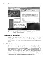
Then, Android undertook a radical change for version 5.0, Lollipop, with the introduction of Material
Design. See how the home screen has changed from Android 1.6 to Android 5.0 in Figure 1.1.
Figure 1.1 The home screen for Android 1.6 (top left), 2.3 (top right), 4.2 (bottom left), and 5.0
(bottom right)
Material Design
Although Android 5.0 and Material Design are closely linked, Material Design isn’t just a design
language for Android 5.0 and beyond. It is meant to be a set of design principles that apply across
device types and arbitrary software versions. That means best practices from Material Design should
be applied to older versions of Android and even web apps. Google describes it this way:
A material metaphor is the unifying theory of a rationalized space and a system of motion.
The material is grounded in tactile reality, inspired by the study of paper and ink, yet
technologically advanced and open to imagination and magic.
If you’re like most nondesigners, your immediate reaction is “What?” It is easy to dismiss this type of
statement as just “designer fluff” and not appreciate the meaning, but designers have guiding
principles that are meant to make their work better and more coherent just like developers (who have
principles such as “Don’t repeat yourself”). Google’s description is saying that Material Design is
based on real paper and ink, but it isn’t limited to just what those elements can do in the physical
world.
General Concepts
In the Material Design world, paper is the primary surface that everything else exists on. It can grow
and shrink, unlike paper in the real world. That means a piece of paper can appear in the center of the
screen by growing from a single pixel to its full size and it can even change shape. Paper always
shows up with some kind of transition (growing or sliding into place); it is never just suddenly there
at full size. Pieces of paper can push each other when their edges collide. Pieces of paper can be split
into two, and multiple pieces can join to become one. A sheet of paper can never go through another,
but one sheet of paper can slide over another.
The fact that paper can slide in front of other paper means that Material Design exists in a 3D
environment. The third dimension, plotted on the Z-axis, is how close the object is to the surface of
the screen, which affects the shadow it casts and whether it is in front of or behind another piece of
paper. Material Design treats the Z-axis as very finite, meaning that there is no significant amount of
depth that can be shown (just how many pieces of paper thick is your actual screen?). This limitation
means that differences in depth are much more noticeable. Paper is always one density-independent
pixel thick (the concept of density-independent pixels, or dips, is covered in detail in Chapter 4,
“Adding App Graphics and Resources,” but you can simply think of a dip as a unit for now), which
means that it does not bend or fold.
Devices don’t (yet) have a third dimension to their screens, so this depth is created with the
traditional techniques of perspective, obscuring (sometimes called occlusion), and shadow. As
shown in Figure 1.2, an object closer to the surface is bigger than the same object at a lower level.
An object that is in front of another obscures some or all of what it is behind it just like in Figure 1.3.
A closer object casts a shadow as demonstrated in Figure 1.4. Combining these simple principles
means that you get a much clearer picture of the depth of objects as shown in Figure 1.5.
Figure 1.2 Simple perspective means closer objects are larger, but with that cue alone it is unclear
if an object is closer or just larger than the others
Figure 1.3 Obscuring allows you to show that one object is in front of another, but it doesn’t tell
you how much in front
Figure 1.4 A simple shadow can indicate that an object is closer, but the lack of a size change (due
to perspective) can create confusion
Figure 1.5 When you combine all of these principles, it is much more obvious that the middle item
is closer even with the outside pieces of paper being raised from the surface slightly
Shadows in Material Design are created by two light sources: a key light and an ambient light. If you
imagine taking a quick photo of someone with your phone, the flash is the key light and all the other
light is ambient. The key light is what creates the strong, directional shadows. The ambient light
creates soft shadows in all directions. The key light is coming from the top center of the screen,
casting shadows down from paper; this also means that these bottom shadows are slightly more
pronounced for paper that is at the bottom of the screen because the light is at a sharper angle. This
sort of subtle visual detail goes almost unnoticed, but it enhances the consistency of the artificial
environment and makes the shadows appear that little bit more realistic. To better understand what
this means, see Figure 1.6, which demonstrates these concepts in the 3D environment.
Figure 1.6 3D rendering of a Material Design app
In addition to paper, ink is the other major component of Material Design. Ink is what colors paper
and creates text on paper. It has no thickness. It can move around on a piece of paper (e.g., a photo
can move from the top to the bottom of a piece of paper or grow from a thumbnail to a larger photo on
that paper). It can grow or shrink, and change color or shape. It is generally bold and purposeful.
Many apps have been designed with very subdued colors or even just shades of gray, but Material
Design calls for a vibrancy to the design. Chapter 7, “Designing the Visuals,” discusses color choice
in detail.
Interaction and Animation
One of the most important aspects of app design that is often ignored is interaction. What happens
when the user touches this button? Sure, it shows a new screen, but what is the process to get there?
Does the button grow or shrink or change color? Does the new content slide in or grow from the old
content? Material Design puts much more emphasis on interaction and animation than previous design
guidelines, which will help make your apps feel well polished.
Touch events in the past were often expressed with a simple background color change. Tapping a row
in a list might have caused the background to suddenly go from white to orange or blue. Material
Design is about natural transitions, so the typical touch reaction is a ripple. You can imagine dropping
a rock in a pond and seeing the water ripples move outward from that point; that is similar to the
response of an interactive element in Material Design. In addition, an item’s paper can react. If a
standalone piece of paper reacts to touch, the whole paper rises up as if eager to meet the finger. This
is important to note because it is the opposite of traditional design where objects like buttons are
pushed down in an effort to mimic the physical world (called skeuomorphic design).
Animations should be fluid and accelerate or decelerate where appropriate. Just like how a car