The Web Form Controls
Bạn đang xem bản rút gọn của tài liệu. Xem và tải ngay bản đầy đủ của tài liệu tại đây (22.93 KB, 3 trang )
The Web Form Controls
In this section, you'll see a summary of the various Web form controls that you can pick
from the Toolbox's Web Forms Section. Table 15.1
summarizes the controls.
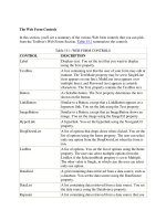
Table 15.1: WEB FORM CONTROLS
CONTROL DESCRIPTION
Label Displays text. You set the text that you want to display
using the Text property.
TextBox A box containing text that the user of your form may edit at
runtime. The TextMode property may be set to SingleLine
(text appears on one line), MultiLine (text appears over
multiple lines), and Password (text appears as asterisk
characters). The Text property contains the TextBox text.
Button A clickable button. The Text property determines the text
shown on the button.
LinkButton Similar to a Button, except that a LinkButton appears as a
hypertext link. You set the link using the Text property.
ImageButton Similar to a Button, except that an ImageButton shows an
image. You set the image using the ImageUrl property.
HyperLink A hyperlink. You set the hyperlink using the NavigateUrl
property.
DropDownList A list of options that drops down when clicked. You set the
list of options using the Items property. The user can select
only one option from the DropDownList when the form is
run.
ListBox A list of options. You set the list of options using the Items
property. The user can select multiple options from the
ListBox if the SelectionMode property is set to Multiple.
The other value is Single, in which case the user can select
only one option.
DataGrid A grid containing data retrieved from a data source, such as
a database. You set the data source using the DataSource
property.
DataList A list containing data retrieved from a data source. You set
the data source using the DataSource property.
Repeater A list containing data retrieved from a data source that you
Table 15.1: WEB FORM CONTROLS
CONTROL DESCRIPTION
set using the DataSource property. Each item in the list may
be displayed using a template. A template defines the
content and layout of the items in the list.
CheckBox A check box contains a Boolean true/false value that is set
to true by the user if they check the box. The Checked
property indicates the Boolean value currently set in the
check box.
CheckBoxList A multiple-selection check box. You set the list of check
boxes using the Items property.
RadioButton A radio button contains a Boolean true/false value that is set
to true by the user if they press the button. The Checked
property indicates the Boolean value currently set in the
radio button.
RadioButtonList A group of radio buttons. You set the list of radio buttons
using the Items property.
Image Displays an image that you set using the ImageUrl property.
Panel A container for other controls.
PlaceHolder A container for controls that you can create at runtime;
these are known as dynamic controls.
Calendar Displays a calendar for a month and allows a user to select
a date and navigate to the previous and next month. You
use the SelectedDate property to get or set the selected date,
and you use the VisibleDate property to get or set the month
currently displayed.
AdRotator Displays banner advertisements. Details on the
advertisements, such as the image, URL when clicked, and
frequency of display, are set in an XML file that you set
using the AdvertisementFile property.
Table Displays a table of rows, which you set using the Rows
property.
RequiredFieldValidator Used to ensure that the user has specified some input for a
control. You set the control to validate using the
ControlToValidate property. You'll see an example that
uses a validation control shortly.
CompareValidator Used to compare an entry made by a user in one control
with another control or a constant value. You set the control
Table 15.1: WEB FORM CONTROLS
CONTROL DESCRIPTION
to validate using the ControlToValidate property (this
control contains the value entered by the user). You set the
control to compare against using the ControlToCompare
property or the ValueToCompare property. You set the
operator for the comparison using the Operator property.
RangeValidator Used to ensure that the user has entered a value within a
specified range in a control. You set the control to validate
using the ControlToValidate property, and the range of
values using the MinimumValue and MaximumValue
properties.
RegularExpressionValidator Used to ensure that the user has entered a value that
satisfies a specified regular expression. You set the control
to validate using the ControlToValidate property, and the
regular expression using the ValidationExpression property.
CustomValidator Used to perform your own custom validation for the value
entered by a user. You set the control to validate using the
ControlToValidate property, and your function to use in the
validation using the ClientValidationFunction property.
ValidationSummary Used to display a summary of all validation errors on the
Web form and/or a message box. You set whether you want
to show the errors on your Web form using the
ShowSummary property and whether you want to show the
errors in a message box using the ShowMessageBox
property.
XML Displays the contents of an XML file. You set the XML file
to display using the DocumentSource property.
Literal Displays static text. You set the text to display using the
Text property.
You'll see how to use some of these controls in the rest of this chapter.


