Tài liệu Figure Drawing - Compostion doc
Bạn đang xem bản rút gọn của tài liệu. Xem và tải ngay bản đầy đủ của tài liệu tại đây (2.54 MB, 34 trang )
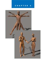
CHAPTER 6
Composition
✎
99
T
here are two basic decisions that an artist has to make with regard to
figure drawing.
1. What to put into the drawing
2. How to arrange the elements in the drawing
These two major decisions are the foundation of composition. From an artis-
tic standpoint, composition means the arrangement or design of a picture. It
is the process of selecting what to draw and then deciding how to draw it. In
the last chapter, we covered posing the figure, which is an element of compo-
sition but does not take into account the rest of the picture area.
100
Figure Drawing with Virtual Models
The Picture
Plane
Whether you are drawing with a
pencil on a piece of paper or using
a digitizing pad and stylus on a
computer to create your figure
drawing, you are working in what
is called a two-dimensional medium.
In other words, the drawing sits on
a flat surface. This flat surface is
called the picture plane. Another
way to think of it is that if you
were to frame your drawing, the
area inside the frame and mat
would be the picture plane.
To be good at composing your
drawings, you need to take full
responsibility for the picture plane.
In other words, every square inch
of the drawing should be con-
sciously arranged under your
direction. I know that might seem
obvious because you are drawing
the picture, but how many times
have you started a drawing only to
find that it doesn’t fit on the paper?
Compositions can be good or bad.
The goal of the artist in creating a
good drawing is to make the com-
position good. For someone new to
art, composition might seem like a
mystery, but like organizing any-
thing from your taxes to your daily
schedule, organizing a picture is
understandable if you know a few
fundamental principles.
✎
Purpose
✎
Placement
✎
Balance
✎
Focal points
✎
Pathways
In many ways, organizing a picture
is similar to organizing your daily
schedule. First you have to lay out
the reason or purpose for the
planned tasks. Next you have to
place the tasks within the available
time. Each task has to be balanced
with all of the other tasks and obli-
gations. You must focus on impor-
tant tasks in order to complete
them, and there must be clear
avenues or pathways to go from
one task to another.
Purpose
Years ago when I was attending
school, I had an English professor
who taught me an important les-
son about art and life. At the
beginning of the term a student
asked him about the importance of
spelling and grammar. His reply
was that while he felt those things
were important, he didn’t really
care if there were a few mechanical
mistakes in the work we turned in
for our assignments in the class.
He was more interested in whether
we had anything to say. In other
words, he wanted us to do what I
call meaningful writing: He wanted
our work to mean something. His
feeling was that he would rather
see a meaningful paper with a few
mechanical errors than a well-
crafted paper of meaningless prose.
That day the professor opened up a
new dimension in my thoughts
about writing. In many of my pre-
vious English classes, I was so
stressed over getting the spelling
right or trying to decipher the mys-
teries of English grammar that I
never felt truly free to express
myself. It made me think about my
art and how I would often get
caught up in the mechanics and
forget having a purpose for my pic-
tures. The result was that while I
did okay with proportions and
shading, my work lacked inspira-
tion.
Every drawing can and should
have a purpose. The purpose
might be as simple as seeing an
interesting pose and drawing it. Or
the purpose might be that the artist
has a specific agenda, message, or
feeling that is expressed in the art.
101
Composition
In commercial art the purposes are
almost always well-defined. The
purpose is part of the assignment
the artist is given. Sell this car.
Convey this thought. Draw this
building. Express this feeling.
Draw attention to this product. All
of these things are challenges for
the commercial artist, and many of
them are accomplished by the use
of figure drawing. The architect
uses people in his pictures to rep-
resent scale. The illustrator might
use people in her pictures to depict
a story or sell an idea. The designer
might show a person using his
product. The animator might have
people as the characters in her
show.
In fine art the need for a purpose is
still there, but the artist generally
determines what that purpose is
rather than receiving it as an
assignment. The purpose might be
to capture a feeling, such as seren-
ity or excitement. It might be to
depict the lighting of a scene to
bring out the colors, or it might be
to express a personality in a por-
trait.
There really is no limit on the types
of purposes for a drawing. One of
the intrinsic values of art is that
almost anything can be expressed
through visual media. Often begin-
ning artists will limit the scope of
their expression by drawing or
painting exactly what they see and
never going beyond that to see
what they express in their work. It
is like living a life without direc-
tion: You never really get any-
where. The beauty of art is the
exploration of forms, shapes, col-
ors, and values.
So how do you develop purpose
for a picture? The simple truth is
that most pictures have a purpose,
even if the picture is just a doodle
while waiting for the train. The
purpose of the doodle might have
only been to explore some
thoughts while relaxing. If, on the
other hand, the doodles were small
designs related to a product the
artist was thinking about or they
were pictures of a place the artist
wanted to visit, the purpose of the
doodle could be more than simple
relaxation.
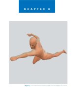
Take a minute and think about the
purpose of a picture of a favorite
pet. The purpose of the picture
might be to show others what your
pet looks like. However, there
could be more to that purpose.
Maybe you not only want to show
what your pet looks like, but you
also want to show your pet’s per-
sonality. Maybe your pet is playful
and active. Instead of drawing your
pet resting, it might be more mean-
ingful to draw your pet at play, as
in the drawing in Figure 6.1.
A deeper meaning for a picture of
your pet might be to somehow
express your feelings about the pet.
Maybe you have a deep emotional
attachment to your pet and you
want your picture to capture that
attachment. What could you draw
that would express your feelings
though your art?
Can you see how having a purpose
for a picture moves the drawing
from a simple picture to a work of
art? Many of the most famous pic-
tures in the grandest museums are
there not because the artist was a
skilled painter, but rather because
the art had meaning.
Figure 6.1 The line drawing cap-
tures the personality of the pet.
102
Figure Drawing with Virtual Models
Placement
Placement is the arrangement of
pictorial elements within the pic-
ture frame. It is not merely the
placement of the figure; rather, it is
the placement of all elements of
drawing. The elements of drawing
are what make up a picture; they
include points, lines, shapes, and
forms.
Points
The smallest mark an artist can
make and thus the smallest design
element is the point. Some draw-
ings, such as stipple drawings, are
made up of nothing but points. A
stipple drawing is usually drawn in
ink on paper. The drawing consists
of dots of ink that can vary in size
and distance from each other to
make up shades of light and dark.
Figure 6.2 shows an example of a
stipple drawing.
Lines
When a point becomes longer in
any one direction, it is no longer a
point and becomes a line. The line
is the most common and versatile
drawing element. Lines can be
used to indicate areas, show depth,
lead the viewer, delineate edges,
define detail, and depict value.
Lines are more expressive than
points because they have direction
and they can vary in weight. Look
at the example in Figure 6.3.
Notice that there are three drawing
elements. The first is a point, the
second is a line, and the third is a
line that varies in weight. Can you
see how the line is more expressive
than the point, and the line with
variation in weight is more expres-
sive than just a simple line?
Figure 6.2 Stipple drawings are made up of many tiny dots.
Figure 6.3 Adding variation in
weight can make a line more
expressive.
103
Composition
Varying the weight of a line is often
called using thick and thin lines in
art. The technique of drawing with
thick and thin lines is most often
used in pen and ink drawings. The
basic idea of varying the weight of
a line for compositional purposes
is that a heavier line emphasizes
that part of the line and thus that
part of the drawing. Figure 6.4 is a
line drawing of a character using
thick and thin lines. Notice how
the thick and thin lines add a more
dramatic feel to the drawing. Also
notice how the thicker areas of the
lines in the drawing add weight to
emphasize that area.
Beginning artists often ask the
question of what lines should be
thicker and what lines should be
thinner. Although there is not hard
rule about thick and thin lines,
there are a few general rules that
might help.
✎
Contrast. Thick lines
have more contrast
with the white of the
paper than thin lines
do. Thick lines around
a specific area of your
drawing will draw
more attention to that
area. I wanted the
viewer to look first at
the character’s head, so
I gave that area of the
drawing more contrast,
as shown in Figure 6.5.
✎
Movement. Variation in
the weight of a line
tends to cause the eye
to move from the nar-
rower area of the line
to the thicker area. By
placing lines in a draw-
ing that vary in thick-
ness over their length,
the artist can orches-
trate the way a person
looks at the picture.
Think of it in terms of
creating a racetrack in
which the lines are the
track. In Figure 6.6,
there is a sense of
movement in the char-
acter’s hat.
Figure 6.4 Adding variation in
weight can give a line more
emphasis.
Figure 6.5 Use thicker lines in
areas of emphasis.
Figure 6.6 The viewer’s eye tends
to follow the lines in a drawing.
104
Figure Drawing with Virtual Models
✎
Curves. Lines going
around an arc tend to
look better if the line is
thicker as it swings
around the curve.
Going back to our anal-
ogy of the racetrack,
motion tends to slow in
a curve. By adding
width to a line in a
curve, you give more
space for swinging
around the curve, mak-
ing the curve easier to
follow with the eye. In
the curves on the char-
acter’s shoulder shown
in Figure 6.7, the lines
are thicker, making the
curve easier to follow.
✎
Tapered ends. Abrupt
endings cause harsh
stops in a drawing. It is
much easier for the eye
to begin and end at a
tapered point. Figure
6.8 shows several lines
in the drawing that
begin or end in tapered
points.
✎
Corners. Sharp corners
are abrupt changes of
direction. They can
happen in the course of
a line or when two or
more lines meet.
Adding more weight to
the lines at a corner
helps keep the viewer’s
eyes on the drawing.
The corner then acts as
a launch pad for the
eyes to move in a dif-
ferent direction. Figure
6.9 shows where the
corners of the charac-
ter’s pants cause
abrupt changes in
direction.
Figure 6.7 Adding weight to curves
makes them easier to follow.
Figure 6.8 A tapered end is easier
for the eye to begin and end.
Figure 6.9 A heavy corner can make an abrupt change in direction more
natural.
105
Composition
This list does not cover every
aspect of using thick and thin
lines, but hopefully it will give
you a start. One of the wonderful
aspects of art is taking basic
concepts and exploring new
applications.
Lines are the building blocks of
most drawings. Using lines, the
artist can define almost anything.
When it comes to composition,
one of the most important things
that lines define is shape.
Shapes
A shape is a defined area in a draw-
ing. For example, Figure 6.10
shows the familiar shape of a heart.
The shape is composed of two
lines, but the meaning of the shape
goes way beyond just the two lines
because the shape is also a symbol.
Not all shapes have symbolic
meaning, but the fact that they can
have meaning beyond a mark on a
piece of paper shows an important
distinction between a shape and
a line.
As you approach creating a figure
drawing, try to look beyond the
figure and look at the entire pic-
ture as a set of shapes. Sometimes
looking at the silhouette of shapes
in a picture helps define them.
Figure 6.11 shows the silhouette of
a figure.
Figure 6.10 Some shapes have
symbolic meaning.
Figure 6.11 The figure is a shape in the drawing.
106
Figure Drawing with Virtual Models
The figure is a shape because it is a
defined area in the drawing.
Understanding the shapes in your
drawings will help you develop
good compositions. For example,
here there are three basic shapes—
a square, a circle, and a heart. One
or more lines define each shape.
The quality and placement of the
lines not only define the shapes,
they also define the picture. The
picture is somewhat static because
all of the lines are similar in weight
and spacing. The shapes also are of
equal size and centered on the
paper.
By adjusting some of the drawing
elements, you can see how the
dynamics of the picture can
change. In Figure 6.13, the shape
of the circle was enlarged and the
other two shapes were reduced.
The circle is now the dominant
shape. The dominant position of
the circle is also enhanced by the
fact that it is in the center of the
picture.
In Figure 6.14, the circle is moved
to the side but the weight of the
line is heavier, so even though it is
not central, it is still dominant
because of the heavier line.
Figure 6.12 The picture contains three basic shapes.
Figure 6.13 The circle is the dominant shape in the drawing.
Figure 6.14 The circle is dominant in both size and line weight.
107
Composition
Another method of emphasizing a
shape is to have it overlap other
shapes, as shown in Figure 6.15.
The overlapping helps to increase
the importance of the top shape
and diminish the importance of the
other two shapes.
One aspect of a shape is the fact
that by defining a shape in a draw-
ing, you also define others shapes.
Notice that in the last picture there
are three overlapping shapes, but
there is also the shape of the sur-
rounding area of the picture. The
areas defined outside the pictorial
shapes in a drawing are often
referred to by artists as negative
shapes. Figure 6.16 shows the neg-
ative shape in white.
Figure 6.16 The negative shape surrounds the other shapes in the picture.
Figure 6.15 Overlapping shapes can emphasize importance.
108
Figure Drawing with Virtual Models
Negatives shapes are very impor-
tant in a composition. If they are
organized correctly, they can have a
big impact on the success of your
drawing. For example, Figure 6.17
shows a group of negative and pos-
itive shapes.
When the shapes are put together
in the correct organization, the
negative shapes carry the message
of the drawing, as shown in Figure
6.18.
The way you place pictorial ele-
ments can have a big effect on the
quality of your composition. When
placing shapes in a drawing, there
are a few things that you should
avoid, such as monotony, tangents,
and unwanted inclusion.
Figure 6.17 The picture shows some unorganized shapes.
Figure 6.18 When organized, the negative shapes spell the words nega-
tive shapes.
109
Composition
Monotony
Monotony is the repetition of
shapes that closely match each
other in size and spacing. A good
example of monotony is back in
Figure 6.12, in which all of the
shapes are roughly the same size
and are spaced statically across the
drawing. The best way to avoid
monotony is to vary the size and
spacing of the pictorial shapes in
your drawings.
Tangents
Sometimes the placement of
objects can cause problems. For
example, tangents can cause visual
confusion. In Figure 6.19, the seal
is supposed to be in the fore-
ground. However, the placement of
the seal’s nose on the line of the
barn gives the impression that the
seal is balancing the barn on his
nose.
When placing items in a picture,
you should always watch out for
potential problems with tangents
that cause confusion in the place-
ment of the visual elements in
three-dimensional spaces.
Tangents can also be painful. In
Figure 6.20, the diamond shape is
placed next to the edge of the pic-
ture. This causes two problems.
First, the placement is uncomfort-
able because it is poking the side of
the picture frame. It is almost like
the frame is getting hurt! Second,
sharp corners can often act as
arrows, directing viewers’ attention
away from the picture.
Figure 6.19 The seal looks like he is balancing the barn on
his nose.
Figure 6.20 Some tangents can be painful.
110
Figure Drawing with Virtual Models
Unwanted Inclusion
Sometimes a shape might be
behind another shape, causing the
two shapes to run together and
blend. This is particularly true
when the two shapes are of similar
value. Figure 6.21 shows a simple
example of this problem. The
square shape is overlapping the
cross shape, but they are so close
in value that they seem to be one
shape rather than two.
Sometimes you might want the
shapes of your drawing to run
together, so this is only a problem
when the blending is unwanted yet
still present. It is always a good
idea to create a value sketch of
your drawing first to see whether
there is any potential for unwanted
inclusion.
Form
In nature there really aren’t any
lines. Lines are what artists use to
interpret nature. Lines are often
used by artists to define edges or
suggest contours, but there is
another aspect of composition that
brings pictorial elements into
three-dimensional representations;
it is called form. Form is the depic-
tion of objects based on the effects
of light on that object. It brings the
element of shading into drawings.
In Figure 6.22 there are two cir-
cles. The one on the left shows
only the shape of the circle,
whereas the one on the right shows
the form of the circle as a sphere.
Figure 6.21 The cross and square blend together because they are similar
in value.
Figure 6.22 The circle on the right indicates the form of the circular
shape.