Tài liệu Pro CSS Techniques- P5 doc
Bạn đang xem bản rút gọn của tài liệu. Xem và tải ngay bản đầy đủ của tài liệu tại đây (1.27 MB, 50 trang )
Creating CSS-Based Tabbed Navigation
On most web sites, somewhere in the header (or shortly after), you’re likely to find some kind
of “tabbed” navigation facility. In this design, it sits directly above the breadcrumb trail.
Normally, this type of navigation can be a styled unordered list. That technique actually
warrants a chapter in its own right (and indeed it gets one—see Chapter 12), so rather than
rush through a styled list here, we’re going to show how you can style a series of divs. The list
approach is certainly preferable, but you may find that in some circumstances you are not
able to do this (perhaps your content management system, or CMS, is limited in what it can
spit out or you’re styling legacy markup that cannot easily be changed). Whatever the reason,
be aware that a styled list would be preferable.
So, we’ve handed you the loaded gun and told you that you shouldn’t really pull the trig-
ger. But here’s how we get the firing mechanism to work, folks!
Creating the Markup
Going back to our design, we can see five top-level links. In the markup, it would look like this
if you were using div elements:
<div id="tablinks">
<div><a href="/">Home</a></div>
<div><a href="/travel/">Travel</a></div>
<div><a href="/flights/">Flights</a></div>
<div><a href="/hotels/">Hotels</a></div>
<div><a href="/late-deals/">Late Deals</a></div>
</div>
Positioning the Links
By default, the divs would appear one after the other in a vertical stack, but we can transform
them in the CSS to line up side by side by using floats:
#tablinks div {
float:left;
}
■
Note
Reminder about floated elements: you need to clear the floats afterward! (See the methods for
managing floats in the previous chapter.) In this example we’ll use the “easy clearing” method.
This code gets them in the right position, but there’s plenty of work left to do, as Figure 8-11
proves.
CHAPTER 8
■
CREATING COMMON PAGE ELEMENTS172
732Xch08FINAL.qxd 11/1/06 2:06 PM Page 172
Please purchase PDF Split-Merge on www.verypdf.com to remove this watermark.
Figure 8-11. Our links are in the right place, but they need more work.
Styling the Links
We need to do the following to get this looking the way we want:
• Apply a background image to the entire horizontal strip
• Give each one of the links a bit of padding
• Add some borders between the links
• Create a background image that can be used to identify the current location in the site
Applying a Background
This is a straightforward job. We simply tile a background image to the strip, repeating it along
the x-axis. In the design, there is a slight fade from the top strip, so we need to anchor it at the
top:
#tablinks {
background:#336868 url(tab-bg.gif) repeat-x top;
}
Padding Out the Links and Adding Borders
Where we’ve floated the div elements that contain the links, the widths have all collapsed
down. We can add padding in—all around, as it happens—because these are block elements
that we’re dealing with and as such they honor padding and border attributes that we set. We’ll
set the border at the div level but we’ll set the padding to the link inside. Why? Because we want
to apply a different background to the link on hovers and on the current page, so we want the
link to stretch all the way out to the container rather than be pushed in by padding that’s
applied to the div element.
In order to add padding to the link (an inline element) inside the floated div element (a
block-level element), we need to convert the link to a block-level element. This is easily done!
#tablinks div {
float:left;
border-right:1px solid #094747;
}
#tablinks a {
display:block;
padding:5px 10px;
}
CHAPTER 8
■
CREATING COMMON PAGE ELEMENTS 173
732Xch08FINAL.qxd 11/1/06 2:06 PM Page 173
Please purchase PDF Split-Merge on www.verypdf.com to remove this watermark.
■
Note
To achieve this visual effect, you don’t actually even need to wrap each link in a
div
element—by
“promoting” the inline
a
element to a block element, you could float them, apply padding and margins and
so on to get the same effect. However, if you have total control over the HTML for these navigation blocks,
you would be wise to put them in an unordered list, as previously noted.
Setting the Link Color and Background Image for the Current Tab
We have just a couple of small tasks left to do—set the font color for the links and set a back-
ground that is going to be used for the current page:
#tablinks a:link,
#tablinks a:visited,
#tablinks a:hover,
#tablinks a:active {
color:white;
text-decoration:none;
}
#tablinks a.current {
background:#047070 url(tab-bg-hover.gif) repeat-x top;
}
Remember to set the class of current to the appropriate link (applied to the a element,
not the containing div):
<div><a href="/travel/" class="current">Travel</a></div>
The final result is shown in Figure 8-12.
Figure 8-12. The finished product: styled divs in a tab-like style
■
Note
In the previous example it would be up to you to manually or programmatically write in the current
class for the section you’re in. There is a smarter way of achieving this using CSS contextual selectors that
takes the effort out of this; see Chapter 12.
CHAPTER 8
■
CREATING COMMON PAGE ELEMENTS174
732Xch08FINAL.qxd 11/1/06 2:06 PM Page 174
Please purchase PDF Split-Merge on www.verypdf.com to remove this watermark.
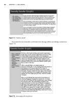
Breadcrumb Trails
A breadcrumb trail is an often-used technique on web sites for letting visitors know exactly where
they are within the site hierarchy. It’s a great way to allow people to jump several levels back up the
site, and it’s also invaluable for orienting visitors who arrive at the site from a search engine result.
Unfortunately, it’s nearly always the case that when you see these breadcrumbs, the
markup used for it is something like this:
<div class="breadcrumb">You are in: <a href="/preferences/">
preferences</a> → <a href="/preferences/page-style/">page style</a> →
</div>
Showing the Hierarchy of the Breadcrumb Trail
In the previous example, the links look fine and the XHTML is all valid, so what’s the problem?
If you think about it, a breadcrumb is a reflection of a site hierarchy (imagine navigating through
folders on your own computer—it’s effectively the same as the process the server does when
trawling through the file system). What you really want is something that hints at that hierar-
chy, and nested lists can give you just that. Let’s look at the travel site example; this is how the
breadcrumb trail appears on the page:
You are in Travel > Destinations > Europe
This could be better expressed in the XHTML like this:
<div id="breadcrumb">
You are here:
<ul>
<li><a href="/travel/">Travel</a>
<ul>
<li><a href="/travel/destinations/">Destinations</a>
<ul>
<li>Europe</li>
</ul>
</li>
</ul>
</li>
</ul>
</div>
■
Note
At this point, some people may claim that this is a case of semantics gone mad—that all you really
need is a straight line of text links with an appropriate separator between them. That might do the job visu-
ally, but it's good to think about the relationship that elements have with one another, and that's partly why
we’ve gone for this technique rather than a flat piece of text.
CHAPTER 8
■
CREATING COMMON PAGE ELEMENTS 175
732Xch08FINAL.qxd 11/1/06 2:06 PM Page 175
Please purchase PDF Split-Merge on www.verypdf.com to remove this watermark.
Styling the Hierarchical Order
Now the aim is to flatten that list so that it renders in one line but retains the semantic mean-
ing that it has in a nested list. You can use display:inline to make each of the list items appear
one after the other. Here’s a first stab at it:
#breadcrumb ul,
#breadcrumb li {
display:inline;
padding:0;
margin:0;
}
The effect is almost what we want, as Figure 8-13 shows.
Figure 8-13. The breadcrumb list, flattened with CSS
What we really want, though, is some kind of separator between the links, as we had in
the non-CSS version. You can use one of two techniques to achieve this:
• Generated content (using the :after pseudo-class)
• An image placed in the background of the list items
The second option is the better supported of the two, so this is what we’ll use. Because
we’ve set the li elements in the header to display:inline, we can no longer do things that we
could if they were block-level elements, such as apply height or padding at the top and bottom
(not that we want to, for that matter), but we can specify padding on the left and right on inline
elements. This is key, because we need to nudge the content of those li elements across so
that the background image is clearly visible:
#breadcrumb li {
padding-left:14px;
background: url(arrow.gif) no-repeat left center;
}
You can see the effect in Figure 8-14.
Figure 8-14. An arrow character separates the breadcrumb trail items.
CHAPTER 8
■
CREATING COMMON PAGE ELEMENTS176
732Xch08FINAL.qxd 11/1/06 2:06 PM Page 176
Please purchase PDF Split-Merge on www.verypdf.com to remove this watermark.
Just one last thing to clean up: we don’t want the first list item to be preceded by an arrow
but just the subsequent ones. You can use specificity (which you learned about in Chapter 3)
to control this:
#breadcrumb ul li {
padding-left:0;
}
#breadcrumb ul li ul li {
padding-left:14px;
background: url(arrow.gif) no-repeat left center;
}
Essentially, the rule only applies to li items after one level of nesting; the first level gets
no special treatment, as Figure 8-15 shows.
Figure 8-15. The final styled breadcrumb navigation
■
Note
Secondary navigation (aka left nav and right nav) is perhaps the most common feature of any web
page, but we’re going to skip over it in this chapter. The method we suggest for navigation of this type is to
use unordered lists styled in CSS, and this is covered in full in Chapter 12. In addition, page headings and body
copy are common features on web pages, but we’re going to skip them here and simply refer you to another
chapter that deals with them in greater detail—the next chapter, in fact, which is all about typography.
Images and Hover Effects
In the bad old days of early web development, fancy image effects (such as hovering over an
item and the image changing) were the realm of JavaScript, and some of these scripts were far
more complicated than they needed to be. Although JavaScript has its place—and indeed some
argue that a visual effect such as a change on hover is a “behavioral” feature and should be
controlled with JavaScript—CSS lets you create a number of image effects quite simply. So
throw out your old JavaScript functions, get rid of your onclick and onmouseover inline event
handlers, and use some CSS instead.
The Simple Image Swap
Let’s start at the beginning. You may have used this kind of thing in the past:
onmouseover="this.src='house-renovated.gif';"
onmouseout="this.src='house.gif';" />
CHAPTER 8
■
CREATING COMMON PAGE ELEMENTS 177
732Xch08FINAL.qxd 11/1/06 2:06 PM Page 177
Please purchase PDF Split-Merge on www.verypdf.com to remove this watermark.
The problem with this approach is that it requires you to change any effect like this right there
in the source code. Imagine if this were a common navigation element that had some kind of
hover effect, was repeated several times on any web page, and was present on hundreds of
web pages—that’s a lot of changes to make! CSS lets you centralize this type of effect; all you
need to do is specify a class in the markup where you want the effect to apply and specify the
image swap in the CSS. Here’s how it’s done:
.ex1 {
display:block;
width:200px;
padding:10px;
border:1px solid black;
margin:0 0 10px 0;
text-decoration:none;
text-align:center;
background:#fff url(stars-dim.gif) no-repeat center center;
}
.ex1:hover {
border:1px dotted red;
background:#fff url(stars.gif) no-repeat center center;
}
...
<div><a href="nowhere.html" class="ex1">Hover over me</a></div>
<div><a href="nowhere.html" class="ex1">Hover over me</a></div>
There is a selection of other styles that we’ve applied in the previous example, but the key
part is highlighted in bold. Figure 8-16 shows a screen shot of the default state and the hover state.
Figure 8-16. The background image changes on hover; we set this using CSS.
Avoiding “Divitis”
Using a div in this way does the job perfectly well, but it can be improved a little. If the previ-
ous technique were applied to a navigation area, or some other section where the technique is
used over and over again, using so many class attributes would be overkill. We can tidy this up
by wrapping all of the links in a containing div and then using a contextual selector to achieve
the same effect. Here’s an amended version:
div.ex2 a {
display:block;
width:200px;
padding:10px;
border:1px solid black;
CHAPTER 8
■
CREATING COMMON PAGE ELEMENTS178
732Xch08FINAL.qxd 11/1/06 2:06 PM Page 178
Please purchase PDF Split-Merge on www.verypdf.com to remove this watermark.
margin:0 0 10px 0;
text-decoration:none;
text-align:center;
background:#fff url(stars-dim.gif) no-repeat center center;
}
div.ex2 a:hover {
border:1px dotted red;
background:#fff url(stars.gif) no-repeat center center;
}
...
<div class="ex2">
<div><a href="nowhere.html">Hover over me</a></div>
<div><a href="nowhere.html">Hover over me</a></div>
</div>
Sprites: Using One Image for All States
In the techniques we discussed so far, we have a different image for the default background
and the hover background. When the visitor hovers over the link, only then will the server
retrieve the new image and display it. On a fast connection and with a small image, this should
be OK, but if you were to use this effect in less favorable circumstances, there might be a time lag.
A simple technique to get around this issue is to have both image states compiled into one
single image. Then, you display just one portion of that image to the visitor (imagine trying to
admire a work of art through a mailbox—that’s the general idea). When the user hovers over
the link that acts as the trigger, the image is nudged along by however many pixels are required
to reveal the hover state. In Figure 8-17, you can see two stars: the dimmed default version and
the bright hover version. The image is 34 pixels wide and 15 pixels high. We’ll set the container
element to be just 17 pixels wide, so only the first half of the image will show.
Figure 8-17. The single image with the default and hover state included
The CSS required for this follows:
.ex3 {
background:#fff url(all-stars.gif) no-repeat 0 0;
display:block;
height:15px;
width:17px;
}
.ex3:hover {
background:#fff url(all-stars.gif) no-repeat -17px 0;
}
...
<a href="nowhere.html" class="ex3"></a>
CHAPTER 8
■
CREATING COMMON PAGE ELEMENTS 179
732Xch08FINAL.qxd 11/1/06 2:06 PM Page 179
Please purchase PDF Split-Merge on www.verypdf.com to remove this watermark.
As you can see from the CSS, in the hover state the background image is slid 17 pixels to the
left, thus revealing the different portion of the image.
Because the image has already been downloaded for the default state, there is no need to
call a new image off the server, so we have effectively preloaded all the images we need.
Remote Image Swaps
Perhaps you’re thinking. “Ah, that’s all well and good if I want the image underneath the mouse
pointer to change on hover, but my JavaScript changes an image elsewhere on the page. CSS
can’t do that, can it?”
Actually, it can . . . but not in all cases. Let’s look at an example. The following CSS works
by placing an empty span element inside the link that triggers the hover effect, and applying
a unique id to that link:
<ul>
<li><a href="nowhere.html" id="ex4">Link one<span></span></a></li>
<li><a href="nowhere.html" id="ex5">Link two<span></span></a></li>
<li><a href="nowhere.html" id="ex6">Link three<span></span></a></li>
</ul>
When the mouse hovers on that link, we can set the span element to display as a block-
level element somewhere else on the page (using absolute positioning) and with whatever
background image we want. Because that span element is empty, we’ll also need to specify
height and width, as illustrated in Figure 8-18; otherwise, it won’t show up on the page.
Figure 8-18. An empty span, positioned absolutely and set to display as a block-level element
and given a fixed height and width (border shown for demonstration purposes only)
And here’s the CSS that achieves the aims stated in the preceding section—the positioning
aspects are highlighted in bold:
#ex4:hover span {
background: url(metro.jpg);
background-repeat: no-repeat;
display:block;
width:100px;
height:100px;
position:absolute;
top:450px;
left:300px;
}
#ex5:hover span {
background-image: url(tower.jpg);
CHAPTER 8
■
CREATING COMMON PAGE ELEMENTS180
732Xch08FINAL.qxd 11/1/06 2:06 PM Page 180
Please purchase PDF Split-Merge on www.verypdf.com to remove this watermark.
background-repeat: no-repeat;
display:block;
width:100px;
height:100px;
position:absolute;
top:450px;
left:400px;
}
#ex6:hover span {
background-image: url(clock.jpg);
background-repeat: no-repeat;
display:block;
width:100px;
height:100px;
position:absolute;
top:450px;
left:500px;
}
...
You can see the effect in Figure 8-19 (the mouse cursor does not show in the screen shots,
but you can see from the link styles which one is being hovered over).
Figure 8-19. Hovering over links displays an image elsewhere on the page.
Remote Image Swapping and Sprites Combined
The previous example showed that it’s possible to make an image appear elsewhere on the
page, not just underneath your mouse pointer. The problem with this technique, once again,
is the issue of preloading. These images may be quite large in file size and you don’t want to
have a time delay. So, you can use the sprites technique (placing all the images in one image
CHAPTER 8
■
CREATING COMMON PAGE ELEMENTS 181
732Xch08FINAL.qxd 11/1/06 2:06 PM Page 181
Please purchase PDF Split-Merge on www.verypdf.com to remove this watermark.
and revealing only what’s needed), but that could make matters worse as when the visitor to
your site hovers over the link, the server needs to fetch one large image only to display a portion
of it. Madness? No, because we can preload by placing an element on the page (a span) and
apply the background image to that element. However, because the span element is empty, the
preloaded background image will not show but when the visitor hovers over the link: bingo!
The image is already downloaded there on the computer’s hard drive. Whichever link we hover
over, we know the image is there ready and waiting to be used.
#imagepreload {
background-image: url(prague-big.jpg);
}
#ex7:hover span {
background-image: url(prague-big.jpg);
background-repeat: no-repeat;
display:block;
width:100px;
height:100px;
position:absolute;
top:550px;
left:300px;
}
#ex8:hover span {
background-image: url(prague-big.jpg);
background-repeat: no-repeat;
background-position: -100px 0;
display:block;
width:100px;
height:100px;
position:absolute;
top:550px;
left:400px;
}
#ex9:hover span {
background-image: url(prague-big.jpg);
background-repeat: no-repeat;
background-position: -200px 0;
display:block;
width:100px;
height:100px;
position:absolute;
top:550px;
left:500px;
}
...
<span id="imagepreload"></span>
CHAPTER 8
■
CREATING COMMON PAGE ELEMENTS182
732Xch08FINAL.qxd 11/1/06 2:06 PM Page 182
Please purchase PDF Split-Merge on www.verypdf.com to remove this watermark.
<ul>
<li><a href="nowhere.html" id="ex7">Link one<span></span></a></li>
<li><a href="nowhere.html" id="ex8">Link two<span></span></a></li>
<li><a href="nowhere.html" id="ex9">Link three<span></span></a></li>
</ul>
These techniques show that it is possible to do dynamic image swapping using CSS.
Naturally, you can adapt these ideas to your own needs, but there is one limitation that we
haven’t mentioned that you may have wondered about. In all the examples, we attached the
hover behavior to a link (an a element). What if you don’t have a link on the web page where
you want the effect to happen? Unfortunately, it’s not possible to do this on Microsoft Internet
Explorer 6 or earlier, but for most other browsers, including IE 7, you can use the hover pseudo-
class on any element. However, Microsoft is offering IE 7 as part of its Windows Update web
site and will automatically be downloaded for people who have opted in to the Automatic
Updates service. So it's hoped (at least by web developers who love web standards!) that the
numbers of IE 6 users and earlier should go into something of a decline.
Rounded-Corner Boxes
With border styles and padding at your disposal, it’s all too easy to create blocks of content
that look, well, boxy! Wouldn’t it be nice if we could create rounded corners and smooth off
some of those hard edges?
To achieve rounded corners, you need to make prodigious use of background images
combined with a suitable solid background color (in case images are disabled in the browser
or are slow to download).
Creating a Fixed-Width Rounded Box
Figure 8-20 shows a background with rounded edges that is split into three. The top and bot-
tom sections will be used as background images, while the middle section is solid background
color. Note that the bottom image has a slight gradient effect applied.
Figure 8-20. A rounded corner box,“exploded” view
CHAPTER 8
■
CREATING COMMON PAGE ELEMENTS 183
732Xch08FINAL.qxd 11/1/06 2:06 PM Page 183
Please purchase PDF Split-Merge on www.verypdf.com to remove this watermark.
In the sample web page, we’ll apply this to the related links section. Because this will be
constructed from a background image that is exactly 200 pixels wide, we need to make sure
that the containing div is also set to that amount (and, for that matter, the right margin for the
main page content):
body#cols3 #content-wrapper {
padding-left:9em;
padding-right:220px;
}
...
#related {
width: 200px;
}
The top image is set as a background for the related links heading (an h2 element), with
an appropriate amount of padding applied so that the text has some breathing space:
#related h2 {
margin: 0;
padding: 10px;
font-size: large;
background: url(top.gif) no-repeat;
}
The bottom part of the image is set on the outer container—the div with an id of
related—and anchored to the bottom. The heading stays at the top while the bottom part
moves up and down, accordion-style, depending on the amount of content inside:
#related {
width: 200px;
background:#013433 url(example1/bottom.gif) no-repeat bottom;
}
One minor cosmetic touch is still required—the text color needs to be white against the
dark teal:
#related,
#related a {
color:white;
}
CHAPTER 8
■
CREATING COMMON PAGE ELEMENTS184
732Xch08FINAL.qxd 11/1/06 2:06 PM Page 184
Please purchase PDF Split-Merge on www.verypdf.com to remove this watermark.
By applying the background images in this way, you can achieve a rounded-corner box, as
shown in Figure 8-21.
Figure 8-21. The related links section with rounded corners
Creating a Rounded Box That Scales
Making a box with rounded corners is pretty straightforward—you only need two pieces that
move up and down. Creating a box that can be scaled up so that its width and heights change
and still retaining the rounded-corner effect takes a bit more work.
In the past, an effect like this would have been achieved using a table with three columns
and three rows and a separate image piece in each corner table cell. With CSS it is possible to
do this using just two images by carefully revealing different parts of those images underneath
clean, semantic XHTML. You can see this ingenious technique, devised by Ethan Marcotte
(www.sidesh0w.com/), on the BrowseHappy (www.browsehappy.com/) web site.
Making the Background Images
The trick to making a rounded box that scales is to create background images that are much
wider and taller than you believe they are going to need to be. As with techniques described
earlier in this chapter, we’ll only show as much of those images as is needed (see Figure 8-22).
CHAPTER 8
■
CREATING COMMON PAGE ELEMENTS 185
732Xch08FINAL.qxd 11/1/06 2:06 PM Page 185
Please purchase PDF Split-Merge on www.verypdf.com to remove this watermark.
Figure 8-22. Two background images, left.gif and right.gif
■
Note
Although these images are large in terms of dimensions, they are still very small in file size because
of the limited color palette and the continuous nature of the colors.
The outer container—the div with the id of related—has the larger right image applied,
anchored to the top right, as demonstrated in the following CSS and in Figure 8-23:
#related {
background: #013433 url(example2/right.gif) no-repeat right top;
}
Figure 8-23. The first image is applied to the outer container.
CHAPTER 8
■
CREATING COMMON PAGE ELEMENTS186
732Xch08FINAL.qxd 11/1/06 2:06 PM Page 186
Please purchase PDF Split-Merge on www.verypdf.com to remove this watermark.
Next, we apply the left image to the h2 heading, anchoring it to the top left. Because the
left image is only a few pixels wide, it does not obscure the border previously applied—the join
is essentially seamless, as shown in Figure 8-24.
#related h2 {
margin: 0;
padding: 10px;
font-size: large;
background: url(example2/left.gif) no-repeat left top;
}
Figure 8-24. Corner applied to the heading
The next element to be treated is the unordered list (ul). We’ve already taken care of the
top-left corner (applying an image to the h2) and the top and right edges (applied to the
#related div), and now we’re going to add in another piece to this jigsaw on the left side. This
image will be anchored to the bottom left of the ul element.
■
Note
It’s necessary to remove margins from the unordered list so that there is no gap between the head-
ing and the list (otherwise, the border effect would be broken).
The following CSS does the trick (Figure 8-25 is the proof):
#related ul {
margin:0;
padding-bottom:10px;
background: url(example2/left.gif) no-repeat left bottom;
}
CHAPTER 8
■
CREATING COMMON PAGE ELEMENTS 187
732Xch08FINAL.qxd 11/1/06 2:06 PM Page 187
Please purchase PDF Split-Merge on www.verypdf.com to remove this watermark.
Figure 8-25. The jigsaw is nearly complete.
Keeping with the jigsaw analogy, isn’t it annoying when you get to the end of putting the
puzzle together only to find there’s a piece missing? We have a similar predicament here—
there is no element for us to attach the final piece to, so we have to create an element simply
for the purpose of hanging the background image on. It needs to be in between the outer con-
tainer div and the unordered list. Here’s the markup with the new div added in:
<div id="related">
<h2>Related Links</h2>
<div>
<ul>
<li><a href="/related/">Related link</a></li>
<li><a href="/related/">Another link</a></li>
<li><a href="/related/">And another</a></li>
<li><a href="/related/">Related link</a></li>
<li><a href="/related/">Another link</a></li>
<li><a href="/related/">And another</a></li>
</ul>
</div>
</div>
The CSS to attach the final piece to the bottom-right edge follows. Figure 8-26 shows the
end result at various different font sizes to demonstrate the scaling ability.
#related div {
background-: url(example2/right.gif no-repeat right bottom;
}
CHAPTER 8
■
CREATING COMMON PAGE ELEMENTS188
732Xch08FINAL.qxd 11/1/06 2:06 PM Page 188
Please purchase PDF Split-Merge on www.verypdf.com to remove this watermark.
Figure 8-26. Scaling the box up does not break the rounded-corner effect.
The addition of a seemingly superfluous div to finish the technique is not ideal, but with
a bit of planning you may not need to do this—in our example, it would be possible to apply
a class to the last list item and add the background image there.
Conclusion
JavaScript is a powerful tool in the right hands but is not always required for visual effects on
a web page, and HTML need not be overtly complex to achieve certain stylish touches. The
aim of this chapter was to show that most, if not all, of what you may have used in the past—
for example, JavaScript—to create common page elements can be done with CSS. Even better,
though, you can usually do it more simply, with more semantic and meaningful markup and
in ways that offer you great flexibility for change later on. And for those common features
on a page that have not been covered here, we hope the examples we provided can give you
enough hints about how to tackle the problem for yourself.
So with that out of the way, we’ll borrow some techniques from print design, and turn to
typography in our next chapter. We’ll explore how some simple typographic techniques can
really improve the look of our web page text.
CHAPTER 8
■
CREATING COMMON PAGE ELEMENTS 189
732Xch08FINAL.qxd 11/1/06 2:06 PM Page 189
Please purchase PDF Split-Merge on www.verypdf.com to remove this watermark.
732Xch08FINAL.qxd 11/1/06 2:06 PM Page 190
Please purchase PDF Split-Merge on www.verypdf.com to remove this watermark.
Typography
W
ith all the attention given to multimedia on the Web, it sometimes seems strange that text
still is the content king. Type and the written word has been with us much longer than photos,
videos, audio recordings, and the like, and quite an art has developed around it. Typography is
the art of setting type. This art exists to honor the content it sets—to enhance legibility and
embody the character of the words within. All too often, web designers think that typography
means “picking a cool font.” They believe it’s simply not possible to achieve quality typogra-
phy on the Web, or they reduce the art to a set of mundane rules like “Always use sans serif
fonts on the Web.” In reality, attention to typography is one of the hallmarks of well-designed
sites that differentiate them from their amateurish counterparts.
CSS was designed with typography at the forefront, and today it is possible to properly set
type in a manner that might even make Gutenberg proud. This is what we’ll explore in this
chapter. Specifically, we’ll look at
• Understanding the various typeface classifications
• Selecting typefaces with CSS
• Assigning font weights
• Sizing type
• Choosing font styles
• Transforming text
• Understanding font variants
• Setting blocks of text
• Styling headings and subheads
191
CHAPTER 9
■ ■ ■
732Xch09FINAL.qxd 11/1/06 2:08 PM Page 191
Please purchase PDF Split-Merge on www.verypdf.com to remove this watermark.


