Tài liệu Pro SQL Server 2008 Analysis Services- P9 docx
Bạn đang xem bản rút gọn của tài liệu. Xem và tải ngay bản đầy đủ của tài liệu tại đây (1.63 MB, 50 trang )
CHAPTER 14 USER INTERFACES
381
Figure 14-12. Nesting hierarchies
Pivot Table Ribbons
The easiest way to work with a pivot table is with the PivotTable Tools ribbons, which appear when you
click inside the pivot table. There are two ribbons—one for general options and one for design, as shown
in Figures 14-13 and 14-14. The ribbons are fairly self-explanatory, but I strongly recommend browsing
through them as you start working with pivot tables, as it can be easy to forget they’re there and get
frustrated trying to work with the pivot table itself. For example, selecting a pivot table to move it in a
workbook is nontrivial, but straightforward with the Move PivotTable button on the Options ribbon.
Figure 14-13. The pivot table options ribbon
The most notable function on the Options tab is the ability to rename the pivot table. If you work
with Excel named ranges a lot, you may find yourself a bit baffled as to how to name the pivot table by
selecting a range on the worksheet. The easy answer is to just click inside the table and rename it on the
Options tab. You can also select fields (column and row headers, value fields) and work with their
settings, and expand or collapse them.
With the Group Selection and Ungroup buttons you can select members from a hierarchy and
create a custom grouping. For example, if you have all 50 states listed, you may want to group them into
geographic regions. To do so, just select the states you want to group together and click the Group
Selection button. Repeat to create additional groups—as you go, any ungrouped members will be swept
into a group called Other.
Please purchase PDF Split-Merge on www.verypdf.com to remove this watermark.
CHAPTER 14 USER INTERFACES
382
Figure 14-14. The pivot table design ribbon
The pivot table design ribbon is pretty descriptive—it provides the tools to change the appearance
and layout of your pivot table. The drop-down buttons in the Layout section allow you to select whether
to show grand totals and subtotals (for rows and/or columns), and whether to insert blank rows between
items. The Report Layout selector offers compact, outline, or tabular layouts, as shown in Figure 14-15.
Figure 14-15. Pivot table formats
The checkboxes in the PivotTable Style Options section let you switch the styles for row and column
headers on and off, and select whether to shade alternating rows or columns. Finally, the PivotTable
Styles gallery provides a number of preformatted styles for pivot tables. You can preview how the style
will affect your table by mousing over the styles without clicking on them. Also, you can drop down the
gallery with the lower down-arrow to the right of the display, as shown in Figure 14-16.
Figure 14-16. Opening the style gallery
Please purchase PDF Split-Merge on www.verypdf.com to remove this watermark.
CHAPTER 14 USER INTERFACES
383
Formatting a Pivot Table
Formatting the contents of a pivot table is as easy as highlighting the cells you want to change the format
on and using the controls in the ribbon or the context menu. Note that you won’t be able to alter the
structure of the pivot table—for example, trying to merge cells in a pivot table will raise an error
prompting you with the options for what you’re trying to do. You can also use the Cell Styles drop-down,
shown in Figure 14-17, for quick access to some standard styles and number formats. (I just discovered
that there’s a quick style on there for Currency with no decimals. I’ve been doing that by hand.…)
Figure 14-17. The Cell Styles gallery on the Home tab of the ribbon
Another powerful option in Excel 2007 is to use conditional formatting for values. With conditional
formatting, you can apply a specific style to cells based on the specific numeric value or the value in
relation to other values, or even if it contains a specific text or is a date between certain dates.
Conditional formatting is under the Conditional Formatting drop-down gallery in the Styles section of
the Home tab on the ribbon. Figure 14-18 shows the Conditional Formatting gallery opened to the
Highlight Cells Rules selection.
Please purchase PDF Split-Merge on www.verypdf.com to remove this watermark.
CHAPTER 14 USER INTERFACES
384
Figure 14-18. Conditional Formatting selectors
Selecting New Rule near the bottom of the drop-down opens a dialog that provides a more fine-
grained rule-editing capability. Ultimately you have the option of entering a formula to select which cells
to format, and a custom format using any of the Excel cell formatting styles.
One of my favorite format schemes is to apply data bars to a selection of cells, shown in Figure 14-
19. The bars behind the numbers give a quick visual indication of the relative magnitude of the values. It
is important, however, to be careful not to include any subtotal or total rows, as those will obviously be
far larger and dominate the layout.
Please purchase PDF Split-Merge on www.verypdf.com to remove this watermark.
CHAPTER 14 USER INTERFACES
385
Figure 14-19. Data bars in a pivot table
Now that we understand how to create and format a pivot table, we also want to be able to use these
values in other calculations (that’s a major reason we’re using Excel, right?). So let’s take a look at the ins
and outs of using pivot table values in formulas.
Formulas Using Pivot Table Values
Let’s say you wanted to create a column next to your pivot table showing what the numbers would look
like with 10% growth added on top. So you click in a cell, type an equal sign, and then click on a cell in
the pivot table to reference it. You’ll end up with something looking like this:
=GETPIVOTDATA("[Measures].[Internet Sales Amount]",$A$3,
"[Product].[Product Categories]",
"[Product].[Product Categories].[Product].&[374]")
This is the function Excel puts in place to fetch the pivot table value, and it’s the reference you’ll get.
This will work well enough—type “*110%” afterwards and you’ll see it calculates fine. The problem is
when you copy that formula and try to paste it for all the values in the column. You’ll get the same value
for every cell. Why is that?
The GETPIVOTDATA function in this case has four arguments. These are the data field (Internet Sales
Amount), a descriptor for the pivot table ($A$3, the cell reference for the table anchor), the field, and then
the unique name for the specific cell. So when we copy and paste the cell reference, it keeps the unique
name and we get the same value.
Couldn’t we just type a cell reference for the value? Well, that would work, except that if either rows
or columns contain a hierarchy, the user can expand and collapse the members of that hierarchy, giving
Please purchase PDF Split-Merge on www.verypdf.com to remove this watermark.
CHAPTER 14 USER INTERFACES
386
us the result shown in Figure 14-20. Since the GETPIVOTDATA formula uses unique names to identify cells,
then so long as the pointer to the pivot table is valid, the value will still work.
Figure 14-20. The dangers of using cell references with pivot tables
■
Note One problem you can still run into is if the value you’re referencing gets hidden. For example, in Figure
14-20, if you were referencing a specific bike model and you then closed up the subcategory, the reference would
break as well (but it would be valid again if the user opened that category again).
Now that we have a feeling for putting our data together and formatting it in a pivot table, let’s
create some visual displays of our data with pivot charts.
Pivot Charts
Being able to visualize data is every bit as important as actually viewing the data itself. In this section
we’re going to create pivot charts in Excel to give a graphical view of the data in the pivot table. Figure
14-21 shows an example of such a chart.
It’s important to remember that a pivot chart is always bound to a pivot table. When we talk about
ProClarity and SQL Server Reporting Services charts later in the chapter, we’ll look at some very powerful
charting capabilities as the result of linking directly to SSAS cubes. However, Excel pivot charts are
limited to what’s in the pivot table.
Please purchase PDF Split-Merge on www.verypdf.com to remove this watermark.
CHAPTER 14 USER INTERFACES
387
Figure 14-21. A pivot chart showing sales by product category over twelve months
There are three ways to create a pivot chart in Excel:
• From the Insert tab on the ribbon, drop-down the PivotTable button and select
PivotChart. You will be prompted to select either a table or range, or to use an
external data source. Excel will automatically create a pivot table linked to the data
source, and the pivot chart linked to the pivot table.
• When you create a data connection, one of the options is to create a pivot chart
with the pivot table.
• If you’ve already created a pivot table, then while the table has focus, the Options
tab under PivotTable Tools in the ribbon has a PivotChart button.
There are many types of charts available in Excel, including bar charts, line charts, pie charts, and
area charts. For each chart type there are various stylistic subtypes, as shown in Figure 14-22 for bar
charts. Be careful not to spend too much time worrying about which type of chart to use—remember
that the goal is to convey information, not win a beauty contest. For a more in-depth discussion about
charting and chart types, I recommend Show Me the Numbers by Stephen Few (2004, Analytics Press).
Figure 14-22. Selecting a bar chart type
Please purchase PDF Split-Merge on www.verypdf.com to remove this watermark.
CHAPTER 14 USER INTERFACES
388
Each of the subtypes is generally a minor stylistic variation on the main chart type, but there are
some significant standouts, most notably the stacked variations (where values are added together or
presented as percentages).
■
Note When creating a chart from pivot table data, you can’t use an XY (scatter) chart, bubble chart, or stock
chart, since these chart types require additional dimensions of data. Unfortunately, they’re not disabled in the
chart-type selector, so you’ll get an error if you try to use them.
As with the pivot table, when you create a pivot chart, Excel presents you with a number of new tabs
on the ribbon to manage the chart, shown in Figure 14-23. This time we have four tabs:
• Design: Here you can change the fundamentals of the chart—the chart type, data,
rough layout (title and legend), and style.
• Layout: This tab offers more specific layout options. There are selectors for the
chart and axis titles, legend, data table (if there is one), axes, gridlines, plot area,
and specific parts of the chart itself. You can also set the chart name here and
insert objects into the chart.
• Format: More finely-grained formatting for the chart objects. By selecting a chart
item, e.g., the title or data labels, you can use the format galleries in the Format tab
to apply a specific font, outline, fill, or other formatting.
• Analyze: Here you’ll find the toggles for the field list and filters, as well as a button
to refresh the pivot chart data and expand or collapse hierarchies, if used.
Figure 14-23. The PivotChart Tools tabs in Excel
Pivot charts really are fairly straightforward—since they’re bound to the underlying pivot table,
most of your work will be done ensuring the data in that table is in the proper format for the chart. In
Exercise 14-1 we’re going to use the AdventureWorks cube to create a pivot table and pivot chart so we
can get a feel for how they work together.
Exercise 14-1. Create an Excel PivotTable and PivotChart
In this exercise we’ll walk through using Excel as a front end for an Analysis Services cube, including
connecting to the cube, building a pivot table, configuring the pivot chart, and applying some Excel
formatting.
1. Open Excel 2007.
Please purchase PDF Split-Merge on www.verypdf.com to remove this watermark.
CHAPTER 14 USER INTERFACES
389
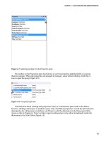
2. Click the Data tab in the ribbon.
3. Click the From Other Sources button to drop-down the selector, and then click
From Analysis Services, as shown in Figure 14-24.
Figure 14-24. Creating an Analysis Services connection
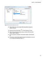
4. This will open the Data Connection wizard, shown in Figure 14-25. Enter the name
of your SSAS server (“localhost” if it’s on the same machine).
Figure 14-25. The Data Connection Wizard
5. Click the Next button.
Please purchase PDF Split-Merge on www.verypdf.com to remove this watermark.
CHAPTER 14 USER INTERFACES
390
6. The next page allows you to select the database and cube that you want for the
pivot table. Select Adventure Works DW 2008 (or whatever you named your
AdventureWorks database) and then the Adventure Works cube, as shown in
Figure 14-26.
Figure 14-26. Selecting the SSAS database and cube
7. On the “Save Data Connection File and Finish” page, you can leave the defaults or
edit the file name, friendly name, and description if you choose to. This step
creates the data connection file in your file system (by default in $DOCUMENTS\My
Data Sources\).
8. Click the Finish button.
9. Now you should see the Import Data dialog, which prompts whether you want to
create a PivotTable, PivotTable and PivotChart, or just create the connection file
(Figure 14-27). Select PivotTable Report and leave “Existing worksheet” selected
for the location.
Please purchase PDF Split-Merge on www.verypdf.com to remove this watermark.
CHAPTER 14 USER INTERFACES
391
Figure 14-27. Inserting the PivotTable and PivotChart
10. Click the OK button.
11. You’ll have a PivotTable placeholder and the PivotTable Field List task pane open,
as shown in Figure 14-28. (If you don’t see the task pane, click inside the
PivotTable placeholder, select the PivotTable Tools – Options tab in the ribbon, and
then click Field List in the Show/Hide section to the far right.)
Figure 14-28. Excel with a pivot table embedded
Please purchase PDF Split-Merge on www.verypdf.com to remove this watermark.
CHAPTER 14 USER INTERFACES
392
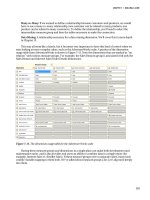
12. Now let’s add some data to our pivot table. In the Field List on the right, check the
boxes for
Internet Sales Amount
and
Internet Gross Profit Margin
. This
will add the two values to the pivot table. With no dimensions or filters, they
represent their respective values for the entire cube. (Also note that the Column
Labels section now has an entry for Values to indicate the values dimension added
with the two measure members.)
13. Let’s break these measures down by product. In the “Show fields related to” drop-
down at the top of the PivotTable Field List task pane, select Internet Sales.
14. Scroll down in the list of fields—under Product check the box next to Product
Categories. Note the categories now in the left-hand column, as shown in Figure
14-29.
Figure 14-29. Adding product categories to the pivot table
15. Click on the [+] next to Bikes to see the category open and display the
subcategories underneath.
16. Scroll to the Date dimension in the PivotTable Field List. Click [+] to open the
Calendar folder.
17. Check the box next to Calendar Year. This moves the Calendar Year hierarchy of
the Date Dimension to the Column Labels area.
18. We don’t have a lot of data for Calendar Years 2001 and 2002, so let’s leave them
off for now. In the pivot table click the drop-down arrow next to Column Labels
and uncheck 2001 and 2002, as shown in Figure 14-30.
Please purchase PDF Split-Merge on www.verypdf.com to remove this watermark.
CHAPTER 14 USER INTERFACES
393
Figure 14-30. Unselecting CY 2001 and 2002
19. Click the OK button.
20. We now have a pivot table showing Internet sales and profit margin by
Category/Subcategory/Product and by calendar year.
21. Open up the subcategory Road Bikes by clicking the [+] symbol next to it.
22. Select the cells with Road-250 bikes by clicking and dragging. Then right-click
and select Group, as shown in Figure 14-31.
Please purchase PDF Split-Merge on www.verypdf.com to remove this watermark.
CHAPTER 14 USER INTERFACES
394
Figure 14-31. Grouping products
23. The group will be named Group1 by default—rename it Road-250.
24. Do the same for the Road-350, Road-550, Road-650, and Road-750 bikes.
25. Now we can look at numbers by product line. (The cube actually has a hierarchy
for Product Lines, but you get the idea.)
26. “Internet Gross Profit Margin” is a bit verbose, so let’s trim it a bit. Right-click on
one of the column headers, and then select Value Field Settings.
27. For Custom Name, type Internet PM. Note the other options available here for
manipulating the display of the value field.
28. Now we have Sales and Profit Margin broken down by calendar year and product,
as shown in Figure 14-32. The Fields area in the sidebar should look like Figure
14-33.
Please purchase PDF Split-Merge on www.verypdf.com to remove this watermark.
CHAPTER 14 USER INTERFACES
395
Figure 14-32. Breaking down sales and profit margins by calendar year and product
Figure 14-33. The field area in the sidebar task pane
29. If we’re focused on our Road Bike models, having the other categories and
subcategories displayed can be a bit distracting—let’s hide them. Click on the
drop-down arrow next to Row Labels.
30. In the “Select field” selector, uncheck Accessories, Clothing, and Components.
Then click the [+] next to Bikes, and uncheck Mountain Bikes and Touring Bikes,
as shown in Figure 14-34.
Please purchase PDF Split-Merge on www.verypdf.com to remove this watermark.
CHAPTER 14 USER INTERFACES
396
Figure 14-34. Filtering out other products
31. Click the OK button and you should be left with a cleaner display, as shown in
Figure 14-35.
Figure 14-35. Breaking down sales and profit margin for all road bikes
32. For CY 2003, the Road 250 stands out with $2.1M out of almost $4M in sales, but
it takes some staring and thinking to figure out how the other models rank. Let’s
add a visual cue.
Please purchase PDF Split-Merge on www.verypdf.com to remove this watermark.
CHAPTER 14 USER INTERFACES
397
33. Click and drag to highlight the sales amounts for CY 2003 for the five Road
models.
34. Click the Conditional Formatting button in the ribbon (on the Home tab), and then
select Data Bars and choose one of the color schemes, as shown in Figure 14-36.
Figure 14-36. Applying color bar conditional formatting
35. You should see each of the values, now accented with a color bar showing their
relative values, as shown in Figure 14-37.
Figure 14-37. Color bars showing relative values
Please purchase PDF Split-Merge on www.verypdf.com to remove this watermark.
CHAPTER 14 USER INTERFACES
398
■
Note The color bars themselves shouldn’t be read like a chart; they just show relative values.
Now that we’ve seen how to create a pivot chart in Excel, let’s quickly put a pivot table on top.
1. Click a cell inside the pivot table to bring up the task pane and PivotTable Tools.
2. In the PivotTable Tools/Options tab, click the PivotChart button in the Tools
section.
3. This will open the Insert Chart dialog, which prompts you to select a chart type.
Leave the default selection and click the OK button.
4. You should see a chart similar to Figure 14-38. Note that Excel has created series
for both the year and the measures.
Figure 14-38. The default pivot chart
5. If you look at the PivotChart Filter Pane, you’ll see that you can filter the fields
down, but not much else.
6. Experiment with right-clicking on various parts of the chart to understand the
options available.
7. Save the workbook—we’ll use this later with Excel Services.
In my experience, Excel 2007 is awesome for pivot tables—if you need to do tabular analysis on SSAS
data, Excel is a top-tier client. Unfortunately, the fact that the pivot chart is bound to a pivot table,
combined with the lack of ability to manipulate data in the chart, makes it pretty limited. Later in this
chapter we’ll look at Reporting Services and ProClarity for more powerful charting tools. For now let’s
look at the other member of the Office family that understands Analysis Services—Visio.
Please purchase PDF Split-Merge on www.verypdf.com to remove this watermark.
CHAPTER 14 USER INTERFACES
399
Visio 2007
With Visio 2003, Microsoft started introducing more data-binding capabilities into the product. We
won’t dive too deeply into this, other than to look at the SSAS integration. Visio 2007 includes a construct
called a pivot diagram, which we can use to map cube data. An example of a breakdown of Internet sales
data is shown in Figure 14-39.
Figure 14-39. A Visio pivot diagram
■
Note I read a comment online that I have to agree with—Visio is generally used for designing, not reporting.
There are some publication capabilities built into Visio, but they’re not used as extensively as Excel Services, and
certainly nothing like Reporting Services. So pivot diagrams are fairly niche; but if you have the need to bring
Analysis Services data into Visio, there it is.
Please purchase PDF Split-Merge on www.verypdf.com to remove this watermark.
CHAPTER 14 USER INTERFACES
400
Creating a pivot diagram is pretty easy to do—in a new Visio drawing, select PivotDiagram
Æ
Insert
PivotDiagram. This will start the PivotDiagram wizard, which is essentially a dialog box to either select an
existing connection or create a new connection (which will launch the New Connection wizard we’re
familiar with).
Once you’ve created the connection, Visio will add a shape representing the default measure from
the measure group, and add a task pane listing measures (“Totals”) and dimension hierarchies
(“Categories”) in the selected cube, as shown in Figure 14-40. Checking a Total adds it to the diagram. If
you select a pivot node (the shapes in the pivot diagram) and select a Category, Visio will add a
breakdown of that hierarchy under the selected node (replacing an existing hierarchy if one is in place).
Figure 14-40. The SSAS task pane in Visio 2007
This operates in much the same way as the ProClarity Decomposition Tree, which we’ll look at later
in the chapter. There are two significant differences:
Please purchase PDF Split-Merge on www.verypdf.com to remove this watermark.