Tài liệu Essential Silverlight 3- P6 doc
Bạn đang xem bản rút gọn của tài liệu. Xem và tải ngay bản đầy đủ của tài liệu tại đây (388.43 KB, 50 trang )
ptg
this.ManagerTextBlock.SetBinding(
TextBlock.TextProperty,
new Binding("Manager")
);
}
DataContext Inheritance
In the previous example, the
MainPage
constructor set the
DataContext
property, whereas its child
TextBlock
elements specified the binding. This
usage pattern works because the
DataContext
property is an inherited
property, that is, Silverlight determines the value of the property by finding
the nearest parent element with the property explicitly set.
You can reset a binding object connection by either calling the
ClearValue
method for the property or by setting the property to some
other explicit value.
Technical Insight
Silverlight only provides built-in markup extensions; you cannot define your
own. Future Silverlight versions will likely let you write your own markup
extensions. The most general form of a markup extension is syntax for cre-
ating an object and providing that object with a
FrameworkElement
instance and the
DependencyProperty
to set.
Technical Insight
Silverlight freezes a binding object when you set the binding to a property,
and you will no longer be able to modify the binding properties.
Chapter 10: Data Binding
218
DEBUGGING TIP
Errors in binding connections do not throw exceptions by default. To
determine why a connection has failed, you can view the error mes-
sages in your debugger output window. Later in this chapter, you will
learn how to enable data-binding exceptions.
From the Library of Lee Bogdanoff
Please purchase PDF Split-Merge on www.verypdf.com to remove this watermark.
ptg
Data Synchronization and Binding Modes
After establishing a binding between a data object and an element property,
you may need to synchronize data values when the data object properties
change or if the element property changes. For example, if the data that is
bound to a control changes, the binding needs to notify the control to
update its displayed value. If a control value changes, the binding may
need to write the data back to a data store.
To use data binding to synchronize your data with an element property,
first ensure that your data object implements
INotifyPropertyChanged
:
public class MyDataItem : INotifyPropertyChanged
{
//
// Set a default value in the constructor
//
public MyDataItem()
{
this.employee = "";
}
//
// INotifyPropertyChanged implementation
//
public event PropertyChangedEventHandler PropertyChanged;
//
// Employee property
//
public string Employee
{
get
{
return this.employee;
}
set
{
this.employee = value;
// Call the PropertyChanged handler
if (PropertyChanged != null)
Data Binding Objects 219
From the Library of Lee Bogdanoff
Please purchase PDF Split-Merge on www.verypdf.com to remove this watermark.
ptg
{
PropertyChanged(this, new PropertyChangedEventA rgs("Employee"));
}
}
}
private String employee;
}
To control how properties synchronize, you can set the binding mode
of a
Binding
object to
OneTime
,
OneWay
, or
TwoWay
.
OneTime
indicates that
Silverlight will read the data only once and will never update values when
properties are changed.
OneWay
indicates that changes to a data object will
change the element property, but changes to the element property will not
change the data object. With a
OneWay
binding, changes to the element
properties will disconnect the
Binding
object and will no longer synchro-
nize data.
TwoWay
indicates that Silverlight will synchronize changes to the
element property with the data object and changes to the data object with
the element. The default binding mode is
OneWay
.
You can specify the binding mode by setting the
Mode
property on a
Binding
object, or declaratively through the markup extension:
<UserControl
x:Class="BindingModeExample.MainPage"
xmlns="
xmlns:x="
>
<StackPanel>
<TextBlock
x:Name="myOneTimeTextBlock"
Text="{Binding Employee, Mode=OneTime}"
/>
<TextBlock
x:Name="myOneWayTextBlock"
Text="{Binding Employee, Mode=OneWay}"
/>
<TextBlock
x:Name="myTwoWayTextBlock"
Text="{Binding Employee, Mode=TwoWay}"
/>
Chapter 10: Data Binding
220
From the Library of Lee Bogdanoff
Please purchase PDF Split-Merge on www.verypdf.com to remove this watermark.
ptg
</StackPanel>
</UserControl>
Changes to
MyDataItem
or
TextBlock
properties then synchronize based
on the binding mode:
MyDataItem dataItem = new MyDataItem();
this.DataContext = dataItem;
// Updates only the TextBlocks set to bind mode
// OneWay and TwoWay. Does not update the OneTime
// binding mode TextBlock.
dataItem.Employee = "Mark B";
// Does not update the data source since only OneWay
// binding is specified
//
// Setting the local value also removes the binding
// associated with this property
this.myOneWayTextBlock.Text = "Mark C";
// Updates the data source since TwoWay binding
// is specified
this.myTwoWayTextBlock.Text = "Mark D";
Data Binding Collections with ItemsControl
In Chapter 9, “Controls,” you learned how to use an
ItemsControl
element.
In this section, you learn how to bind data to your
ItemsControl
.
To bind to a list, follow these steps:
1. Provide a data source that is a collection of some object type.
For proper synchronization, make sure your data source properly
implements
INotifyCollectionChanged
.
2. Use an
ItemsControl
element as the display container for your list.
3. Create a
DataTemplate
to specify the display of each item.
A
DataTemplate
is an
ItemTemplate
that you have already seen in
Chapter 9.
Data Binding Objects 221
From the Library of Lee Bogdanoff
Please purchase PDF Split-Merge on www.verypdf.com to remove this watermark.
ptg
4. Set the
ItemsSource
property of the
ItemsControl
to the collection
of data to display as described in Chapter 9.
To implement a collection-based data source, it is simplest to inherit from
ObservableCollection:
public class MyDataCollection : ObservableCollection<String>
{
public MyDataCollection()
{
//
// Populate the data source with some data
//
this.A dd("Item 1");
this.A dd("Item 2");
this.A dd("Item 3");
}
}
The next step is to create an
ItemsControl
(
or any
ItemsControl
derived control such as a
ListBox
) as shown in Figure 10.2.
Chapter 10: Data Binding
222
Figure 10.2: Data
binding to a list
<UserControl
x:Class="ItemsControlExample.MainPage"
xmlns="
xmlns:x="
>
<ItemsControl x:Name="myItemsControl">
<ItemsControl.ItemTemplate>
<DataTemplate>
<Border BorderThickness="2" BorderBrush="Black" CornerRadius="3">
<TextBlock Text="{Binding}"/>
</Border>
</DataTemplate>
</ItemsControl.ItemTemplate>
</ItemsControl>
</UserControl>
From the Library of Lee Bogdanoff
Please purchase PDF Split-Merge on www.verypdf.com to remove this watermark.
ptg
In the previous data-template example, the
Text
property was set to
{Binding}
without specifying a property to bind. The reason no addi-
tional parameters were required was because our collection was of type
String
, and you are binding the object itself (not a sub-property) to the
Text
property. If the collection was of a type that contains multiple prop-
erties, use the same binding syntax used in the previous sections that
specified the property name. The
ItemsControl
sets the
DataContext
to
the list when you set the
ItemsSource
property, and in this case, the bind-
ing refers to the item types.
As you learned in Chapter 9, the default behavior for an
ItemsControl
is to create a
StackPanel
that replaces the content contained within a
DataTemplate
specified in the
ItemTemplate
property. For example, in this
case, you get the equivalent of the following XAML shown in Figure 10.2:
<StackPanel>
<Border BorderThickness="2" BorderBrush="Black" CornerRadius="3">
<TextBlock Text="Item 1"/>
</Border>
<Border BorderThickness="2" BorderBrush="Black" CornerRadius="3">
<TextBlock Text="Item 2"/>
</Border>
<Border BorderThickness="2" BorderBrush="Black" CornerRadius="3">
<TextBlock Text="Item 3"/>
</Border>
</StackPanel>
Now that you have learned how to data bind to an
ItemsControl
class,
you can use the same method to bind to any list-based class that derives
from
ItemsControl
. For example, you can replace the
ItemsControl
container with a
ComboBox
to get the result shown in Figure 10.3.
Data Binding Objects 223
Figure 10.3: Data binding
to a ComboBox
From the Library of Lee Bogdanoff
Please purchase PDF Split-Merge on www.verypdf.com to remove this watermark.
ptg
<UserControl
x:Class="ItemsControlExample.MainPage"
xmlns="
xmlns:x="
>
<ComboBox x:Name="myItemsControl">
<ItemsControl.ItemTemplate>
<DataTemplate>
<Border BorderThickness="2" BorderBrush="Black" CornerRadius="3">
<TextBlock Text="{Binding}"/>
</Border>
</DataTemplate>
</ItemsControl.ItemTemplate>
</ComboBox>
</UserControl>
Chapter 10: Data Binding
224
PERFORMANCE TIP
If your data source contains a list of items that are far greater than what
Silverlight can display on the screen, the
ItemsControl
approach
shown here generates many invisible elements and slows down the
performance of your application. You should filter your
ItemsSource
to a collection containing only those items that are visible on the screen
to improve performance. You can approximate the scroll thumb size
for large lists based on typical item sizes. The
ListBox
element in
Silverlight 3 will now virtualize large lists of data for you, and is much
faster than using the
ItemsControl
element directly.
PERFORMANCE TIP
For best performance, keep your
DataTemplate
simple for large lists.
Silverlight replicates the content you put in the
DataTemplate
for each
item in your collection. A simpler
DataTemplate
decreases the load
time of your content.
As with the
ItemsControl
class, you can create custom controls with
template customization by either using an
ItemsControl
for list-based con-
trols or using the
ContentControl
element and
ContentPresenter
element
for single item content controls. Chapter 9 discussed the
ContentControl
element and
ContentPresenter
element in detail.
From the Library of Lee Bogdanoff
Please purchase PDF Split-Merge on www.verypdf.com to remove this watermark.
ptg
Value Converters
In the previous examples, we mapped data items directly to property
values. You may need to convert a data value from one type to another
before mapping to a property value. In our previous example, suppose you
had a priority associated with each data item. Furthermore, suppose you
want all high priority values to display in red.
First, extend the list item definition to include the
Priority
property:
public enum Priority
{
Normal,
High
}
public struct MyDataItem
{
public MyDataItem(String name, Priority priority)
{
this.name = name;
this.priority = priority;
}
public String Name
{
get {return this.name;}
}
public Priority Priority
{
get { return this.priority; }
}
private String name;
private Priority priority;
}
As with the previous example, build a data set:
public class MyDataCollection : ObservableCollection<MyDataItem>
{
public MyDataCollection()
{
//
// Populate the data source with some data
//
Data Binding Objects 225
From the Library of Lee Bogdanoff
Please purchase PDF Split-Merge on www.verypdf.com to remove this watermark.
ptg
this.A dd(new MyDataItem("Item 1", Priority.High));
this.A dd(new MyDataItem("Item 2", Priority.Normal));
this.A dd(new MyDataItem("Item 3", Priority.Normal));
}
}
Now, define a class that implements
IValueConverter
to convert from
a
Priority
type to a
Brush
type:
public class MyPriorityConverter : IValueConverter
{
public object Convert(
object value,
Type targetType, // Ignore target type and always return a brush
object parameter,
System.Globalization.CultureInfo culture
)
{
object result = null;
//
// Check for high priority items and mark red
//
if ((Priority)value == Priority.High)
{
return new SolidColorBrush(Colors.Red);
}
//
// If we haven't converted to anything special, default to
// black
//
return new SolidColorBrush(Colors.Black);
}
public object ConvertBack(
object value,
Type targetType,
object parameter,
System.Globalization.CultureInfo culture
)
{
// Implement this callback for two way data binding
throw new NotImplementedException();
}
}
Chapter 10: Data Binding
226
From the Library of Lee Bogdanoff
Please purchase PDF Split-Merge on www.verypdf.com to remove this watermark.
ptg
After you have defined your value converter, you can use it with your
Binding
:
<UserControl
x:Class="ValueConverterExample.MainPage"
xmlns="
xmlns:x="
xmlns:app="clr-namespace:ValueConverterExample"
>
<ItemsControl x:Name="myItemsControl">
<ItemsControl.Resources>
<app:MyPriorityConverter x:Key="myDataConverter"/>
</ItemsControl.Resources>
<ItemsControl.ItemTemplate>
<DataTemplate>
<TextBlock
Text="{Binding Name}"
Foreground="{Binding Priority, Converter={StaticResource
myDataConverter}}"
/>
</DataTemplate>
</ItemsControl.ItemTemplate>
</ItemsControl>
</UserControl>
By default, if you do not specify a value converter and the types do not
match, Silverlight does some conversions automatically when possible. For
example, Silverlight can convert most types to a string automatically.
Data Validation
If your data source throws an exception or a built-in Silverlight converter
throws an exception, Silverlight ignores these exceptions. In the case of the
ItemsControl
class, the items control omits that item from the list. You may
want to show a visual indicator for malformed data so that your application
user can correct that data.
To receive these errors, set both the
NotifyOnValidationError
and
ValidatesOnExceptions
flags on the
Binding
to receive validation errors:
<TextBlock
Text="{Binding Name, NotifyOnValidationError=True,
ValidatesOnExceptions=True}"
/>
Data Binding Objects 227
From the Library of Lee Bogdanoff
Please purchase PDF Split-Merge on www.verypdf.com to remove this watermark.
ptg
The
NotifyOnValidationError
option indicates that Silverlight should
report any error during binding, for example, if types do not match, an
error should be reported. The
ValidatesOnExceptions
option specifically
indicates that Silverlight should treat exceptions as reportable errors.
Then, you can listen to the event by connecting a validation event
handler:
public MainPage()
{
InitializeComponent();
this.myItemsControl.ItemsSource = new MyDataCollection();
this.BindingValidationError += new
EventHandler<ValidationErrorEventA rgs>( BindingErrorHandler);
}
with the validation event handler defined as
public void BindingErrorHandler(
object sender,
ValidationErrorEventA rgs e
)
{
// Set a visual indicator for malformed data
this.Background = new SolidColorBrush(Colors.Red);
}
The validation error event bubbles up the tree until it finds a handler
that marks the event as handled.
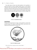
Element to Element Binding (New in Silverlight 3)
A new feature in Silverlight 3 is the capability to bind the property value
of one element to a property value of another element.
For example, suppose you want to bind the value of a
Slider
element to
the
Text
property of a
TextBlock
element. You can use the
ElementName
value in your binding to reference the other element to get the result shown
in Figure 10.4.
Chapter 10: Data Binding
228
From the Library of Lee Bogdanoff
Please purchase PDF Split-Merge on www.verypdf.com to remove this watermark.
ptg
<StackPanel>
<Slider Width="100" x:Name="mySlider"/>
<TextBlock
Text="{Binding Value, ElementName=mySlider, Mode=TwoWay}"
/>
</StackPanel>
Under the Hood
This section discusses how the
Binding
object and the
ItemsControl
element work “under the hood.”
Binding Object
When the Silverlight parser creates a
Binding
object for a markup
extension, the parser calls
Binding.SetupExtension
that consequently calls
FrameworkElement.SetBinding
. The
SetBinding
call creates the connection
between bound properties.
In particular,
FrameworkElement.SetBinding
does the following:
1. Creates a
BindingExpression
object from the
Binding
.
A
BindingExpression
is an internal object that Silverlight uses
to retrieve property values and can be set as the value of a
DependencyProperty
.
2. Calls
SetValue
on the target property with the
BindingExpression
specified.
3. The
BindingExpression
attaches to the data object by caching its
value and listening to any property change notifications that are
available if the
BindingMode
is not
OneTime
.
Under the Hood 229
Figure 10.4: Element to
element binding
From the Library of Lee Bogdanoff
Please purchase PDF Split-Merge on www.verypdf.com to remove this watermark.
ptg
4. The
BindingExpression
also walks up the parent chain to find the
nearest
DataContext
and registers for changes to that
DataContext
property.
5. For some events, the
BindingExpression
substitutes high frequency
property change notifications with lower frequency notifications.
For example, the
TextBox.Text
property changes with every
keystroke and the
BindingExpression
instead listens to the
TextBox.OnChanged
handler. For these substitutions, the
Binding
Expression
also listens to focus lost notifications and forces an
update if focus is lost.
6. The
BindingExpression
reads the initial value from the source and
caches it locally as the initial data-binding value.
After Silverlight creates and connects the
BindingExpression
object,
any changes to the source object notify the
BindingExpression
, which
propagate the value to the data-bound object. If the types of the data object
do not match a target or if there is an explicit value converter set, Silverlight
calls the value converter to convert to compatible types.
ItemsControl
The
ItemsControl
element is the key to data-binding lists and has two
roles: keeping the list of data and expanding the templates used for
display.
When you set the
ItemsControl.ItemsSource
property, the
ItemsControl
listens to any collection changes through the
INotifyCollectionChanged
interface. Any changes to the list including the initial population invalidate
the
ItemsControl
element and mark it as needing a measure pass. Silverlight
Chapter 10: Data Binding
230
PERFORMANCE TIP
For best performance, set the
DataContext
property as close as possi-
ble to the properties bound to the
DataContext
. The more elements
that Silverlight must walk to find the
DataContext
, the slower your
performance will be.
From the Library of Lee Bogdanoff
Please purchase PDF Split-Merge on www.verypdf.com to remove this watermark.
ptg
then measures the
ItemsControl
element on the next tick as discussed in
Chapter 7, “Layout.”
During the
ItemsControl
element measure call, Silverlight parses all
data templates and objects are instantiated to reflect the data changes.
Silverlight defers the template expansion process so that it does not expand
items that are not visible.
Where Are We?
This chapter discussed the following:
• The Silverlight data-binding design principles
• How to connect and synchronize data with your application user
interface
• How the data-binding system works “under the hood”
Where Are We? 231
PERFORMANCE TIP
Template expansion can be a slow process. You should use data binding
for binding your data to controls, but you should avoid excessive use
when scalability up to many thousands of elements is required. For
example, if you are binding data to a list, use the
ItemsControl
element (or
ListBox
element) and data binding. If you are doing a data
visualization animation that consists of tens of thousands of shapes, it is
likely better to use lighter weight elements such as the
Canvas
element and
Shape
element discussed in Chapter 3, “Graphics.”
From the Library of Lee Bogdanoff
Please purchase PDF Split-Merge on www.verypdf.com to remove this watermark.
ptg
This page intentionally left blank
From the Library of Lee Bogdanoff
Please purchase PDF Split-Merge on www.verypdf.com to remove this watermark.
ptg
11
Effects
S
ILVERLIGHT
3
ADDS
new effects including blur, drop shadow, and
custom pixel shaders. For example, you can apply a drop shadow to
some text, a blur to simulate motion blur, or create a custom water effect.
This chapter will describe the following:
• The Silverlight effect design principles
• How to use built-in effects
• How to define custom pixel-based effects
• How Silverlight effects work “under the hood”
Effect Principles
The design principles of Silverlight effects include the following:
• Good performance for real-time animation
• Basic built-in effects
Real-Time Speed
Silverlight 3 introduces a pixel shader API (application programming inter-
face) tuned for real-time scenarios such as the use of custom effects with
animation. A pixel shader is a small program that allows you to modify the
233
From the Library of Lee Bogdanoff
Please purchase PDF Split-Merge on www.verypdf.com to remove this watermark.
ptg
visual appearance of an element based on the element’s rasterization, brush
inputs, and pixel shader parameters. With the pixel shader API, you can
write your own custom effects, including color filters, edge detection filters,
and so on. The pixel shader language is limited in its expressiveness to
enable the Silverlight runtime to parallelize the pixel shader code to run on
multiple processor cores using SIMD (Single Instruction Multiple Data)
CPU instructions.
Common Built-In Effects
Silverlight includes a set of common effects such as blur and drop shadow
effects. These effects are useful by themselves but also provide useful
building blocks that you can use with shader-based effects. For example,
you can use a blur effect to simulate depth of field, motion blur, and
light blooms.
Effect Elements
In this section, you will learn how to use the built-in Silverlight effects and
how to create your own custom effects.
Applying an Effect
To use an effect, you can set the
UIElement.Effect
property to the desired
effect object to get the result shown in Figure 11.1.
Chapter 11: Effects
234
Figure 11.1: Drop shadow effect
applied to text
<TextBlock FontSize="24">
<TextBlock.Effect>
<DropShadowEffect BlurRadius="5" Opacity="0.5"/>
</TextBlock.Effect>
Hello World
</TextBlock>
From the Library of Lee Bogdanoff
Please purchase PDF Split-Merge on www.verypdf.com to remove this watermark.
ptg
Effect Elements 235
Silverlight 3 has two built-in effects:
DropShadowEffect
and
BlurEffect
.
The drop shadow effect blurs the contents of an element, applies an offset
transform, converts to grayscale, and draws underneath the original
content.
You can use a
BlurEffect
class to apply a Gaussian blur to an element’s
content to get the result shown in Figure 11.2.
Figure 11.2: Blur effect
applied to text
PERFORMANCE TIP
Blur and drop shadow effects use significant CPU time and memory.
If you can simulate the drop shadow with radial and linear gradients,
you will get significantly better performance.
Technical Insight
Both the blur and drop shadow effects implement the blur operation by
creating a temporary surface to render the element’s content, applying a
horizontal Gaussian blur, and then applying a vertical Gaussian blur. This
process is mathematically equivalent to applying a two-dimension blur.
However, this process involves allocation of a surface and multiple passes
over the pixels.
<TextBlock FontSize="24">
<TextBlock.Effect>
<BlurEffect Radius="10"/>
</TextBlock.Effect>
Hello World
</TextBlock>
From the Library of Lee Bogdanoff
Please purchase PDF Split-Merge on www.verypdf.com to remove this watermark.
ptg
Creating an Effect
To create a custom effect, you need to write a pixel shader in a language
such as the DirectX High Level Shader Language (HLSL). Pixel shaders
limit the length of programs that run on each pixel and can only
• Read input registers.
• Read bitmap image colors using samplers. A sampler is the name of
the component that allows reading colors from a brush.
• Take parameters that provide the position in the element.
• Do simple math and output a color as four floating-point numbers
with each channel between 0 and 1.
Technical Insight
The pixel shader format used in Silverlight is the same as the pixel shader
byte code used in DirectX 9. Using the same format enables you to use the
DirectX shader tools and may enable GPU acceleration of shader effects in
a later Silverlight version. Using an HLSL compiler is the easiest way to
generate pixel shader byte code.
You can write a simple HLSL pixel shader that fills the element content
with pure red by writing the following code:
float4 main(float2 elementPosition : TEXCOORD) : COLOR
{
float4 outputColor;
// Set the color to red and return the color
outputColor.a = 1.0f;
outputColor.r = 1.0f;
outputColor.g = 0.0f;
outputColor.b = 0.0f;
return outputColor;
}
Chapter 11: Effects
236
From the Library of Lee Bogdanoff
Please purchase PDF Split-Merge on www.verypdf.com to remove this watermark.
ptg
You can compile the HLSL pixel shader using the DirectX
fxc.exe
compiler
that you can get by downloading the DirectX SDK (software development
kit) from For example, if the preced-
ing HLSL program was in a
red.fx
file, you could produce the shader byte
code by running
fxc /Tps_2_0 red.fx /Fored.fx.ps
Technical Insight
Silverlight uses DirectX byte code as the input format instead of HLSL to
enable you to use any input shader language that can output DirectX byte
code and the most recent optimizing compilers.
To apply an HLSL pixel shader to an element, first place
red.fx.ps
in an
assembly as a resource using Visual Studio.
After you have added
red.fx.ps
to your assembly, you can create a
custom effect class by inheriting from the
ShaderEffect
class and setting
the
PixelShader
property to refer to the shader byte code:
public class MyShaderEffect : ShaderEffect
{
static MyShaderEffect()
{
//
// Load the pixel shader once in a static constructor
// so that each use of the effect does not have to reload
// the pixel shader.
//
pixelShader = new PixelShader();
//
// red.fx.ps must be compiled byte code embedded in the
// assembly containing MyShaderEffect.
//
pixelShader.UriSource = new Uri(
"/ShaderExample;component/red.fx.ps",
Effect Elements 237
From the Library of Lee Bogdanoff
Please purchase PDF Split-Merge on www.verypdf.com to remove this watermark.


