CSS in 44 minutes
Bạn đang xem bản rút gọn của tài liệu. Xem và tải ngay bản đầy đủ của tài liệu tại đây (9.69 MB, 44 trang )
Sold to
STEP BY STEP GUIDE
CSS in
44 minutes
Build your own webpage
from scratch
Written by
Jeremy Thomas
© Copyright 2018 – Jeremy Thomas
1Introduction
Thisbookisastepbystepguidethatwillteachyouhowtobuildthiswebpagefromscratch:
It'sthewebpageofafictionaltechrecruitercalledAlexJefferson.AllimagescomefromUnsplash.Asyou
followthisguide,feelfreetochangethestylesandcontentthewayyouwant.
Whoisthisbookfor
Anyonecanreadthisbook!Nopriorwebdevelopmentorprogrammingknowledgeisrequired,sinceIwill
tellyouwhattodo,linebyline.
Whatyouwillbuild
Thiswebpagewillusethefollowingfiles:
1HTML5file
3CSSfiles
4images(provided)
1JavaScriptfile
Itwillalsomakeuseoftwothirdpartyservices:FontAwesomeandGoogleFonts.
Whatyouwilllearn
Throughthisguide,Iwillteachyouhowto:
SetupavalidHTML5document
Writesemanticmarkup
InsertresponsiveRetina-friendlyimages
LearnhowtostructureyourCSScorrectly
Designa100%responsivepage
Understandhowmediaquerieswork
UseCSSFlexboxtolayoutyourcomponents
Styleyourtextwithtypographyproperties
AddvisualfeedbackwithCSSTransitions
BringyourpagetolifewithCSSAnimations
MakeuseofGoogleFonts
IncludeandstyleFontAwesomeicons
Whatyouneedtostart
Youonlyneedtoinstall2programs:
adecenttexteditororIDEwithsyntaxhighlighting.IrecommendSublimeTextbutyoucanuse
Notepad++,Vim,Emacs,IntelliJ,Atom…
amodernwebbrowser.IuseGoogleChromebutyoucanuseFirefox,Safari,Opera,orEdge.
YoualsoneedafewfilesthatIhaveprovided:
1CSSfile: minireset.min.css
7images:
alex.jpg
austria.jpg
1x.png
2x.png
3x.png
Havethemavailableandreadytobeused.
2WritingtheHTML5
content
Openyourtexteditor,createanewfileandpastethiscodesnippet:
<!DOCTYPE html>
<html>
<head>
<meta charset="utf-8">
<meta http-equiv="X-UA-Compatible" content="IE=edge">
<meta name="viewport" content="width=device-width, initial-scale=1">
<title>Alex Jefferson – Tech Recruiter</title>
</head>
<body>
Hello world!
</body>
</html>
Savethisfileas index.html ,openitinyourbrowser,andyouwillseethefollowingpage:
Makesuretohavethe .html fileextension.Here'showtodoitonWindowsandMacOS.
AvalidandresponsiveHTML5document
ThispageisavalidresponsiveHTML5pagebecauseitsatisfiesthefollowingrequirements.
<!DOCTYPE html>
ThislinetellsthebrowserthatthiswebpageisanHTML5documentandshouldbeinterpretedassuch.
<meta name="viewport" content="width=device-width, initial-scale=1">
Thisistheresponsivemetatag.Ittellsthebrowsertosetthecontentwidthtotheviewportone,ensuring
forthecontenttoadaptautomatically.Italsotellsthebrowsertosetthezoomlevelto1initially,whilestill
allowingtheusertozoomin(especiallyonmobilephones).
Also,eachHTMLtag( <html> , <head> , <body> …)isopenedandclosedintherightorder.Onlythe
<meta> tagsneedtobeself-closing.
AddingtheCSSreset
Beforedesigningyourpage,youwanttostartwithacleancanvas.Sinceeachbrowsercomeswithitsown
defaultstyles,youwanttoremovethemfirst,otherwisethesestyleswillclashwithyours.Thisprocessis
thepurposeofaCSSreset.
Bestpractice
Separatecontentandstyling
YouwanttochooseanHTMLtagforitssemanticmeaning,notitsappearance.
Ifchanginganelement'staginyourHTMLchangesitsappearance,thenyou’reessentiallystylingyour
webpageintheHTML,whichiswhatwewanttoavoid.
MostcurrentCSSresetsareeithercomplicatedoroutdated,soIcreatedasmallonecalledminireset.css.I
useitforallmyprojects,andit'sincludedbydefaultinBulmatoo.
Theonlytworealrequirementsareto:
removethemarginsandpaddingsfromallblockelements
use box-sizing: border-box
Feelfreetoreadthroughthesourcecode.
Alongsideyour index.html file,createa /css folder,andmovethe minireset.min.css fileinit.
Let'slinkourCSSfilefromtheHTMLfile.Justbelowthe <title> ,addthisline:
<title>Alex Jefferson – Tech Recruiter</title>
<link rel="stylesheet" type="text/css" href="css/minireset.min.css">
Thetext "Hello world!" isnowunstyled.
YourownCSS
Inthe /css folder,createanewemptyfilecalled main.css .
YounowhavetoincludethisCSSinyourpage.In index.html ,rightbelowtheminireset,linkyour
main.css file.Younowhave2CSSfiles:
<link rel="stylesheet" type="text/css" href="css/minireset.min.css">
<link rel="stylesheet" type="text/css" href="css/main.css">
ToseeiftheCSSwascorrectlyincluded,addthisto main.css :
html {
background-color: blue;
}
Ifyourscreendoesn'tturnblue,makesureyour index.html fileisalongsideyour /css folder:
TheCSSnowworkssoyoucanremovethebluebackgroundfromtheCSS.BeforewritinganyCSS,you
havetostartwiththemostimportantofawebpage:thecontent.
Writingcontent
Thepurposeofdesignistoenhancethepresentationofthecontentit'sappliedto.Itmightsoundobvious,
butcontentbeingtheprimaryelementofawebsite,itshouldnotbeestablishedasanafterthought.Written
contentmakesupformorethan90%oftheWeb.
Remove "Hello world!" fromyourpage,andputthiscodeinsidethe <body> :
<div class="wallpaper"></div>
<div class="content">
<aside class="side">
<figure class="picture">
<div class="picture-shadow"></div>
srcset="images/alex.jpg 1x,
images/ 2x,
images/ 3x"
alt="Portrait of Alex Jefferson"
width="320"
height="320">
</figure>
</aside>
<main class="about">
Hi, I'm Alex Jefferson
Tech recruiter
<hr class="hr">
<div class="description">
I spend my time traveling the world,
helping startups and tech businesses
hire the best people.
</div>
<div class="contact">
<a class="button" href="mailto:">
Get in touch
</a>
</div>
</main>
</div>
Asyoucansee,HTMLisnoisy:thereislotscodefornotmuchcontentonscreen.ButalltheseHTMLtags
arehereforsemanticreasons,andalltheseCSSclassnamesareherefor(future)stylingpurposes.
HTMLstructure
The wallpaper willdisplayatransparentimageinthebackground,coveringthewholepage.
The content isthecontainerforthereadablepartofthewebpage,andwillcoverthewholepageaswell.
Ontheright,the side willdisplaytheportraitimage.
Ontheleft,the about sectionisawrapperforalltext.The button actsasalinkforvisitorstoclick,so
makesuretoreplace withyourownemailaddress.
ResponsiveandRetina-friendlyimages
Asyoucansee,sincethe alex.jpg imageismissing,thebrowserisshowingthe alt text"Portraitof
AlexJefferson"asafallback.Tofixthis,createan /image folderalongsidethe /css one,andmovethe4
images( alex.jpg , , and )inside:
Wewanttodisplaythisimageatamaximumof 320x320 pixels.Butscreenshavedifferentpixelratios,
especiallymobilephones.Forexample,theSonyXperiaShasapixelratioof 2 ,theAppleiPhoneX 3 ,
andtheSamsungGalaxyS8 4 .
Wecouldshowthe 1280x1280 versiontoeveryoneandresizeitto 320x320 .Butwewouldpenalize
userswhoownadevicewithapixelratioof 1 becausetheywouldendupdownloadinganimage10
timesthesizethattheirdevicecanactuallydisplay.
Thesolutionisto:
showtheuserthehighestqualityimagepossibletheirdevicecansupport
preventthebrowserfromdownloadingtheotherimages
Thisispossiblethankstothe srcset attributewhichtellsthebrowserthelistofimagealternatives
availableforeachpixeldensity,andlethimfigureoutwhichimagetodisplay.
Ifthebrowserdoesn'tsupport srcset ,itwilluse src asafallback.
Thisisallthecontentthatyouneedfornow:
aportraitimage
aname
ajobtitle
adescription
acontactbutton
Thiscontentwillbeextendedfurthermorelater.It'stimetoaddyourfirstlinesofCSS.
3SettingupaCSSbase
Beforestylingindividualelements,youneedtosetaglobalbasestyleforyourwebpage.
Thehtmlstyles
Thegeneralstylingofawebpageisdonethroughstylesappliedtothe html elementbecausemostof
themarecascadedthroughalltheotherchildelements.
Inyourempty main.css file,addthiscode:
/* 1. Base */
html {
background-color: #5f45bb;
background-image: linear-gradient(to bottom right, #180cac, #d054e4);
color: #fff;
font-family: "Quicksand", sans-serif;
font-size: 16px;
-moz-osx-font-smoothing: grayscale;
-webkit-font-smoothing: antialiased;
line-height: 1.5;
min-height: 100vh;
min-width: 300px;
overflow-x: hidden;
text-shadow: 0 3px 5px rgba(0, 0, 0, 0.1);
}
Thisrule-setisbasicbutdoesthejob:
the background and color declarationssettheoveralltone
the font and text-shadow setthebasetypography
the line-height andbrowser-specific font-smoothing declarationsmakethepagemorereadable
thedimensionsandoverflowvaluesensurethatthepagefillsupthewholeviewport
Bestpractice
OrderyourCSSrulesalphabetically
WheneditingaCSSfile,findingthedeclarationtochangecanbetimeconsuming.
Toreducethecognitiveloadwhenbothreadingandwritingrules,writethemalphabetically.
It'stheonlysortingrulethatisfuture-proofbecauseit'sopinionless.
Whenyouwillhavemorethan10CSSdeclarationsinarule,youwillbegladtoknowwheretofindwhatyou
werelookingforinasplitsecond!
The background-color usuallyactsasafallbackifthe background-image doesn'tload,butsincewe're
usinga linear-gradient() itwillalmostalwaysappear.Thisgradientappearsontopofthesinglecoloredbackground,hencewhyweonlyseethegradient.
Thefont-familypropertytakesalistofpossiblefamilies.IftheQuicksandfontisnotavailable,thebrowser
willusethefallbackfontprovided: sans-serif .ThisusuallymeansArialorHelveticaonWindows
machines,SanFranciscoonMacOS,andUbuntuonLinuxmachines.Sinceyourvisitorswillprobablynot
havethatfont,wewillincludeitusingGoogleFonts.
The line-height hasaunitlessvalueof 1.5 .Itmeanseachlineoftextwillbe1.5timestheelement's
currentfontsize.Formostofthepage,andcombinedwiththe font-size: 16px declaration,thiswill
makeeachlineoftext 24px high.
Ialwayshavea min-width: 300px thatpreventsthepagefrombeingtoonarrowtobereadable.
The min-height: 100vh ensuresthepagetobeatleastastallas100%oftheviewportheight( vh ).
The overflow-x: hidden declarationpreventsthepagefromscrollinghorizontallywhilepreservingthe
usualverticalscroll.
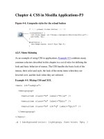
AddingtheGooglefonts
In index.html ,beforeincluding minireset.min.css ,addthisCSSfromGoogleFonts.Younowhave3
CSSfiles:
<link href=" rel="stylesheet">
<link rel="stylesheet" type="text/css" href="css/minireset.min.css">
<link rel="stylesheet" type="text/css" href="css/main.css">
Thisaddstwofontstoyourpage:QuicksandandMontserrat,bothinregularfontweightonly(valueof
400 ).Reloadthepagetoseethefontsinaction:
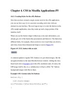
Stylinglinks
Linksarebydefaultblueandunderlined.AddthisinyourCSS:
a {
color: currentColor;
cursor: pointer;
text-decoration: none;
}
Using currentColor ispreferedbecauseitwillpickupthecolorsetby html before: color: #fff .
Updatingthecolorofbothonlyrequiresasinglelinechange.
Sometimes,thehandcursordoesn'tshowupwhenhoveringalink.That'swhyIalwaysadd cursor:
pointer toforcethehandtoshowup.
"Getintouch"isnowwhiteaswell:
4Definingthelayout
Thewallpaper
Attheendof main.css addthissnippet:
/* 2. Shared */
.wallpaper {
display: block;
height: 100%;
left: 0;
top: 0;
width: 100%;
}
Thisisthe 2. Shared sectionoftheCSS.Here,differentselectorswillsharethesamesetofrules.Wewill
extendthissectionasweneedalongtheway.
Fornow,thisruleensuresthatthewallpapercoversthewholepage.
Wenowenterthe 3. Specific sectionwherewewillstyleeachelementindividually.Addthe
austria.jpg filetothe /images folder:
Thenaddthissnippetattheendof main.css :
/* 3. Specific */
.wallpaper {
background-image: url("../images/austria.jpg");
background-position: center;
background-size: cover;
opacity: 0.2;
position: fixed;
}
Thisimageisnotdisplayedwithan <img> tagbecauseitspurposeisdecorativeandbelongsintheCSS.
Thankstothefixedpositioning,thewallpaperwillnotscrollwiththepage.
Bestpractice
Avoidtheshorthandnotation
We'reusingeach background-* propertyinsteadoftheshorthand background one.
Ifyouuse background: red ,youareessentiallysetting background-color: red andresetingallother
propertiestotheir initial value.
Itbecomesaproblemwhenyouactuallyoverrideadeclarationyouhadpreviouslywritten,andyouwonder
whyyourCSSlinedoesn'twork!
If background-color hadbeensetearlier,itwouldhavebeenundonehere.
Theonlyusefulshorthandpropertiesare margin , padding and border .
Mainlayout
The content elementisparenttoboth:
side withtheportraitimage
about withthetextcontent
We'regonnauseCSSFlexboxtosetthegloballayoutofthepage.
.content {
display: flex;
position: relative;
min-height: 100vh;
}
.side {
max-height: 20rem;
max-width: 20rem;
}
.about {
max-width: 26rem;
}
WeenableFlexboxonthe .content bysimplyusing display: flex .Thismakesboth .side and
.about Flexboxitems.
The position: relative allows .content toappearabove .wallpaper ,andthe min-height is
heretomakesure .content coversthewholepage.
Theuseof max-width isverypractical:itjustmeansthatatanypointwedon'twantanelementtoby
widerthanacertainvalue.Forreadabilityreasonswewantthe .about sectiontonevergobeyond
26rem inwidth(whichis 26 x 16px = 676px ).Sinceit'sablockelement,itwillusethewholewidth
availableuptoacertainpoint.Dependingonthelengthofyourwrittencontent,youcanplaywiththevalue
here.
Bestpractice
Avoidz-indexwhenpossible
Allpositionedelements( absolute , fixed ,or relative )canhavea z-index valuetostackthem
relativelytoeachother.
ButelementsarealreadystackedbasedontheirlocationwithintheHTMLcode.
Because .wallpaper and .content aresiblings,thesecondone .content willappearabove(onlyifit's
positionedtoo).
Andchildelementswillappearabovetheirparent.
It'sbettertoplacethemasyouwantinyourHTML,otherwiseyou'llhavetokeeptrackofall z-index values
throughoutyourCSS.
Makingthelayoutresponsive
Wewantourlayouttoberesponsive,meaningthatitwillbedifferentonsmallerviewports(below 800px )
thanonwiderones( 800px andabove):
onmobile,we'rehavingacenteredverticallayout
ondesktop,we'rehavingacenteredhorizontallayout
We'regonnawriteamediaquery:anyCSSwritteninsidethatblockwillonlybeactiveifalltheitemsinthe
mediaquerylist( screen and (max-width: 799px) )aretrue.Inthiscase,wearetargettingmobile
deviceswhohaveaviewportnarrowerorequalto 799px .
Luckily,evenonyourdesktopyoucansimplyresizeyourbrowsertoseeitinaction.
/* 4. Responsiveness */
@media screen and (max-width: 799px) {
.content {
flex-direction: column;
justify-content: center;
align-items: center;
padding: 5rem 3rem;
}
.side {
margin-bottom: 3rem;
width: 100%;
}
}
Resizeyourbrowsertoseeitinaction.
We'reusingthefollowingFlexboxproperties:
flex-direction: column makesthelayoutvertical
justify-content: center makesthecontentcenteredonthemainaxis(vertical)
align-items: center makesthecontentcenteredonthecrossaxis(horizontal)
The padding preventsthecontentfromtouchingtheviewportedges,givingitsomespacetobreath.
The .side (whichcomesfirst)hasa margin-bottom toseparateitfromthe .content (whichcomes
second).
Desktopview
Ondesktop,wewantthelayouttobehorizontalinstead:
@media screen and (min-width: 800px) {
.content {
align-items: center;
justify-content: space-around;
justify-content: space-evenly;
padding: 4rem;
}
.side {
flex-grow: 0;
flex-shrink: 0;
height: 20rem;
margin-left: 4rem;
order: 2;
width: 20rem;
}
.about {
flex-grow: 1;
flex-shrink: 1;
}
}
The .content usesthedefaultvalueof flex-direction whichis row ,meaningtheitems( .side
and .about )arespreadouthorizontally. justify-content appearstwicebecausethe space-evenly
valueisnotavailableinallbrowsers,soweuse space-around asareasonablefallback.
The .side element(whichcontainstheimage),hasfixeddimensionsofa 20rem by 20rem square.If
there'smorehorizontalspaceavailable,wedon'twantittogrow,hencethe flex-grow: 0 .Ontheother
hand,wealsodon'twantittoshrinkatall,otherwise,theimagewouldbesquased.That'swhy flex-
shrink: 0 isusedheretoo.Webasicallywantthe .side tobe 20rem by 20rem atalltimes.Wealso
wantittoappearafterthetextcontent,whichiswhyweuse order: 2 .
Forthe .about ,wedowantittousetheremainingspaceavailable,inbothdirections,whichiswhy
flex-grow and flex-shrink havebothavalueof 1 .
Bestpractice
Inmediaqueries,don’tundo,justdo
Withmobile-firstapproaches,it'seasytomakealayoutworkwellonnarrowscreens,andthen"undo"mostof
itondesktop.Butthat'strickybecauseyouhavetokeeptrackofwhathasbeendoneoutsideofmediaqueries,
andresetthosevaluesinsidethedesktopmediaquery.YoualsoendupwritingalotofCSSjusttoreset
values,andyoucanendupleavingCSSlike margin-bottom: 0 youarenotsurewhat.
The margin-bottom setforthe .side elementshouldonlyappearonmobile.
Insteadofapplyingamarginbydefaultonallscreens,andremovingitondesktop,weonlyapplyitonmobile.
5Stylingallelements
Thepicture
Theshadowisseparatedfromtheimagebecausewearegoingtoanimatethemseparatelylateron.
Inthe 2. Shared sectionoftheCSS,updatethelistofselectorsandaddboth .picture-shadow and
.picture-image :
.wallpaper,
.picture-shadow,
.picture-image {
display: block;
height: 100%;
left: 0;
top: 0;
width: 100%;
}
Attheendofthe 3. Specific sectionoftheCSS,addthefollowingstyles:
.picture {
padding-top: 100%;
position: relative;
width: 100%;
}
.picture-shadow {
border-radius: 290486px;
background-image: radial-gradient(#000 0%, rgba(0, 0, 0, 0) 70%);
position: absolute;
top: 10%;
}
.picture-image {
border-radius: 290486px;
position: absolute;
}
The padding-top: 100% isatechniquethatmakesthe .picture ashighasitiswidemakingitsquare
atalltimes.Italsohasa position: relative sothatitactsasareferencepointforitstwoabsolutely
positionedchildren.
Theshadowusesasemi-transparent radial-gradient() .It'sslightlyoffsettowardsthebottomwith
top: 10% .
The border-radius issettotheveryhighvalueof 290486px toensuretheelementstoberounded.You
canuseanyextremelyhighvalue.Ipersonalyuse 290486px asatrademarkbecauseit'smydateofbirth.
It'squiteinterestingtoseeitshowupinotherpeople'scode!
Thename
Thenameisthemostimportantinformationofthepage.That'swhyitusesthe


