Tài liệu Web Application Design Patterns- P13 docx
Bạn đang xem bản rút gọn của tài liệu. Xem và tải ngay bản đầy đủ của tài liệu tại đây (1.07 MB, 30 trang )
CHAPTER 11 Accessibility
346
<link rel="stylesheet" href="name_of_cssfile.css" type="text/css" media="all" />
<style type="text/css">
@import url(name_of_cssfile.css);
</style>
FIGURE 11.2
Two common approaches of referencing an external style sheet.
FIGURE 11.3
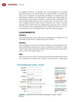
Washington Mutual allows users to change the text size by clicking on one of
the text options in the top-right corner of the page.
earlier in this chapter). Then, add presentation-related markup using style sheets
such that the addition of style sheets does not limit the page’s accessibility.
KEEP PAGE MARKUP AND STYLE SHEETS SEPARATE
Keep all style sheet declarations in external CSS fi les rather than embedding them
in individual pages or presenting them inline with markup elements. Style sheet
fi les can then be referenced using either the < link > or @import tag ( Figure 11.2 ).
By keeping all style declarations in a separate fi le, it’s also easier to update one
external fi le rather than go through every application page and make updates.
USE RELATIVE UNITS FOR FONT SIZES TO ALLOW
USERS TO RESIZE TEXT
Using relative units, such as em, %, and keywords, allows users to enlarge or
reduce text size as needed in web browsers such as Firefox, Safari, and Internet
Explorer. Although px (pixels) is considered a relative unit, Internet Explorer
(version 6 and older) doesn’t allow text in the px-based layouts to be resized.
Internet Explorer 7, however, allows user to zoom in and out of the page; this
feature zooms in/out the entire page, not just the text.
It’s possible that some users may not know how to resize text using browser con-
trols. Therefore, consider providing users an explicit way to resize text ( Figure 11.3 ).
ALLOW USER STYLE SHEETS TO OVERRIDE AUTHOR
STYLE SHEETS
User style sheets are CSS fi les created by users and are used to override author
style sheets to make pages easier to read. For example, a user might change the
background color to black and the text color to yellow and set the font size
larger to make the page easier to read. Most of the popular web browsers allow
347
users to specify and use their own style sheet over the designer’s/publisher’s
style sheet.
Browsers give preference to users ’ style sheets unless a style declaration is
marked !important in the style sheets. Not being able to override the author
styles can, in some instances, make pages unreadable for some users. Therefore,
avoid using !important declaration in style sheets.
Related design patterns
Even when using CSS unobtrusively, it’s important to use structural tags
to mark up pages to ensure that pages are accessible without style sheets
(SEMANTIC MARKUP). In addition, style sheets should be added only after
the page structure has been created (PROGRESSIVE ENHANCEMENT).
UNOBTRUSIVE JAVASCRIPT
Problem
Using JavaScript on pages can offer users richer interactivity and make inter-
action more pleasant. However, not all web browsers support JavaScript, and
users or system administrators may disable JavaScript because of their work-
place security policy or personal preference. Therefore, web applications depen-
dent on JavaScript may become inaccessible to at least some users.
Solution
Use JavaScript “ unobtrusively ” — that is, incorporate JavaScript within web
pages in such a way that not having it available does not affect users ’ ability to
use the web application.
Why
Using JavaScript unobtrusively and redundantly allows web applications to be
functional without being dependent on it. When JavaScript is supported and
enabled, the web application can offer enhanced interactivity.
How
Following the principle of PROGRESSIVE ENHANCEMENT, structure the
page fi rst (SEMANTIC MARKUP), add necessary presentation enhancements
(UNOBTRUSIVE STYLE SHEETS), and then enhance browser interaction using
JavaScript such that not having it available does not affect structural and pre-
sentation layers and the use of the web application.
KEEP PAGE MARKUP AND JAVASCRIPT SEPARATE
Keep all JavaScript for the web application in external JS fi les rather than in the
page itself or embedded in the HTML markup, and reference them using the
< script > tag as follows:
< script type = " text/javascript " src = " javascriptfile.js " > < /script >
Unobtrusive JavaScript
CHAPTER 11 Accessibility
348
Keeping JavaScript fi les separate from page structure also makes it easy to
change scripts without updating individual pages within the application.
USE THE DOM SCRIPTING APPROACH TO ATTACH
FUNCTIONS TO PAGE EVENTS
Do not embed JavaScript functions within page markup. That is, do not call
JavaScript functions that use the approaches shown in Figure 11.4 .
Calling JavaScript functions from page markup may prevent pages from work-
ing correctly in browsers where JavaScript is unavailable or disabled. A better
approach is to attach functions to events for different page elements using
the DOM
3
Scripting approach (Keith, 2005). Use DOM methods such as
getElementById and getElementsByTagName to fi nd a specifi c element or a set
of elements, respectively, and then assign behavior to specifi c events such as
click , mouse over , and so forth ( Figure 11.5 ).
DO NOT USE DROPDOWN LISTS TO INITIATE NAVIGATION
OR FORM SUBMISSION
Do not use JavaScript to navigate to a different page or change effects on the
web page when users change the option in a dropdown list. This is typically
accomplished using the onchange event handler in JavaScript. Instead, allow
users to select the menu item and then click an adjacent form button to go to
the page corresponding to the item they have selected.
If a dropdown list is used to submit a form or to navigate to a different page,
it will be extremely diffi cult, if not impossible, for keyboard users to select an
appropriate option. For example, if a dropdown list is used to navigate to a dif-
ferent page as users select an item in the list, this would trigger the onchange
event, and users would be immediately taken to the corresponding page.
<a href="javascript:doThis();">Link Anchor</a>
or
<input type="button" onclick="doThis();" value="Save Changes" />
FIGURE 11.4
“ Obtrusive ” ways of incorporating JavaScript — that is, calling JavaScript
functions within the page markup.
var allLinks = document.getElementsByTagName("a");
for (var i=0; i<allLinks.length; i++) {
allLinks[i].onclick = function() {
…
return false;
}
}
FIGURE 11.5
This code snippet accesses all links within the document (marked up using the
< a > tag) and assigns the onclick behavior to it.
3
DOM, or Document Object Model, refers to a way of representing HTML and XML documents
so that they can be manipulated using scripting technologies such as JavaScript. For more infor-
mation, see www.w3.org/TR/DOM-Level-3-Core/introduction.html .
349
The only way for assistive technology users to select the last item in the drop-
down list would be to repeatedly go back after selecting an option from the
dropdown list, navigating to the page, and then select the next option in the
list and so forth, until the last item is reached.
Related design patterns
Using JavaScript unobtrusively requires that pages be built using the principle
of PROGRESSIVE ENHANCEMENT and that the “ behavior ” layer provided by
JavaScript be completely separated from the structure and presentation layers (pro-
vided by SEMANTIC MARKUP and UNOBTRUSIVE STYLE SHEETS, respectively),
such that its unavailability does not make the web application inaccessible.
ACCESSIBLE FORMS
Problem
Forms may become diffi cult to use if they are designed without regard to their use
with keyboards and assistive technology such as screen readers or Braille readers.
Solution
Lay out form elements and incorporate appropriate accessibility tags in the
markup to make forms accessible to assistive technology users. At a minimum,
associate form elements with labels using < label > tags, group related form ele-
ments using < fi eldset > tags, and set appropriate sequences for tabbing through
form elements using tabindex attributes.
Why
Forms are the foundation of web applications. Making them accessible is essen-
tial to ensure the widest reach. Using < label > tags and grouping form elements
using < fi eldset > also adds meaning to elements and helps create a semantic
structure in the markup (see the SEMANTIC MARKUP pattern earlier in this
chapter). These techniques not only make forms accessible for users of assistive
technology, but they also make them more usable and readable for users with-
out disabilities.
How
First and foremost, follow the patterns in Chapter 2 to make forms usable and
accessible. Ensure that forms are organized in a logical order and that it is easy
for users to associate a form element with its label.
USE < LABEL > TAGS TO IDENTIFY CORRESPONDING
FORM ELEMENTS
Use < label > tags to associate fi eld labels to their corresponding form elements
as follows:
< label for = " firstName " > First Name: < /label >
< input type = " text " id = " firstName " name = " firstName " / >
Accessible Forms
CHAPTER 11 Accessibility
350
In this example, the text fi eld for fi rst name has an id of “ fi rstName ” that is ref-
erenced in the < label > tag using the “ for ” attribute to associate the label First
Name
to the corresponding text fi eld.
Not only does the < label > tag make it easy for screen readers to correctly associ-
ate labels to form control irrespective of where the form control is positioned,
but it also helps sighted users when they interact with radio buttons and check-
boxes. When used with radio buttons and checkboxes, the < label > tag allows
users to click the label to select the corresponding radio button or checkbox.
Thus, users have a larger clickable area and are not restricted to clicking the
smaller radio button controls or checkboxes ( Figure 11.6 ).
In addition, to ensure that screen readers present information to users in the
correct order, place labels that relate to text fi elds or dropdown lists before the
form element in the markup. This does not apply to radio buttons and check-
boxes, where labels come after the corresponding controls.
GROUP FORM CONTROLS USING < FIELDSET > TAGS
Use the < fi eldset > tag to group related form controls and use the < legend > tag
to provide a heading to the grouped form controls ( Figure 11.7 ). This helps
screen readers identify and communicate groups to users. The tags < fi eldset > and
< legend > can also be styled using style sheets to make them visually appealing
(Adams, 2008).
MAKE FORMS KEYBOARD ACCESSIBLE
Most browsers allow users to navigate among links, frames, and form elements
on a page using the Tab key, which when pressed, moves the focus from one
element to another in the order of their presence in the markup. In most cases,
when the page is marked up correctly, the sequence in which users would move
from one element to another would be correct. However, in cases, when the
default tab sequence needs to be changed to provide a better form-fi lling expe-
rience, use the tabindex attribute for form elements ( Figure 11.8; see also the
KEYBOARD NAVIGATION pattern in Chapter 2).
Another way to make forms keyboard accessible and effi cient to use is by using
the
accesskey attribute, which allows users keyboard access to frequently used
FIGURE 11.6
In this form from Orbitz, users can click either on the highlighted areas or
the radio controls instead of just clicking the radio button control to select an option.
351
areas on a page or form ( Figure 11.9 ). For example, the accesskey attribute can
be used to navigate among primary navigation options in a web application
and can also be used with a link to allow users to navigate to corresponding
pages using the keyboard.
When the accesskey attribute is specifi ed, users can press a combination of the
“ modifi er ” key(s) (e.g., Alt or Ctrl keys) in conjunction with the character spec-
ifi ed in the accesskey attribute. See Figure 11.10 for a list of modifi er key(s) on
different browsers.
USE JAVASCRIPT UNOBTRUSIVELY WHEN USED
FOR FORM VALIDATION
Many forms use client-side scripting technology, such as JavaScript, to manipulate
forms or check for validity of users ’ data input. However, use of such scripting
Accessible Forms
<label for="firstName">First Name:</label>
<input type="text" id="firstName" name="firstName" tabindex="10" />
<label for="lastName">Last Name:</label>
<input type="text" id="lastName" name="lastName" tabindex="20" />
FIGURE 11.8
The tabindex attribute allows users to navigate form elements in a logical manner.
<label for="search" accesskey="S">Search:</label>
<input type="text" id="search" name="search" />
FIGURE 11.9
By adding the accesskey attribute of “ S ” to the < label > tag for the search
box, we can allow users to focus on the search fi eld by pressing the Alt key (or Ctrl key or
another key combination) and the “ s ” key at the same time.
FIGURE 11.7
This form in (a) is created using the < fi eldset > and < legend > tags shown in
(b) along with a few style sheet rules (not shown).
(a)
<fieldset>
<legend>Personal Information</legend>
<label for="firstName">First Name:</label>
<input type="text" id="firstName" name="firstName" />
<label for="lastName">Last Name:</label>
<input type="text" id="lastName" name="lastName" />
</fieldset>
(b)
CHAPTER 11 Accessibility
352
technology may render forms inaccessible to users with assistive technology or
those who have disabled JavaScript in their browsers. Therefore, perform the form
validation on the web server regardless of whether it’s done on users ’ browsers
using JavaScript. This will ensure that forms remain accessible to all, including
those using browsers that do not support JavaScript (see also the HIJAX approach
discussed in the PROGRESSIVE ENHANCEMENT pattern earlier in this chapter).
Related design patterns
The patterns discussed in Chapter 2, such as LOGICAL GROUPING, REQUIRED
FIELD INDICATORS, SMART DEFAULTS, FORGIVING FORMAT, KEYBOARD
NAVIGATION, INPUT HINTS/PROMPTS, and ACTION BUTTONS, are all essen-
tial for designing usable and accessible forms.
ACCESSIBLE IMAGES
Problem
Images are not available to users with visual impairments.
Solution
Provide necessary text alternatives for images and minimize the use of superfl u-
ous graphics. There is a common misconception that to make a page accessible, all
images must be removed. This is not true. Illustrations, graphics, and other images
(including animated images) not only help improve comprehension for users
without vision impairments but also help those with some forms of cognitive/
learning disabilities (Brewer, 2005). By incorporating text alternatives for images,
designers can possibly avoid building an alternative version of the web application.
Why
Making images accessible by providing a text alternative allows both screen
reader users and those who have disabled images in their browsers to under-
stand the purpose and function of the images. An added benefi t is that it pro-
vides a meaning and description of images that can be read by search engines
to improve searchability of pages. When used appropriately, images can make a
page look visually pleasing and be incorporated in the page without impacting
its accessibility.
How
Provide a text alternative for images describing the image’s purpose. This is accom-
plished using the alt attribute for all image-related markup: < img > tags, < area >
tags for hotspots on image maps, and input tags of type = " image " ( Figure 11.11 ).
Internet Explorer ALT (PC), Ctrl (Mac)
Mozilla Firefox ALT + SHIFT (configurable by typing about:config in the address field)
Opera SHIFT + Esc
Konqueror (Linux) Press CTRL and the accesskey in sequence
FIGURE 11.10
Modifi er key(s) for different browsers when using the accesskey attribute.
353
USE AN EMPTY ALT ATTRIBUTE FOR DECORATIVE IMAGES
Decorative images refer to images that are used for presentation purposes
only — for example, spacer images, transparent images, or fi ller photographs.
Using the alt attribute to describe such images is not necessary because it
doesn’t communicate any relevant information to users. Therefore, use an
empty alt attribute for images, such as < img src = " spacer.gif " alt = " " / > .
When images are used only for decorative purposes, consider using them as back-
ground. Screen reader users will not see the image, and the need for an empty alt
text will not arise. This can be easily accomplished using CSS ( Figure 11.12 ).
USE THE LONGDESC ATTRIBUTE FOR DETAILED IMAGE
DESCRIPTIONS
Use the alt attribute for images when a short description for the image is suffi -
cient. In cases where the image cannot be described succinctly, use the longdesc
attribute to reference and link to the page where the detailed image description
is provided ( Figure 11.13 ).
Because the longdesc attribute is not supported by older assistive technologies,
often designers put a “ d-link ” (description link) next to the image that opens the
description fi le — the same fi le referenced in the longdesc attribute ( Figure 11.14 ).
USE MEANINGFUL TEXT WHEN DESCRIBING IMAGES
When describing images using either the alt or longdesc attribute, indicate the
image’s informational content and/or function as appropriate within its usage
context. For example, consider Figure 11.15 . This example from WebAIM.org
illustrates a good approach in determining what would constitute a meaningful
text for the PDF icon image. Four potential values for the PDF icon’s alt text are:
1. " Employment Application "
2 . " PDF File "
3. " PDF icon "
4. " " , because the image content is presented in context
Accessible Images
<map name="globalNav">
<area coords="0,0,50,20" href="AboutUs.html" alt="About Us" />
<area coords="51,0,100,20" href="CustomerSupport.html" alt="Customer Support" />
</map>
(b)
(c)
<input type="image" src="btn_login.gif" alt="Log In" />
<img src="btn_login.gif" alt="Log In" />
(a)
FIGURE 11.11
Examples of alt text for images (a), image maps (b), and the input
(type = “ image ” ) tag (c).
CHAPTER 11 Accessibility
354
The preceding are discussed in the online article, Appropriate Use of Alternative
Text (www.webaim.org/techniques/alttext /) :
Notice that the image is within the link. If it were not within the link, then
the
alt text might be different. In this case, because the image provides
additional information about the function of the link, it’s important that it
<div id="preamble">
<h3><span>So What is This About?</span></h3>
<p class="p1">…. </p>
</div>
(b)
#intro #preamble {
background: transparent url(images/breakrule.gif) no-repeat center bottom;
padding: 25px 0px 37px 0px;
width: 464px; }
(c)
#intro #preamble h3 {
background: transparent url(images/txt_sowhatisthisabout.gif) no-repeat left top;
height: 25px;
margin: 0px 0px -9px 27px; }
#intro #preamble h3 span {
display: none; }
(d)
(a)
FIGURE 11.12
In this example from CSS Zen Garden, the designer has included a decorative
image below the section in the background (a). This is evident in the HTML code for this section
(b) and the corresponding style (c). The designer uses the breakrule.gif fi le as the background
image and positions it at the bottom of the paragraph to use it as a separator between it and the
next section. A similar approach is used for the section header, the text of which ( “
So What Is
This About?
” ) is enclosed within the < h3 > < span > tags (b), and its CSS shows the use of the
image as background. The text is hidden from sighted users by setting its display to “ none ” but
is still accessible to text reader users. Another option is to use a large negative text-indent value
(e.g., – 9999px). (Source: www.csszengarden.com/?cssfi le ϭ /204/204.css & page ϭ 0 . )
355
be within the link itself and is read with the link. This is vital because links
are often accessed out of context from their surroundings.
Option A (
" Employment Application " ) is redundant with surrounding text
so it is not the best choice. Option B is the best choice — it clearly provides
the content that is being presented by the image — that the link is to a PDF
fi le. The function (
" Download the Employment Application " ) is presented
within the text of the link, so it does not need to be included within the
alt
attribute. Option C (
" PDF icon " ) describes the image itself, but is not most
appropriate for this context. In another context, it may be important that
the user know that this image is indeed an icon — in such a case, using the
word
" icon " in the alt text may be appropriate. Option 4 (null or empty alt
text) would not provide the important information that the image presents.
Accessible Images
<img src="chart_sales.gif" alt="Sales from the year 2000 to 2003" longdesc="traffic_chart.html" />
FIGURE 11.13
When describing a chart, alt text ( “ Sales from the year 2000 to 2003 ” )
may not be suffi cient to describe what the chart represents. To make it easier for users to
understand the chart, summarize the content on a separate page (in this example,
“ traffi c_
chart.html ”
) and link it using the image’s longdesc attribute.
<img src="chart_sales.gif" alt="Sales from the year 2000 to 2003" />
<a href=”traffic_chart.html”>D</a>
FIGURE 11.14
An example of a d-link that references the page and provides the detailed
image description.
FIGURE 11.15
Using a link and an image together.
NOTE
Another option is to use the PDF icon as a background image and position it using the
style sheet and use the text PDF in the HTML markup as follows:
HTML:
< a href = " /docs/employement_application.pdf " class = " pdfdoc " >
Download the Employment Application (PDF, 300KB)
< /a >
CSS:
a.pdfdoc {
/* Assuming that the image is about 24px × 24px and 6px space to its
left is adequate */
background: transparent url(/images/icon_pdf.doc) no=repeat right;
padding-right: 30px;
}
CHAPTER 11 Accessibility
356
AVOID USING TEXT IN GRAPHICS
Graphic formats (e.g., GIF, JPEG, and PNG) appear pixelated when zoomed in.
When text is used in graphics, users who have magnifi ed the screen to improve
readability would end up reducing the page’s readability ( Figure 11.16 ).
Readability is further compromised when text is overlaid on another image or a
patterned background. Therefore, as much as possible, avoid using text in graph-
ics; it also helps with internationalization (see the EXTENSIBLE DESIGN pattern
in Chapter 10).
FIGURE 11.16
Text used in graphics appears pixelated and thus is diffi cult to read when
magnifi ed.
Related design patterns
Using images should not compromise the SEMANTIC MARKUP. Therefore,
use decorative images as background images using CSS so that they are not
included in the page structure (see also the UNOBTRUSIVE STYLE SHEETS pat-
tern earlier in this chapter).
ACCESSIBLE TABLES
Problem
Reading and understanding data presented in tables can be confusing to assis-
tive technology users if they are unable to establish the relationship among the
data elements. For example, if users are not able to associate data in table cells
to corresponding headings, they may not know exactly what the data represent
and how they relate to data in other cells.
Solution
Reserve the use of < table > tags for presenting tabular data and use style sheets
for page layout (see the TABULAR LIST pattern in Chapter 7). Mark up tabular
data such that table captions, column headings, and row headings are clearly
identifi ed. This helps screen readers understand and communicate the relation-
ship between data presented in tables.
This is not to suggest that pages formatted using < table > tags are inaccessible.
It is possible to build accessible pages using tables so that when content is
“ linearized ” — that is, when all table-related tags are removed and content is
presented in the order it appears in the markup — the resulting content order
matches what users would expect and the page is accessible to assistive tech-
nology users. However, the same visual and structural result can be achieved
357
using style sheets, and there is no longer a valid reason for favoring < table > tags
for layout (Andrew and Shafer, 2006). In addition, using tables for layout vio-
lates the SEMANTIC MARKUP pattern, which suggests that content be marked
up using tags to match its structural intent and not to achieve a certain visual
presentation.
Why
Associating data in tables to their column and row headings helps screen read-
ers correctly communicate the relationship among data elements, and users
establish appropriate context for their use.
How
Most important, clearly distinguish headings that indicate what the data repre-
sent from data cells (the actual values). This is achieved by marking up head-
ings (both column and row headings) using < th > tags and data values using
< td > tags.
USE THE < CAPTION > TAG AND SUMMARY ATTRIBUTE
TO ESTABLISH CONTEXT
Use the < caption > tag to provide a short descriptive title indicating the table’s
purpose ( Figure 11.17 ). The information within the < caption > tag is displayed
to users and can be formatted using style sheets.
In addition, use the summary attribute to describe in detail what the table presents.
Because information contained within the summary attribute is not displayed, its
main purpose is to describe the data table’s purpose and any relevant formatting
information for assistive technology users ( Figure 11.18 ).
IDENTIFY ROW AND COLUMN HEADERS OF DATA TABLES
Ensure that data values are correctly associated with their headings by using the
scope attribute. Such a practice lets assistive technology users know if data are
Accessible Tables
NOTE
With the new browsers supporting CSS tables using the display properties of table ,
table-row , and table-cell , soon there would be even fewer valid reasons to use HTML
< table > tags for laying out pages (Andrew and Yank, 2008).
<table>
<caption>Sales Data for Past 3 years</caption>
… rest of the table markup
</table>
FIGURE 11.17
Use the < caption > tag to briefl y describe the purpose of tabular data.
CHAPTER 11 Accessibility
358
tied to column headings ( < th scope = " col " > ), row headings ( < th scope = " row " ),
or both ( Figure 11.19 ).
USE THE HEADERS ATTRIBUTE ON CELLS OF COMPLEX
DATA TABLES
Use the headers attribute to specify the relationship among the headings for a
given cell in more complex tables. This is accomplished by attaching an id attri-
bute to any cell that you want to be a header cell and then adding the ids of
those header cells to the headers attribute of the data cells ( Figure 11.20 ).
Related design patterns
Data table presentation can be improved using style sheets so that the rela-
tionship between data values and headings are clear to those without vision
impairments as well. (See Christie, 2008, for how CSS can be used to effec-
tively present tabular data.) This is important for sighted users because attri-
butes such as summary , scope , and headers are not displayed in web browsers.
However, UNOBTRUSIVE STYLE SHEETS should be used to ensure that markup
and presentation are layered independently as advocated in the PROGRESSIVE
ENHANCEMENT pattern.
<table summary=”Sales data for years 2005, 2006, and 2007 show an increasing trend, with
sales doubling from $1,200,000 in 2005 to $2,400,000 in 2007”>
<caption>Sales Data for Past 3 Years</caption>
… rest of the table markup
</table>
FIGURE 11.18
By using the summary attribute, users know what is relevant and important
in the table and can help improve comprehension of the data presented in the table.
<table>
<caption>Sales Data for Past 3 Years</caption>
<tr>
<th></th>
<th scope="col">2005</th>
<th scope="col">2006</th>
<th scope="col">2007</th>
</tr>
<tr>
<th scope="row">Sales</th>
<td>$ 1,200,000</td>
<td>$ 1,500,000</td>
<td>$ 2,400,000</td>
</tr>
</table>
FIGURE 11.19
Knowing the scope of
headings, users can
clearly establish that
sales in 2005 were
$1,200,000.
359
ACCESSIBLE NAVIGATION
Problem
Most web pages are organized such that the main “ content ” area comes after persis-
tent elements such as a logo, utility navigation, primary navigation, and secondary
navigation. Although this practice is benefi cial for users without vision impair-
ments because they prefer a consistent location for navigation (see Chapter 5),
it’s disruptive for screen readers and keyboard users because they have to navigate
through those links with every page load before they can reach the main content.
Solution
Allow users to access the page’s main content without requiring them to go
through persistent navigation and other elements located in the page’s header
Accessible Navigation
<table>
<caption>Travel Expense Report</caption>
<tr>
<th><br /></th>
<th id="meals">Meals</th>
<th id="hotel">Hotel</th>
<th id="transportation">Transportation</th>
</tr>
<tr>
<td id="august-25" >25-Aug-03</td>
<td headers="meals august-25">$ 37.74</td>
<td headers="hotel august-25>$ 112.00</td>
<td headers="transportation august-25">$ 45.00</td>
</tr>
<tr>
<td id="august-26" >25-Aug-03</td>
<td headers="meals august-26">$ 37.74</td>
<td headers="hotel august-26>$ 112.00</td>
<td headers="transportation august-26">$ 45.00</td>
</tr>
<tr>
<th id="total">Total:</th>
<td headers="meals total">$ 196.27</td>
<td headers="hotel total">$ 442.00</td>
<td headers="transportation total">$ 162.00</td>
</tr>
</table>
FIGURE 11.20
In this example, the ids of the column headers are meals , hotel , and
transportation , and the ids of the row headers are
august-25 , august-26 , and total .
Then the cell at row 2, column 3 would have
headers = " hotel august-25 " or the other way
around — that is,
headers = " august-25 hotel " — if that seems more appropriate.
CHAPTER 11 Accessibility
360
area. In addition, structure the page so that users can easily navigate among the
page’s content areas.
Why
For users without vision impairments, it’s easy to ignore persistent header and
navigation sections of pages and focus on relevant content areas. Screen read-
ers and keyboard users, however, are forced to access the page in a linear fash-
ion, disrupting their experience. Built-in mechanisms to directly access a page’s
content via an explicit “ skip navigation ” link at the top of the page or through
appropriate structural markup make interaction with web pages both effi cient
and pleasurable for assistive technology users.
How
Provide a link at the top of the page that allows users to skip over navigation
links. The “ skip navigation ” or “ skip to main content ” link is just an HTML
link created using the anchor < a > tag. If designers do not want to make the link
visible, they may use CSS to hide it ( Figure 11.21 ).
NOTE
For sites with primary and secondary navigation, it’s benefi cial to provide separate skip navi-
gation links: one for global (primary and utility) navigation and one for secondary navigation.
The fi rst “ skip ” link would then be “ Skip Main Navigation ” or “ Skip Global Navigation ” and
the second “ Skip Local Navigation, ” which then takes users to the page’s main content.
CSS:
a.skip-navigation {
display: block;
position: absolute;
top: -9999px;
left: -9999px;
}
HTML:
<a class="skip-navigation" href="#maincontent">Skip to main content </a>
… navigation and other persistent elements
<a name="maincontent" id="maincontent"></a>
<! Main Content Starts Here >
FIGURE 11.21
Using this approach, the link is hidden for users without vision impairments but
is read by the screen readers and is accessible to text browsers such as Lynx. As shown, the
anchor for the “ skip ” link does not need to have any content.
361
Another common approach is to make the link visible when it receives focus
( Figure 11.22 ). This makes the link available to those who are navigating the
page using the keyboard.
USE HEADINGS IN THE MARKUP TO IDENTIFY
PAGE STRUCTURE
Identify sections within the page using headings markup — that is, use < h1 >
through < h6 > . This allows users with screen readers and browsers to navigate
using a keyboard (e.g., JAWS for Windows users can use the “ h ” key to navigate
the page content).
Related design patterns
It’s also important that primary, secondary, and/or utility navigation features
are marked up using appropriate SEMANTIC MARKUP. With the availability
of working-draft versions of ARIA, consider marking up navigation elements
using appropriate “ role ” attributes (see the Accessibility and Rich Internet
Applications section later in this chapter).
ACCESSIBLE ALTERNATIVE
Problem
Sometimes it is not possible to make a web application accessible either
because of the technology used (e.g. RIAs) or the way it is programmed.
Accessible Alternative
(b)
(a)
FIGURE 11.22
By default, Molly doesn’t show users the “ Skip to the Content ” link (a).
However, when users navigate to the link using the keyboard (or hover over it using a mouse),
the link becomes visible (b).
CHAPTER 11 Accessibility
362
Solution
Create an accessible alternative for the web application that offers the same
content and functionality, and provide a link to the alternative application.
This follows the recommendation by WCAG 1.0, which states:
If, after best efforts, you cannot create an accessible page, provide a link
to an alternative page that uses W3C technologies, is accessible, has
equivalent information (or functionality), and is updated as often as the
inaccessible (original) page.
And, from WCAG 2.0 (see Conformance Requirements at www.w3.org/TR/2007/
WD-WCAG20-20070517/#conformance ):
If the Web page does not meet all of the success criteria for a specifi ed
level, then a mechanism to obtain an alternate version that meets all of
the success criteria can be derived from the nonconforming content or its
URI [Universal Resource Identifi er], and that mechanism meets all success
criteria for the specifi ed level of conformance.
Why
Ideally, web applications should be able to adapt to the needs and capabilities of
browsers, assistive technologies, or users without maintaining separate versions.
However, sometimes web applications use technology that offers important
benefi ts justifying its use (e.g., better performance, richer interactivity, etc.) but
are not well supported by assistive technologies.
RIAs are a good example. They offer important usability and performance ben-
efi ts (e.g., Google Maps, Gmail). However, when used with assistive technology,
mobile devices, or browsers that have JavaScript and CSS disabled, they break
down. In addition, there may be legal requirements to use an exact copy of
a document, making modifi cations to original documents impossible. In such
instances, rather than excluding users, it’s better to create an alternative version
of the application with the same content and core functionality.
How
Once the alternative version is developed, two important WCAG 2.0 require-
ments are:
1. The accessible v
ersion provides the same content even with compro-
mises in design and functionality.
2. At the beginning of the pages of the nonaccessible version, a link is pro-
vided to the alternative accessible version.
Approaches similar to those used for incorporating “ skip navigation ” link in
the page markup can be used for providing the links to an alternative version of
the application (see ACCESSIBLE NAVIGATION pattern earlier in this chapter).
363
Related design patterns
If Ajax or the use of JavaScript is making the application inaccessible, use
approaches outlined in the UNOBTRUSIVE JAVASCRIPT and PROGRESSIVE
ENHANCEMENT patterns to make the application as accessible as possible.
ACCESSIBILITY AND RICH INTERNET
APPLICATIONS
Approaches used in developing RIAs (see Chapter 8) make extensive use of
dynamic HTML and Ajax to offer a richer and more interactive experience.
However, they pose signifi cant accessibility challenges. For example, if page
content changes without a page refresh, new content may not be available to
people who rely on screen magnifi ers or screen readers. RIAs also use complex
interface controls such as sliders, progress bars, tabs, trees, and so forth, which
are not natively supported in current versions of HTML/XHTML markup.
The W3C-WAI group has been working on addressing these challenges through
their ARIA suite (WAI-ARIA; see www.w3.org/WAI/intro/aria ). The purpose of
WAI-ARIA is to offer a way to associate behavior and structure to interactive
controls used on rich web pages with existing markup to make RIAs accessible
to people with disabilities. It does so by incorporating roles and states and prop-
erties within existing markup.
Roles allow an RIA designer to provide proper type semantics on custom con-
trols to make them accessible. For example, as indicated in the SEMANTIC
MARKUP pattern, page navigation should be marked up using lists. However,
if a page has several other types of lists, it’s not easy for users to distinguish
between navigation-based lists and other lists. ARIA specifi cation provides help
by using the notion of roles, which provide information about what the con-
trol is irrespective of the HTML markup that was used to create it. For example,
an unordered list used for navigation can be marked up as:
< ul role = " navigation " >
< li > Navigation Item 1 < /li >
…
< /ul >
Roles are divided into widget roles and structural roles . Widget roles include
widgets common in RIAs such as progressbar , slider , combobox , tree , alert , dia-
log
, and others. Structural roles include roles such as menubar , toolbar , bread-
crumbs
, search , liveregion (in which content is changed without page refresh),
tab , navigation , and so forth. Of particular importance for RIAs is the structural
role of liveregion , which allows text in the live region to be spoken without giv-
ing it focus. Users can then be informed of any updates within the area tagged
as liveregion without losing their place within the content.
While roles provide information about the type of control being used, the
states and properties module of ARIA adds semantics about relationships and
Accessibility and Rich Internet Applications
CHAPTER 11 Accessibility
364
current states. For example, a slider control can have properties such as value-
now
, valuemin , and valuemax ; a liveregion can have a state of “ busy ” ; a com-
bobox
could have the property of autocomplete ; a tree can have the state of
“ expanded ” with a treeitem having an attribute of level ; and so forth.
Currently assistive technologies such as Window Eyes 5.5 ϩ , Jaws 7.0 ϩ , and
ZoomText have some support for WAI-ARIA – based markup with Firefox 2
or later; and Orca 2.20 supports WAI-ARIA with Firefox 3. Therefore, design-
ers should start adding appropriate WAI-ARIA attributes in their markup to
improve accessibility of RIAs. Because extra attributes will be ignored by brow-
sers that do not support WAI-ARIA, there is minimal risk in their use. As sup-
port grows in browsers and assistive technologies, accessibility of RIAs continue
to improve as well.
365
INTRODUCTION
Although web applications are designed to facilitate task completion, visual
design of them shouldn’t be ignored. Not only does visual design play
an important role in how usable an application is perceived (Kurosu and
Kashimura, 1995; Tractinsky, 1997), but it also affects how credible it is con-
sidered by users (Fogg et al., 2002).
Among the fi rst decisions that web application designers make is whether
application content should adjust to the browser window width (LIQUID-
WIDTH LAYOUT) or remain the same regardless of its width (FIXED-WIDTH
LAYOUT). Although usability and accessibility generally favor liquid-width
layouts, page aesthetics are often compromised with excessively large or small
browser window widths. Using a PROGRESSIVE LAYOUT with defi ned mini-
mum and maximum widths is a reasonable compromise because not only can
it help maintain the aesthetic integrity but also better accommodate users who
have either high- or low-resolution monitors.
The next important step is related to the placement and alignment of page
elements to aid users by providing a clear visual page structure (GRID
STRUCTURE, VISUAL HIERARCHY). Designers also may make certain page
elements stand out (HIGHLIGHT) or use images that indicate important states
and actions (ICONS) to further assist users in navigating pages and accessing
features.
Visual design involves carefully balancing distinct components: layout, colors,
graphics, fonts, contrast, and so on. Several books have been written on both
the theory and practice of these components for web design (e.g., Baird, 2007;
Lidwell et al., 2003; McIntire, 2008; Wroblewski, 2002). This chapter, however,
emphasizes visual design patterns that are relevant for web application. Best
practices for effectively incorporating other elements to create an effective design
(e.g., colors, size and proportion, gestalt, typefaces), though not discussed, are
important and must be considered for all designs.
Visual Design
CHAPTER 12
CHAPTER 12
CHAPTER 12 Visual Design
366
LIQUID-WIDTH LAYOUT
Problem
Web page content (e.g., tabular data with many columns, image editors, portal
applications with multicolumn layouts, etc.) requires considerable horizontal
space. If presented using a preset width (FIXED-WIDTH LAYOUT), content would
either appear too cramped to users with large monitors or require users with small
monitors to scroll horizontally, which is typically not preferred (Nielsen, 2005).
Solution
Design web pages using a liquid-width layout such that as users widen or
narrow the browser window, page content and data adjust to its width; this
approach is also referred to as a fl uid or fl exible layout ( Figure 12.1 ).
Why
It is very diffi cult to know or predict users ’ screen resolutions and browser win-
dow size preferences. Thus, designing for a specifi c width takes control away
from users; instead of the design adapting to user preferences, users are forced
to adjust to the design. Furthermore, with fi xed-width layouts, much of the
(a)
FIGURE 12.1
The gowebtop web mail application uses a liquid layout and adjusts its content
to fi t the browser’s window size.
(b)
367
available screen space remains unused for users with high-resolution monitors.
On the other hand, those using lower-resolution monitors may need to scroll
pages horizontally to view the entire page.
Using a liquid-width design allows different page areas to adjust to browser win-
dow sizes and minimizes unnecessary horizontal scrolling. It also allows users to
open sidebars for browser history and bookmarks without affecting their ability
to view page content. In addition, users with vision defi ciencies may prefer to use
larger text sizes, which can be easily accommodated with liquid-width designs.
Although the study by Bernard and Larsen (2001) found no signifi cant differ-
ences in user performance with liquid- or fi xed-width layouts for reading and
searching tasks, most users preferred a liquid layout. It could be argued that
Bernard and Larsen ’ s conclusion is dated because they used a monitor resolu-
tion of 1024 ϫ 768, and almost 40 percent of users on the Web today use screen
resolutions higher than 1024 ϫ 768 and may have a different preference (see
w3schools, www.w3schools.com/browsers/browsers_display.asp ). However, using
larger-resolution monitors does not necessarily imply that most users maximize
their browser window to their maximum screen resolutions, and 60 percent of
web users still use screen resolutions of 1024 ϫ 768 or lower.
How
Designing a liquid-width or fl uid-width layout requires page components — at
least those occupying the main content area — to have a specifi c width relative to
the browser’s window width, which is usually accomplished by designing pages
using percentage values. For example, overall content can be set to 100 percent,
main content to 62 percent, and sidebar content to 38 percent (Clarke, 2007).
IT’S OKAY TO KEEP NAVIGATIONAL AREAS AS FIXED WIDTH
It’s not necessary for all layout areas to expand proportionally for large win-
dows. Page elements such as navigation, sidebars, and callouts, may be kept
fi xed to a certain width, while keeping areas occupied by main content fl exible
( Figure 12.2 ). This minimizes jumping and readjusting of page components
when users resize their browser’s window.
Liquid-Width Layout
FIGURE 12.2
Gmail keeps left navigation fi xed while expanding content areas.
CHAPTER 12 Visual Design
368
ADJUST PAGE ELEMENTS TO BROWSER’S WINDOW SIZE
When using liquid-width layouts, page elements using background colors
or images should fi ll up appropriately with expanding or narrowing browser
window widths. The relative position of page elements — left- and right-aligned
components such as headers, navigation bars, footers, and so on — should also
maintain their alignment with varying window widths ( Figure 12.3 ).
Related design patterns
As already mentioned, large screen resolutions are becoming common, and
designers have started considering PROGRESSIVE LAYOUTS to ensure that pages ’
content readability does not suffer when users maximize browser window sizes.
FIXED-WIDTH LAYOUT
Problem
Liquid-width design can create excessive empty spaces between elements for
pages with fewer elements. This not only makes pages appear sparse, disorga-
nized, and disconnected but also less readable and visually unappealing.
Solution
Use a design that has a fi xed width to ensure that page components remain
together and appear coherent ( Figure 12.4 ). Fixed-width layout means that the
width of the page content is set to a certain pixel width irrespective of browser
FIGURE 12.3
When users narrow (a) or expand (b) the browser window, Basecamp adjusts the
background colors for body, header, and content areas as necessary. Utility navigation (in the
header), the “ powered by ” logo (in the footer), and the “ … assigned to ” dropdown list maintain
their right alignment with changing browser window widths.
(a)
(b)
369
window size. Users cannot change the width by resizing the window or by
changing the text size.
Why
For web applications that do not demand excessive horizontal space (i.e., mainly
textual content and tables with just a few columns), a fi xed-width layout is the
most suitable, as information readability and scanability can be maintained even
for large browser window sizes. In addition, with fi xed-width layouts, designers
have complete control over the placement of page elements, which allows them
to ensure the layout appears almost identical in all major browsers.
How
Fixed-width layouts are typically designed by specifying the page width in
pixels — an absolute unit of measure for text sizes. A downside of such an
approach is that it doesn’t scale well for users who have set text sizes larger or
smaller than those specifi ed by the designer. A common alternative is to use
measurement units relative to the text size — that is, in em or ex. This layout is
commonly referred to as an elastic layout because such a layout changes its size
based on the text size users set. However, designs using elastic layouts are still
unaffected by browser window widths and thus are fi xed-width designs.
Optimal screen resolution for specifying the width of the layout is an impor-
tant consideration when designing fi xed-width layouts. Design for 800 ϫ 600
resolutions to accommodate the largest number of users without introducing
horizontal scrollbars. The width of the layout is then typically set to 750 to 770
pixels (with 30 – 50 pixels allocated for the browser chrome). In situations where
the design is targeted for 1024 ϫ 768 screen resolutions, the fi xed-width con-
tainer is set at 960 to 980 pixels. The goal, of course, is to prevent horizontal
scrolling for the vast majority of the web application’s users. Baekdal’s (2006)
research suggests that fi xed-width designs for lower (i.e., 800 ϫ 600) resolutions
would support about 95 percent of users, whereas those designed for larger (i.e.,
1024 ϫ 768) resolutions would support only about 80 to 85 percent of users.
CENTER THE LAYOUT ON THE PAGE
Reduce the perception of empty space for users with larger screen resolutions
by centering the layout so that the empty space is equally divided as the left
Fixed-Width Layout
FIGURE 12.4
Blinksale uses a fi xed-width centered layout. The background is fi lled with the
gradient if users are viewing the page in larger browser window sizes.
CHAPTER 12 Visual Design
370
and right margins. For example, viewing a design optimized for 800 ϫ 600 res-
olutions (i.e., 770-pixel width) on a 1024 ϫ 768 resolution screen would show
an empty space of about 100 to 110 pixels on each side of the centered layout
and 200 to 220 pixels worth of empty space on the right side for left-aligned
layouts ( Figure 12.5 ).
FILL THE PAGE BACKGROUND FOR LARGER BROWSER
WINDOWS
Like centering the layout, fi lling the page background with an appropriate
color, image, or texture makes empty space more acceptable and the page more
visually appealing ( Figure 12.6 ).
MAKE PAGES PRINTER-FRIENDLY
When web pages that are designed with fi xed-width layouts are printed in a
portrait or vertical (as opposed to landscape) orientation, information on the
right usually gets clipped. This is because most printers cannot support more-
than 600 pixels horizontally. If an application has pages likely to be printed by
FIGURE 12.5
Target centers the page so that there is an equal amount of white space on
either side of the page.
FIGURE 12.6
Backpack (from 37signals) fi lls empty space with header and body background
colors.


