Tài liệu A guide to our identityEmirates General Petroleum Corporation doc
Bạn đang xem bản rút gọn của tài liệu. Xem và tải ngay bản đầy đủ của tài liệu tại đây (855.13 KB, 10 trang )
A guide to our identity
Emirates General Petroleum Corporation
P.O. Box 9400, Dubai, United Arab Emirates
Telephone (971-4) 3434444
Telefax (971-4) 3433393
Website: www.emarat.co.ae
One Look
One Voice
Our Mark
Colours
Typefaces
Photography
Specifications
Four values – or types of behaviour – are
at the heart of the Emarat brand. Our
brand personality is based on service
that is: Expert, Responsible, Active and
Strong.
This guide is a tool designed to help
us project the values and vision
behind the Emarat brand. It is
important that it is followed carefully
so that we can ensure a consistent
style and quality of presentation.
Everything we do and produce
needs to reflect Emarat clearly
and consistently.
Our Mark
The centrepiece of our identity is our mark, a symbol
of the vision. It is styled to suggest accuracy, speed
and brilliance rather than aggression and tradition.
Centred mark
Centred mark with strapline
Horizontal mark
Large symbol mark
Horizontal mark with strapline
Large symbol mark with strapline
1.5x
x
x
1.5x1.5x
1.5x
x
x
1.5x1.5x
Different colours Different typefaceDifferent colour
combinations
Different size
or position relationship
Different size or
position relationship
Repeat pattern
Pictorial use of the symbol
Distorted
or redrawn mark
Here are some examples of what not
to do with the mark.
Never change the colours, or stretch,
distort or redraw the mark in any way.
It is perfect as it is and inconsistencies
will weaken its impact.
Only use the digital master artwork of the
mark, which can be found on the CD
supplied with this guide. On the CD you
will also find versions of the mark for
single-colour use.
orem ipsum dolor sit amet, consectetuer adipiscing elit,
ed diam nonummy nibh euismod tincidunt ut laoreet
olore magna aliquam erat volutpat. Ut wisi enim ad minim
eniam, quis nostrud exerci tation ullamcorper suscipit
bortis nisl ut aliquip ex ea
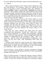
The dotted line around the centred mark
represents the minimum area; no other
elements, ie. images or type should
invade this boundary. A good rule is to
allow as much space around the mark
as possible.
orem ipsum dolor sit amet, consectetuer adipiscing elit, sed diam
onummy nibh euismod tincidunt ut laoreet dolore magna alvolutpat. Ut
si enim ad minim veniam, quis nostrud exerci tation ullamcorper suscipit
bortis nisl ut aliquip ex eaLorem ipsum dolor sit amet, consectetuer
dipiscing elit, sed diam nonummy nibh euismod tincidunt ut laoreet dolore
agna aliquam erat volutpat. Ut wisi enim ad minim veniam, quis nostrud
Our Mark
Usage
Here are some other examples of how to
use the Emarat mark, typefaces and
colours in advertisement, billboards and
a TV sign off.
In situations where there
is restricted vertical
space for example on a
banner the horizontal
mark should be used.
Consectet
dolore
Consectet
dolore
Lorem
ispsum
Consectet dolore
For consistency we
recommend to use the
mark in A4 publications
at 20mm across the
right edge.
The Emarat mark must always be placed
predominantly on a brochure cover with
ample space around it.
The use of the strapline is optional.
Top right Centre right Bottom right
Where possible use messages and
photography that supports our strapline
‘Making life better’ and our values
Expert, Responsible, Active and Strong.
Ipsumdolo
situ
Lorem ipsum dolor sit sectetuer
ut commodo consequat.
Adipiscing elit, sed diam tincidunt ut laoreet
dolore magna aliquam erat volutpat. Ut wisi enim
ad minim veniam, quis nostrud exerci tation
ullamcorper suscipit lobortis nisl ut aliquip ex ea
commodo consequat. Duis autem vel eum iriure
dolor in hendrerit in vulputate velit esse molestie
consequat, vel illum
These examples show recommended
cropped versions of our symbol.
Nonumy nibe
TV advertising
sign off
Adipiscing elit, sed diadipiscing elit, sed delit, sed diadipiscing elit, sed diipiscing elit, sed
diadipiscing elit, sed
Billboard using large symbol mark and large strapline
Single page press advertisement
Consectet
Emarat blue
background
Emarat green
background
Emarat silver
background
Black
background
Light four colour
background
Dark four colour
background
Non corporate
colour background
Two colour
Emarat green / blue
Four colour process
Centred mark Large symbol mark Horizontal mark Symbol Horizontal logotype Centred logotype
One colour
Emarat blue
One colour
Emarat green
One colour
Emarat silver
One colour
black
Our Mark
Colour
Our Mark
Backgrounds
Wherever possible the mark should be
used in Emarat green and blue. If this is
not possible, the mark may be reproduced
in one colour. No other colour than those
shown above should be used.
The mark should never appear on any
other background than those shown
above.
Colour
We use silver, green and blue
consistently across all media,
communicating a strong and
clear identity.
Where green and blue are used together,
green should be the predominant colour
at an approximate ratio of 70% green,
30% blue with a backdrop of silver.
Pantone 348
Cyan 100%
Magenta0%
Yellow 80%
Black 27%
For the exact colour
specifications for all
materials please refer
to the ‘specifications’
page of this guide.
Pantone Reflex Blue
Cyan 100%
Magenta 72%
Yellow 0%
Black 6%
Pantone 877C
Cyan 0%
Magenta 0%
Yellow 0%
Black 25%
®
®
®
Information Typefaces Emarat Typeface
The Emarat typeface is unique to us.
It has been designed to complement
the mark, and is available in both
Arabic and English.
It should only be used for sub-brand
names or added value services.
Welcome
Helvetica
Butrus E’lani
For signs, literature and stationery, we use
Helvetica and Butrus E’lani.
Photography
Always use fresh, active photography.
Strong, straightforward images are the
best way to communicate our brand
values. Imaginative crops and use of
scale are recommended, but filters and
other special effects are best avoided.
Selecting images containing blue, green
or silver elements is a good way of
increasing brand awareness.
Fresh, dynamic photography
focusing on people presents
Emarat as a leading
service brand.
Specifications
General printing
Stationery
Brochures
Carrier bags
Station Components
Main fascia canopy
Secondary fascia canopy
Shop fascia
Clad columns
Pumps
Information signage
Vehicles
Illuminated underline to
sub-brand fascias
Back Illuminated
mark on:
Pole sign
Spreader
Corporate signage
Back Illuminated
lettering on:
Pole sign
Information signage
(when applicable)
Canopies
Fascias
Emarat shop fascia
Interior shop
Information fascia lettering
Non-illuminated graphics
for:
Information signage
Pumps/spreaders
Shop signage
Vehicles
Secondary buildings
Printing (special colours)
Printing (four colour process)
Flowropolymer coating
Translucent acrylic back
illuminated
Translucent acrylic back
illuminated
Translucent acrylic back
illuminated
Halo illuminated
Translucent acrylic back
illuminated, covered with
silver opaque vinyl decals
with screenprinted, dark
blue graduated dot pattern
Opaque vinyl decals
Reflective vinyl
Cladding silver powder
coated
Green Pantone 348
Blue Pantone reflex blue
Silver Pantone 877C
Green: cyan 100%
yellow 80%
black 27%
Blue: magenta 72%
cyan 100%
black 6%
Silver: black 25%
Green RAL 6029
Blue RAL 5002
Silver RAL 9006
Blue Rohm Plexiglass gs
BLAU 601
Blue Rohm Plexiglass gs
BLAU 601
Green Rohm Plexiglass gs
BRUN 720
White Rohm Plexiglass gs
Weiss 072
Brushed stainless steel on
clear prismatic lens
White Rohm Plexiglass gs
Silver Scotchlite
100/220-120
Green Scotchcal
100-722/220-186
Blue Scotchcal
100-37/220-37
Silver Scotchcal
100-58/220-120
White Scotchcal
100-10/220-10
Green Scotchlite
580-77/280-77
Blue Scotchlite
580-75/280-75
Silver Scotchcal
580-10/280-10
White Scotchcal
580-10/280-10
Lumiflon
Vernicron FP
Rohm
Rohm
Rohm
Rohm
Rohm
3M
3M
3M
Application Reproduction method Reference Supplier
Need More?
Pantone is a registered trademark
of Pantone Inc.
The colours used throughout this
guide are not intended to match
the Pantone Colour Standards
®
®
If you have any queries about this guide,
please contact our brand co-ordinator: