John wiley sons data mining techniques for marketing sales_13 docx
Bạn đang xem bản rút gọn của tài liệu. Xem và tải ngay bản đầy đủ của tài liệu tại đây (1.18 MB, 34 trang )
470643 c11.qxd 3/8/04 11:17 AM Page 380
380 Chapter 11
Using Thematic Clusters to Adjust Zone Boundaries
The goal of the clustering project was to validate editorial zones that already
existed. Each editorial zone consisted of a set of towns assigned one of the four
clusters described above. The next step was to manually increase each zone’s
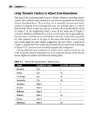
purity by swapping towns with adjacent zones. For example, Table 11.1 shows
that all of the towns in the City zone are in Cluster 1B except Brookline, which
is Cluster 2. In the neighboring West 1 zone, all the towns are in Cluster 2
except for Waltham and Watertown which are in Cluster 1B. Swapping Brook-
line into West 1 and Watertown and Waltham into City would make it possible
for both editorial zones to be pure in the sense that all the towns in each
zone would share the same cluster assignment. The new West 1 would be all
Cluster 2, and the new City would be all Cluster 1B. As can be seen in the map
in Figure 11.12, the new zones are still geographically contiguous.
Having editorial zones composed of similar towns makes it easier for the
Globe to provide sharper editorial focus in its localized content, which should
lead to higher circulation and better advertising sales.
Table 11.1 Towns in the City and West 1 Editorial Zones
TOWN EDITORIAL ZONE CLUSTER ASSIGNMENT
Brookline City 2
Boston City 1B
Cambridge City 1B
Somerville City 1B
Needham West 1 2
Newton West 1 2
Wellesley West 1 2
Waltham West 1 1B
Weston West 1 2
Watertown West 1 1B
470643 c11.qxd 3/8/04 11:17 AM Page 381
Automatic Cluster Detection 381
Lessons Learned
Automatic cluster detection is an undirected data mining technique that can
be used to learn about the structure of complex databases. By breaking com-
plex datasets into simpler clusters, automatic clustering can be used to
improve the performance of more directed techniques. By choosing different
distance measures, automatic clustering can be applied to almost any kind of
data. It is as easy to find clusters in collections of news stories or insurance
claims as in astronomical or financial data.
Clustering algorithms rely on a similarity metric of some kind to indicate
whether two records are close or distant. Often, a geometric interpretation of
distance is used, but there are other possibilities, some of which are more
appropriate when the records to be clustered contain non-numeric data.
One of the most popular algorithms for automatic cluster detection is
K-means. The K-means algorithm is an iterative approach to finding K clusters
based on distance. The chapter also introduced several other clustering algo-
rithms. Gaussian mixture models, are a variation on the K-means idea that
allows for overlapping clusters. Divisive clustering builds a tree of clusters by
successively dividing an initial large cluster. Agglomerative clustering starts
with many small clusters and gradually combines them until there is only one
cluster left. Divisive and agglomerative approaches allow the data miner to
use external criteria to decide which level of the resulting cluster tree is most
useful for a particular application.
This chapter introduced some technical measures for cluster fitness, but the
most important measure for clustering is how useful the clusters turn out to be
for furthering some business goal.
470643 c11.qxd 3/8/04 11:17 AM Page 382
TEAMFLY
Team-Fly
®
470643 c12.qxd 3/8/04 11:17 AM Page 383
Analysis in Marketing
12
Knowing When to Worry:
Hazard Functions and Survival
CHAPTER
Hazards. Survival. These very terms conjure up scary images, whether a
shimmering-blue, ball-eating golf hazard or something a bit more frightful
from a Stephen King novel, a hatchet movie, or some reality television show.
Perhaps such dire associations explain why these techniques are not fre-
quently associated with marketing.
If so, this is a shame. Survival analysis, which is also called time-to-event
analysis, is nothing to worry about. Exactly the opposite: survival analysis is
very valuable for understanding customers. Although the roots and terminol-
ogy come from medical research and failure analysis in manufacturing, the
concepts are tailor made for marketing. Survival tells us when to start worry-
ing about customers doing something important, such as ending their rela-
tionship. It tells us which factors are most correlated with the event. Hazards
and survival curves also provide snapshots of customers and their life cycles,
answering questions such as: “How much should we worry that this customer
is going to leave in the near future?” or “This customer has not made a pur-
chase recently; is it time to start worrying that the customer will not return?”
The survival approach is centered on the most important facet of customer
behavior: tenure. How long customers have been around provides a wealth of
information, especially when tied to particular business problems. How long
customers will remain customers in the future is a mystery, but a mystery that
past customer behavior can help illuminate. Almost every business recognizes
the value of customer loyalty. As we see later in this chapter, a guiding principle
383
470643 c12.qxd 3/8/04 11:17 AM Page 384
384 Chapter 12
of loyalty—that the longer customers stay around, the less likely they are to stop
at any particular point in time—is really a statement about hazards.
The world of marketing is a bit different from the world of medical research.
For one thing, the consequences of our actions are much less dire: a patient
may die from poor treatment, whereas the consequences in marketing are
merely measured in dollars and cents. Another important difference is the vol-
ume of data. The largest medical studies have a few tens of thousands of par-
ticipants, and many draw conclusions from a just a few hundred. When trying
to determine mean time between failure (MTBF) or mean time to failure
(MTTF)—manufacturing lingo for how long to wait until an expensive piece of
machinery breaks down—conclusions are often based on no more than a few
dozen failures.
In the world of customers, tens of thousands is the lower limit, since cus-
tomer databases often contain data on millions of customers and former
customers. Much of the statistical background of survival analysis is focused
on extracting every last bit of information out of a few hundred data points. In
data mining applications, the volumes of data are so large that statistical con-
cerns about confidence and accuracy are replaced by concerns about manag-
ing large volumes of data.
The importance of survival analysis is that it provides a way of understand-
ing time-to-event characteristics, such as:
■■ When a customer is likely to leave
■■ The next time a customer is likely to migrate to a new customer segment
■■ The next time a customer is likely to broaden or narrow the customer
relationship
■■ The factors in the customer relationship that increase or decrease likely
tenure
■■ The quantitative effect of various factors on customer tenure
These insights into customers feed directly into the marketing process. They
make it possible to understand how long different groups of customers are
likely to be around—and hence how profitable these segments are likely to be.
They make it possible to forecast numbers of customers, taking into account
both new acquisition and the decline of the current base. Survival analysis also
makes it possible to determine which factors, both those at the beginning
of customers’ relationships as well as later experiences, have the biggest effect
on customers’ staying around the longest. And, the analysis can be applied to
things other then the end of the customer tenure, making it possible to deter-
mine when another event—such as a customer returning to a Web site—is no
longer likely to occur.
A good place to start with survival is with visualizing customer retention,
which is a rough approximation of survival. After this discussion, we move
on to hazards, the building blocks of survival. These are in turn combined into
470643 c12.qxd 3/8/04 11:17 AM Page 385
Hazard Functions and Survival Analysis in Marketing 385
survival curves, which are similar to retention curves but more useful. The
chapter ends with a discussion of Cox Proportional Hazard Regression and
other applications of survival analysis. Along the way, the chapter provides
particular applications of survival in the business context. As with all statisti-
cal methods, there is a depth to survival that goes far beyond this introductory
chapter, which is consciously trying to avoid the complex mathematics under-
lying these techniques.
Customer Retention
Customer retention is a concept familiar to most businesses that are concerned
about their customers, so it is a good place to start. Retention is actually a close
approximation to survival, especially when considering a group of customers
who all start at about the same time. Retention provides a familiar framework
to introduce some key concepts of survival analysis such as customer half-life
and average truncated customer tenure.
Calculating Retention
How long do customers stay around? This seemingly simple question
becomes more complicated when applied to the real world. Understanding
customer retention requires two pieces of information:
■■ When each customer started
■■ When each customer stopped
The difference between these two values is the customer tenure, a good
measurement of customer retention.
Any reasonable database that purports to be about customers should have
this data readily accessible. Of course, marketing databases are rarely simple.
There are two challenges with these concepts. The first challenge is deciding
on what is a start and stop, a decision that often depends on the type of busi-
ness and available data. The second challenge is technical: finding these start
and stop dates in available data may be less obvious than it first appears.
For subscription and account-based businesses, start and stop dates are well
understood. Customers start magazine subscriptions at a particular point in
time and end them when they no longer want to pay for the magazine.
Customers sign up for telephone service, a banking account, ISP service, cable
service, an insurance policy, or electricity service on a particular date and
cancel on another date. In all of these cases, the beginning and end of the rela-
tionship is well defined.
Other businesses do not have such a continuous relationship. This is particu-
larly true of transactional businesses, such as retailing, Web portals, and cata-
logers, where each customer’s purchases (or visits) are spread out over time—or
470643 c12.qxd 3/8/04 11:17 AM Page 386
386 Chapter 12
may be one-time only. The beginning of the relationship is clear—usually the
first purchase or visit to a Web site. The end is more difficult but is sometimes
created through business rules. For instance, a customer who has not made a
purchase in the previous 12 months may be considered lapsed. Customer reten-
tion analysis can produce useful results based on these definitions. A similar
area of application is determining the point in time after which a customer is no
longer likely to return (there is an example of this later in the chapter).
The technical side can be more challenging. Consider magazine subscrip-
tions. Do customers start on the date when they sign up for the subscription?
Do customers start when the magazine first arrives, which may be several
weeks later? Or do they start when the promotional period is over and they
start paying?
Although all three questions are interesting aspects of the customer relation-
ship, the focus is usually on the economic aspects of the relationship. Costs
and/or revenue begin when the account starts being used—that is, on the issue
date of the magazine—and end when the account stops. For understanding
customers, it is definitely interesting to have the original contact date and time,
in addition to the first issue date (are customers who sign up on weekdays dif-
ferent from customers who sign up on weekends?), but this is not the beginning
of the economic relationship. As for the end of the promotional period, this is
really an initial condition or time-zero covariate on the customer relationship.
When the customer signs up, the initial promotional period is known. Survival
analysis can take advantage of such initial conditions for refining models.
What a Retention Curve Reveals
Once tenures can be calculated, they can be plotted on a retention curve, which
shows the proportion of customers that are retained for a particular period of
time. This is actually a cumulative histogram, because customers who have
tenures of 3 months are included in the proportions for 1 month and 2 months.
Hence, a retention curve always starts at 100 percent.
For now, let’s assume that all customers start at the same time. Figure 12.1,
for instance, compares the retention of two groups of customers who started at
about the same point in time 10 years ago. The points on the curve show the
proportion of customers who were retained for 1 year, for 2 years, and so on.
Such a curve starts at 100 percent and gradually slopes downward. When a
retention curve represents customers who all started at about the same time—
as in this case—it is a close approximation to the survival curve.
Differences in retention among different groups are clearly visible in the
chart. These differences can be quantified. The simplest measure is to look at
retention at particular points in time. After 10 years, for instance, 24 percent of
the regular customers are still around, and only about a third of them even
make it to 5 years. Premium customers do much better. Over half make it to 5
years, and 42 percent have a customer lifetime of at least 10 years.
470643 c12.qxd 3/8/04 11:17 AM Page 387
Hazard Functions and Survival Analysis in Marketing 387
100%
90%
80%
70%
60%
50%
40%
30%
20%
10%
0%
0 12 24 36 48 60 72 84 96 108 120
High End
Regular
Percent Survived
Tenure (Months after Start)
Figure 12.1 Retention curves show that high-end customers stay around longer.
Another way to compare the different groups is by asking how long it takes
for half the customers to leave—the customer half-life (although the statistical
term is the median customer lifetime). The median is a useful measure because
the few customers who have very long or very short lifetimes do not affect it.
In general, medians are not sensitive to a few outliers.
Figure 12.2 illustrates how to find the customer half-life using a retention
curve. This is the point where exactly 50 percent of the customers remain,
which is where the 50 percent horizontal grid line intersects the retention
curve. The customer half-life for the two groups shows a much starker differ-
ence than the 10-year survival—the premium customers have a median life-
time of close to 7 years, whereas the regular customers have a median a bit
under over 2 years.
Finding the Average Tenure from a Retention Curve
The customer half-life is useful for comparisons and easy to calculate, so it is a
valuable tool. It does not, however, answer an important question: “How
much, on average, were customers worth during this period of time?”
Answering this question requires having an average customer worth per time
and an average retention for all the customers. The median cannot provide this
information because the median only describes what happens to the one cus-
tomer in the middle; the customer at exactly the 50 percent rank. A question
about average customer worth requires an estimate of the average remaining
lifetime for all customers.
There is an easy way to find the average remaining lifetime: average cus-
tomer lifetime during the period is the area under the retention curve. There is
a clever way of visualizing this calculation, which Figure 12.3 walks through.
470643 c12.qxd 3/8/04 11:17 AM Page 388
388 Chapter 12
100%
90%
80%
70%
60%
50%
40%
30%
20%
10%
0%
0 12 24 36 48 60 72 84 96 108 120
High End
Regular
Percent Survived
Tenure (Months after Start)
Figure 12.2 The median customer lifetime is where the retention curve crosses the
50 percent point.
First, imagine that the customers all lie down with their feet lined up on
the left. Their heads represent their tenure, so there are customers of all differ-
ent heights (or widths, because they are horizontal) for customers of all
different tenures. For the sake of visualization, the longer tenured customers
lie at the bottom holding up the shorter tenured ones. The line that connects
their noses counts the number of customers who are retained for a particular
period of time (remember the assumption that all customers started at about
the same point in time). The area under this curve is the sum of all the cus-
tomers’ tenures, since every customer lying horizontally is being counted.
Dividing the vertical axis by the total count produces a retention curve.
Instead of count, there is a percentage. The area under the curve is the total
tenure divided by the count of customers—voilà, the average customer tenure
during the period of time covered by the chart.
TIP The area under the customer retention curve is the average customer
lifetime for the period of time in the curve. For instance, for a retention curve
that has 2 years of data, the area under the curve represents the two-year
average tenure.
This simple observation explains how to obtain an estimate of the average
customer lifetime. There is one caveat when some customers are still active. The
average is really an average for the period of time under the retention curve.
Consider the earlier retention curve in this chapter. These retention curves
were for 10 years, so the area under the curves is an estimate of the average cus-
tomer lifetime during the first 10 years of their relationship. For customers who are still
active at 10 years, there is no way of knowing whether they will all leave at 10
years plus one day; or if they will all stick around for another century. For this rea-
son, it is not possible to determine the real average until all customers have left.
470643 c12.qxd 3/8/04 11:17 AM Page 389
Hazard Functions and Survival Analysis in Marketing 389
time
A group of customers with different
tenures are stacked on top of each
other. Each bar represents one
customer.
At each point in time, the edges
count the number of customers
active at that time.
Notice that the sum of all the areas is
the
sum
of all the customer tenures.
Proportion of
Number of
Customers
Customers
Making the vertical axis a proportion
instead of a count produces a curve
that looks the same. This is a
retention curve.
The area under the retention curve is
the
average
customer tenure.
Figure 12.3 Average customer tenure is calculated from the area under the retention curve.
This value, called truncated mean lifetime by statisticians, is very useful. As
shown in Figure 12.4, the better customers have an average 10-year lifetime of
6.1 years; the other group has an average of 3.7 years. If, on average, a cus-
tomer is worth, say, $100 per year, then the premium customers are worth
$610 – $370 = $240 more than the regular customers during the 10 years after
they start, or about $24 per year. This $24 might represent the return on a reten-
tion program designed specifically for the premium customers, or it might
give an upper limit of how much to budget for such retention programs.
Looking at Retention as Decay
Although we don’t generally advocate comparing customers to radioactive
materials, the comparison is useful for understanding retention. Think of cus-
tomers as a lump of uranium that is slowly, radioactively decaying into lead.
Our “good” customers are the uranium; the ones who have left are the lead.
Over time, the amount of uranium left in the lump looks something like our
retention curves, with the perhaps subtle difference that the timeframe for ura-
nium is measured in billions of years, as opposed to smaller time scales.
470643 c12.qxd 3/8/04 11:17 AM Page 390
390 Chapter 12
Percent Survived
100%
90%
80%
70%
60%
50%
40%
30%
20%
10%
0%
average 10-year tenure regular
customers
44 months (3.7 years)
High End
Regular
average 10-year tenure high
end customers =
73 months (6.1 years)
0 12 24 36 48 60 72 84 96 108 120
Tenure (Months after Start)
Figure 12.4 Average customer lifetime for different groups of customers can be compared
using the areas under the retention curve.
One very useful characteristic of the uranium is that we know—or more pre-
cisely, scientists have determined how to calculate—exactly how much ura-
nium is going to survive after a certain amount of time. They are able to do this
because they have built mathematical models that describe radioactive decay,
and these have been verified experimentally.
Radioactive materials have a process of decay described as exponential
decay. What this means is that the same proportion of uranium turns into lead,
regardless of how much time has past. The most common form of uranium, for
instance, has a half-life of about 4.5 billion years. So, about half the lump of
uranium has turned into lead after this time. After another 4.5 billion years,
half the remaining uranium will decay, leaving only a quarter of the original
lump as uranium and three-quarters as lead.
WARNING Exponential decay has many useful properties for predicting
beyond the range of observations. Unfortunately, customers hardly ever exhibit
exponential decay.
What makes exponential decay so nice is that the decay fits a nice simple
equation. Using this equation, it is possible to determine how much uranium
is around at any given point in time. Wouldn’t it be nice to have such an equa-
tion for customer retention?
It would be very nice, but it is unlikely, as shown in the example in the side-
bar “Parametric Approaches Do Not Work.”
To shed some light on the issue, let’s imagine a world where customers did
exhibit exponential decay. For the purposes of discussion, these customers have
a half-life of 1 year. Of 100 customers starting on a particular date, exactly 50 are
still active 1 year later. After 2 years, 25 are active and 75 have stopped. Exponen-
tial decay would make it easy to forecast the number of customers in the future.
470643 c12.qxd 3/8/04 11:17 AM Page 391
Hazard Functions and Survival Analysis in Marketing 391
measured in years; the units might also be days, weeks, or months.
Each point has a value between 0 and 1, because the points represent a
under the curve is the sum of the areas of these rectangles.
Circumscribing each point with a rectangle makes it clear how to calculate the area
under the retention curve.
values in the curve—an easy calculation in a spreadsheet. , an easy way to
the horizontal axis. So, the units of the average are also in the units of the
horizontal axis.
0%
10%
20%
30%
40%
50%
60%
70%
80%
90%
100%
0 1 2 3 4 5 6 7 8 9 10 11 12
DETERMINING THE AREA UNDER THE RETENTION CURVE
Finding the area under the retention curve may seem like a daunting
mathematical effort. Fortunately, this is not the case at all.
The retention curve consists of a series of points; each point represents the
retention after 1 year, 2 years, 3 years, and so on. In this case, retention is
proportion of the customers retained up to that point in time.
The following figure shows the retention curve with a rectangle holding up
each point. The base of the rectangle has a length of one (measured in the
units of the horizontal axis). The height is the proportion retained. The area
The area of each rectangle is—base times height—simply the proportion
retained. The sum of all the rectangles, then, is just the sum of all the retention
Voilà
calculate the area and quite an interesting observation as well: the sum of the
retention values (as percentages) is the average customer lifetime. Notice also
that each rectangle has a width of one time unit, in whatever the units are of
Tenure (Years)
Percent Survived
470643 c12.qxd 3/8/04 11:17 AM Page 392
392 Chapter 12
PARAMETRIC APPROACHES DO NOT WORK
It is tempting to try to fit some known function to the retention curve. This
approach is called parametric statistics, because a few parameters describe the
shape of the function. The power of this approach is that we can use it to
estimate what happens in the future.
The line is the most common shape for such a function. For a line, there are
two parameters, the slope of the line and where it intersects the Y-axis.
Another common shape is a parabola, which has an additional X
2
term, so a
parabola has three parameters. The exponential that describes radioactive
decay actually has only one parameter, the half-life.
The following figure shows part of a retention curve. This retention curve is
for the first 7 years of data.
The figure also shows three best-fit curves. Notice that all of these curves fit
the values quite well. The statistical measure of fit is R
2
, which varies from 0
to 1. Values over 0.9 are quite good, so by standard statistical measures, all
these curves fit very, very well.
It is easy to fit parametric curves to a retention curve.
The real question, though is not how well these curves fit the data in the
range used to define it. We want to know how well these curves work beyond
the original 53-week range.
The following figure answers this question. It extrapolates the curves ahead
another 5 years. Quickly, the curves diverge from the actual values, and the
difference seems to be growing the further out we go.
y = -0.0709x + 0.9962
R
2
= 0.9215
y = 0.0102xy = 0.0102x
22
- 0.1628x + 1.1493- 0.1628x + 1.1493
RR
22
= 0.998= 0.998
y = 1.0404ey = 1.0404e
-0.1019x-0.1019x
RR
22
= 0.9633= 0.9633
0%
10%
20%
30%
40%
50%
60%
70%
80%
90%
100%
1 2 3 4 5 6 7 8 9 10 11 12 13
Tenure (Years)
Percent Survived
TEAMFLY
Team-Fly
®
470643 c12.qxd 3/8/04 11:17 AM Page 393
Hazard Functions and Survival Analysis in Marketing 393
(continued)PARAMETRIC APPROACHES DO NOT WORK
0%
10%
20%
30%
40%
50%
60%
70%
80%
90%
100%
Percent Survived
1 2 3 4 5 67 8 910111213
Tenure (Years)
The parametric curves that fit a retention curve do not fit well beyond the range where
they are defined.
Of course, this illustration does not prove that a parametric approach will
not work. Perhaps there is some function out there that, with the right
parameters, would fit the observed retention curve very well and continue
working beyond the range used to define the parameters. However, this
example does illustrate the challenges of using a parametric approach for
approximating survival curves directly, and it is consistent with our experience
even when using more data points. Functions that provide a good fit to the
retention curve turn out to diverge pretty quickly.
Another way of describing this is that the customers who have been around
for 1 year are going to behave just like new customers. Consider a group of 100
customers of various tenures, 50 leave in the following year, regardless of the
tenure of the customers at the beginning of the year—exponential decay says
that half are going to leave regardless of their initial tenure. That means that
customers who have been around for a while are no more loyal then newer cus-
tomers. However, it is often the case that customers who have been around for
a while are actually better customers than new customers. For whatever reason,
longer tenured customers have stuck around in the past and are probably a bit
less likely than new customers to leave in the future. Exponential decay is a bad
situation, because it assumes the opposite: that the tenure of the customer rela-
tionship has no effect on the rate that customers are leaving (the worst-case sce-
nario would have longer term customers leaving at consistently higher rates
than newer customers, the “familiarity breeds contempt” scenario).
470643 c12.qxd 3/8/04 11:17 AM Page 394
394 Chapter 12
Hazards
The preceding discussion on retention curves serves to show how useful reten-
tion curves are. These curves are quite simple to understand, but only in terms
of their data. There is no general shape, no parametric form, no grand theory
of customer decay. The data is the message.
Hazard probabilities extend this idea. As discussed here, they are an exam-
ple of a nonparametric statistical approach—letting the data speak instead of
finding a special function to speak for it. Empirical hazard probabilities simply
let the historical data determine what is likely to happen, without trying to fit
data to some preconceived form. They also provide insight into customer
retention and make it possible to produce a refinement of retention curves
called survival curves.
The Basic Idea
A hazard probability answers the following question:
Assume that a customer has survived for a certain length of time, so the cus-
tomer’s tenure is t. What is the probability that the customer leaves before t+1?
Another way to phrase this is: the hazard at time t is the risk of losing
customers between time t and time t+1. As we discuss hazards in more detail,
it may sometimes be useful to refer to this definition. As with many seemingly
simple ideas, hazards have significant consequences.
To provide an example of hazards, let’s step outside the world of business
for a moment and consider life tables, which describe the probability of
someone dying at a particular age. Table 12.1 shows this data, for the U.S. pop-
ulation in 2000:
Table 12.1 Hazards for Mortality in the United States in 2000, Shown as a Life Table
AGE PERCENT OF POPULATION THAT
DIES IN EACH AGE RANGE
0–1 yrs 0.73%
1–4 yrs 0.03%
5–9 yrs 0.02%
10–14 yrs 0.02%
15–19 yrs 0.07%
20–24 yrs 0.10%
25–29 yrs 0.10%
30–34 yrs 0.12%
470643 c12.qxd 3/8/04 11:17 AM Page 395
Hazard Functions and Survival Analysis in Marketing 395
Table 12.1 (continued)
AGE PERCENT OF POPULATION THAT
DIES IN EACH AGE RANGE
35–39 yrs 0.16%
40–44 yrs 0.24%
45–49 yrs 0.36%
50–54 yrs 0.52%
55–59 yrs 0.80%
60–64 yrs 1.26%
65–69 yrs 1.93%
70–74 yrs 2.97%
75–79 yrs 4.56%
80–84 yrs 7.40%
85+ yrs 15.32%
A life table is a good example of hazards. Infants have about a 1 in 137
chance of dying before their first birthday. (This is actually a very good rate; in
less-developed countries the rate can be many times higher.) The mortality
rate then plummets, but eventually it climbs steadily higher. Not until some-
one is about 55 years old does the risk rise as high as it is during the first year.
This is a characteristic shape of some hazard functions and is called the bathtub
shape. The hazards start high, remain low for a long time, and then gradually
increase again. Figure 12.5 illustrates the bathtub shape using this data.
0.0%
0.5%
1.0%
1.5%
2.0%
2.5%
3.0%
Hazard
0-1 yrs
1-4 yrs
5-9 yrs
10-14 yrs
15-19 yrs
20-24 yrs
25-29 yrs
30-34 yrs
35-39 yrs
40-44 yrs
45-49 yrs
50-54 yrs
55-59 yrs
60-64 yrs
65-69 yrs
70-74 yrs
Age (Years)
Figure 12.5 The shape of a bathtub-shaped hazard function starts high, plummets, and then
gradually increases again.
470643 c12.qxd 3/8/04 11:17 AM Page 396
396 Chapter 12
The same idea can be applied to customer tenure, although customer haz-
ards are more typically calculated by day, week, or month instead of by year.
Calculating a hazard for a given tenure t requires only two pieces of data. The
first is the number of customers who stopped at time t (or between t and t+1).
The second is the total number of customers who could have stopped during
this period, also called the population at risk. This consists of all customers
whose tenure is greater than or equal to t, including those who stopped at time
t. The hazard probability is the ratio of these two numbers, and being a proba-
bility, the hazard is always between 0 and 1. These hazard calculations are pro-
vided by life table functions in statistical software such as SAS and SPSS. It is
also possible to do the calculations in a spreadsheet using data directly from a
customer database.
One caveat: In order for the calculation to be accurate, every customer
included in the population count must have the opportunity to stop at that par-
ticular time. This is a property of the data used to calculate the hazards, rather
than the method of calculation. In most cases, this is not a problem, because haz-
ards are calculated from all customers or from some subset based on initial con-
ditions (such as initial product or campaign). There is no problem when a
customer is included in the population count up to that customer’s tenure, and
the customer could have stopped on any day before then and still be in the data set.
An example of what not to do is to take a subset of customers who have
stopped during some period of time, say in the past year. What is the problem?
Consider a customer who stopped yesterday with 2 years of tenure. This cus-
tomer is included in all the population counts for the first year of hazards.
However, the customer could not have stopped during the first year of tenure.
The stop would have been more than a year in the past and precluded the
customer from being in the data set. Because customers who could not have
stopped are included in the population counts, the population counts are too
big making the initial hazards too low. Later in the chapter, an alternative
method is explained to address this issue.
WARNING To get accurate hazards and survival curves, use groups of
customers who are defined only based on initial conditions. In particular, do
not define the group based on how or when the members left.
When populations are large, there is no need to worry about statistical
ideas such as confidence and standard error. However, when the populations
are small—as they are in medical research studies or in some business
applications—then the confidence interval may become an issue. What this
means is that a hazard of say 5 percent might really be somewhere between 4
percent and 6 percent. When working with smallish populations (say less than
a few thousand), it might be a good idea to use statistical methods that provide
470643 c12.qxd 3/8/04 11:17 AM Page 397
Hazard Functions and Survival Analysis in Marketing 397
information about standard errors. For most applications, though, this is not
an important concern.
Examples of Hazard Functions
At this point, it is worth stopping and looking at some examples of hazards.
These examples are intended to help in understanding what is happening, by
looking at the hazard probabilities. The first two examples are basic, and, in
fact, we have already seen examples of them in this chapter. The third is from
real-world data, and it gives a good flavor of how hazards can be used to
provide an x-ray of customers’ lifetimes.
Constant Hazard
The constant hazard hardly needs a picture to explain it. What it says is that
the hazard of customers leaving is exactly the same, no matter how long the
customers have been around. This looks like a horizontal line on a graph.
Say the hazard is being measured by days, and it is a constant 0.1 percent.
That is, one customer out of every thousand leaves every day. After a year (365
days), this means that about 30.6 percent of the customers have left. It takes
about 692 days for half the customers to leave. It will take another 692 days for
half of them to leave. And so on, and so on.
The constant hazard means the chance of a customer leaving does not vary
with the length of time the customer has been around. This sounds a lot like
the exponential retention curve, the one that looks like the decay of radioactive
elements. In fact, a constant retention hazard would conform to an exponential
form for the retention curve. We say “would” simply because, although this
does happen in physics, it does not happen much in marketing.
Bathtub Hazard
The life table for the U.S. population provided an example of the bathtub-
shaped hazard function. This is common in the life sciences, although bathtub
shaped curves turn up in other domains. As mentioned earlier, the bathtub haz-
ard initially starts out quite high, then it goes down and flattens out for a long
time, and finally, the hazards increase again.
One phenomenon that causes this is when customers are on contracts (for
instance, for cell phones or ISP services), typically for 1 year or longer. Early in
the contract, customers stop because the service is not appropriate or because
they do not pay. During the period of the contract, customers are dissuaded
from canceling, either because of the threat of financial penalties or perhaps
only because of a feeling of obligation to honor the terms of the initial contract.
470643 c12.qxd 3/8/04 11:17 AM Page 398
398 Chapter 12
When the contract is up, customers often rush to leave, and the higher rate
continues for a while because customers have been liberated from the contract.
Once the contract has expired, there may be other reasons, such as the prod-
uct or service no longer being competitively priced, that cause customers to
stop. Markets change and customers respond to these changes. As telephone
charges drop, customers are more likely to churn to a competitor than to nego-
tiate with their current provider for lower rates.
A Real-World Example
Figure 12.6 shows a real-world example of a hazard function, for a company
that sells a subscription-based service (the exact service is unimportant). This
hazard function is measuring the probability of a customer stopping a given
number of weeks after signing on.
There are several interesting characteristics about the curve. First, it starts
high. These are customers who sign on, but are not able to be started for some
technical reason such as their credit card not being approved. In some cases,
customers did not realize that they had signed on—a problem that the authors
encounter most often with outbound telemarketing campaigns.
Next, there is an M-shaped feature, with peaks at about 9 and 11 weeks. The
first of these peaks, at about 2 months, occurs because of nonpayment. Cus-
tomers who never pay a bill, or who cancel their credit card charges, are
stopped for nonpayment after about 2 months. Since a significant number of
customers leave at this time, the hazard probability spikes up.
7%
6%
5%
Weekly Hazard
4%
3%
2%
1%
0%
0
4
8
12
16
20
24
28
32
36
40
44
48
52
56
60
64
68
72
76
Tenure (Weeks after Start)
Figure 12.6 A subscription business has customer hazard probabilities that look like this.
470643 c12.qxd 3/8/04 11:17 AM Page 399
Hazard Functions and Survival Analysis in Marketing 399
The second peak in the “M” is coincident with the end of the initial promo-
tion that offers introductory pricing. This promo typically lasts for about
3 months, and then customers have to start paying full price. Many decide that
they no longer really want the service. It is quite possible that many of these
customers reappear to take advantage of other promotions, an interesting fact
not germane to this discussion on hazards but relevant to the business.
After the first 3 months, the hazard function has no more really high peaks.
There is a small cycle of peaks, about every 4 or 5 weeks. This corresponds to
the monthly billing cycle. Customers are more likely to stop just after they
receive a bill.
The chart also shows that there is a gentle decline in the hazard rate. This
decline is a good thing, since it means that the longer a customers stays around,
the less likely the customer is to leave. Another way of saying this is that cus-
tomers are becoming more loyal the longer they stay with the company.
Censoring
So far, this introduction to hazards has glossed over one of the most important
concepts in survival analysis: censoring. Remember the definition of a hazard
probability, the number of stops at a given time t divided by the population
at that time. Clearly, if a customer has stopped before time t, then that customer
is not included in the population count. This is most basic example of censoring.
Customers who have stopped are not included in calculations after they stop.
There is another example of censoring, although it is a bit subtler. Consider
customers whose tenure is t but who are currently active. These customers are
not included in the population for the hazard for tenure t, because the customers
might still stop before t+1—here today, gone tomorrow. These customers have
been dropped out of the calculation for that particular hazard, although they are
included in calculations of hazards for smaller values of t. Censoring—dropping
some customers from some of the hazard calculations—proves to be a very pow-
erful technique, important to much of survival analysis.
Let’s look at this with a picture. Figure 12.7 shows a set of customers and
what happens at the beginning and end of their relationship. In particular, the
end is shown with a small circle that is either open or closed. When the circle
is open, the customer has already left and their exact tenure is known since the
stop date is known.
A closed circle means that the customer has survived to the analysis date, so
the stop date is not yet known. This customer—or in particular, this cus-
tomer’s tenure—is censored. The tenure is at least the current tenure, but most
likely larger. How much larger is unknown, because that customer’s exact stop
date has not yet happened.
470643 c12.qxd 3/8/04 11:17 AM Page 400
400 Chapter 12
time
Figure 12.7 In this group of customers who all start at different times, some customers
are censored because they are still active.
Let’s walk through the hazard calculation for these customers, paying par-
ticular attention to the role of censoring. When looking at customer data for
hazard calculations, both the tenure and the censoring flag are needed. For the
customers in Figure 12.7, Table 12.2 shows this data.
It is instructive to see what is happening during each time period. At any
point in time, a customer might be in one of three states: ACTIVE, meaning
that the relationship is still ongoing; STOPPED, meaning that the customer
stopped during that time interval; or CENSORED, meaning that the customer
is not included in the calculation. Table 12.3 shows what happens to the cus-
tomers during each time period.
Table 12.2 Tenure Data for Several Customers
5CUSTOMER CENSORED TENURE
2 N 4
3 N 3
4 Y 3
5 N 2
6 Y 1
7 N 1
470643 c12.qxd 3/8/04 11:17 AM Page 401
1
2
3
4
5
6
7
Table 12.3
Tracking Customers over Several Time Periods
CUSTOMER CENSORED LIFETIME TIME
0 TIME 1 TIME 2 TIME 3 TIME 4 TIME 5
Y
5
ACTIVE ACTIVE ACTIVE ACTIVE ACTIVE
ACTIVE
N
4
ACTIVE ACTIVE ACTIVE ACTIVE STOP
PED CENSORED
N
3
ACTIVE ACTIVE ACTIVE STOPPED CEN
SORED CENSORED
Y
3
ACTIVE ACTIVE ACTIVE ACTIVE CEN
SORED CENSORED
N
2
ACTIVE ACTIVE STOPPED CENSORED CEN
SORED CENSORED
Y
1
ACTIVE ACTIVE CENSORED CENSORED CEN
SORED CENSORED
N
1
ACTIVE STOPPED CENSORED CENSORED CEN
SORED CENSORED
Hazard Functions and Survival Analysis in Marketing 401
470643 c12.qxd 3/8/04 11:17 AM Page 402
402 Chapter 12
Table 12.4 From Times to Hazards
TIME 0 TIME 1 TIME 2 TIME 3 TIME 4 TIME 5
ACTIVE 7 6 4 3 1 1
STOPPED 0 1 1 1 1 0
CENSORED 0 0 2 3 5 5
HAZARD 0% 14% 20% 25% 50% 0%
Notice in Table 12.4 that the censoring takes place one time unit later than
the lifetime. That is, Customer #1 survived to Time 5, what happens after that
is unknown. The hazard at a given time is the number of customers who are
STOPPED divided by the total of the customers who are either ACTIVE or
STOPPED.
The hazard for Time 1 is 14 percent, since one out of seven customers stop at
this time. All seven customers survived to time 1 and all could have stopped.
Of these, only one did. At TIME 2, there are five customers left—Customer #7
has already stopped, and Customer #6 has been censored. Of these five, one
stops, for a hazard of 20 percent. And so on. This example has shown how to
calculate hazard functions, taking into account the fact that some (hopefully
many) customers have not yet stopped.
This calculation also shows that the hazards are highly erratic—jumping
from 25 percent to 50 percent to 0 percent in the last 3 days. Typically, hazards
do not vary so much. This erratic behavior arises only because there are so few
customers in this simple example. Similarly, lining up customers in a table is
useful for didactic purposes to demonstrate the calculation on a manageable
set of data. In the real world, such a presentation is not feasible, since there are
likely to be thousands or millions of customers going down and hundreds or
thousands of days going across.
It is also worth mentioning that this treatment of hazards introduces them as
conditional probabilities, which vary between 0 and 1. This is possible because
the hazards are using time that is in discrete units, such as days or week, a
description of time applicable to customer-related analyses. However, statisti-
cians often work with hazard rates rather than probabilities. The ideas are
clearly very related, but the mathematics using rates involves daunting inte-
grals, complicated exponential functions, and difficult to explain adjustments
to this or that factor. For our purposes, the simpler hazard probabilities are not
only easier to explain, but they also solve the problems that arise when work-
ing with customer data.
Other Types of Censoring
The previous section introduced censoring in two cases: hazards for customers
after they have stopped and hazards for customers who are still active. There
TEAMFLY
Team-Fly
®
470643 c12.qxd 3/8/04 11:17 AM Page 403
Hazard Functions and Survival Analysis in Marketing 403
are other useful cases as well. To explain other types of censoring, it is useful
to go back to the medical realm.
Imagine that you are a cancer researcher and have found a medicine that
cures cancer. You have to run a study to verify that this fabulous new treat-
ment works. Such studies typically follow a group of patients for several years
after the treatment, say 5 years. For the purposes of this example, we only
want to know if patients die from cancer during the course of the study (med-
ical researchers have other concerns as well, such as the recurrence of the
disease, but that does not concern us in this simplified example).
So you identify 100 patients, give them the treatment, and their cancers
seem to be cured. You follow them for several years. During this time, seven
patients celebrate their newfound health by visiting Iceland. In a horrible
tragedy, all seven happen to die in an avalanche caused by a submerged
volcano. What is the effectiveness of your treatment on cancer mortality? Just
looking at the data, it is tempting to say there is a 7 percent mortality rate.
However, this mortality is clearly not related to the treatment, so the answer
does not feel right.
And, in fact, the answer is not right. This is an example of competing risks. A
study participant might live, might die of cancer, or might die of a mountain
climbing accident on a distant island. Or the patient might move to Tahiti and
drop out of the study. As medical researchers say, such a patient has been “lost
to follow-up.”
The solution is to censor the patients who exit the study before the event
being studied occurs. If patients drop out of the study, then they were healthy
to the point in time when they dropped out, and the information acquired dur-
ing this period can be used to calculate hazards. Afterward there is no way of
knowing what happened. They are censored at the point when they exit. If a
patient dies of something else, then he or she is censored at the point when
death occurs, and the death is not included in the hazard calculation.
TIP The right way to deal with competing risks is to develop different sets of
hazards for each risk, where the other risks are censored.
Competing risks are familiar in the business environment as well. For
instance, there are often two types of stops: voluntary stops, when a customer
decides to leave, and involuntary stops, when the company decides a cus-
tomer should leave—often due to unpaid bills
In doing an analysis on voluntary churn, what happens to customers who
are forced to discontinue their relationships due to unpaid bills? If such a
customer were forced to stop on day 100, then that customer did not stop vol-
untarily on days 1–99. This information can be used to generate hazards for
voluntary stops. However, starting on day 100, the customer is censored, as
shown in Figure 12.8. Censoring customers, even when they have stopped for
other reasons, makes it possible to understand different types of stops.
470643 c12.qxd 3/8/04 11:17 AM Page 404
404 Chapter 12
considered stopped.
included in the calculation of the
These two customers were forced to
leave, so they are censored at the
point of attrition instead of being
All the data from before they left is
hazard functions for voluntary
attrition — since this they remained
as customers before then.
time
Figure 12.8 Using censoring makes it possible to develop hazard models for voluntary
attrition that include customers who were forced to leave.
From Hazards to Survival
This chapter started with a discussion of retention curves. From the hazard
functions, it is possible to create a very similar curve, called the survival curve.
The survival curve is more useful and in many senses more accurate.
Retention
A retention curve provides information about how many customers have been
retained for a certain amount of time. One common way of creating a retention
curve is to do the following:
■■ For customers who started 1 week ago, measure the 1-week retention.
■■ For customers who started 2 weeks ago, measure the 2-week retention.
■■ And so on.
Figure 12.9 shows an example of a retention curve based on this approach.
The overall shape of this curve looks appropriate. However, the curve itself is
quite jagged. It seems odd, for instance, that 10-week retention would be bet-
ter than 9-week retention, as suggested by this data.