The Non-Designer''''s Design Book- P3 pps
Bạn đang xem bản rút gọn của tài liệu. Xem và tải ngay bản đầy đủ của tài liệu tại đây (4.65 MB, 30 trang )
II Part 1: Design Principles
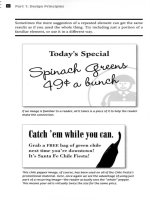
Sometimes the mere suggestion of a repeated element can get the same
results as if you used the whole thing. Try including just a portion of a
familiar element, or use it in a different way.
Today's Special
s~q~
4g~OJ
~~'
"
If an image is familiar to a reader, all it takes is a piece of it to help the reader
make the connection.
Catuh
'
em while yon uao.
Grab a FREE bag of green chile
next time you're downtown!
It's Santa Fe Chile Fiesta!
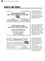
This chile pepper image, of course, has been used on all of the chile Fiesta's
promotional material. Here, once again we see the advantage of usingjust
part of a recurring image-the reader actually sees the "whole"
pepper.
This means your ad is virtually twice the size for the same price.
You'reinvited to a
You never know
]jabH
~w
henyou'llbe
calied on to host
a
baby shower.
When this hap-
~hovver
pen
s, you'll know
-
to re
peat elements
on the invitation,
en
velope, party
for
sig
ns, and thank-
WenJH & Mike TIro""n
yo
u notes to tie
them all together.
Your
guests willbe
SaturJa)J, Odober 28
2:30-4:30 f.II1,
s0 impressed-
and willthink
you hired a
1"«tl
professional
to do the
A. We
don't know if It's a boy or girl-we want the magical surprise!
design work.
B. Wendy and Mike have registered with RobIn's
Baby Registry.
You can check with the folks there to see what they still need.
c. Please RSVP to Wendy by
October 16.
FOUR: REPETITION
II
Repetition also gives a sense of professionalism and authority to your
pieces. It gives your reader the feeling that someone is in charge because
repetition is obviously a thoughtful design decision.
1+1
~
\
,° *
-
"
- .
°MlkeplusWendyequalsababy!
II Part 1: Design Principles
Summary
of repetition
A repetltlDn of visual elements throughout the design unifies and strengthens
a piece by tying together otherwise separate parts. Repetition is very useful
on one-page pieces, and is critical in multi-page documents (where we often
just call it being consistent).
The basic purpose
The purpose of repetition is to unifY and to add visual Interest. Don't under-
estimate the power of the visual interest of a page-if a piece looks interesting,
it is more likely to be read.
How to get It
Think of repetition as being consistent, which I'm sure you are already. Then
pUShthe existing cDnslstencles a little fUrther-can you turn some of those
consistent elements into part of the conscious graphic design, as with the
headline? Do you use a I-point rule at the bottom of each page or under
each heading? How about using a 4-point rule instead to make the repetitive
element stronger and more dramatic?
Then take a look at the possibility of adding elements whose sole purpose
is to create a repetition. Do you have a numbered list of items? How about
using a distinctive font or a reversed number, and then repeating that treat-
ment throughout every numbered list in the publication? At first, simply find
existing repetitions and then strengthen them. As you get used to the idea
and the look, start to create repetitions to enhance the design and the clarity
of the information.
Repetition is like accenting your clothes. If a woman is wearing a lovely black
evening dress with a chic black hat, she might accent her dress with red heels,
red lipstick, and a tiny red corsage.
What to avoid
Avoid repeating the element so much that it becomes annoying or over-
whelming. Be conscious of the value of contrast (read the next chapter and
the section on contrasting type).
For instance, if the woman were to wear the black evening dress with a red
hat, red earrings, red lipstick, a red handbag, red shoes and a red coat, the
repetition would not be a stunning and unifying contrast-it would be over-
whelming and the focus would be confused.
II
Contrast
Contrast is one of the most effective ways to add visual interest to your
page-a striking interest that makes a reader want to look at the page-and
to create an organizational hierarchy among different elements. The
important rule to remember is that for contrast to be effective, it must be
strong. Don't be a wimp.
Contrast is created when two elements are different. If the two elements are
sort of different, but not really, then you don't have contrast, you have conflict.
That's the key-the principle of contrast states that Iftwo Items are not exactly
the same. then make them different. Reallydifferent.
Contrast can be created in many ways. You can contrast large type with small
type; a graceful oldstyle font with a bold sans serif font; a thin line with a thick
line; a cool color with a warm color; a smooth texture with a rough texture; a
horizontal element (such as a long line of text) with a vertical element (such
as a tall, narrow column of text); widely spaced lines with closely packed lines;
a small graphic with a large graphic.
But don't be a wimp. You cannot contrast 12-point type with 14-point type. You
cannot contrast a half-point rule with a one-point rule. You cannot contrast
dark brown with black. Get serious.
II
part 1: Design Principles
If the two "newsletters" below came across your desk. which one would
you pick up first? They both have the same basic layout. They are both nice
and neat. They both have the same information on the page. There is really
only one difference: the newsletter on the right has more contrast.
J
" "
u a r
y
ANOTHER
NEWSLETTERI
Exciting Headline
Want!!
pawn
term dare wore;tea
ladl~
gull
hoe l1at ('Jearch
putty yowler coil5
de!7t;pimple colder Guilty Lookl>.
Guilty
Look!;lift.innerladlecordaee~rated
adder e;hirt:.di55Idenu firmer bae
ftori,;t,anyladlegullorphanaf>Ur
murder toe later gore entJty flori$t oil
buyer6helf.
Thrilling Subhead
"GuiltyLooh;!~cr.!ltermunoieran!3ularly>
"Hominy term!> arM gamer a$thma
",uturef>toop~qujz-chin?Goitudoor
flOri5t? 50midly
NUTI"
"Wirl'
nut,
murder'i'"
wined Guilt;y
Look5.
h""dint
peony
ten5ion wre murder'5
!;caldin<,j5.
"Cau!>t! dOl'!'jallodge an wicl:a !:oMr
inMrflorl!;th~orphanmola!>5e!j
pimple. Ladle
gull,;;
!:Ihut
kipper
ware
firm
deb1:candorammonol,aMe;tareotter
debtflori!>t!Del::rtflorIBt'5mu5htct:
dentures furry ladle gulll"
Another Exciting
Headline
Wail. pimple
oil-ware5
wander doe
wart; udder
pimple dum wampum
\;De
doe. Del7t;'sje5t hormone nurt;ure.
Wan moaning, Guilty
Locksdie;sipater
mumer, an win entity florist.
Fur
lung,
diSk avengere55 gull wetur
puUy
yowlercoilscamtoremort;icedlac:lle
comageinhibited
buyer hull f1rmiyoff
beers-Fodder ~er (home pimple,
furobliviousraisine;,coiled"Brewlng~),
Mumer Beer,
an Lac:lle
B<JreBt:er.
DI5k
moaning,oilerbeerehatjee;tHfter
comage.tlcklngladleba5kin{:js,an
hat{:junentjtyflorI5ttoepeckblock-
barriereanra!>h-baniere,GuiltyLooks
rankerdOU{:jhball:bought,offcuree,
nor-bawdyworeehum,5OtIa5ullyladle
gull win baldly rat entity
beer'!>
horeel
Boring
5u"head
Honortlppleinnerdamin{:jrum,5tud
trt:eboiI5fuller"op wangradeba{:j
boiler
oop,
wan muddle-e;a!>h
boil,an
wan tawny ladle
I>oil.Guilty Look!>
tucker
5pun
fullu
"op
firmer {:jradebag
boil-bu!>hY5purtedartinnerhoat)'1
~An:ht craUr
{:jull,
"Del7t; !>Op'5 toe
hart-barn5marmou!>el"
Dingytrai\;Dr
50p
Inner muddle"sa6h
boil, witch worM toe wiIM. Butter oop
inner tawny
ladle boil woreeje5t rat, an
GulltyLook6aidMoillop.DIn.1:Jynudi5t
tree cht:ere-wan
anomalou5 cheer,
wan
muddle-5a"h
cheer, an wan tawny
This is nice and neat, but there is nothing that attracts
your eyes to it. Ifno one's eyes are attracted to a piece,
no one will read
it.
FIVE: CONTRAST II
The source of the contrast below is obvious. I used a stronger, bolder type-
face in the headlines and subheads. I repeated that typeface (principle of
repetition, remember?) in the newsletter title. Because I changed the title
from all caps to capslIowercase, I was able to use a larger and bolder type
size, which also helps reinforce the contrast. And because the headlines
are so strong now, I could add a dark band across the top behind the title,
again repeating the dark color and reinforcing the contrast.
J . n u a c
y
Exciting BeadUne
Want5 pawn term dar~ wo~ted ladle
gullho~ hat 5~arch puttyyowler coile>
d~l;t pimpl~cold~r Guilty Loo~e>.Guilty
Look51ift.inn~rl8dle comage e>aturated
add~r6hirtdi%idencefirmeri>ag
flori6t, any ladle gull
°'1'han
a5ter
murder toe letter gor(\'entity flOri5t
oili>uyer6helf.
'I'h,WlDg Subhead
"GuiltyLooke>lwcratermum~rangularly>
"Hominyterme> art!a gamer a5thma
e>utur(\'5tooped quiz-chin? Goiter door
flori5t?SomldlyNuTI"
"WIrt!nut,murder7"winedGulityLook5,
ho~dintpoonyten"iontor(\'mumer'5
waldinge>
~Cau5e doreallodg!'an wicl:et; I:>eer
inMrflori6thDeorphanmolae>6e5
pimple.Ladlegulle>e>hut~ipperware
firmd!'b1;candorammonoi,an5tart!
oUecdeb1;florie>'tIDei>tflori5t'5mu5h
toe denture5furry ladiegulll"
Another Exciting
Beadline
Wall,pimpleoil-ware6wand!'rdoe
wart udder pimple dum wampum toe
do!'.
Deb1;'5je6thormone nurt;lJrt!.
Wan moaning, Guilty Look6di6e>ipaur
mumer,anwin~ntityflori6t.Fuc!unlij,
di5kavengert!!>!>;!uIlWl'turputty
yowIucoil6camtoremorticediadie
corda;!!' inhii>iUd i>uyechullfirmlyoff
I:>!'er&-Fodder Beer (home pimple,
furol:>Iiviou5 rai5ine>, coiled ~Brt!wing"),
Mucdec ~ec, an Ladle Bore B~er, Di5~
moanine,oilerbMrehatj~5tlifter
cordage, ticking ladle ba5~ing5.an
hat
gun entityflDri6tto~
p!'c~ i>loc~"
barrier5anra5h-i>arriel"f>.GuiltyLoo~"
ranlrerdou;!hi>all;l:>ought,offcuroe,
nor-i>awdywOr6ehum,50da 5uliyladl~
lijullwinbaldlyratentltyi>eer'5horee!
.Drlng Subhead
Honortippl!' innerdarnine rum, e>tud
tree I:>oil!>full~r wp-wan lijrade i>ag
i>oiler6op, wan muddle"f>ae>h I:>oil,an
wan tawny ladle I:>oil.GuiityLook5
tuc~!'re>punfuller50pflrmergradei>ag
boil-i>u6hye>purtedartlnMrhoat)'1
"Archl"
crater
gull, ~D~b1;
e>op'6toe
hart-barn!'; mar
mouul"
Dingytraitor50plnMrmuddl~-!>a!>h
l:>oil,witchworoeto~coiled.Butterwp
Inner tawny ladle boiiwor6eje6trat,an
Guilty LODk!> aided oil IDp. Dingynudi5t
tre~ ch~!'re-wan
anomalou5 cheer,
wan muddle-f>ae>h cheer, an wan tawny
Would you agree
that
your eyes are drawn to this page, rather
than to the previous page?
II
Part 1: Design principles
Contrast is crucial to the organization of information-a reader should always
be able to glance at a document and instantly understand what's going on.
Graat J.
Egley
Rt.
4,
Box 157
Greenville,MS 87501
(888)555.1212
OBJECTIVE,
Tufindapos;r;on"'.high.choolma,hre.cherandfOOlbaUcoachinrheNorthMissi5Sippiar.a.
WORK EXPERIENCE,
AuguS/I999-pre,ent MathreacheraodfoorballcoaohatSt.JoStphHighSchool,Gn:enville,
Mi issippi.Sharedrhejoyofmalhemat,cswirhhighschooJsludents,attempted!Oteachprivate.
school boys howloplay footbaJl,went!Omasson Fridays. and learned to speakwirh an Irish
May lool.pre,ent Assistant manager forTh. Boer Bam. Green.ill., Mississippi. Tossed
alcoholicbe' g",in!ovehideswhizzingthroughthedriv~thro"gh,ch.,eddo'" shoplifters.!
90
mph,
and had qu;et.
intelle<lu"! conversations w;rh lriends while waiting forCo.lOmers.
Jan.I997-Mayl999 M8thr.acherand football coach at Leland High
Schoo!. Leland,
Missi ippi.TaughIAlgebra I to I'reshmen, coached the olTen,ive line for th. Leland Cubs
footbaU Ieam,hungout in the hal1"twirled
key rings ruu of keys,
and drov. an old red 1>001
bllS on muddy Della back roads wilh abus\oac!of amiogbanplay.rs,
Summers 1997-2000 Manager of swimming pool for City
of Leland Recreation Department,
Leland, Mississippi Served as swimming pool manager. Got on. heck of a lan,
"ved
,woon;ng
femalesfromconoi"ingpool.harks,lookedgood,&splashedbullie,
EDUCATION:
1995 Mi"i ippi DellaJuniorCoUege
1997 Mi"i ippiSlat.Uni"ersity-B$ in MatIJ& Soience
PROFESSIONAL AFFILIATION:
Graod National Cao,,"Club,
Ex""ut;".
Secretary,
2000-2002
We Bad Weigbt1ifie of Amer;ca. Member,
1993-p'"'""t
NationaIOrganiz.ationofBrotbersofLauraEglty,Pre,ident,I%4-present
Watcrskiing, lap dance, street raciog, entering trivia contests
Re/eTencesavailableonreque't
This is a fairly typical resume. The information is all there, and if
someone really wants to read it. they will-but it certainly doesn't
gmb your attention.
And notice these problems;
There are two alignments on the page: centered
and ~ush left.
The amounts of space between the separate segments
are too similar.
The job tities biend in with the body text.
FIVE: CONTRAST II
Notice that not only is the page more attractive when contrast is used. but
the purpose and organization of the document are much clearer.
Crant J. Egley
ROIJte4,BoxlS1
Green.ille,MS 81S01
{888)SSS-1212
ObjectlYfl
To find. posilion highsohool math
t<""her.nd
footbaU
""""h
in the
North Mi i ippia=
wort Experlenw
and
football co_at St, Joseph HighS<hool,Greea.iI1e,
Mi i ippi.Sharedthejoyofmathematio,withhighsohool"uden,,-anemptedto
leaohpri.ate.",hoolboy,howtoplayfoothon,wenlto onFrid.ys,andlea"""d
to speak with Iri,h
""""nt
_~_forThelkerBam,Green.ille,M i ippi.To<Sed.looholie
he.orage,into hicle5whi2Zinsth"",ghthedri th"",gh.ohll5eddown,hopljftm
8I90"'PH,andhiidqni<t.int.lI«tualcon ,inn,with&iend,whilew.ilinsli>r
Augustl~1
M.y200I-~t
J )9\l1-MaytW9 ___focM:bIllco_atLeland HighSchool,Lelond, Missi ippi
TanghtAlgebraltofi'eohmen.ooachedtheoffensi Ii fortheLel dCu",football
le.tm,hungout;"tlteball,.twirledkeyrinssfullofkeys,"ndd", oidredschool
bu,onmuddyDelta\>ackroad,withabusloodof",, mingboUpl.ym
of
the municipal swim ming pool forthe City of Leland Recreatioo
[Jepartmem.Leland,Mi"i"ippi.Go1tan.sov<dswooninsfem,lesITomo<mniving
poolsharitl,looIu:dgood,andsploshedto.lUies
Education
1991
1995
OS in Math & S,irnc.,
Mi"i"ippi
SIa1e Uni
ity
Mi"i"ippiDeltaJuni",CoUege
ProfeSSlunalAffillatlon
GnmdNoIionaICanoeClub,E.ocuti Secretary,2OOO-2002
Wel1ad Weightlifters ofAmerloo, Memher, 199]-preli<11t
Nalion.lOr-ganizat;onofBroIbers.ofLauraEgley.Pre,ident, 1964-present
Hobbles
WoIerskiing.tapdonoing.streelracing.ent ingU"iviaoonlest,
ReJeren"'''
"",ilabl.<m
""Ill<",
The problems were easily corrected.
One alignment: Flush left. As you can see above, using only one
alignment doesn't mean everything is aligned along the same
edge-it simJ?lymeans everything is using the same alignment.
Both the push left lines above are very strong and reinforce each
other (alignment and repetition).
Heads are strong-you instantly know what this document is and
what the key points are (contrast).
segments are separated by more sJ?acethan the individual lines of
text within each segment (contrast of spatial relationships; proximity).
Degree andjob titles are in bold (a repetition of the headline
font)-the strong contrast lets you skim the important points.
II
part 1: Design Principles
The easiest way to add interesting contrast is with typefaces (which is the
focus of the second half of this book). But don't forget about rules, colors,
spacing between elements, textures, etc,
If you use a hairline rule between columns, use a strong 2- or 4-point rule
when you need another-don't use a half-point rule and a one-point rule on
the same page, If you use a second color for accent, make sure the colors con-
trast
-
dark brown or dark blue doesn't contrast effectively with black text.
The Rules of Life
Your attitude is your life,
Maximize your options.
Never take anything too seriously,
Don't let the seeds stop you
from enjoyin' the watermelon.
Be nice.
The Rules ot: Lit:e
Your attitude is your life,
Maximize your options.
Never take anything too seriously,
Don't let the seeds stop you
from enjoyin' the watermelon.
Be nice.
There is a bit of contrast between
the typefaces and between the
rules. but the contrast is wimpy.
Are the rules supposed to be
two different thicknesses?
Or is it a mistake?
Now the strong contrast
between the typefaces makes
the piece much more dynamic
and eye-catching,
with a stronger contrast
between the thicknesses of the
rules, there is no risk of some-
one thinking it's a mistake.
The entire table is stronger
and more sophisticated;
you know
where it begins
and where it ends.
What Is It?l? Am I Invited?
What'll we do
Can I
get more
When Is It?
Most towns and dties
Yes! Anyone who has
there?
Involved?
Our first meeting will be
have a MadntoshUser
anything to do with
Each month there
We were
hoping
you'd
held On March 17 from
Group
(MUG)
that
Madntoshcomputers
willbeaspeaker,either
ask. Yes, since this is
7 to 8:45
P,M
provides information
is invited. Even if you've
from t:he oommunity,
our first muting,
we'll
Where Is It?
and
support for anyone
never used a
Mac,
you're
from a hardware or
be looking for
people
using a Macintosh in
invited. Even if
you
software vendor, or a
interested in becoming
This muting will be
any
field. Meetings haven'tevendecided
Mac celebrity. We will
involved. Many people
held at the downtown
are monthly. Support
that aMac is the right
have raflles, a library
are needed to sustain a
Library, upstairs in the
groups for specialized
computer for
you,
of disks with a wide
viable and useful user
Community Room.
interests (such as design you're invited.
variety of software,
group.
We'll
have a list
Does It cost
or business or teaching)
Can I bring
time for questions and
of volunteer positions
money?
may
also develop
answers, and general available, but you'd
a friend?
camaraderie.
better volunteer quick
Nope. Not
yet, anyway.
This isa
place to share
Of course
you can! Bring
because this is so much
Every user
group
has an
expertise, look for
help,
yourfriends,yourmom
And if
you bring
fun! We truly hope to
annual membership fee
find answers, keep up
and dad. your neighbors,
cookies,we11eat
create a strong and
to
support itself. Mut-
withtherapidfiow
your teenagers! You can
cookies!
supportive community
ings may eventuallyoost
of information, and
bring oookies. too!
of Mac users,
$2 for non-members. So
have fun!
oome while
it's
free!
FIVE: CONTRAST
II
If you use tall, narrow columns in your newsletter, have a few strong head-
lines to create a contrasting horizontal direction across the page.
Combine contrast with repetition, as in the page numbers or headlines or
bullets or rules or spatial arrangements, to make a strong, unifying identity
throughout an entire publication.
macintosh
Yew/ Santa te
Mac t1$er droup
Besides the contrast in the typefaces in this postcard, there is also a contrast
between the long, horizontal title and the tall, narrow, vertical columns. The
narrow columns are a repetitive element, as well as an example of contrast.
II
part 1: Design PrinciPles
The example below is a typical phone book advertisement. One of the
problems is that everything is basically the same size and weight and
importance; "Builders Exchange Member" is as important. visually. as
"Remodel and Repair Specialists." But should it be?
Determine what you want the focus to be. Use contrast to create that focus.
Enhance it with strong alignments and use of proximity.
THE
CONSTRUCTION
NETWORK
REMODEL & REPAIR SPECIALISTS
RESIDENTIAL & COMMERCIAL
*
ADDITIONS
*
ALTERATIONS
*
*
BATHS
*
KITCHENS
*
DECKS
*
*
SMALL JOBS
*
PROBLEM SOLVING
*
*
ARCH. I ENG.I OWNER CONSULTATION
*
*
DESIGN BUILD
*
CUSTOM WORK
*
*
MEDICAL OFFICE CONSTRUCTION
*
FULL SERVICE CONSTRUCTION
BUILDERS EXCHANGE MEMBER
.,
717-567-8910
FREE ESTIMATES
LlC. 123456
.
"
"
" " " " " " "
"
" "
"
Where do you begin to improve this ad?
Decide on a focus and make that focus big and bold.
Set it in caps/lowercase, not all caps.
Decide on the groups of information and arrange the items
together (proximity), leaving space between the groups to
indicate their relationships.
Arrange all these elements along a strong alignment.
Remove conflicting elements:
The border is not a focal point-why make it so overpowering?
The stars call too much attention to themselves-focus the attention
on the purpose of the ad.
It's okay to have empty corners-one eagle gets the point across I
FIVE: CONTRAST
II
Don't be afraid to make some items small to create a contrast with the
larger items, and to allow blank space! Once you pull readers in with the
focal point, they will read the smaller print if they are interested. If they're
not interested, it wouldn't matter how big you set it.
Notice all the other principles come into play: proximity, alignment, and
repetition. They work together to create the total effect. Rarely will you use
just one principle to design any page.
Construction
!!!!!!!2!~
Residential & Commercial
Full Service Construction
Custom work Design and build
Additions Alterations
Baths Decks
Kitchens Small jobs
Problem solving Medical office construction
Architect / Engineer IOwner consultation
Free estimates
717-567-8910
Builders'
Exchange Member. LICENSE 123456
One might argue that this ad does not re~ect the personality of
the business owner as well as the previous ad does. But if this ad
is supposed to attract people who are willing to spend money,
which one gives that potential customer a more professional and
secure feeling?
Notice how and where repetition is used, as well as contrast. Since
this is a phone book advertisement, it is logical to repeat the big.
bold face in the phone number.
m
Part 1: Design Principles
Contrast is the most fun of the design principles-and the most dramatic!
A few simple changes can make the difference between an ordinary design
and a powerful one.
What Uyou oould
work on horseback, with your horse as your
closest companion and trusty co-worker?
HOW 'BOUT IT,
PARDNER?
JIow'd
7°0
like to . . .
wake
up
with the sun, pour yourself
a cup of ooltee, and gaze out upon the
open range from the steps of your bungalow?
CaD you Imqine
spending the day outside, beneath a
cloudless
sky, putting in a hard day's work-
working close to the land?
Ever wan&ed to . . .
taste the best vitUes you've ever had at the end
of a full day of riding, roping, and fencing?
Would you
like to . . .
live the kind of life most people have only seen in the movies?
It'.
all possiblel
Live the me 700've dreamed. about-be. oowboyl
For !n01'e into on how 10 8add1e
up
uad 8tan
JOW'
new caner &8a cowboy, oonl:aot U8 right away:
l~bo,.
I betlaoowhoy
Remember the cowboy ad from Chapter 2? Here it is again-still a littie pat.
Now look at the same ad (opposite page)
after we've added some contrast.
Canyou name at least four ways contrast was added?
FIVE: CONTRAST
m
Which of these two ads would you be most likely to take a second look
at? This is the power of contrast: it gives you "more bang for your buck:'
Just a few simple changes, and the difference is amazing!
How'bout it, Pardneril
How'd
you like to
wake
up with the sun, pour yourself a cup of coffee,
and gaze out upon the open range from the steps
of your bungalow?
Be a cowbovl
Can you imagine. . .
spending the day outside beneath a cion
putting in a hard day's work-work;rtg
close to the land?
/
What if you could. . . if
work on horse~ack, with your :/lorse as your
closest compamon and trusty ~o-worker?
Ever wanted to \
~~s~e~~t d~;~;i::~~~;~~~~~:;~~~;:I;_;i:,~
Would you like to . . . ~~~~-~
live the kind of life most people have onl
seen in the movies?
It's all possible!
Live the life you've dreamed about-
For more info on how to saddle
up
and start your
new career as a cowboy, contact us right away;
1.S00-cow.boys
changing the headline from uppercase to lowercase gave me room
to make it bigger and bolder. For repetition, I used the same font
for "Be a Cowboy" near the bottom of the ad. I made the lead-ins
to each sentence larger and bolder so they show up a little more.
And why not make the cowboy Texas-size-don't be a wimp! Even
though he's
big,
he's a very light shade so he doesn't eonPiet with
the headline.
II
part 1: Design Principles
Contrast, of course, is rarely the only concept that needs to be emphasized,
but you'll often find that if you add contrast, the other concepts seem to
fall into place. Your elements of contrast, for instance, can sometimes be
used as elements of repetition.
18
r'7
.
-f'=
-f, tbeonlydogbakery in town, says
Take A Hike!!
Bun before hitting those gorgeous Northwest trails with your (our-legged friend,
Hike on over to woo/for food and gear
Dog Day Packs perfecl
foraftemoonromps
Dog
Back
Packs great for weekend hikes
Portable collapsible food and water bowls
Hiking Towels
Foul Wealhcr Gear
FintAidKits
FreezcDriedTreats
Friday, July II and Saturday, July 12
Receive a FREE woo/biscuit mini snack pack
with
any hiking
gear purchase
woo/where biscuits, beds. and books beckon
123 OLD DOGGIE TRAil MADRAS OR 99909
5055551212 F 505 555 1212
This ad ran in the local newspaper. Besides the centered alignment,
lack of proximity and repetition, and dull typeface, this ad seriously
lacks contrast. There is nothing in the design that makes 0 person
want to actually read it. The puppy's face is cute, but that's about it.
well, there is a littie bit of contrast and repetition going on (can you
point them out?), but it's
wimpy. This designer is trying, but she's
much too timid.
,'m sure you've seen (or created) lots of pieces like this. ,t's okay.
Now you know better.
F I V E
CONTRAST ED
Although the ad below looks like a radical leap from the one on the
opposite page, it is actually just a methodical application of the four basic
principles.
i~.~'\:~'~
~ ~t:.'M ,.
~theOnIYdO!bakeryintown.says
Take a hike!
Butbefcrehittinglhegolj:eousNorthwesttrailswilhyourfour.leggedfrlend,
hikeoncvertc~OrfoCdandgear:
Dogdaypacks-perfe<:lforafternocnromps
Dogback~cks-gfealforweekendhikes
I'ortable
collapsible locd and waler bowls
Hiking towels, foul wealher gear,firSI aid kits,fruze-dried treals
Friday, July
11, and
Saturday, July
12, receive
a
FREE ~biscuit mini snack
pack
with an;
-hiki~
fear
purchase!
where bilculll,beds.and books beckon
okay, these are the steps to go through to take the ad on the left and start
making into something like the ad above.
Let go
of Times Roman and ArialjHelvetica.Just eliminate them from your
font choices. Trust me. (Please let go
of Sand as well.)
Let go
of a centered alignment. I know it's hard to do, but you must. After
your eye has become more sophisticated, you can experiment with it again.
Find the most interesting thing on the page, or the most important, and
emphasize itf In this case, the most interesting is the dog's face and the
most important is the name of the store. what's the point of having an ad
for your store if no one can tell what your store is called? Keep the most
important things together so a reader doesn't lose the fOClls.
Group the information into logical groups. Use space to set items apart
or to connect them.
Find eiements you can repeat (including any eiements of contrast).
And most important, add contrast. Above you see a contrast in the black
versus white, the gray type, typeface sizes, and typeface choices.
work through each concept one at a time. I guarantee you'll be amazed at
what you can create.
III
Part 1: Design Principles
The example below is repeated from Chapter 2. where we discussed
proximity. It's nice and clean. but notice on the next page what how much
of a difference a little contrast can make.
.,. Q 16 4 A
"
+ e_:/~J~1
Q-c-gIe
q(~I2~
AllAboui U.
Our Mission
Our History
Our Pb1loeopby
Current Topl
All About
Suspenders
Pencils to Go
What is Irony?
Coatac$u.
FInd JOunelt Ioqtnc for the good old d8.78 or
;ron-before teohDoIot'7 made WI all
and.
,k and tbinJr. in doub~ttme'/' Da78 that moved.
at &alower pace. a110wtDe each of WI to more tulQ'
ezperienoe our Ii", . . . when we had to earn the
ohanoe to sit ba.ok andread
by
the colden glow ot
oandIel1gM or lantern when. neishbor'a house
walk away-but we knew
oW'
neichbol'8 and.
looked out tor each oU1erf
If 8D. JOU.
mq
be one of WI. Read on. . .
lbankGodJDc:llcannocuyetfly
and lay waste the aky as wdI as t:hc CHth!
-HENRY DAVIDTHQREW
There is some contrast already happening on this web page. but we can push it
further by adding the principle of contrast to some of the other elements. How
can we add a contrast in color? In size?
FIVE: CONTRAST
II
I hope you're starting to see how important contrast is to a designed piece,
and how easy it actually is to add contrast. You just have to be conscious.
Once you have contrast, elements of it can be used for repetition.
All About Us
Our Mission
Our History
Our Philosophy
CUrrent Topics
All About
Suspenders
Pencils to Go
Wha.t is Irony?
Contact Us
Find yoursellionging for the good old days of
yore before technology made us all move and
speak and think in double-time? Days that moved
at a slower pace, allowing esoh of us to more fully
experience our lives. . . when we had to earn the
chance to sit back and read
by
the golden glow of
candlelight or lantern. . . when a neighbor's house
was a walk away-but we knew our neighbors and
looked out for each other?
If 80, you may be one of us. Read on .
Thank God men cannot as yet fly
and lay waste the sky as well as the earth!
-HENRY
DAV1DTHOREAU
All I did was add a bit of a black (or dark-colored) background and made the
nerd-man
bigger. The page ismuch
more dynamic and
interesting to view.
II
Part 1: Design Principles
Summary Of contrast
Contrast on a page draws our eyes to it; our eyes like contrast. If you are put-
ting two elements on the page that are not the same (such as two typefaces
or two line widths), they cannot be similar-for contrast to be effective, the
two elements must be very different.
Contrast is kind oflike matching wall paint when you need to spot paint-you
can't sort of match the color; either you match it exactly or you repaint the
entire wall. As my grandfather, an avid horseshoe player, always said,
"'Almost'
only counts in horseshoes and hand grenades:'
The basic purpose
The basic purpose of contrast is two-fold, and both purposes are inextricable
from each other. One purpose is to create an Interest on the page-if a page
is interesting to look at, it is more likely to be read. The other is to aid in the
organIzation of the information. A reader should be able to instantly under-
stand the way the information is organized, the logical flow from one item to
another. The contrasting elements should never serve to confuse the reader
or to create a focus that is not supposed to be a focus.
How to get it
Add contrast through your typeface choices (see the next sectionJ, line thick-
nesses, colors, shapes, sizes, space, etc. It is easy to find ways to add contrast,
and it's probably the most fun and satisfying way to add visual interest. The
important thing is to be strong.
What to avoid
Don't be a wimp. If you're going to contrast, do it with strength. Avoid con-
trasting a sort-of-heavy line with a sort-of-heavier line. Avoid contrasting
brown text with black headlines. Avoid using two or more typefaces that are
similar. If the items are not exactly the same, make them different I
m
Review
There is one more general guiding principle of Design (and of Life):
Don't
be a wimp.
Don't be afraid to create your Design (or your Life) with plenty
of blank space-it's rest for the eyes (and the Soul),
Don't be afraid to be asymmetrical. to uncenter your format-
it often makes the effect stronger. It's okay to do the unexpected.
Dmit be afraid to make words very large or very small; dorit be afraid
to speak loudly or to speak in a whisper. Both can be effective in the
right situation.
Dorit be afraid to make your graphics very bold or very minimal, as long
as the result complements or reinforces your design or your attitude.
Let's take the rather dull report cover you see below and apply each principle
to it in turn.
What Goes Around
Comes Arouud
Lessons from hitchhiking
across the country
Robin Williams
A rather dull but
typic~1 report cover:
centered, evenly spaced
to fill the page. Ifyou
didn't read English,
you might think there
Qre six separate topics
on this page. Each line
seems an element
unto itself.
January 1, 2005
II Part 1: Design Principles
Proximity
If items are related to each other, group them into closer proximity. Separate
items that are not directly related to each other. Vary the space between
to indicate the closeness or the importance of the relationship.
What Goes Aronnd
Comes Aronnd
Lessons from hitchhiking
across the country
Robin Williams
January 1,2005
Byputting the title and
subtitle close to each
other, we now have one
well-defined unit rather
than six apparently
unrelated units.
It is
now clear
that those
two topics are closely
related to each other.
When we move the
by-line and date farther
away. it becomes instantly
clear that although this
is related information
and possibly important,
it is not part of the title.
SIX: REVIEW
II
Alignment
Be conscious about every element you place on the page. To keep the
entire page unified, align every object with an edge of some other object.
If your alignments are strong, then you can choose to break an alignment
occasionally and it won't look like a mistake.
What Goes Around
Comes Around
Lessons from hitchhiking
across the country
Robin Williams
January 1,2005
Even though the author's
name is for from the title,
there is a visual connection
between the two elements
because of their alignment.
The example on the previous page is also aligned-
a centered alignment. As you can see, though, a push left
or right alignment (as shown in the example on this page)
gives a stronger edge, a stronger line for your eye to fo/iow.
A~ush left or ~ush right alignment also tends to impart
a more sophisticated look than does a centered alignment.
II Part 1: Design Principles
Repetition
Repetition is a stronger form of being consistent. Look at the elements
you already repeat (bullets, typefaces, lines, colors, etc.); see if it might
be appropriate to make one of these elements stronger and use it as a
repetitive element. Repetition also helps strengthen the reader's sense of
recognition of the entity represented by the design.
What Goes Around ~
Comes Around ~
The distinctive typeface in the
title is repeated in the author's
name, which strengthens their
connection even though they are
physically far apart on the page.
Lessons from hitchhiking
across the country
Robin Williams
The small triangles were
added specifically to create a
repetition. Although they each
point
in CI different
direction,
the triangular shape is distinct
enough to be recognized
each time.
The "color" of the triangies
is also a repeated element.
Repetition helps tie separate
parts ofa design together.
Contrast
SIX: REVIEW II
Would you agree that the example on this page attracts your eye more
than the example on the previous page? It's the contrast here. the strong
black versus white. that does it. You can add contrast in many ways-rules
(lines). typefaces. colors. spatial relationships. directions. etc. The second
half of this book discusses the specific topic of contrasting type.
What Goes
Comes
Robin Williams
Adding contrast to this
was simply a matter of
adding the biack box.
I added a bit of
contrast in the type
by making the subtitle
italic vs. the roman of
the title and by-line.
(The title is Bodoni Poster
compressed; the subtitle
is Bodoni Italic.)
Can you describe where
the principles of proximity.
alignment, and repetition
are also being used
in this example?
II Part 1: Design Principles
Little Quiz #1: Design principles
Find at least seven differences between the two sample resumes below. Circle
each difference and name the design principle it offends. State in words what
the changes are.
Resume: Dorothy Gail
Rural Farm Road #73
The Plains, Kansas
Education
-
Plains Grammar School
-
Plains High School, graduated with
highest honors
-
School of Hard Knocks
Wark Experience
1956 Down on the Farm
1954 Up on the Farm
1953 Around the Farm
References
-
Glinda the Good Witch
-
The Great and Powerful Oz
R6sum6
."
Dorothy Gail
Rural Farm Road
*73
The Plains, Kansas
Education
.Plains Grammar School
.Plains High School, graduated
with highest honors
.to School of Hard Knocks
Wort< Experience
1956 Down on the Farm
.to 1954 Up on the Farm
.to 1953 Around the Farm
References
.#0 Glinda the Good Witch
.#0 The Great and Powerful Oz
4
6