Photoshop CS3 for Screen Printers- P3 pptx
Bạn đang xem bản rút gọn của tài liệu. Xem và tải ngay bản đầy đủ của tài liệu tại đây (1.1 MB, 30 trang )
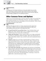
You can display as many palettes as you like or will fit on your screen. If
your screen resolution is set to a low resolution like 800 x 600, you’ll
probably want to collapse most of the palettes. In fact, at that resolution,
you may not even be able to see all of the tools in the toolbox. A higher
resolution lets you see more items on the screen, and that’s better for
Photoshop. What you see will differ depending on your screen resolution;
however, this image does give you a feel for how your screen should
look. If your screen resolution is too low to handle everything in the
Photoshop interface, try changing it to something higher, such as 1152 x
864.
.
Note:
Although you should use the highest resolution that works for both you and
your computer, many of the screen shots in this book were taken using a
lower resolution so they would be more readable. This might cause some
minor differences between the screen shot and what you see on your
screen, but for the most part, you won’t n otice any difference at all.
The Default Palettes
The default palettes, as shown in Figure 3-1, contain two or three sepa-
rate palettes that are docked together. The first one contains the
Navigator, Histogram, and Info palettes.
Navigator, Histogram, and Info Palettes
These three palettes are docked together because they are each used for
obtaining information about an open file. The Navigator palette allows
you to quickly change the viewing area of the file on which you are work
-
ing. You can quickly zoom in and out and view additional palette options.
The Histogram palette lets you view the Histogram of the image
(more on that later), and select sliders for various color choices like
RGB, CMYK, and Web colors. With these sliders you can make adjust
-
ments to the color levels and tones.
The Info palette displays information about the color that’s directly
underneath the location of the mouse pointer in the image, and displays
additional information depending on the tool chosen. As a graphic artist,
36 Part I / The Photoshop Interface
this information can be quite useful when matching a color or working
between different color models.
The Info palette offers other information, including the following:
n
X and Y values are shown when using the Crop tool, the marquee
tools, the Zoom tool, and the Line, Pen, and Gradient tools.
n
Readouts can be configured to show values for actual color, proof
color, grayscale, RGB color, web colors, HSB, CMYK, and lab colors,
and total ink or opacity. There are two sets of readouts, both of which
can be set.
Let’s explore these palettes and view colors for an RGB file:
1. Open the Ducky.tif file from the Samples folder stored in the Adobe
program folder. (This procedure was detailed in Chapter 2.)
2. Make sure the Navigator palette is open, as shown in Figure 3-2. To
verify that the default palettes are available, choose Window>
Workspace>Reset Palette Locations.Forthisfigure,I’ve
dragged the palette closer to the image.
3. Click the Info tab to access the Info palette.
Chapter 3 / The Palettes 37
Figure 3-2: Using the Navigator palette
4. Click the arrow in this palette to see the additional options, and
choose Palette Options.
5. From the Info Options dialog box, change the first option to RGB
Color and the second to CMYK Color. Click OK.
6. Select the Eyedropper tool from the toolbox. Remember, you can
also select the Eyedropper by pressing I on the keyboard.
7. Hover the Eyedropper over a color in the image. In the Info palette
you can see the values for the color. Move the mouse around to see
the values of the other colors. Check out the setting when you hover
over the white part of the image. Notice the RGB values are all at
255 (that’s the highest). Now, hover over the black part of the image.
Notice the RGB values now lean toward all zeros. That’s the lowest
number.
8. Shift+click on the image to add a sampled color to the Info palette.
You can then compare the colors from this selection to other areas of
the image. You can add up to four sampled colors here. This is quite
useful when you need to know if one yellow in an image is pretty
close to another yellow in the image.
9. ClickontheNavigator tab to open the Navigator palette. Use the
slider bar to zoom in or out, or click on the zoom icons in this
palette.
10. Click the Histogram tab. Notice the Histogram chart. A histogram
is a graphical representation of the color data in the image. Click the
arrow in this palette and choose All Channels View. While this is
beyond the scope of this chapter, after learning how to read these
histograms you can tell if a photo is underexposed or overexposed
(among a multitude of other flaws), and use the tools in Image>
Adjustments>Levels to correct what’s wrong. Go ahead and open
Image>Adjustments>Levels toviewthetools,andmovethe
slider to see one of the ways you can use levels and histograms to
change the image on the screen.
11. Select Window>Workspace>Reset Palette Locations before
continuing.
There is much more on colors later in this book; this chapter is only
meant to familiarize you with the available palettes.
38 Part I / The Photoshop Interface
Color, Swatches, and Styles Palettes
These palettes are docked together because they all have to do with the
colors in the foreground and background of an image or the style of the
selected layer. The Color palette displays information about the current
foreground and background colors and allows you to change the colors as
desired and/or base the colors on different color models. The Swatches
palette also allows you to choose a foreground or background color, but
also lets you add or delete colors from the Swatches library of colors.
The Styles palette lets you apply a preset style to a selected layer, which
can be the foreground or background, or load different libraries of styles.
Project 3-1: Creating a Custom Foreground and Background Color
Photoshop CS3 uses foreground and background colors to determine
which color will be applied when a specific tool is chosen and used. The
foreground color is used when paint tools are chosen and when fill and
stroke tools are selected. The foreground color is also used by some of
the special effect filters. The background color is used when creating gra-
dient fills, when creating a new file using the background color, or when
filling in an erased area of the image.
You can use the Color and Swatches palettes to create a new fore-
ground and background color, to edit the colors based on different color
models, and to see alerts concerning colors that are out of the printable
color spectrum for the color model that you’ve selected.
In this project, you’ll create a custom foreground and background
color through various methods, including using sliders, using the
Swatches palette, typing in specific values, and using the Eyedropper
tool. You will probably be called upon at some point to create a specific
color for a client who needs his colors matched exactly, needs the colors
guaranteed the same every time, or needs to have colors match some
industry specification. (Of course, printing it exactly or matching it from
your shop’s ink selection is another story, but I’ll save that discussion for
later!)
1. Close any open files. If the Ducky.tif file is open, close it without sav
-
ing the changes. Choose File>New to open a new file. Accept the
default width and height (which will match the resolution set for your
monitor) and RGB Color, 8 bit, and in the Background Contents,
select Background Color. Click OK. (Note that we aren’t going to
Chapter 3 / The Palettes 39
actually do anything to the file, we simply must open a file to access
the tools I want to explore here.)
2. A new file will open, and the color of the new file will be filled with
the current background color. It could be any color! You can see the
background color that’s currently set at the bottom of the toolbox.
Now, locate the Color, Swatches, and Styles palettes. (If they aren’t
visible, choose Window>Workspace>Reset Palette Locations.)
3. Choose the Color palette by clicking on its tab; you’ll want the RGB
colors and sliders to be showing. If the RGB sliders aren’t showing,
click the down arrow and, from the additional options, select RGB
Sliders as shown in Figure 3-3. (Don’t worry if your numbers don’t
match mine.)
4. In the Color palette, select the background color square by clicking
on it. A black outline will show around it. The background color is
represented by the square in the background, in Figure 3-3, it’s the
white color square. Click it again to open the Color Picker. Make
sure the title of the new window is Color Picker (Background Color).
To create a custom foreground color, you select the foreground color
square and click it again to open the Color Picker (Foreground
Color) window.
5. Hover the mouse over the color ramp and click on a new color.
Notice that the sliders move and the color shown in the background
color square changes. (This activity does not change the background
color of the file; it only changes the background color in the toolbox
for the next use.) Click OK.
40 Part I / The Photoshop Interface
Figure 3-3: The Color palette and its options
6. Next, move the sliders in the Color palette manually. Notice that the
color shown in the background box changes again. You can change
the amount of red, green, and blue with the sliders.
7. You can also double-click on the background color in the Color pal
-
ette and select a new color from the Color Picker that appears by
clicking on the desired color.
8. Type in numbers in the RGB boxes to create your own color based
on color values. The numbers must be from 0 to 255.
]
Tip:
Each of these steps can also be applied after selecting the foreground or
background color in the Color palette, as well as from the toolbox.
9. Click on the additional options and notice how many color models
there are. Select CMYK and then Web Color Sliders to see addi-
tional options.
10. Click the Swatches tab to open the Swatches palette. Select a color
from the swatch choices and watch the foreground color change.
11. Click the additional options under this palette. Additional options are
found under the down arrow. There are several libraries of colors to
choose from. Select Pantone Solid to Process and click OK when
prompted to load the new library.
12. Double-click on any color to see its name and Pantone number.
Pantone numbers are quite important when creating artwork for
larger companies. The blue used in your local hospital’s logo is likely
not the same blue used for your favorite detergent’s logo.
13. When finished exploring, choose the additional options again and
choose Reset Swatches. Click OK when prompted.
If you are new to screen printing and graphic work, all of these color
options might seem a little overwhelming; if you are an old hand at the
art, you might be so excited about these options that you can hardly stay
in your seat. Whatever the case, there is more on colors and swatches
later in this book; for now, knowing how to access the palettes and select
a color or two is all you really need to understand.
Chapter 3 / The Palettes 41
Layers, Channels, and Paths Palettes
The last default palette box contains three palettes (Layers, Channels,
and Paths) and is shown in Figure 3-4.
6
Caution!
Your default palettes may not look like this if you’re using 800 x 600 resolu
-
tion; change to 1024 x 768 or higher if you haven’t done so already.
.
Note:
Layers, channels, and paths are all rather complex concepts in Photoshop
and are detailed in various chapters throughout the book. For now it is only
important to understand a little about layers and that layers c an be edited
here.
Layers are like transparencies, which are clear plastic sheets of material
that can be printed on. The transparencies can be printed and stacked on
top of one another to form a complex picture, and single transparencies
42 Part I / The Photoshop Interface
Figure 3-4: The Layers, Channels, and Paths palettes
can be removed from the stack for editing or removal. When you create
artwork in Photoshop CS3, you can create it on layers similar to these
transparencies—text on one layer, background image on another, and
perhaps a selection pasted from another file on another. These layers can
then be edited independently of each other, making the editing process
more efficient and precise.
Viewing a Multilayered Image
To see an example of a multilayered image, open the DVDMenu.psd file from the
Samples folder of the Adobe program files on your hard drive. Look in the Layers
palette for the five layers in the image. You might also want to view the following
files:
· Layer Comps
· Onion Stack
To see how layers work, in the Layers palette, click the eye icon in the Title layer.
The eye will disappear, as will the title in the image. Click the eye icon again t o
redisplay the layer. Very, very, powerful stuff!
Additional Palettes
There are additional palettes available that aren’t shown on the interface
by default, including the History, Actions, Tool Presents, Brushes, and
Character palettes. Let’s take a moment to look at a few of these.
History and Actions Palettes
To view the History and Actions palettes, click the double arrow next to
the Navigator palette. This will expand the palette dock and allow you to
see the additional default palettes.
The History palette helps you correct errors (by storing what you’ve
done to a file previously) and allows you to “go back” to a point before a
particular edit was made by simply clicking on the appropriate step. If
you realize you made a mistake 15 steps ago, instead of clicking
Edit>Step Backward 15 times, you can simply find the point in the
History palette.
Chapter 3 / The Palettes 43
The Actions palette lets you record, play, edit, and delete specific
actions or load action files. Action files can include adding text effects,
image effects, and production actions, such as changing a custom RGB
file to grayscale or saving a file as a JPEG, and will increase the effi
-
ciency in which you perform often-repeated tasks. You can also purchase
actions from third-party vendors and software manufacturers; these
actions will usually perform extremely complex sets of instructions.
Tool Presets Palette
The Tool Presets palette lets you load, save, and replace tool preset
libraries for quick reference. Saving custom preset tools allows you to
reuse custom tools without recreating them each time. Creating a new
tool preset is easy; just choose a tool, configure the options you want to
set for the tool, and choose New Tool Preset from the additional options
available from the Tool Presets palette.
]
Tip:
When you begin to create logos and artwork, keep the History and Tool
Presets palettes open. Refer to the History palette often for a quick and
painless way to revert back any number of steps to “undo” actions per-
formed. Use the Tool Presets to quickly access preconfigured tools.
Brushes Palette
The Brushes palette can be opened using Window>Brushes, or you can
expand the Dock as previously noted. From here, you can create or
access thousands of types of brushes and configure them to meet any
drawing need. You’ll use brushes when you create logos and artwork, and
you can even use the airbrushes to create airbrushed artwork.
6
Caution!
Make sure that a brush is chosen when accessing the Brushes palette; other
-
wise, all of the brushes will be grayed out!
44 Part I / The Photoshop Interface
Character and Paragraph Palettes
The Character palette can be opened using Window>Character. You can
also expand the Dock and have the Paragraph palette open with it, or you
can use Window>Paragraph if you like. With these palettes, the offset
printer, logo designer, CAD cutter, or sign maker can format the text
used in a file. This includes choosing or changing the font, font style, and
font size, as well as making precise changes to text, such as leading,
kerning, scale, and baseline shift. Paragraphs can also be formatted,
including indentation, orientation, and hyphenation rules. Many of these
attributes can also be changed from the options bar while adding the text
itself; all of these points are covered in Chapter 9, “Working with Text
and Numbers.” Since I haven’t discussed adding type yet, I’ll save this
discussion for later.
Pop-up Palettes
Some palettes are not available from the Window menu choices and
appear instead when a specific tool is chosen and being configured.
These palettes are called pop-up palettes for this reason. Let’s look at a
few of these palettes:
1. Close any open files. Then choose File>New to create a new canvas
to work with.
2. Choose RGB Color,awhite background, and accept the rest of the
default settings.
3. Choose Window>Workspace>Reset Palette Locations to revert
the workspace to its defaults.
4. Select the Brush tool from the toolbox.
5. Click on the down arrow to the right of the word Brush in the options
bar; it is the second down arrow on the bar.
Chapter 3 / The Palettes 45
6. The resulting list is called a pop-up palette. Click the right arrow to
see the additional options. I’ve chosen to view my pop-up palette
using the Large Thumbnail option, but you can choose whatever
option is best for you, as shown in Figure 3-5.
7. The brushes shown in Figure 3-5 are the default brushes. From the
additional options list, choose Assorted Brushes and click OK
when prompted. Note all of the additional brushes available, and
that’s just from one of the choices! Click outside the pop-up palette
to close it.
8. Click the Gradient tool in the toolbox.
9. From the options bar, click on the down arrow next to the gradient to
see another pop-up palette. Again, click the arrow for additional
options.
10. From the toolbox, choose the Custom Shape tool.
11. Click the down arrow next to the word Shape on the options bar to
see the pop-up palette for the custom shapes. When finished, close
the file.
As you can probably surmise from the multitude of palettes and options,
there are literally thousands of configurations possible for brushes, tools,
palettes, and other items. In the next section, you learn how to custom
-
ize the palettes in the work area and save a workspace.
46 Part I / The Photoshop Interface
Figure 3-5: The
pop-up palette
for the Brush tool
Moving, Adding, and Removing
Palettes
Customizing the workspace is an important part of Photoshop’s offerings,
and the palettes are quite flexible. The palettes can be added or removed
from the workspace, and most of the palettes can be resized as well.
They can be grouped together in different configurations or docked verti
-
cally below the options bar.
Moving the Palettes
Palettes are moved like any dialog box in most software programs; just
click and drag from the title bar. Resizing is done similarly; just drag from
the bottom-right corner.
The Window Menu Options
The Window menu commands offer quick ways to show or hide specific
palettes or revert to the default workspace or a saved one. From the
Window menu, click to place a check next to the palettes you wish to see
in the workspace, and click again to remove the check to remove them
from the workspace.
Docking the Palettes Together
If you don’t like the way the palettes are docked together, you can change
them. To separate a palette from its docked companions, simply drag the
palette’s tab to another area on the screen. Figure 3-6 shows a
workspace where several palettes have been undocked from their
grouped positions. Of course, this isn’t an effective way to work, but it
proves the point.
Chapter 3 / The Palettes 47
The palettes can also be dragged off of the workspace to the Dock, which
is detailed next, or dragged to another palette and grouped elsewhere.
Figure 3-7 shows all of the default palettes grouped together in a floating
panel.
48 Part I / The Photoshop Interface
Figure 3-6: Undocking palettes
Figure 3-7: Grouping palettes
The Dock
The palettes that are in the workspace can be removed from the work
area by dragging them to the Dock. The Dock is where the palettes are
stored by default, on the right side of the interface. Using the same drag
-
ging technique as detailed in the previous section, floating palettes can
be dragged from the workspace to the Dock. This frees up space in the
work area, while keeping the palette handy and easily accessible. The
palettes can be dragged back onto the workspace from the Dock when
-
ever necessary.
]
Tip:
You can collapse the Dock by clicking the right arrow directly above the top
palette in the default configuration (the Info palette).
Saving the Workspace
Once you have the workspace just the way you want it, you can save that
configuration using the Window>Workspace>Save Workspace com-
mand. Type a name for the workspace in the Save Workspace dialog box,
and it becomes available from the Window>Workspace choices.
.
Note:
In Chapter 5, “Perso nalizing the Workspace,” we create a workspace spe
-
cific to your n eeds as a screen printer and artist.
Palette Tips and Tricks
There are several tips and tricks out there for palette configuration, and
although they’re documented in Photoshop’s help files, they’re worth
repeating in the last bit of space here.
Open a new or existing file and try these tips and tricks:
n
To show or hide the toolbox, the options bar, and all of the open pal
-
ettes, press the Tab key.
n
To show or hide only the palettes, press the Shift+Tab key
combination.
Chapter 3 / The Palettes 49
n
Display various palette menus by clicking on the right arrow in most
palettes.
n
Use the minimize and maximize options on each palette to make it
smaller or larger.
n
To always start with the default palette positions, choose Edit>Pref
-
erences>General, select Interface, and deselect Remember Palette
Locations.
n
When using pop-up sliders, type in a number for the value to achieve
a precise move.
n
When using pop-up palettes, set the thumbnails to Large Thumbnail
if you want to see the name, size, and sample of each.
n
Use the additional options in a palette to rename or delete an item
such as a brush.
n
Leave the History palette in the workspace so it’s easily accessible.
After working with the palettes for a while, you’ll discover what you use
and what you don’t. Armed with that knowledge, you can more effec-
tively personalize the workspace.
Summary
In this chapter you learned all about palettes, including how to use them,
how to access additional options, group and ungroup them, dock them,
and access pop-up palettes. The palettes play an important role in per
-
sonalizing the work area and working with files and artwork. Even
though you can personalize the workspace, for now consider leaving it
as is until you are comfortable with what is available by default.
50 Part I / The Photoshop Interface
Chapter 4
The Options BarThe Options Bar
The options bar is another part of Photoshop CS3’s interface and changes
each time a tool is chosen from the toolbox. Figures 4-1, 4-2, and 4-3
show the options bar for various tools. From here, the tool can be
configured.
.
Note:
Figures 4-1, 4-2, and 4-3 show what you’ll see when you select a tool. Once
you apply a tool you’ll see two new items on the options bar: a c heck mark
(Commit button) to commit changes, and a circle with a line through it
(Cancel button) to undo the changes.
In this chapter, we take a look at some of the common option bar choices,
such as Style, Mode, Opacity, Brush, and more. Many of these options
are shown for multiple tools, such as Opacity and Brush, while others are
only available for a specific tool, like Resize Windows To Fit when using
the Zoom tool.
51
Figure 4-1: The options bar when the Horizontal Ty pe tool is chosen
Figure 4-2: The options bar when the Brush tool is chosen
Figure 4-3: The options bar when the Pen tool is chosen
.
Note:
As with the remaining chapters of this book, not every option is covered.
Photoshop can be overkill for screen printers and graphic artists, as they
most likely don’t create images for the web or use filters and gradients much
in their artwork. In this chapter, I only cover what is relevant to the graphic
artist.
Common Options from the Options Bar
In order to use the tools successfully, you need to understand what’s
available and what the words and options mean. A word like “opacity”
might not mean much to the layperson, but it is certainly one every
Photoshop user should know!
]
Tip:
You can drag the options bar anywhere o n the screen by pulling from the far
left corner.
Style
The Style option from the options bar is a common one indeed. You’ll use
this option most when you choose the marquee and Art History tools.
Clicking on the down arrow next to the Style option brings up a
drop-down list where choices can be made about the style of the tool
with which you are working. (The Styles palette is one of the default pal
-
ettes, described in the previous chapter. But the Style option in the
options bar and the Styles palette in the Dock are two different things.)
Figure 4-4 shows the drop-down list that appears when clicking the
Style arrow on the options bar when the Rectangular Marquee tool is
selected. There are three choices, Normal, Fixed Ratio, and Fixed Size.
Here, Fixed Ratio is selected. Notice the Width and Height options.
When you select the Fixed Ratio option, you can set the width and height
of the rectangle you plan to draw with the mouse. As you might guess,
Normal is a free-hand draw, and Fixed Size is a specific width and height.
52 Part I / The Photoshop Interface
Mode
Mode appears more often on the options bar than just about anything
else, including when the Healing Brush, Pencil, Brush, Clone Stamp,
Pattern Stamp, History Brush, Art History Brush, Eraser, Paint Bucket,
Gradient, Blur, Sharpen, Smudge, and Sponge tools are chosen. This
option has many uses, and its choices and effects on an image differ
depending on the tool chosen.
Basically, the Mode options allow you to control how you want pixels
to be affected by the application of the painting or editing tool you
choose. Modes, also called blending modes, are generally used for creat-
ing special effects. Figure 4-5 showstheModeoptionswhentheBrush
tool is chosen.
Chapter 4 / The Options Bar 53
Figure 4-4: Style choices from the options bar
Figure 4-5: Mode options
As shown in the figure, there are multiple modes to choose from. While it
is not necessary to go through a detailed explanation of all these modes
(you’ll probably never use many of them), a brief explanation of a few is
certainly in order here.
Some modes you might use include:
n
Normal: This mode is the default mode for painting and editing for
most of the tools. Normal mode simply replaces the underlying pix
-
els with the pixels you add to the image by painting or brushing. It is
merely uncomplicated replacement of color.
n
Multiply and Screen: When using Multiply mode, the foreground
color is combined with the original colors in the image to decrease
the brightness in the areas in which you are painting. This produces
darker images by emphasizing the darker colors. Screen is just the
opposite and works in tandem with lighter colors.
n
Light m odes: There are several light modes, including Vivid Light,
Linear Light, Pin Light, Soft Light, and Hard Light, and each applies
light to the image in different ways. Most produce special effect type
lighting.
n
Hue: Hue paints with the foreground shade only and is good for
applying tint to areas of an image.
n
Clear: This mode changes solid-colored pixels to transparent pixels
when using the Paint Bucket, Brush, or Pencil tools when using the
fill command or the stroke command. Changing pixels to transparent
removes them from the image. (You can’t choose the Clear mode if
the layer is locked.)
Don’t worry too much about the huge number of modes shown in Figure
4-5. Most screen printers don’t spend much time applying modes for cre
-
ating special effects or lightening or darkening images. Most of the time,
you’ll use the Image>Adjustments>Curves command to change the col
-
ors in an image; it’s fast, easy, and a common tool for screen printers.
Using this option offers a preview of the color changes made as well as
the ability to set target colors including midtones, shadows, or highlights.
There are several other options that can be set manually as well, and
these are discussed throughout the book.
54 Part I / The Photoshop Interface
Brush
The Brush option from the options bar comes up quite a bit too. In fact,
you’ll probably use these settings more than just about anything else on
the options bar. The Brush option appears when many of the tools are
chosen, including the Healing Brush, Brush, Pencil, Pattern Stamp,
Clone Stamp, History Brush, Art History Brush, Eraser, Background
Eraser, Blur, Sharpen, Dodge, Burn, and Smudge tools. (The brush pre
-
sets are available when tools are chosen as well, and are discussed later
in this chapter.) The Brush option lets you configure the tool that you are
working with by selecting the attributes it will have for its size, texture,
shape, and more.
Project 4-1: Using the Brush Options from the Options Bar to Clone
an Area of an Image
Let’s take a look at one of the tools that uses brush settings (the Clone
Stamp tool) and how you might use it in a screen printing environment to
clone a specific area of an image:
1. Open the file Flowers1.psd from the Chapter 4 folder on the com-
panion CD. Click Update if prompted to update layers.
2. If you’ve moved the palettes around, reset them using Window>
Workspace>Reset Palette Locations.
3. Choose the Clone Stamp tool from the toolbox or by pressing S on
the keyboard. If using the keyboard, verify you’ve chosen the Clone
Stamp tool and not the Pattern Stamp tool from the toolbox.
4. From the options bar, click the down arrow to the right of Brush to
open a pop-up palette showing the Brush settings. Next, click the
right arrow at the top of the palette to show the additional options, as
shown in Figure 4-6. Choose Reset Brushes and click OK when
prompted.
Chapter 4 / The Options Bar 55
5. Choose brush number 19, a hard, round brush, by double-clicking on
the brush number.
6. Change the master diameter to 50 px by moving the slider bar or
typing 50 px in the Master Diameter field. Press the Enter key to
close the window.
7. Press the Alt key on the keyboard and hold and click in the center of
the bottom sunflower to create a sampling point. (The brown part of
the flower.) When pressing the Alt key, the cursor will change to a
target shape. Let go of the Alt key.
8. Position the cursor in the top-left corner of the picture. You’ll be
cloning the original sunflower there. Click once and notice that there
is now a cross over the area f rom which you took the sampling point,
the middle of the sunflower, as well as the outline of the brush you
are working with. Use this cross to carefully trace around the sun
-
flower and to create a clone of the original flower. Figure 4-7 shows
two pictures; the first is the original, and the second shows the Clone
56 Part I / The Photoshop Interface
Figure 4-6: Using the Brush options
Stamp tool in use. If you look closely, you can see the circle that rep
-
resents the brush and the cross that represents the cloned point in
the brown parts of the two left-most flowers.
9. You can repeat these steps to create many sunflowers, as shown in
Figure 4-8.
.
Note:
A file called Flowers2.psd is also in the Chapter 4 folder on the co mpanion
CD and contains an image with several c loned sunflowers, as you might have
created in this exercise.
Chapter 4 / The Options Bar
57
Figure 4-7: Using a brush in combination with the Clone Stamp tool
This is just one of the uses for a brush. As mentioned in the introduction
of this section, many tools offer brushes as a way to use the tool effec-
tively. You’ll want to become proficient in using, selecting, and
configuring brushes.
Opacity
Opacity is available on the Layers palette for working with a fill or a layer
and from the options bar when working with the Brush, Pencil, Clone
Stamp, Pattern Stamp, History Brush, Art History Brush, Eraser, Magic
Eraser, Gradient, or Paint Bucket tools. Opacity can also be set when
blending options are chosen.
Opacity is used to specify how transparent a layer should be either
on its own or in regard to other layers. To see how the Opacity setting
functions, work through the following project for creating a gradient
layer.
58 Part I / The Photoshop Interface
Figure 4-8: An example of using the Clone Stamp tool
Project 4-2: Creating a Background for a Business Card, Decal, or
Mouse Pad (Understanding Opacity)
In this project, we create a gradient layer that can be used as a back
-
ground for a business card, truck or car decal, sign, coffee mug, mouse
pad, or process (or simulated process color) T-shirt. In doing so, we learn
about opacity and brushes (and maybe even a little bit about layers). We
first configure opacity using the Layers palette and later with the options
bar.
.
Note:
Configuring opacity with the Layers palette first gives you a better under
-
standing of what exactly opacity is.
1. Choose File>New and configure the settings as shown in Figure
4-9, then click OK.
2. Choose Layer>New Fill Layer>Gradient . Click OK in the New
Layer dialog box.
3. In the Gradient Fill dialog box, choose Linear from the Style choices
by clicking on the down arrow.
4. From the Gradient choices, select a gradient that you like. Leave the
other options as is. Click OK.
Chapter 4 / The Options Bar 59
Figure 4-9: Creating a new file
5. Locate the Layers palette; it should be visible in the work area. If it
is not, place a check next to Layers in the Window menu. This pal
-
ette is shown in Figure 4-10. Note that you can drag the Layers
palette out of the Dock and expand the palette as shown here.
6. Highlight the layer that contains the gradient, as shown in the figure.
In the Layers palette, click the right arrow beside the Opacity field,
and move the slider to the left. Let go of the mouse and notice the
depth or thickness of the colors on the layer change. If you move the
slider all the way to the left, the gradient layer becomes transparent
and doesn’t show at all; all the way to the right and there is no trans-
parency at all.
7. Set Opacity to 40 percent by typing in the value in the Layers
palette.
8. Select the Brush tool from the toolbox.
9. Choose Layer>New>Layer and click OK in the New Layer dialog
box. Notice in the Layers palette that the additional layer has been
added. We will apply a brush to this layer.
10. From the options bar click the down arrow to the right of the Brush
to bring up the Brushes pop-up palette.
11. Click the right arrow in this pop-up palette and choose Reset
Brushes. Click OK when prompted. (You don’t have to do this every
time; I want you to do it here so we’ll see the same things in the
Brush options.)
60 Part I / The Photoshop Interface
Figure 4-10: Using the Layers
palette to configure opacity