Adobe illustrator cs4- P10 docx
Bạn đang xem bản rút gọn của tài liệu. Xem và tải ngay bản đầy đủ của tài liệu tại đây (1.58 MB, 30 trang )
CHAPTER 7: WORKING WITH LIVE EFFECTS
244
Illustrator can also import SVG fi lters. To do so, choose Effect > SVG
Filters > Import SVG Filter. In the dialog box, open an SVG fi le with a
fi lter effect in it; when you do, Illustrator will import that fi lter into your
current fi le.
WARP: CHOOSING YOUR
DISTORTION
The Warp effect is one of several distortion functions in the Illustrator arse-
nal. You can use Warp to apply any of 15 different preset distortions to any
object, group, or layer.
To apply a Warp effect, make a selection, and choose Effect > Warp > Arc.
Even though all 15 warp styles are listed in the submenu, you don’t have to
worry about choosing the right one just yet—the Warp Options dialog box
lets you choose from any of the preset warp styles.
When the Warp Options dialog box appears, select the Preview check box
so you can preview your warp on your artboard as you adjust the settings.
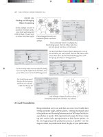
Click the Style pop-up menu to choose from the list of warp styles: Arc,
Arc Lower, Arc Upper, Arch, Bulge, Shell Lower, Shell Upper, Flag, Wave,
Fish, Rise, Fisheye, Infl ate, Squeeze, and Twist. Little icons appear to the
left of each warp style to help you visualize what each one does, although
trial and error probably works better (Figure 7.26).
NOTE SVG e ects
should be the last
e ects applied in the stacking
order when multiple e ects
are being speci ed; other-
wise, the SVG e ect will end
up being rasterized.
Figure 7.26 The little icons
that appear to the left of
each Warp e ect help you
understand what each
option does.
APPLYING PHOTOSHOP EFFECTS
245
Once you’ve chosen a warp style, you can specify whether the warp is
applied horizontally or vertically, and you can adjust how slight or extreme
the warp is applied by adjusting the Bend slider. Also, you can use the
Horizontal and Vertical sliders to apply additional distortion to your
selection.
Warp effects are particularly useful when applied at the group or layer level,
where you might often add or remove elements from the group. For example,
you might apply a Warp effect to a logo to show movement or excitement. If
you applied the Warp effect at the group level, adding new art to the group
will automatically cause the new art to take on the same Warp effect.
APPLYING PHOTOSHOP EFFECTS
The effects we have discussed to this point are considered Illustrator effects,
and for the most part, they are vector in nature and make adjustments to
vector paths (with the obvious exception of the Rasterize effect and most of
the Stylize effects).
However, Illustrator also has the ability to apply a variety of purely pixel-
based effects to any object, group, or layer. These effects are grouped in the
Photoshop Effects section of the Effect menu. The same rules as to how
effects are applied through the Effect menu and edited via the Appearance
panel apply to these effects as well.
In truth, the Photoshop effects in the bottom portion of the Effect menu
are really Photoshop fi lters. You can copy Photoshop fi lters and plug-ins
into the Illustrator Plug-ins folder (found in the same folder in which the
Illustrator application fi le appears), and they appear listed in the Effect
menu as well.
At fi rst, it may seem unnatural to fi nd that you can apply a Gaussian Blur
or Unsharp Mask effect in Illustrator, but you’ll quickly fi nd that you can
achieve wonderful designs and cool effects by employing Photoshop fi lters
such as Crystallize and Mezzotint. Some of the graphic styles libraries
that ship with Illustrator employ a variety of these effects, and by reverse-
engineering them, you can learn how to use them.
NOTE Refer to
Chapter 2 for detailed
information on the other dis-
tortion features in Illustrator,
as well as a sidebar of those
features as they compare to
the Warp e ect.
NOTE Be aware that
copying objects with
below-the-line e ects from
one document to another
may cause the appearance
of the e ect to change if
the two les have di erent
resolution settings.
CHAPTER 7: WORKING WITH LIVE EFFECTS
246
Illustrator E ects and Photoshop E ects
At rst glance, it may appear that the Illustrator e ects are purely vector in nature and the Photoshop e ects
are raster-based ones, but this isn’t true. E ects such as Feather and Drop Shadow, which appear in the Stylize
submenu, are listed as Illustrator e ects, and they produce raster content. So, what then is the distinction
between Illustrator and Photoshop e ects?
The di erence is relatively simple yet absolutely critical: resolution.
At the beginning of the chapter, you learned how the Document Raster E ects Settings dialog box determines
the resolution at which e ects are rasterized when the document is either attened or printed. But the setting
is also important for determining the appearance of some e ects. Let’s take a look at an example:
1. Open the Document Raster E ects Settings dialog box, set the resolution to 72 ppi, and click OK.
2. Draw two identical shapes.
3. Apply a Feather e ect to one shape (an Illustrator e ect) and a Gaussian Blur e ect to the other
(a Photoshop e ect), and then observe the results (Figure 7.27).
Figure 7.27 Shown are
identical shapes with a
Feather e ect applied (left)
and a Gaussian Blur e ect
applied (right). You can
see that both appear to be
somewhat similar.
4. Now open the Document Raster E ects Settings dialog box, change the resolution to 300 ppi, and click
OK. Observe the results of the e ects (Figure 7.28).
Figure 7.28 The shape with the
Feather (left) remains unchanged
in appearance, but the shape with
the Gaussian Blur (right) now has a
harder edge than it did before the
change in resolution.
You’ll notice that the appearance of the Gaussian Blur e ect has changed, but the Feather e ect remained
the same. This happens because the Gaussian Blur e ect (and all Photoshop e ects, for that matter) uses
absolute measurements to calculate the e ect. You’ll notice the Gaussian Blur e ect dialog box speci es
the blur value in pixels (Figure 7.29). Changing the resolution—the number of pixels in your le—changes
the appearance in pixels (Figure 7.29). Changing the resolution—the number of pixels in your le—
changes the appearance of your e ect. In contrast, the Feather e ect—and all Illustrator e ects—uses
relative units to calculate the e ect (Figure 7.30). The Feather dialog box speci es the feather value in inches
(or whatever measurement system you’ve chosen in preferences), so when you change the resolution setting,
Illustrator simply adjusts the number of pixels it uses in the e ect, as needed.
(continues)
APPLYING PHOTOSHOP EFFECTS
247
Illustrator E ects and Photoshop E ects (continued)
Figure 7.29 The Gaussian
Blur e ect uses pixels to
calculate the e ect.
Figure 7.30 The Feather e ect uses
relative units (in this case, inches) to
calculate the e ect.
Overall, we refer to Photoshop e ects as below-the-line e ects because they appear below the divider line
in the E ect menu (Figure 7.31). When using below-the-line e ects, it’s best to ensure that your document
raster e ects settings are correct before you begin working on your design. Otherwise, the appearance of
your artwork will change when you adjust it later (or if your printer adjusts it). If you use above-the-line e ects
(Illustrator e ects), you can get better performance by leaving the document raster e ects settings at a lower
resolution until you are about to send the le out for high-end output.
Figure 7.31 All e ects
that appear below the line
are considered Photoshop
e ects and are resolution-
dependent.
CHAPTER 7: WORKING WITH LIVE EFFECTS
248
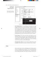
A Gallery of Effects
Going through each Photoshop effect listed in the Effect menu is beyond
the scope of this book, but one feature that really makes it easy to experi-
ment with a wide range of Photoshop effects is the Effects Gallery. If you’re
familiar with the Photoshop Filter Gallery feature, you’ll fi nd that the
Effects Gallery is the same. Once you’ve targeted an object, group, or layer,
choose Effect > Effects Gallery, which opens the Filter Gallery dialog box.
The dialog box is split into three main sections: a preview on the left, a list
of the different effects you can apply in the center, and the parameters for
the selected effect on the right (Figure 7.32).
To preview different effects, click an effect in the center area (expand the
folders to see the individual effects), and adjust the settings at the upper
right of the dialog box. Once you’ve found the effect you like, click the
OK button to apply it.
Figure 7.32 You can spend
hours going through the
e ects in the Filter Gallery
dialog box.
Chapter
Eight
Working with Typography
Though a picture speaks 1,000 words, you still need
to type words every once in a while. Adobe Illustra-
tor CS4 has very powerful typography features, which
we’ll cover in detail later in this chapter. Illustrator is a
top-notch illustration tool, but it is also capable of set-
ting professional-level type—its typography features
are on par with those found in the award-winning
Adobe InDesign. And although InDesign shines when
it comes to setting pages and pages of type, Illustrator
is the program of choice for creative uses of type.
Graphical applications, such as putting type on a path, putting it around
a circle, putting it inside a shape, and wrapping it around an object, are
all quick and easy tasks in Illustrator.
In this chapter, in addition to the creative uses of type, we’ll explore some
important technologies, such as Unicode compliance, as well as some of the
newer typography features found in Illustrator. Toward the end of the chapter,
we’ll discuss a very important side effect of all this new technology—
backward compatibility with previous versions of Illustrator.
249
CHAPTER 8: WORKING WITH TYPOGRAPHY
250
WORKING WITH TEXT OBJECTS
For now, it’s suffi cient for you to learn about the two kinds of type objects
that Illustrator can create: point text and area text. Naturally, each has its
own benefi ts. Point text gets its name from the fact that it is anchored, so to
speak, by a single point you create when you fi rst click with the Type tool.
Point text is fi ne if you want to enter just a few words or so. The problems
are that the type doesn’t wrap automatically and that many typographic
controls are not available to you. Area text is contained by a text frame or
shape and behaves more like the text you create in a page layout program
like InDesign. This is the kind of text object you’ll want to use for longer
chunks of type.
Working with Point Type
The simplest form of text in Illustrator is point type, which you can create
by choosing the Type tool and clicking any blank area on your artboard.
Once you’ve defi ned a point at which to start typing, you can enter text
on the artboard. Point type doesn’t have defi ned boundaries, so text never
wraps automatically, although you can press Return (Enter) to manually
type on a new line. When you use point type, the paragraph alignment
settings (left, right, and center) refer to the single point that you created
when you fi rst clicked with the Type tool (Figure 8.1).
Although point type is easy to create, many of the powerful text features
that Illustrator has, including the Adobe Every-line Composer, text thread-
ing, and the ability to set text in columns, are not available. However, if
you want to place text in numerous areas of an illustration (such as callouts,
maps, graphs, and so on), point type is the way to go.
NOTE Illustrator can
also create another
other kind of type—path
type, which is explained
later in this chapter.
Figure 8.1 Point type aligns
di erently depending on
the paragraph alignment
options you set for the text.
WORKING WITH TEXT OBJECTS
251
Working with Area Type
As with most page-layout applications, you can also place text within a
frame, although with Illustrator, any vector object can serve as a text frame.
Area type is text that is enclosed within the confi nes of a vector shape
(Figure 8.2). To create an Area Type object, you can either use the Area
Type tool to click an existing vector shape or use the Type tool to click
inside any closed vector shape (Figure 8.3). Alternatively, you can click
and drag a blank area of the artboard with the Type tool to create an Area
Ty p e object.
Multiple Area Type objects can be linked to have a single story fl ow across
them called a thread of text. Text fl ows from line to line automatically within
an Area Type object, and more advanced paragraph settings such as columns,
Figure 8.2 Area type is
enclosed within a frame.
Figure 8.3 As you drag the
Type tool over an object
that can become a text
frame, Illustrator displays
the tool icon in parentheses.
CHAPTER 8: WORKING WITH TYPOGRAPHY
252
composition, hyphenation, and indents are available. We’ll cover text thread-
ing and the advanced text features that are available later in the chapter.
Area type might take an extra click or two to create, but for uniform layouts
and longer runs of copy, you’ll want to use it.
Converting Text to Editable Vectors
In Chapter 3, “Technical Drawing,” you learned about the primary shape
tools in Illustrator. The characters in both Point Type and Area Type objects
are vector shapes too, but they can’t be edited as regular vector shapes can
because you can’t access their anchor points or direction handles. In essence,
text is a special kind of vector object. Fonts have specifi c information built
into them, called hinting, which modifi es character shapes slightly based on
the size in which text is printed. For example, a lowercase e character has
a small hole in the middle, and at really small point sizes, that hole might
appear to close up or fi ll in when printed. Font hinting adjusts the size of
that hole to be slightly larger at smaller point sizes.
You can select any text object and choose Type > Create Outlines to con-
vert text into regular, editable vector shapes. Doing so allows you to per-
form edits on the actual shapes of the characters (for example, extending an
ascender or removing the dot from an i ) but results in the loss of any font
hinting (Figure 8.4).
Where possible, it’s always best to leave text in an editable state and avoid
converting it to vector outlines. In this way, you’ll be able to make edits
easily, and you’ll preserve font information. However, sometimes it’s a good
idea to convert text to outlines, such as when you’ve created artwork that
will be distributed or used in many different places (logos are good exam-
ples). In this way, you don’t need to worry about passing font fi les around
(which has legal ramifi cations anyway—something we’ll discuss later in
the book).
Figure 8.4 Converting text
to outlines (right) gives you
unlimited freedom to edit
the vector paths (left).
GETTING GLOBAL TEXT SUPPORT WITH UNICODE
253
Why Text Looks “Fatter” When Converted to Outlines
You might notice that when you convert text to editable vector outlines, the appearance of that text is bolder
than text that is not outlined. There are actually two main reasons behind this (both technical in nature):
• The loss of hinting makes certain features potentially inconsistent. For example, letter strokes that you
expect to be the same width might turn out to be di erent widths depending on how they fall on the grid
of the output device. Slight di erences can get magni ed unexpectedly, such as rounded letters going
below the baseline. This happens because the information that makes the outlines round consistently to
the pixel grid has been lost.
• The change in the ll algorithm combines with the lack of hinting to make the letters look fatter. Font
rasterizing uses a ll algorithm that turns on a pixel only when the center of the pixel is within the glyph
outline (center-scan). Graphics rasterizing uses a ll algorithm that turns on a pixel when any part of
the pixel is within the graphic outline (overscan). Given that the outline is no longer being rounded to
pixel boundaries at key points, the rendering will generally be at least 1 pixel thicker and occasionally
2 pixels thicker.
Of course, how much di erence this makes depends on the size and style of the type and especially on the
resolution of the output device. At 2,400 dots per inch (dpi) with typical text sizes, the e ect is pretty subtle.
At 600 dpi with 6-point text, the e ect is quite obvious.
Special thanks to Thomas Phinney of Adobe for providing this information.
GETTING GLOBAL TEXT SUPPORT
WITH
UNICODE
When you use your keyboard to type words on your computer, each charac-
ter you type is stored on your computer by a number. Every font also has a
number assigned to each of its characters. This method of mapping charac-
ters to numbers is called character encoding. The idea is that when you type
an a, your computer matches up its code with the code in the selected font,
and an a shows up on your screen. Simple, right?
The problem is that not every computer uses the same encoding system.
For example, Mac and Windows use different character encodings. Operat-
ing systems in different languages and countries around the world also use
a variety of encodings. Confl icts also exist in that one system may encode a
certain character with a number, whereas another system may have a com-
pletely different character encoded for that same number. Because there are
NOTE Besides Unicode
support, Illustrator also
has fantastic support for
Asian languages and type
features such as Mojikumi,
Kinsoku, and composite fonts.
To activate these extended
features in the English-
language version of Illustrator,
turn on Show Asian Options
in the Type panel
of Preferences.
CHAPTER 8: WORKING WITH TYPOGRAPHY
254
so many different ways of encoding characters, you can run into a situation
where you create a fi le on one computer, and simply opening that same fi le
on a different computer results in words not appearing correctly. If you’ve
ever typed something on Windows and transferred it to a Mac and noticed
that certain characters appear as question marks, appear as weird boxes, or
disappear completely, you can now understand why that happened.
In 1991, a standard was formed called Unicode, which, as its name implies,
is a single encoding that can be used to describe every single character, in
any language, on any computer platform. The text engine that was intro-
duced in Illustrator CS uses Unicode, and if you use Unicode-compliant
fonts to create your documents, you can pass your documents across the
world and have them display correctly on any computer.
UNDERSTANDING THE WAY
OF THE
FONT
Have you heard about the latest reality show? Ten designers have to create a
logo, but fi rst they have to get their fonts to work on their computers. Seri-
ously, though, we’d think that in a day and age where we can put people on
the moon and do just about anything wirelessly, we would have fi gured out
the whole font thing by now. As you will soon learn, different font formats
are available, and each offers different capabilities. In addition, Illustrator is
specifi cally sensitive to corrupt fonts, and although a bad font may work in
other applications, it can cause problems in Illustrator. Several font manage-
ment utilities are available, including Suitcase, Font Reserve, FontExplorer,
and Font Agent, and each of these has components to help you identify and
repair problematic fonts.
More importantly, different font formats are available. As a designer, you
may be familiar with PostScript Type 1 fonts, TrueType fonts, or Multiple
Master fonts. Adobe reduced support for Multiple Master fonts with the
release of Illustrator CS, and although those fonts might still work in
Illustrator today, there’s no way to take advantage of the extended technol-
ogy that they were meant to bring. TrueType fonts aren’t used as much in
print workfl ows because when they were fi rst introduced, they weren’t as
reliable as PostScript Type 1 fonts (although nowadays, those problems no
longer exist). Because of this, PostScript Type 1 fonts have always been per-
ceived as being higher-quality fonts.
NOTE For more
information on
the Unicode standard,
visit www.unicode.org.
TIP If you nd that
Illustrator is crashing
frequently, the cause might
be a corrupt font. By turning
o all fonts and activating
them one by one, you
can help troubleshoot
these issues and locate a
problematic font.
UNDERSTANDING THE WAY OF THE FONT
255
Another font type, called OpenType, has introduced a new era in working
with fonts, bringing extended functionality and even higher quality to the
desktop.
What’s Your Type?
We once had a bumper sticker that declared, “Whoever dies with the most fonts wins.” There’s nothing a
designer loves more than a unique font that no one else has. At the same time, with so many fonts out there,
you want to make sure you’re using high-quality fonts. These days, fonts come in several formats:
• PostScript Type 1. Originally developed by Adobe, PostScript Type 1 fonts consist of a printer or outline
font, a screen or bitmap font, and usually a font metrics le (an .afm le). Type 1 fonts have been consid-
ered the high-quality standard over the years, although OpenType is changing that.
• TrueType. Originally developed by Apple and Microsoft, the intent of TrueType was to overtake the Type 1
font standard. A TrueType font consists of a single le. TrueType fonts have traditionally been prevalent on
Windows computers.
• Multiple Master. Originally developed by Adobe, Multiple Master fonts were intended to give the
designer creative freedom to scale fonts to custom widths and weights. They are actually a avor of Type
1 fonts. Some Multiple Master fonts also allow designers to scale serifs as well. Adobe has since dropped
development and support for this format.
• OpenType. Originally developed by Adobe and Microsoft, the intent of OpenType is to create a universal
font format that includes the bene ts of Type 1 and TrueType font technologies. In fact, an OpenType font
can contain either Type 1 or TrueType outlines. An OpenType font is Unicode compliant, is cross-platform,
and consists of a single font le.
Introducing OpenType
Although PostScript Type 1 fonts are great, they have some issues and
limitations that make them diffi cult to use. For one, Type 1 fonts are not
Unicode compliant. Second, Type 1 fonts are platform dependent, which
means that if you have the Mac version of a font, you can use that font only
on a Mac. You need to purchase a Windows version of a Type 1 font to use
it on a Windows computer. Additionally, a Type 1 font consists of two fi les:
a screen font and a printer font, both of which you must have to correctly
print a fi le. If you forget to send either of these fi les to a printer, the fi le
won’t print. Finally, a Type 1 font is limited to 256 glyphs per font. A glyph
is a specifi c graphical representation of a character. For a given character,
there may be a default glyph and then alternates. For example, a ligature is
NOTE At one time,
Adobe o ered certain
fonts in “expert” collections;
these were created because
the type designer wanted to
create additional glyphs and
characters but ran out of
space. Creating an expert
version of the font gave the
designer another 256 glyphs
to work with.
CHAPTER 8: WORKING WITH TYPOGRAPHY
256
a glyph that represents multiple characters. Although the English language
doesn’t usually require that many glyphs, some languages, such as Chinese,
Japanese, and Korean, are severely affected by this limitation.
OpenType fonts address all these limitations and offer extended function-
ality. OpenType fonts are Unicode compliant, are platform independent
(you can use the same font fi le on both Windows and Mac), and consist of
a single font fi le (both printer and screen fonts are embedded into a single
fi le). In addition, OpenType can contain more than 65,000 glyphs in a single
font. With the 256-glyph limit gone, type designers can create fonts with
extended character sets that include real small caps, fractions, swash charac-
ters, and anything else they dream up.
The good news is that you already have OpenType fonts! Illustrator
(whether you bought it separately or as part of the Adobe Creative Suite 4
family) automatically installs more than 100 OpenType fonts on your com-
puter. You can quickly identify OpenType fonts in two ways: a green O icon
appears to the left of their font names when you’re scrolling through the
font menu (Figure 8.5), and they end in the letters Std (standard) or Pro.
OpenType Pro fonts contain extended character sets.
NOTE OpenType fonts
work with applications
that don’t support OpenType,
but those applications see
only the rst 256 glyphs in
that font.
Figure 8.5 The WYSIWYG
font menu in Illustrator not
only displays a preview of
the font but also displays
icons to identify the font
type—this is especially help-
ful when you have multiple
versions of a font.
OpenType Font
TrueType Font
PostScript Type 1 Font
UNDERSTANDING THE WAY OF THE FONT
257
OpenType + Illustrator = Intelligent Fonts
Although the technological benefi ts of OpenType fonts are nice, they are
just half the story. From a design perspective, OpenType fonts also offer
superior typographical functionality through something called automatic
glyph replacement.
To best describe what automatic glyph replacement is, we’ll use ligatures
as an example. A ligature is a special combination of characters that don’t
ordinarily look that great when they appear together. For example, common
ligatures include fi and fl where the lowercase f collides with or overlaps the
following i or l character. So, type designers create a new glyph, called a
ligature, which somehow connects the two letters and makes them aestheti-
cally pleasing (Figure 8.6).
The way ligatures are traditionally applied, a designer locates two characters
that appear together, and if the font has a ligature for that character pair, the
designer manually deletes the two characters and replaces them with the
ligature character. Besides the extra time it takes to make this switch, this
method has two issues. First, a spell checker will fi nd errors when ligatures
are used, because the spelling checker sees a ligature and not two separate
letters. Second, if you change the font of your text to a typeface that doesn’t
have a ligature, you end up with a garbage character where the ligature was.
Automatic glyph replacement is when Illustrator automatically inserts a liga-
ture for you, as you type, when you’re using an OpenType font. Illustrator
watches as you enter text, and if it fi nds a ligature in the font you are using
for the characters you type, it automatically swaps the individual characters
for the ligature. But that isn’t even the cool part. Even though the ligature
appears on your screen and prints, Illustrator still sees it as two separate
characters (you can even place your cursor between the two characters).
That means if you run the spelling checker, you won’t get a spelling error,
and you won’t run into issues if you change fonts. If the font you switch to
doesn’t have a ligature, the individual characters are displayed.
Figure 8.6 An f and an i
character as they appear
together in a word (left)
and appearing combined
as a ligature in the same
word (right).
CHAPTER 8: WORKING WITH TYPOGRAPHY
258
What’s astounding is that if you take into account that each OpenType font
can contain up to 65,000 glyphs, you’ll realize that this functionality goes
way beyond simple ligatures. Many OpenType fonts can also automatically
replace fractions, ordinals, swash characters, real small caps, discretion-
ary ligatures, contextual alternates, and more. Of course, the beauty of this
functionality is that it happens automatically, so you don’t have to even
search through a font to fi nd these special characters.
Using the OpenType Panel
Although automatic glyph replacement is nice, giving a computer program
total control over how your text appears is something that should exist only
in the movies. In real life, a designer has complete control over a project.
Choose Window > Type > OpenType to open the OpenType panel where
you can specify exactly where and how Illustrator replaces glyphs. When
you select text that is styled with an OpenType font, you can use the eight
icons at the bottom of the panel to turn on and off the automatic glyph
replacement for each kind of feature (Figure 8.7). If icons appear dimmed,
the font you have selected doesn’t contain those kinds of glyphs.
OpenType sets perfect fractions because each typeface can contain all
10 numbers at normal, numerator, and denominator sizes.
The nice aspect of using the OpenType panel is that you can experiment
with different type treatments simply by toggling a few of the panel icons.
You can still use Type 1 and TrueType fonts with Illustrator, of course, and
you can even mix them within the same document, but the OpenType
panel works with OpenType fonts only.
Figure 8.7 With text
selected, clicking the di er-
ent icons in the OpenType
panel gives you instant
feedback about the di erent
glyphs available in a particu-
lar OpenType font.
NOTE OpenType
features can also be
set within paragraph and
character styles, which are
covered later in this chapter.
UNDERSTANDING THE WAY OF THE FONT
259
Finding Glyphs and Fonts
If you are trying to fi nd a specifi c glyph in a font, it is usually a tiresome
game of trying to fi nd the right keystroke combination. If you’ve ever run
your fi ngers across the keyboard, typing every key just to fi nd where the
square box is in the Zapf Dingbats typeface (it’s the lowercase n, by the
way), you know what we mean.
The reality is, because a font can have up to 65,000 glyphs, it can be almost
impossible to fi nd the glyph you need. More to the point, how do you even
know what glyphs are in a font to begin with? The answer is that you use
the Glyphs panel.
You can see a graphic representation of all the glyphs in any font installed on
your computer by opening the Glyphs panel (choose Type > Glyphs).
You can resize the Glyphs panel by dragging from the lower-right corner.
By clicking the two icons at the bottom-right side of the panel, you can
make the previews bigger and smaller. You can choose any font (even non-
OpenType ones) from the pop-up menu at the bottom of the panel, and
you can use the pop-up menu at the top of the panel to show only specifi c
kinds of characters in a chosen font. If your cursor is in a text object on your
artboard, double-clicking any icon in the Glyphs panel places that glyph in
your text. If an icon contains a small black arrow in its lower-right corner,
that indicates alternative glyphs for that character (Figure 8.8).
Figure 8.8 OpenType
fonts can contain a variety
of glyphs for each charac-
ter, including small caps,
old style, numerator, and
denominator versions.
CHAPTER 8: WORKING WITH TYPOGRAPHY
260
Using the Find Font Dialog Box
Knowing what fonts are used in your document is important when you’re
sending fi les out for others to use, especially printers. Sometimes it might
be necessary to switch fonts, either when you want to replace a Type 1 font
with an OpenType version or when you are missing fonts and want to sub-
stitute them for ones you have installed on your computer.
Choose Type > Find Font to open the Find Font dialog box where you
can see a list of all fonts used in an open document. An icon at the far right
of each listing identifi es the type of font. Fonts in this list don’t appear in
alphabetical order. Rather, they appear according to where they appear fi rst
in the document’s object stacking order.
The bottom portion of the dialog box allows you to replace fonts with those
that already exist in the document or with those that are installed on your
computer (Figure 8.9). You can also use the check boxes to fi lter the kinds
of fonts you want to see listed. If your system contains many fonts, dese-
lecting some of the options that appear at the bottom of the dialog box will
limit the results you see in the Find Font dialog box, making it easier to
make font choices and changes.
Figure 8.9 The Find Font
dialog box is great for
replacing fonts, but it’s
even better for quickly
seeing all the fonts used
in a document.
SPECIFYING CHARACTER AND PARAGRAPH OPTIONS
261
Earlier in the chapter, we defi ned OpenType, Type 1, and TrueType fonts.
Here’s a description of the remaining options found in the Find Font dialog
box:
• Roman. Roman doesn’t mean “not italic,” as in the face. Roman here
instead refers to the language or character set. Fonts that use alphanu-
meric characters are roman fonts.
• CID. CID fonts are basically the opposite of roman fonts. CID is short
for Character IDentifi er. CID fonts were developed for Asian markets and
languages such as Chinese, Japanese, and Korean (what Adobe often
refers to as CJK). CID fonts are usually several fonts “sewn” together
because many Asian fonts contain far more than 256 glyphs (the limit
with PostScript Type 1 fonts). OpenType fonts and something called
composite fonts (available only when using Asian fonts in Illustrator) have
replaced much of the need for CID fonts these days.
• Multiple Master. Multiple Master fonts are a special fl avor of Type 1
PostScript and were originally developed to allow designers to inter-
actively scale fonts on horizontal and vertical axes. This would give a
great amount of control to designers to customize a font as needed, but
the need for this kind of control never really materialized. The features
available in OpenType fonts are far more important to designers. Adobe
has not made Multiple Master fonts for some time now.
• Standard. Standard fonts are fonts that are installed and used by the
operating system.
SPECIFYING CHARACTER AND
PARAGRAPH OPTIONS
Just about all the text settings you would expect to fi nd in a page layout
program are present in Illustrator. You can fi nd these settings in the Control
panel when you select the Type tool or in the Character and Paragraph pan-
els, both of which you can open by choosing the Window > Type menu.
Using the Character Panel
The Character panel allows you to specify the font family and font style
(italic, bold, and so on) as well as the settings for type size and leading
(pronounced ledding, which controls the vertical distance from one baseline
CHAPTER 8: WORKING WITH TYPOGRAPHY
262
to the next). You can also specify kerning, which is the amount of space that
appears between text characters (see the sidebar “Optical Kerning”), and
tracking, which is the amount of space that appears between characters over
a range of text (entire words, paragraphs, and so on).
Horizontal and vertical scaling can make type appear narrower or wider,
although most designers avoid these settings because they can distort text.
Use the condensed or extended versions of fonts instead, if they are avail-
able. You can apply the Baseline Shift setting to individual characters and
use it to adjust where the selected text sits relative to the baseline of the
type object. The Character Rotation setting allows you to rotate individual
characters within a text string, although you should be aware that you’ll
most likely need to perform manual kerning when you use this setting. You
can specify whether you want selected text underlined or crossed out (the
strikethrough feature), and you can also choose from the Language pop-up
menu to tell Illustrator what language the selected text is (Figure 8.10).
This is helpful for hyphenation and spelling dictionaries (discussed later in
this chapter).
Figure 8.10 When creating
multilingual documents,
choosing a language for
text tells Illustrator which
spelling and hyphenation
dictionaries to use.
SPECIFYING CHARACTER AND PARAGRAPH OPTIONS
263
Optical Kerning
Getting just the right kerning is critical when you’re working with logos and headlines; it can often mean the
di erence between text that is easy to read and text that is di cult to understand. Kerning is usually set in a
typeface automatically and described in a metrics le that identi es the amount of space each letter has. Some
font designers also include kerning pairs, which are letters that have natural white space between them when
set side by side (the letters V and A are the most commonly used example of this).
Illustrator has a setting in the Kerning eld of the Character panel called Optical, which performs kerning auto-
matically. Rather than using metrics tables to de ne the space between letters, Illustrator looks at the actual
glyph shapes and kerns the characters as they appear to the eye (Figure 8.11). Using optical kerning has two
immediate bene ts.
Figure 8.11 The word on the top is set to Auto kerning and
is using metrics to determine kerning. Notice the open space
between the m and the u and how the u almost touches the
base of the s. The word on the bottom is set to Optical kerning.
Notice how the letters appear evenly spaced.
First, you can apply optical kerning to any text in your le—even body copy or the 4-point legal text that
appears at the bottom of an advertisement. Although designers spend time kerning logos and headlines,
it’s too time-consuming to kern all the text in your le. With optical kerning, you can kern all the text in your
document with a single click. You can even specify optical kerning in a character or paragraph style.
Second, kerning applied by hand is good only for the typeface you’ve chosen. Once you change your text to
use a di erent typeface, you need to redo the kerning. When using optical kerning, Illustrator automatically
makes adjustments because it is always using the visual appearance of the text to do the kerning.
Of course, you can always override or make additional adjustments to optically kerned text. Once you’ve speci-
ed optical kerning to text, you can kern that text as you would normally. Generally, for well-designed fonts,
metrics kerning is superior to optical. But optical kerning is very useful for poorly made fonts (almost every
shareware font, for instance). It’s also handy for speci c pairs that the type designer might have missed.
In one case, optical kerning can work against you, and that’s when you’re using the underscore character to
create elds when you’re designing forms. With optical kerning turned on, the underscore characters won’t
touch each other; the result is what appears to be a dashed line. However, you can select the underscore
characters and change the kerning to the Auto setting to get the appearance of a solid line (Figure 8.12).
Figure 8.12 The top line is set to Auto kerning, and
the underscore characters appear as one line. The
bottom line is set to Optical kerning, and the under-
scores appear as a dashed line.
CHAPTER 8: WORKING WITH TYPOGRAPHY
264
Using the Paragraph Panel
The Paragraph panel allows you to choose between seven different ways to
align your text. You can also specify left, right, and fi rst-line indents and add
space before or after paragraphs. There’s also a check box to enable/disable
hyphenation for the selected paragraph(s).
Through the Paragraph panel menu, you can also choose to use the Adobe
Single-line Composer or the Adobe Every-line Composer to determine how
line breaks are specifi ed in a paragraph of text (see the “Adobe Single-Line
Composer vs. Adobe Every-Line Composer” sidebar).
Setting Tabs
To create tab settings in Illustrator, select a Path Type or Area Type object,
and choose Window > Type > Tabs. Clicking the magnet icon at the far
right of the panel aligns the panel with your selected text. Choose between
one of the four kinds of tabs (left, center, right, and decimal), and click
the ruler to add a tab. As you drag a tab on the ruler, a vertical line appears
onscreen to help you visualize where the tab stop will be (Figure 8.13). You
can add multiple tabs on a single line (if you can fi nd a page big enough),
and to delete a tab, you simply drag it off the ruler. Clicking a tab selects
it, and you can specify an exact coordinate for it if you don’t have a steady
hand. Additionally, you can specify any character as a leader; doing so fi lls up
the space between tabs with the specifi ed character.
Figure 8.13 Setting tabs
in previous versions of
Illustrator was never fun.
Now, it’s easy to align tabs
perfectly.
SPECIFYING CHARACTER AND PARAGRAPH OPTIONS
265
Adobe Single-Line Composer vs. Adobe Every-Line Composer
When good designers talk about setting a nice paragraph of text, they refer to the color of the type. In this case,
they aren’t referring to black, blue, or yellow. Rather, they are talking about how readable the text is, which is
heavily in uenced by the spacing that appears between letters and words and by how text is broken from line
to line. It is especially common to see rivers in justi ed text, which are areas of white space that seem to con-
nect from line to line so that your eyes see them when you are looking at the paragraph.
Using a technology that rst appeared in InDesign, Illustrator o ers two “engines” that you can use to compose
a paragraph of text. The Adobe Single-line Composer looks at each line as it ows text into an Area Type object.
Based on hyphenation and justi cation settings, as well as on font and point size, the Single-line Composer
determines how many words can t on each line. It does so by looking at the rst line, owing the text, then
moving on to the next line, and so on. Once a line of text has been set, it’s as if Illustrator isn’t even aware of its
existence. Sometimes, the result is a line that doesn’t t right. As a designer, you might look at such a line and
manually break it di erently by adding a forced line break somewhere in the paragraph in an attempt to create
better spacing.
In contrast, the Adobe Every-line Composer looks at the entire paragraph as it ows text into an Area Type
object. As it composes type, Illustrator analyzes the previous lines and sees whether it can get better spacing,
fewer hyphens, and so on. The result is a paragraph of text (shown on the right in Figure 8.14) that has supe-
rior color and that requires less manual work from the designer.
Figure 8.14 The paragraph
on the left was set using
the Single-line Composer,
and the paragraph on the
right, which has fewer spac-
ing problems and a more
even look, was set using the
Every-line Composer.
Keep in mind that with the Every-line Composer, adding a manual line break might result in text re owing
above your cursor, not just after it. This happens because Illustrator is relentless in trying to set the perfect
paragraph of text; by making a forced line break, you’ve changed the layout of the paragraph. If you are
manually breaking lines in a paragraph of text, you should consider using the Adobe Single-line Composer.
CHAPTER 8: WORKING WITH TYPOGRAPHY
266
DEFINING TEXT STYLES
Sure, there are lots of text settings, and having to constantly choose between
them can make design work boring and time-consuming. Have no fear,
though, because paragraph and characters styles can get you back to having
fun designing in no time. As with page layout applications, you can defi ne a
style that stores paragraph- and character-based settings that you can apply
to selected text with the click of a button. In Chapter 9, “Drawing with
Effi ciency,” you’ll learn how to create graphic styles, which are similar in
concept.
To defi ne a paragraph or character style, you can use one of two methods.
The fi rst is what some call the “show me” way, where you style text on your
artboard in the usual way. Once you have your text styled the way you want,
you select the text and click the New Style button in either the Paragraph
Styles or Characters Styles panel. This way is more visual and allows you to
experiment with ideas before committing to creating a particular style. The
second way is the “fl ying blind” method, where you create a new style and
then double-click the style name in the panel to defi ne the settings for that
style (Figure 8.15). This way is useful when you already have a pretty good
idea of what settings you want to defi ne in the style.
Everything we’ve discussed in this chapter with regard to styling text can
be stored as an attribute in a paragraph or character style. Once a style is
defi ned, you can apply the style to selected text just by clicking the style
name in the Character Styles or Paragraph Styles panel. To modify a style,
double-click its name, and when you’ve made changes, any text that has
that style applied in your document is updated with the changes.
NOTE Some people
who use page layout
programs refer to paragraph
styles as text style sheets.
TIP If a style appears
with a plus sign after
its name, the selected text
contains an override, or a set-
ting that doesn’t match the
style. Pressing the Option (Alt)
button while clicking the style
name clears the override.
Figure 8.15 When y-
ing blind, you can quickly
specify font style settings in
the Paragraph Style Options
dialog box.
WORKING WITH AREA TYPE
267
WORKING WITH AREA TYPE
Earlier in this chapter, you learned the differences between point type and
area type (or point text and area text). Because area type has more structure
than point type, you will fi nd that area type has many features that you
would expect to fi nd in a page layout application. For example, an Area Type
object can contain multiple columns of text within a single frame and can
fl ow text from one frame to another, which is called text threading.
Creating and Editing Text Threads
Text that fl ows across multiple type objects is called a text thread. In previ-
ous versions of Illustrator, this was called linking text boxes and was diffi cult
to work with. Taking a note from its sister application InDesign, Illustrator
makes it possible to easily manage text threads.
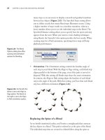
An Area Type object always displays two boxes on its path, one located at
the upper left of the object, called the in port, and one located at the lower
right, referred to as the out port (Figure 8.16). Text fl ows into an Area Type
object through the in port and exits the object via the out port. The ports
themselves are also used to control text threads.
Figure 8.16 Every Area
Type object in Illustrator has
an in port and an out port.
Out Port
In Port
CHAPTER 8: WORKING WITH TYPOGRAPHY
268
To create a new text thread, you must fi rst have an existing text object to
work with.
1. First, either use the Type tool to drag out an Area Type object or click
any closed vector path with the Type tool to convert the shape to an
Area Type object.
2. Switch to the Selection tool, and select the Area Type object.
With the object selected, you’ll see the in and out ports, which will both
be empty (colored white). An empty in port indicates the beginning of
the story, and an empty out port indicates the end of a story.
3. Using the Selection tool, click the Area Type object’s out port, and
you’ll notice your cursor changes to the place text icon.
4. At this point, you can either click an existing closed vector path or click
and drag an empty area on the artboard to create a second Area Type
object. The two objects are now linked together.
You can see that the objects are linked because the out port of the fi rst
object and the in port of the second object are fi lled with a blue arrow.
A line connects the two ports so that you can easily identify the direc-
tion of a thread when the Area Type objects are selected (Figure 8.17).
To turn this preview off, choose View > Hide Text Threads.
Figure 8.17 A blue arrow
and a connecting line help
identify the direction of a
text thread.