Adobe illustrator cs4- P19 ppsx
Bạn đang xem bản rút gọn của tài liệu. Xem và tải ngay bản đầy đủ của tài liệu tại đây (989.01 KB, 30 trang )
CHAPTER 15: PREPRESS AND PRINTING
514
In truth, transparency has always been around—in raster form—in Adobe
Photoshop. The only difference now is that you can apply these effects in
vector form and still edit them late in your workfl ow. At the end of the day,
these transparency effects will become rasterized, leaving you with the same
result as if you had done everything in Photoshop. In any case, let’s take a
closer look at what transparency is and how it works.
Understanding Transparency Flattening
Let’s start with a simple fact: PostScript doesn’t understand transparency. As
you probably know, PostScript is the language that printers and RIPs speak.
Native transparency is understood only by PDF language version 1.4 or
newer (fi rst present in Acrobat 5 and Illustrator 9).
To print objects with transparency, Illustrator must “translate” any transpar-
ent artwork into a language that PostScript understands. This translation
process is called transparency fl attening.
The process of fl attening is simple, and Illustrator follows two cardinal rules
when performing fl attening on a fi le:
1. All transparency in the fi le must be removed.
2. In the process of performing rule #1, the appearance of the fi le cannot
change.
Both of these rules are followed during the fl attening process, with no
exception. Obviously, all transparency has to be removed because PostScript
doesn’t know what transparency is. Additionally, if removing the transpar-
ency would result in your fi le changing in appearance, that would mean you
could design something in Illustrator that couldn’t be printed, which doesn’t
make sense either. If you think about it, if you’re removing transparency
from the fi le and you’re also keeping the visual appearance of the object,
something has to give, and that something is the editability of your fi le.
Let’s take a look at an example of this.
Flattening Artwork
Let’s try an example of fl attening:
1. Draw two different-colored circles, one overlapping the other.
2. Set the top circle to Multiply (Figure 15.10).
NOTE If you’ve used
Photoshop before,
you may be familiar with the
term attening, which com-
bines all layers in a document.
Although similar in concept,
transparency attening is
di erent.
LEARNING THE TRUTH ABOUT TRANSPARENCY
515
The nice feature of transparency is that you can move the top circle
around or change its color, and any overlapping areas will simply mul-
tiply. The problem is that PostScript doesn’t know what transparency
is and doesn’t know how to print that overlapping area, so transparency
fl attening is required.
3. Select both circles, choose Object > Flatten Transparency, and click OK
(don’t worry about the dialog box, which we’ll get to later).
The fi le is now fl attened. Does it look any different? It can’t, because of
rule #2, but the fi le now no longer contains any transparency and can
be printed on a PostScript device. The difference is that the fi le is no
longer editable as it was before it was fl attened. Upon selecting the cir-
cles, you’ll fi nd that the two transparent circles have now been broken
up into three individual opaque shapes (Figure 15.11).
This fl attening process happens every time you print something with trans-
parency. However, the fl attening happens in the print stream, not to your
actual Illustrator fi le. When you choose to print a fi le, Illustrator fl attens a
copy of your fi le and sends the fl attened fi le to the printer, while leaving
your document intact. It wouldn’t be good if simply printing a fi le rendered
it uneditable. In our example, we specifi cally fl attened the fi le using the
Figure 15.10 By setting the
top circle to the Multiply
blending mode, you can
see through it to the circle
below, even with Opacity
set to 100%.
Figure 15.11 Once the
objects are attened, the
artwork is split up into
individual opaque pieces,
called atomic regions.
CHAPTER 15: PREPRESS AND PRINTING
516
fl atten transparency function to see the results, but under normal circum-
stances, you would not fl atten the transparency manually—Illustrator would
do that for you automatically at print time.
So, when you print a fi le with transparency, this fl attening process occurs so
that a PostScript printer can print the fi le correctly, and this process happens
on the way to the printer, so your Illustrator fi le is not affected in any way.
This example of the two overlapping circles is a simple case of fl attening.
However, other examples can display certain side effects. Let’s explore such
a case.
Flattening with Rasterization
Let’s create another example:
1. As in the previous example, create two overlapping circles.
2. Set the top circle to Multiply.
3. Fill each circle with a linear gradient, but in one of the circles, apply the
gradient on a 45-degree angle.
The result is two circles with gradients, but the area in which these two
shapes overlap appears as two gradients traveling in different directions
(Figure 15.12).
When this fi le is fl attened, you know that the result will be three sepa-
rate shapes as in the previous example; however, this example is a bit
different. Although gradients can be preserved in vector form, there’s
no way to describe a crisscross gradient, like you see in the overlapping
area, as a vector. Because of rule #2, Illustrator is not allowed to change
NOTE Flattening also
happens whenever
you save or export your le
to a format that doesn’t
understand transparency.
For example, EPS (which is
PostScript) and PDF 1.3 do
not support transparency.
Figure 15.12 This gure
shows two overlapping
circles, each lled with
a gradient on a di erent
angle.
LEARNING THE TRUTH ABOUT TRANSPARENCY
517
the appearance of your fi le during fl attening, so the only course of action
Illustrator can take is to turn that overlapping area into a raster image.
4. Select both circles, choose Object > Flatten Transparency, and click OK.
You’ll fi nd that although the fi le looks the same, it now consists of two
vector shapes and a raster image in the middle. Illustrator creates a vec-
tor mask for the middle shape so that the fi le will print correctly (raster
images are always rectangular in shape). It’s important to point out that
Illustrator didn’t raster the entire fi le; it merely rasterized the portion of
the fi le that could not be preserved in vector form (Figure 15.13).
At this point, a question should be forming in your mind: If part of the fi le
is now a raster image, what is the resolution of that raster? Patience, young
Padawan; we’ll get to that soon. Here’s a review of what you’ve learned to
this point:
• Transparency fl attening is required to correctly print a fi le with trans-
parency to a PostScript device.
• Transparency fl attening happens automatically, in the print stream,
when you print a fi le with transparency from Illustrator, InDesign,
Acrobat, or Adobe Reader.
• Transparency fl attening may cause certain parts of a vector fi le to
become rasterized to prevent a fi le from changing in appearance.
Using the Two Levels of Rasterization
In the previous example, where two vector shapes resulted in a portion
of that fi le becoming rasterized, Illustrator had no choice but to rasterize
Figure 15.13 Where
appearance can’t be
preserved in vector form,
Illustrator converts parts
of a le into a raster.
CHAPTER 15: PREPRESS AND PRINTING
518
the middle region because there was simply no other way to preserve the
appearance in vector form. This is one level of rasterization.
However, in some cases a second level of rasterization may occur, even if
the appearance of a fi le could be preserved in vector form. Before printing
a fi le, Illustrator analyzes the entire document and looks for complex regions
containing many overlapping objects (which would result in a large number
of atomic regions). Illustrator may then choose to rasterize those complex
regions for performance reasons. Although we’ve been trained to think vec-
tor objects are simpler than their bitmapped counterparts, try to imagine an
Illustrator graphic fi lled with many overlapping objects with transparency
applied (Figure 15.14). Although it may seem like only several objects at
fi rst glance, once those objects are broken up into atomic regions, you may
be looking at thousands of vector shapes, which can take a long time to pro-
cess and print (Figure 15.15). In those cases, Illustrator can save precious
RIP and processing time by rasterizing these complex regions.
Figure 15.14 Using the
Symbol Sprayer tool, you
can easily create a le that
contains many overlapping
shapes. You can also make
some of these symbols
transparent with the
same tool.
LEARNING THE TRUTH ABOUT TRANSPARENCY
519
As far as the fi rst level of rasterization goes, you really have no choice but
to allow Illustrator to rasterize objects where it needs to do so. What you
can do, however, is learn how to build fi les that work around this issue (see
“Understanding Object Stacking Order and Transparency Flattening” later
in this chapter). With regard to the second level of rasterization, you can
control how liberal Illustrator is when looking for complex regions. In fact,
you can even disable this second level of rasterization altogether. Finally,
with either level of rasterization, Illustrator always gives you total control
over how these areas are rasterized.
Understanding the Transparency Flattener Settings
As mentioned earlier in this chapter, Illustrator has three transparency fl at-
tener presets that you can choose from in the Advanced panel of the Print
dialog box. These settings control how fi les with transparency are fl attened
at print time. To access these settings, choose Edit > Transparency Flattener
Presets, and click the New button to defi ne a new preset. Let’s explore
the settings in the Transparency Flattener Preset Options dialog box
(Figure 15.16).
Figure 15.15 Even though
you may have started with a
small number of objects, the
resulting number of atomic
regions can be extremely
large because of attening.
CHAPTER 15: PREPRESS AND PRINTING
520
• Raster/Vector Balance. This slider is what controls how liberal
Illustrator is when looking for complex regions to rasterize (what we
defi ned previously as the second level of rasterization). A number closer
to zero (0) gives Illustrator more freedom to rasterize at will, resulting
in faster print times. Moving the slider closer to 100 results in fewer ras-
terized areas but longer print times. At the 100 setting, Illustrator does
not rasterize any parts of the fi le for performance reasons, effectively
disabling the second level of rasterization. The High Resolution fl at-
tener preset uses this setting. In cases where fi les are taking extremely
long to print (or crashing the RIP altogether), adjusting this slider to a
slightly lower setting helps.
• Line Art and Text Resolution. In cases where Illustrator is going to
rasterize line art or text, you can specify a resolution that results in good-
looking, sharp output. You’ll notice that the High Resolution fl attener
setting specifi es a resolution of 1200 ppi, ensuring that text elements and
vector objects still have nice, clean, sharp edges in fi nal output.
• Gradient and Mesh Resolution. Because gradients and meshes are
continuous tones in nature, they don’t require a resolution as high as
line art or text. In fact, anything twice your line screen is probably
getting thrown out anyway. Therefore, Illustrator uses this setting to
rasterize elements that can afford to be set at a lower resolution. You’ll
notice that the High Resolution fl attener preset uses a value of 300 ppi.
• Convert All Text to Outlines. In cases where text is going to be raster-
ized, chances are that the rasterized text looks a bit chunkier than regular
vector text. To compensate for this, you can turn on this option to con-
vert all text to outlines, giving a consistent chunkier look to all of your
text. If you use the method described later in this chapter to move text
onto its own layer, you’ll rarely need to concern yourself with this setting.
Figure 15.16 You can
de ne your own custom
attener settings, or your
printer or service provider
can de ne them for you.
NOTE The two resolu-
tion settings in the
attener controls are used
whenever vector objects are
forced to become rasters
during the attening process.
However, live e ects, such as
Feather and Drop Shadow,
use the Document Raster
E ects Resolution setting to
determine their resolutions.
LEARNING THE TRUTH ABOUT TRANSPARENCY
521
• Convert All Strokes to Outlines. Similar to the previous setting, this
compensates for disparity between vector and rasterized strokes by con-
verting all strokes to outlines.
• Clip Complex Regions. We mentioned that Illustrator can look for
complex areas of a fi le and rasterize them for performance reasons.
However, we know that raster images are always rectangular in shape,
which means it’s possible for “innocent” parts of your fi le to become
rasterized simply because they fall into the rectangular bounding box
of the area that is complex. More often than not, this results in stitching,
or noticeable boxes and color shifts. The Clip Complex Regions option
avoids this issue by creating a clipping mask around any rasterized com-
plex region (so the rectangular-shaped raster is masked by the vector
outline of the object). As you can probably understand, this makes for
even more complex fi les and can result in longer print times as well.
This option is turned on by default but isn’t applicable in the High
Resolution preset because no complex regions are rasterized at all with
that setting (because it has a Raster/Vector Balance setting of 100).
Understanding Object Stacking Order and
Transparency Flattening
When rasterization occurs during transparency fl attening, the last thing you
want to see turning into a raster is text. That’s because you always want text
to be clean and sharp in your printouts. Even at the High Resolution setting,
where text is rasterized at 1200 ppi, that resolution is still less than half of
what most imagesetters set text with—usually upward of 2400 ppi.
Although it’s true that under certain circumstances rasterization must occur
in order to print a fi le and maintain its appearance, the way you build your
fi les can affect how often this happens. Let’s look at a simple example that
clarifi es this:
1. Draw a circle, and add a drop shadow to it by choosing Effect >
Stylize > Drop Shadow.
As you learned in Chapter 8, “Working with Typography,” the Drop
Shadow effect is a raster-based effect, and when transparency is fl at-
tened, the drop shadow becomes rasterized.
CHAPTER 15: PREPRESS AND PRINTING
522
2. Switch to the Type tool, create some text, and position the text near the
drop shadow (Figure 15.17).
3. With the text still selected, choose Object > Arrange > Send to Back.
4. Now select both the circle and the text, choose Object > Flatten
Transparency, and click OK.
Upon close inspection, you’ll see that a portion of the text was raster-
ized. This happened because the text was below the drop shadow in
the stacking order, and to maintain the fi le’s appearance when the drop
shadow was rasterized, Illustrator had to include part of the text in the
drop shadow’s bounding area (Figure 15.18).
Figure 15.17 Placing text
near an object is common,
especially when you’re add-
ing captions or credit text
near photographs.
Figure 15.18 To maintain
the appearance of the le,
Illustrator rasterized the text
that was behind the drop
shadow.
LEARNING THE TRUTH ABOUT TRANSPARENCY
523
5. Choose Edit > Undo to go back to the version before you applied the
Flatten Transparency function, and select the text object.
6. Choose Object > Arrange > Bring to Front.
7. Select the circle and the text, choose Object > Flatten Transparency,
and click OK.
In this case, the text, which was above the drop shadow in the stacking
order, was not affected at all and was not rasterized (Figure 15.19).
When using transparency features in Illustrator (or InDesign, for that mat-
ter), it’s important to make sure that text always appears above objects with
transparency to avoid unwanted rasterized text issues. Of course, some
designs call for text to appear beneath transparent objects, and in those
cases, you don’t have much of a choice.
Does My File Contain Transparency?
Not every document needs fl attening—only those with transparency
in them. The tricky part is that transparency can be introduced into an
Illustrator document in several ways:
• You apply a blending mode or an Opacity value other than 100% in
the Transparency panel.
• You apply the Effect > Stylize > Drop Shadow feature.
• You apply the Effect > Stylize > Feather feature.
Figure 15.19 If the text
appears above the shadow
in the stacking order, the
text is not rasterized
during attening.
CHAPTER 15: PREPRESS AND PRINTING
524
• You apply the Effect > Stylize > Outer Glow feature.
• You apply the Effect > Stylize > Inner Glow feature.
• You apply any “below-the-line” Photoshop effect from the Effect menu.
• You place a PDF fi le that contains transparency.
• You place a native Photoshop fi le or layered TIFF that contains
transparency.
It would be helpful to know whether the document you’re working on
uses transparency or is even going to require any of the two levels of ras-
terization we spoke of earlier. You can use the Flattener Preview panel
(Window > Flattener Preview) to tell whether a document has transparency
effects in it, as well as to preview areas that will become rasterized in the
fl attening process.
By clicking the Refresh button in the panel, Illustrator highlights specifi c
areas in your fi le in red, indicating where rasterization will occur. You can
enlarge the panel to see a larger image, and you can also click inside the
preview area of the panel to zoom in closer to see more detail. From the
Highlight pop-up menu, you can choose from a variety of items that
Illustrator will preview. If all the items listed in your Highlight pop-up
are dim, that indicates your fi le doesn’t have transparency present, and no
fl attening is necessary to print your fi le (Figure 15.20). For example, when
you choose Transparent Objects, Illustrator shows you where all objects that
use transparency are on your page—although those regions may not neces-
sarily become rasterized. We also mentioned earlier that Illustrator looks for
complex areas of a document; you can see where those areas are by choosing
Rasterized Complex Regions in the pop-up menu (Figure 15.21). Addition-
ally, the All Affected Objects option shows you all the objects that may not
be transparent themselves but that interact with transparency in some way.
(Like with the example we mentioned earlier with the drop shadow and
the text, the text itself doesn’t have transparency applied to it, but if the text
appears below the drop shadow, the text must become rasterized to preserve
the appearance.)
To take advantage of all that the Flattener Preview panel can offer, adjust
the different fl attener settings, and preview the results—making changes or
adjustments where necessary—all before you actually print the fi le. As an
aside, InDesign and Acrobat Pro also contain a similar Flattener Preview
panel and identical fl attener settings (in fact, it’s the same underlying code).
LEARNING THE TRUTH ABOUT TRANSPARENCY
525
Figure 15.20 If your le
contains no transparency,
you don’t have to worry
about the e ects of
attening.
Figure 15.21 You can
use the Flattener Preview
panel to identify areas that
Illustrator deems as complex
regions, giving you a heads
up for what areas will be
rasterized.
CHAPTER 15: PREPRESS AND PRINTING
526
What Kind of RIP Are You Using?
To throw yet another variable into the mix, the kind of printer or RIP you use can also render di erent results.
For the most part, any Adobe PostScript LanguageLevel 3 device should be able to handle transparency
without issue. Speci cally, PostScript version 3015 (which appears in the latest versions of RIPs) has enhanced
functionality to process les that have been attened. It’s important to remember that attening has to occur
for any RIP to understand how to print transparency. If your RIP can process PDF les, that doesn’t necessarily
mean it can process PDF les with transparency in them. If you’re in doubt, check with your RIP manufacturer
to nd out whether transparency attening can occur inside the RIP or whether you need to print les from an
Adobe application to atten them.
Some older print devices are confused by the e ects of attening. For example, a Scitex Brisque RIP (since
acquired by Creo and now Kodak) looks at jobs that are printing and splits up the vector and raster elements
onto two “layers.” The rasterized content prints on a continuous tone (CT) layer at a lower resolution (such as
300 dpi), and line art prints on a separate vector layer at a much higher resolution (such as 2400 dpi). Because
attening could cause a vector object to be rasterized, the RIP sees that raster only as a CT image and prints it
at the lower resolution. This might cause text that is rasterized to print with noticeably jagged edges. There’s
an update available for Brisque RIPs to address this issue, but that doesn’t automatically mean everyone who
owns a Brisque has installed the update (or knows it exists).
Rampage RIPs also experience similar issues, although turning o the dual-mode setting addresses the problem.
The best advice in any case is to talk with your printer. For any big job, most printers will be happy to run a test
le for you to make sure everything will print correctly. Taking advantage of these opportunities will surely
save you headaches when press deadlines loom. Adobe also has free specialized training materials for print
service providers if your printer needs more information (located online at />asn/psp/detail.html).
Printing with Confi dence
You can avoid accidents by learning to anticipate possible problems. Now
that you’re aware of how transparency works, here are a few ways to ensure
that you get the results you expect when you’re printing from Illustrator:
• Use the right fl attener presets—Low Resolution, Medium Resolution,
and High Resolution. For quick proofs to your laser printer, you can
use the Low Resolution or Medium Resolution setting, but when you’re
printing to a high-end proofer or imagesetter, use the High Resolution
setting. You’ll fi nd the Transparency Flattener settings in the Advanced
panel of the Print dialog box.
LEARNING THE TRUTH ABOUT TRANSPARENCY
527
• To avoid text becoming rasterized, create a new layer in your Illustrator
fi le, and place all your text on that layer. As long as you keep that text
layer as the top layer in your document, you won’t have to worry about
chunky or pixelated text because of rasterization.
• A potential problem is that even if you, as a designer, are aware of trans-
parency, plenty of printers aren’t. If you are sending a fi le and aren’t sure
who will be printing it or what they will be using to print it, you might
consider sending the fi le as a PDF/X-1a fi le. See Chapter 14, “Saving
and Exporting Files,” for more information about PDF/X.
If you’d like an easy way to remember the important steps to get great
results when printing, a small transparency checklist (Figure 15.22,
courtesy of Design Responsibly), is available when you register at
www.peachpit.com/rwillcs4.
Figure 15.22 The transpar-
ency checklist o ers a few
quick reminders to help
ensure your le prints
correctly.
Designing with transparency allows you to design creations that were pre-
viously prohibitive and diffi cult to implement, thus allowing you to save
valuable time while being even more creative. Now that you know how
transparency works and what’s necessary to use it in your workfl ow, give
it a test drive. You’ll be happy you did.
CHAPTER 15: PREPRESS AND PRINTING
528
UNDERSTANDING OVERPRINTS
Hang around a print shop long enough, and you’ll hear the term overprint. In
the world of prepress, overprinting is a way to control how color-separated
plates interact with each other. A printing press imprints each color on a
piece of paper, one after the other, as it runs through the press. Because
of this process, you need to consider certain issues when making color
separations.
For example, say you design some blue text over a yellow background.
When those colors are separated and printed on press, the blue and yel-
low mix, resulting in green text on a yellow background. Therefore, under
normal conditions, when pages are separated, color that appears underneath
other objects is removed so that the color on top is unaffected. In this exam-
ple, the blue text removes, or knocks out, the yellow background underneath
it, allowing the blue to appear correctly when printed.
Overprinting, on the other hand, is a method of overriding a knockout and
forcing overlapping colors to mix on press. In our example, setting the blue
text to overprint means that the yellow background still appears behind it,
and the result on press is green text on a yellow background (Figure 15.23).
Figure 15.23 The text on
the left, by default, knocks
out the background behind
it. The text on the right is
set to overprint, and the
background behind it is
una ected.
Knockout
Blue Plate Yellow Plate Blue Plate Yellow Plate
Overprint
UNDERSTANDING OVERPRINTS
529
Why Overprint?
You’d want to apply an overprint when you specifi cally want to mix colors
on press. Some designers who work with low-budget jobs that print in two
or three spot colors can simulate other colors by mixing those spot colors.
Before transparency rolled around, designers would also specify overprints
to simulate objects being transparent; you could also simulate shadows or
shading by overprinting with black over other elements.
Overprinting is also essential when you’re creating plates for custom dyes
and varnishes. For example, if you want to create a spot varnish for a par-
ticular photo, you need to create a spot color called Varnish and set it to
overprint, because this allows the photo that appears beneath it to print
(otherwise, the varnish knocks out the photo).
You can easily specify overprinting from the Attributes panel (Window >
Attributes). With an object selected, you can force the fi ll, the stroke, or both
to overprint. Remember that Illustrator also allows you to specify whether a
stroke is painted in the centerline, inside, or outside a path, and you should
be aware that if you overprint a stroke that’s on the inside or the centerline
of a path, the stroke also overprints the fi ll of that object.
Trapped in a Corner
Those who work in packaging rely on using overprints all the time for creating
traps—colors that share borders with other colors that overlap slightly. This is
because the materials that are used for many packages and the printing pro-
cesses used (called exographic printing, or exo for short) don’t always result
in perfect printing. Remember that the requirements for printing a couple
hundred brochures and printing several million containers of milk can be quite
di erent. The next time you see a bag of potato chips or a bottle of soda, take
a close look at the label; you’ll be able to see the overprint traps. These are
usually created in Illustrator by setting just the stroke to overprint.
CHAPTER 15: PREPRESS AND PRINTING
530
Handling the Limitations of Overprints
Let’s get technical for a moment. You’ll encounter some limitations when
it comes to using overprints. First, whereas one color plate can overprint
another, an overprint cannot overprint its own plate. For example, if you
have a color that contains cyan and you set it to overprint over a background
that contains cyan, you won’t get an overprint on the cyan plate.
Second, sometimes users specify overprinting for objects colored white.
Usually, white is always a knockout (because it lets the white paper show
through), and setting a white object to overprint would kind of defeat the
purpose. However, these things do happen accidentally. You might have a
logo that you created that’s colored black and that you’ve set to overprint.
Then you might come upon a situation where you need a reverse (white)
version of the logo, so you might just open the fi le, color it white, and save
it with a different name, forgetting that you set the fi ll to overprint. This
would most likely result in the fi le not printing properly, because either the
white overprints (making it entirely transparent) or the RIP doesn’t process
the fi le correctly.
Previewing Overprints
Because overprints are really PostScript commands that you use when
you’re printing color separations, you’ll always have a problem with display-
ing overprints onscreen or when you’re printing composite proofs to show
a client. In the past, the only real way to proof overprints was by printing
separations and creating a matchprint proof or by investing in expensive
prepress plug-ins. More often than not, a designer would show a proof to
a client and say, “It won’t look like this when it’s actually printed.” If only
there were a better way…
Illustrator offers that better way. By choosing View > Overprint Preview,
you can actually see on your monitor what the effects of overprint com-
mands are. Additionally, in the Output panel of the Print dialog box, the
Simulate Overprint option, when activated, prints composites as they will
look with overprints applied. This is perfect for showing clients exactly what
they are going to get. The Simulate Overprint option is also available in the
Advanced panel of the PDF dialog box, so you can even show your client an
accurate proof via PDF. You disable Simulate Overprint when you choose to
print separations—it’s available only when you’re printing composites.
UNDERSTANDING OVERPRINTS
531
Although overprints are useful (and essential in some workfl ows), our
advice is to talk to your printer before you use them, because some printers
prefer to specify overprints themselves.
Handling Transparency Effects That
Disappear or Print as White Boxes
Has the following scenario ever happened to you?
You create some artwork that contains two spot colors (let’s say Pantone
Blue 072 and Red 032). The logo has a drop shadow behind it, and you’ve
correctly set the Illustrator Drop Shadow effect to use the Blue 072 spot
color, not black. On the Illustrator artboard, the logo appears correctly
against the spot color background (Figure 15.24).
Figure 15.24 In Illustrator,
the Drop Shadow e ect
appears correctly against
the spot color background.
Then you save the art as a PDF/X-1a fi le because it will be used in an ad
and you want to make sure it will print correctly. Or you save your docu-
ment using Acrobat 4 (PDF 1.3) compatibility. Alternatively, you save your
fi le as an EPS fi le because maybe you’re required to place this logo into a
QuarkXPress document. The point here to focus on is that you’re saving
your fi le to a fl attened format.
CHAPTER 15: PREPRESS AND PRINTING
532
The “problem” is that when you open the PDF in Acrobat or Reader, or
when you place the fi le into QuarkXPress or InDesign and print the fi le to
your laser or ink-jet printer, it comes out looking incorrect—either the drop
shadow disappears completely (Figure 15.25) or a white box appears where
the transparent effect should blend into the background (Figure 15.26).
Figure 15.25 When saving
the le from Illustrator CS4
and viewing or printing the
art outside of Illustrator, the
transparency e ect seems
to disappear.
Figure 15.26 When saving
the le from Illustrator CS4
and viewing or printing the
art outside of Illustrator, a
white box appears around
the transparency e ect.
UNDERSTANDING OVERPRINTS
533
The key items to focus on here are that you have used a transparent effect
and you’ve used a spot color. Now, you’ll know what’s happening and what
the solution is.
When you have a transparent effect, the result is a mixture of the inks. In
this case, the shadow, which is Pantone Blue 072, blends right into the Red
032 background. By default, when one color sits on top of another color, a
knockout occurs, as we discussed earlier in this chapter. In other words, the
area beneath the top shape is removed from the lower object. Otherwise,
the top color will print on top of the bottom color when the paper is run
through the printing press, causing the two inks to mix. In the case of the
red and blue colors, the result would be purple in appearance. However, in
this case, where you want the drop shadow to blend into the background on
press, you have to override that knockout by specifying an overprint.
The thing is, Illustrator already knows this, so no action is required on
your part. When you print your fi le from Illustrator, all these settings are
done automatically, so your fi le looks great when you print it—either as a
composite or as separations. The same applies when you save your fi le from
Illustrator as a native Illustrator fi le and place it into InDesign or when you
create a PDF with Acrobat 5 compatibility (PDF 1.4) or newer.
But when you save your fi le to a format that doesn’t support transparency,
Illustrator has to fl atten the transparency. And in that process, Illustrator
realizes that in order to preserve the spot colors so that they print in separa-
tions correctly, the drop shadow must be set to overprint the background
color (in Illustrator CS4, the spot color is set to overprint instead).
The problem is that overprint commands are honored only when you print
your fi le as separations. When you are previewing your document onscreen
or when you are printing a composite proof of your fi le, the overprint com-
mands aren’t used, and either the result will be white where overprinting
should occur or the transparency effect will simply disappear. The fi le will
print correctly when you print as separations, because, at that time, the over-
prints are honored (as they should be).
NOTE Some RIPs have
built-in settings to
ignore overprints in les and
instead use their own settings
for overprints. This often
results in output that isn’t
desirable. You can easily x
these issues by instructing
the RIP to honor the over-
prints in your les. For exam-
ple, Rampage RIPs have a
setting called Preserve
Application Overprint that,
when activated, results in
perfect output.
CHAPTER 15: PREPRESS AND PRINTING
534
The good news is that this issue is easy to solve when using InDesign,
Acrobat, or Reader:
• In InDesign, choose View > Overprint Preview. This will allow you to
view overprints on your screen. When printing composite proofs, select
the Simulate Overprints box in the Output panel of the Print dialog box
to get the correct appearance in your printouts.
• In Acrobat or Reader, click the Overprint Preview button in the Page
Display panel in Preferences to view the fi le correctly on your screen.
When printing composite proofs, choose Print, and then click the
Advanced button. Then select the Simulate Overprinting box in the
Output section of the dialog box. The fi le will then print with the
correct appearance.
TIP If you’re using
QuarkXPress (at least
up through version 8.0),
though, you really don’t have
an option, because that pro-
gram doesn’t allow you to
simulate overprint commands
when printing composite
proofs. One workaround is to
create two versions of your
le: one that uses spot colors
that will separate correctly
when you print separations
and another version where
you’ve converted your spot
colors to process colors. When
you convert to process colors,
you don’t need the overprints,
and the le will print with the
correct appearance on a com-
posite proof.
Appendix
Application Preferences
Adobe Illustrator CS4 has many different settings, or preferences, that control
the program’s behavior. You can fi nd these settings on the 12 panels of the
Preferences dialog box. On Mac OS, you can open the Preferences dialog
box by choosing Application > Preferences or by pressing Command-K.
On Windows, you can open the Preferences dialog box by choosing Edit >
Preferences or by pressing Ctrl-K.
In general, the preferences in Illustrator are application-based, meaning they
aren’t saved in each Illustrator document but rather in Illustrator’s applica-
tion preferences fi le (see the sidebar “The Illustrator Preferences File”). This
means if you open an Illustrator fi le that was created on another computer
with different preferences, your own preferences don’t change.
535
APPENDIX: APPLICATION PREFERENCES
536
The Illustrator Preferences File
Each time you quit or close Illustrator, it writes the latest preferences you’ve speci ed along with information
about which panels are open and their locations on your screen.
When things go awry in Illustrator (frequent crashing, missing tools or panels, and so on), the culprit can often
be a corrupt preferences le. In such cases, the cure is to delete the preferences le (when no preferences le is
present at launch time, Illustrator generates a new one).
You can delete the preferences le automatically by pressing Command-Option-Shift (Ctrl-Alt-Shift) while
launching Illustrator. Keep the keys pressed until you see the splash screen appear. Alternatively, you can man-
ually delete the le, which you can nd in the following location:
Mac OS: Username/Library/Preferences/Adobe Illustrator CS4 Settings/en_US/Adobe Illustrator Prefs
Windows: Documents and Settings\Username\Application Data\Adobe\Adobe Illustrator CS4 Settings\
en_US\ AIPrefs
If you make many changes to your preferences le, you’ll lose the changes when you delete your preferences
le. For this reason, you might consider making a copy of your le for safekeeping. If you ever need to delete the
preferences le, simply use the copy you’ve created. Or if you’re really brave, you can manually edit the le in just
about any text editor.
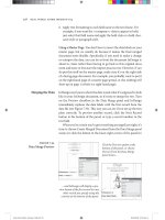
THE GENER AL PANEL
The General panel of Preferences is pretty much a melting pot of settings
(Figure A.1). These settings are also the ones that alter the behavior of
Illustrator the most.
Figure A.1 The General
panel in Preferences o ers
quick access to settings such
as Keyboard Increment.
THE GENERAL PANEL
537
Keyboard Increment. When moving artwork around on your screen,
using the mouse or even a pressure-sensitive pen doesn’t always give you the
control you need. The Keyboard Increment setting determines the distance
a selected object moves when you tap any of the four arrow keys on your
keyboard. Some call this the nudge amount. Don’t be fooled into thinking
that this setting should always be as small as possible. When you’re working
with a grid or in scale (designing fl oor plans, schematics, and so on), it can be
extremely helpful to set your keyboard increment to a specifi c value (such as
.25 inch). In this way, you can easily tap an arrow two times and know you’ve
moved the object exactly .5 inch. It’s no coincidence that when you open the
Preferences dialog box, the Keyboard Increment value is highlighted. Power
users know they can quickly press Command-K (Ctrl-K), enter a value, press
Enter, and then nudge their objects precisely.
Constrain Angle. When you draw objects in Illustrator, the objects are
aligned to the Constrain Angle setting, which is normally set to 0 degrees.
However, sometimes you’ll want to draw your document on a specifi c angle,
and changing the Constrain Angle preference affects all tools and modifi er
keys in Illustrator.
Corner Radius. When you’re creating a shape with the Rounded Rectangle
tool, this setting defi nes the default corner radius for the rounded corners.
This preference sets the default behavior, which you can easily override on
a per-object basis in the Rounded Rectangle tool dialog box.
Disable Auto Add/Delete. Illustrator tries its best to help you get your
work done, but sometimes its overzealousness gets in the way. By default,
when you move your pointer over an existing path with the Pen tool,
Illustrator thinks you want to add a point to the existing path and con-
veniently switches to the Add Anchor Point tool. This is great, unless, of
course, you wanted to start drawing a new path with the Pen tool. Turning
this preference on politely tells Illustrator, “Thanks but no thanks.”
Use Precise Cursors. Some tool icons in Illustrator are cute, such as the
Symbol Sprayer and Smudge tools, but they can be hard to position pre-
cisely. Even with the Pen tool, it can be hard to know exactly where the real
tip of the pointer is. When Use Precise Cursors is active, all pointers are
replaced by a simple X icon, which clearly defi nes the spot you’re clicking.
You can toggle this setting by pressing the Caps Lock key on your keyboard.
APPENDIX: APPLICATION PREFERENCES
538
Show Tool Tips. Illustrator has a lot of icons—tiny chicklet icons, as we
like to call them. Sometimes it’s hard to know what a tool or button is just
by looking at it, so if you hold your pointer over the icon for a second, a
little window pops up identifying the name of the feature. These are called
tool tips, and they are turned on by default. Although they are helpful, some
people think they get in the way, which is why this preference lets you dis-
able tool tips.
Anti-aliased Artwork. Computer screens are low-resolution devices
(generally between 72 and 130 ppi), so artwork may appear jagged onscreen.
This is especially true with the sharp vector shapes you create with Illustrator.
Although the fi les print fi ne, looking at jagged artwork all day may cause
eyestrain and doesn’t accurately display the way the graphics will eventually
print. This option (on by default) applies antialiasing to the Preview mode
so your art onscreen appears clean and smooth. Antialiasing is always turned
off in Outline view mode. Note that this setting affects how the art appears
onscreen only and does not in any way affect how the art prints.
Select Same Tint %. Illustrator has a feature that allows you to select all
objects that are fi lled or stroked with the same color. When you use this
feature, all objects fi lled with tint percentages of that same color are also
selected. This preference setting selects only those objects that are fi lled
with the same tint percentages of that color (resulting in fewer objects
being selected).
Append [Converted] Upon Opening Legacy Files. When you open fi les
that were created in previous versions of Illustrator (what Illustrator refers
to as legacy fi les), you may have to adjust text objects. To prevent you from
accidentally overwriting your original fi les, Illustrator tacks on the word
[converted] to your fi le name when it opens legacy fi les. For more informa-
tion about text and legacy fi les, see Chapter 8, “Working with Typography.”
Double Click To Isolate. On by default, this option makes it possible to
double-click an object to isolate it for editing. With this option turned off,
you can still isolate a selection, but you have to either select Enter Isolation
Mode from the panel menu in the Layers panel or click the Isolate Selected
Object icon on the Control panel.
Use Japanese Crop Marks. Illustrator allows you to create simple crop
marks automatically by choosing Effect > Crop Marks. If you want