The Adobe Illustrator CS Wow- P5 ppsx
Bạn đang xem bản rút gọn của tài liệu. Xem và tải ngay bản đầy đủ của tài liệu tại đây (3.66 MB, 30 trang )
Jared Schneidman
Jared Schneidman illustrated this building for
a capabilities brochure for Structure Tone, an
interior construction company. Schneidman
traced a scan of an architectural drawing of
the building, rendered originally in an isomet-
ric view. While drawing, Schneidman set the
Constrain Angle (Preferences >General) to 30°,
so he could edit objects by dragging selected
points or lines along the same angles as the
isometric view (he held down the Shift key
while dragging to constrain movement to the
set angles).
Chapter 3 Drawing & Coloring
95
Objective Colors
Custom Labels for Making Quick Changes
Overview: Define custom spot or
global colors, naming colors by the
type of object; repeat the procedure
for each type of object; use Select
commands to select types of objects
by spot or global color name to edit
colors or objects.
Option-clicking on the New Swatch icon to di-
rectly access Swatch Options; naming the color,
then setting the color to be a Spot Color or
choosing the Global option, which allows global
changes and tinting
A spot color swatch with its custom label
When you need to frequently adjust the colors of an
illustration, it's essential to find a way of organizing your
colors. This illustration by Rick Henkel demonstrates how
his firm, Agnew Moyer Smith (AMS), uses colors to label
different categories of objects, making it simple to isolate
and update colors. This method also makes it easy to find
all objects in a category in order to apply any other global
changes, such as changing the stroke weight or scaling, or
adding transparency or effects.
1 Creating custom spot or global colors. AMS uses spot
colors, even for process color jobs, to allow easy access
to tints. (You can also use Process colors by checking the
Global option in the Swatches palette.) In the Swatches
palette, Option-click/Alt-click on the New Swatch icon.
Chapter 3 Drawing & Coloring96
If you have premixed a color in the Color palette, this
color will be loaded in the color mixer. You can then edit
it using the color sliders. Now give your color a name that
conveys the kind of object you plan to fill with the color
and either choose Spot Color from the Color Type pop-
up, or choose Process, and enable the Global option. Rick
Henkel used labels such as "CamRight" and "DriveLeft"
to label the colors he would use in his illustration of the
Duquesne Incline. To help his selection of reliably repro-
ducible colors, Henkel used the Agfa PostScript Process
Color Guide to look up the color he actually wanted and
then entered the CMYK percentages.
2 Repeating the procedure for all colors and labels,
and changing color definitions as necessary. Create
colors for each type of object to be styled differently, nam-
ing each color for the objects it will fill (to speed creation
of swatches, see the Tip below right). Henkel created spot
colors, properly labeled, for each type of object included
in this incline railroad illustration.
The spot and global color systems makes it easy to
change definitions of colors. From the Swatches palette,
double-click on the color you want to change in order to
open Swatch Options, where you can change the color
recipe. Click OK to apply the changes to all objects con-
taining that color.
3 Using the labels to find all like objects. To select all
like objects—for example, those colored with "Cam-
Right"—click on that color name in your Swatches palette
list and choose Select > Same > Fill Color. Once selected,
you can edit other attributes besides color (like stroke
width, layer position and alignment).
Spot colors for four-color-process jobs
If you choose to define your swatches as spot colors,
and you intend to print four-color-process separa-
tions from the Print dialog box, be sure to enable the
"Convert All Spot Colors to Process" Output option.
Creating custom spot color swatches for each
category of object to be styled differently
With a color swatch label selected, choosing
Select>Same>Fill Color to find the objects filled
with that color
After selecting the next color swatch, using the
Select >Reselect command to select all objects
colored with that swatch
From one swatch to another
When defining swatches with
custom parameters in Swatch Op-
tions, such as Spot colors or Global
process colors, instead of having
to continually set similar parame-
ters, simply select a swatch that is
close to the color you want, then
Option-click/Alt-clickthe New
Swatch icon to redefine and name
the Swatch.
Chapter 3 Drawing & Coloring 97
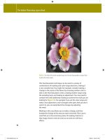
Jean Tuttle
As any colorist knows, an organized palette
helps facilitate the creative process. Artist Jean
Tuttle constructed a color chart file that made
it easy to create several illustrations using the
same palette and allowed her to work with col-
ors in an intuitive manner. In order to reliably
predict the colors she'd get in print, Tuttle used
tear-out swatches from a Pantone Color Speci-
fier to choose the beginning colors for her base
palette. In Illustrator, she then constructed a
palette of rectangles filled with the Pantone
colors she'd chosen (from the Libraries option
in the Swatches pop-up menu). Each time she
chose a Pantone color from the Pantone library
it was automatically added to her Swatches
palette. She renamed these swatches based on
their colors (a color containing yellow would
include "yel" in its new name). To rename a
color swatch in the Swatches palette, first dese-
lect all objects (Select >Deselect), then double-
click a swatch name in the Swatches palette
to display the Swatch Options dialog box. In
Options, you can rename your swatch in the
Swatch Name field and adjust the color recipe
if you wish.
Saturating and desaturating with sliders
With the Shift key held down, grab one color
slider to move all slid-
ers together. Grabbing
the right-most slider
gives the greatest con-
trol. Drag to the right
to 100% for full color
saturation. Drag left to
desaturate.
Chapter 3 Drawing & Coloring
98
Clarke Tate
Setting the familiar characters, Woodstock and
Snoopy, in famous locations, Clarke Tate illus-
trated this scene for a McDonald's Happy Meal
box designed for Asian markets. Tate produced
a palette of custom colors with descriptive
names. View color names by selecting Name
View from the Swatches palette pop-up menu.
Chapter 3 Drawing & Coloring 99
Christopher Burke
When printed in CMYK, Illustrator's smooth,
crisp edges can be a registration nightmare.
Even the slightest misregistration of inks can
create visually disturbing white gaps between
colors. So, although you shouldn't have to
worry about what happens to your illustration
once it's completed, the reality is that you still
have to help your printer along. "Trapping" is a
technique of printing one color over the edge
of another—usually achieved by creating over-
printing strokes that overlap adjacent objects.
Christopher Burke uses a work-around where
the colors in his images contain at least one
(preferably two) of the color plates in every
region of his image. As long as adjacent objects
share at least 5% of at least one color, no
white gaps can form, and trapping will natu-
rally occur. This technique ensures "continuous
coverage" of ink and maintains a full spectrum
palette while keeping just enough in common
between adjacent colors. (See Tip "Trapping
Issues" in the Basics chapter) The background
image is a rasterized Illustrator drawing with
an applied blur effect; raster images are free of
trapping problems (see the Illustrator & Other
Programs chapter for more on rasterizing).
Manual trapping of gradients and pattern fills
Since you can't style strokes with gradients or patterns, you can't trap using the Pathfinder Trap
filter either. To trap gradients and patterns manually, first duplicate your object and stroke it in
the weight you'd like fora trap. Then use Object > Path > Outline Stroke to convert the stroke to
a filled object and style this the same as the object you'd like to trap. Lastly, enable the Overprint
Fill box in the Attributes palette. If necessary, use the Gradient tool to unify gradients (see "Uni-
fied Gradients" in the Blends, Gradients & Mesh chapter), and replicate pattern transformations.
Chapter 3 Drawing & Coloring
100
Dorothy Remington /Remington Designs
Color printers are notoriously unpredict-
able in terms of color consistency, so Dorothy
Remington developed a method to increase
consistency from proof to final output. When
Remington constructs an image, she freely
chooses colors from any of the CMYK pro-
cess color models (such as Pantone Process,
TruMatch, Focoltone, Toyo, etc.) that come
with Illustrator, provided that she has the
matching color swatchbooks. Whenever she
sends the computer file to the service bureau
for proofing or final output, she also sends
along the matching color swatches representing
the colors she used in the image. Remington
then asks the service bureau to calibrate the
printer to match her swatches as closely as pos-
sible. Although requesting such special atten-
tion might result in a small surcharge, it can
save you an immense amount of time with the
service bureau, and can save you the expense
of reprinting the image because colors did not
turn out as expected.
Chapter 3 Drawing & Coloring
101
Karen Barranco/Evenson Design Group
Karen Barranco was hired to design a versatile,
stylized version of the original Warner Brothers
shield for a sports apparel line. It's important
to remember that often the simplest tech-
niques can be used to make the most sophisti-
cated logo. Here, Barranco used only the Pen
tool and Bezier editing tools to modify the
original version of the logo to create the cur-
rent one. Simple changes in fill color allow the
logo to be adapted for a wide variety of appli-
cations (T-shirt and sneaker shown below).
Chapter 3 Drawing & Coloring102
Karen Barranco/Special Modern Design
In order to create a logo, it is often important
to try out a wide range of designs in order to
capture the essential elements of the idea the
logo is to represent. To design this logo for the
Jennifer Diamond Foundation, Karen Barranco
created variations of the dragonfly by first
placing photo references of the dragonfly on
a locked layer of the artboard, which she used
as a template. She then traced the photos with
the Pen tool until she was satisfied with the
overall shape. Barranco continued to refine the
dragonfly image, experimenting with many
styles, as shown above. She used the most basic
of Illustrator tools, the Pen, to create each of
her trial designs. With the addition of color and
variations of opacity, a multitude of elegant
dragonflies were created, until the final design
was achieved.
Chapter 3 Drawing & Coloring
103
Filip Yip
The green perimeter in the background of
this Illustration consists of multiple copies of
a rough-edged oval (shown above) grouped
together, along with other artwork. First, Filip
Yip drew a rough-edged, oval-shaped line
with charcoal on rough watercolor paper. He
then scanned it into Adobe Photoshop, saved
the image as a TIFF, and autotraced it in Adobe
Streamline. The sketch was brought back into
Photoshop (where the edges were cleaned
up), saved as a path, and exported to Illustra-
tor (File >Export >Paths to Illustrator). In Illus-
trator, Yip drew a solid oval shape to fit the
rough textured path, selected both, and chose
Object >Compound Path >Make to preserve
the transparency around the edges of the tex-
tured path. Yip copied the compound path (a
green oval with a jagged edge) several times
and in various sizes, and grouped the result-
ing objects together to make up the jagged-
edged perimeter. Once he was satisfied with
the overall shape of the green background, he
chose Effect >Pathfinder > Merge to make the
background into one object. He created jagged
shapes manually instead of using brushes (see
the Brushes & Symbols chapter), because he
preferred the consistent, jagged edge he could
achieve by hand. The distortions that occur
when brushes "stretch" felt too unpredictable
to Yip.
Chapter 3 Drawing & Coloring
104
Gary Ferster
Using only simple filled and stroked objects,
Gary Ferster was able to create this series of
illustrations on Roman Life for a children's
educational CD-ROM titled "Ancient 2000".
For help making perspective guidelines, see
"Varied Perspective" in the Layers Chapter.
Chapter 3 Drawing & Coloring 105
Distort Dynamics
Adding Character Dynamics with Transform
Overview: Create characters and
group them; use the Free Trans-
form tool to drag one corner to
exaggerate the character; draw
a sun and use the Free Transform
tool to add dynamics to circles.
The original bug (top); then with the Free
Transform tool the jaw is enlarged, the back is
squashed and the entire character is skewed
forward
After John Kanzler creates the cast of characters in his
scenes, he often uses the Free Transform tool on each of
the characters one at a time in order to add energy, move-
ment, dynamics and action.
1 Creating and grouping a character, then apply-
ing the Free Transform tool. After building his bug
one object at a time, Kanzler thought it needed a more
menacing look, and wanted the bug to appear as if it
was charging forward. By grabbing and moving various
handles, he was able to enlarge the jaws while squash-
ing the body. Then he skewed the bug to the left to give a
sense of forward motion and more energy than the origi-
nal. Select your objects and choose the Free Transform
tool (E key). Now, this is essential throughout this lesson:
grab a handle and then hold down (Mac)/Ctrl (Win) to
pull only that selected handle to distort the image. Look
Chapter 3 Drawing & Coloring
106
carefully at what results from movement of each of the
Free Transform handles. For his hovering wasp, Kanzler
used the Free Transform tool to give the wasp a little
more "personality" by pulling a corner out to one side.
Notice that as you pull a corner sideways to expand in one
direction, the opposite side distorts and compresses—if
you pull a center handle, you will merely skew the objects,
elongating them toward the pulled side.
2 Applying the Free Transform tool to regularly
shaped objects to add perspective and dynamics. In
creating an "action line" for his illustration, Kanzler used
the Free Transform tool to make an arc of dots skew out
of uniformity, while constraining the arc of the skewed
path to that of the original, unskewed path. First, he
applied a custom dotted Pattern Brush to a curved path
(see the Brushes & Symbols chapter for help). Then he
chose Object >Expand Appearance to turn the brushed
path into a group of oval objects. By carefully tucking and
pulling with the Free Transform tool, Kanzler was able to
add flair to the arc while keeping the same general size.
3 Making a sun, then creating extreme perspective
using the Free Transform tool. To make the sun object,
draw a circle (hold Shift as you draw with the Ellipse
tool). In Outline mode (View menu), place your cursor
over the circle centerpoint, hold Option/Alt and the Shift
key while drawing a second, larger concentric circle and
make it into a Guide (View > Guides >Make Guides).
With the Pen tool, draw a wedge-shaped "ray" that
touches the outer-circle guide. Select the wedge, and with
the Rotate tool, Option/Alt-click on the circle's center
point. Decide how many rays you want, divide 360 (the
degrees in a circle) by the number of rays to find the angle
to enter in the dialog box and click Copy. To create the
remaining rays, keep repeating Transform Again, -D
(Mac)/Ctrl-D (Win). Select all sun objects and choose
Object >Group. Then, with the Free Transform tool, grab
one single corner handle to skew the sun's perspective.
The effect of Free Transform on the hovering
wasp
Using the Free Transform tool, pull different
handles to create action and perspective effects
The sun object shown in Outline mode, before
the process of Transform Again; and while pull-
ing a Free Transform handle
Chapter 3 Drawing & Coloring 107
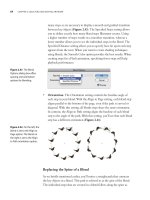
Distort Filter Flora
Applying Distort Filters to Create Flowers
Overview: Create rough circles;
resize and rotate copies of the circles
to construct a rose; fill with a radial
gradient; apply the Roughen filter;
apply other Distort filters to copies.
Setting the Pencil Tool Preferences; drawing two
rough circular paths
Using the Scale tool dialog window to create a
reduced-size pair of circles nested within the
first pair of circles
(Left) Using the Rotate tool to rotate the last-
created pair of circles; (right) the complete
construction of the flower before coloring—the
flower center consists of a few small circles
Artist Laurie Grace used two roughly drawn circu-
lar paths and a series of Distort niters to construct the
delicate flowers in her illustration, which she colored with
various radial gradients. (See the Live Effects & Graphic
Styles chapter for examples of artwork created using
"live" versions of filters, called "effects.")
1 Drawing circular paths; resizing and rotating path
copies. Grace drew two rough circular paths, then
resized and duplicated the two paths as the first steps in
creating each rose. In a new Illustrator document, double-
click on the Pencil tool to bring up the Pencil Tool Prefer-
ences window. In the Tolerances section, set Fidelity to
0.5 pixels and Smoothness to 0. In the Options section,
disable "Keep selected" and "Edit selected paths." Using
the Color palette, set a Fill of None and a Stroke of Black.
Draw a roughly circular path, holding the Option (Mac)/
Alt (Win) key as you near the end of the circle to auto-
matically close the path. Then draw another rough circle
just within the first circle. Overlapping is okay.
Use the Selection tool or Lasso tool to select the two
paths. To create a duplicate pair of circles that is smaller
108
Chapter 3 Drawing & Coloring
than and nested within the first pair, double-click on the
Scale tool again (you should note that the previously used
reduction setting is saved) and click the Copy button.
With the last pair still selected, choose the Rotate tool and
click-drag on the image in the direction of the rotation
you want. Continue to resize/copy and rotate selected
pairs of circles until the flower form you are building is
almost filled with circles.
To vary the petal placement in the final rose, you can
continue to rotate some of the pairs after you've created
them. Then, for the center of the rose, click on the Pencil
tool and draw a few small, nested circles. Use the Lasso
tool or the Selection tool to select all the paths that make
up the rose construction, and choose Object > Group,
then deselect all paths by choosing Select > Deselect.
2 Coloring the flower using a radial gradient. To give
the final rose illustration a color effect that mimicked
the petals of real flowers, Grace created a radial gradi-
ent color swatch and applied it to her rose construction.
Open the Swatches palette (Window >Swatches), and
click on the "Show Gradient Swatches" button. Next, click
on the "Black, White Radial" swatch. To change the col-
ors of the gradient, open the Color and Gradient palettes
(Window > Color and Window > Gradient), click once on
the leftmost gradient slider (the beginning point of the
gradient) in the Gradient palette, and adjust the color
sliders in the Color palette. Grace chose 100% M for the
beginning slider. Next, click on the rightmost gradient
slider (the ending point of the gradient) and adjust the
color sliders; Grace chose 34% M and moved the К slider
to 0%. To increase the amount of 100% magenta in your
filled objects, drag the left slider to the right and release it
where you like (Grace used a Location setting of 45.51%).
Finally, create your new Gradient swatch by Option-
clicking (Mac)/Alt-clicking (Win) on the "New Swatch"
button in the Swatches palette. Name your swatch (Grace
chose "Pink Flower Gradient") and click OK. Select the
rose illustration and then set the Fill to "Pink Flower
Choosing a radial gradient swatch to adjust
Adjusting the color settings of the beginning
point gradient slider
Adjusting the color settings of the ending point
gradient slider
Repositioning the beginning gradient slider
(Top) Creating a new Gradient swatch; (bottom,
left and right) setting Fill to the "Pink Flower
Gradient" swatch and Stroke to None
Chapter 3 Drawing & Coloring
109
Settings for the Roughen filter; the final rose
Applying additional distortion filters to copies of
the final rose illustration.
Gradient" and the Stroke to None. For more on Gradi-
ents, see the Blends, Gradients & Mesh chapter.
3 Applying the Roughen filter. To give her rose a realistic
rough-edged petal effect, Grace applied the Roughen filter
to the illustration. Use the Selection tool to select the rose,
then choose Filter > Distort > Roughen. In the Roughen
dialog box, enable the Preview checkbox to see the effect
of the filter before you apply it. In the Roughen Options,
set Size to 3%, Detail to 5/in, and Points to Smooth. Click
OK to apply your chosen settings.
Grace used her final rose to create some of the other
flowers in her illustration by applying more Distort fil-
ters to copies of the rose (be sure to enable the Preview
checkbox for each as you work). Select the entire rose
and duplicate it by holding down the Option (Mac)/Alt
(Win) key as you drag the rose to a new location. With
the duplicate still selected, choose Filter > Distort > Pucker
& Bloat, enable Preview, and set the Bloat to 33%. Click
OK to apply. On another copy of the rose, apply a Pucker
& Bloat setting of-40 Pucker. With a third copy of the
rose selected, choose Filter > Distort >Zig Zag and set Size
to .25 in, choose Absolute, set Ridges to 5 and choose
Corner in the Points section. With a fourth copy of the
rose, apply an additional roughening by choosing Filter >
Distort > Roughen. Set Size to .21 in, choose Absolute, set
Detail to 23/ in, and select Smooth in the Points section.
You can easily change the colors of the radial gradient
for each of your flowers using the three-palette combina-
tion of Color, Swatches, and Gradient. Select the flower
you want to change and modify the color and positioning
of the sliders in the Gradient palette. When you change
any attributes of your flower's Fill, it will disassociate
from your "Pink Flower Gradient" swatch in the Swatches
palette. In order to save any new gradient you create (that
you may want to apply later to other flowers), Option-
click (Mac) or Alt-click (Win) on the New Swatch button
in the Swatches palette while you have your new gradient-
filled object selected, name the swatch, and click OK.
Chapter 3 Drawing & Coloring
110
Laurie Grace
Continuing with the flower theme she created in the previ
ous lesson, Laurie Grace made some adjustments to color
and size used for some of the flowers. She created
variations on the other flowers by using Filter >
Distort >Roughen. She created more flowers
using the pen tool to draw individual pedals
and then adding color using gradient mesh. She
option clicked on the rotate tool to bring
up a dialog box, typed in 30°
and chose Copy. She then
used -D/Alt-D to con-
tinue the rotation around
360°. To add to the deco-
rative design for the
greenery, she used
the Pen and
Pencil tools
to draw
the stems
and leaves.
She then used
Filter > Distort >
Zig Zag or Twist
on some of the
pen lines and
leaves. (See the
Blends, Gradi-
ents & Mesh
chapter for
help with
blends.)
Chapter 3 Drawing & Coloring
111
Vector Photos
Pen and Eyedropper Technique
Overview: Trace object outline using
template; create contour paths then
divide using Pathfinder; select and fill
each object with Eyedropper tool.
The original photographic composite image
placed as a template
The Place dialog box with the Link and Template
checkboxes enabled
Brashear's building outline (a closed object) on
the left; two open paths drawn on the right
(Brashear used the open paths to divide the
building outline)
Reproducing a pixel image as a vector composition is
usually done by auto-tracing the image in a program
like Adobe Streamline. Tracing it manually in Illustra-
tor, however, allows greater control in organizing layers
and eliminating unwanted detail. For this scene from
Gothenburg, Sweden, artist Bruce Brashear traced shapes
from an imported image, used the Pathfinder filters to
create the detailed elements of buildings and figures, and
sampled image colors with the Eyedropper tool to apply
to vector objects he had created.
1 Starting a new document, placing an image, and
modifying image visibility. Start your reproduction by
creating a new document (File >New). Import the image
you'll trace by choosing File > Place. In the Place dialog
box, select the image and enable the Template checkbox
to automatically create a template layer for the image. If
you want to change the opacity of the layer, so the image
doesn't obscure the vector objects you will create, double-
click the template layer's name in the Layers palette and
key in a percentage in the Dim Images field. (See the Lay-
ers chapter for more information on creating and working
with the Layers palette and with template layers.)
2 Drawing shapes of buildings and creating compound
shapes with the Pathfinder palette. To reproduce the
buildings in his image, Brashear drew overlapping paths
Chapter 3 Drawing & Coloring
112
and relied on the Divide Pathfinder to create adjoining
objects (like the sunlit and shadowed parts of a wall)
whose edges aligned perfectly (thus alleviating the need
to meticulously draw adjoining edges so that there were
no gaps between them). To divide a closed path (like the
roof of a building) with open paths, first draw a closed
path and give it a stroke but no fill. Then draw a line that
divides the closed path into light and shadow, extending
your path beyond the closed object. Select both the closed
object and the open path and click on the Divide icon in
the Pathfinder palette. As a result, Illustrator divides the
roof object into two closed objects (one representing the
sunlit part of the roof and the other the shadowed part).
You may need to divide one closed path with another
closed path. To create the building's window balconies,
Brashear drew overlapping rectangles, one for the win-
dow and one for the balcony. After selecting both objects,
he applied the Divide Pathfinder, which created three
objects. To remove the object created where the window
and balcony overlap, select both objects and Option-click/
Alt-click the Add to Shape Area icon in the Shape Modes
from the Pathfinder palette. Both objects are then com-
bined into one object. (If you don't remember to Option-
click/Alt-click, simply click the palette's Expand button
after using the Shape Mode.)
Instead of using the Pathfinders to divide an object,
consider using the Knife tool. To access the Knife tool,
click and hold the mouse button down on the Scissors
tool icon. Select an object and then draw a freehand line
with the Knife (press the Option/Alt key before you drag
it across an object to constrain the direction that the
Knife moves). When you release the mouse button, Illus-
trator will automatically divide the selected object into
two separate objects.
Your goal is to make as many closed objects as nec-
essary to reproduce the different shapes you see in the
placed image. The more objects you make, the more
closely your vector reproduction will match the detail and
realism of the image.
Left, result of using the Divide Pathfinder; right,
the three objects (colored for demonstration)
Top left, portion of template image; top right,
two rectangles drawn over the template image;
bottom, Pathfinder palette with Divide icon
being selected
Top left, the result of using the Divide Path-
finder, the two rectangles that need to be
merged; top right, the two remaining rectangles
after using the Add to Shape Area Pathfinder;
bottom, the Pathfinder palette with the Add to
Shape Area icon selected
The Knife tool accessed by holding the cursor
down on the Scissors icon in the toolbox
Chapter 3 Drawing & Coloring
113
Left, the placed image that Brashear sampled
with the Eyedropper tool; Right, objects filled
with sampled colors (including a radial gradient
created from sampled colors)
Default Eyedropper tool's options dialog box;
these settings require a Shift-click to sample an
image
By disabling the Appearance checkbox, the
Eyedropper tool can be clicked instead of Shift-
clicked to sample an image
Changing the shape of a cut
Whether you cut an object with
the Divide Pathfinder or with
the Knife tool, the result will be
two objects that share adjoining
edges. While these two edges
look like one line, they are two
coinciding paths. To change the
shape of two unfilled edges at the
same time, so that they remain
coincidental, be sure to select
points using the Direct Selection
tool before moving the points.
That way you'll move points on
both of the paths simultaneously.
3 Using the Eyedropper tool to fill objects with colors
selected from the image. After creating his objects,
Brashear filled them with colors he sampled from the
placed image. First, select an object you want to fill (make
sure the Fill icon in the toolbox is active so you color the
fill, not the stroke). Next, find a representative color in the
placed image and Shift-click on it with the Eyedropper
tool to fill the object with the sampled color.
You can create a color gradient with colors that are
sampled from the image. To learn about producing a
gradient fill, see the Blends, Gradients & Mesh chapter.
Because a gradient will obscure the image underneath it
as you create and edit it, see the Layers chapter to learn
how to toggle a layer or object from Preview to Outline
view before you begin sampling image colors.
From Shift-click to click
Can't remember to Shift-click with the Eyedropper tool
when sampling a color from an image? Just change the
t6ol options. Double-click the Eyedropper icon in the
toolbox. Then, uncheck the Appearance checkbox in
the Eyedropper Picks Up portion of the Eyedropper's
options dialog box. Now just click to sample a color
from an image.
Two tools at once
You can toggle between a selection tool and the
Eyedropper tool using the /Ctrl key. First, click on the
selection tool you'll use to select objects (the Selection,
Direct Selection, or Group Selection tool). Then click
on the Eyedropper tool. Now, when you're using the
Eyedropper and want to select an object, the /Ctrl
key will toggle to the selection tool you clicked on pre-
viously. See The Zen of Illustrator chapter for additional
keyboard shortcuts ("Finger dances") that can save you
time as you work.
Chapter 3 Drawing & Coloring114
Brad Hamann
Brad Hamann created this travel sticker for a
Honda Corporation ad campaign for one of its
cars (the Passport). He placed a photo of Niag-
ara Falls into his document as a template and
then traced over it using the Pencil tool. Using
the Eyedropper tool, he held the Shift key to
sample color from the photo to fill his pencil-
drawn shapes. To finalize his image he created
a clipping mask in the shape of a circle and
added type (see the Advanced Techniques and
Type chapters for help with masks and type).
Chapter 3 Drawing & Coloring
115
Intricate Patterns
Designing Complex Repeating Patterns
Advanced Technique
Overview: Design a rough com-
position; define a confining pattern
boundary and place behind all layers;
use the box to generate crop marks;
copy and position elements using crop
marks for alignment; define and use
the pattern.
Left, arranging pattern elements into a basic
design; right, adding the pattern tile rectangle
behind the pattern elements
Creating crop marks based on selection of the
pattern tile rectangle
Included with Illustrator are many wonderful patterns
for you to use and customize, and the User Guide does a
good job of explaining pattern-making basics. But what if
' you want to create a more complex pattern?
A simple trick with crop marks can help to simplify
a tedious process of trial and error. With some help
from author and consultant Sandee Cohen, Alan James
Weimer used the following technique to design an intri-
cate tile that prints seamlessly as a repeating pattern.
1 Designing your basic pattern, drawing a confining
rectangle, then creating crop marks for registration.
Create a design that will allow for some rearrangement of
artwork elements. Hint: You can't make a pattern tile that
contains rasterized or placed images, or unexpanded and
unmasked patterns, gradients, blends, or brushes.
Use the Rectangle tool to draw a box around the part
of the image you would like to repeat. This rectangle
defines the boundary of the pattern tile. Send the rect-
angle to the bottom of the Layers palette or to the bottom
of your drawing layer (Object > Arrange > Send to Back).
This boundary rectangle, which controls how your pat-
tern repeats, must be an unstroked, unfilled, nonrotated,
nonskewed object. Make certain this rectangle is selected,
Chapter 3 Drawing & Coloring
116
and select Filter > Create > Crop Marks. Last, Ungroup
these marks (in the next step, you'll use the crop marks to
align elements that extend past the pattern tile).
2 Developing the repeating elements. If your pat-
tern has an element that extends beyond the edge of the
pattern tile, you must copy that element and place it on
the opposite side of the tile. For example, if a flower blos-
som extends below the tile, you must place a copy of the
remainder of the blossom at the top of the tile, ensuring
that the whole flower is visible when the pattern repeats.
To do this, select an element that overlaps above or below
the tile and then Shift-select the nearest horizontal crop
mark (position the cursor on an endpoint of the crop
mark). While pressing the Shift-Option or Shift-Alt keys
(the Option key copies the selections and the Shift key
constrains dragging to vertical and horizontal direc-
tions), drag the element and crop mark upward until the
cursor snaps to the endpoint of the upper horizontal crop
mark. (For any element that overlaps the left or right side
of the tile, select the element and the vertical crop mark
and hold down Shift-Option/Shift-Alt as you drag them
into position.)
Left, selecting the flower blossom and horizon-
tal crop mark; right, after dragging a copy of the
flower blossom and crop mark into position at
the top of the pattern tile artwork
Finished artwork for the pattern tile, before
turning into a pattern swatch in the Swatches
palette
3 Testing and optimizing your pattern. To test your
pattern, select your pattern elements (including the
bounding rectangle), and either choose Edit > Define
Pattern to name your pattern, or drag your selection to
the Swatches palette (then double-click the swatch to
customize its name). Create a new rectangle and select
the pattern as your fill from the Swatches palette. Illustra-
tor will fill the rectangle with your repeating pattern. If
you redesign the pattern tile and then wish to update the
pattern swatch, select your pattern elements again, but
this time Option-drag/Alt-drag the elements onto the
pattern swatch you made before.
Optimize your pattern for printing by deleting
excess anchor points. Select pattern elements and use the
Simplify command (Object >Path >Simplify).
Making a new swatch using Edit >Define Pattern
Speeding redraw with patterns
After filling an object with a pat-
tern, speed up screen redraw by
setting View to Outline mode, or
by rasterizing a copy of the object
(keep the original object unfilled
in case you need to use it later).
Chapter 3 Drawing & Coloring 117
Tiffany Larsen
Tiffany Larsen used custom patterns to dress
the Big Bad Wolf in realistic fabric textures.
The gingham dress pattern was created by
drawing a checkerboard of squares with the
Rectangle tool. Within the checkerboard,
Larsen drew smaller squares of various sizes
to simulate a mottled appearance. She then
masked the grouped checkerboard into the
size she wanted and dragged it to the Swatches
palette to create a pattern. To make the lace
(shown above on a black background), Larsen
drew several circles (white Fill, no Stroke)
within a square (white Fill, no Stroke). With the
Direct Selection tool, she selected the square
and circles and made the selection into a com-
pound path (Object>Compound Path>Make)
to create transparent holes (see the Advanced
Techniques chapter for more on masks). Larsen
made the selection into a pattern by choosing
Edit >Define Pattern. Using the Stroke palette,
Larsen made the stitching a 1 pt dashed line
with a 2 pt gap.
Chapter 3 Drawing & Coloring
118
Brushes & Symbols
120 Introduction
120 Brushes
123 Symbols
124 Symbols vs. Scatter Brushes
125 Gallery: Chris Bucheit
126 Ink Brush Strokes: Making Naturalistic Pen and Ink Drawings
128-131 Galleries: Sharon Steuer, Lisa Jackmore, Jen Alspach,
Ellen Papciak-Rose
132 Preparing Art: Adding Brushes to Existing Artwork
134 Pattern Brushes: Creating Details with the Pattern Brush
136-139 Galleries: Bert Monroy, Shayne Davidson,Steve Spindler,
Jacqueline Mahannah
140 Building Brushes: Building Brushes for Lettering
142 Advanced Technique: Map Techniques:
Simplifying Complex Image Creation
145 Gallery: Joe Lertola
146 Symbol Basics: Creating and Working with Symbols
149 Gallery: Sandee Cohen & Sharon Steuer
150 Advanced Technique: Organic Creation:
Painting with Brushes, Symbols, and Mesh
152 SPECIAL BRUSHES SUPPLEMENT by Sandee Cohen