Hướng dẫn sử dụng Coreldraw x5 - part 42 potx
Bạn đang xem bản rút gọn của tài liệu. Xem và tải ngay bản đầy đủ của tài liệu tại đây (735.92 KB, 10 trang )
and for accessing an instance (a duplicate that takes up less saved file space in a document)
of it tomorrow:
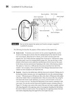
1. With an object selected, choose Edit | Symbol | New Symbol.
2. In the Create New Symbol box, type a name you’ll remember later in the Name field
and then click OK. As you create more and more new files using CorelDRAW,
you’ll definitely want to stay tidy in your cataloguing work. Cross-referencing is a
good practice; in Figure 13-7, the Name of the symbol refers to the typeface it was
copied from. Later, it’s easy to look up the name of the symbol and use it in a
program outside of CorelDRAW.
394 CorelDRAW X5 The Official Guide
FIGURE 13-7 Define a symbol and then save it to a Symbol Library.
Export Library
Symbol only in
current document
Symbol available
all the time
Drag into the document
3. Open the Symbol Manager and then click on the Symbol1 title. A thumbnail of the
symbol you just saved appears.
4. A tiny Export icon becomes active; click it, it’s the Export Library command. This is
not much of a library, but you need to start somewhere!
5. In the Export Library box, it’s best to save the new library to where CorelDRAW
recommends (to better allow the program to locate it in the future; Symbols is a
good location). Name the library and then click Save. You’re done.
6. In any new document, open the Symbol Manager, click the User Symbols + icon to
open the collection, and then click the name of the library you saved in step 5. Now
all you need to do is drag the thumbnail into a document, and you have an instance
of the symbol you saved.
In Windows 7, if you install CorelDRAW X5 Graphics Suite to the default hard disk
location, your saved Symbol Library should be in your boot drive directory (usually
C:\)AppData\Roaming\Corel\CorelDRAW Graphics Suite X5\Symbols. This is good to
know when you want to load your collection by clicking Add Library on the Symbol
Manager docker, to add symbols to a Local document.
With the Pick tool, right-click over any object you create, and you can then choose
Symbol | New Symbol and Symbol | Symbol Manager from the context menu.
Symbols saved to a library are always instances and as such, duplicates you add to a
document cannot be edited using the Shape tool or other shape-editing features. You can
apply transformations such as scaling and rotating, but you cannot edit the nodes of a shape
instance. However, you can edit the original shape as saved in the Library, and all future
instances you use reflect your edits. To edit a symbol in your library, right-click the shape
thumbnail in the Symbol Manager and then choose Edit. After you’ve edited the shape,
right-click the shape in the document window, and then click the Finish Editing Object
button to the left of the document horizontal scroll bar. Every instance in every document is
updated to reflect your edits.
It’s easy to tell the difference between an instanced symbol and one that can be
edited in any document. Choose the shape using the Pick tool. If the bounding box
dots are blue, it’s a shape instance. If the bounding box handles are black, it’s a
regular shape and you can perform any CorelDRAW operation on the shape.
Font Etiquette: Using Fonts with Style and Appropriateness
It’s easy for anyone to mistype a word or use fractured grammar in an email message.
However, an ad posted on the Web and a sign hanging in a store window for thousands to
see is not a use of “relaxed” typography between friends—and it’s hard to retract. A badly
CHAPTER 13: Typography Rules and Conventions 395
13
designed sign from a typographic point of view hurts the product, the company, and your
reputation as a professional. The following sections discuss common mistakes we try to
avoid from the planning stage of a printed message; you’ll work with CorelDRAW’s type
features in future chapters, but now it’s time to learn to walk before you learn to fly with
new talents and skills.
Font Appropriateness and Very Basic Layout Rules
When an audience looks at a printed message, they don’t simply absorb what the message
says, but they additionally look at the presentation: the choice of capitalization, emphasis
through bold and italic family members, how lines of text are stacked (justification), point
size, font color, and how well the printed message harmonizes with any accompanying
graphic. With most digital typefaces, the artist casts a tone on the typed message. Headline,
sans serif Gothic fonts, for example, are rather hard-edged and cold yet impactful, while
Roman serif fonts tend to lull the audience with rounded strokes, swooping serifs, and
swashes. Roman typefaces generally send a warm but clean and professional signal to the
viewer, while Gothic fonts wake up the reader, perhaps even warning them—hence their
appropriateness as a headline typeface.
Figure 13-8 has two obvious sight gags demonstrating inappropriate uses of specific
fonts. At left, the use of all uppercase, Gothic stencil contrasts extremely distastefully with
both the message and the graphic behind it. At right, the choice of fonts on the page the
officer is showing to someone about to be detained clashes with the message to the extent
that the officer will probably have a hard time getting the cuffs on the person rolling on the
pavement laughing.
A quick fix to these two bad examples would be to swap the fonts around, so the stencil
font is used in the Miranda rights, and the slightly silly typeface is used for “I Love You.” But
better still, a quick trip to Font Navigator and the CorelDRAW Fonts CD will show you that
Staccato 222BT (its industry name is Mistral) is warm, loose, and splendid for a valentine, and
the font that commonly goes by the name Machine (distributed by ITC among other vendors)
is serious, functional, and perfect for the arresting officer. You have the choices of fonts at
hand; all you need to do is apply your artistic sensibilities to the selection.
When you have more than one line of text in a headline, legibility is a concern, and this,
too, is accomplished by an appropriate choice of fonts. You want a “quick read” from the
audience, especially on billboards and vehicle signage that appears and disappears as the
sign or the reader moves.
Let’s take a simple example headline, pull it apart, examine it, and make it work hard for
your money. “The best deals in town” is a common slogan. In Figure 13-9 you can see this
headline cast in text three different ways, with icons beneath them to indicate their merit as a
sales message.
396 CorelDRAW X5 The Official Guide
CHAPTER 13: Typography Rules and Conventions 397
13
FIGURE 13-8 Don’t undercut your message with the wrong font.
FIGURE 13-9 From clownish to professional, your message stands or falls based on fonts
and layout.
First, the sign above the clown suffers from the following abuses of typographic
conventions and rules:
●
The use of Times New Roman, a Roman serif font, is stale (it’s a Windows default
typeface used since 1991 on the PC) and artistically defeats the message. It’s large
yet the characters aren’t bold enough to present an impactful message.
●
The use of all capital characters looks particularly inappropriate; Roman typefaces
have upper- and lowercase characters, and the message looks like the designer had
the
CAPS LOCK key enabled. Also, it’s plain bad form to “shout” a message unless a
typeface has no lowercase letters and the designer is firm about the choice of fonts.
●
The use of several exclamation marks suggests that if the business owner shouts
loudly enough, someone will buy the product. One exclamation mark is sufficient
for stressing a message; often a headline is adequately emphasized with no exclamation
at all. It is redundant to cast a headline in all caps followed by several exclamation
marks.
●
The use of quotes is for quotations, not for emphasizing a phrase. When a designer
puts quotation marks around “BEST” in this example, it creates in the reader’s
mind the suggestion that the retailer is speaking euphemistically. For example, when
someone writes, “Get that ‘antique’ out of my parking lot in 15 minutes,” they aren’t
actually referring to your 10-year-old car as a valuable antique, but rather as a piece
of junk to which they’re referring euphemistically or sarcastically. The word “BEST”
in quotes will surely be interpreted by anyone with writing skills as, “They really
aren’t the best deals; they mean something else.”
●
The alignment of the headline is wrong. Although left justification is acceptable for
Western language countries, the second line is much shorter than the third line. As a
result, the reader has a hard time focusing to quickly read the message.
The center example in Figure 13-9 is a vast improvement and gets a checkmark because
it’s acceptable as a headline. Here’s what is going right for this treatment of the slogan:
●
The use of sans serif Gothic fonts makes the headline easier to read quickly.
●
The emphasis created by using a bold, italic font to stress “BEST” makes it the first
word a casual passerby will read. What this design does is create a hierarchy of
importance within the message. It directs the reader to the most important, then to
the second most important area of the slogan.
●
The slogan uses center justification and the lines are stacked to align well; no line is
too long or short, and both legibility and neatness have been added.
398 CorelDRAW X5 The Official Guide
The middle example is short of ideal for two reasons:
●
Because “BEST” is italicized, it might be design overkill to also make it all capitals
and bolder.
●
The exclamation mark at the end is not really necessary. The message’s importance
is already well supported by the use of the fonts. Generally, if you’ve graphically
punctuated a slogan, you don’t need to add an exclamation mark to overdo the
importance of the slogan.
The example at right, which earns four stars, works the best for the slogan. Here’s why:
●
The lines of text have been stretched to fit, by using the Pick tool and scaling
horizontally, disproportionately. You can do this with CorelDRAW artistic text. The
result is a very neatly stacked presentation of words.
●
The word “BEST” stands out through the use of a different color. In design, you
don’t necessarily have to use black to emphasize something, not when text
surrounding a particular word is set in black. Contrast can be achieved through
emphasis, or by “negative emphasis”; when objects surrounding the most important
one are gray, you make the most important object black. And conversely, a gray
object gets noticed when surrounded by black objects. Additionally, uppercase for
“THE” and “BEST” works in this example because the other words are upper- and
lowercase. In art, you first learn the rules, and then when you understand them well
enough, you can break the rules with style.
●
The hierarchy of importance of the words is proper and reads well. “BEST” is read
first, then the surrounding text, and then “in town”—because a thin typeface is used,
a script type font, it becomes subordinate in visual importance.
It’s not hard to think up a more compelling and fresh sales slogan than “The Best deals
in town.” Once you have that ideal slogan, consider the good and bad points in the previous
example, approach your sales message with taste and sensitivity, lean but don’t push, and
you cannot go wrong.
You’ve seen in this chapter how to define a font, how to find a font, how to find and save
an individual character, and how to put the whole of your acquired knowledge into motion
with some good working rules for the ambitious sign-maker. There’s a lot more in store in
the following chapters on working with text. It’s not just about signs: you’ll see how to work
with the Text tool to its fullest potential, creating extraordinary logos and headline treatments,
and then work your way up to outstanding page layouts and special design needs such as
reverse printing, flawless character alignment, special effects, and more.
You’ve read enough text in this chapter; let’s move on and actually work with text!
CHAPTER 13: Typography Rules and Conventions 399
13
This page intentionally left blank
CHAPTER 14
Getting Your
Words Perfect
401
Y
ou want your text to look as good as your drawings, and the good news is that the same
powerful grammar and spelling tools offered in Corel WordPerfect Office suite are
right inside CorelDRAW. Proofing tools including a spell-checking system, thesaurus, and
grammar checker—in 25 different languages—are at your fingertips. This means you don’t
have to duck out to your word processor just to proof text that you’ve entered on-the-fly in a
CorelDRAW document.
CorelDRAW also has the same QuickCorrect feature that’s in WordPerfect for correcting
common typos and spelling mistakes as you type. With QuickCorrect, you can also automatically
replace something you’ve typed with something else—which is extremely helpful for words
that you commonly mistype and for common extended characters such as © or ™.
Both CorelDRAW and WordPerfect use the same writing tools, dictionaries, word lists,
and configurations. If you add a word to your user word list in WordPerfect, it is there for
you in CorelDRAW. Therefore, when you know how to use the writing tools in WordPerfect,
you already know how to use them in CorelDRAW and vice versa. If you’re a Microsoft
Word user, CorelDRAW’s proofing tools are as easy to learn as WordPerfect’s—the dialogs
and labels are a little different in appearance, but you’ll soon get the idea. This chapter takes
you through the steps and options you have to step up to the title of Literary Wizard in
addition to CorelDRAW Design Guru.
Using CorelDRAW’s Writing Tools
Frequently, small to medium businesses communicate with customers around the world;
with text proofing in 25 different languages available right out of the box, CorelDRAW
makes it easy for you to get your sales language proofed perfectly regardless of whether you
minored in French at school. When you install CorelDRAW, choose the languages you are
most likely to use (you can go back at any time and install more), and you are ready to check
the spelling and grammar of anything that comes your way.
By default, CorelDRAW assigns a language code and checks all text using the proofing
tools that correspond to the language your operating system uses. For example, if you use a
U.S. English copy of Windows, CorelDRAW automatically installs English–U.S. proofing
tools and assigns all text to U.S. English (ENU).
Assigning Language Codes
If your document contains text in a language other than the default language, you need to
select the foreign language text and assign the proper language code to the text so CorelDRAW
will use the appropriate proofing tools. The language currently assigned to selected text is
noted by a three-letter code in parentheses next to the font description in the status bar, as
shown, for example, by “(ENU)” here.
402 CorelDRAW X5 The Official Guide
Ill 14-1
To change the language assignment of any character, word, or paragraph of artistic or
paragraph text in a document, select the text and then choose Text | Writing Tools |
Language. When the Text Language dialog opens, you can choose any one of the 122
different language and language variants that appear in the list. Click OK to make the
selection.
Why Language Codes Are Important
You want your text to be spelled correctly, including accent and other orthographic marks
(text indicators of how a word is pronounced), regardless of what language you use. When
text is tagged with the proper language codes and you’ve installed the corresponding
proofing tools, it’s as easy to check foreign language text as it is to check your native
language text.
For example, suppose you’re working on a package design that contains text in English,
French, and Spanish on a system that uses U.S. English. To proof in multiple languages, you
select each piece of French text and assign it a French language tag, select each piece of
Spanish text and assign that text a Spanish language tag, and so on. CorelDRAW has already
assigned the English language tag, so you don’t have to do that. Now when checking the
document for spelling and grammar, CorelDRAW will use English, French, and Spanish
proofing tools (if you installed them) to check the text for foreign language spelling errors.
CHAPTER 14: Getting Your Words Perfect 403
14