Hướng dẫn sử dụng Coreldraw x5 - part 54 pptx
Bạn đang xem bản rút gọn của tài liệu. Xem và tải ngay bản đầy đủ của tài liệu tại đây (762.16 KB, 10 trang )
To create a collection of color styles and child color styles from a selection of existing
colored objects in your document is quick and easy, as follows.
Sampling and Saving Colors from a Document
1. Press CTRL+A to select everything on the page, or select individual objects. Open the
Color Styles docker by choosing Tools | Color Styles.
2. Click the Auto-Create Color Styles button to open the Automatically Create Color
Styles dialog.
3. Choose the properties on which you want to base your new collection of styles by
choosing the Use Fill Colors and/or Use Outline Colors check boxes.
4. Choose Automatically Link Similar Colors Together for flexibility in future revisions to
your document, or choose Convert Child Palette Colors To CMYK if you think you’ll
have a future need to use only CMYK values for objects you’ll add to the drawing.
5. The Many Parents Or Few Parents slider can be used to alleviate the world’s
overpopulation crisis. Only kidding—use this slider to limit the number of parent
(master) colors generated, which is quite useful if you have hundreds of unique
colors in the document.
6. To review the styles that will be automatically created and listed in the Color Styles
docker before committing, click the Preview button. The color styles CorelDRAW is
about to create are listed in the preview window.
7. To accept the previewed listing and close the dialog, click OK. Your styles are
automatically created.
514 CorelDRAW X5 The Official Guide
Moving from Color Models to Other Ways to Define Color
Although color models provide the designer with an intuitive device for picking colors,
CorelDRAW offers alternative methods in the form of the color mixer and palettes—an
extensive collection of swatches that simulate real-world ink, paint, and plastic colors on
your monitor to match the colors manufacturers use from Pantone and other vendors. The
following sections explore how to “mix it up” with the other tabs on the Uniform Fill dialog.
Using Color Mixers
Color mixers provide ways to create as many coordinated colors as you need automatically.
Anytime you find yourself choosing a color in CorelDRAW’s Color dialog, you have access
to the color mixers. Mixers create colors using “color harmonies” and color blend tools.
Select any object in your document, and press
SHIFT+F11 to open the Uniform Fill dialog;
then click the Mixers tab.
Mixing with Color Harmonies
Click the Options button at the bottom of the Mixers tab dialog shown in the next illustration,
and choose Mixers | Color Harmonies. This is the default mixing type for Mixers. The term
color harmony means that the color spectrum is organized using equal emphasis—equal
space is devoted—on each color of the spectrum. Think of color harmonies as organization
in the same way that color models show structure. To arrive at several colors that work well
together in a composition is a manual task; no computer program can decide which colors
work well together for you. The harmonies mixer features a color wheel and control handles
you drag to choose which hue you want to make variations from, and which other hues, if
any, should be used to create variations. Again, the color mixer creates variations you can
choose from and can display other hues that have a math relationship to your chosen hue, and
the related hues can be used to generate their own variations. However, the mixer is a mixer; it
does not generate a “Oh, these colors all work together well in a drawing” color palette.
Use the Model drop-down selector to choose a color model on which to base a collection
of color variations you can save. Choose one of the configurations from the Hues drop-down
list, and then click-drag to rotate the color wheel markers to alter the collection of swatches
displayed at bottom left. Choose from Primary, Complementary, Triangle (1 and 2), Rectangle,
or Pentagon hues to create color markers that move as you change the primary hue marker
around the color wheel; the related color markers range from a single point to five points.
Use the Variation drop-down selector to choose among Cooler, Warmer, Lighter, Darker, and
Less Saturated “children” of the target color you’ve defined on the color wheel. If you want
a preference in your mix of a certain hue—and you’ve chosen Triangle, Rectangle, or Pentagon
from the Hues drop-down—you can favor certain hues over others around the wheel.
CHAPTER 17: Digital Color Theory Put to Practice 515
17
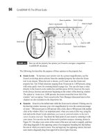
First choose the hue—drag the black triangle to your choice, and then drag any of the white-
circle color markers toward or away from their current location, distorting the polygon.
516 CorelDRAW X5 The Official Guide
Reshape polygon to shift hues
away or toward target hue.
Color Relationships
It is through color harmonies that you can better see the relationships between primary,
secondary, and complementary colors. In the additive color model, the primary colors
are red, green, and blue. Complementary colors are the color opposites of primaries
and lie at 180 degrees in opposition on a color wheel of hues. For example, the digital
complementary color of Red is Cyan; the opposite of Blue is Yellow; and these
complements are largely responsible for the A and B color channels in the LAB model,
discussed earlier in this chapter. Secondary (additive) colors are the result of mixtures of
two primary colors: Red + Green yields Yellow, Green + Blue produces Cyan, and Red
+ Blue produces Magenta, which is the basis for the CMYK (subtractive) color model. It
should be noted, however, that color harmonies, relationships that are described based on
math, are not necessarily the sort of “harmony” you think of when designing a scheme,
for example, for the living room. The “color explorer” utilities you can download online
Here is a set of steps you can use to gain experience with the features of the color
mixer’s Color Harmonies mode.
Experimenting with Color Harmonies
1. You might not want to mess up the default Color Palette in your workspace, so before
exploring mixers, create a new palette: click the menu options button on the default
palette, as shown at left in the following illustration, and then choose Palette | New.
When prompted for a new palette name, name it “Test” or anything you’ll remember
CHAPTER 17: Digital Color Theory Put to Practice 517
17
typically do exactly what CorelDRAW’s mixer does. Usually showing only contrasting
colors (color opposites, complementary colors), color mixers have no intelligence; they
describe only relationships between hues, and therefore can choose, for example, college
sports team colors, but you truly have to use your own mind’s eye when designing an
eye-pleasing palette
of colors to use in your work.
In RGB, the complementary color of Red is Cyan. Quoting from Wiki:
In the RGB color model (and derived models such as HSV), primary colors and
secondary colors are paired in this way:
●
red and cyan
●
green and magenta
●
blue and yellow
However, in art and design, complementary colors are defined differently. Using
Wiki again:
Because of the limited range of colors that was available throughout most of the
history of art, many artists still use a traditional set of complementary pairs,
including:
●
white and black
●
red and green
●
blue and orange
●
yellow and violet
(from />later. A new blank palette appears to the left of the default Color Palette at the right
edge of the drawing window.
2. With an object selected on the page, open the Uniform Fill dialog (SHIFT+F11), click
the Mixers tab, and choose Options | Mixers | Color Harmonies. Choose a color
model from the Model drop-down menu.
3. Choose a Hue type—in the illustration shown next, Triangle1 is selected. A four-
pointed rectangle shape appears around the color wheel. Click-drag the black marker
to change hue, and click-drag the white markers to reshape the rectangle. Triangles
and other multi-point harmonies can be reshaped, too. By making the rectangle wide
and short, you narrow the range of complementary colors to red (the selected color);
yellows, greens, and violets are eliminated from the mixer swatches, in preference
for cyans and blues.
4. Choose a Variation type to change the swatch collection below the color model,
based on the color marker positions on the model. If you choose None from the
Variation drop-down list, only one color per marker appears in the collection, and
the Size slider is dimmed. In the case of the Rectangle harmony, four markers
appear.
5. Choose a Variation other than None, and then choose a Size for your collection
using the Size slider control. Choose up to 20 different variation colors per marker.
518 CorelDRAW X5 The Official Guide
New palette
6. Work on this color collection using different harmonies and variations until you
arrive at something you think you’ll use in the future.
7. To save the collection now to the palette you created in step 1, click the first color
well (the color swatch), and then
SHIFT-click the last color well to select them all.
Alternatively, if you have some colors you feel are useless,
CTRL-click only the
valuable color wells. Highlighted color wells take on a bevel-edge highlight.
8. With your colors selected, click the down arrow to the right of the Add To Palette
button, and then choose your palette. You’re not done yet: click the Add To Palette
button, and your collection of colors is saved to your custom color palette.
9. At any time, you can add a color directly to the custom palette by dragging a filled
object into the palette, whether it is docked or not. You can also rearrange the order
of colors by dragging from one position on the palette, and then releasing the swatch
when it’s over its desired position.
To add an object’s fill and its outline color at the same time to a custom palette,
drag the object aboard the palette. A shape with a fountain fill can also add colors
to a custom palette. For example, a four-color multi-step fountain fill will add its
four primary color transition points to the custom palette if you drag the object onto
the palette.
Mixing with Color Blend
The Color Blend mixer (shown in the following illustration) is the other mode of the Mixers
module, where you define colors almost literally by mixing them, very much like when you
create a multi-stage fountain fill. You can choose four different colors and then generate a
collection of up to 1,024 unique values, and then choose the ones you like to create your
CHAPTER 17: Digital Color Theory Put to Practice 519
17
Drag a filled object over the
palette to add its color.
Save selected color wells
(swatches) to new palette.
own color palette. All these color options are easier to mentally sort by task: when you want
a specific color, you use the Models module. When you want a palette of colors based
around your tastes, you use the Mixers module.
To access the Color Blend feature from within the main Uniform Fill dialog while you’re
on the Mix
ers tab, choose Options | Mixers | Color Blend.
Here’s how to work the Color Blend feature to create a small collection, and then to
choose the colors you want to save as a palette.
Using the Color Blend Mixer
1. Create an object, select it, and then double-click the Fill Color button on the status
bar to open the Uniform Fill dialog.
2. Click the Mixers tab and then choose Options | Mixers | Color Blend.
3. Choose four colors for your blend by clicking each of the four color selectors in
view and choosing a color from the palette displayed. You do not need to blend from
four colors: you can choose the same color from two or more of the flyout palettes to
home in on a range of colors, making your decisions easier. Each time a selector is
changed, the color field changes, as do the available colors from which to choose.
520 CorelDRAW X5 The Official Guide
4. Choose a Size for your collection using the Size slider control.
5. Save some of the more useful colors to a palette; let’s use the palette you saved in
the previous tutorial. Remember that if you’ve got some eye-pleasing colors in the
collection, you don’t have to save a huge, all-inclusive collection; you can create
shades of your favorite colors on-the-fly using the child colors feature covered
earlier in this chapter.
CTRL-click on the color wells in the collection to select only,
let’s say, your eight favorite colors. See the following illustration.
6. Choose a palette from the drop-down list, and then click the Add To Palette button.
Your color blend collection is saved.
Using Fixed and Custom Palettes
A fixed palette is a collection of ink colors prepared by an ink manufacturer, such as a specific
process or spot color. Because these color specialists have spent a good deal of time preparing
combinations of inks and other pigments to match as closely as possible between your monitor’s
display and how the colors look on real-world packaging and other goods, you don’t edit these
colors as you can with models and mixers. However, if you choose a collection made up of one
solid ink color (not a process color) such as Pantone Solid Uncoated, you can specify a Tint of
CHAPTER 17: Digital Color Theory Put to Practice 521
17
this solid color (the Tint slider is below the color samples); the professional mixing the color
for you simply adds white pigment. Fixed palettes are like small color catalogs. Manufacturers
such as Pantone, Trumatch, and Focoltone have supplied color simulations for CorelDRAW
users. You might use only one color collection, but you have a wide variety from which to
choose, and these simulations are as faithful in the “What You See Is What Will Print” arena
as technology can bring you today.
Using Fixed Palettes
Some of the palettes are for use in commercial print—they provide simulations for metallic
inks, inks that will be printed to coated or uncoated stock (in English: glossy and matte
finishes), and so on. Other palettes you’ll find in this area of uniform fills are geared for the
Web and not for print. The World Wide Web has color specifications, too. Using a specific
color palette usually ensures that colors you use in a design fall within the capabilities of the
reproduction or display technique used to show off your work.
To apply process color values (CMYK, usually, although Pantone Hexachrome fixed-
palette inks use six values) to your work, the very first thing you do is talk with the commercial
press operator. They might want to use substitution values (less expensive inks), or they
might not even own the physical equipment to reproduce Hexachrome. You always work
backwards when your final output is to be printed—you find out what can be reproduced on
what budget, and then you choose your colors. Here’s a short tutorial on how to specify a
color from the Palettes list.
Choosing Predefined Colors for Print
1. With an object selected on the page, in the Uniform Fill dialog (press SHIFT+F11),
click the Palettes tab.
2. Choose a palette from the Palette drop-down menu. Colors appear in the main selector
window, and you can pick swatches by clicking them; their names appear in the Name
list at bottom right. You can more quickly thumb through colors by choosing Options |
Show Color Names; the selector window changes from swatches to larger color samples
with the name in the center of the color. The vertical selector to the right of the selector
window lets you navigate through the available colors very quickly.
3. Click the color you need.
4. If you’ve chosen a process color collection, the Tint slider is unavailable. However, if
you’ve picked a Metallic, Pastel, or other solid color collection, choose a percentage
value for your color by using the Tint option. By default, tints of selected colors are set
to 100 percent of the ink, but you can specify any value between 0 and 100 percent.
However, choosing zero for a Tint just changes the chosen color to white; printing
white on white paper probably won’t earn you big bucks with your client!
5. Click OK to apply the palette color or a tinted value of the color.
522 CorelDRAW X5 The Official Guide
Information about the Palettes You Can Use for Printing Assignments
Here’s a quick rundown on each of the commercial palettes you can choose in the Palettes
tab of the Uniform Fill dialog:
●
SVG Colors This collection was designed to address the need for standardized
colors for Scalable Vector Graphics (SVG), an emerging technology that allows
designers to post vector images as vector images (and not bitmaps) on web pages.
These colors were agreed upon by the W3 Consortium.
For a chart featuring user-friendly names for SVG colors, visit www.w3c.org/TR/
SVG11/types.html#ColorKeywords.
●
Pantone Pantone dominates the publishing industry with its color-matching
system. CorelDRAW offers all of Pantone’s color-matching simulations including
coated, uncoated, and matte color versions for solids, as well as process and
Hexachrome colors. CorelDRAW also features Pantone’s metallic, GoeBridge,
Color Bridge, pastel, solid-to-process EURO, and process-coated EURO palettes.
●
HKS (Hostmann, Kast, and Schmincke) This palette collection uses CMY
components that occasionally (depending on the color) don’t require a black plate.
The HKS collections use a Euroscale color space, ISO 12647:2 2002, the FOGRA
standard. If you’re a Westerner, you probably won’t use this color collection. HKS
palettes include HKS Colors, HKS E, HKS Z, HKS N, and HKS K.
●
Focoltone This 750-color palette was designed from the ground up to be ICC
compliant. If your commercial printer supports Focoltone (an abbreviation for
“Four-color tone”), your client insists on color consistency between printed material
and packaging, and you, the designer, need some flexibility in choosing colors and
tints, you might want to try this collection.
●
Trumatch The Trumatch process-color palette is made up of more than 2,000
printable colors. Trumatch has specifically customized its color-matching system to suit
the digital color industry by using the Computer Electronic Prepress System (CEPS).
The palette has 40 tints and shades of each hue. Black is varied in 6-percent increments.
●
Web Safe The Web Safe Palette contains the 216 colors of the Web Safe color
model. Colors are defined using the hexadecimal scheme; one of the six shades of each
color (red, green, and blue) is combined together to create each color in the palette.
●
TOYO and DIC The TOYO and DIC color-matching systems are widely used
throughout Asia—Japan, in particular. Each system contains its own numbering
system and collection of different process colors. The TOYO collection of colors has
been developed using its own process ink colors. The DIC (Dainippon Ink and
Chemicals, Inc.) brand of process color inks is divided into three categories: DIC,
DIC Traditional, and DIC Part II.
CHAPTER 17: Digital Color Theory Put to Practice 523
17