Hướng dẫn sử dụng Coreldraw x5 - part 75 pot
Bạn đang xem bản rút gọn của tài liệu. Xem và tải ngay bản đầy đủ của tài liệu tại đây (1.17 MB, 10 trang )
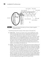
●
The A area is for rotating the RAW image before placing the copy into your
CorelDRAW document. RAW camera data can also include portrait and
landscape orientation, so you might never need to use these buttons if your
camera saved orientation info.
●
B marks your navigation tools for previewing the image. From left to right you
have tools for panning the window (click-drag when your cursor is inside the
preview window), zoom in and out, Fit To Window, 100% (1:1) viewing
resolution, and finally a slider to zoom your current view in and out.
●
C marks the Split Pane view (shown in the previous illustration) so you can
compare the original image with any corrections you make.
724 CorelDRAW X5 The Official Guide
FIGURE 23-4 Use the Camera RAW Lab to color- and tone-correct high-quality digital
images.
A
B
C
D
E
F
G
H
I
J
K
L
M
N
●
D marks the Color Depth. You’d be ill-advised to change this from 48-bit,
because only a high-depth image can be adjusted extensively without taking on
banding and color clipping (explained shortly). The only reason you’d choose
24-bit from the selector list is if the image were flawless and you wanted to get
down to work by placing it in your document and saving space on your hard
disk.
●
E marks the White Balance selector. You have many choices that influence the
color casting of the RAW image. Ideally, you want the placed image to be
casting neutral; the grays in the image contain no hues, and the photo looks
neither too warm nor too cold. You have selections such as Tungsten, Cloudy,
and other lighting conditions that influence the color cast of images. “As Shot”
is the default setting, and this image appears to be fine As Shot.
●
F is the White Balance eyedropper tool, used to define a completely neutral area
in the preview window to better set and possibly neutralize color casting. The
cursor for this tool gives you an RGB readout of the current area in the preview
photo; this is the true color over a pixel, and not the “ideally neutral color.” You
click an area you believe should contain equal amounts of red, green, and blue
components (R:64, G:64, B:64, for example), and this action remaps the image
to reflect the color casting in the image based on where you clicked. Although
it’s a useful tool, you might not have a photo that contains a perfectly white or a
perfectly neutral gray area; if this is the case, don’t use this tool.
●
G marks color Temperature and Tint, perhaps the least intuitive of RAW digital
image properties. The values in the Camera RAW Lab’s color Temperature
controls run from low at the left of the slider (cools down warm images) to high
at right (warms cool images). The temperature controls, specifically values you
enter in the numeric field, are not degrees of Kelvin; they are correction values
for you to only refer to and compare with other settings and other images.
However, it is correct to think of color temperature in general as measured in
degrees Kelvin. You might want to “uncorrect” a perfect image to make it
warmer or colder. The Tint slider is the color complement of the color
Temperature control; a neutral temperature displays a band on the Tint slider
from magenta at left to green at right. You always use Tint after you’ve set
Temperature because Tint varies according to temperature.
●
H is the Saturation control, which is mostly self-explanatory—it’s used to
compensate for dull photographs (you increase Saturation) or for overly colorful
images (you desaturate by dragging to the left with the slider).
CHAPTER 23: Bitmap Boot Camp: Working with Photographs 725
23
●
I marks the Exposure control. Exposure is not the same as, for example, the
brightness/contrast controls on a TV set or the Levels command in image-editing
applications. Exposure is the total light that falls on a scene, and it’s set when
you take a picture by setting the ISO value. Therefore, it’s always a good idea to
double-check the info in the Properties tab: if the ISO is a low value and the
picture looks dark or muddy, then Exposure is probably the Color option that
needs adjusting.
●
J marks Brightness, which you should play with only after setting the best Exposure.
If you drag Brightness to the right with this image, you’ll see that the midtones of the
image become brighter, but not the shadow areas. So you use this slider to bring out
detail in the midranges in an image without ruining the deeper tones.
●
K is the Shadow slider, and this option is used only to make deeper areas more
pronounced without affecting the midtones and highlights. Shadows might also
be called “contrast”; dragging the slider to the right does indeed create a
difference between the lighter and darker areas of the overall image.
●
L marks both the Shadow and Highlights clipping regions. These two buttons—
you need to click these buttons—that frame the histogram (M), will display a
bright red overlay in the preview window in areas where the brightest brights
have fallen out of range (they can’t be accurately displayed onscreen, and they
can’t be accurately printed); and deepest shadows will display a green-tinted
overlay. If you see a tint in areas, this means that the Shadow, the Exposure, or
the Saturation adjustments you’ve made are too intense. The solution is to
choose lesser values for any of these options until the tint disappears in the
preview window.
●
M is the histogram of the current photograph. A histogram is a visual representation
of how many pixels of what color are located at what brightness in the image.
Although there are always exceptions to any rule, and all photos have different
brightness content, usually a well-toned image will have a lot of color pixels in
the mid-region of the histogram—this is where the most visual detail is apparent
in digital photographs. If the histogram shows too many pixels—for example, in
the lower regions there’s a hump in the histogram curve toward the left—it means
your image needs less Shadow or more Exposure.
●
N is the area where you can create Snapshots. When you arrive at a good exposure
for an image you want to copy into a page, click the Create Snapshot button, and a
thumbnail appears at bottom left. Snapshots are not saved; their purpose is for you
to compare snapshots and ultimately to choose one you’ll import.
6. Once you’ve made your adjustments, click OK, and you’re then presented with a
loaded cursor for placing and scaling the imported image, as discussed earlier in this
chapter.
726 CorelDRAW X5 The Official Guide
To import more than one digital image at a time, hold SHIFT while clicking to select
contiguous files, or hold
CTRL while clicking to select noncontiguous files in the
Import dialog. As multiple files are imported, the cursor indicates the file
information for each image being placed.
An Everyday Bitmap-Oriented Workflow
In addition to CorelDRAW’s capabilities to import, resize, resample, and develop RAW images,
you also have many of PHOTO-PAINT’s effects right within CorelDRAW to filter imported
images. And CorelDRAW has an Image Adjustment Lab for enhancing RAW file format images.
Once you’re finished working on a composition, whether it’s vector, bitmap, or a combination of
these two elements, you probably want to pop a copy of your work off to a friend or a client. The
following sections take you through these four stages of CorelDRAW design work; in the process
you’ll grow quite comfortable with all this “bitmap stuff” and appreciate CorelDRAW’s power to
bring different media together for both your import and export needs.
Creating a Catalog Cover
Lux, a fictitious candle manufacturer, needs a new catalog cover for 2010. As to be expected,
they have no money to take a new picture for the cover, but they’ve heard that your copy of
CorelDRAW X5 ships with some really cool filters that might put a new spin on an old image.
Follow along in the next sections’ steps to take a tour of the Image Adjustment Lab, the
Bitmap effects CorelDRAW offers, and as a grand finale, you’ll breeze through the export
options for the JPEG file format so you can send a rough layout to the fictitious client.
Working in the Image Adjustment Lab
For “normal” photographs—photos in JPEG, TIFF, and file formats other than Camera RAW—
you have under the Bitmaps menu in CorelDRAW a fairly comprehensive Image Adjustment
Lab to make practically every global adjustment (but not pixel-editing adjustments) you’ll find
in PHOTO-PAINT. This makes it very easy to photo-correct imported bitmaps and to integrate
them into a composition without ever leaving CorelDRAW; better still, the features are almost
identical to those in the Camera RAW Lab.
Let’s work through the mock assignment now: first, you’ll import and place an image in
the layout that’s been designed for you.
Adjusting a PNG Image in the Lab
1. Open LUM catalog.cdr. Choose the Object Manager docker (Tools | Object Manager).
Click the “put the photo on this layer” title on the Object Manager to make it the
current layer (the background layer with the text is locked).
2. Choose File | Import (CTRL+I), and then choose LUM candles.png from the location
where you downloaded it. Click Import.
CHAPTER 23: Bitmap Boot Camp: Working with Photographs 727
23
3. Your cursor is loaded with the image now, and it’s much larger than the place for it
within the layout, so you’ll scale the image as you place it. First, make sure Snap To
Guidelines is checked on the Snap To list on the standard toolbar. Click an insertion
point at the top left of the guides intersection; then drag down until the right edge of
the image meets the right guide. You’ve scaled and placed the image now, as shown
in Figure 23-5.
728 CorelDRAW X5 The Official Guide
FIGURE 23-5 Scale the imported image as you place it in the design.
4. With the photo selected, choose Bitmaps | Image Adjustment Lab.
5. In Figure 23-6 you’ll see a lot of the same navigation controls as you saw in the
Camera RAW Lab. However, the Image Adjustment Lab has slightly different
features for color and tone adjustments. Always shoot for tone correction for
exposure, and then work on the color if necessary.
●
A marks Auto Adjust, a one-step routine that adds contrast to an image; let’s
skip this feature—automated routines don’t give “one off” assignments the
custom attention they need, and you don’t learn anything from automated
routines.
●
B marks the White Point eyedropper tool, used to define in the preview window
the lightest area that should be in the picture. Click in the center of one of the
candle flames (presumably the whitest white in the image) to see if the Lab
adjusts the other tones and snaps up the image.
CHAPTER 23: Bitmap Boot Camp: Working with Photographs 729
23
FIGURE 23-6 Color- and tone-correction can be performed on photographs with CorelDRAW.
AB
C
D
E
F
●
C marks the Black Point eyedropper, which redefines the darkest point in the
image based on where you click in the preview window. This step is optional;
hover your cursor over the top left of the background in the image. Your cursor
will tell you that the background toward the top is almost black with a little red
tossed in. Click this point with the eyedropper tool. Your artistic judgment might
tell you that the preview pane at right shows a better, snappier image. If you
disagree, click the “Reverse the last operation” left-arrow button at bottom left.
●
D marks the Brightness and Contrast sliders. They basically do what you’d expect;
they’re like the controls on a television set, but as with a TV set, brightness and
contrast don’t always make an image better. Skip these controls for this assignment.
●
E marks the area the professionals use to selectively add contrast and to remove
any murkiness the photo might have as a result of too many pixels of similar
brightness values neighboring one another in an area of the picture. Leave the
Highlights slider alone in this assignment; this brightens the brighter areas in the
image without affecting the midtones or shadow areas. However, do drag the
Midtones slider up to 2 to open up darker regions to provide image detail
without messing up the Shadows region, which is fine as is.
6. Finally, click the Create Snapshot button (F). This creates an entry on the Undo
docker in case you want to reverse a correction after exiting the lab. Click OK and
your adjusted image is now placed in the layout. Keep the file open and Save (press
CTRL+S).
Photo Effects
If you need to do something dramatic to a photo, such as making a film negative version
(using the Invert style), you have these options:
●
Put an object over the photo, and then use lens effects, covered in Chapter 22. You
might not get exactly the effect you want with a lens, so the advantage to this
method is that the change isn’t made directly to the photo—a lens effect can be
deleted at any time, restoring the normal appearance of objects beneath it.
●
Use the effects on the bottom of the Bitmaps menu, as you’ll do in the following
tutorial.
Effects you apply via the Bitmaps menu are permanent changes; the bad news is that you
can choose to Undo an applied effect only right after you’ve made one. The good news is that
all effects are applied only to an image you’ve imported—your original photo is safely tucked
away somewhere on hard disk. Effects filters in CorelDRAW are divided into categories, and you’ll
be using only two from the Color Transform and Art Strokes categories in this assignment.
You should feel free to set aside some time to experiment with the various filters on an image
you believe has the potential to look more interesting after a little Distortion or Trace Contour
filtering.
730 CorelDRAW X5 The Official Guide
It’s important to understand that any filter you apply to a photo removes original image
information and occasionally supplies altered image information. Therefore, you need to
make a creative and qualitative judgment as to whether an image looks “better” after applying
one or more filters. There is no such thing as “Instant Art.” You need to use your artistic taste
when allowing a filter to change the original image’s data, and don’t dismiss the possibility
that an original image might look better and be more appropriate than a filtered one.
Usually, you’d want to reach for the Bitmaps menu filters for two occasions:
●
When a photography session isn’t possible to provide a new photo for a new catalog
or brochure. You or the client have to use an older photo, but you want it to look a
little different from last year’s photo.
●
When a photo is visually boring. It’s not a bad photo, just an uninspired photograph
whose composition, geometry, and colors are very staid and simple. The LUX
candle image isn’t a bad image; its problems in this example are that it was used last
year, and the geometry in the scene is exceptionally simple and looks like any still
photo of a bunch of cylinders.
To use a bitmaps effect, you first need to have an imported bitmap selected. The bitmap has
to be either an 8-bit (Grayscale mode, for example) or 24-bit image in either RGB or CMYK
color mode. RAW images you import—if they are higher than 24-bit—need to be changed
to a bit depth the effects can work with. In English, if the effects menus and submenus are
dimmed, choose Bitmaps | Mode; then convert the selected image to RGB 24-bit, and life
is good. Working with an effect is easy and intuitive: you have different options and sliders
depending on the specific effect, but to work an effect, there are four key areas of the dialog
that appears when you choose one:
●
Preview Even at an effect’s default settings, you need to click Preview to see what
the effect will look like on the page.
●
Reset Clicking this button removes all changes you’ve made to the sliders and
other controls for all effects.
●
OK Clicking this applies the effect using the options you’ve defined and closes the
dialog.
●
Controls To customize an effect, you drag sliders, enter values in num boxes, and/
or drag other controls such as the direction of an effect.
CHAPTER 23: Bitmap Boot Camp: Working with Photographs 731
23
Once you’ve made changes to the effect’s values, you click Preview to update the page
preview, and when you’re satisfied with the customized effect, you click OK.
Ill 23-9
In the following steps, you’re going to kick out all the stops and combine two effects to
create a unique stylized version of the candles image. You’ll duplicate the image, apply two
different filters to the two images, and then use CorelDRAW’s transparency effect to
combine the two filtered images. You don’t have to do this in your own work if one effect
filter does the job, but these steps show that you can.
Filtering a Photo
1. With the Pick tool, click-drag the candles image to the right and then tap the right
mouse button before releasing both buttons to drop a copy of it to the right of the
original.
2. With the duplicate selected, choose Effects | Adjust | Hue/Saturation/Lightness. Drag
the Saturation slider all the way to the left to make a grayscale version of the image,
and then click OK to apply. You do this to prepare the duplicate image for a filter
effect; this command could also be done in the Image Adjustment Lab.
732 CorelDRAW X5 The Official Guide
Preview Reset Apply Controls Options are unique to each effect.
3. Choose Bitmaps | Contour | Find Edges. In the Find Edges box, click the Solid
button, click Preview, utter some amazement at how neat the outline version of the
image looks, and then click OK to apply the effect.
4. Select the original image. Choose Bitmaps | Art Strokes | Crayon. Drag the Size
slider to 20, set the Outline slider to 0, click Preview, and then click OK to apply.
5. With the Pick tool, drag the duplicate over so it’s aligned on top of the original. The
guides should help snap the duplicate into perfect alignment.
Choose the Transparency tool from the toolbox. Select the top duplicate image and then
on the property bar, set the type of transparency to Uniform (from the drop-down list), and
then first try the If Lighter operation from the drop-down list. Divide and Texturize operations
also produce an interesting effect. It’s your call here, and 50% Uniform transparency seems
to work best. Figure 23-7 shows the process of laying the Find Edges version of the bitmap
over the Crayon filtered image.
CHAPTER 23: Bitmap Boot Camp: Working with Photographs 733
23
FIGURE 23-7 Add two different filtered images to create a composite by using Transparency.
Crayon Effect
Remove Saturation; then add Find Edges effect
Find Edges on top, Transparency effect,
Uniform, 80% Transparent, If Lighter mode