Tự học HTML và CSS trong 1 giờ - part 58 pps
Bạn đang xem bản rút gọn của tài liệu. Xem và tải ngay bản đầy đủ của tài liệu tại đây (1.16 MB, 10 trang )
ptg
Using Links
Without links, web pages would be dull and finding anything interesting on the Web would
be close to impossible. In many ways, the quality of your links can be as important as the
writing and design of your actual pages. Here’s some friendly advice on creating and
using links.
Use Link Menus with Descriptive Text
As I’ve noted throughout this book, using link menus is a great way of organizing your
content and the links on a page. If you organize your links into lists or other menu-like
structures, your visitors can scan their options for the page quickly and easily.
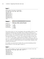
Just organizing your links into menus might not be enough, however. Make sure that
your descriptions aren’t too short. For example, using menus of filenames or other mar-
ginally descriptive links in menus can be tempting (see Figure 18.11).
546
LESSON 18: Writing Good Web Pages: Do’s and Don’ts
FIGURE 18.11
DON’T: A poor
link menu.
Each link describes the actual page to which it points, but it doesn’t describe the content
of the page. How do visitors know what’s on the other side of the link, and how can they
decide whether they’re interested in it from the limited information you’ve given them?
Of these three links, only the last (pesto-recipe.txt) gives the visitors a hint about
what they’ll see when they jump to that file.
A better plan is either to provide some extra text describing the content of the file, as
shown in Figure 18.12, or to avoid the filenames altogether. Just describe the contents of
the files in the menu with the appropriate text highlighted, as shown in Figure 18.13.
Download from www.wowebook.com
ptg
Using Links
547
18
FIGURE 18.12
DO: A better link
menu.
FIGURE 18.13
DO: Another
better link menu.
Either one of these forms is better than the first. They both give your visitors more clues
about what’s on the other side of the link.
Use Links in Text
The best way to provide links in text is to first write the text as if it isn’t going to have
links at all—for example, as if you were writing it for hard copy. Then you can highlight
the appropriate words that will link to other pages. Make sure that you don’t interrupt the
flow of the page when you include a link. The text should stand on its own. That way,
the links provide additional or tangential information that your visitors can choose to fol-
low or ignore at their own whim.
Figure 18.14 shows another example of using links in text. Here the text isn’t particularly
relevant; it’s just there to support the links. If you’re using text just to describe links,
consider using a link menu instead of a paragraph. Instead of having to read the entire
paragraph, your visitors can skim for the links that interest them.
Download from www.wowebook.com
ptg
Figure 18.15 shows one way to restructure the previous example. The most important
items on the page are the name of the conference, the events, and the dates on which
they occur. You can restructure the page so that this information stands out. As you can
see in Figure 18.15, presenting the events in a preformatted text table makes the impor-
tant information stand out from the rest.
548
LESSON 18: Writing Good Web Pages: Do’s and Don’ts
FIGURE 18.14
DON’T: Links in
text that don’t
work well.
FIGURE 18.15
DO: Restructuring
the links in the
text.
Probably the easiest way to figure out whether you’re creating links within text properly
is to print out the formatted web page from your browser. In hard copy, without hyper-
text, does the paragraph still make sense? If the page reads funny on paper, it’ll read
funny online, too.
The revisions don’t always have to be as different as they are in this example.
Sometimes, a simple rephrasing of sentences can make the text on your pages more read-
able and more usable, both online and when printed.
Download from www.wowebook.com
ptg
Avoid the “Here” Syndrome
A common mistake that many web authors make when creating links in body text is
using the “here” syndrome. This is the tendency to create links with a single highlighted
word (here) and to describe the links somewhere else in the text. Look at the following
examples, with underlining to indicate link text:
Information about ostrich socialization is contained here.
Follow this link
for a tutorial on the internal combustion engine.
Because links are highlighted on the web page, the links visually pop out more than the
surrounding text (or draw the eye, in graphic design lingo). Your visitors will see the link
first, before reading the text. Try creating links this way.
Figure 18.16 shows a particularly heinous example of the “here” syndrome. Close your
eyes, open them quickly, pick a here in the figure at random, and then see how long it
takes you to find out what the here is for.
Using Links
549
18
FIGURE 18.16
DON’T: The
“here” syndrome.
Now try the same exercise with a well-organized link menu of the same information, as
shown in Figure 18.17.
FIGURE 18.17
DO: The same
page reorganized.
Download from www.wowebook.com
ptg
Because “here” says nothing about what the link is used for, your poor visitors have to
search the text before and after the link itself to find out what’s supposed to be “here.” In
paragraphs that have many occurrences of here or other nondescriptive links, matching
up the links with what they’re supposed to link to becomes difficult. This forces your vis-
itors to work harder to figure out what you mean.
To Link or Not to Link
Just as with graphics, every time you create a link, consider why you’re linking two
pages or sections. Is the link useful? Does it give your visitors more information or bring
them closer to their goal? Is the link relevant in some way to the current content?
Each link should serve a purpose. Just because you mention the word coffee on a page
about some other topic, you don’t have to link that word to the coffee home page.
Creating such a link may seem cute, but if a link has no relevance to the current content,
it just confuses your visitors.
The following list describes some of the categories of useful links in web pages. If your
links don’t fall into one of these categories, consider the reasons why you’re including
them in your page:
n
Explicit navigation links indicate the specific paths that visitors can take through
your web pages: forward, back, up, and home. These links are often indicated by
navigation icons, as shown in Figure 18.18.
550
LESSON 18: Writing Good Web Pages: Do’s and Don’ts
FIGURE 18.18
Explicit navigation
links.
n
Implicit navigation links (see Figure 18.19) are different from explicit navigation
links because the link text implies, but does not directly indicate, navigation
between pages. Link menus are the best example of this type of link. The high-
lighting of the link text makes it apparent that you’ll get more information on this
topic by selecting the link, but the text doesn’t necessarily say so. Note the major
difference between explicit and implicit navigation links: If you print a page con-
taining both, you won’t pick out the implicit links.
Download from www.wowebook.com
ptg
Implicit navigation links also can include tables of contents or other overviews
made up entirely of links.
n
Definitions of words or concepts make excellent links, particularly if you’re creat-
ing large networks of pages that include glossaries. By linking the first instance of
a word to its definition, you can explain the meaning of that word to visitors who
don’t know what it means without distracting those who do. Figure 18.20 shows an
example of this type of link. (You could also use a DHTML effect to display the
definition without requiring the user to follow the link.)
Using Links
551
18
FIGURE 18.19
Implicit navigation
links.
FIGURE 18.20
Definition links.
n
Finally, links to tangents and related information are valuable when the text content
will distract from the main purpose of the page. Think of tangent links as footnotes
or endnotes in printed text (see Figure 18.21). They can refer to citations to other
works or to additional information that’s interesting but isn’t necessarily directly
relevant to the point you’re trying to make.
Download from www.wowebook.com
ptg
Be careful that you don’t get carried away with definitions and tangent links. You might
create so many tangents that your visitors spend too much time following links elsewhere
to get the point of your original text. Resist the urge to link every time you possibly can,
and link only to tangents that are relevant to your own text. Also, avoid duplicating the
same tangent—for example, linking every instance of the letters WWW on your page to
the WWW Consortium’s home page. If you’re linking twice or more to the same location
on one page, consider removing most of the extra links. Your visitors can select one of
the other links if they’re interested in the information.
552
LESSON 18: Writing Good Web Pages: Do’s and Don’ts
FIGURE 18.21
Footnote links.
Thanks to Nathan Torkington for his “Taxonomy of Tags,” published
on the
www-talk mailing list, which inspired this section.
Using Images
In Lesson 9, “Adding Images, Color, and Backgrounds,” you learned all about creating
and using images in web pages. This section summarizes many of those hints.
Don’t Overuse Images
Be careful about including a large number of images on your web page. Besides that
each image adds to the amount of time it takes to load the page, having too many images
on the same page makes it look cluttered and distracts from the point you’re trying to get
across. Sometimes, though, people think that the more images they include on a page,
the better it is. Figure 18.22 shows such an example.
NOTE
Download from www.wowebook.com
ptg
Remember the hints I gave you in Lesson 9. Consider how important each image is
before you put it on the page. If an image doesn’t directly contribute to the content,
consider leaving it out.
Keep Images Small
Keep in mind that each image you use is a separate network connection and takes time to
load over a network. This means that each image adds to the total time it takes to view
the page. Try to reduce the number of images on the page, and keep them small both in
file size and in actual dimensions. In particular, keep the following hints in mind:
n
The entire page (text, CSS, JavaScript, and images) shouldn’t take more than
10 seconds to load; otherwise, your visitors may get annoyed and move on without
reading your page. Strive to achieve that size by keeping your images small and
just as importan, reducing the number of images on your page. The browser has to
open a new connection to your server for every image on your page, and there is
overhead associated with those connections.
n
For larger images, consider using thumbnails on your main page and then linking
to the images rather than putting them inline.
n
Save your image in both the PNG and GIF formats to see which creates a smaller
file for the type of image you’re using. You might also want to increase the level of
compression for your JPEG images or reduce the number of colors in the palette of
the GIF images to see whether you can save a significant amount of space without
adversely affecting image quality.
Using Images
553
18
FIGURE 18.22
DON’T: Images
that are too large.
Download from www.wowebook.com
ptg
n
You can reduce the physical size of your images by cropping them (using a smaller
portion of the overall image) or scaling (shrinking) them. When you scale an
image, you might lose some of the detail.
554
LESSON 18: Writing Good Web Pages: Do’s and Don’ts
Remember that reducing the size of your images using the height
and width CSS properties or the height and width attributes of
the
<img> tag only makes them take up less space on the page; it
doesn’t affect the size of the image file or the download speed. It
also has a tendency of making your images just look bad.
With the preceding suggestions in mind, take a second look at the images on your page.
How can you put the page shown in Figure 18.22 on a diet and improve its appearance?
n
The background of the page can be dropped. It makes the page hard to read, and
the tiling of the image is not good. This makes the page simpler and helps it down-
load more quickly.
n
There are a couple of problems with the banner image. The first is that it’s large,
and the second is that it has no semantic meaning. It is purely decorative. The cur-
rent style is to put things like page headings in regular tags and then use CSS back-
grounds to add images where appropriate. The banner image will be replaced by a
heading with a background image. This approach is friendlier to search engines
and more accessible.
n
Those horizontal rules are a big problem. First, there are too many of them.
Second, they overpower the page heading because of their size. Third, they distract
from the list of items because they create separation between them. I’ve removed
them from the updated page.
n
The bullets that appear before each list item are way too large. They could stand to
be cut down to half their size. As a rule, most bullets are kept to 30×30 pixels or
less. In the updated image, I’ve used smaller bubbles as bullets in the list.
All the improvements I’ve suggested here are shown in Figure 18.23.
CAUTION
Download from www.wowebook.com
ptg
Watch Out for Assumptions About Your Visitors’
Hardware
Many web designers create problems for their visitors by making a couple of careless
assumptions about their hardware. When you’re developing web pages, be kind and
remember that not everyone has the same screen and browser dimensions as you do.
Just because that huge image you created is narrow enough to fit in your browser doesn’t
mean that it’ll fit in someone else’s. An image that’s too wide is annoying because the
visitors need to resize their windows or scroll sideways.
Most developers limit the overall width of their pages to 750 pixels or 950 pixels, and for
the sake of readability, limit the width of containers used to display text to 500 or 600
pixels. Pages meant to be displayed on mobile devices need to be even smaller.
Be Careful with Backgrounds and Link Colors
Using CSS, you can use background colors and patterns on your pages and change the
color of the text. This can be tempting, but be careful. Changing the page and font colors
and providing fancy backdrops can quickly and easily make your pages entirely unread-
able. The following are some hints for avoiding these problems:
n
Make sure you have enough contrast between the background and foreground
(text) colors—Low contrast can be hard to read. Also, light-colored text on a dark
background is harder to read than dark text on a light background.
n
Increasing the font size of all the text on your page can sometimes make it
more readable on a low-contrast background—You can use CSS g to increase
the default font size for your page.
Using Images
555
18
FIGURE 18.23
DO: Better use of
images.
Download from www.wowebook.com