Engineering Statistics Handbook Episode 1 Part 8 ppt
Bạn đang xem bản rút gọn của tài liệu. Xem và tải ngay bản đầy đủ của tài liệu tại đây (75 KB, 14 trang )
Definition: The PPCC plot is formed by:
Vertical axis: Probability plot correlation coefficient;
●
Horizontal axis: Value of shape parameter.●
Questions The PPCC plot answers the following questions:
What is the best-fit member within a distributional family?1.
Does the best-fit member provide a good fit (in terms of
generating a probability plot with a high correlation
coefficient)?
2.
Does this distributional family provide a good fit compared to
other distributions?
3.
How sensitive is the choice of the shape parameter?4.
Importance Many statistical analyses are based on distributional assumptions
about the population from which the data have been obtained.
However, distributional families can have radically different shapes
depending on the value of the shape parameter. Therefore, finding a
reasonable choice for the shape parameter is a necessary step in the
analysis. In many analyses, finding a good distributional model for the
data is the primary focus of the analysis. In both of these cases, the
PPCC plot is a valuable tool.
Related
Techniques
Probability Plot
Maximum Likelihood Estimation
Least Squares Estimation
Method of Moments Estimation
Case Study
The PPCC plot is demonstrated in the airplane glass failure data case
study.
Software PPCC plots are currently not available in most common general
purpose statistical software programs. However, the underlying
technique is based on probability plots and correlation coefficients, so
it should be possible to write macros for PPCC plots in statistical
programs that support these capabilities. Dataplot supports PPCC
plots.
1.3.3.23. Probability Plot Correlation Coefficient Plot
(4 of 4) [5/1/2006 9:56:52 AM]
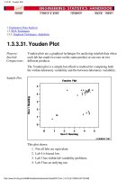
Sample Plot
This q-q plot shows that
These 2 batches do not appear to have come from populations
with a common distribution.
1.
The batch 1 values are significantly higher than the corresponding
batch 2 values.
2.
The differences are increasing from values 525 to 625. Then the
values for the 2 batches get closer again.
3.
Definition:
Quantiles
for Data Set
1 Versus
Quantiles of
Data Set 2
The q-q plot is formed by:
Vertical axis: Estimated quantiles from data set 1
●
Horizontal axis: Estimated quantiles from data set 2●
Both axes are in units of their respective data sets. That is, the actual
quantile level is not plotted. For a given point on the q-q plot, we know
that the quantile level is the same for both points, but not what that
quantile level actually is.
If the data sets have the same size, the q-q plot is essentially a plot of
sorted data set 1 against sorted data set 2. If the data sets are not of equal
size, the quantiles are usually picked to correspond to the sorted values
from the smaller data set and then the quantiles for the larger data set are
interpolated.
1.3.3.24. Quantile-Quantile Plot
(2 of 3) [5/1/2006 9:56:52 AM]
Questions The q-q plot is used to answer the following questions:
Do two data sets come from populations with a common
distribution?
●
Do two data sets have common location and scale?●
Do two data sets have similar distributional shapes?●
Do two data sets have similar tail behavior?●
Importance:
Check for
Common
Distribution
When there are two data samples, it is often desirable to know if the
assumption of a common distribution is justified. If so, then location and
scale estimators can pool both data sets to obtain estimates of the
common location and scale. If two samples do differ, it is also useful to
gain some understanding of the differences. The q-q plot can provide
more insight into the nature of the difference than analytical methods
such as the chi-square and Kolmogorov-Smirnov 2-sample tests.
Related
Techniques
Bihistogram
T Test
F Test
2-Sample Chi-Square Test
2-Sample Kolmogorov-Smirnov Test
Case Study
The quantile-quantile plot is demonstrated in the ceramic strength data
case study.
Software Q-Q plots are available in some general purpose statistical software
programs, including Dataplot. If the number of data points in the two
samples are equal, it should be relatively easy to write a macro in
statistical programs that do not support the q-q plot. If the number of
points are not equal, writing a macro for a q-q plot may be difficult.
1.3.3.24. Quantile-Quantile Plot
(3 of 3) [5/1/2006 9:56:52 AM]
Definition:
y(i) Versus i
Run sequence plots are formed by:
Vertical axis: Response variable Y(i)
●
Horizontal axis: Index i (i = 1, 2, 3, )●
Questions The run sequence plot can be used to answer the following questions
Are there any shifts in location?1.
Are there any shifts in variation?2.
Are there any outliers?3.
The run sequence plot can also give the analyst an excellent feel for the
data.
Importance:
Check
Univariate
Assumptions
For univariate data, the default model is
Y = constant + error
where the error is assumed to be random, from a fixed distribution, and
with constant location and scale. The validity of this model depends on
the validity of these assumptions. The run sequence plot is useful for
checking for constant location and scale.
Even for more complex models, the assumptions on the error term are
still often the same. That is, a run sequence plot of the residuals (even
from very complex models) is still vital for checking for outliers and for
detecting shifts in location and scale.
Related
Techniques
Scatter Plot
Histogram
Autocorrelation Plot
Lag Plot
Case Study
The run sequence plot is demonstrated in the Filter transmittance data
case study.
Software Run sequence plots are available in most general purpose statistical
software programs, including Dataplot.
1.3.3.25. Run-Sequence Plot
(2 of 2) [5/1/2006 9:56:53 AM]
Questions Scatter plots can provide answers to the following questions:
Are variables X and Y related?1.
Are variables X and Y linearly related?2.
Are variables X and Y non-linearly related?3.
Does the variation in Y change depending on X?4.
Are there outliers?5.
Examples
No relationship1.
Strong linear (positive correlation)2.
Strong linear (negative correlation)3.
Exact linear (positive correlation)4.
Quadratic relationship5.
Exponential relationship6.
Sinusoidal relationship (damped)7.
Variation of Y doesn't depend on X (homoscedastic)8.
Variation of Y does depend on X (heteroscedastic)9.
Outlier10.
Combining
Scatter Plots
Scatter plots can also be combined in multiple plots per page to help
understand higher-level structure in data sets with more than two
variables.
The scatterplot matrix generates all pairwise scatter plots on a single
page. The conditioning plot, also called a co-plot or subset plot,
generates scatter plots of Y versus X dependent on the value of a third
variable.
Causality Is
Not Proved
By
Association
The scatter plot uncovers relationships in data. "Relationships" means
that there is some structured association (linear, quadratic, etc.) between
X and Y. Note, however, that even though
causality implies association
association does NOT imply causality.
Scatter plots are a useful diagnostic tool for determining association, but
if such association exists, the plot may or may not suggest an underlying
cause-and-effect mechanism. A scatter plot can never "prove" cause and
effect it is ultimately only the researcher (relying on the underlying
science/engineering) who can conclude that causality actually exists.
1.3.3.26. Scatter Plot
(2 of 3) [5/1/2006 9:56:53 AM]
Appearance The most popular rendition of a scatter plot is
some plot character (e.g., X) at the data points, and1.
no line connecting data points.2.
Other scatter plot format variants include
an optional plot character (e.g, X) at the data points, but1.
a solid line connecting data points.2.
In both cases, the resulting plot is referred to as a scatter plot, although
the former (discrete and disconnected) is the author's personal
preference since nothing makes it onto the screen except the data there
are no interpolative artifacts to bias the interpretation.
Related
Techniques
Run Sequence Plot
Box Plot
Block Plot
Case Study
The scatter plot is demonstrated in the load cell calibration data case
study.
Software Scatter plots are a fundamental technique that should be available in any
general purpose statistical software program, including Dataplot. Scatter
plots are also available in most graphics and spreadsheet programs as
well.
1.3.3.26. Scatter Plot
(3 of 3) [5/1/2006 9:56:53 AM]
1. Exploratory Data Analysis
1.3. EDA Techniques
1.3.3. Graphical Techniques: Alphabetic
1.3.3.26. Scatter Plot
1.3.3.26.2.Scatter Plot: Strong Linear
(positive correlation)
Relationship
Scatter Plot
Showing
Strong
Positive
Linear
Correlation
Discussion Note in the plot above how a straight line comfortably fits through the
data; hence a linear relationship exists. The scatter about the line is quite
small, so there is a strong linear relationship. The slope of the line is
positive (small values of X correspond to small values of Y; large values
of X correspond to large values of Y), so there is a positive co-relation
(that is, a positive correlation) between X and Y.
1.3.3.26.2. Scatter Plot: Strong Linear (positive correlation) Relationship
[5/1/2006 9:56:53 AM]
1. Exploratory Data Analysis
1.3. EDA Techniques
1.3.3. Graphical Techniques: Alphabetic
1.3.3.26. Scatter Plot
1.3.3.26.4.Scatter Plot: Exact Linear
(positive correlation)
Relationship
Scatter Plot
Showing an
Exact
Linear
Relationship
Discussion Note in the plot above how a straight line comfortably fits through the
data; hence there is a linear relationship. The scatter about the line is
zero there is perfect predictability between X and Y), so there is an
exact linear relationship. The slope of the line is positive (small values
of X correspond to small values of Y; large values of X correspond to
large values of Y), so there is a positive co-relation (that is, a positive
correlation) between X and Y.
1.3.3.26.4. Scatter Plot: Exact Linear (positive correlation) Relationship
(1 of 2) [5/1/2006 9:56:54 AM]
1.3.3.26.4. Scatter Plot: Exact Linear (positive correlation) Relationship
(2 of 2) [5/1/2006 9:56:54 AM]
1.3.3.26.5. Scatter Plot: Quadratic Relationship
(2 of 2) [5/1/2006 9:56:54 AM]
1.3.3.26.6. Scatter Plot: Exponential Relationship
(2 of 2) [5/1/2006 9:56:55 AM]
1.3.3.26.7. Scatter Plot: Sinusoidal Relationship (damped)
(2 of 2) [5/1/2006 9:56:55 AM]
1.3.3.26.8. Scatter Plot: Variation of Y Does Not Depend on X (homoscedastic)
(2 of 2) [5/1/2006 9:57:05 AM]
performing a Y variable transformation to achieve
homoscedasticity. The Box-Cox normality plot can help
determine a suitable transformation.
2.
Impact of
Ignoring
Unequal
Variability in
the Data
Fortunately, unweighted regression analyses on heteroscedastic data
produce estimates of the coefficients that are unbiased. However, the
coefficients will not be as precise as they would be with proper
weighting.
Note further that if heteroscedasticity does exist, it is frequently
useful to plot and model the local variation
as a
function of X, as in . This modeling has
two advantages:
it provides additional insight and understanding as to how the
response Y relates to X; and
1.
it provides a convenient means of forming weights for a
weighted regression by simply using
2.
The topic of non-constant variation is discussed in some detail in the
process modeling chapter.
1.3.3.26.9. Scatter Plot: Variation of Y Does Depend on X (heteroscedastic)
(2 of 2) [5/1/2006 9:57:05 AM]